4,677 search results
(0.034 seconds)
- Rosa Stencil by Schriftgestaltung,
$19.00English Scripts are nice and decorative. I wanted to make them strong and expressive, too. - Elongated Roman by Aboutype,
$24.99An ultra light thins all caps Victorian design with a slight stroke contrast. Elongated Roman requires subjective display kerning and compensation. - Peroba Rosa by Yahya Type,
$16.00 Peroba rosa is a modern sans serif type family featuring a blend of modern, classical, and playful characteristics. The simple, clean forms and classically inspired proportions give it a timeless quality and interesting visual rhythm. Peroba rosa is perfect for logo design, magazine headers, product packaging, branding projects, clothing or simply as a stylish text overlay to any images or websites. WHAT’S INCLUDED? • Comes with regular, thin, light, italic, bold, thin italic, light italic, bold italic and bold italic font styles. Uppercase & lowercase letters. numbers. punctuation Ligature & Huge Stylistic alternate. Multilingual support. Still got a question? Send me a message and I’ll be happy to answer! qura.yahya@gmail.com
 - Old Roman by Mad Irishman Productions,
$6.00Intrigued by typefaces of the late 18th and early 19th centuries, the designer was surprised to find no digital renderings of the popular Old Roman typeface. This font is the designer's interpretation of this c. 1895 typeface designed by T.W. Smith. - Marble Roman by MADType,
$21.00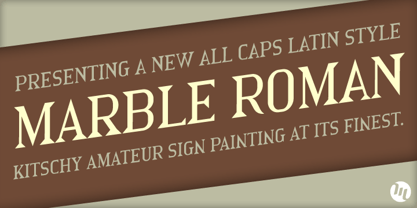
- SoftTimes Roman by Wiescher Design,
$39.50 Designing SoftTimes has been easy on my nerves after the strain of HardTimes. The harder the Times are the more do we need some soft typefaces, this one is the soft counterpart for HardTimes. -Your softspoken typedesigner, Gert Wiescher
 - Roman Wells by Wooden Type Fonts,
$15.00 A revival of one of the popular wooden type fonts of the 19th century, suitable for display, heavy stems, very thin serifs, short descenders. Heavily revised, very much improved, extensive kerning. Now in otf and ttf formats.
 - FS Rosa by Monotype,
$52.99 FS Rosa is a free-spirited and optimistic serif typeface – reminiscent of those used on fanzines, film sequences and book covers of the 1970s, such as Cooper and Windsor, it has a laid-back nature with a touch of rebellion. It also reminds of type used in colourful protest graphics by nun-turned-designer Corita Kent, and its personality is akin with brands like Whole Foods - positive rather than preachy. While unconventional, it’s sensible enough to work perfectly for socially conscious brands, magazines, websites and campaigns that want a fairer and more responsible world. Hand-drawn digitally, FS Rosa is warm and open-minded – its irregular letterforms are rounded, with soft terminals, a large x-height and wide apertures. But it is also quirky and eclectic, with irregular shapes – its short ascenders and descenders have slanted serifs, its uppercase forms have unusually low crossbars and the letters are filled with oddities and surprises. The typeface looks to stand out against a sea of homogenous, geometric sans serifs, and celebrates beauty through imperfection. It comes in five weights of Thin, Light, Regular, Bold and Black. The heavier weights make an impact and are great for loud, headline statements. The Regular weight is functional, balanced and robust for text, and the lighter weights have an elegance and contemporary beauty. FS Rosa is eclectic yet with its soft roundness, also positive and progressive. Its name, inspired by the phrase “rose-tinted glasses”, reflects its optimism.
 - Elongated Roman by Red Rooster Collection,
$45.00 Elongated Roman is a Didone-style serif typeface. It was originally designed in 1950 by typographers at Stephenson Blake. After International TypeFounders, Inc. acquired exclusive licensing rights to the Stephenson Blake Collection, Steve Jackaman (ITF) digitally revived the typeface in 1997 for the Red Rooster Collection. Much like other Didone typefaces, Elongated Roman’s strong contrast between thick and thin strokes and hairline serif design strengthen its elegance as a “modern face.” Unlike other Didone typefaces in the Red Rooster Collection, Elongated Roman was designed with display size in mind thanks to its strong variance in stroke weight.
 - Monolith Roman by ABC Types,
$45.00 - Informal Roman by ITC,
$29.00Informal is the work of lettering designer Martin Wait and is reminiscent of the late 1940s and early 1950s. Informal is worthy of its name and perfect for anything with a look of the mid-20th century or simply a casual, spontaneous appearance. - Mixtra Roman by T4 Foundry,
$21.00Mixtra is a versatile and complete type family designed by Bo Berndal. The three Mixtra family branches are Roman, Sansserif and Slabserif, each with a full set of weights. The Roman also has a Small Caps font. Combining the three family members is a good starting point for creating a coherent typographical design. Mixtra works well in magazines and all sorts of print in need of a strong visual identity. "Mixtra is a multiface", says Bo Berndal. "With or without serifs, or with powerful slabserifs, you can pick the version that best suits the design and printing technique you have chosen." - Cafe Aroma by BA Graphics,
$45.00A great looking script can be used for many applications; it even works extremely well as text. Has a old fashioned charm. - Tresillian Roman by ITC,
$29.99 - Romans Lovers by Alit Design,
$12.00 Introducing Roman Lover Elegant typeface + Bonus Boho Illustrations The Roman Lover Serif typeface is an elegantly themed font that has a dynamic serif style. The details of the shape of the "Roman Lover Serif Elegant typeface" are very smooth and flow to create unique and beautiful curves. Elegant Serif typefaces such as “Roman Lover Serif Elegant typeface” are very easy to apply to any design, especially those with an elegant and smooth concept, besides that this font is very easy to use both in design and non-design programs because everything changes and glyphs are supported by Unicode (PUA). The Roman Lover Serif Elegant typeface contains 573 glyphs with many unique and interesting alternative options. Plus, there's a cool serif font family for header and description text from Thin to Heavy. In the poster preview all the letters are in the Roman Lover Serif Elegant typeface.
 - Medium Roman by Monotype,
$29.99Medium Roman is an engravers, all-capitals font for invitations and stationery. Particular characteristics of the Medium Roman font are the tail on Q and the spurs on J and U. - Alaya Roza by Supfonts,
$15.00 Alaya Roza supports both Cyrillic and Latin layout. You can write an attractive invitation or issue menu. It is of a classic style that will fit perfectly into any project. Шрифт поддерживает как кириллическую так и латинскую раскладку. Вы можете писать привлекательные приглашения или оформлять меню. Классическое начертание идеально впишется в любой проект :) Test it out below to see how it could look for your next project! Includes: Regular Script Latin languages support Cyrillic languages support Uppercase and lowercase Numbers and punctuation Ligatures Check out my blog: https://www.instagram.com/di.zigner pinterest.com/dmitriychirkov7 Enjoy
 - Kingston Roman by Letterena Studios,
$17.00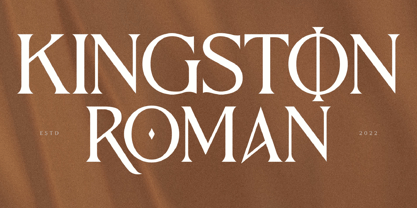 Kingston Roman is a modern and classic serif typeface with a unique style and fancy look. This typeface is perfect for an elegant & luxury logo, book or movie title design, fashion brand, magazine, clothes, lettering, quotes, and so much more. **Uppercase
 - Spry Roman by Stephen Rapp,
$49.00 Handmade, expressive, lively, organic— …words typically used to describe a script font or a casual sans. Spry Roman opens up new possibilities. It’s origin is handwritten letters created using a pointed nib on slightly toothy paper. While based on a Roman form, the letters are designed to break out of the mold and dance along the baseline. Spry Roman Pro is a fully featured opentype font. Among the 964 glyphs are loads of alternate characters and swash letters; a full set of small caps; simple fractions; case sensitive punctuation; and a variety of ornaments, border elements, and flourishes. It also includes a full dose of language support for not only main characters, but also for alternates and small caps. Ligatures have been kept to a minimum to allow users the option of tracking text. **Please note that the Pro version has all the glyphs of the others combined. The smaller versions are for those who don't have opentype savvy apps like Adobe Illustrator.
 - Rama Slab by Dharma Type,
$19.99 Rama Slab is an antique slab serif designed inspired by 1800s-style wood type. All glyphs have been designed carefully to be retro-looking to fill the viewer with nostalgia. This condensed font family with 18 styles is a great solution for posters, titles and anywhere you need impact. To complete your work perfectly, Gothic Extras family is ready for free. They include borders, ornaments and frames designed using vintage catalog of Hamilton in 1800s as a model. Incidentally, -r- has its alternative glyph that can be used with OpenType salt feature. Be sure to check out the sans serif style of this Rama series named Rama Gothic.
 - Bechamel Roman by Andinistas,
$39.00 BECHAMEL ROMAN was born interpreting unicase letterings of the movie "Willy Wonka and the chocolate factory". Later these ideas matured with flexible tip nib and paper mixing their naive proportions with some classic ingredients of Baskerville, Bodoni, Didot, Round Hand Script, Graffiti and labels found in Venezuela and Colombia. BECHAMEL ROMAN designed to be combined with Bechamel. BECHAMEL Script, Vein, Words & Ornaments were hand drawn to design words and phrases in logos, packaging, posters, envelopes and greeting cards. BECHAMEL ROMAN 1,2,3 & 4 is an experimental font family designed by #carlosfabiancg. It includes an irregular look to communicate craftsmanship. Its multiple upper cases with condensed width and naive lines are notable for their expressive drawing with a high amount of contrast between thick and thin strokes.
 - Toma Sunny by Letterena Studios,
$17.00 Toma Sunny is a modern and classic serif font with a unique style and bold look. This typeface is perfect for an elegant & luxury logo, book or movie title design, fashion brand, magazine, clothes, lettering, quotes, and so much more.
 - Classic Roman by Monotype,
$40.99. - Rome Dianok by Runsell Type,
$16.00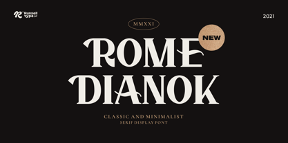 Rome Dianok font is perfect for many of your projects like logos & branding, photography, invitations, watermarks, advertisements, product designs, stationery, wedding designs, labels, product packaging, special events and much more.
 - Roman Shaded by URW Type Foundry,
$35.00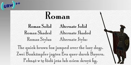
- FS Rome by Fontsmith,
$50.00 Trajan The original template for this one-weight, all-caps font was the inscription on Trajan’s Column, carved in AD 113 to celebrate the emperor Trajan’s victory in the Dacian Wars. College student Jason Smith copied the stone lettering from the cast on display in London’s Victoria & Albert Museum. In Roman times, the signmaker would paint letters onto stone with a wide brush for the stone mason to chisel out later. The signwriter would end each stroke with a flick of his brush, which the mason would also carve into the stone. Ecce (as they would have said in Rome): the serif was born. Hand-crafted “I first drew this typeface when I was 17,” says Jason. “I drew it with a very sharp 9H pencil on polydraw film. “Then, using a Rotring pen, I inked the letters in and scraped back the serifs so they were perfectly sharp. These letters were then reduced on a PMT camera. I’d designed my first typeface, although it wasn’t digitised till much later.” Digitised Years after Jason had drawn the original typeface, its transfer into digital form made further refinements necessary. The serifs and weights needed thickening slightly, creating a crisp, new version whose delicate elegance is best appreciated in larger sizes. A classically-inspired font, timeless and perfectly-proportioned, to reflect the refinement of premium brands.
 - Karma Koma by Maulana Creative,
$14.00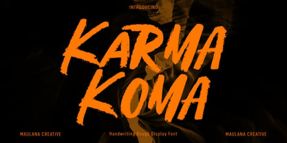 Karma Koma is a casual handwritten font. With bold brush stroke, fun character with a bit of ligatures and alternates. To give you an extra creative work. Karma Koma font support multilingual more than 100+ language. This font is good for logo design, Social media, Movie Titles, Books Titles, a short text even a long text letter and good for your secondary text font with sans or serif. Make a stunning work with Karma Koma font. Cheers, Maulana Creative
 - Roaming Around by Olivetype,
$18.00 Roaming Around is a typeface that is perfect for any design project. With its graffiti-inspired style, it's guaranteed to give your designs a hand-painted, stand-out feel. Fight the monotony of clean fonts by giving your designs true character with Roaming Around. So what’s included : Basic Latin Uppercase and Lowercase Numbers, symbols, and punctuations Ligatures Multilingual Support. PUA Encoded and fully accessible without additional design software Simple Installations works on PC & Mac Thank You and Happy Designing!
 - Neue Haas Grotesk Text by Linotype,
$33.99The original metal Neue Haas Grotesk™ would, in the late 1950s become Helvetica®. But, over the years, Helvetica would move away from its roots. Some of the features that made Neue Haas Grotesk so good were expunged or altered owing to comprimises dictated by technological changes. Christian Schwartz says Neue Haas Grotesk was originally produced for typesetting by hand in a range of sizes from 5 to 72 points, but digital Helvetica has always been one-size-fits-all, which leads to unfortunate compromises."""" Schwartz's digital revival sets the record straight, so to speak. What was lost in Neue Haas Grotesk's transition to the digital Helvetica of today, has been resurrected in this faithful digital revival. The Regular and Bold weights of Helvetica were redesigned for the Linotype machine; those alterations remained when Helvetica was adapted for phototypesetting. During the 1980s, the family was redrawn and released as Neue Helvetica. Schwartz's revival of the original Helvetica, his new Neue Haas Grotesk, comes complete with a number of Max Miedinger's alternates, including a flat-legged R. Eight display weights, from Thin to Black, plus a further three weights drawn specifically for text make this much more than a revival - it's a versatile, well-drawn grot with all the right ingredients. The Thin weight (originally requested by Bloomberg Businessweek) is very fine, very thin indeed, and reveals the true skeleton of these iconic letterforms. Available as a family of OpenType fonts with a very large Pro character set, Neue Haas Grotesk supports most Central European and many Eastern European languages. - Bebas Neue Semi Rounded by Dharma Type,
$4.99 Bebas Neue SemiRounded is the Bebas Neue with rounded corners. As you know, Bebas Neue is the most widely used free font recently. This semi-rounded version is the new style for more widely use. The basic theory and proportion are same as Bebas Neue but rounded shape gives a warm, soft and natural impression. A bit more rigid than Bebas Neue Rounded. Available at an affordable price.
 - Neue Haas Unica Paneuropean by Linotype,
$65.00Neue Haas Unica by Toshi Omagari: The original purpose behind the creation of the typeface Haas Unica was to provide a sympathetic update of Helvetica. But now the font designer Toshi Omagari has decided to make this typeface his own and has thus significantly supplemented and extended it. In the late 1970s, at the same time at which hot metal typesetting was being replaced by phototypesetting, the Haas Type Foundry commissioned a group of specialists known as "Team '77" consists of Andre Gurtler, Christian Mengelt and Erich Gschwind to adapt Max Miedinger's font The characters of Haas Unica are somewhat narrower than those of Helvetica so that the larger bowls, such as those of the "b" and "d", appear more delicate and have a slightly more pleasing effect. In general, the spacing of Haas Unica was increased to provide for improved kerning and thus enhance the legibility of the typeface in smaller point sizes. Major changes were made to the lowercase "a", in that the curve of the upper bowl became rounder and its spur was eliminated. The form of the "k" was additionally modified to remove the offset leg so that both diagonals originate from the main stem. The outstroke of the uppercase "J" was also significantly curtailed. In addition to many minor alterations, such as to the length of the horizontal bars of the "E", "F" and "G" and to the angle of the tail of the "Q", the leg of the "R" was extended and made more diagonal. In the case of the numerals, the upper curve of the "2" was reduced and the lower loops of the "5" and "6" were correspondingly adapted. The sweep of the diagonal of the "7" was also reduced. Several decades later, Toshi Omagari returned to the original sketches with the objective of reinvigorating this almost totally forgotten typeface. First, however, he needed to revise the drafts prepared by Team '77 to adapt them for digital typesetting. So Omagari carefully adjusted the proportions of the glyphs, achieving a more uniform overall effect across all line weights and removed details that had become redundant for contemporary typefaces. It was also apparent from the old drafts that it had been the case that the original plan was to create more than the four weights that were published. Omagari has added five additional styles, giving his Neue Haas Unica? a total of nine weights, from Ultra Light to Extra Black. He has also greatly extended the range of glyphs. Providing as it does typographic support for Central and European languages, Greek and Cyrillic texts, Neue Haas Unica is now ready to be used for major international projects. In addition, it has been supplied with small caps and various sets of numerals. With its resolute clarity and excellent typographic support, Neue Haas Unica is suitable for use in a wide range of new contexts. The light and elegant characters can be employed in the large point sizes to create, for example, titling and logos while the very bold styles come into their own where the typography needs to be powerful and expressive. The medium weights can be used anywhere, for setting block text and headlines. - Neue Luthersche Fraktur SB by Scangraphic Digital Type Collection,
$39.50 Since the release of these fonts most typefaces in the Scangraphic Type Collection appear in two versions. One is designed specifically for headline typesetting (SH: Scangraphic Headline Types) and one specifically for text typesetting (SB Scangraphic Bodytypes). The most obvious differentiation can be found in the spacing. That of the Bodytypes is adjusted for readability. That of the Headline Types is decidedly more narrow in order to do justice to the requirements of headline typesetting. The kerning tables, as well, have been individualized for each of these type varieties. In addition to the adjustment of spacing, there are also adjustments in the design. For the Bodytypes, fine spaces were created which prevented the smear effect on acute angles in small typesizes. For a number of Bodytypes, hairlines and serifs were thickened or the whole typeface was adjusted to meet the optical requirements for setting type in small sizes. For the German lower-case diacritical marks, all Headline Types complements contain alternative integrated accents which allow the compact setting of lower-case headlines.
 - Neue Haas Grotesk Display by Linotype,
$33.99 The first weights of Neue Haas Grotesk were designed in 1957-1958 by Max Miedinger for the Haas’sche Schriftgiesserei in Switzerland, with art direction by the company’s principal, Eduard Hoffmann. Neue Haas Grotesk was to be the answer to the British and German grotesques that had become hugely popular thanks to the success of functionalist Swiss typography. The typeface was soon revised and released as Helvetica by Linotype AG. As Neue Haas Grotesk had to be adapted to work on Linotype’s hot metal linecasters, Linotype Helvetica was in some ways a radically transformed version of the original. For instance, the matrices for Regular and Bold had to be of equal widths, and therefore the Bold was redrawn at a considerably narrower proportion. During the transition from metal to phototypesetting, Helvetica underwent additional modifications. In the 1980s Neue Helvetica was produced as a rationalized, standardized version. For Christian Schwartz, the assignment to design a digital revival of Neue Haas Grotesk was an occasion to set history straight. “Much of the warm personality of Miedinger’s shapes was lost along the way. So rather than trying to rethink Helvetica or improve on current digital versions, this was more of a restoration project: bringing Miedinger’s original Neue Haas Grotesk back to life with as much fidelity to his original shapes and spacing as possible (albeit with the addition of kerning, an expensive luxury in handset type).” Schwartz’s revival was originally commissioned in 2004 by Mark Porter for the redesign of The Guardian, but not used. Schwartz completed the family in 2010 for Richard Turley at Bloomberg Businessweek. Its thinnest weight was designed by Berton Hasebe.
 - Neue Luthersche Fraktur EF by Elsner+Flake,
$35.00 - MartiniThai Neue Slab V2 by Deltatype,
$39.00 Award winning 2017 font from Demark (Thailand) and G-Mark (Japan) in Graphic Design, MartiniThai Neue Slab is now available with better taste. Deltatype created a better version of MartiniThai Neue Slab V2: refined for better outline, we fine-tuned all outlines for better letterforms. Proportion were adjusted for better consistent. Metrics got new values for increased readability. Kerning, fine-tuned kerning pair for better spacing between the letters. MartiniThai Neue Slab V2 comes in six weights: Thin, Light, Regular, Bold, Extra Bold, Black. Thai Language is included in this package. MartiniThai Neue Slab is a unique slab serif in Thai Script that creates a sense of timeless and contemporary feel and is used by a media provider and nationwide in Thailand.
 - Roma Initial Caps JNL by Jeff Levine,
$29.00Roma Initial Caps JNL is a set of alphabet caps drawn from elegant lettering found in an old sign painter's manual. The upper case keys have the letters in white on black backgrounds, while the lower case has the letters in black on a white background with a black border. - Cimero Pro - 100% free

- Nuixyber Pro - Personal use only

- Scriptina Pro - 100% free

- Familiar Pro - 100% free


