4,677 search results
(0.03 seconds)
- Neue School by Daniel Brokstad,
$29.00 Neue School is a modern sans serif font with extra tight tracking & deep ink traps. Designed to maximize the available space, make impactful headlines. Inspired by old school narrow poster fonts, presented in a “neue”-way. The font consists of 8 weights, across 2 widths, plus italics. Symbols are fixed weight throughout, as a contrast to the font weights. There are 2 additional OpenType stylistic sets. Stylistic Set 1 adds more rounded edges to specific characters for a softer look. Stylistic Set 2 makes lowercase ascenders and symbol height equal to capital height, making it ideal for stacking type more easily with all same height.
 - Heavitas Neue by Graphite,
$20.00 Heavitas Neue is versatile and flexible all caps font family, with most of the upper case characters different from the lower case ones. By using either only upper case, or only lower case, or a mixed combination of upper and lower characters, a totally different look of the font can be achieved. Heavitas Neue has a strong and distinct character, suitable for, but not limited to, logotypes, headlines, branding, books, signage, motion graphics and packaging.
 - Base Neue by Power Type,
$15.00 Base Neue is the reincarnation of the basic typography (adaptation) of modern civilization. InkTrap is applied and many variations that can be used for this typeface, from very narrow media to extra-large publications. Weights from thin to black and then there are widths from Super Condensed to Super Expanded, which of course are all used in various media, from heading or titles to body text. Base Neue provides a total of 108 styles consisting of 782 glyphs per style. 95 different languages are supported, and it also has access to alternative letters and interesting ligatures.
 - Revx Neue by OneSevenPointFive,
$15.00 Revx Neue, an unsquared typeface is a modern sans serif. It contains 14 styles, 7 uprights, and the corresponding italics. The OpenType Latin Pro character set is crafted with powerful OpenType features, alternative glyphs, kerning pairs, and more which makes the font well featured. The typeface is suitable for all platforms (web, display, print, etc.). Revx Neue blends beautifully into your designs. Character request / Feedback: https://forms.gle/iY8Zswmsg689m95M8
 - Neue Alter by OzType.,
$30.00 Introducing Neue Alter: the harmonious blend of readability and dynamic details : With 4 weights and their corresponding italics, you'll find your ideal style. The regular weight showcases even strokes for effortless legibility, while the light and semibold weights offer a robust texture, ideal for impactful headlines and compelling paragraphs. It's perfectly proportioned and is an excellent choice for captions, navigation systems, and anything that requires concise, accurate language
 - Neue Augenblick by Harmnessless Type,
$40.00 Neue Augenblick is a modern contemporary Germany-esque grotesk. This Font face carries a powerful mechanical and industrial feel, it is inspired by aesthetic personality of beautiful Panzerkampfwagen and Post-war Brutalist Architectural. There are ten weights, ranging from Thin to Black, each with oblique italics and plenty of alternates. Neue Augenblick comes with attention-grabbing ink traps make it feels more contemporary. Various opentype features from stylistic alternates, multilingual extended latin support, ligatures, discretionary ligatures, fractions, arrows, scientific numerals, catchwords set, icons and more. Neue Augenblick is suited for embrace both maximalism or minimalism design works for designers to play with.
 - Aneba Neue by Borutta Group,
$27.00 Aneba Neue is refreshed version of my old type family. It's a geometric sans serif typeface with a clean feel. The low contrast and high x height is perfect for headlines and display purposes. Aneba Neue contains 5 weights in two different styles - Bold & Slanted.
 - Campione Neue by BoxTube Labs,
$24.00 Campione Neue was designed to be a true work horse. It is powerful and versatile thanks to its two styles Sans and Serif. It's perfect for logotypes, sports branding, social media edits, posters, apparel design, magazine headlines, labels and so much more. Campione Neue is spanning from Thin to Black in both Sans and Serif. The Variable Fonts can be used in Adobe Photoshop and Adobe Illustrator and other applications that supports this feature. They make the process of designing more flexible and easy. For those who prefer fixed weight fonts we've included nine weights for each style in the package. Campione Neue comes with a character set supporting most western languages including: Afrikaans, Basque, Breton, Catalan, Danish, Dutch, English, Finnish, French, Gaelic, German, Icelandic, Indonesian, Irish, Italian, Norwegian, Portuguese, Sami, Spanish, Swahili, Swedish and many more...
 - Neue waver by Look Minus Today,
$14.00 Introducing Neue Waver - Contemporary Serif Font With A Ligatures & Alternates by Rijesain x Look minus today Trendy, elegant, retro, sharp & modern style serif font for your new fancy projects. Stylish, luxury, creative, romantic and classic style on Neue Waver font will be great for any modern branding project. Lot of alternates and ligatures will help you to create unique and original logo design or website header! Enjoy :) Features: - Uppercase & Lowercase - Ligatures & Alternates - Numerals & Punctuation - Multilingual - Simple Installations - Accessible in the Adobe Illustrator, Adobe Photoshop, Microsoft Word - PUA Encoded Characters - Fully accessible without additional design software. Thanks & Happy Designing!
 - Agenor Neue by Graphite,
$20.00 Agenor Neue is a geometric sans serif with a slight twist. The selective use of rounded edges gives it a unique and distinct character. Agenor Neue family comes in 7 weights and works great for logotype, headers, titles and any other display usage. The Regular weight is available for free and can be used for any commercial or personal project.
 - Neues Haus by S6 Foundry,
$80.00 Neues Haus is a typeface with legible characters for maximum readability and legibility — perfect for a modern and stylish contemporary design, characterized by more generous oval proportions and slightly more open terminals. This font family can be used as a headline or as a body copy typeface, and also includes a useful icon set.
 - Bebas Neue by Dharma Type,
$- Bebas Neue is a free font which is licensed under the SIL Open Font License 1.1. Designed by Ryoichi Tsunekawa. - Bebas Neue Pro has lowercases and Italics. - Bebas Neue SemiRounded are some derived, Semi rounded fonts from this Bebas Neue. - Bebas Neue Rounded are some derived, rounded fonts from this Bebas Neue. - Mocha Mattari is a distressed, vintage-effected font based on this Bebas Neue. When you need more impact for titling, please try our Kaneda Gothic, Dharma Gothic and Rama Gothic. When you need body-text font matching with this Bebas family, please try our Bio Sans font family.
 - Neues Bauen by Hanoded,
$10.00 Neues Bauen is a Bauhaus inspired font with some interesting glyphs. It is slightly rounded in places, but sharp in others and it will most certainly make your designs stand out. Neues Bauen in other words, like the style that emerged in pre-war Germany, is a statement.
 - Neue Aachen by ITC,
$40.99 Impressed by the quality of the Aachen typeface that was originally designed for Letraset in 1969 and extended to include Aachen Medium in 1977, Jim Wasco of Monotype Imaging has extended this robust display design to create an entire family. Derived from the serif-accented Egyptienne fonts dating to the early 20th century, Aachen has serifs that are very solid but considerably shorter than those of its precursor. The incorporated geometrical elements, such as right angles and straight lines, provide the slender letters of Aachen with a slightly technological, stencil-like quality. Despite this, the effect of Aachen is by no means static; its dynamism means that this typeface, originally designed for use in headlines, has come to be used with particular frequency in sport- and fitness-related contexts. Jim Wasco, for many years a type designer at Monotype Imaging, recognized the potential of Aachen and decided to extend the typeface to create an entire typeface family. He appropriated the existing Aachen Bold in unchanged form and first created the less heavy cuts, Thin and Regular. Wasco admits that he found designing the forms for Thin a particular challenge. It took him several attempts before he was able to achieve consistency within the glyphs for Thin and, at the same time, retain sufficient affinity with the original Aachen Bold. But he finally managed to adapt the short serifs and the condensed and slightly geometrical quality of the letters to the needs of Thin. The weights Light, Book, Medium and Semibold were generated by means of interpolation. Supplemented by Extralight and Extrabold, the new Neue Aachen can now boast a total of nine different weights. Wasco initially relied on his predilection for genuine cursives in his designs for the Italic cuts. But it became apparent with these first trial runs that the soft curves of cursives did not suit Aachen and led to the loss of too much of its original character. Wasco thus decided to compromise by using both inclined and cursive letters. Neue Aachen Italic is somewhat narrower than its upright counterparts; the lower case 'a' has a closed form while the 'f' has been given a descender, but the letters have otherwise not been given additional adornments. The range of glyphs available for Neue Aachen has been significantly extended, so that the typeface can now be used to set texts not only in Western but also Central European languages. Wasco has also added a double-counter lowercase 'g' while relying on the availability of alternative letters in the format sets for the enhancement of the legibility of Neue Aachen when used to set texts. The seven new weights and completely new Italic variants have enormously increased the potential applications of Aachen and the range of creative options for the designer. While the Bold weights have proved their worth as display fonts, the new Book and Regular cuts are ideal for setting text. And the subtlety of Ultra Light will provide your projects with a quite unique flair. The new possibilities and opportunities in terms of design and applications that Neue Aachen offers you are not restricted to print production; you can also create internet pages thanks to its availability as a web font.
 - Armature Neue by fontBoy,
$15.00 Armature Neue is an extension and clarification of the original Armature family released in 1997. We made the distribution of weights more even, and added italics extra light and black weights. Originally consisting of four fonts, Armature Neue has twelve: six weights with accompanying italics. Although conceived as a display face, a number of alternate characters are included that can be used to regularize the type for text setting. Armature is one result of my interest in typefaces that are constructed, rather than drawn. Although it is basically a monoline design, there are subtle details throughout that compensate for a monoline’s evenness. As with all fontBoy fonts, there are dingbats hidden away in the dark recesses of the keyboard. When I first started designing this face in 1992, I called it Dino-I thought I would name all my fonts after famous pets-so the dingbats for Armature are dinosaurs. Designed by Bob Aufuldish with editing and production by Psy/Ops.
 - Danger Neue by Green Type,
$46.00 Danger Neue is the latest version of the popular Danger font. In this version, the contours of the letters are finalized and improved. Contains an extended set of glyphs and open type features.
 - Flink Neue by Identity Letters,
$45.00 Geometric typefaces are a staple in every typographer’s toolbox since the 1920s. It was a time when iconic faces such as Futura, Erbar, and Kabel appeared on the scene and turned the world of type upside-down. Inspired by those early giants as well as later epigones with a legacy of their own (such as 1970’s Avant Garde Gothic), Flink Neue is the Identity Letters take on this genre, characterized by a clean and focused appearance. With neat shapes and the look of pure geometry, Flink Neue adapts to a vast range of applications and topics, from the fine print in contract to website body copy to logo design to billboard-size slogans. Its x-height is considerably larger than in classic geometric sans-serif fonts; its proportions are harmonized as opposed to strictly constructed. This makes for a more contemporary look, setting it apart from the classics. With three different widths, Flink is a true all-rounder. Geometric fonts are usually quite wide, which often leads to text-settings problems with headlines or small print. The Condensed and Compressed variants of Flink Neue solve this problem easily. This font family comes along in 18 weights from Thin to Black with matching Italics. There are almost 1400 characters per style, including nine stylistic sets that offer variations to the look and feel of Flink Neue, making it even more versatile. Besides the default mood of Flink Neue, there is also a Text and Bauhaus variant, where different letters have been changed to create a new mood. In theory, you just need one single font file to change between all three moods, but to make it easier for you, we also exported each mood within a separate file. Plenty of additional Open Type Features like ligatures, small caps, case sensitive forms, old-style figures, tabular figures and symbols make Flink Neue a valuable tool for the discerning typographer. Flink Neue is the reimagination of a classic genre, designed to suit the needs of our time.
 - Neue Comic by Unio Creative Solutions,
$4.00 Meet "Neue Comic," a rounded typeface making a bold entrance into the design scene, aiming to redefine the delicate balance between playfulness and practicality in typography. Crafted with the recognition that rounded aesthetics enhance information retention and legibility, Neue Comic delivers a distinct, rhythmic design that breaks through traditional design boundaries. Reflecting on the divisive legacy of Comic Sans, we pondered: Is it really deserving of all the hate? Comic Sans entered the typography scene in 1994 with the noble goal of injecting fun into casual contexts. However, it fell victim to misuse and eventually succumbed to an undeserved sense of imposter syndrome. This prompted us to create a typeface that transcends these limitations. Inspired by the non-connecting script of comic book lettering, Neue Comic seeks to recapture the charm of the '90s while acknowledging the genuine intention behind Comic Sans—offering accessibility and friendliness. Avoiding the pitfalls of overuse, Neue Comic presents itself with seven weights and corresponding obliques, showcasing the flexibility of a variable version. Specifications: - Files included: Neue Comic, including obliques - Multi-language support (Central, Eastern, Western European languages) - OpenType Features (Superscript and Subscript Numerals, Fractions, Oldstyle figures) Thanks for viewing, Unio.
 - Oktah Neue by Groteskly Yours,
$25.00 Oktah Neue is an extended version of a more limited Oktah family. Since its release in 2019, Oktah Neue received two major updates, the most recent in June 2022. The latest version of Oktah Neue is comes in 22 styles as well as one variable font. Oktah Neue inherits the best traits of Oktah—great legibility, simple geometric letters shapes, low contrast across all styles—but also introduces what Oktah fell short of: extensive language support and enhanced OpenType features. While working on Oktah Neue, we strove to create a neutral typeface that would be a workhorse for designers, typographers and other font users alike. Building onto the familiar shapes of Oktah, we tried to make them more neutral, at the same time preserving the unique character of the typeface. Certain characters remained the same, others have undergone a complete transformation, which left them better tailored for the wide implementation range of Oktah Neue. Over the past years the size of the character set in Oktah Neue was significantly expanded (currently standing at 2500+ characters). In addition to Extended Latin, new language systems (Extended Cyrillic, Greek — both Basic and Polytonic — and Hebrew) were introduced. The already vast Cyrillic set also includes localised forms for such languages as Bulgarian, Serbian and many others. Oktah Neue is OpenType friendly: it knows how to do alternatives, contextual alternatives, switch various between stylistic sets and adjust the height of punctuation and symbols as you type. Small Caps include all listed languages as well as numerals and symbols. Oktah Neue comes equipped with various styles of numerals — from standard Proportional Lining figures to Oldstyle, Tabular Oldstyle. Sub- and Superscript, Fractions and two sets of circled numbers. Oktah Neue is well-kerned with more than 3000 kerning pairs and automatically hinted. Oktah Neue comes in 22 styles (11 uprights and 11 italics), two of which — Ultra Light and Black Italic — can be downloaded free of charge to get a firsthand experience of what Oktah Neue is ready to offer. The latest update of Oktah Neue introduced a fully variable option: now, both axes (Slant and Weight) can be accessed in the same file for utmost convenience.
 - Nauman Neue by The Northern Block,
$39.95 Nauman Neue is a modern humanist sans serif typeface made for the screen. Broad open letter forms are combined with precise geometry to create a functional and legible font that’s ideal for web and on-screen applications. In 2021 Nauman was expanded to sixty styles, including two helpful widths condensed and semi-condensed. Included in the font are 900 characters per style, ten weights and three widths with matching italics. Opentype features consist of seven numerals variations, including inferiors, superiors, fractions, tabular, lining, and old style. It also has alternate lowercase a, e, I, M, small caps, arrows and language support covering Western, South, Central Europe and Vietnamese.
 - Neue Northwest by Kaligra.co,
$19.00 Neue Northwest is a vintage sans serif family, Inspired by Vintage Wild west culture and combining with modern vintage touch. An All-Caps Sans Serif pairing with a Clean, Rounded & textured version of each. Choose between varying texture strength for your desired effect. This font is great for logo print, Restaurant Menus & Signage, Pubs, Bars, Tattoo Shops, Barber Shops, Butcher Shops, Handmade Brands, BBQ, Anything vintage styles related, etc
 - MTT Roma by MTT Type Firm,
$39.99 MTT Roma is designed to re-create the atmosphere of the city of Rome of the 21st century. The studio for the letterform evolved from the Trajan Column alphabet. Suitable for both display and body-text usage, stylistically MTT Roma aims to distance itself from the proliferation of geometric sans-serif families of its time. The result is a sharp, subtly humanist typeface inspired by modern day Rome, the city of contrasts and eternal beauty. Featuring an extended character set to support Central and Eastern European as well as Western European languages, the typeface comes with six weights – from thin to black — with matching italics.
 - Bodoni Roma by BA Graphics,
$45.00An elegant take on Bodoni, with its subtle flared serifs that give it a very beautiful distinguished look. - Roma Invicta by Maulana Creative,
$13.00 Roma Invicta Font Give your designs an authentic handcrafted feel. "Roma Invicta Font" is perfectly suited to signature, stationery, logo, typography quotes, magazine or book cover, website header, clothing, branding, packaging design and more. Thanks for use this font ~ Maulana
 - Neuf by Velvele,
$9.99 Neuf family is an experimental search for new Art Deco letterforms, which are still easy to read and generate some unexpected attention.The distinguishes Neuf favoured by Art Deco and its predecessor Art Nouveau with a modern design touch. The style of Neuf is characterized by geometric shapes and craft motifs with Machine Age imagery and materials.
 - Romely by Din Studio,
$25.00 If you’re looking for a gorgeous font to attract your audiences or customers then we’ve got the font for you! Introducing Romely- A Sans Serif Font This handmade font typeface with modern style looks very interesting for loads of different projects and promotions. It is perfect to be used on your website, for your social media branding, Pinterest banners, printed products, and more! Features: Multilingual Support PUA Encoded Numerals and Punctuation Thank you for downloading premium fonts from Din Studio
 - Noma by Spinturnix,
$15.00 Noma is a new wide-set display font with a minimal geometric style. I designed Noma because I wanted a tech-inspired font that has plenty of character while remaining legible. Noma is a great choice for high-impact headings and logotypes. I hope you enjoy, thanks for checking it out!
 - Rosa by SoftMaker,
$9.99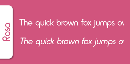 Rosa is a decorative typeface published by Softmaker.
 - Rioma by Halbfett,
$30.00 Rioma is a geometric typeface inspired by a legend of type design: Antique Olive. As a font family, Rioma ships in two different formats. Depending on your preference, you can install the typeface as two Variable Fonts or use the family’s 16 static OpenType font files instead. Those weights run from Light to Heavy. While the static-format fonts offer a good intermediary-step selection, users who install the two Variable Fonst have vastly greater control over their text’s stroke width.
 - Roza by Szymon Furjan,
$4.00 Roza is a cute and lovely handwritten font. Designed to use when in need of something light and playful.
 - Rosa by Pelavin Fonts,
$25.00 Inspired by Art Deco packaging, Rosa fits comfortably into that classic genre. It’s namesake in the collection of La Sociéte Parisienne de Savons is described thusly: In mythological legend, Chloris, the goddess of Spring flowers transformed the body of a nymph into the first Rose. Aphrodite gave her beauty. Dionysus, the god of wine gave her a sweet fragrance and the Three Graces, charm, joy and radiance. Equally compatible with Machine Age, Streamline, Moderne and even Memphis design motifs, it presents the unique option of serving as both the typographic and decorative components of a design. Use Rosa to evoke a sense of elegance, high style and historical context.
 - Romb by Letterhead Studio-VG,
$35.00 Romb is the display font based on feeling of the retro typefaces of the early 20th century. Good for posters, magazines, packaging.
 - Homa by Naghi Naghachian,
$108.00 Homa is a sans-serif sigle weight font designed by Naghi Naghashian. It is extremely legible even in very small size. This font is The contribution to modernisation of Arabic typography, gives the font design of Arabic letters real typographic arrangement und provides more typographic flexibility. Homa supports Arabic, Persian ( Farsi) and Urdu. It also includes proportional and tabular numerals for the supported languages. Homa design fulfills the following needs: A Explicitly crafted for use in electronic media fulfills the demands of electronic communication. B Suitability for multiple applications. Gives the widest potential acceptability. C Extreme legibility not only in small sizes, but also when the type is filtered or skewed, e.g., in Photoshop or Illustrator. Homa’s simplified forms may be artificial oblilqued in InDesign or Illustrator, without any loss in quality for the effected text. D An attractive typographic image. Homa was developed for multiple languages and writing conventions. Homa supports Arabic, Persian and Urdu. It also includes proportional and tabular numerals for the supported languages. E The highest degree of calligraphic grace and the clarity of geometric typography.
 - Roman by MacCampus,
$30.00Linotype Banjoman was designed by Paul Veres. Most of its basic forms are constructed although some characters, like the a, g, or p, are more freely designed. This font is available in a variety of weights and styles. The bold weights are best for headlines or emphasis in text and the balanced Text styles were designed specifically for running text. Linotype Banjoman is an independent yet well-mannered font suitable for a variety of purposes. - Roka by Thinkdust,
$10.00 Roka is a remix of the original 2010 Rika typeface. This time it's got texture and a lot more attitude.
 - Romi by Scholtz Fonts,
$15.00Romi is a legible, feminine, script font, suitable for wedding invitations, valentine cards, beauty products, or wherever a soft, romantic image is sought. Suggestions for use: - wedding stationery - greeting cards - valentines day media - beauty product media - lingerie tags - women's magazine pages - classical music media The font is fully professional: carefully letterspaced and kerned. It contains over 235 characters - (upper and lower case characters, punctuation, numerals, symbols and accented characters are present). - Roca by My Creative Land,
$29.00 Initially started as an extension to Praline MCL, Roca transformed into a new font family - influenced by the same fonts as Praline - Windsor and Cooper Black - the hits of 60s and 70s – with a hint of Bookman. Created in 2 styles and 6 weights that can be mixed and match, it contains 24 fonts including alternates and true italics . It is full of OpenType features – stylistic alternates and ligatures. This multilingual font family supports most of the European languages as well as Cyrillic ones (Russian and Ukrainian).
 - Romy by Sudtipos,
$39.00 Romy is a fresh take on casual handwriting. It combines aspects of comedy, graffiti, greeting cards, and refrigerator notes. The unmistakable lettering expertise of Angel Koziupa and smooth, crisp digitization of Alejandro Paul provide a humorous, friendly and lively typeface.
 - Soma by Funk King,
$10.00Soma is inspired by the Soma cube and the work of MC Escher. The font uses geometric patterns to create “impossible” glyphs. Some can be easily imagined; others bend the mind. Many alternate versions of glyphs have been provided for additional design possibilities. This is my 2nd most popular font at Dafont with over 50,000 downloads. The original set was 26 basic characters (A-Z), repeated for uppercase and lowercase. Now the set is almost 300 glyphs. - Romp by Positype,
$30.00 With all ego aside, Romp was designed and influenced by my daughter, Angel. For some time now, she has wanted me to design a font based on her handwriting. But each time I sit down to do it, I run into more that she needs to do and redo. On a recent attempt, I ran into the same situation again. Instead of moving on to something else, I decided to whip out a sumi brush and start making letters...for me, type design is something a little ‘serious’ and never a time to just have fun. This typeface proved that notion wrong—it really was fun. As a result, each letter encouraged another and the design grew...and grew! The happy result spawned 3 separate sets of letters & numerals (small caps and some ligatures too!). Using the beauty of OpenType, these 3 sets have been fused into one, randomly generating font set. If you are using any type of OpenType enabled application, then the Romp Pro typeface is the way to go. They include everything found in the 3 separate variants for each style as well as entirely expanding offering of additional small cap and ligature sets.