10,000 search results
(0.048 seconds)
- Nighty Night by Maulana Creative,
$15.00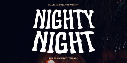 Nighty Night horror display font. Bold stroke, fun character with a bit of ligatures and alternates. To give you an extra creative work. Nighty Night font support multilingual more than 100+ language. This font is good for logo design, Social media, Movie Titles, Books Titles, a short text even a long text letter and good for your secondary text font with script or serif. Make a stunning work with Nighty Night font. Cheers, Maulana Creative
 - Dreamy Night by Fidan Fonts,
$18.40 Dreamy Night is an uppercase decorative font. We've tried to create a cute and simple hand-lettered bubbly sans serif font. This font would be perfect for party invitations, baby showers, birthday cards and more. It includes uppercase basic characters, multilingual symbols, numerals and punctuation. Latin-based Language Support. Happy creating!
 - Night Market by Epiclinez,
$18.00 Say goodbye to boring typography and hello to the lively energy that Night Market brings to every design endeavor. From posters promoting events at local night markets to bold signage capturing the spirit of bustling marketplaces, this font is here to infuse your creations with personality and flair with its cool rough textures. Add a dose of playfulness and creativity to your designs with Night Market - because who says business can't be fun? Night Market features : Standard Latin Numbers, symbols, and punctuations Multilingual Support. Fully accessible without additional design software Simple Installations Works on PC & Mac Uppercase Thank You.
 - Magical Night by Viswell,
$19.00 Magical Night is an another retro serif font inspired by classic sixties and seventies bold typeface, comes with alternate and ligature make this font more stylish with retro style. This font will be suit for heading, logotype, poster, and many more.
 - Yesterday Night by Mans Greback,
$59.00 Yesterday Night is a lively handwriting font that captures the essence of an active and cute brush style. This handmade calligraphy font is perfect for fashion projects, adding a sense of energy and excitement to your designs. The font family's handbrushed appearance brings an authentic, personal touch to your creative work, making it feel warm and approachable. The Yesterday Night font family includes four engaging styles to suit various design needs: Regular: A balanced and energetic style for everyday use Regular Italic: Adds a playful touch and a sense of movement Bold: Offers a bolder, more assertive presence for impactful designs Bold Italic: Combines the strength of bold with the flair of italic Built with advanced OpenType functionality, Yesterday Night ensures top-notch quality and provides you with full control and customizability. It includes stylistic alternates, ligatures, and other features to make your designs truly unique. The font offers extensive lingual support, covering all Latin-based languages, from Northern Europe to South Africa, from America to South-East Asia. It contains all the characters and symbols you'll ever need, including all punctuation and numbers.
 - Night Candle by Yumna Type,
$16.00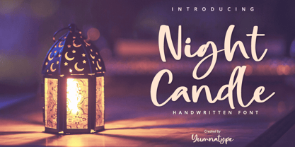 Night Candle is a elegant handwritten font. Made for any professional project branding. It is the best for logos, branding and quotes. Every letter has a unique and beautiful touch. Includes: Night Candle (OTF) Features: Standard Ligatures PUA Encoded Multilingual Support Numerals and Punctuation by Yumnatype
 - Night Visions by Wing's Art Studio,
$14.00 Night Visions: An Unsettling Hand-Drawn Brush Script Font Night Visions is a hand-drawn script font with a loose style typical of late night horror and thriller movie posters. It’s designed to look as though ink has been laid with the nervous flick of the artists brush, giving a random, imperfect, but elegant result. This font comes with the flowing script of the regular version or a complete set of non-script alternatives. Added to which there are additional character alternatives and special ligatures to experiment with for a truly hand-made look. Each version comes with a full set of uppercase and lowercase characters along with numerals, punctuation and language support. I recommend this font for anyone about to design a header or title that needs an authentically hand-made look. It’s the perfect choice for movie titles or posters, album covers, comic books, t-shirts or editorials. It’s a font that rewards experimentation and offers many options for your designs. Check out the visuals for usage ideas.
 - Night Circus by Yumna Type,
$25.00 Night Circus is a capitalized display font in a circus theme having unique, interesting designs with big, prominent letter sizes to catch attention. All of its letters are peculiarly designed in bright colors and many decorative circus elements. The power-expressing big, thick letters are perfect to use in power, boldness message-delivering designs. The advantages of Night Circus font, which provides a clipart in line with the theme, are the abilities to produce unique, charming nuances to your designs and to make your products more interesting which increases the products’ attractiveness. You can use it in big text sizes to be greatly legible and enjoy the available features here. Features: Multilingual Supports PUA Encoded Numerals and Punctuations Night Circus fits best for various design projects, such as brandings, headings, magazine covers, quotes, printed products, merchandise, social media, etc. Find out more ways to use this font by taking a look at the font preview. Thanks for purchasing our fonts. Hopefully, you have a great time using our font. Feel free to contact us anytime for further information or when you have trouble with the font. Thanks a lot and happy designing.
 - Right Female by Haksen,
$14.00 Right Female is an elegant bold script with natural texture. I designed it with my own hand-writting style. I really hope you will enjoy it so much when using this font. I love using this one with layer masks in Photoshop, really look natural written. Right Female Script includes over couple ligatures to make everything look totally hand-done. What's Included: - OTF files - Ligatures in script - Numbers + Punctuation - Non-English support - Swashes If you are interested in more fonts of mine: https://creativemarket.com/Haksen/3908083-Attention-l-Combine-with-Extra-Bonus Please contact me if anything question, I'm glad to help :) Happy Designing, Haksen
 - Night Rumble by Gassstype,
$27.00 Introducing Night Rumble is a Strong Textured Typeface that is written casually and quickly. That is why Night Rumble has charming, authentic and relaxed characteristic more natural look to your text with a more natural look to your text. design more interesting. Night Rumble is perfect for homeware designs,branding projects, Logo design, Quotes product packaging.
 - Janda Closer To Free - Personal use only

- SPARKS Free for All - Unknown license

- Free Form Retro JNL by Jeff Levine,
$29.00 The titles and credits from the 1960 French film “Le Passage Du Rhin” (English release title: “Tomorrow is My Turn”)” are hand made in a free form bold alphabet resembling both cut paper and quickly sketched lettering. This avant garde style inspired the digital type revival, which is available in both regular and oblique versions.
 - Free Form Showcard JNL by Jeff Levine,
$29.00 One of the examples in the 1916 publication “Baker’s Showcard Book” [an early 20th Century instructional book on sign lettering] was simply called “Plain Poster”. Somewhat Art Nouveau in style, but with many ‘nonconforming’ character shapes and widths, this novelty design is available digitally as Free Form Showcard JNL in both regular and oblique versions.
 - Janda Closer To Free by Kimberly Geswein,
$5.00 This chunky serif handwriting is fun but still completely legible for children.
 - Bodoni Classic Free Style by Wiescher Design,
$39.50 Bodoni Classic Free Style is my really fat, high contrast free flowing, liberated designed, script-like non-script extension to my ever expanding Bodoni Classic family.
 - Neue Haas Grotesk Text by Linotype,
$33.99The original metal Neue Haas Grotesk™ would, in the late 1950s become Helvetica®. But, over the years, Helvetica would move away from its roots. Some of the features that made Neue Haas Grotesk so good were expunged or altered owing to comprimises dictated by technological changes. Christian Schwartz says Neue Haas Grotesk was originally produced for typesetting by hand in a range of sizes from 5 to 72 points, but digital Helvetica has always been one-size-fits-all, which leads to unfortunate compromises."""" Schwartz's digital revival sets the record straight, so to speak. What was lost in Neue Haas Grotesk's transition to the digital Helvetica of today, has been resurrected in this faithful digital revival. The Regular and Bold weights of Helvetica were redesigned for the Linotype machine; those alterations remained when Helvetica was adapted for phototypesetting. During the 1980s, the family was redrawn and released as Neue Helvetica. Schwartz's revival of the original Helvetica, his new Neue Haas Grotesk, comes complete with a number of Max Miedinger's alternates, including a flat-legged R. Eight display weights, from Thin to Black, plus a further three weights drawn specifically for text make this much more than a revival - it's a versatile, well-drawn grot with all the right ingredients. The Thin weight (originally requested by Bloomberg Businessweek) is very fine, very thin indeed, and reveals the true skeleton of these iconic letterforms. Available as a family of OpenType fonts with a very large Pro character set, Neue Haas Grotesk supports most Central European and many Eastern European languages. - Bebas Neue Semi Rounded by Dharma Type,
$4.99 Bebas Neue SemiRounded is the Bebas Neue with rounded corners. As you know, Bebas Neue is the most widely used free font recently. This semi-rounded version is the new style for more widely use. The basic theory and proportion are same as Bebas Neue but rounded shape gives a warm, soft and natural impression. A bit more rigid than Bebas Neue Rounded. Available at an affordable price.
 - Neue Haas Unica Paneuropean by Linotype,
$65.00Neue Haas Unica by Toshi Omagari: The original purpose behind the creation of the typeface Haas Unica was to provide a sympathetic update of Helvetica. But now the font designer Toshi Omagari has decided to make this typeface his own and has thus significantly supplemented and extended it. In the late 1970s, at the same time at which hot metal typesetting was being replaced by phototypesetting, the Haas Type Foundry commissioned a group of specialists known as "Team '77" consists of Andre Gurtler, Christian Mengelt and Erich Gschwind to adapt Max Miedinger's font The characters of Haas Unica are somewhat narrower than those of Helvetica so that the larger bowls, such as those of the "b" and "d", appear more delicate and have a slightly more pleasing effect. In general, the spacing of Haas Unica was increased to provide for improved kerning and thus enhance the legibility of the typeface in smaller point sizes. Major changes were made to the lowercase "a", in that the curve of the upper bowl became rounder and its spur was eliminated. The form of the "k" was additionally modified to remove the offset leg so that both diagonals originate from the main stem. The outstroke of the uppercase "J" was also significantly curtailed. In addition to many minor alterations, such as to the length of the horizontal bars of the "E", "F" and "G" and to the angle of the tail of the "Q", the leg of the "R" was extended and made more diagonal. In the case of the numerals, the upper curve of the "2" was reduced and the lower loops of the "5" and "6" were correspondingly adapted. The sweep of the diagonal of the "7" was also reduced. Several decades later, Toshi Omagari returned to the original sketches with the objective of reinvigorating this almost totally forgotten typeface. First, however, he needed to revise the drafts prepared by Team '77 to adapt them for digital typesetting. So Omagari carefully adjusted the proportions of the glyphs, achieving a more uniform overall effect across all line weights and removed details that had become redundant for contemporary typefaces. It was also apparent from the old drafts that it had been the case that the original plan was to create more than the four weights that were published. Omagari has added five additional styles, giving his Neue Haas Unica? a total of nine weights, from Ultra Light to Extra Black. He has also greatly extended the range of glyphs. Providing as it does typographic support for Central and European languages, Greek and Cyrillic texts, Neue Haas Unica is now ready to be used for major international projects. In addition, it has been supplied with small caps and various sets of numerals. With its resolute clarity and excellent typographic support, Neue Haas Unica is suitable for use in a wide range of new contexts. The light and elegant characters can be employed in the large point sizes to create, for example, titling and logos while the very bold styles come into their own where the typography needs to be powerful and expressive. The medium weights can be used anywhere, for setting block text and headlines. - Neue Luthersche Fraktur SB by Scangraphic Digital Type Collection,
$39.50 Since the release of these fonts most typefaces in the Scangraphic Type Collection appear in two versions. One is designed specifically for headline typesetting (SH: Scangraphic Headline Types) and one specifically for text typesetting (SB Scangraphic Bodytypes). The most obvious differentiation can be found in the spacing. That of the Bodytypes is adjusted for readability. That of the Headline Types is decidedly more narrow in order to do justice to the requirements of headline typesetting. The kerning tables, as well, have been individualized for each of these type varieties. In addition to the adjustment of spacing, there are also adjustments in the design. For the Bodytypes, fine spaces were created which prevented the smear effect on acute angles in small typesizes. For a number of Bodytypes, hairlines and serifs were thickened or the whole typeface was adjusted to meet the optical requirements for setting type in small sizes. For the German lower-case diacritical marks, all Headline Types complements contain alternative integrated accents which allow the compact setting of lower-case headlines.
 - Neue Haas Grotesk Display by Linotype,
$33.99 The first weights of Neue Haas Grotesk were designed in 1957-1958 by Max Miedinger for the Haas’sche Schriftgiesserei in Switzerland, with art direction by the company’s principal, Eduard Hoffmann. Neue Haas Grotesk was to be the answer to the British and German grotesques that had become hugely popular thanks to the success of functionalist Swiss typography. The typeface was soon revised and released as Helvetica by Linotype AG. As Neue Haas Grotesk had to be adapted to work on Linotype’s hot metal linecasters, Linotype Helvetica was in some ways a radically transformed version of the original. For instance, the matrices for Regular and Bold had to be of equal widths, and therefore the Bold was redrawn at a considerably narrower proportion. During the transition from metal to phototypesetting, Helvetica underwent additional modifications. In the 1980s Neue Helvetica was produced as a rationalized, standardized version. For Christian Schwartz, the assignment to design a digital revival of Neue Haas Grotesk was an occasion to set history straight. “Much of the warm personality of Miedinger’s shapes was lost along the way. So rather than trying to rethink Helvetica or improve on current digital versions, this was more of a restoration project: bringing Miedinger’s original Neue Haas Grotesk back to life with as much fidelity to his original shapes and spacing as possible (albeit with the addition of kerning, an expensive luxury in handset type).” Schwartz’s revival was originally commissioned in 2004 by Mark Porter for the redesign of The Guardian, but not used. Schwartz completed the family in 2010 for Richard Turley at Bloomberg Businessweek. Its thinnest weight was designed by Berton Hasebe.
 - Neue Luthersche Fraktur EF by Elsner+Flake,
$35.00 - MartiniThai Neue Slab V2 by Deltatype,
$39.00 Award winning 2017 font from Demark (Thailand) and G-Mark (Japan) in Graphic Design, MartiniThai Neue Slab is now available with better taste. Deltatype created a better version of MartiniThai Neue Slab V2: refined for better outline, we fine-tuned all outlines for better letterforms. Proportion were adjusted for better consistent. Metrics got new values for increased readability. Kerning, fine-tuned kerning pair for better spacing between the letters. MartiniThai Neue Slab V2 comes in six weights: Thin, Light, Regular, Bold, Extra Bold, Black. Thai Language is included in this package. MartiniThai Neue Slab is a unique slab serif in Thai Script that creates a sense of timeless and contemporary feel and is used by a media provider and nationwide in Thailand.
 - LT Flode Neue News - 100% free

- Nue Medium - Personal use only

- Dael Neu - Unknown license

- SF Orson Casual Light - Unknown license

- Lady Ice - Extra Light - Unknown license

- Lady Ice - Extra Light - Unknown license

- SF Orson Casual Light - Unknown license

- Quality Capcay Black Light by Sulthan Studio,
$6.00 Quality Capcay Black is a handwritten that comes with three fonts. This font is fresh and cute and it will be fun for you when use it. File include - Quality Capcay Black(line). otf/ttf - Quality Capcay Black(light). otf/ttf - Quality Capcay Black. otf/ttf
 - JH Diwani Simplified Light by JH Fonts,
$120.00 JH Diwani Simplified Light is an advanced Arabic font simulating the Diwani Calligraphy with its finest details. Its typical usage: Wedding / greeting cards, headlines, poetry, and books. Please note that Arabic Kashida is not available for this font.
 - Copperplate Classic Light Floral by Wiescher Design,
$39.50 Copperplate Classic Light Floral is the latest addition to my Copperplate Classic Group of fonts. The floral decorations go perfectly well together with the classic forms of the Copperplate. Your decorative designer Gert Wiescher.
 - Light Line Deco JNL by Jeff Levine,
$29.00 The unusual, thin line hand lettering on the cover of the sheet music for 1936's "If You Love Me" was the basis for Light Line Deco JNL, which is available in both regular and oblique versions.
 - JH Naskh Expanded light by JH Fonts,
$120.00 JH Naskh expanded light font is designed based on Naskh calligraphy; it is typical for greeting cards, book covers including spine, headlines, short text paragraphs, poetry…..
 - 3 Prong Tree - Unknown license

- Bujardet Freres (Unregistered) - Unknown license

- KR Family Tree - Unknown license

- 2 Prong Tree - Unknown license

- DB Family Tree by Illustration Ink,
$3.00DB Family Tree is a great DoodleBat with plenty of style rooted in strong genealogy. Makes a great adornment to any creative project.


