10,000 search results
(0.055 seconds)
- Velourist by Fargun Studio,
$15.00 Velourist is a bold display type that’s absolutely perfect for editorial headlines with retro looks. It’s unique, bold, and slim figure make it a great fit for t-shirts, posters, and magazine covers.
 - Rakoon by Mans Greback,
$59.00 Big and bold script typeface.
 - Gogo Latin by Bogusky 2,
$25.00Ultra Bold Condensed Latin Serif - Daito by insigne,
$29.99 It’s alive! Insigne’s new creation, Daito, is now functional, built to process your logos, business cards, magazine layouts, packaging and more without the slightest glitch. But this new slab serif is no heartless churn of the same factory nuts and bolts. Daito is designed to greet your reader with a friendly face. Inspired by types from the era of the Space Race, this new take on some old faces brings a contemporized, unique set of serif forms to the font race. Daito comes complete with a variety of weights to help you find the best settings for your current needs or moods. Need soft and playful? Daito light communicates its message gently with softened serif. Need a different feel with more authority? With the touch of a few buttons, engage the powerful Black or striking Bold. Additional features with Daito include stylistic alternates, ligatures, titling capitals and small caps among other typographic features. Please note: use magical OpenType-savvy applications such as Adobe Creative Suite, QuarkXPress, etc to keep your font from malfunctioning, shorting, attacking people, or attempting a world takeover. Daito also speaks Western, Eastern, and Central European languages. However, Japanese is not available for this edition. It’s not every day you find a top-of-the-line font like Daito. This machine can handle most anything on your list, short of folding your laundry (though it may make your laundry look nicer). Don’t wait. Order yours today while supplies last.
 - Malow by Putracetol,
$28.00 Malow - Display Font Malow is a stunning display font that will bring elegance and sophistication to any project. This font was designed with a contemporary style that still maintains a classic look, making it perfect for a wide range of applications. The idea behind the creation of Malow was to develop a font that combines a modern aesthetic with a touch of timeless elegance. The result is a typeface that looks fantastic on branding projects, logos, packaging designs, posters, and more. Malow is a versatile font that can be used in a variety of design contexts, whether it's for print or digital projects. Its clean lines and bold appearance make it an excellent choice for headlines and titles, while its legibility also makes it ideal for body text. This font comes with a range of features that make it even more appealing. It includes uppercase and lowercase letters, opentype alternates and ligatures, and full multilingual support, ensuring that it can be used for projects in any language. In the font package, you will find three different file formats, including OTF, TTF, and WOFF. This makes it easy to use the font across a range of design software, including Adobe Illustrator, Photoshop, InDesign, and more. If you're looking to add a touch of sophistication to your design project, then Malow is an excellent choice. Its clean lines and elegant style make it a versatile font that will elevate any design. In summary, Malow is an elegant display font that combines modern and timeless styles, making it a great choice for a wide range of design projects. Its features include multilingual support, opentype alternates and ligatures, and three file formats in the package. This font is perfect for anyone looking to add a touch of sophistication to their project.
 - Malden Sans by Monotype,
$49.00 Malden Sans is a mischievous grotesque sans serif with charming details that gives designers a solid typographic voice. It was created by Michele Patanè with regular and condensed widths, as a utilitarian typeface family for print and digital environments. It was originally designed as part of a type system for cinema magazines, and embodies the devil-may care attitude of the silver screen. Designer Michele Patanè looked back to an earlier era of typography to create the typeface, embracing unusual details, rather than ironing them out. “There is a very naive way of using typography in the 30s and 40s, something not as clean as how it’s used in the late 50s and 60s when everything passed through a rationalisation of the typographic palette,” he explains. “In film magazines you can still see a bit of roughness, and I like that.” This is a design that’s desperate to be used in editorial environments, and has been created to stand up to lower quality paper. It would be equally at home on posters, packaging, and even in digital environments where designers are looking for something more expressive than another geometric sans serif. Malden Sans includes a Normal and Condensed range, with 7 weights in the normal and 6 in the Condensed, both including italics.
 - Lektorat by TypeTogether,
$35.00 Florian Fecher’s Lektorat font family is one for the books, and for the screens, and for the magazines. While an editorial’s main goals are to entertain, inform, and persuade, more should be considered. For example, clear divisions are necessary, not just from one article to the next, but in how each is positioned as op-ed or fact-based, infographic or table, vilifying or uplifting. From masthead to colophon, Lektorat has six concise text styles and 21 display styles to captivate, educate, and motivate within any editorial purpose. Magazines and related publications are notoriously difficult to brand and then to format accordingly. The research behind Lektorat focused on expression versus communication and what it takes for a great typeface to accomplish both tasks. In the changeover from the 19th to 20th century, German type foundry Schelter & Giesecke published several grotesque families that would become Lektorat’s partial inspiration. Experimentation with concepts from different exemplars gave birth to Lektorat’s manifest character traits: raised shoulders, deep incisions within highly contrasted junctions, and asymmetrical counters in a sans family. After thoroughly analysing magazine publishing and editorial designs, Florian discovered that a concise setup is sufficient for general paragraph text. So Lektorat’s text offering is concentrated into six total styles: regular, semibold, and bold with their obliques. Stylistic sets are equally minimal; an alternate ‘k, K’ and tail-less ‘a’ appear in text only. No fluff, no wasted “good intentions”, just a laser-like suite to focus the reader on the words. The display styles were another matter. They aim to attract attention in banners, as oversized type filling small spaces, photo knockouts, and in subsidiary headings like decks, callouts, sections, and more. For these reasons, three dialed-in widths — Narrow, Condensed, and Compressed — complete the display offerings in seven upright weights each, flaunting 21 headlining fonts in total. If being on font technology’s cutting edge is more your goal, the Lektorat type family is optionally available in three small variable font files for ultimate control and data savings. The Lektorat typeface was forged with a steel spine for pixel and print publishing. It unwaveringly informs, convincingly persuades, and aesthetically entertains when the tone calls for it. Its sans serif forms expand in methodical ways until the heaviest two weights close in, highlighting its irrepressible usefulness to the very end. Lektorat is an example of how much we relish entering into an agreed battle of persuasion — one which both sides actually enjoy.
 - Deception by Typodermic,
$11.95 Introducing Deception—the sub-pixel typeface that’s about to blow your mind! With ten captivating effects, this font is a must-have for anyone looking to create unique and eye-catching designs. Deception Array is the perfect choice for modern architectural themes, with wide blocks reminiscent of a digital VU meter. Deception Bars gives your text a mesmerizing look, like it’s being viewed through lenticular glass. Deception Blocks approximates the heavy JPEG degradation and pixel sharpening glitch effects that are all the rage right now. Looking for something flashy and prestigious? Try Deception Diamonds with a glow effect. Deception Lines can produce a grayscale effect or banding depending on resolution and rendering type, so keep experimenting to see what works best for you. Deception Particles echoes the look of impact printers or laser-etched sell-by dates, giving your text a vintage feel. Deception Plusses radiates positivity with its energetic design. Deception Process simulates grayscale LCD text or a thermal printer on the fritz, perfect for creating a unique and edgy look. Deception Scanline duplicates the appearance of television picture tube text rendering, ideal for recreating a videogame or retro computing vibe. And if you’re feeling daring, Deception System smacks of 1-bit dithering gone completely haywire! Each style of Deception is available in Regular and Bold, with OpenType fractions, numeric ordinals, and plenty of currency symbols included. So what are you waiting for? Try out Deception today and take your designs to the next level! Most Latin-based European writing systems are supported, including the following languages. Afaan Oromo, Afar, Afrikaans, Albanian, Alsatian, Aromanian, Aymara, Bashkir (Latin), Basque, Belarusian (Latin), Bemba, Bikol, Bosnian, Breton, Cape Verdean, Creole, Catalan, Cebuano, Chamorro, Chavacano, Chichewa, Crimean Tatar (Latin), Croatian, Czech, Danish, Dawan, Dholuo, Dutch, English, Estonian, Faroese, Fijian, Filipino, Finnish, French, Frisian, Friulian, Gagauz (Latin), Galician, Ganda, Genoese, German, Greenlandic, Guadeloupean Creole, Haitian Creole, Hawaiian, Hiligaynon, Hungarian, Icelandic, Ilocano, Indonesian, Irish, Italian, Jamaican, Kaqchikel, Karakalpak (Latin), Kashubian, Kikongo, Kinyarwanda, Kirundi, Kurdish (Latin), Latvian, Lithuanian, Lombard, Low Saxon, Luxembourgish, Maasai, Makhuwa, Malay, Maltese, Māori, Moldovan, Montenegrin, Ndebele, Neapolitan, Norwegian, Novial, Occitan, Ossetian (Latin), Papiamento, Piedmontese, Polish, Portuguese, Quechua, Rarotongan, Romanian, Romansh, Sami, Sango, Saramaccan, Sardinian, Scottish Gaelic, Serbian (Latin), Shona, Sicilian, Silesian, Slovak, Slovenian, Somali, Sorbian, Sotho, Spanish, Swahili, Swazi, Swedish, Tagalog, Tahitian, Tetum, Tongan, Tshiluba, Tsonga, Tswana, Tumbuka, Turkish, Turkmen (Latin), Tuvaluan, Uzbek (Latin), Venetian, Vepsian, Võro, Walloon, Waray-Waray, Wayuu, Welsh, Wolof, Xhosa, Yapese, Zapotec Zulu and Zuni.
 - Laurentian by Monotype,
$29.99 Maclean's is a weekly Canadian newsmagazine with a broad editorial mission. A typical issue covers everything from violence on the other side of the globe to the largest pumpkin grown in a local county. In 2001, Maclean's invited Rod McDonald to become part of the design team to renovate" the 96-year-old publication. The magazine wanted to offer its readers a typographic voice that was professional, clean, and easy to read. Above all, the typeface had to be able to speak about the hundreds of unrelated subjects addressed in each issue while remaining believable and uncontrived. A tall order, perhaps? Now add in that this would be the first text typeface ever commissioned by a Canadian magazine. McDonald, who some have called Canada's unofficial "typographer laureate," took on the challenge. McDonald used two historic models as the basis for Laurentian's design: the work of French type designer Claude Garamond, and that of the English printer and type founder, William Caslon. From Garamond Laurentian acquired its humanist axis, crisp serifs and terminals that mimic pen strokes. Caslon's letters are less humanistic, with a more marked contrast in stroke weight and serifs that appear constructed rather than drawn. These traits also made their mark on Laurentian. Using these two designs as a foundation, McDonald drew Laurentian with the narrow text columns and small type sizes of magazine composition in mind. He gave his letters strong vertical strokes and sturdy serifs, a robust x-height and a slightly compressed character width A tall order, per McDonald's genius is evident in the face's legibility, quiet liveliness and in the openness of the letters. The result is a typeface that not only met Maclean's demanding design brief, but also provides exceptional service in a wide variety of other applications. Laurentian is available in three weights of Regular, Semi Bold and Bold, with complementary italics for the Regular and Semi Bold, and a suite of titling caps."
 - ATF Franklin Gothic by ATF Collection,
$59.00 ATF Franklin Gothic® A new take on an old favorite Franklin Gothic has been the quintessential American sans for more than a century. Designed by Morris Fuller Benton and released in 1905 by American Type Founders, Franklin Gothic quickly stood out in the crowded field of sans-serif types, gaining an enduring popularity. Benton’s original design was a display face in a single weight. It had a bold, direct solidity, yet conveyed plenty of character. A modern typeface in the tradition of 19th-century grotesques, Franklin Gothic was drawn with a distinctive contrast in stroke weight, giving it a unique personality among the more mono-linear appearance of later geometric and neo-grotesque sans-serif types. Franklin Gothic has been interpreted into a series of weights before, most notably with ITC Franklin Gothic. But as the original type was just a bold display face (later accompanied by a few similarly bold widths and italics), how Benton’s design is expanded to multiple weights and styles as a digital type family can vary significantly. Benton designed several gothic faces that harmonize with one another, including Franklin Gothic, News Gothic, and Monotone Gothic, that can serve as models for new interpretations of his work. With ATF Franklin Gothic, Mark van Bronkhorst looked to Benton’s Monotone Gothic—originally a single typeface in a regular weight, and similar to Franklin Gothic in its forms—as the basis for lighter styles. ATF Franklin Gothic may appear familiar given its heritage, but is a new design offering a fresh take on Benton’s work. The text weights are wider and more open than some previous Franklin Gothic interpretations, and as a result are quite legible as text, at very small sizes, and on screen. ATF Franklin Gothic maintains the warmth and the spirit of a Benton classic while offering a suite of fonts tuned precisely for contemporary appeal and utility. The 18-font family offers nine weights with true italics, a Latin-extended character set, and a suite of OpenType features. Download the PDF specimen for ATF Franklin Gothic.
 - Presidential Dingbats by Loaded Fonts,
$15.00The presidents busts in a typeable format. Use a Glyph palette or Character Map for quick navigation. Who knows, one day it may come in handy. - Thumper by Kern Club,
$10.00 Nostalgia styled font designed by Samborghini Uppercase Character Set A-Z Lowercase Character Set a-z Tons of alternate characters Numerals & Simple punctuation OTF file format
 - Futhark by Deniart Systems,
$10.00 A font based on the Germanic rune divination system dating back to medieval times NOTE: this font comes with a comprehensive interpretation guide in pdf format.
 - Exogenetic by Aaron Nicholls,
$19.00 Exogenetic is a monoline, sans-serif typeface suitable for display/headline purposes. It was influenced by circuit boards and robotics. Exogenetic is available in OpenType format.
 - Kinesthesia by Typodermic,
$11.95 Introducing Kinesthesia, the hypermodern typeface that channels the sleek, futuristic aesthetic of liquid crystal displays. With its sharp diamond points and hi-tech letterforms, Kinesthesia is the perfect choice for anyone looking to communicate their message with a cool, technical tone. Whether you’re designing a cutting-edge website, a high-tech advertisement, or a bold logo, Kinesthesia will give your work an unmistakable edge. But what sets Kinesthesia apart from other typefaces on the market? For starters, it offers a wide range of monetary symbols, as well as numeric ordinals, primes, and OpenType fractions. So whether you’re writing a report for work or creating a digital design for a client, you can be confident that Kinesthesia has all the symbols and characters you need to convey your message with precision. And of course, let’s not forget Kinesthesia’s angular design. With its sharp, diamond-shaped points, this typeface is the perfect choice for anyone looking to add a contemporary edge to their work. Available in Ultra-Light, Extra-Light, Light, Regular, Semi-Bold, Bold, and Heavy with obliques, Kinesthesia offers a wide range of weights and styles to suit any design need. So if you’re ready to take your design game to the next level, look no further than Kinesthesia. With its technical aesthetic and wide range of features, this typeface is the perfect choice for anyone looking to make a bold, unforgettable statement. Most Latin-based European writing systems are supported, including the following languages. Afaan Oromo, Afar, Afrikaans, Albanian, Alsatian, Aromanian, Aymara, Bashkir (Latin), Basque, Belarusian (Latin), Bemba, Bikol, Bosnian, Breton, Cape Verdean, Creole, Catalan, Cebuano, Chamorro, Chavacano, Chichewa, Crimean Tatar (Latin), Croatian, Czech, Danish, Dawan, Dholuo, Dutch, English, Estonian, Faroese, Fijian, Filipino, Finnish, French, Frisian, Friulian, Gagauz (Latin), Galician, Ganda, Genoese, German, Greenlandic, Guadeloupean Creole, Haitian Creole, Hawaiian, Hiligaynon, Hungarian, Icelandic, Ilocano, Indonesian, Irish, Italian, Jamaican, Kaqchikel, Karakalpak (Latin), Kashubian, Kikongo, Kinyarwanda, Kirundi, Kurdish (Latin), Latvian, Lithuanian, Lombard, Low Saxon, Luxembourgish, Maasai, Makhuwa, Malay, Maltese, Māori, Moldovan, Montenegrin, Ndebele, Neapolitan, Norwegian, Novial, Occitan, Ossetian (Latin), Papiamento, Piedmontese, Polish, Portuguese, Quechua, Rarotongan, Romanian, Romansh, Sami, Sango, Saramaccan, Sardinian, Scottish Gaelic, Serbian (Latin), Shona, Sicilian, Silesian, Slovak, Slovenian, Somali, Sorbian, Sotho, Spanish, Swahili, Swazi, Swedish, Tagalog, Tahitian, Tetum, Tongan, Tshiluba, Tsonga, Tswana, Tumbuka, Turkish, Turkmen (Latin), Tuvaluan, Uzbek (Latin), Venetian, Vepsian, Võro, Walloon, Waray-Waray, Wayuu, Welsh, Wolof, Xhosa, Yapese, Zapotec Zulu and Zuni.
 - HOCUS FOCUS - Personal use only

- Mushmellow by Ingrimayne Type,
$10.95 An informal, rather bold typeface without serifs, Mushmellow looks like it might have been written with a marker pen. In addition to the plain and bold weights, it comes with outline and “cactus” variants.
 - Section by Monotype,
$29.99The Section Bold Condensed font is patterned with lines dividing each letter into small sections. Section Bold Condensed is a headline face with uses ranging from book titles on technological subjects to embroidery books. - Camelin by Gian Studio,
$15.00 Introducing Camelin sant display is a complete typeface that is modern, simple and clean. As a typographic display it is useful for posters, logotypes, titles and short text in general. This font is easy to read and bold, easy to play. the embellished serif of the hat is slightly different from the usual hat to create an alternative glyph. We also designed an attractive uppercase set inside, to enhance your design. Enjoy!
 - Laureen pro Arabic by Zaza type,
$29.00 Laureen pro typeface Laureen pro is an Arabic typeface that has a very particular appearance. It combines the characteristics of different genres; most notably the contrast of serif faces. While its design is influenced by Kufic and the Naskh style. Laureen pro consists of two typefaces, text and display, and 4-weights. It’s a perfect choice for bold headlines, oversize typography, fashion logos, branding, identity, website design, album art, covers, posters, advertising, etc.
 - Zimeta by Twinletter,
$12.00 Zimeta is a sanserif font with a unique style that we created specifically for you to satisfy your diverse demands, where a friendly font and strong character make your project bold and powerful. of course, your various design projects will be perfect and extraordinary if you use this font because this font is equipped with a font family, both for titles and subtitles and sentence text, start using our fonts for your extraordinary projects.
 - Austten by Wacaksara co,
$20.00 Austten is a bold connected script font with a clear style and dramatic movement this font is great for your next creative project such as logos, printed quotes, invitations, cards, product packaging, headers, Logotype, Letterhead, Poster, Apparel Design, Label, and etc. Austten comes with uppercase, lowercase, numerals, accents (Multilingual characters), punctuations and so many variations on each characters include opentype alternates, common ligatures and also additional swash to let you customise your designs.
 - Monema by ArimaType,
$18.00 Monema is a modern serif font with a unique, high-contrast binding style. The letterform morphology makes this typeface ideal for display purposes such as large bold logos and titles. Also, thanks to its large x-height, it works flawlessly in headlines with tight prefixes. On the other hand, its high contrast and very simple and easily recognizable form makes it very easy to read, so it also works with small and long text.
 - Caster by Gian Studio,
$16.00 The newest Caster Serif is a complete serif typeface that is modern, simple and clean. As a typographic display it is useful for posters, logotypes, titles and short text in general. This font is easy to read and bold, easy to play. the embellished serif of the hat is slightly different from the usual hat to create an alternative glyph. We also designed an attractive uppercase set inside, to enhance your design. Enjoy!
 - Gigantic by Eclectotype,
$40.00 Gigantic, as the name suggests, should be set large. The type is spaced "tight-not-touching" so you really don't want to go under 72 points. The font is intended to be used to create an impact - a chunk of text will have a graphic aesthetic while maintaining legibility. Because it's so bold, it's a great face to use with images showing through. Ideal for magazine headlines and posters, not so ideal for setting novels.
 - Mavblis by Aga Silva,
$34.99 Mavblis fonts have playful and fancy look, which may recall that seen in fifties ads. The look, which is quite bold may well allow for using this font in titles, packaging, or catchphrases. There are also some ligatures and alternates encoded, so you are not stuck with one look in case you require to add some variety to your text. There are over 900 characters in each font, and many languages are served.
 - Opulence by Ogle Studio,
$14.00 Opulence is a font designed to show the world you mean business. Inspired by Times New Roman, this contemporary serif typeface is perfect for business cards, logos, presentations and web. Crafted to promote a modern, clean and elegant solution for your projects. Not only is it a solid, bold choice for a title, it also shows its strength a subtitling and body text. Opulence contains 187 beautiful characters with latin and western language support.
 - Athletic Condensed by Mandarin,
$19.00 Athletic Condensed was designed to be a must have for any kind of projects. Bold and elegant at the same time, both the regular and slanted styles are super versatile and can be used to dictate a strong message, headlines or just setting casual text. Practical and simple, this font is a classic that will not let you down, as it does an excellent job either as the main character or supporting role.
 - Boleo by Salsipuedes,
$19.00 Boleo is a typeface designed to work in short texts such as headlines, banners, logos, signs, packaging and posters. It is a display font but has a good legibility thanks to well-proportioned shapes which let it works fine both on paper and screen. Boleo’s shapes remind to ribbons in motion, so that its lines, all curved, can be traced all at once. Boleo displays in three weights: regular, bold and black.
 - Billbreak by Ergibi Studio,
$17.00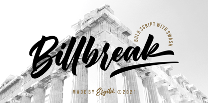 Billbreak is a bold script font inspired by urban fashion. This font is great for your next creative project such as logos, badge, apparel, product packaging, headline, T-shirt/apparel, Poster, or anything which needs a Calligraphy. Billbreak comes with uppercase, lowercase, numerals, punctuations and so many variations on each character include opentype alternates, and common ligatures to let you customize your designs. If you have any questions, don’t hesitate to contact us Ergibi Studio
 - Energy Grotesk by Tall Chai,
$9.00Energy Grotesk is a modern grotesque family. It is an OpenType Variable font with weight axis going from 100 to 900. Energy Grotesk is extrovert, bold and full of energy. Most wide, grotesque fonts are uppercase only, but Energy embraces upper and lowercase. Available in 9 weights Over 1000 glyphs supporting extended Latin Ideal for display texts: Titles, Logos and Headlines etc. Supports OpenTypes features like Ligatures and Stylistic Alternates Tabular Numerals included - Cecilia by Mchcrafter,
$14.00 Cecilia is a Bold Minimalist Elegant Modern vintage font with beautiful ligatures, tons of special alternative glyphs, ornament and multilingual support. It's a very versatile font that works great in large and small sizes. Perfect for branding projects, Logo design, Clothing Branding, product packaging, magazine headers, or simply as a stylish text overlay to any background image. Features: 2 Weights font Lowercase and Uppercase Stylistic Alternates & Ligatures Numerals & Punctuation Accented characters Multiple Languages Supported
 - Sunnylise by Mevstory Studio,
$10.00 Sunnylise, from Mhdafifersya, is a handwritten script font with a simple and classy style. It includes a set of lowercase characters without connecting strokes. Be sure to turn on your OpenType features when using Sunnylise - it’s packed with ligatures and alternate characters for both upper and lower case glyphs. This font is great for your next creative projects such as headlines, quotes, album cover, bold branding, business cards, and many other design project. Thanks
 - Seventh August by Reyrey Blue Std,
$14.00 Seventh August is a beautiful bold serif typeface that has own unique style & modern look. Seventh August is perfect for many purposes such as a headline, sub-headline, logo, and short body text for magazines, books, fashion, quotes, youth t-shirt, signboards, logos, and many more! Add it confidently to your projects, and you will love the results. Features : · All Uppercase and Lowercase · Number & Symbol · Supported Languages · Alternates and Ligatures · PUA Encoded
 - Black Dreams by Letterara,
$45.00 Black Dreams is a bold and edgy metal rocker font that captures the raw energy of heavy metal music. With rugged textures and unique glyphs, this font is perfect for album covers, t-shirts, and posters. Use it for headlines or body text to create designs that truly stand out in the metal scene. Don't settle for mediocre fonts - get this ultimate metal rocker font today and let your designs rock the world!
 - Grivas by Nathatype,
$29.00 Prepare to be entranced by the unparalleled allure of Grivas, a serif display font that redefines typographic elegance. Each letter of Grivas is a work of art, meticulously crafted with two distinct outlines that harmoniously coexist. One outline boasts a refined delicacy, evoking a sense of timeless sophistication, while the other exhibits bold strokes that command attention and add a modern twist. For the best legibility use this font in the bigger text sizes.
 - Castle by Linotype,
$29.99This family, which includes faces in light, book, bold, and ultra weights, more stroke contrast than is typical of sans serifs, making it very legible in text. Because of its large x-height, it is recommended for used in point sizes ranging from 12 point upward. Of course, it functions well in display sizes, too. The contrast between the four weights makes this family optimal for use in hierarchical advertising systems, and corporate identity uses. - ITC Static by ITC,
$29.99Static looks almost like it was stamped on paper: the black color is not evenly distributed and the background comes through the letters and consciously irregular forms reinforce the effect. The characters do not all have the same height, nor do they stand straight and regularly on the base line. Static is a robust font with bold, rounded serifs and is best used for headlines and short texts in point sizes of 12 and larger. - Sabu by Larin Type Co,
$16.00 Sabu is multitasking, modern sans-serif font family, and a great solution for anyone your project. It includes upright and Italic style, each of them has weight weights from thin to extra bold. This is a multi-purpose one that is perfect for big and small text, it is constructed modern and easy to read. With it, you can create logos, banners, use in advertising, packaging, books covers and magazines, headings, descriptions and much more.
 - Redriver by Niznaztype,
$9.00 Redriver is a postmodern font in a futuristic graphic style, mixing characteristics from postmodern, contemporary and even older design styles. Redriver's strength will be the soul of your graphic designs. Redriver is perfect for futuristic and postmodern graphic art, editorial design, posters, t-shirts, book covers, headlines, advertising, branding, movies titling, and more. Redriver can be used for both short or long text in your designs and comes in 3 styles: thin, regular, and bold.
