5,113 search results
(0.019 seconds)
- Jeff - Unknown license
- Goudy Initialen - Personal use only
- Tejaratchi - Unknown license
- DelitzschCaps - 100% free
- DayPosterBlack - Unknown license
- Tender - Unknown license
- Varah - Unknown license
- Romantik - Personal use only
- Lilith - Unknown license
- Preciosa - Unknown license
- Cretino - Unknown license
- QuaNauticale_Initials_No1 - Unknown license
- Capitular Moldurada 2 - Unknown license
- Rose - Unknown license
- Rage - Unknown license
- Folio by Linotype,
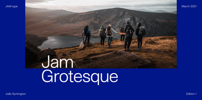
$29.99 - Jam Grotesque by JAM Type Design,
$25.00 - Cardboard by deFUNKT,
$35.00 - Benjamin by Wilton Foundry,
$29.00 - Strike Swiss - Unknown license
- Squarish by The Type Fetish,
$10.00 - Ticketbook by Suomi,
$20.00 - TD Beta by Inusentes Catapusan,
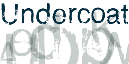
$9.00 - Undercoat by Open Window,
$19.95 - CG Triumvirate by Monotype,
$40.99 - Aura by Monotype,
$29.99 - Circus - Unknown license
- Ornamental Versals - Personal use only
- GDS Infinity - 100% free
- Only Fools & Horses - Personal use only
- Dearest Open - Unknown license
- Creation - Unknown license
- FlatPack - Unknown license
- Stiletto - Unknown license
- Dearest Friend - Unknown license
- Floral Majuscules, 11th c. - Unknown license
- NiteClub - Personal use only
- Ardenwood Demo - Unknown license
- KaiserRotbartOneCaps - 100% free
- Rediviva - Unknown license


