512 search results
(0.017 seconds)
- Cracko Deco - Unknown license

- Click Clack by Fonthead Design,
$15.00ClickClack is a family designed by Ethan Dunham that is made of hand-drawn typewriter letters. An actual sample of a typewriter alphabet was blown up and carefully traced into the two versions, regular and light. This family has a bouncy, informal feel and is a departure from other typewriter fonts. - Funky Track by Surplus Type Co,
$18.00 Funky Track is a super bold tall retro display font that features a thick baseline. This eye catching typeface is great for large scale use in projects such as web design, visual identities, advertising, packaging & much more! It includes upper and lowercase characters, as well as multilingual characters.
 - Buckle wrack by LetterStock,
$15.00 **Bukle wrack Font** This pair was inspired by the vintage music poster design that i saw on some coffee shop, It was crafted by hand specially to add natural handmade feeling in its brand identity than i make it clean with pentool. **Opentype features** Bukle wrack font has 203 character set included Bukle wrack Font is very good looking in logo, labels, product packaging, invitations, advertising and others. **What includes** * Multilingual support (Western European characters). This fonts works with folowing languages: Afrikaans, Albanian, Asu, Basque, Bemba, Bena, Chiga, Cornish, Danish, English, Estonian, Filipino, Finnish, French, Friulian, Galician, German, Gusii, Indonesian, Irish, Italian, Kabuverdianu, Kalenjin, Kinyarwanda, Low German, Luo, Luxembourgish, Luyia, Machame, Makhuwa-Meetto, Makonde, Malagasy, Malay, Manx, Morisyen, North Ndebele, Norwegian Bokmål, Norwegian Nynorsk, Nyankole, Oromo, Portuguese, Romansh, Rombo, Rundi, Rwa, Samburu, Sango, Sangu, Scottish Gaelic, Sena, Shambala, Shona, Soga, Somali, Spanish, Swahili, Swedish, Swiss German, Taita, Teso, Vunjo, Zulu Thank you for using this font. LS
 - Macon Tracks by Elemeno,
$- - AF Track by ACME Collection,
$44.00 - Home Track by Illushvara,
$15.00 Hello, Home Track is a display slab font. More explore the basic slab font speciality the uppercase mix with a vintage adventure style and make an unique alternates line. Will make your design strong, bold and stand out. With playful line this font perfects for headline, poster film, banner product, website, logo labels or any type of advertising purpose. This font support Multilingual Languages. FEATURES : Uppercase Number Punctuation Multilingual PUA Encode Opentype Character Alternates FILES INCLUDED : Home Track. Otf If you have any question, don’t hesitate to contact me. Happy Designing !!! Thank You, Illushvara Design
 - Cyber Track by Nirmana Visual,
$24.00 Cyber track - Techno Futuristic Display Typeface Inspired by Sci fi Movie, very suitable for the title, logo, typography, clothes, magazines, brochures, packaging and much more for your design needs,making your designs more modern and professional.
 - Make Tracks by Gerald Gallo,
$20.00 The character set contains 47 left foot animal track designs. The shift+character set contains the 47 right foot animal track designs corresponding to the character set.
 - Track drift by Scratch Design,
$14.00 Track Drift is a strong font with a race theme. This font has speed, strong, sharp, fast, powerful, and modern characters. Track Drift will be suitable for racing or game themes of design, such as logos, headlines, posters, sports or race events, automotive posters, magazines, product design, packaging, labels, and other creative projects that need speed and strong font. What you'll get : All caps font in two styles Numbers & punctuation Multilingual support Ligatures Thank you for your purchase! Hope you enjoy our font!
 - Chick Chack by Almarkha Type,
$23.00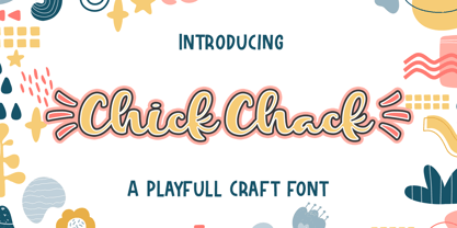 Chick Chack is a Playful Craft font that will make your designs look unique and fun. It’s perfect for labels, quotes, posters, DIY projects, branding, packaging, greeting cards, websites, photos, photography overlays, signs, window art, scrapbooking, tags and so much more!
 - Murder Brack by Multype Studio,
$99.00 Murder Brack is a font with a death metal theme. Be an alternative to make logos, merch, or anything with the nuances of death metal music. This font perfect for logotype death metal band, logotype death metal brand, product, merchandise death metal band, death metal band covers, rock events, rock posters, rock magazine covers, branding, product design, labels and other creative project. What’s Included : Standard glyphs Works on PC / Mac Simple installations Accessible in the Adobe Illustrator, Adobe Photoshop, Adobe InDesign, even work on Microsoft Word PUA Encoded Characters, Fully accessible without additional design software. Multilingual support Thank you for your purchase! Hope you enjoy with our font!
 - Helvetian Times by Elemeno,
$25.00Helvetian Times is an unusual typeface. It clearly thinks it's a standard text font, but the offbeat letter shapes and inconsistent serifs combine to form something that defies conventional categorization. Helvetian Times works well at any size, but generally evokes the impression that something's not quite right. - Cack-handed by Kerry Colpus Designs,
$25.00 Cack-handed was created by writing with my left hand even though I am right handed.
 - KR All Cracked Up - Unknown license

- FZ JAZZY 12 CRACKED - Unknown license

- Cranked Pipe 2D by 2D Typo,
$24.00 Font has Industrial motifs and simple geometric shapes. Best suited for large lettering. Font contains characters for all occasions, many ligatures, alternatives and exotic.
 - LDJ Squirrel Tracks by Illustration Ink,
$3.00If squirrels could write, chances are they would love to use this perky new font from Jillustration. - Krazy Kracks NF by Nick's Fonts,
$10.00This playful offering, suggestive of Cooper Black on some serious drugs, is based on the so-called “California” style of lettering used extensively in travel posters of the 30s to the 50s. This version is based on its interpretation by Carl Holmes in a Walter T. Foster artbook entitled ABC of Lettering. Both versions of this font include the complete Unicode Latin 1252 and Central European 1250 character sets. - PF Hellenica Pro by Parachute,
$69.00 The Golden Age of the Greek Civilization. The world’s history carved on stone. Hellenica Pro was created based on numerous photos from archaeological sites and several other historical references dating back to 1100 B.C. In order to capture the essence of this writing, there are a few alternate forms used at lowercase, uppercase and/or accented positions. These alternates come from different regions in Greece. For instance, uppercase Theta was used by the Cretans and the Korinthians, whereas uppercase Delta by the Ionians. PF Hellenica Pro comes in 3 versions: Light, regular and bold. The new ‘Pro’ version has been expanded to include 3 major scripts: Latin, Greek and Cyrillic.
 - Eight Track program 3 - Personal use only

- Eight Track program 4 - Personal use only

- Eight Track program two - Personal use only

- Spinner Rack Pro BB by Blambot,
$10.00 Spinner Rack Pro BB is a new and improved version of the classic Blambot typeface, Spinner Rack BB! New spacing, kerning, manga characters, barred-I correction, additional accented characters, autoligatures, contextual alternates, and a plain bold weight for the first time!
 - Heltar by The Northern Block,
$19.30 A modern neo-grotesque typeface. Having grown up in Sheffield and been completely immersed in the work of The Designers Republic I became very drawn to their treatment of Helvetica, especially the close tracking of the letter space. This visual investigation led me to the study of the font Hass Unica, a so called improvement to Helvetica. In order not to replicate and become a clone of Unica I redrew all the characters from scratch improving optical appearance, developing subtle corrections and reshaping individual letterforms. The result is a remixed neo-grotesque font that has strong general optical balance with great rhythm under close tracking. Details include 10 weights, an extended European character set, true italic, manually edited kerning and Euro symbol.
 - Miedinger by Canada Type,
$24.95 Helvetica’s 50-year anniversary celebrations in 2007 were overwhelming and contagious. We saw the movie. Twice. We bought the shirts and the buttons. We dug out the homage books and re-read the hate articles. We mourned the fading non-color of an old black shirt proudly exclaiming that “HELVETICA IS NOT AN ADOBE FONT”. We took part in long conversations discussing the merits of the Swiss classic, that most sacred of typographic dreamboats, outlasting its builder and tenants to go on alone and saturate the world with the fundamental truth of its perfect logarithm. We swooned again over its subtleties (“Ah, that mermaid of an R!”). We rehashed decades-old debates about “Hakzidenz,” “improvement in mind” and “less is more.” We dutifully cursed every single one of Helvetica’s knockoffs. We breathed deeply and closed our eyes on perfect Shakti Gawain-style visualizations of David Carson hack'n'slashing Arial — using a Swiss Army knife, no less — with all the infernal post-brutality of his creative disturbance and disturbed creativity. We then sailed without hesitation into the absurdities of analyzing Helvetica’s role in globalization and upcoming world blandness (China beware! Helvetica will invade you as silently and transparently as a sheet of rice paper!). And at the end of a perfect celebratory day, we positively affirmed à la Shakti, and solemnly whispered the energy of our affirmation unto the universal mind: “We appreciate Helvetica for getting us this far. We are now ready for release and await the arrival of the next head snatcher.” The great hype of Swisspalooza '07 prompted a look at Max Miedinger, the designer of Neue Haas Grotesk (later renamed to Helvetica). Surprisingly, what little biographical information available about Miedinger indicates that he was a typography consultant and type sales rep for the Haas foundry until 1956, after which time he was a freelance graphic designer — rather than the full-time type designer most Helvetica enthusiasts presume him to have been. It was under that freelance capacity that he was commissioned to design the regular and bold weights of Neue Haas Grotesk typeface. His role in designing Helvetica was never really trumpeted until long after the typeface attained global popularity. And, again surprisingly, Miedinger designed two more typefaces that seem to have been lost to the dust of film type history. One is called Pro Arte (1954), a very condensed Playbill-like slab serif that is similar to many of its genre. The other, made in 1964, is much more interesting. Its original name was Horizontal. Here it is, lest it becomes a Haas-been, presented to you in digital form by Canada Type under the name of its original designer, Miedinger, the Helvetica King. The original film face was a simple set of bold, panoramically wide caps and figures that give off a first impression of being an ultra wide Gothic incarnation of Microgramma. Upon a second look, they are clearly more than that. This face is a quirky, very non-Akzidental take on the vernacular, mostly an exercise in geometric modularity, but also includes some unconventional solutions to typical problems (like thinning the midline strokes across the board to minimize clogging in three-storey forms). This digital version introduces four new weights, ranging from Thin to Medium, alongside the bold original. The Miedinger package comes in all popular font formats, and supports Western, Central and Eastern European languages, as well as Esperanto, Maltese, Turkish and Celtic/Welsh. A few counter-less alternates are included in the fonts.
 - Timesquare by Campotype,
$25.00 The initial idea of timesquare typeface inspired by Helvetica when presenting the board information on a subway escalator in Time Square, Manhattan, New York. This confirms strength the legend of Helvetica is not lost amid rampant nice fonts in the site. Therefore it should not appropriate that this timesquare fonts come to rival the greatness of Helvetica. Fonts timesquare thrive (since 2008 for self used) of the basic forms of Helvetica to timesquare born in different shapes and sizes. The greatest challenge during development timesquare is both shape similarity to Helvetica directly, as well as to other fonts inspired by Helvetica. Timesquare's main characteristics are the wide character, modern touch and individually, can work well on a wide variety of applications in books, brochures and magazines as well as applications in advertising. This typeface has been developed on the Latin character sets. Hopefully useful.
 - Razlom by Pavel Boog,
$11.00 ?Razlom is a spectacular, brutal and at the same time intriguing font. Tej wide letters are filled with small cracks resembling faults. They crack, but they don't break. The font will convey confidence and strength to each project and highlight it from all
 - Neue Haas Grotesk Text by Linotype,
$33.99The original metal Neue Haas Grotesk™ would, in the late 1950s become Helvetica®. But, over the years, Helvetica would move away from its roots. Some of the features that made Neue Haas Grotesk so good were expunged or altered owing to comprimises dictated by technological changes. Christian Schwartz says Neue Haas Grotesk was originally produced for typesetting by hand in a range of sizes from 5 to 72 points, but digital Helvetica has always been one-size-fits-all, which leads to unfortunate compromises."""" Schwartz's digital revival sets the record straight, so to speak. What was lost in Neue Haas Grotesk's transition to the digital Helvetica of today, has been resurrected in this faithful digital revival. The Regular and Bold weights of Helvetica were redesigned for the Linotype machine; those alterations remained when Helvetica was adapted for phototypesetting. During the 1980s, the family was redrawn and released as Neue Helvetica. Schwartz's revival of the original Helvetica, his new Neue Haas Grotesk, comes complete with a number of Max Miedinger's alternates, including a flat-legged R. Eight display weights, from Thin to Black, plus a further three weights drawn specifically for text make this much more than a revival - it's a versatile, well-drawn grot with all the right ingredients. The Thin weight (originally requested by Bloomberg Businessweek) is very fine, very thin indeed, and reveals the true skeleton of these iconic letterforms. Available as a family of OpenType fonts with a very large Pro character set, Neue Haas Grotesk supports most Central European and many Eastern European languages. - "Helveticrap" is a unique and distinctive font created by Michael Tension, an artist and designer known for his creative endeavors and contributions to the world of typography and graphic design. The...
- Evergreen by Sudtipos,
$39.00 Evergreen is Koziupa and Paul going all Zeitgeist after a few Malbec drinks. Two fonts praise nature from when the lights go out to the crack of dawn, and vice versa. That's 24/7/365 of wild leafy Kumbaya. Even butterflies and flowers were mystified so much they had to get in there. Evergreen is local, organic, and certified free trade. At some point we wrote down the name of the jungle where it originated, then lost the parchment in the hot springs a few hours later. But that's immaterial. Crank up your Deep Forest sound, prep your Earthtone and Foliage palettes, and get into the big herbal.
 - Bamboo by Komet & Flicker,
$10.00 Crack open another coconut! With Bamboo, you can almost hear the waves and feel the warm tropical island breeze.
 - Jerkoff - Unknown license

- Folio by Linotype,
$29.99Folio was designed by Konrad F. Bauer and Walter Baum and appeared with the Bauer font foundry (Bauersche Gießerei) in 1957. The designers based their ideas on Helvetica but Folio did not turn out to pose the competition they had hoped. The font has the same applications as Helvetica and is an extremely legible font. Folio is particularly good for text and has an objective, neutral character. - Jam Grotesque by JAM Type Design,
$25.00 Inspired by the beautiful typefaces like Helvetica and Neue Haas Unica, this beautiful typeface looks fantastic in print as well as online.
 - Cardboard by deFUNKT,
$35.00This font was actually designed by trying to teach my helper-monkey, Philip, to cut Helvetica out of a piece of cardboard. - Benjamin by Wilton Foundry,
$29.00Wilton's "Benjamin-Regular" is a delightful twist on a classic - reminiscent of Franklin Gothic, Helvetica and Frutiger with it's own contemporary twist. - Strike Swiss - Unknown license

- Fraught by Morganismi,
$12.00 Fraught is a rough tough stencil font for hard use. Feel the touch of cracked concrete, rusty iron and undressed board. Fraught supports most European languages.
 - Squarish by The Type Fetish,
$10.00Squarish could have been the Universe or Helvetica of the 1980's, if only it was designed then. Now it is just a little quirky gridded typeface.


