9,126 search results
(0.028 seconds)
- Galson Serif by Typehill Studio,
$15.00 Galson Serif attracts a typeface that is smooth, clean, unique, elegant, modern, feminine, sensual, glamorous, simple and very easy to read. Classic style is very suitable to be applied in various formal forms such as invitations, labels, menus, logos, fashion, make up, stationery, letterpress, romantic novels, magazines, books, greeting/wedding cards, packaging, labels. Galson Serif has alternative, Ligature and multilingual support.
 - Sarebbe Bellissimo by Mr. Typeman,
$19.00 Meet my new font Sarebbe Bellissimo – a romantic delicate signature font with its poetic flow, wich simulates natural handwriting. Great for logo creating, wedding stationery, packaging, for your Instagram and other social media posts. The font includes: Uppercase and lowercase Standard punctuation & numerals Special letters for most of the European languages 47 ligatures (pair combinations, which help the font to look more natural)
 - Sweet Butterfly by AEN Creative Studio,
$14.00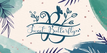 Sweet Butterfly is a beautiful script font with a romantic monogram theme, featuring lovely, butterfly ornaments. Fall in love with its authentic feel and use it to create gorgeous wedding invitations, thank you cards, logos, business, branding, and every other design which needs a handwritten touch. This font is PUA encoded which means you can access the available glyphs and swashes with ease!
 - Matcha Orisha by Zeenesia Studio,
$15.00 Matcha Orisha is a beautiful and feminine serif font created by a romantic and lovely look. Matcha Latte was built with openType features, stylistic Alternate and Ligature makes your project will be awesome!! Perfect for Branding identity, editorial projects, Logo design, web font, clothing branding, product packaging, magazine headers, or simply as a stylish text overlay to any background image.
 - Matinee Idol by Comicraft,
$19.00 Now showing at your local picture house is the latest romantic comedy coupling featuring Matinee Idol and Matinee Idol Bold; famous faces you've come to know and love in features like Warners' "Hush" and Columbia's "The Evil That Men Do." Stop by our lobby and check these fonts out. Oh, and please remember to refrain from smoking and talking during the show!
 - Montlake Road by The Styled Script,
$25.00 Say hello to the Montlake Road Script Font. This is a carefree and elegant font with a romantic and feminine flare. Montlake Road has Opentype ligatures that give help give a natural handwritten look while the lowercase swashes add a beautiful touch to any project. This font is perfect for logos, notes, labels, wedding invitations, or branding for any project.
 - Queen Bee by Stefani Letter,
$12.00 Queen Bee is a sweet and cute font with special heart characters. Get inspired by its gorgeous swashes and create beautiful designs with a romantic touch to any crafting project! This font is PUA encoded which means you can access all of the amazing glyphs and swashes with ease! It also features a wealth of special features including alternate glyphs and ligatures.
 - Glamoria by Balpirick,
$15.00 Glamoria is a Modern Monoline Script Font. Glamoria Script is an enchanting handwritten font. This versatile script font has a wide spectrum of applications ranging from greeting cards to headlines and is guaranteed to add a romantic feel to your next project. Glamoria also multilingual support. Enjoy the font, feel free to comment or feedback, send me PM or email. Thank you!
 - Spice Girls by Suza Studio,
$18.00 Spice Girls is an elegant & modern Calligraphy Look typeface that stands out. Spice Girls is best suited for creating logotypes, branding, headlines, fashion, romantic novels, corporate identity and marketing materials for the web & as well as any minimal designs. Please see the included demographics to get an idea of what this typeface is capable of when used for branding and marketing material design.
 - College Game JNL by Jeff Levine,
$29.00 The hand lettered credits for the 1940 horror film “The Invisible Woman” look more like they would show up in a movie about a college football game. A bold, condensed slab serif type design, it’s perfect for many sports-themed graphics projects. The digital version has been aptly named College Game JNL, and is available in both regular and oblique versions.
 - Salzburger Plakat NF by Nick's Fonts,
$10.00A poster by Otto Baumberger for an Austrian winter sports festival in 1907 inspired this charming confluence of medieval and Art Nouveau influences. As such, its appeal is timeless, and well suited for storybook romances of all stripes. Both versions of the font include complete Latin 1252, Central European 1250 and Turkish 1524 character sets, with localization for Moldovan, Romanian and Turkish. - Mileadila by Letterara,
$14.00 Mileadila is a sweet and simple display font that is perfect for adding a romantic charm to your next Valentine's day project and that will turn any design project into a true standout. We also made many stunning clip-art which is packed in extras, so you can create many designs for your projects. Get inspired by Mileadila's unique look for your valentine.
 - Sweetgrace by Good Java Studio,
$20.00 Sweetgrace is a romantic script font with many swashes in start and ending characters. This font includes full set of swash heart lowercase letters, numerals, and punctuation. Also it includes: short lowercase beginning and ending swashes, lowercase ending heart swashes, which serve to connect two words or letters. Sweetgrace is absolutely perfect for invitations, monograms, wedding invitations, fashion, branding, labels, and logotypes.
 - Celsius Flower by Typehill Studio,
$17.00 Celsius Flower attracts a typeface that is smooth, clean, unique, elegant, modern, feminine, sensual, glamorous, simple and very easy to read. Classic style is very suitable to be applied in various formal forms such as invitations, labels, menus, logos, fashion, make up, stationery, letterpress, romantic novels, magazines, books, greeting/wedding cards, packaging, labels. Celsius Flower has alternative, Ligature and multilingual support.
 - Yesterday Morning by Mans Greback,
$59.00 Yesterday Morning is a lively handwriting font that captures the essence of an active and cute brush style. This handmade calligraphy font is perfect for fashion projects, adding a sense of energy and excitement to your designs. The font family's hand-brushed appearance brings an authentic, personal touch to your creative work, making it feel warm and approachable. The Yesterday Morning font family includes four engaging styles to suit various design needs: Regular: A balanced and energetic style for everyday use Regular Italic: Adds a playful touch and a sense of movement Bold: Offers a bolder, more assertive presence for impactful designs Bold Italic: Combines the strength of bold with the flair of italic Built with advanced OpenType functionality, Yesterday Morning ensures top-notch quality and provides you with full control and customizability. It includes stylistic alternates, ligatures, and other features to make your designs truly unique.
 - Archie by Canada Type,
$39.95 Archie is a wide attention-grabber based on a simple geometric alphabet drawn in the early 1930s by Dutch calligrapher and lettering artist Martin Meijer. This digital family expands considerably on the original letters, adding biform shapes, small caps, italics across the board, and support for many Latin-based languages. Archie's eye-catching forms are meant for clear, seamless and strong message delivery. In its upright styles, strong vertical strokes emphasize the sense of confidence and importance, and in its italics, that emphasis is further affirmed by a natural sense of urgency. This kind of alphabet is perfect for display typography aiming at the glance-and-go crowd. When used properly and placed prominently, no eye can escape it. The basic Archie family is comprised of six basic fonts, while the Pro set combines all three uprights in one font and all three italics in another.
 - Grandeux Serif by Mans Greback,
$59.00 Grandeux Serif is a classic Victorian-inspired font that exudes vintage elegance and sophistication. Its distinct vintage style makes it perfect for adverts, restaurant branding, and other high-end design projects that require a touch of luxury and refinement. The font's heavy strokes and high-quality craftsmanship give it a strong presence, while its intricate details and stylistic alternates allow for a truly customized and unique typographical experience. The Grandeux Serif font family includes six high-quality styles to suit various design needs: Light: Delicate and sophisticated for a subtle, elegant presence Light Italic: Adds a touch of dynamic flair to the light style Regular: A well-balanced, classic look for versatile use Regular Italic: Combines the versatility of regular with a touch of expressiveness Bold: A strong, assertive style for impactful designs Bold Italic: Merges the boldness of the bold style with the energy of italic The font is built with advanced OpenType functionality and has a guaranteed top-notch quality, containing stylistic and contextual alternates, ligatures and more features; all to give you full control and customizability. It has extensive lingual support, covering all Latin-based languages, from Northern Europe to South Africa, from America to South-East Asia. It contains all characters and symbols you'll ever need, including all punctuation and numbers.
 - Berndal by Linotype,
$29.99Bo Berndal, the master Swedish typographer, is the eponymous designer of Berndal, a contemporary text family with five different styles. This family represents a new achievement for Bo Berndal, who has spent many years working to optimize text legibility in the printed media. Several small tricks make the Berndal family an interesting milestone in legibility. Berndal's letterforms contain large x-heights. Large x-heights open up the counterforms of letters, making text appear lighter on a page, but their correspondingly shorter ascenders and descenders can hinder legibility. This does not occur in Berndal at all! Coupled with this experiment, Berndal's various font weights display a certain softness and roundness. The letterforms themselves are relatively wide, with an overall consistency in width. The calligraphic nature of the strokes has been minimized, yet a contrast stroke-thickness is still to be noticed within the alphabet. Berndal's five styles offer almost everything that one could want from a good text family. The Regular weight may be paired with Small Caps, Italic, Bold, and Bold Italic. All styles ship in the OpenType format, and include tabular and old style figures. The two italic weights are made up of true italics, not obliques. The Berndal family is a part of the Take Type 5 collection from Linotype GmbH." - Flanker Tanagra by Flanker,
$12.00 In order to give new imput to the art of typeface design in Italy, Nebiolo Company held, in March 1910, an artistic competition for a new alphabet conception, so the best-ranked design would be transformed into a real new typeface. 42 competitors participated and, although the first prize was not technically awarded, "Ancora" resulted as the best typeface, created by the designer-typographer Natale Varetti of Turin. Nonetheless, the new alphabet was transformed into a full-fledged metal typeface in 1924, renamed "Tanagra" in honor of the Greek city in the center of Boeotia. The new font, although not significantly detached from the classical Roman form, introduced decorative elements that allowed its use in both rational and artistic compositions. This font appears very clear and easy to read, with very high ascenders and some decorations that make it distinctly retrò. Finally, after almost 100 years, this peculiar character has been digitized taking it as a model the shapes of the 16 points size (other dimensions have significantly different contrasts and proportions). To adapt it to modern use, some glyphs have been modified, but all the originals are available as Stylistic Alternate OTF, as well as all the swashed variants while the missing ones were added.
 - Only You Pro by LeType,
$49.90 Only You is handmade, and specially romantic. It was made to brighten your projects, turning everything more beautiful. The special encounter between uppercase letters and lowercase letters is perfect. Only You is unicase, with 888 glyphs, and what’s better: it has one special alternative for all letters as uppercase, and that creates an infinity of combinations. Only You is brilliant, gorgeous, and multilingual - it also includes the Cyrillic version! It has more than 200 ligatures, several alternates and swashes. You can also obtain an unlimited number of possibilities in your layout - there are several possibilities for starting and finishing a word. Do you want some more? You should take a look at Only You Icons with more than 300 options between icons, ribbons and frames that will make your project very attractive and romantic. The font doesn't have PDF and works better in softwares that support the complete OpenType function.
 - Roz by Gaslight,
$25.00 Roz is clean geometric sans round by one side and sharp on the other side. It has three weights and corresponding italics. Roz is ideal for package design, headlines and other typographic mediums.
 - Spantaran by Nurf Designs,
$25.00 Spantaran is a sporty display typeface which is very suitable for logos, titles, player names on the jersey, and more. It was made with italic & bold characters which give it a strong feel.
 - Evander by Punchform,
$29.00 Evander allows graphic designers to create advanced typographical layouts by offering 64 alternative glyphs and 3 stylistic sets. The family has 18 weights — 9 uprights and 9 italics — ranging from Thin to Black.
 - Avarita by Asritype,
$22.00 Avarita is an italic font variant. The font design is a fusion between serif and handwriting. Avarita match to many kind of typing, such as comical conversation text, caption, handwritten typing, and othes.
 - Magnel Display by Eimantas Paškonis,
$15.00 A display Didone of four weights plus italics. The defining stylistic features are large x-height and asymmetric legs that give feminine, oriental, floral look. Includes accented swashes, decorative ligatures and oldstyle numerals.
 - Bockhold by Stereo Type Haus,
$25.00 Influenced by the classic German industrial typeface DIN, Bockhold strays from the grid system and into humanist nuances. The family consists of two weights with matching italics, making a total of four fonts.
 - ALS Mirta by Art. Lebedev Studio,
$63.00 ALS Mirta is a clean text type well-suited for use in typesetting of smart volumes and kids’ books. A fine and well-balanced antiqua face is complemented by surprisingly vigorous sophisticated italics.
 - Tenika by Eaver Studio,
$12.00 Minimal & squarish techno style type for your graphic design project. Designed based off a modified square for the small letters and developed to have the capital letters. Available in upright and oblique (italic).
 - Karmina by TypeTogether,
$49.00 Karmina is a text typeface developed mainly for pocket books and budget editions. It was built to withstand the worst printing conditions: low quality papers, high printing speed with web presses and variations in the ink level of the printing press. Some of Karmina's most representative features are the rather large serifs, intended to work perfectly in small reproduction sizes, the sharpness of the shapes, including some calligraphic reminiscences, and the large and yet graceful ink traps in the acute connections. Structurally, Karmina combines a significantly large x-height with relatively compressed letterforms. The result of these features grants Karmina outstanding legibility and economy. Karmina features four weights and 800 characters per weight, including small caps, discretionary ligatures, fractions and a complete range of numerals for every use. It also supports over 40 languages that use the latin extended alphabet. Karmina was selected in the text typography category at the Letras Latinas exhibition 2006 and won a merit in the European-wide ED-Awards competition 2007. Karmina Basic is a reduced version of Karmina. It is still an OT-font but without any particular features except of a set of ligatures, class-kerning and language support including CE and Baltic.
 - Hybi5 by Hybi-Types,
$12.50 The Hybi5 font family can be described as a “crossover” between Antiqua, Grotesque and Brushscript with characteristics from all of this genres. My aim was to design friendly and versatile fonts, which can be used for headlines or slogans as well as for some longer texts. To make the fonts useful for as many languages as possible, I added a lot of exotic accents. All styles contain the whole “Adobe Latin 3 (CE)” character set plus a few letters from “Adobe Latin 4”. A lot of ligatures prettify the look of the fonts. Alternate uppercase letters in the script style might do the same. If you are a professional designer, you will surely appreciate the thousands of kerning pairs within each style, which will make your work easier. I recommend to set Kerning to “metric” and spacing to “zero” in your layout app. Back in 2015 I worked on the first sketches of “Hybi5” using Adobe Illustrator. “Fontself Maker”, an extension for Illustrator, was used to convert the drawings into font-files. This tool can only create “OTF” font files. For this reason there are no “TTF” versions. It’s not the first font I have ever made, but the first to be distributed commercially.
 - Classic Roots Personal Use - Personal use only

- Rabiosa - Personal use only

- Bauer - Unknown license

- Photonica - Unknown license

- HansHand - Unknown license

- Opal - Unknown license

- Peronel by Tanincreate,
$16.00 Peronel is a serif font with swash line under the lowercase letters. It has a regular and an italic style and works perfectly for logos, headlines, posters, packaging, postcards, social media and much more.
 - Pro Sotan by Differentialtype,
$10.00 Pro sotan is a rounded sans serif font family that comes with 9 weights and matching italics. This font is ideal for typing in documents, headlines, packaging, logos, advertisements, corporate identities and much more.
 - Rearview Mirror by Hanoded,
$15.00 Rearviewmirror (no space) is a Pearl Jam song and it happens to be my favourite! Rearview Mirror is a handmade tall & thin font. It comes in a regular and bold style with their italics.
 - Union Telegraph NF by Nick's Fonts,
$10.00Discovered in The Zanerian Manual of Alphabets and Engrossing was this quaint charmer, called simply "Italic Roundhand". The manual touts this face as plain, practical and rapid; it's lovely, luscious and nostalgic, as well.


