9,126 search results
(0.039 seconds)
- Bumbel by Say Studio,
$12.00 Introducing Bumbel - Bubble Typeface Bumbel is a captivating font that combines the essence of bubble dynamics with a modern and funky style. Its unique design exudes energy and playfulness, making it perfect for projects that require a fresh and vibrant look. This typeface features rounded letterforms with soft edges, giving it a friendly and approachable feel. The bubbly contours of each character create a sense of movement and liveliness, capturing attention and adding a touch of whimsy to any design. With its modern twist, Bumbel brings a contemporary edge to traditional bubble fonts. It embraces clean lines, sleek curves, and a balanced composition, making it versatile for a wide range of applications. Whether you're designing a logo, branding materials, advertising campaigns, or social media graphics, this font will add a dynamic and eye-catching element to your project. Bumbel have Outline Version allowing you to customize and experiment with different letter combinations. This versatility empowers you to create unique typographic compositions that truly reflect your creative vision. Embrace the spirit of modernity and funk with Bumbel. Elevate your designs, stand out from the crowd, and infuse them with a sense of joy and energy. Let this captivating typeface be the perfect tool to express your creativity and make a memorable impact. You will get : - Bumbel Regular - Bumbel Italic - Bumbel Outline - Bumbel Outline Italic - Multilingual Support Thanks, Have a wonderful Day Say Studio
 - Quercus Serif by Storm Type Foundry,
$69.00 Quercus is characterised by open, yet a little bit condensed drawing with sufficient spacing so that the neighbouring letters never touch. It has eight interpolated weights with respective italics. Their fine gradation allows to find an exact valeur for any kind of design, especially on the web. Quercus serif styles took inspiration from classicistic typefaces with vertical shadows, ball terminals and thin serifs. The italics have the same width proportion as upright styles. This “modern” attitude is applied to both families and calls for use on the same page, e g in dictionaries and cultural programmes. Serif styles marked by “10” are dedicated to textual point sizes and long reading. The sans-serif principle is rather minimalistic, with subtle shadows and thinned joints between curved shapes and stems. Quercus family comprises of the usual functionality such as Small Caps, Cyrillics, diacritics, ligatures, scientific and aesthetic variants, swashes, and other bells & whistles. It excels in informational and magazine design, corporate identity and branding, but it’s very well suited for book covers, catalogues and posters as well. When choosing a name for this typeface I've been staring out from my studio window, thinking helplessly without any idea in sight. Suddenly I realised that all I can see is a spectacular alley of oaks (Quercus in Latin) surrounding my house. These oaks were planted by the builders of local ponds under the leadership of Jakub Krčín in the fifteenth century.
 - Elsain by Maculinc,
$15.00 Elsain is a serif family font that is very unique on the edges with different angular styles, the spacing between these fonts is made very tight to deepen the character of this font. This font is great in layout design for quotes or body copy, best used as a display for headings, logos, branding, magazines, product packaging, invitations or anything else. Elsain Serif Family has many features such as Multilingual support, has 14 font families from thin to thick and also 2 variables. This font is also available in Cyrillic to complement many other languages. Not to forget it is also available in Greek form, and some other accessories. This completeness can be used in various letters from various countries such as English, Indonesian, Afrikaans, Basque, Breton, Catalan, Danish, Dutch, Finnish, French, Gaelic, German, Icelandic, Irish, Italian, Norwegian, Portuguese, Saami, Spanish, Swahili , SwedenCroatia, Czech, Estonian, Hungarian, Latvian, Lithuanian, Polish, Romanian, Serbian, Slovak, Slovenian, Turkish, Avar, Balkar, Belarusian, Bulgarian, Chechen, Erzya, Ingush, Lezgian, Macedonian, Moldavian, Ossetian, Russian, Serbian, Ukrainian, Greek and others. What do you get: Elsain Serif Regular and Italic Elsain Variable Regular and Variable Italic TTF. Accessible in Adobe Illustrator, Adobe Photoshop, and Adobe InDesign, it even works in Microsoft Word. Fully Encoded Characters are accessible without additional design software. Images used: All photos/images/vectors used in the preview are excluded, for illustration purposes only. Feel free to follow, like and share. thank you very much for checking my store!
 - Prangs by Sudtipos,
$59.00 The late-19th-century Prussian-American printer and publisher Louis Prang, the “father of the American Christmas card”, was well-known for his efforts to improve art education in the United States. He published many instructional books and even founded a training school for art teachers. One of the books he published included a series of alphabets for sign painters, lithographers, illuminators, architects and civil engineers. There was nothing truly original there — in the book’s preface, Prang says that the alphabets were “based on foreign forms and adapted for American taste”. The one alphabet that caught my attention in that book was one simply called “Italic”. It’s a high- contrast modern, a Didone really, but with an interesting little twist: the lowercase is almost entirely connected, which makes for an interesting mix of modern typography and classic calligraphy. That stuff is right up my alley now. Whenever my eyes happen on a modern, it’s easy, even almost impulsive for me to envision swashes coming out of serifs and terminals. The caps melt and the minuscules dance with them. And so I brought my vision to life. Prangs is an italic set of three weights, each containing more than 1400 glyphs with plenty of OpenType features and Latin language support. This set celebrates the convergence of three centuries of fancy display alphabets. These fonts should work wherever moderns are used to elevate and scripts are used to appeal — namely today’s branding, packaging and glossy publications.
 - Technotyp by URW Type Foundry,
$39.99 The digital font Technotyp is based on the hot metal typeface created by the German typographer and type designer Herbert Thannhaeuser (1898-1963) for the former East German type foundry Typoart in Dresden. In the typography book ‘Der Schriftsetzer’ (Fachbuchverlag, Leipzig, 1952), by Paul Fritzsche, this absolutely beautiful slab serif design is presented in all its variations. Fritzsche remarked that – because of its rather condensed form and its relatively long ascenders – the 'Werkschrift' of the Technotyp (comparable with our 'Regular') seemed to be very well suited to serve as a text face, and recommended for this purpose that the face be cut for the composing machine. However, this never happened and the entire Technotyp family was made available for hand composition only. This is finally changing and being remedied for good now: URW++ proudly presents the new digital version of this really charming font family with its distinct flavor of the 1950s, adding it to the other digital renditions of Herbert Thannhaeuser fonts at URW++, namely Garamond No. 4 and Magna. The original Typoart family had an italic style for the light version only. The new digital version of Technotyp includes italic styles for the regular, medium and bold weights as well, enhancing the family to meet today’s standards and requirements for professional type setting. To further increase its usefulness, Cyrillic faces were created, too. True to the standard for all digital fonts at URW++, the character set for Technotyp covers all West- and East European languages.
 - PG Grotesque by Paulo Goode,
$30.00 This is my interpretation of Edel Grotesk – a “lost typeface” from circa 1914 produced by Johannes Wagner GmbH of Ingolstadt, Germany. PG Grotesque is definitely not a revival, or even a faithful reproduction of that typeface as I was unable to source enough accurate references. What I have done is take the essence and unique characteristics of that typeface and brought this forgotten gem right into the 21st century. The full family features 99 fonts spread across 9 weights and 6 widths. PG Grotesque is also available as a single variable font so that you can fine tune the width, weight, and italic angle to your exact preference. Distinctive features include high-waisted capitals, a straight-legged capital ‘R’, and flattened arches in the ‘a’ and ‘g’ glyphs. Using PG Grotesque will give your typography a distinctly retro feel with its vintage heritage inherent in every character. You will find this is an incredibly versatile typeface with added value from its extensive language coverage along with small caps availability at the click of a button. PG Grotesque will prove to be a valuable asset in your type arsenal. Test drive PG Grotesque today – both the Regular and Italic fonts are offered as a free download. See full details and hi-res images at https://paulogoode.com/pg-grotesque Key features: 9 Weights 6 Widths 99 Fonts Small Caps Old Style Figures European Language Support (Latin) 550+ Glyphs per font
 - Full Sans by Bülent Yüksel,
$19.00 Full Sans is a geometric sans in the tradition of Futura, Avant Garde and the like. It has a modern streak which is the result of a harmonization of width and height especially in the lowercase letters to support legibility. Full Sans is the younger brother of original Full Neue, Full Slab and Full Tools. Ideally suited for advertising and packaging, editorial and publishing, logo, branding and creative industries, poster and billboards, small text, wayfinding and signage as well as web and screen design. Full Sans provides advanced typographical support for Latin-based languages. An extended character set, supporting Central, Western and Eastern European languages, rounds up the family. The designation “Full Sans LC 50 Book” forms the central point. The first figure of the number describes the stroke thickness: 10 Thin to 90 Bold. Full Sans LC comes 5 weights and italics also Full Sans SC comes 5 weights and italics total 20 types. The family contains a set of 485 characters. Case-Sensitive Forms, Classes and Features, Small Caps from Letter Cases, Fractions, Superior, Inferior, Denominator, Numerator, Old Style Figures just one touch easy In all graphic programs. Full Sans is the perfect font for web use. You can enjoy using it. UPDATE: 08 March 2019 - Fixed extension of glyhps "y" and "g". - "LineGap" error has been fixed. - Fixed bug in "onum", "pnum", "tnum" and "tnum" software in OpenType feature.
 - Quercus Sans by Storm Type Foundry,
$69.00 “Quercus” is characterised by open, yet a little bit condensed drawing with sufficient spacing so that the neighbouring letters never touch. It has eight interpolated weights with respective italics. Their fine gradation allows to find an exact valeur for any kind of design, especially on the web. Quercus serif styles took inspiration from classicistic typefaces with vertical shadows, ball terminals and thin serifs. The italics have the same width proportion as upright styles. This “modern” attitude is applied to both families and calls for use on the same page, e g in dictionaries and cultural programmes. Serif styles marked by “10” are dedicated to textual point sizes and long reading. The sans-serif principle is rather minimalistic, with subtle shadows and thinned joints between curved shapes and stems. Quercus family comprises of the usual functionality such as Small Caps, Cyrillics, diacritics, ligatures, scientific and aesthetic variants, swashes, and other bells & whistles. It excels in informational and magazine design, corporate identity and branding, but it’s very well suited for book covers, catalogues and posters as well. When choosing a name for this typeface I've been staring out from my studio window, thinking helplessly without any idea in sight. Suddenly I realised that all I can see is a spectacular alley of oaks (Quercus in Latin) surrounding my house. These oaks were planted by the builders of local ponds under the leadership of Jakub Krčín in the fifteenth century.
 - Condell Bio by Letritas,
$9.00 Condell Bio is part of the bigger Condell family: a project that involves series of typographies and whose early conception and development began in 2006. Unlike its Poster version , with its excessive and eccentric forms, Condell Bio tries to adapt itself to a monolinear shape, but conserving at the same time the organic character of its forms and endings. In this way Condell Bio is able to expanse its typographical use fields to a vaster scale. Condell’s endings and organic strokes haven’t been conceived in a structural way but stylistically. This means that Condell’s high readability doesn’t change and its original personality and idiosyncrasy as well. Condell can be said the ideal typography for connoting the corporation and brand identity, because of its high readability; especially its “eatable” forms, who collects images of food, are easily adaptable to food industry. Condell is highly recommended for the following products groups: cleansers, dish soaps, toothpastes, all sorts of personal hygiene products (shampoos, soaps,..), industrial cleanser products and also for products which refer to its softness, volatility and smoothness. Condell’s soft forms and nice endings, inspired through spontaneous brush strokes, give to the typography a very peculiar pleasant connotation. Its Italic (10 degrees inclination) has been produced singularly and not automatically calculated by the software. Condell Bio is composed of 16 fonts: from thin to black, whose weights are in regular and italic. Each singular weight has 600 characters and is composed of 206 languages.
 - Gravitica by Ckhans Fonts,
$34.00 Features: • Support for 28 languages: Afrikaans Albanian Catalan Croatian Czech Danish Dutch English Estonian Finnish French German Hungarian Icelandic Italian Latvian Lithuanian Maltese Norwegian Polish Portugese Romanian SlovakSlovenian Spanisch Swedish Turkish Zulu Swedish Turkish Zulu • Contains OpenType features with alternates or substitutes • Tabular Figures • Ordinal numbers • 74 icons (It will keep updating.) • 72 graphic patterns for designer (It will keep updating.) • 28 brand symbols (It will keep updating.) • 27 arrows glyphs • 0-99 line circled glyphs • 0-99 solid circled glyphs • A-Z line circled glyphs • A-Z solid circled glyphs Gravitica is a modern sans serif with a geometric touch. It comes in 8 weights, 16 uprights and its matching italics, patterns, so you can use them to your heart’s content. Designed with powerful opentype features in mind. Each weight includes extended language support, fractions, tabular figures, arrows, ligatures, icons and patterned. Gravitica family consists of 13 styles (12 weights, 12 Italics and 1 patterns), in each of which there are more than 940+ glyphs. In the typeface, each weight includes extended language support, fractions, tabular figures, arrows, ligatures and more. Perfectly suited for graphic design and any display use. It could easily work for web, signage, corporate as well as for editorial design. documents and folders, mobile interface. Useful links: Gravitica PDF Type Guide and Specimen (You can know how to use icons and arrows, other glyphs.) Behance (You can give feedback if you find a problem.)
 - Qene G by Balibilly Design,
$21.44 Say hello to Qene-G Typeface, Qene-G is based on a problem that often occurs when I design, which is to combining typefaces in typographic art. I am pretty sure you also in this problem, so Qene-G Typeface comes to solve the problem. Qene-G is a complete package consisting of serif fonts and signature scripts. A careful approach makes this font give a luxurious and elegant taste to your project. Smooth curves, some flowy terminals, and flirty tails will make your project looks unique. The handmade signature combination emphasizes the style that you create in the natural beauty atmosphere. Qene-G consists of 5 families, they are Qene-G-Regular, Qene-G-Regular Italic, Qene-G-Outline, Qene-G-Outline Italic, and Qene-G-Script. You will get all caps letters with 2 styles that you can access via uppercase and lowercase buttons, charming script fonts, and tons of ligatures and stylistic alternates. Complete with Unicode and PUA which allows you to access all features without graphic design software. Your project will travel around the world with 131 languages of this font. Qene-G is a strikingly versatile font, It is a bold choice for branding projects, fashion magazine imagery, social media text overlays, posters, website headers, and more. Let's start creating stand out designs with this font. We are pleased to tell you about our newest product made with totality, please CLICK HERE
 - Donaire Italic is my current interpretation of the classic Didonas, a modern Didona that pays homage to the elegant fat-face fonts that emerged in the late 18th century. Inspired by modernist and ...
- Etruscan by ITC,
$29.00British designer Tim Donaldson created the lively typeface Etruscan in 1995. Based on Etruscan letters from ancient Italy, this unusual and condensed sans serif face whimsically mixes soft lowercase characters with more angular capitals. Etruscan brings light and airy classical form into contemporary documents, and a sunny Mediterranean flair and jollity into your projects. - Green by ITC,
$29.99Green is the work of British designer Timothy Donaldson, known for his experimentation with letter forms. This typeface features a sharp stroke contrast and eccentric lower case letters, giving it a vital, clean-cut style. Green is perfect in both large display sizes and small text sizes and gives any work a fresh, new look. - HT Cartoleria by Dharma Type,
$19.99 This font has a lovely roundish shape and gives us cute and relax impression. But because it is upright, it has a well-ordered atmosphere. Holiday Type Project offers retro hand drawing scripts. Inspired by retro script on shopfront lettering, wall paint advertisements in Italy around 1950s. Check out the script fonts from Holiday Type!
 - Systema by Gspr one,
$4.00 "Systema" is an innovative typeface that combines modularity and pixelated style in a surprising way. Its letters continuously transform, taking on shapes ranging from soft circles to sharp squares, with occasional flashes that add a touch of vitality. This versatility makes it the perfect choice for design projects looking for a dynamic and unique aesthetic.
 - TT Hoves Pro by TypeType,
$39.00 We've upgraded TT Hoves Pro with 20 new fonts and Vietnamese! TT Hoves Pro useful links: Specimen | Graphic presentation | Customization options Please note! If you need OTF versions of the fonts, just email us at commercial@typetype.org TT Hoves Pro is the studio's bestseller, one of the top three universal sans serifs along with TT Norms® Pro and TT Commons™️ Pro. TT Hoves Pro has a neutral yet recognizable character suitable for use in any modern project. The font has a large character set, including extended Cyrillic and Latin, as well as a large number of styles. TT Hoves Pro was already perfect, but we made it even more functional! Updated TT Hoves Pro: supports more than 200 languages, including Vietnamese; contains 4 widths: Compact, Normal, Condensed, Expanded; consists of 83 styles, 20 of which are new Compact fonts; includes upright and italic Outline fonts, each with 672 characters; contains an improved variable font that varies in weight, width and slope; includes 1573 characters in each style, except for Outline versions; contains 41 OpenType features, including many ligatures and stylistic alternatives. The geometry of the TT Hoves Pro has remained unchanged. The font lacks pronounced contrast, all terminals are on the same level, and there are wide horizontal strokes in triangular characters. TT Hoves Pro is ideal for web design and use in applications. Perfect for branding, packaging design and printing. TT Hoves Pro OpenType features list: aalt, ccmp, locl, subs, sinf, sups, numr, dnom, frac, ordn, tnum, onum, lnum, pnum, c2sc, smcp, dlig, liga, salt, calt, case, zero, ss01, ss02, ss03, ss04, ss05, ss06, ss07, ss08, ss09, ss10, ss11, ss12, ss13, ss14, ss15, ss16, ss17, ss18, ss19 TT Hoves Pro language support: English, Albanian, Basque, Catalan, Croatian, Czech, Danish, Dutch, Estonian, Finnish, French, German, Hungarian, Icelandic, Irish, Italian, Latvian, Lithuanian, Luxembourgish, Maltese, Moldavian (lat), Montenegrin (lat), Norwegian, Polish, Portuguese, Romanian, Serbian (lat), Slovak, Slovenian, Spanish, Swedish, Swiss German, Valencian, Azerbaijani, Kazakh (lat), Turkish, Acehnese, Banjar, Betawi, Bislama, Boholano, Cebuano, Chamorro, Fijian, Filipino, Hiri Motu, Ilocano, Indonesian, Javanese, Khasi, Malay, Marshallese, Minangkabau, Nauruan, Nias, Palauan, Rohingya, Salar, Samoan, Sasak, Sundanese, Tagalog, Tahi- tian, Tetum, Tok Pisin, Tongan, Uyghur, Afar, Afrikaans, Asu, Aymara, Bemba, Bena, Chichewa, Chiga, Embu, Gusii, Jola-Fonyi, Kabuverdianu, Kalenjin, Kinyarwanda, Kirundi, Kongo, Luba-Kasai, Luganda, Luo, Luyia, Machame, Makhuwa-Meetto, Ma- konde, Malagasy, Mauritian Creole, Morisyen, Ndebele, Nyankole, Oromo, Rombo, Rundi, Rwa, Samburu, Sango, Sangu, Sena, Seychellois Creole, Shambala, Shona, Soga, Somali, Sotho, Swahili, Swazi, Taita, Teso, Tsonga, Tswana, Vunjo, Wolof, Xhosa, Zulu, Ganda, Maori, Alsatian, Aragonese, Arumanian, Belarusian (lat), Bosnian (lat), Breton, Colognian, Cornish, Corsi- can, Esperanto, Faroese, Frisian, Friulian, Gaelic, Gagauz (lat), Galician, Interlingua, Judaeo-Spanish, Karaim (lat), Kashubian, Ladin, Leonese, Manx, Occitan, Rheto-Romance, Romansh, Scots, Silesian, Sorbian, Vastese, Volapük, Võro, Walloon, Welsh, Karakalpak (lat), Kurdish (lat), Talysh (lat), Tsakhur (Azerbaijan), Turkmen (lat), Zaza, Aleut (lat), Cree, Haitian Creole, Hawaiian, Innu-aimun, Karachay-Balkar (lat), Karelian, Livvi-Karelian, Ludic, Tatar, Vepsian, Nahuatl, Quechua,, Russian, Belarusian (cyr), Bosnian (cyr), Bulgarian (cyr), Macedonian, Serbian (cyr), Ukrainian, Gagauz (cyr), Moldavian (cyr), Kazakh (cyr), Kirghiz, Tadzhik, Turkmen (cyr), Uzbek (cyr), Azerbaijan, Lezgian, Abazin, Agul, Archi, Avar, Dargwa, Ingush, Kabardian, Kab- ardino-Cherkess, Karachay-Balkar (cyr), Khvarshi, Kumyk, Lak, Nogai, Rutul, Tabasaran, Tsakhur, Altai, Buryat, Dolgan, Enets, Evenki, Ket, Khakass, Khanty, Komi-Permyak, Komi-Yazva, Komi-Zyrian, Manci, Shor, Siberian Tatar, Tofalar, Touva, Aleut (cyr), Alyutor, Even, Koryak, Nanai, Negidal’skij, Nivkh, Udege, Ulch, Bashkir, Chechen (cyr), Chukchi, Chuvash, Erzya, Eskimo, Kryashen Tatar, Mari-high, Mari-low, Mordvin-moksha, Nenets, Nganasan, Saami Kildin, Selkup, Tatar Volgaic, Udmurt, Yakut, Uighur, Rusyn, Karaim (cyr), Montenegrin (cyr), Romani (cyr), Dungan, Karakalpak (cyr), Shughni, Mongolian, Adyghe, Kalmyk, Talysh (cyr), Russian Old, Vietnamese
 - Ah, "Silky Smoke" by DM Letter Studio; envision a font that dances on the page like a graceful wisp of smoke from an aristocrat's cigar in a swanky, dimly-lit lounge. It's not just a font; it's a per...
- Areplos by Storm Type Foundry,
$53.00To design a text typeface "at the top with, at the bottom without" serifs was an idea which crossed my mind at the end of the sixties. I started from the fact that what one reads in the Latin alphabet is mainly the upper half of the letters, where good distinguishableness of the individual signs, and therefore, also good legibility, is aided by serifs. The first tests of the design, by which I checked up whether the basic principle could be used also for the then current technology of setting - for double-sign matrices -, were carried out in 1970. During the first half of the seventies I created first the basic design, then also the slanted Roman and the medium types. These drawings were not very successful. My greatest concern during this initial phase was the upper case A. I had to design it in such a way that the basic principle should be adhered to and the new alphabet, at the same time, should not look too complicated. The necessary prerequisite for a design of a new alphabet for double-sign matrices, i.e. to draw each letter of all the three fonts to the same width, did not agree with this typeface. What came to the greatest harm were the two styles used for emphasis: the italics even more than the medium type. That is why I fundamentally remodelled the basic design in 1980. In the course of this work I tried to forget about the previous technological limitations and to respect only the requirements then placed on typefaces intended for photosetting. As a matter of fact, this was not very difficult; this typeface was from the very beginning conceived in such a way as to have a large x-height of lower-case letters and upper serifs that could be joined without any problems in condensed setting. I gave much more thought to the proportional relations of the individual letters, the continuity of their outer and inner silhouettes, than to the requirements of their production. The greatest number of problems arose in the colour balancing of the individual signs, as it was necessary to achieve that the upper half of each letter should have a visual counterbalance in its lower, simpler half. Specifically, this meant to find the correct shape and degree of thickening of the lower parts of the letters. These had to counterbalance the upper parts of the letters emphasized by serifs, yet they should not look too romantic or decorative, for otherwise the typeface might lose its sober character. Also the shape, length and thickness of the upper serifs had to be resolved differently than in the previous design. In the seventies and at the beginning of the eighties a typeface conceived in this way, let alone one intended for setting of common texts in magazines and books, was to all intents and purposes an experiment with an uncertain end. At this time, before typographic postmodernism, it was not the custom to abandon in such typefaces the clear-cut formal categories, let alone to attempt to combine the serif and sans serif principles in a single design. I had already designed the basic, starting, alphabets of lower case and upper case letters with the intention to derive further styles from them, differing in colour and proportions. These fonts were not to serve merely for emphasis in the context of the basic design, but were to function, especially the bold versions, also as independent display alphabets. At this stage of my work it was, for a change, the upper case L that presented the greatest problem. Its lower left part had to counterbalance the symmetrical two-sided serif in the upper half of the letter. The ITC Company submitted this design to text tests, which, in their view, were successful. The director of this company Aaron Burns then invited me to add further styles, in order to create an entire, extensive typeface family. At that time, without the possibility to use a computer and given my other considerable workload, this was a task I could not manage. I tried to come back to this, by then already very large project, several times, but every time some other, at the moment very urgent, work diverted me from it. At the beginning of the nineties several alphabets appeared which were based on the same principle. It seemed to me that to continue working on my semi-finished designs was pointless. They were, therefore, abandoned until the spring of 2005, when František Štorm digitalized the basic design. František gave the typeface the working title Areplos and this name stuck. Then he made me add small capitals and the entire bold type, inducing me at the same time to consider what to do with the italics in order that they might be at least a little italic in character, and not merely slanted Roman alphabets, as was my original intention. In the course of the subsequent summer holidays, when the weather was bad, we met in his little cottage in South Bohemia, between two ponds, and resuscitated this more than twenty-five-years-old typeface. It was like this: We were drinking good tea, František worked on the computer, added accents and some remaining signs, inclined and interpolated, while I was looking over his shoulder. There is hardly any typeface that originated in a more harmonious setting. Solpera, summer 2005 I first encountered this typeface at the exhibition of Contemporary Czech Type Design in 1982. It was there, in the Portheim Summer Palace in Prague, that I, at the age of sixteen, decided to become a typographer. Having no knowledge about the technologies, the rules of construction of an alphabet or about cultural connections, I perceived Jan Solpera's typeface as the acme of excellence. Now, many years after, replete with experience of revitalization of typefaces of both living and deceased Czech type designers, I am able to compare their differing approaches. Jan Solpera put up a fight against the digital technology and exerted creative pressure to counteract my rather loose approach. Jan prepared dozens of fresh pencil drawings on thin sketching paper in which he elaborated in detail all the style-creating elements of the alphabet. I can say with full responsibility that I have never worked on anything as meticulous as the design of the Areplos typeface. I did not invent this name; it is the name of Jan Solpera's miniature publishing house, in which he issued for example an enchanting series of memoirs of a certain shopkeeper of Jindrichuv Hradec. The idea that the publishing house and the typeface might have the same name crossed my mind instinctively as a symbol of the original designation of Areplos - to serve for text setting. What you can see here originated in Trebon and in a cottage outside the village of Domanín - I even wanted to rename my firm to The Trebon Type Foundry. When mists enfold the pond and gloom pervades one's soul, the so-called typographic weather sets in - the time to sit, peer at the monitor and click the mouse, as also our students who were present would attest. Areplos is reminiscent of the essential inspirational period of a whole generation of Czech type designers - of the seventies and eighties, which were, however, at the same time the incubation period of my generation. I believe that this typeface will be received favourably, for it represents the better aspect of the eighties. Today, at the time when the infection by ITC typefaces has not been quite cured yet, it does absolutely no harm to remind ourselves of the high quality and timeless typefaces designed then in this country.In technical terms, this family consists of two times four OpenType designs, with five types of figures, ligatures and small capitals as well as an extensive assortment of both eastern and western diacritics. I can see as a basic text typeface of smaller periodicals and informative job-prints, a typeface usable for posters and programmes of various events, but also for corporate identity. Štorm, summer 2005 - Mo' Funky Fresh by ITC,
$29.99Mo' Funky Fresh is the work of New York designer David Sagorski. It is an all capital typeface which includes a set of alternative capitals, compatible symbols and lively illustrations. Mo' Funky Fresh brings to mind sunny days, tiki bars, surfboards and cool drinks and is a great choice for headlines requiring a vital, energetic look. - Olpal by Bunny Dojo,
$16.00 A Display Serif, a Monoweight Sans, and an Inline form combining the two, Olpal is a versatile companion for your next adventure. With surprising vitality for a workhorse font, Olpal embraces any job – and whistles while it works. Neutral – with a hint of pizzazz – the font's strong legibility and compressed footprint make it a brilliant fit in any environment.
 - Ignorance by Typogama,
$29.00 Ignorance is a script typeface that mimics traditional handwriting found in America in the 19th century. Full of vitality and personality, this typeface includes a wide range of Opentype ligatures, alternates and swash characters that allow multiple choices for each setting. This design is principally aimed for use in display and titling setting that will reveal it's finer details.
 - Banja by Typogama,
$19.00 Banja is a single weight, non connecting script typeface filled with vitality. Designed for branding and editorial design, this dynamic style is filled with a selection of swash letters and ligatures to add even more variety and choice for layouts. Banja includes a full extended latin character set that covers most european languages including Turkish, Icelandic or Polish.
 - Farfa by Eurotypo,
$44.00 The Farfa fonts were designed for institutional use, commissioned by the City of Fara in Sabina, Italy. This project started from the study of the manuscripts found in the Abbey of Farfa, penned in a variant of the lower case of “Carolingian” typical style of that area. The Capital, ligatures and Small Caps, however, are based on the uncial writing that often appears in those codes and manuscripts. Farfa Abbey is a territorial abbey in northern Lazio, central Italy. It is one of the most famous abbeys of Europe. It belongs to the Benedictine Order and is located about 60 km from Rome, in the commune of Fara Sabina The origin of the Abbey is still unknown. Archaeological discoveries seem to prove that the first monastic establishment was built on the ruins of a pagan temple. The Vandals destroyed the first monastery in the fifth century. Only a few documents from the sixth-century prove the early presence of the monastic community. It had the heritage of Charlemagne (S VIII), the Lombard chiefs, and later the Carolingians, succeeded in withdrawing Farfa from obedience to the Bishops of Rieti, and in securing many immunities and privileges for the monastery. Farfa was at this period the most important monastery in Italy both from the point of view of worldly possession and ecclesiastical dignity.
 - Rastania Script by Straight.Co,
$12.00 Rastania Script is a calligraphy script font that comes with lovely alternates character. a mixture of from copperplate calligraphy with handlettering style. Designed to convey style elegance. Rastania is attractive like a smooth, clean, feminine, sensual, glamorous, simple and highly legible typeface. Its classic style is perfect to be applied in any type of formal pieces such invitations, labels, menus, Logos, fashion, make up, stationery, letterpress, romantic novels, magazines, books, greeting / wedding cards, packaging, labels. Rastania features 498 + glyphs and 283 + alternative characters. including multiple language support. With OpenType features with stylistic alternates, ligatures and swash characters, that allows you to mix and match pairs of letters to fit your design. To enable the OpenType Stylistic alternates, you need a program that supports OpenType features such as Adobe Illustrator CS, Adobe Indesign & CorelDraw X6-X7, Microsoft Word 2010 or later versions. (Windows), Font Book (Mac) or a software program such as PopChar (for Windows and Mac).
 - The Humble Script by Letterfreshstudio,
$15.00 The Humble Script is new quality calligraphy font. High-quality script fonts come with modern and vintage touches in them. Inspired by a mixture of copper calligraphy with handlettering style. OpenType feature with Stylistic Alternatives, Swash, Ligatures, Stylistic sets. It allows you to mix and match letter pairs to fit your design, and also comes with modern ornaments to make this font look elegant and perfect. The Humble Script is attractive like a smooth, clean, feminine, sensual, glamorous, simple and very easy to read. The classic style is perfect to be applied in various formal forms such as invitations, labels, menus, logos, fashion, make up, stationery, letterpress, romantic novels, books, greeting / wedding cards, packaging, labels, and more. The Humble Script also supports in pragram, Adobe Illustrator, Adobe Photoshop, Adobe InDesign, Corel Draw X version, Microsoft Word.Language Support : Albanian, Basque, Breton, Chamorro, Danish, Dutch, English, Faroese, Finnish, French, Frisian, Galician, German, Icelandic, Italian, Malagasy, Norwegian, Portuguese, Spanish, Swedish.
 - Meltisia Script by Rastype Studio,
$12.00 Meltisia Script is a romantic and sweet calligraphy typeface with characters that dance along the baseline. It has a casual and yet elegant touch. It can be used for various purposes such as logos, wedding invitations, headings, t-shirts, letterhead, signage, lables, news, posters, badges etc. The fonts include OpenType features with stylistic alternates, ligatures and multiple language support. To enable the OpenType Stylistic alternates, you need a program that supports OpenType features such as Adobe Illustrator CS, Adobe Indesign & CorelDraw X6-X7, Microsoft Word 2010 or later versions. There are additional ways to access alternates/swashes, using Character Map (Windows), Nexus Font (Windows), Font Book (Mac) or a software program such as PopChar (for Windows and Mac). How to access all alternative characters, using Windows Character Map with Photoshop: https://www.youtube.com/watch?v=Go9vacoYmBw How to access all alternative characters using Adobe Illustrator: http://youtu.be/iptSFA7feQ0 How to use stylistic sets font in Microsoft Word 2010 or later versions: https://youtu.be/x1A_ilsBsGs
 - Love Bird Script by Suza Studio,
$15.00 Love Bird Script is a romantic and sweet calligraphy typeface with characters that dance along the baseline. It has a casual and yet elegant touch. It can be used for various purposes such as logos, wedding invitations, headings, t-shirts, letterhead, signage, lables, news, posters, badges etc. The fonts include OpenType features with stylistic alternates, ligatures and multiple language support. To enable the OpenType Stylistic alternates, you need a program that supports OpenType features such as Adobe Illustrator CS, Adobe Indesign & CorelDraw X6-X7, Microsoft Word 2010 or later versions. There are additional ways to access alternates/swashes, using Character Map (Windows), Nexus Font (Windows), Font Book (Mac) or a software program such as PopChar (for Windows and Mac). How to access all alternative characters, using Windows Character Map with Photoshop: https://www.youtube.com/watch?v=Go9vacoYmBw How to access all alternative characters using Adobe Illustrator: http://youtu.be/iptSFA7feQ0 How to use stylistic sets font in Microsoft Word 2010 or later versions: https://youtu.be/x1A_ilsBsGs
 - The Chastha Script by madjack.font,
$20.00 Chasta. script Chastha Script is a romantic typography. sans, an elegant & fun vintage script font. Can be used for various purposes such as logos, wedding invitations, t-shirts, letterhead, signage, news, posters, badges etc. Chastha Script features 521+ glyphs and extruded fonts, alternate characters, ligatures, strokes, and multiple language support. See all the glyphs here: http://s28.postimg.org/7osts7ezx/All_Glyphs.jpg To enable the OpenType Stylistic alternative, you need a program that supports OpenType features such as Adobe Illustrator CS, Adobe Indesign & CorelDraw X6-X7. How to get alternate glyph access from open type fonts: http://youtu.be/iptSFA7feQ0 There are additional ways to access alternatives/swashes, using the Character Map (Windows), Nexus Font (Windows), Font Book (Mac) or a software program such as PopChar (for Windows and Mac). How to access all alternative characters, using the Windows Character Map with Photoshop: https://www.youtube.com/watch?v=Go9vacoYmBw Need help? If you need help or advice, please contact me by email. Thank You!
 - Strak by Kustomtype,
$25.00 Strak is a font that was born out of admiration for the work of E. Vermeulen, a Belgian artist known for his tight, precise line and an unseen masterpiece that is spread around the world. He has published and exhibited his work in London, Liverpool, Angoulême, New York, Geneva, Amsterdam, Lyon and Turku (in Finland) and he even signed for the New York Times. Based on a few characters, a complete font was composed by Kustomtype. After a few sketches, Strak came to life. The name Strak, in this case, refers to the slender, beautiful woman with the correct waistlines and proportions. The font is designed this way; it is completely hand-drawn, digitized and can be used in all modern and graphic media. Strak is available in 8 different styles, has class and will make many people's mouth water when they see it on your designs. Do you want quality and style? Then Strak is the font-perfect solution!
 - VIP by Canada Type,
$29.95 VIP is a humanist sans serif uppercase and figures combined with a freshly redrawn revival of the classic Constanze initials originally designed by Joachim Romann for Stempel in 1956. As well as a vehicle to revive the Constanze initials, VIP was inspired by modern typography found in many artful books, on many product packages, and on the windows and literature of high-end restaurants, jewelry stores, haute couture fashion sellers, architecture firms and trendy brand name establishments. If you've walked through the soho or downtown of any major metropolitan, you've seen them: Widely tracked words or lines starting with a script majuscule and going on with clean and comfortable sans serif caps. If classy modern combination typography is your thing, you will find much pleasure in using VIP. VIP was updated with expanded language support in 2012. It now supports a very wide range of codepages, including Cyrillic, Greek, Central and Eastern European, Turkish, Baltic, Vietnamese, and of course Celtic/Welsh.
 - Baby Boy by Ws Studio,
$15.00 Baby boy - Elegant calligraphy font is a sweet, romantic calligraphy typeface with interesting characters along basic lines. It has a casual yet elegant touch. It can be used for various purposes such as logos, wedding invitations, titles, t-shirts, letterheads, name boards, labels, news, posters, badges etc. The font includes OpenType features with alternative styles, ligatures, and multiple language support. To activate the alternative OpenType Stylistic, you need a program that supports OpenType features such as Adobe Illustrator CS, Adobe Indesign & CorelDraw X6-X7, Microsoft Word 2010 or a later version. There are additional ways to swap / swap, using Character Map (Windows), Nexus Fonts (Windows), Font Book (Mac) or a software program such as PopChar (for Windows and Mac). How to access all alternative characters, using Windows Character Map with Photoshop. How to access all alternative characters using Adobe Illustrator. How to use a stylized font set in Microsoft Word 2010 or a later version.
 - Glistening Script by Suza Studio,
$12.00 Glistening Script is a romantic and sweet calligraphy typeface with characters that dance along the baseline. It has a casual and yet elegant touch. It can be used for various purposes such as logos, wedding invitations, headings, t-shirts, letterhead, signage, labels, news, posters, badges etc. The fonts include OpenType features with stylistic alternates, ligatures and multiple language support. To enable the OpenType Stylistic alternates, you need a program that supports OpenType features such as Adobe Illustrator CS, Adobe Indesign & CorelDraw X6-X7, Microsoft Word 2010 or later versions. There are additional ways to access alternates/swashes, using Character Map (Windows), Nexus Font (Windows), Font Book (Mac) or a software program such as PopChar (for Windows and Mac). How to access all alternative characters, using Windows Character Map with Photoshop: https://www.youtube.com/watch?v=Go9vacoYmBw How to access all alternative characters using Adobe Illustrator: http://youtu.be/iptSFA7feQ0 How to use stylistic sets font in Microsoft Word 2010 or later versions: https://youtu.be/x1A_ilsBsGs
 - Queen Kelly Sword Regular by Julia Visht,
$21.00 “Queen Kelly’s Sword” - new elegant luxury bold serif from Julia Visht. Classical font serif with stylish decorative elements! Romantic and elegant, “Queen Kelly’s Sword” – is a luxury bold serif with both modern and vintage curves. “Queen Kelly’s Sword” is a must-have for your collection of fonts. Main features: Ligatures. Set of OpenType ligatures allows to make your design truly unique. Alternates. Set of stylistic alternates allows you to create even more authentic custom-feel text. OpenType Style Set. Open Type Style Sets allow to create many perfect styles of your text. Multyfunctionality. It's perfect for: elegant modern branding, web-design, posters, headers, advertising, wedding stationery, book cover designs, classy packaging, album covers, greeting cards, wall art, websites, photos, and so much more. Multylangual support. English, German, Italian, French, Danish, Norwegian, Swedish, Italian, Spanish, Filipino, Scottish Gaelic, Indonesian, Irish, Swiss German, Portuguese. Stylish font for your stylish projects! Happy creating! Designers: Julia Kruk Publisher: Julia Visht
 - Solidaritas Script by Rastype Studio,
$12.00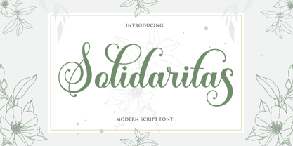 Solidaritas Script is a romantic and sweet calligraphy typeface with characters that dance along the baseline. It has a casual and yet elegant touch. It can be used for various purposes such as logos, wedding invitations, headings, t-shirts, letterhead, signage, lables, news, posters, badges etc. The fonts include OpenType features with stylistic alternates, ligatures and multiple language support. To enable the OpenType Stylistic alternates, you need a program that supports OpenType features such as Adobe Illustrator CS, Adobe Indesign & CorelDraw X6-X7, Microsoft Word 2010 or later versions. There are additional ways to access alternates/swashes, using Character Map (Windows), Nexus Font (Windows), Font Book (Mac) or a software program such as PopChar (for Windows and Mac). How to access all alternative characters, using Windows Character Map with Photoshop: https://www.youtube.com/watch?v=Go9vacoYmBw How to access all alternative characters using Adobe Illustrator: http://youtu.be/iptSFA7feQ0 How to use stylistic sets font in Microsoft Word 2010 or later versions: https://youtu.be/x1A_ilsBsGs
 - Marcel Merlina by Pixesia Studio,
$16.00 Introducing Marcel Merlina - A Lovely Chic Script Font Marcel and Marlina is now released as beautiful as romance is. This font-type gives you the vibe of an elegant and the classic-yet-so fresh kind of feeling. The curves and the flexibility of the fonts provide you the warm and familiar sense—as if you are reading letters from your beloved ones. Marcel and Marlina is meant to be endearing—portray the warmth of love. This font is designed to be used in such occasions which require high involvement of delightful emotion. This font would be best to be used in wedding invitations, love letters, and sincere greeting cards for someone so dear to you. FEATURES - Stylistic Alternates - Ligatures - PUA Encoded - Uppercase and Lowercase letters - Numbering and Punctuations - Multilingual Support - Works on PC or Mac - Simple Installation - Support Adobe Illustrator, Adobe Photoshop, Adobe InDesign, also works on Microsoft Word Hope you Like it. Thanks.
 - My Dream by Suza Studio,
$12.00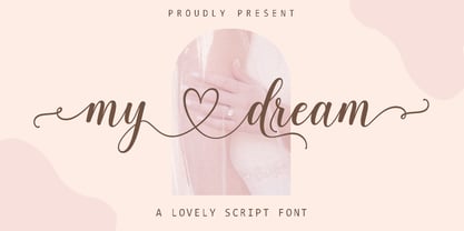 My dream is a romantic and sweet calligraphy typeface with characters that dance along the baseline. It has a casual and yet elegant touch. It can be used for various purposes such as logos, wedding invitations, headings, t-shirts, letterhead, signage, lables, news, posters, badges etc. The fonts include OpenType features with stylistic alternates, ligatures and multiple language support. To enable the OpenType Stylistic alternates, you need a program that supports OpenType features such as Adobe Illustrator CS, Adobe Indesign & CorelDraw X6-X7, Microsoft Word 2010 or later versions. There are additional ways to access alternates/swashes, using Character Map (Windows), Nexus Font (Windows), Font Book (Mac) or a software program such as PopChar (for Windows and Mac). How to access all alternative characters, using Windows Character Map with Photoshop: https://www.youtube.com/watch?v=Go9vacoYmBw How to access all alternative characters using Adobe Illustrator: http://youtu.be/iptSFA7feQ0 How to use stylistic sets font in Microsoft Word 2010 or later versions: https://youtu.be/x1A_ilsBsGs
 - Only You Sexy by LeType,
$49.90 Is the real romanticism over? This is not the intention achieved on a creation of the new version of Only You Pro. Develop a font that reflects the perfect union of sensuality and romanticism: Only You Sexy. It has a soft trait and delicated curves that evokes contemporary and musicality while has erotic and sensual references. The icons are a piece of show. They make reference to hipsters concept a recurring nostalgia and a recovery of an almost forgotten romanticism. Bring all that romance back. Bring the sensuality in your work and graphic texts. This font brings back everything that the true romanticism deserves: a font that allows you to write using beauty, sensuality and the sounds from the hearts. Only You Sexy is handmade, stylish, modern and multilingual. With more than 800 glyphs it is possible to get an infinity of combinations at your disposal. The font doesn't have PDF and works better in softwares that support the complete OpenType function.
 - Silent Noise Font Duo by Dora Typefoundry,
$19.00 Silent Noise has two font types, namely serif and handwritten script with a thin size, adding to the impression of elegance and class, both of these fonts have a subtle touch Silent Noise is versatile enough to add an elegant element to almost any project that requires a special touch of class.,perfect for casual type on greeting cards, illustrations, quotes, old branding, cover books, social media posts, packaging and many others :) Features : Uppercase & lowercase Numbers and punctuation Alternates & Ligatures Multilingual PUA encoded WHAT'S INCLUDED Silent Noise Serif Silent Noise Script Once you download this romantic, handwritten font duo you will be able to start creating straight away. Enjoy! We highly recommend using a program that supports OpenType features and Glyphs panels like many of Adobe apps and Corel Draw, so you can see and access all Glyph variations. This type of family has become the work of true love, making it as easy and fun as possible. I really hope you enjoy it! Thak you.
 - Pretty Heart Script by Suza Studio,
$12.00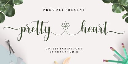 pretty heart script is a romantic and sweet calligraphy typeface with characters that dance along the baseline. It has a casual and yet elegant touch. It can be used for various purposes such as logos, wedding invitations, headings, t-shirts, letterhead, signage, lables, news, posters, badges etc. The fonts include OpenType features with stylistic alternates, ligatures and multiple language support. To enable the OpenType Stylistic alternates, you need a program that supports OpenType features such as Adobe Illustrator CS, Adobe Indesign & CorelDraw X6-X7, Microsoft Word 2010 or later versions. There are additional ways to access alternates/swashes, using Character Map (Windows), Nexus Font (Windows), Font Book (Mac) or a software program such as PopChar (for Windows and Mac). How to access all alternative characters, using Windows Character Map with Photoshop: https://www.youtube.com/watch?v=Go9vacoYmBw How to access all alternative characters using Adobe Illustrator: http://youtu.be/iptSFA7feQ0 How to use stylistic sets font in Microsoft Word 2010 or later versions: https://youtu.be/x1A_ilsBsGs