6,857 search results
(0.034 seconds)
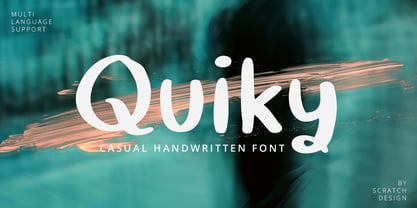
- Quiky by Scratch Design,
$10.00Introducing our Quiky! A playful, hand lettered font. It has smooth lines, a heavy weight, sweet curves and a lot of character that you can name it. Quiky suits for your design such as invitation design, stationery, branding, blog design, advertising design, card, art quote, home decor, book title, special events and more. This font also includes Latin Characters for language support. - Mignonette by Magpie Paper Works,
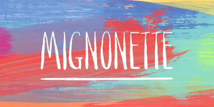
$46.00Hand-drawn with calligraphy ink and an antique dip pen, Mignonette is ready for all uses charming and rustic. She's heavy on the bottom and hairline at the top, and includes all sorts of additional numerals, currency figures as well as multi-language support. Mignonette shines in both correspondence and display; she has a particular affinity for offbeat and heartfelt branding. - Sensor by Tour De Force,
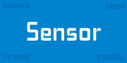
$25.00Square "robocap" typeface containing some little bit of experimental letters such as "t" or "f". Designed by Dusan Jelesijevic who wanted to make a font that would look heavy as building construction printed on your shirts. Even if it looks strong and stable, it is surprisingly very readable at small sizes which make it perfect for titles, posters or logotypes. - ALS Heino by Art. Lebedev Studio,
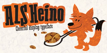
$63.00Heino is a decorative face with two font styles that was inspired by an old magazine lettering. Its original features include heavy serifs and tight spacing, particularly if you take the Black version. The bouncing letters create a cheerful impression, and would look nice in children’s books and magazines, on candy and food packages, holiday and circus posters and flyers. - Sponge Bear by Attractype,
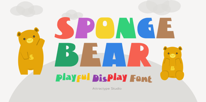
$12.00Sponge Bear is a playful heavy display font, this unique font is suitable for various designs that require thick text and designs with funny, cheerful, happy, spirit, adventure themes. The stylistics of the Sponge Bear font will change the vertical position of the letters randomly, this will make the series of words more unique and interesting. Have fun creating with Sponge Bear. - Zanderley by Greater Albion Typefounders,
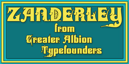
$15.00Zanderley was inspired by a small, almost random sample from a turn-of-the-last- century calligrapher’s instructional manual. It’s a bit Roman, mixed with a little blackletter and a lot of random decorative fun.The family consists of two typefaces- Zanderley regular is a heavy, friendly an d fun display face. They are well complimented by Zanderley initials. Try them out soon! - Valkyrie by Brave Lion Fonts,
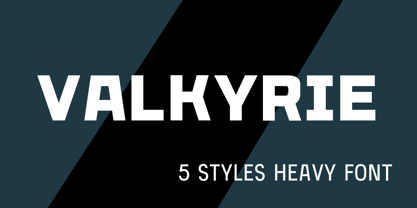
$9.49Valkyrie was designed following the idea to have realy strong letters taking a lot of room. This results in a heavy appearance and gives Valkyrie its special look. It is possible to give it an even more uniform look by using the alternate characters. What can a strong font be used for? Valkyrie hopes to break rules. Use its power. - WA Flat Brush by Wing's Art Studio,
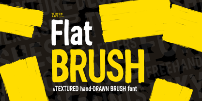
$18.00A versatile textured font hand-made with black ink and brush. The combination of heavy black ink and a well used sable brush resulted in this versatile type, readable in sizes large and small, yet with a distinctly hand-made and textured feel. Great for posters, headers, titles and more. Features uppercase and lowercase letters with language support, numerals, punctuation and symbols. - Hebrew Moses Std VF by Samtype,
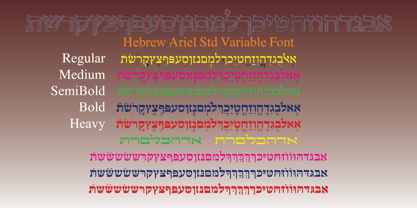
$120.00his is a beautiful, modern, and super readable font. You can use it in any kind of text, from folders to prayer books. This font is especially good for school and kid's books. This font also has modern punctuation: shevana, kamats katan, dagesh hazak, and holam chaser. This is a Variable font! One font with 5 styles (Regular, Medium, SemiBold, Bold, Heavy) - Battleslab by Kostic,
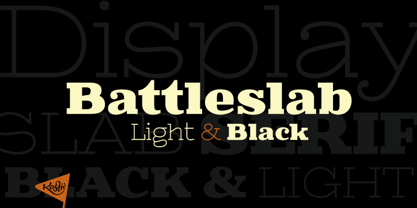
$40.00Battleslab is a slab serif made for setting few words in large sizes. Two heavily contrasted weights work well when combined, with its mono-line wide light and heavy black it is perfect for making that "one-two punch" in headlines or logotypes. Display oriented Battleslab derived from Battlefin Family (which is much more comprehensive with its ligatures, italics and SC). - Solido Compressed by DSType,
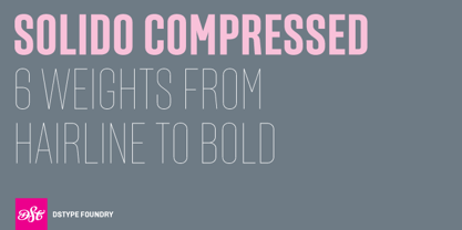
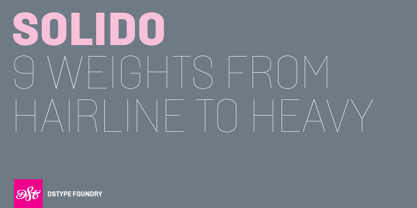
$40.00 - Solido by DSType,
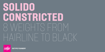
$40.00 - Solido Constricted by DSType,
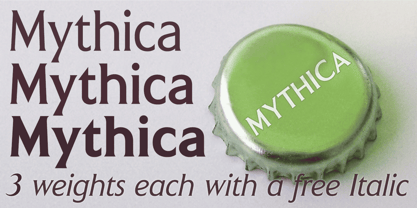
$40.00 - Mythica by K-Type,
$20.00 - Winnetka JNL by Jeff Levine,
$29.00Winnetka JNL was inspired by Cooley Antique Tuscan Condensed - a printer's wood type manufactured in 1859 by J.G. Cooley. Given an additional hand-made treatment, the lettering resembles characters made from cut paper. - Political Poster JNL by Jeff Levine,
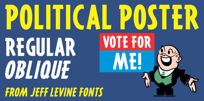
$29.00 - Solido Compact by DSType,
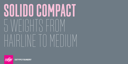
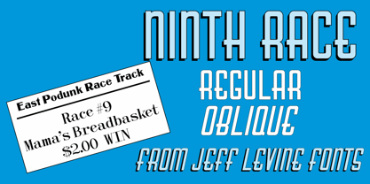
$40.00 - Ninth Race JNL by Jeff Levine,
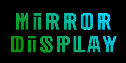
$29.00 - Mirror Display Bold by Mom,
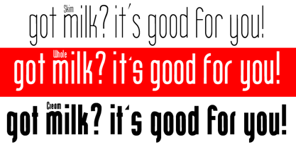
$19.00 - Got Milk by Just My Type,
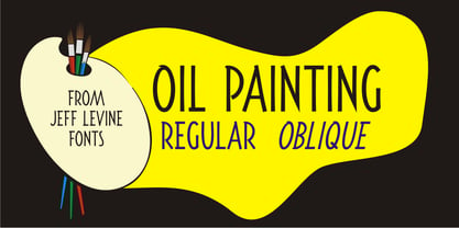
$20.00 - Oil Painting JNL by Jeff Levine,
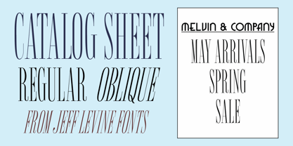
$29.00 - Catalog Sheet JNL by Jeff Levine,
$29.00 - News Event JNL by Jeff Levine,
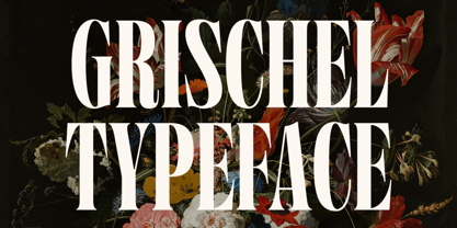
$29.00 - Grischel by Martype co,
$18.00 - Walburn by Shinntype,
$39.00 - Klutz AOE Pro by Astigmatic,
$19.00The Klutz AOE Pro Family was inspired by the plethora of naive hand drawn lettering becoming commonplace in modern advertising. What I hadn't seen was a family of hand drawn typefaces, in a range of widths and weights, with both alternate capitals as well as small caps character sets...and so Klutz Pro was born. The letterforms started with a few letters my daughter had drawn which I expanded on from there. Pulling from inspirations in retro cartoon titling and modern hand lettering playfulness, the full font was born, with weights and width to follow. Quirky, eclectic, and just a bit ridiculous, it lends itself to a range of design typesetting - although I must confess, even though it all began with the Regular width, the Extra Condensed styles are my personal favorites. What's your favorite? - Ryo Gothic PlusN by Adobe,
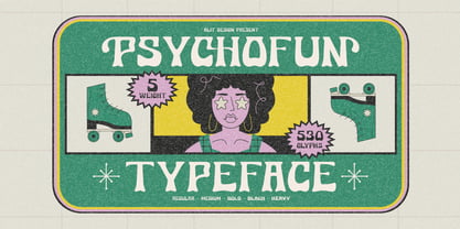
$79.00Ryo Gothic is a new Japanese sans serif (or gothic) kana typeface design. Created by Adobe type designer Ryoko Nishizuka , the typeface has a bright and speedy calligraphic touch and can be used to compose readable body text, as it gives a calm and well-controlled color to the typeset page. Supplied in OpenType format, each Ryo Gothic font includes hiragana, katakana and some punctuation marks and should be combined with the kanji and other glyphs in existing Japanese gothic typefaces that contain full character sets. This typeface family is available in seven weights--extra light, light, regular, medium, bold, heavy, and ultra heavy--which allow end users to select the best-matching weight for their favorite full-set Japanese gothic typeface. Creative professionals using the Japanese version of Adobe InDesign may use that program's Composite Font tool to easily combine Ryo Gothic with other typefaces. - Psychofun by Alit Design,
$15.00Introducing Psychofun Typeface Psychofun Typeface is designed with a retro style concept that has a unique and cool shape. It is suitable for header text fonts, book covers and designs that have a retro and groovy concept, besides that Psychofun Typeface is also very good when used for body text. Psychofun Typeface has 5 families from Regular to Heavy. Display Serif typefaces such as “Psychofun Typeface” are very easy to apply to any design, especially those with an retro, groovy and classic concept, besides that this font is very easy to use both in design and non-design programs because everything changes and glyphs are supported by Unicode (PUA). The Psychofun Typeface contains 530 glyphs with many unique and interesting alternative options. Plus, there's a cool display serif font family for header and description text from regular to heavy. In the poster preview all the letters are in the Psychofun Typeface. - PF Mellon by Parachute,
$35.00PF Mellon is a modernist variable grotesque with mixed roots. Its unconventional aesthetic is the product of an exploration into the art of emphasizing titles, headlines and text in captivating and unpredictable ways. Contrary to conventional practices of highlighting text with heavier weights, PF Mellon proposes an intriguing new scheme based on striking and attention-grabbing compositions of narrow and extended letterforms- even when set in lowercase. Part geometric and part grotesque, PF Mellon’s expressionist alphabet and extravagant style challenge conventions of visual culture in an Art Deco-like manner. PF Mellon’s rebellious idiosyncrasy takes its cues from the eccentric personality of our popular PF Venue, an earlier geometric sans serif characterized by its daring combinations of non-uniform structures. PF Mellon’s basic design skeleton was influenced by nineteenth and early twentieth century condensed sans serif typefaces such as Stephenson Blake's Grotesque No.77 and ATF’s Alternate Gothic, adding an extra contrast to the thickness of strokes. PF Mellon is also available as a variable font format which you may request it free of charge from Parachute® once you purchase the whole type family. - Amazónica - Personal use only
- HIGHUP ITALIC PERSONAL USE - Personal use only
- Olympus Mount - Personal use only
- Ordinatum Medium - Personal use only
- Chesterfield - Personal use only
- SchilderGrotesk - 100% free
- Russian - 100% free
- Slim Chef - Personal use only
- Bistecca - Personal use only
- Squareworm - Personal use only
- DENIAL - 100% free
