10,000 search results
(0.043 seconds)
- Shirah Joie by LightHouse,
$49.00The main challenge with Shirah Joie was how not to design just another monoline font, and how to add liveliness while condensing the letters a little bit. Shirah Joie is an OpenType/TTF Unicode font. - Progreso by CastleType,
$59.00 Progreso is a condensed, unicase, serif gothic type design inspired by the hand-lettering on Russian posters from the 1920s. Supports most European languages, including modern Greek and most languages that use the Cyrillic alphabet.
 - Sailfin by ActiveSphere,
$30.00 Sailfin is a condensed geometric typeface, and works best in text and display applications, such as headline, posters, signage, magazine, product branding, corporate branding, logos and titles. Several alternate characters are included in this typeface.
 - Gravtrac by Typodermic,
$11.95 Gravtrac is a slab serif headliner designed to deliver solid punches while taking up as little horizontal space as possible. Inspiration comes from mid twentieth century classics: Univers 59 Ultra-Condensed, Helvetica Inserat and Compacta. It’s all about flat sides, a steady rhythm and tight, precision curves. The widest style of Gravtac is Condensed—compact, yet a comfortable read, available in 7 weights from Ultra-Light to Heavy. Gravtrac Compressed is probably the width where most typefaces would quit. It's narrow enough for most...but not for you. That’s why we have Gravtrac Crammed. It’s audaciously narrow—perfect for times where you want the reader to slow down and truly pay attention to the message. Gravtrac Crushed is devilishly slender. Try it with wide tracking for a stark, opulent look. All styles are also available in obliques varying from 7 to 10 degrees—58 styles in total. Gravtrac includes Opentype fractions, numeric ordinals, a breadth of currency symbols and old-style (lowercase) numerals. Every skilled designer already has slab serif typefaces in their stockpile but some of us have the need to squeeze. Most Latin-based European, Vietnamese, Greek, and most Cyrillic-based writing systems are supported, including the following languages. Afaan Oromo, Afar, Afrikaans, Albanian, Alsatian, Aromanian, Aymara, Azerbaijani, Bashkir, Bashkir (Latin), Basque, Belarusian, Belarusian (Latin), Bemba, Bikol, Bosnian, Breton, Bulgarian, Buryat, Cape Verdean, Creole, Catalan, Cebuano, Chamorro, Chavacano, Chichewa, Crimean Tatar (Latin), Croatian, Czech, Danish, Dawan, Dholuo, Dungan, Dutch, English, Estonian, Faroese, Fijian, Filipino, Finnish, French, Frisian, Friulian, Gagauz (Latin), Galician, Ganda, Genoese, German, Gikuyu, Greenlandic, Guadeloupean Creole, Haitian Creole, Hawaiian, Hiligaynon, Hungarian, Icelandic, Igbo, Ilocano, Indonesian, Irish, Italian, Jamaican, Kaingang, Khalkha, Kalmyk, Kanuri, Kaqchikel, Karakalpak (Latin), Kashubian, Kazakh, Kikongo, Kinyarwanda, Kirundi, Komi-Permyak, Kurdish, Kurdish (Latin), Kyrgyz, Latvian, Lithuanian, Lombard, Low Saxon, Luxembourgish, Maasai, Macedonian, Makhuwa, Malay, Maltese, Māori, Moldovan, Montenegrin, Nahuatl, Ndebele, Neapolitan, Norwegian, Novial, Occitan, Ossetian, Ossetian (Latin), Papiamento, Piedmontese, Polish, Portuguese, Quechua, Rarotongan, Romanian, Romansh, Russian, Rusyn, Sami, Sango, Saramaccan, Sardinian, Scottish Gaelic, Serbian, Serbian (Latin), Shona, Sicilian, Silesian, Slovak, Slovenian, Somali, Sorbian, Sotho, Spanish, Swahili, Swazi, Swedish, Tagalog, Tahitian, Tajik, Tatar, Tetum, Tongan, Tshiluba, Tsonga, Tswana, Tumbuka, Turkish, Turkmen (Latin), Tuvaluan, Ukrainian, Uzbek, Uzbek (Latin), Venda, Venetian, Vepsian, Vietnamese, Võro, Walloon, Waray-Waray, Wayuu, Welsh, Wolof, Xavante, Xhosa, Yapese, Zapotec, Zarma, Zazaki, Zulu and Zuni.
 - FranklinGothicHandLight by Wiescher Design,
$39.50 FranklinGothicHandLight is part of a series of hand-drawn fonts from way back in time – before computers changed the way we worked. When I was in advertising – before computers – a very time consuming part of my daily work was sketching headlines. I used to be able to sketch headlines in Franklin Gothic, Times, Futura, Helvetica and several scripts. We had a kind of huge inverted camera – which we called Lucy. We projected the alphabet onto a sheet of transparent paper, outlined the letters with a fineliner and then filled them in. It was very tedious work, but the resulting headline had its own charm and we had a permanent race going on who was best and fastest. I won most of the time! They used to call me the fastest "Magic Marker" this side of the Atlantic. Great days, just like today! Your sentimental type designer from the past Gert Wiescher
 - Vesta by Linotype,
$29.99 In the late 1990s Gerard Unger won the assignment to design the signage system for the Holy Year celebrations to be held in Rome in 2000. The system he developed in cooperation with the design agency n|p|k used a classically inspired serif typeface, but the earlier proposals included a sans-serif, which became Vesta (2001). Vesta is a versatile family that can be used as a display face alongside Unger's serif faces Gulliver, Capitolium or Coranto; it can also be used on its own, even in longer texts. Vesta is narrower and therefore more economical than some commonly used sans serifs such as Arial and Helvetica; there is also a noticeable contrast between thick and thin parts, which makes it more lively. Vesta is to be extended with narrow versions, small capitals and old style numerals, along with some special versions for headlines.
 - FranklinGothicHandDemi by Wiescher Design,
$39.50 FranklinGothicHandDemi is part of a series of hand-drawn fonts from way back in time – before computers changed the way we worked. When I was in advertising – before computers – a very time consuming part of my daily work was sketching headlines. I used to be able to sketch headlines in Franklin Gothic, Times, Futura, Helvetica and several scripts. We had a kind of huge inverted camera – which we called Lucy. We projected the alphabet onto a sheet of transparent paper, outlined the letters with a fineliner and then filled them in. It was very tedious work, but the resulting headline had its own charm and we had a permanent race going on who was best and fastest. I won most of the time! They used to call me the fastest "Magic Marker" this side of the Atlantic. Great days, just like today! Your sentimental type designer from the past Gert Wiescher
 - CF Nixt by CozyFonts,
$20.00 The Nixt Font Family is a new font with currently seven styles. As an alternative to Helvetica, Arial, Gill Sans, Futura, & Gotham, Nixt has a similar design aesthetic to those aforementioned in that its design, structure, and feel crosses decades of appeal. From Mid-Century, through the stark '60s, decades of succeeding modern architecture through the turn of the 21st Century, Nixt's glyphs are timeless, clear, ultra-legible in all styles and weights. Best use in Advertising, Branding, Signage, Architecture, Fashion, Posters, Headlines, and By-Lines, Print & Digital, and of course Labels. There are currently, at first release, 7 Styles: Extra Light, Light, Regular, Italic, Book, Bold, & Extra Bold. There are more in process and will be added when completed. The inspiration behind the Nixt Fonts is the Bauhaus, Mid Century Industrial Design, Art Deco through Moderne Era Architecture, American Pottery and American Design of The Twentieth Century.
 - Extra Extra by Comicraft,
$19.00 EXCLUSIVE! Read all about it! The latest scoop from Comicraft is sure to be in all the newspapers today! The Times are a changin' -- comic book letterers everywhere can say a font farewell to typesetting the front pages of Planets and Bugles in Helvetica, Verdana or Gill Sans! Superhero's Pal, Johnny "Roshell" Olsen, was up all night writing copy for the late-night edition, making sure that your newspaper headlines and copy have a warm, pen lettered look... some might say a Rosen-glow! Put a little Extra Extra in your bylines and maybe there's a Pulitzer and an Eisner in your future! Not ready to purchase? Get ExtraExtra Engraved free with any purchase, or by subscribing to our newsletter at the bottom of this page. Features Seven fonts (Regular, Italic, Bold, Bold Italic, Heavy, Heavy Italic & Engraved) with upper and lower case alphabets.
 - Typologic by Ahmad Jamaludin,
$17.00 Introducing Typologic, a font that effortlessly fuses geometric simplicity with the vibrant pop culture styles of the swinging 60s and 70s. This versatile typeface offers not just one, but 8 distinct font families, each with its own unique character. You'll find Condensed, Normal, Semi Expanded, Expanded, and stylish shadow versions. But that's not all—when you choose Typologic, you also get a treasure trove of 56 FREE BONUS ASSETS, featuring retro mascot illustrations that perfectly complement your creative projects. Features: Typologic Main FIle 56 free bonus assets that are Retro Mascot Illustrations Has 8 fonts : Condensed, Normal, Semi Expanded, Expanded, Condensed Shadow, Normal Shadow, Semi Expanded Shadow, Expanded Shadow Instructions (Access special characters, even in Cricut Design) Unique Letterforms Works on PC & Mac Simple Installations Accessible in Adobe Illustrator, Adobe Photoshop, Microsoft Word even Canva! PUA Encoded Characters. Fully accessible without additional design software. Come and say hello over on Instagram! Thank you, Dharmas Studio
 - Korde by Alit Design,
$14.00 Introducing Korde Typeface Korde font is designed with a retro style concept that has a unique and cool shape. It is suitable for header text fonts, book covers and designs that have a retro elegant concept, besides that Korde font is also very good when used for body text. Korde font has 26 families from Thin to Heavy and Condensed. Sans Serif typefaces such as “Korde typeface” are very easy to apply to any design, especially those with an retro and classic concept, besides that this font is very easy to use both in design and non-design programs because everything changes and glyphs are supported by Unicode (PUA). The Korde typeface contains 549 glyphs with many unique and interesting alternative options. Plus, there's a cool sans serif font family for header and description text from thin to heavy and thin condensed to heavy condensed. In the poster preview all the letters are in the Korde typeface.
 - Size by SD Fonts,
$34.00 Retro style is hip, so are early 20th century poster fonts. Size is based on these extra condensed letter forms. In the 19th century the need to communicate commercial messages on limited poster space brought up extremely condensed fonts creating a new typographical look. Since not really legible in small sizes these fonts nearly disappeared with the change in the commercial communication in the 20th century. For a couple of years now, these extra condensed fonts have a revival copying the exact historical appearance of its predecessors. Size, though also seeking the inspiration in the historical draft, furthermore aims to interpret this compressed look in a more vivid way by not closing in on the open counters of the round letters, but having its stroke endings slightly curved. Since other characters are defined by straight strokes, Size displays a look more vital and candid, but still distinct, compared to its historical predecessors.
 - Neue Reman Sans by Propertype,
$45.00 Neue Reman Sans 1.0 --- New Update! CONDENSED - SEMI CONDENSED - SEMI EXPANDED - EXPANDED It has 70 fonts style in total family + 2 Variable Style. --- It is a Roman, Humanist, Grotesk and Geometri sans serif family. The family comes in 7 weights with matching italics + Variable Font File and includes multilingual latin characters. Neue Reman Sans contains 306 glyphs - this is the first version of Neue Reman Family with standard ligatures and a variety of figures and fractions. We create Neue Reman typeface to use in multipurpose project such as on website, systems, printing, embedding, servers, screens, display, digital-ads, branding, logos, titles, headlines, teks, and everything else. This font is a project that we are working on for the long term. We has updating the Condensed and Expanded versions. Then we plan to continue working on Latin Pro, Greek and Cyrillic. It all will be updated gradually. So, hope you would like the first version of Neue Reman Sans Serif Typeface. Thank you very much.
 - BeachType - 100% free

- ÉconoSans Pro by Ingo,
$41.00 The most space-saving sans serif This font saves more space than any of its kind! Slim proportions, but not “condensed” Characters which nearly touch Sparse ascenders and descenders Distinct forms How close to each other can the characters of a font get? Theoretically, as close as you want. But obviously, the words should still be legible. And as any designer knows, body clearance of characters also depends on other parameters such as point size and line spacing. In practice, there are always situations in which as much information as possible has to be positioned in as little space as possible. The ingoFont ÉconoSans is made for exactly this purpose. Even the name of the font implies its function: French for the infinitive “to save” is “économiser.” Now if that doesn’t sound good… The shapes of the upper and lower case letters are completely matter-of-fact, the way a modern font has got to be. The letters c e, and s are wide open to their neighbors. An especially distinguished trait of this font is the design of the “triangular” characters v w y x k z and A V W Y Z K X M N. And the open form of B R and P is also not typical in a sans serif. The distance between letters is kept tight and often the characters nearly touch, but only nearly. With ÉconoSans you gain approximately 20% more text in a line than with »Tahoma«, and even still more than 10% compared to »Helvetica«. ÉconoSans also includes tabular figures as well as ligatures. Among the ligatures, the double mm is especially unusual and is hardly familiar, but can contribute greatly to saving space without catching the reader’s eye.
 - Arkitech - Personal use only

- Peppa Pig - Personal use only

- Bubble Garden by Four Lines Std,
$15.00 Introducing "Bubble Garden" Font - Where Whimsy Meets Readability! Bubbling with Charm: "Bubble Garden" captures the essence of joy and creativity. Its rounded, bubble-inspired letters are like a burst of laughter on your screen or paper. Whether it's for party invitations, children's books, social media content, posters, sticker, thubnail or anything that needs a dose of fun, this font has got you covered.
 - Courage Union by Invasi Studio,
$16.00 Inspired by vintage sportswear. The Courage Union font is designed in slab serif style with a vintage athletic feel. There are six varieties: regular, rough, halftone, outline, outline rough, and outline halftone. Ensuring carefully crafted styles result from the use of this font. This font can be used for anything from logos to social media content to cheering for your favorite sports team.
 - Customs Agent JNL by Jeff Levine,
$29.00 The hand lettered, condensed stencil title on a movie poster for the 1950 film “Customs Agent” inspired both the digital typeface and the font’s name. Customs Agent JNL is available in both regular and oblique versions.
 - New Thin Roman JNL by Jeff Levine,
$29.00 The 1912 publication "Essentials of Lettering" has an example of a hand lettered, condensed spurred serif design called "Compressed Roman". This is now available digitally as New Thin Roman JNL in both regular and oblique versions.
 - Local News JNL by Jeff Levine,
$29.00 The hand lettered title for the 1954 film “Power of the Press” was done in a condensed sans serif type style that is now available digitally in both regular and oblique versions as Local News JNL.
 - Alina by Melvastype,
$35.00 Alina is a laid-back condensed script font. Alina includes OpenType ligatures to all lowercase double letters to make them subtly differ from each other. So Alina feels a little bit more hand lettered and lively.
 - Gemstone JNL by Jeff Levine,
$29.00 A late-19th Century song book entitled "Gems of Scotland - A Beautiful Collection of Scottish Songs" had the words "Gems of Scotland" hand lettered in an ornate, condensed type style now reproduced digitally as Gemstone JNL.
 - Prisom by Illuminaut Designs,
$10.00 I really wanted to make my own condensed typeface for memes and such. I think i have succeeded. This typeface is so average looking that no one would suspect that it is in fact very radical.
 - Linja by Fenotype,
$14.95 Linja is an elegant ultra condensed font. It's best for display use in magazines, books & posters. Linja font was originally designed in 2002. Now it's been remade with the complete character set and six different versions.
 - Nouveau Spur JNL by Jeff Levine,
$29.00 The condensed, spur serif hand lettering for the title on the 1906 sheet music cover of “Gee! But this is a Lonesome Town” inspired Nouveau Spur JNL; which is available in both regular and oblique versions.
 - Gallivant by Jonahfonts,
$39.00 Slightly condensed with a taller lowercase, Gallivant carries itself very well. Similar to classic thick-and-thin san-serif faces with stems slightly facing inward. Note: OpenType variants may only be accessible via OpenType-aware applications.
 - Hadrian LP by LetterPerfect,
$39.00 Hadrian Bold pushes the limits for an extra-condensed titling face. Though remaining in the tradition of the 20th-century 'grotesque' designs, its heavy verticality and tight spacing demand attention for headlines at virtually any size.
 - TOMO Dora Sans by TOMO Fonts,
$15.00 TOMO Dora is a new face designed by TOMO FONTS. Dora is a condensed style-driven sans serif typeface made by hand, adding unique and a sweet touch. A family of 4 styles + awesome icons! Enjoy!
 - Summerville JNL by Jeff Levine,
$29.00 Summerville JNL is a condensed Art Nouveau slab serif design inspired by a typeface called “Superior” [found in the Barnhart Brothers & Spindler type specimen book circa 1897], and is available in both regular and oblique versions.
 - Automotive Service JNL by Jeff Levine,
$29.00 A 1930s print ad for Miller Tires featured lettering in a condensed slab serif design. This provided a design model for the digital typeface Automotive Service JNL, which is available in both regular and oblique versions.
 - SoleaBetween - Unknown license

- Bevan by Wooden Type Fonts,
$20.00 Modern text font, medium weight.
 - RosarGrad by Ingrimayne Type,
$9.95 RosarGrad is a simple but elegant calligraphic face with six style: plain, italic, medium, medium italic, bold, and bolditalic. It was inspired by hand lettering on a graduation picture from the late 1960s.
 - Peachboys Handwritten Font by Maulana Creative,
$13.00 Peachboys is a modern handwritten display font. With slanted medium contrast stroke, fun character. To give you an extra creative work. Peachboys font support multilingual more than 100+ language. This font is good for logo design, Social media, Movie Titles, Books Titles, a short text even a long text letter and good for your secondary text font with sans or serif. Make a stunning work with Peachboys font. Cheers, Maulana Creative
 - Manforest by Maulana Creative,
$12.00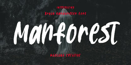 Manforest is a brush handwritten display font. With medium brush stroke, fun character. To give you an extra creative work. Manforest font support multilingual more than 100+ language. This font is good for logo design, Social media, Movie Titles, Books Titles, a short text even a long text letter and good for your secondary text font with sans or serif. Make a stunning work with Manforest font. Cheers, Maulana Creative
 - Befrung by IbraCreative,
$17.00 Berfung is an elegant and commanding black condensed sans-serif font that exudes a sense of modern sophistication. With its tall, slender letterforms, this typeface makes a bold statement, offering a perfect balance between space efficiency and visual impact. The even stroke width and sharp edges contribute to its contemporary aesthetic, while the condensed design allows for efficient use of space, making it ideal for impactful headlines, striking signage, and sleek branding applications. Berfung’s distinctive presence and streamlined structure make it a versatile choice for design projects that demand a refined, edgy, and space-conscious typographic solution.
 - URW DIN Arabic by URW Type Foundry,
$99.99 The digital outline fonts, DIN 1451 Fette Engschrift and Fette Mittelschrift were created by URW in 1984 and are the basis for all DIN font families. Both typefaces were designed for the URW SIGNUS system and were mainly used for the production of traffic signs. They have since become so popular that we have developed a complete Arabic DIN family together with Boutros Fonts. The Arabic characters have been designed to harmonize with our Latin URW DIN and come in 24 individual styles, which consist of 8 weights from Thin to Black and three different widths: Regular, Semi Condensed, and Condensed.
 - Botham Grotesque by Aiquitype,
$15.00 Introducing Botham Grotesque, a versatile typeface meticulously crafted to embody the essence of modernity and sophistication. This exquisite font, classified under the renowned Grotesque category, boasts four distinct styles that seamlessly blend form and function. Its clean lines and balanced proportions lend a professional, making it an ideal choice for a myriad of applications, from corporate branding to editorial design. What’s Include ? 1. Uppercase, Lowercase, Number and Punctutation 2. Ready 4 Style : Condensed, Semi Condensed, Reguler and Semi Ektended 3. Multilingual Support 4. Ligature and Alternate 5. Installed on Mac and Windows 6. PUA Encode Enjoy our Font.


