10,000 search results
(0.053 seconds)
- Gratelos by Maulana Creative,
$11.00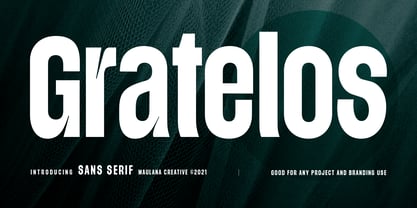 Gratelos is a modern sans serif display font. With condensed bold stroke, fun character with some of ligatures. To give you an extra creative work. Gratelos font support multilingual more than 100+ language. This font is good for logo design, Social media, Movie Titles, Books Titles, a short text even a long text letter and good for your secondary text font with script or signature typeface. Make a stunning work with Gratelos font. Cheers, MaulanaCreative
 - Pinatas Masters by Piñata,
$17.00 Original Foundry: TypeType Original name: TT Masters Pinatas Masters is a very emotional typeface. This typeface will add to your design sincerity and warmth. Pinatas Masters typeface consist of 4 different subfamilies: Pinatas Masters, Pinatas Masters Birds, Pinatas Masters Rough and Pinatas Masters Condensed. Each subfamily consists of 5 styles: Thin, Light, Regular, Bold and Black. Scope of typeface: DIY, handmade stuff, interior design, infographics, graphic design, logotypes, packaging, design of exhibitions, presentations.
 - ArgentaBobbed by Ingrimayne Type,
$5.00ArgentaBobbed is an informal, "hand-printing" font with little balls that some people, often children, like to add to the ends of strokes. Maybe it could be called a ball-serif or dot-serif font. The family has six members. Each of the two weights, plain and bold, have oblique styles. There are also two variants: ArgentaBobbed-Wig is squiggly handwriting with the dots, and ArgentaBobbed-Squish is condensed handwriting with dots. - MC Kagami by Maulana Creative,
$15.00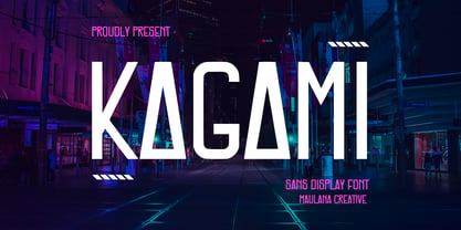 Kagami is a modern sans serif display font. With bold condensed stroke and fun character. To give you an extra creative work, Kagami font support multilingual more than 100+ language. This font is good for logo design, Social media, Movie Titles, Books Titles, a short text even a long text letter and good for your secondary text font with signature or script typeface. Make a stunning work with Kagami font. Cheers, Maulana Creative
 - MC Bigly by Maulana Creative,
$22.00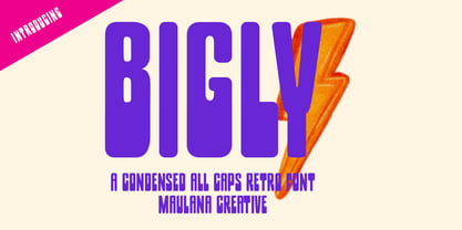 Bigly is a condensed retro font. With bold stroke, fun character with a bit of ligatures and alternates. To give you an extra creative work. Bigly font support multilingual more than 100+ language. This font is good for logo design, Social media, Movie Titles, Books Titles, a short text even a long text letter and good for your secondary text font with script or serif. Make a stunning work with Bigly font. Cheers, Maulana Creative
 - Garmint by Maulana Creative,
$13.00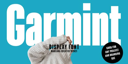 Garmint is a modern sans serif display font. With bold condensed stroke and fun character. To give you an extra creative work, Garmint font support multilingual more than 100+ language. This font is good for logo design, Social media, Movie Titles, Books Titles, a short text even a long text letter and good for your secondary text font with signature or script typeface. Make a stunning work with Garmint font. Cheers, MaulanaCreative
 - Wesna by Type Salon,
$41.90 Typeface Wesna was created as a reflection of the current state of design whose starting point is rooted in the letterings from the Slovenian posters from the interwar period. Bold strokes, condensed letterforms, sharp stroke joints and unique features are combined in the typeface. Wesna preserves the Slovenian typography heritage and establishes the connection between the past and the present through new digital formation. Available in 3 weights, italics in Latin & Cyrillic.
 - Rustico Farmero by Kaligra.co,
$19.00 Rustico Farmero is a Textured ultra condensed Type Family that includes 3 styles: Regular, Rounded & Vintage versions. This family is an All-Caps family with each version contains a textured (Aged) and alternates. With 3 styles and iconic alternates, this font can give a diverse set of aesthetics. With light giving a much more simple modern vintage look, fashionable feel and the bold giving a more rugged vibe for Simple strong and mature design look.
 - Knocky by Jehoo Creative,
$23.00 Knocky is a display typeface that is complete and versatile with a bold round condensed look with unique flexibility. We've added solid alternatives to letters, numbers, and some symbols, plus an outline style that will make the graphic look unique and stand out. With 8 styles and more than 530 glyphs in each. knocky has multi-language support, it will be perfect for many projects from editorial design to branding, advertising, publicity and digital.
 - ZT Bros Oskon 90 s by Zelow Type,
$13.00 ZT Bros Oskon 90s is a captivating typographic creation that seamlessly blends the aesthetic charm of the 1990s retro era with a modern touch. With unmatched serif elegance and a unique 90s style, this font offers 72 variations, including sharp Condensed forms, graceful Expanded, and captivating italic styles. Every character in ZT Bros Oskon 90s is meticulously crafted, creating a vintage ambiance that is truly enchanting. Featuring 6 font weights ranging from Extra Light to Bold, this font provides you with the flexibility to create a wide range of striking and memorable designs. Features of ZT Bros Oskon 90s: 72 Unique Variations Aesthetic Retro Vibes from the 1990s Elegant Serif Style Condensed, Expanded, and Italic Forms 6 Font Weights: Extra Light, Light, Regular, Medium, Semi-Bold, Bold Exceptional Creative Versatility ZT Bros Oskon 90s is the perfect choice for graphic design projects, branding, posters, and other promotional materials that require a captivating retro touch. Unleash limitless creativity with this font and infuse a nostalgic 1990s vibe into every one of your creations. ZT Bros Oskon 90s has 6 free styles, you can get them on my GUMROAD I hope you have fun using ZT Bros Oskon 90s. Thanks for using this font ~ Zelowtype
 - Fux by Rodrigo Fuenzalida,
$25.00 Fux is a condensed, neutral looking font, that features and extended ligature set, small caps, old style numbers and stylistic alternates, that should help to fulfill all your type setting needs. Is perfect to be used as big display and title font, and works very good in small sizes and paragraphs.
 - MaryTodd by TipoType,
$15.00 MaryTodd was created for small texts with a variety of hierarchies. Is condensed to save space. It has a rich set of glyphs: small caps, old style figures, monospaced numbers, numerators and denominators for fractions, etc. It is ideal for organizing and presenting information in a clear and simple way.
 - Alphabeta - Unknown license

- Fenomen Sans by Signature Type Foundry,
$38.00 Geometrical drawing of Fenomen Sans typeface goes back to the roots of the Bauhaus aesthetics and the entire architectural and design avant-garde of the 20th century. It is still a symbol of functional rationality, clean aesthetics in relation to shape, and of progressive thinking. Its popularity is timeless and permanent. The set contains eight basic alphabets of a square pattern, eight semicondensed, eight condensed and eight extremely condensed alphabets, all in Latin and Cyrillic alphabets. Every font of the family has four types of numerals, small caps and variant letters. The typesetting can fluently use all fonts simultaneously. The typeface originated between the years 2011–2014 and was subjected to a series of tests for the fluent legibility of narrow fonts even in extreme conditions. Narrow fonts provide this set with the maximum use also for newspaper typesetting. The typeface has an elegant, delicate design in thin fonts and sufficient legibility in bold. Mutual contrast produces creative tension. Font name acronyms described: SCN = SemiCondensed CN = Condensed XCN = ExtraCondensed
 - Core Sans DS by S-Core,
$20.00 Core Sans DS is a rounded version of Core Sans D and a modern interpretation of condensed sans-serif typeface designed by S-Core and the whole family consists of 2 widths (Condensed, Normal), 7 weights (Thin, Light, Regular, Medium, Bold, Heavy, Black) with their corresponding italics. Core Sans DS features a condensed geometric construction and has a large x-height which enhances legibility. The family is ideal for signage, headline as well as body text. Core Sans DS is a part of the Core Sans Series such as Core Sans N SC, Core Sans N, Core Sans NR, Core Sans M, Core Sans G,Core Sans A, Core Sans GS and Core Sans ES. Letterform in this type family is simple, clean and highly readable. The spaces between individual letter forms are precisely adjusted to create the perfect typesetting. Core Sans DS supports complete Basic Latin, Cyrillic, Central European, Turkish, Baltic character sets. Each font includes proportional figures, tabular figures, numerators, denominators, superscript, scientific inferiors, subscript, fractions and case features.
 - Mantika News by Linotype,
$67.99 Mantika News™, from German designer Jürgen Weltin, was designed to expand the Mantika super family with text and display typefaces for setting newspapers and periodicals. The suite of typefaces is comprised of regular and bold designs, with italic counterparts, for setting continuous text, and light and extra bold versions for setting larger sizes in headlines, sub heads, pull quotes and decks. The typefaces intended for text copy were designed with shared character widths, so that changes can be made in typeface choice without disrupting line endings or column length. The display designs have a slightly smaller x-height and shorter ascenders creating a more elegant demeanor while ensuring compact multi-line display copy. In addition, fonts of Mantika News have a large Monotype W1G (World Glyph Set 1) character set enabling the setting of Greek, Cyrillic and over 20 Eastern and Western European Latin-based languages. Proportional figures are available, in the OpenType® fonts, as an alternative to the tabular designs.
 - Cora by TypeTogether,
$49.00 Cora is a sans serif with an experimental bent, offering a large x-height, some contrast of stroke weight, and capitals inspired by classical lettering. The large x-height gives it a voice with a little more volume so that those in the back of the room have no trouble hearing. Because the letters seem slightly large, Cora remains clear at smaller point sizes. It is a typeface intended to perform well on screen without losing its attraction in print and the nature of its shapes allows for condensation or expansion without becoming severely distorted. The uppercase exhibits classical proportions found in ancient Roman inscriptions, which provides opportunities for setting titles in all caps. Cora Opentype Pro has a full range of numerals for every use, small caps, the most common open type features and supports many languages that use the latin extended alphabet. It is available in a range of three weights plus Italics. CoraBasic is a reduced version of Cora. It is still an OT-font but without any particular features except of a set of ligatures, class-kerning and language support including CE and Baltic.
 - Boldatin by Patria Ari,
$10.00 Boldatin font family, a slab display typeface with different styles (regular, slanted, condensed, condensed slanted) with total of 24 fonts and 6 weight that suit for your project like signage, poster, banner, flyer, etc.
 - Severe by Gerald Gallo,
$20.00 Severe is a clean, contemporary, condensed, geometric font family. There are 2 fonts in the Severe family, Severe Lower Case and Severe Small Caps. The small caps versions has small caps in place of the lower case alphabet. The lower case and small caps versions have the same uppercase alphabet, numbers, punctuation, symbols and miscellaneous characters. In addition to the cap height numbers there are small cap height numbers in each. The Severe fonts are ideal for headlines, titles, branding, small blocks of text or wherever a fresh, contemporary, condensed font is desirable. Severe Lower Case and Severe Small Caps are sold only as a set priced at $20.
 - TA Modern Times by Tural Alisoy,
$17.00 The Modern Times is the most popular font developed by me. It was sold more than any other of font that I created. The earlier version supported Western Europe, Central/Eastern Europe, Baltic, Turkish, Romanian, Cyrillic, Greek, Georgian languages. Last year, I decided to update it. The new version is called TA Modern Times. Its OpenType features include 1200 glyph, Stylistic Alternates, Stylistic Set 01–12, Standard and Discretionary Ligatures, Numerators, Denominators, Subscript, Superscript, Ordinals, Contextual Alternates and Kerning. Currently, supported languages are as following: Western Europe, Central/Eastern Europe, Baltic, Turkish, Romanian, Cyrillic, Greek, Hebrew. Additionally, the font has multiple styles such as Semi Condensed, Condensed, Extra Condensed, Ultra Condensed, Rounded, Inline, Outline, Semi Expanded, Expanded, Extra Expanded, Ultra Expanded. 6 previous versions of the font are FREE. You may download and enjoy it. Latin Plus languages supported 95% Latin Plus diacritics included 88% TA Modern Times OpenType features list: aalt, calt, case, dlig, dnom, frac, kern, liga, locl, numr, ordn, salt, sinf, ss01, ss02, ss03, ss04, ss05, ss06, ss07, ss08, ss09, ss10, ss11, ss12, subs, sups TA Modern Times graphic presentation at Behance
 - Baltica by ParaType,
$30.00Designed at Polygraphmash type design bureau in 1951-52 by Vera Chiminova, Isay Slutsker, et al. Based on Candida of Ludwig&Mayer, 1936, by Jakob Erbar. This typeface has the characteristics of slab-serif, but serifs are much thinner. The capitals are of generous width, x-height is large. Good legibility in small sizes makes this typeface useful in newspaper and magazine typography, while strong character shapes provide for pleasant display lines. The digital version in 3 weights was designed at Polygraphmash by Alexander Tarbeev in 1988. Small capitals, additional Bold, Extra Bold, and Extra Condensed styles were developed by Manvel Shmavonyan and released by ParaType in 2008. - Superba Pro by Red Rooster Collection,
$60.00 Superba Pro is a condensed Egyptian font family with short ascenders and descenders. The dots on the lowercase ‘i’ and the German umlaut-vowels are square. Haas Type Foundry created the original Superba in 1928-1930. Steve Jackaman (ITF) designed and produced a digital version of the bold weight in 1992. In 2017, Jackaman completely redrew the bold weight, added an accompanying wide weight, and expanded the glyph set to support Central and Eastern European languages. Like other slab serif faces, Superba excels at display sizes and is comfortable at subhead sizes. It is robust, and has “superb” legibility, allowing it to dominate attention in any project it is utilized in.
 - Carefree by Jen Wagner Co.,
$17.00 Carefree makes it so simple to elevate a logo or headline text, whether you're wanting something bold or delicate. Introducing the Carefree Serif family – a gorgeous condensed serif typeface that includes 16 fonts, regular and italic, from Hairline weight to Bold. This typeface looks best in larger settings as a display text (think big headers, pretty quotes, calls to action, etc.), but can also be really stunning for longer text like quotes. I would probably avoid using this as a body text because of the high contrast. I've also been loving combining the regular and italic and mixing up the weights, especially for beautiful logos.
 - Optima Nova by Linotype,
$57.99 With the clear, simple elegance of its sans serif forms and the warmly human touches of its tapering stems, the Optima family has proved popular around the world. In 2002, when it was finally possible to produce digital alphabets without technical limitations and compromises, and more than fifty years after the first sketches, an expansion and redesign of the Optima family was completed and released as Optima nova. Hermann Zapf and Japanese type designer, Akira Kobayashi, collaborated on the project, which included re-working of the existing weights and the addition of several new weights: small caps, old style figures, light, heavy, and condensed. The original Optima was never manufactured with a real italic, only an oblique version of the roman. Optima nova has a complete range of beautifully designed real italics; the new italic forms, of the e, f and g are especially notable. The titling face includes capital letters with special and unusual letter combinations and ligatures, making it an excellent choice for headlines, logos and advertising purposes. Optima continues to be an all-purpose typeface; and Optima nova works for just about anything from book text to signage. Optima Nova® font field guide including best practices, font pairings and alternatives.
 - Mayberry by Ascender,
$92.99The Mayberry® is an extensive family of 14 OpenType fonts. Mayberry was initially designed by Steve Matteson to emulate the technical behavior of a font family called Tiresias™ for use in set top TV devices and user interfaces. Mayberry is a significant improvement in aesthetics and functionality over Tiresias. Mayberry includes true italics and a wide range of weights to provide the highest quality and readability on low resolution devices, while also featuring a range of OpenType features that will appeal to creative professionals. Mayberry is a slightly condensed humanist sans serif which allows for more readable text in a narrower column. Open counters and upright stress help keep the design of Mayberry readable at low resolutions. A significant amount of care has been given to design subtleties allowing the design to function well at large sizes. The Mayberry character set supports Cyrillic, Greek, Central and Eastern European, Turkish and Baltic, Mayberry also includes a slashed zero for use where absolute distinction between 'O' and zero is a concern. Also included are typographic features such as old-style figures, fractions, superior and inferior numbers for use with applications that provide advanced OpenType typographic support. A set of closed captioning symbols and arrows add to the font's versatility in interface design. - Goga by Narrow Type,
$42.00 Introducing Goga, a versatile sans serif family available in 10 weights from hairline to black. It is a typeface that combines the best of geometric sans serifs and neo-grotesques. It draws inspiration from typefaces like Avenir on the one hand and Helvetica on the other. Although Goga is a universal and neutral typeface, it is rather warmer and friendly in nature. If you want to add more juice to your project, you can do so by using unusual stylistic alternates of the lowercase g (hence the name Goga). Goga is a typeface suitable for both large sizes and smaller text, thanks to its large x-height. It contains Latin-extended character set, and thus supports most Latin languages. It also offers many open type features such as fractions, old-style figures, tabular figures, discretionary ligatures and more.
 - 35-FTR by ILOTT-TYPE,
$29.00 35-FTR was custom drawn specifically for the book Analogue Photography which required the timeless elegance of Futura and the compact utilitarian typesetting of Helvetica. It combines the best of both with the foundation of a geometric sans but the proportions and rhythm of the Swiss classic. The result is a versatile font that bridges the gap between information design and high-end sophistication. 35-FTR can effortlessly traverse the spectrum of friendly and approachable to aspirational exclusivity. This functional elegance excels in the bolder weights and is perfect for setting display and readable body copy. Version 2.1 includes refinements to the two-story "a" and "g", new superior and inferior figures and improved kerning for German text. Original features: 7 weights with obliques, open type features, European characters, symbols, transit icons, circled figures, old style figures, tabular figures, proportional figures fractions, arrows.
 - PL Modern by Monotype,
$29.99PL Modern Heavy Condensed is based on a design by R.H. Middleton (1936). It has Bodoni-style letterforms, typical of Modern Serif faces. Use the PL Modern Heavy Condensed font for headlines in narrow settings. - Outright Horror by Wing's Art Studio,
$10.00 This new addition to my Video Store font series takes a scratched lettering style and pairs it with a wildly spontaneous brush font with horrific effect! Given life by an unknowable hand, this font clawed into the misty midnight inspired by retro horror movies, ghost stories and unsettling fireside tales. A boiling pot of misspent youth reading Edgar Allen Poe, M.R. James and H.P. Lovecraft. Outright Horror comes with an all-caps scratched style font with a subtly controlled Art Deco feel and a contrasting brush font that ramps up the fear! Consider it’s Regular style the skeleton that holds the Bold creeping flesh, ready for some horrific Halloween designs! It also comes with numerals, punctuation, language support, custom underlines and automatic ligatures. Contents: Outright Horror Regular Outright Horror Bold Underlines
 - Chalk And Cheese NF by Nick's Fonts,
$10.00The name comes from a British expression about two things that couldn't be more different, and it suits this offering to a tee. The uppercase of this typeface is based on 1930s lettering by French poster artist Charles Loupot, and the lowercase is based on 1910s lettering by German plakatmeister Ludwig Hohlwein. Oddly, the two seem to play together well. Both versions of the font include the 1252 Latin and 1250 CE character sets (with localization for Romanian and Moldovan). - Boldina by DSType,
$19.00Boldina consists of 18 fonts with a lot of personality. This is a font to be mixed. That’s its purpose and that’s why it's designed as one single weight in so many different styles. My intent was to give designers a chance to use the same typeface in many different ways, putting together sans and serif, lots of italics and even Greek, Cyrillic and CE characters. The Ligatures and the Script versions give a more poetic and more accurate feeling to the text. - Alaturka by Bülent Yüksel,
$19.00 ABOUT FAMILY: What makes "Alaturka" elegant, friendly and contemporary is its very rounded curves with very open terminals. "Alaturka" has been designed with a higher "x-height" than other fonts in its class to make tiny readability more obvious in any use situation. It will be ideal for use in small sizes such as business cards or mobile applications. This typeface is also equipped with powerful OpenType features to satisfy the most demanding professionals. It has solid features like case sensitivity, small, true capitals, full ligatures, tabular figures for tables, old-style figures to elegantly insert numbers into your sentences, and more alternative characters to give personality to your projects. FEATURE SUMMARY: - 2 style: 1From 1923 To 2023 - 8 weights: Thin, Extra Light, Light, Regular, Medium, Bold, Extra Bold, and Black. - 3widths: Normal, Narrow, and Condensed. - Matching italics (12º) for all weights and widths. - Matching small caps for all weights and widths. - Lining and old-style figures (proportional and tabular). - Some alternate characters - Unlimited fractions. - Automatic ordinals (1st, 2nd, 3rd, etc.). - Extended language support: Most Latin-based scripts - Extended currency support. You can enjoy using it.
 - !the troubles - Unknown license

- Anime Eyes - Unknown license

- Nightowl JNL by Jeff Levine,
$29.00 Nightowl JNL is a headline font encased in rectangles inspired by an Art Deco hand-lettered alphabet found in a 1941 edition of the Speedball® Lettering Pen instruction book. There is only a basic character set plus two different width blank rectangles located on the greater and lesser keys.
 - Garoa by Just in Type,
$20.00 Inspired by the 70's design, specially on Herb Lubalin's work, the typeface Garoa is a rounded mechanical display font without optical compensations, ideal for large bodies. The medium weight has lower case for short texts, and the Bold versions have singular upper case glyphs, with some alternates (at least one alternate per letter – some with OpenType features some using caps on the keyboard). The Garoa Hacker Clube Bold version is free and contains no OpenType features, but the glyphs have the same design as on Garoa Bold.
 - Due Credit by Wing's Art Studio,
$6.00 A versatile compressed font for film posters, credit blocks and trailers, Due Credit is a display font specifically designed for the film and television industry. A versatile typeface that’s suitable for bold headline titles and small credit blocks, with an additional horror genre inspired extra style. Watch Due Credit in action in this showreel: https://youtu.be/2XeoqG17wo8 Contents: Due Credit Version One and Two Uppercase Characters Lowercase Capitals Light, Regular, Bold and Extra Bold Weights Additional Cast and Crew Glyphs (simply drop in crew titles in one click) Additional "Horror" genre style with Alternatives
 - Disorder - 100% free

- Riparo - 100% free

- Speichel - 100% free


