10,000 search results
(0.04 seconds)
- 02-Sep by Device,
$39.00 An update and extension to the popular September family. An authoritative and robust design for headline and shorter texts in the lighter weights, this modern family has all the necessary weight and presence for corporate and academic use, company brochures, branding, sport packaging, television idents, posters, packaging and film titles. This all-new version includes: Six extra weights in both upright and italic, bringing the full family to nine weights Extended character set Old style numbers Numerators and denominators Superior and inferior numbers Alternate glyphs
 - MaryTodd by TipoType,
$15.00 MaryTodd was created for small texts with a variety of hierarchies. Is condensed to save space. It has a rich set of glyphs: small caps, old style figures, monospaced numbers, numerators and denominators for fractions, etc. It is ideal for organizing and presenting information in a clear and simple way.
 - ITC Barcelona by ITC,
$40.99 ITC Barcelona was designed by Ed Benguiat, a serif typeface with almost decorative details. The bold and heavy weights include some unique twists to a number of characters and numerals which are slightly rounder than those of the other weights. The flexible ITC Barcelona can be used in text or displays.
 - Tablica by RMU,
$30.00 Inspired by Typoart’s Minima, Tablica which comes in three styles - Regular, Italic, Bold - fills ideally narrow columns, charts and tables. Since all numerals are monospaced, you can sum up all numbers of a table. Though this is a condensed sans serif family, it offers a high legibility even in small degrees.
 - Franklin Phidian NF by Nick's Fonts,
$10.00 Franklin Type Foundry's 1897 specimen book offered the patter for this face. Numerals maching the lowercase are standard but, if you want numbers to match the uppercase letters, activate Stylistic Alternates in OpenType-savvy applications. Both versions support the Latin 1252, Central European 1250, Turkish 1254 and Baltic 1257 codepages.
 - Franca by René Bieder,
$29.00 Franca is a neo-grotesk family in nine weights plus matching italics. The inspiration for the design came through the constant interest in new interpretations of the classic grotesk model and a study of "neutral“ typefaces like Helvetica, Univers or Normal Grotesk. During the studies, additional attention was given to the American representatives of the genre, resulting in the initial impetus for a reinterpretation, combining both paths into one contemporary design. This is reflected in the name, blending together the names of the most popular typefaces of each genres, (Fran)klin and Helveti(ca). Due to its large x-height and plain design, the family is perfectly suited for all kinds of text. Its mid-weights are optimized for usage in long paragraphs, while the bolder weights, due to a short descender and ascender, create a compact and confident look in headlines or short copy. In order to create strong and dynamic italics, the oblique glyph shapes come with a faint calligraphic hint, defined by a higher stroke contrast and a steeper connection between stems and arcs in, for example, h n m and u. This is followed by different standard shapes for a and y, supporting the dynamic movement of the lowercase in general. A wide range of OpenType features such as ligatures, old style figures, fractions, case-sensitive shapes and many more, are available for professional and contemporary typesetting. This is completed with eleven alternative glyph sets, enabling a quick customization of the typeface. The family supports up to 92 languages and comes with 500+ glyphs per font.
 - Amateur Printer JNL by Jeff Levine,
$29.00 Amateur Printer JNL is comprised of letters and numbers from one of the rubber stamp sign printing sets that were popular with children up until about the 1960s. The letters were printed out on paper, then scanned and converted into a font... leaving all of the rough edges and defects intact to give the look of authentic rubber stamp impressions.
 - Parisine Office Std by Typofonderie,
$59.00 Humanistic sanserif in 4 fonts The Parisine Office typeface family can be considered as the text version of the Parisine. When Parisine xheight fit Helvetica large xheight, Parisine Office is more close to Gill Sans in term of proportion, as it was developed for Ratp, the public transport in Paris to allow compatibility with documents set in Gill Sans without changing the length of text. Parisine Office by default is a humanistic sanserif available in 4 fonts perfect for text setting. The design of the italic lowercases is more cursive than in Parisine. About Parisine Parisine helps Parisians catch the right bus Observateur du design star of 2007
 - ITC Einhorn by ITC,
$29.99Einhorn is a peculiar typeface. Difficult to classify, this upright, bold, script-like semi serif typeface was designed in 1980 by Alan Meeks. Meeks was inspired by the art nouveau period, and may have been trying to liven up the design scene. In 1980, typefaces like Helvetica and Univers were ubiquitous, and the digital revolution was still years away. Experimental faces like Einhorn helped fill the gap for creative designers looking for untraditional choices in which to set headlines and advertising work. The merit of pioneer display faces like Einhorn have never lessened; Einhorn still sets a mean display text, and works great in logos and other corporate ID solutions. - Abadi by Monotype,
$29.99 Designed by Malaysian designer, Ong ChongWah, Abadi is a versatile sans serif typeface whose style lies between the humanist Gill Sans and the more rigid lineales such as Monotype Grotesque and Helvetica. These humanist characteristics give the Abadi fonts a friendliness in use and contribute as much to its legibility as the generous 'x' height. The italic font relates to the roman, yet has sufficient character to be effectively used independently. The range of weights and widths available give Abadi a wide spectrum of graphic applications, from small quantities of text in magazines and newspapers, to display use in packaging, advertising and even television.
 - Red Tape by Wiescher Design,
$39.50 Red Tape is three fonts that were designed by sticking letters together with red tape. It makes for a wonderful makeshift set of fonts. And I really enjoyed sticking those letters together. Of course I did it on screen using bits and pieces of scanned red tape. Just use it as you like, I won't give you any red tape in how to use the fonts. »Red Tape« is since February 2012 on permanent display in the »German National Library« – next to the likes of »Bodoni«, »Garamond« and »Helvetica« – being part of the exhibition about type through the ages. Your (now a little famous) unproblematic type designer, Gert.
 - Parking Lot Stencil JNL by Jeff Levine,
$29.00 At first glance Parking Lot Stencil JNL look quite similar to many sans stencil fonts, but rest assured there are numerous subtle nuances that give the typeface its own unique flavor. Modeled after the plastic stencils used for marking numbers and directional information on paved surfaces, the lettering is clean yet industrial.
 - Elioth by Soerat Company,
$20.00 Elioth is a humanist font with angled terminals as a identity of this product. Comes with a modern look, this font suitable for display and body text. Elioth is perfect for advertising, packaging, logo, editorial and publishing, branding and other creative industries. This family of 9 weights from Thin to Heavy along with italics contain several OpenType features: Stylistic Alternates and Figures Variation (circled number, fraction, tabular lining, numerator, denominator). With over 752 glyphs per style, Elioth supports around 150+ languages in Latin and Cyrillic script. Family overview: 9 weights (from Thin to Heavy) + italics Extended Latin Cyrillic 752 glyphs Variable Font 150+ languages OpenType Features: Localized Forms Subscript and scientific inferiors Superscript (Superiors) Numerators and Denominators Fractions Lining Figures Tabular Figures Oldstyle Figures Circled Number Case-Sensitive Forms Standard and Discretionary Ligatures Stylistic Alternates
 - Arrow Callouts JNL by Jeff Levine,
$29.00 Here’s a set of arrow shaped callouts in two varieties within one font. The black-on-white letters are on the upper case keys, and the white-on-black characters are on the lower case keys. The numerals 1 thru 10 in black-on-white are in the standard key positions, while the white-on-black numbers are on the same keys when engaging the “shift” key. The 'zero' key houses the number '10'. For a more dynamic look, the font is also available in an oblique version.
 - Canava Grotesk by Arodora Type,
$50.00 The Canava Grotesk represents simplicity. Its clean and plain appearance ensures high readability. This font increases compatibility for your UI/UX designs and makes your designs more understandable. It offers you support in many languages. Canava's fluid functionality is achieved through multiple OpenType features such as case sensitive forms, contextual and stylistic alternatives. The standard set of numbers includes tabular figures and symbols, top and bottom numbers, numerators and denominators, as well as fractions. Thanks to its corporate structure, Canava can be shaped and used in accordance with many design trends.
 - A La Nage - Unknown license

- Leopoldo Sans by Tiposureño,
$25.00 Leopoldo Sans is a modern sans serif typeface. He has a small family and its members are: light, regular and bold. Each weight includes small caps, ligatures, and tabular numbers. It could work perfectly in your design, web, editorial and corporate works.
 - Cut by Turtle Arts,
$20.00Cut is a font made from rubber stamps that were specially hand carved by Kerrie. Cut is a single case alphabet, but the font includes Cut Regular and Cut Reversed (the upper and lower case letters) with numbers and extra image symbols. - Almost Heaven NF by Nick's Fonts,
$10.00This charming little number is based on a rubber-stamp alphabet set, sold in the early 1900s under the name "Perfection", which suits it well. Both versions of this font include the complete Unicode 1252 Latin and Unicode 1250 Central European character sets. - Marcher by Horizon Type,
$30.00 Marcher is a modern display type family in 10 weights plus matching true italics. Designed for an impactful and stylish visual impression especially on logos and posters. Marcher has semi-humanist and semi-geometric details and extensive language support. Marcher has OpenType features like fractions, numerators, denominators, tabular numbers, stylistic alternates and 12 stylistic sets.
 - Satisfaction Pro by E-phemera,
$20.00Satisfaction Pro is the vastly expanded and improved version of the popular font Satisfaction, inspired by cigarette ads from the 1930s. This new OpenType version has over 600 glyphs, including a full set of small caps, lining and oldstyle numbers, and numerous discretionary ligatures and contextual alternates to help create the look and feel of real handwriting. - Bandito Script by Muntab Art,
$20.00 Introducing of our new product the name Bandito fonts. Bandito includes uppercase and lowercase letters, numerals, a large range of punctuation and ligatures. All lowercase letters include ending swashes and alternative font. FEATURES : Uppercase Lowercase Number Punctuation Multilingual Swash Opentype Please contact us if you have any questions, we are happy to help you! Thank you!
 - Triplex by Emigre,
$39.00 Although initially designed as a rational/geometric font, Triplex developed into one of Zuzana Licko's most intuitive typeface designs at the time. Its first extensive use was in Emigre magazine #14, a special issue devoted to Swiss designers published in 1990. Triplex was intended as a friendly substitute for Helvetica. The name Triplex refers to the three versions that make up the entire family; Triplex, Triplex Serif and Triplex Italic. Each version of the typeface comes in light, bold and extra bold. The italic was designed and drawn by type designer and sign painter John Downer, and was designed to work with both the serif and sans serif versions. See also Triplex Italic OT.
 - Annonce by Canada Type,
$24.95 Annonce is a digitization and expansion of a 1912 Johannes Wagner Foundry classic called Aurora Grotesk, which also circulated later on in metal under the name Annonce. Bold, extended and clear as a bell, Annonce stood out as the definite big sign font long before the Helveticas of the world. With angled cuts on some of the letters, it also shows humanistic traits that make it more appealing than any other face in its genre. The Annonce set comes in two fonts, a regular and an italic, and includes a very large character set that accommodates almost all Latin-based languages, including Turkish, Baltic, Celtic, Maltese, Esperanto, and the languages of Central and Eastern Europe.
 - Prinzess Gravur by RMU,
$35.00 In 1905 Berthold released an engraved blackletter font called Prinzess Kupferstichschrift. Based on an old printed remnant, I revived this beautiful open-face fraktur and enriched it with several OpenType features. As usual in my blackletter fonts, the round ‘s’ lies on the number sign key, and a traditional number sign can be accessed via the Discretionary Ligature feature and typing 'N-r-period'. In this font you have also the possibility to turn I, V, X, L, C, D, and M into Roman numerals by activating the Stylistic Alternates feature. And last but not least, various useful ligatures polish up this font.
 - Britti Sans by Nois,
$24.00 Britti Sans is a modern grotesque typeface that has geometric details and deep roots in industrial design principles. Its opentype features (alternate characters, localised characters, multilingual characters) give it greater versatility allowing it to adapt to a wide range of contexts. Among its features are contextual alternates, uppercase and lowercase localized Sharp S, numerators and denominators, a wide range of currency symbols including the Bitcoin symbol, emojis and icons, proportional and tabular numbers, fractions and circled numbers. The family has 7 styles + italics and a two-axis variable cut. Any suggestion to continue improving Britti Sans will be welcome.
 - Spitting Image by preussTYPE,
$25.00 SpittingImage is a font which speaks of mechanical exactness, cool and reserved. The SpittingImage font family is formed by two different weights (regular and bold), each one with uppercase and lowercase letters, numbers, punctuation marks and diacritic characters in regular and italic. The outline version included as a part of OpenType-Feature. There are in all styles numerous ligatures, alternate characters, small caps, and different sets of numbers that you can put both headlines and short texts without any problems. OpenType features: contains over 1.000 Glyhps Central European Glyhps Standard Ligatures Small Capitals Stylistic Alternates Discretionary Ligatures OldStyle Figures Ordinals Slashed Zero Feature
 - Oman by Par Défaut,
$35.00 With five weights and four contrasts, all grouped in three version : sans-serif, slab, serif and all this doubled by a true italic, Oman regroup 120 different styles declined in four variables. Perfect from headlines to text, Oman will meet your needs with a many languages to support (Latin pro, Cyrillic), 14 OpenType features (Fraction, Numerator, Denominator, Tabular figure, Oldstyle figure, Small capital, Small capital from capital, Ordinal, Stylistic set, Case sensitive, Discretionary ligature, Contextual alternate and All access alternate). • Numerator and Denominator includes numerals and currency • Tabular Figure includes : numerals, currency, OldStyle numerals, small capital numerals, small capital currency. • Small Capital features includes the Latin & Cyrillic alphabet with the accents. • Ordinal feature includes the Latin & Cyrillic alphabet. • Two Stylistic set for “a” & “g” includes accents. • Discretionary Ligature includes “AE”, “AÉ”, “IJ”,“OE”, available in lowercase, small capital and ordinal. • Contextual Alternate includes ligatures for arrows : <-->^|v|<->v^|. Add n, d or +, for numerator, denominator or case arrows. All Case sensitive characters become after the uppercase and number.
 - Axalp Grotesk by ROHH,
$39.00 Axalp Grotesk™ is a post-Swiss-Style modernist sans serif type family characterized by the play between elegant rounded shapes and sharp angular details. It is minimal, legible, well balanced and charismatic. Its heavy weights deliver powerful yet friendly impact. Thin ones emanate elegance, fine lines and precision. The family has very versatile proportions and generous x-height allowing a successful use for user interfaces, all sorts of display and branding scenarios, as well as a paragraph text typeface. Contemporary minimalistic approach makes Axalp Grotesk an outstanding design tool for creating modern visual identities and user interfaces. A truly universal sans serif family where beautiful forms and proportion work together with careful spacing, kerning and hand-hinting. Axalp Grotesk is an attractive contemporary alternative to the classics of Swiss Design School such as Akzidenz-Grotesk, Univers and Helvetica. It is bright, crisp, modern and friendly in character, and features an alternative stylistic set for more minimalistic and neutral look, simplifying such characters as “Q”, “J”, “a” and “y”. The family has extended latin language support, as well as broad number of OpenType features, such as stylistic alternates, case sensitive forms, ligatures, contextual alternates, lining, oldstyle, tabular and circled figures, slashed zero, fractions, superscript and subscript, ordinals, currencies and symbols.
 - CP Company by FSD,
$23.37 C.P. Company is a group of types including 4 different forms and it is a complementary sign of communication for the C.P. Company clothes maker. C.P. Company communication makes use of media such as the press and the web and that’s the reason why we have always felt the need for a font that would not show incongruities through the monitor. Therefore we have decided to change the structure of glyphs like a, e, g, s… in the most contrasted versions to prevent the serifs from touching the internal parts of the letters and in this manner we have made a really unusual stylistic choice for a group of types. The difference between the height of caps and smalls is very low (about 20%) so that the smalls are easy to read even when their dimensions are on a very small scale. Moreover this stylistic solution gives the possibility to avoid using the small capitals in case of charts and catalogue codes (i.e. Tricot M5) and provides more vertical compactness between the lines. Even a sentence written in capital letters next to another one written in smalls does not look so much contrasted from a typographical point of view and then it is not unpleasant. The limits due to different constructive principles have been overcome by means of a grid based on the automatic division of EM square of 9-point type and in this manner the letters have a wider face. The font is even more unusual owing to the style chosen that belongs to the classical tradition of hair-lined types for glyphs like e and also thanks to ligatures like ? in the characters set. CP Company is a geometrical font whose alphabet makes use of the style of types that preceded the Helvetica, matched with more experimental and updated solutions. Numbering is monospaced. The bending of number 2, the slight raising of the oblique serif of number 4 and the presence of a hair-line in number 7 are the solutions adopted to make the types match in a more balanced manner.
 - Chamber Of Commerce JNL by Jeff Levine,
$29.00Chamber of Commerce JNL is loosely based on a type style used for some rubber stamp letters and numbers from a vintage child's printing set. Originally a cast shadow design, Jeff Levine felt the lettering merited a direct treatment in both regular and oblique styles without the shadow effect. - Actium by Type Mafia,
$45.00 Actium is a contemporary multilingual sans serif typeface developed to help perfect typography automatically. Type Mafia has focussed on words with odd combinations of capital letters and numbers, such as product names and postal codes such as WD40 and H1N5, jump out of the text. They sit awkwardly together as the numerals have been designed to work with the lowercase, not the uppercase letters – affecting readability.To fix this Type Mafia invented Smart Capo™. Smart Capo™ Smart Capo is a feature that automatically activates once you type an uppercase letter together with a number. When a capital letter is sat next to a numeral, Smart Capo converts the letter to a mid-cap — a contemporary alternative to small caps — and the default old-style numeral to a lining numeral. Actium’s mid-caps and lining numerals have been designed with the same height (between cap and x-height) so they sit comfortably next to each other and fit more harmoniously into text. Smart Capo applies equal attention to capitalised words without any numbers, such as NAVO and USA, and are also automatically set into mid-capitals. Working on its own, Smart Capo saves time and money for the typographer — taking the pain out of text formatting — and makes it a more pleasurable experience for the reader. This feature is made possible by the use of ‘contextual alternates’, an OpenType feature used in modern font software, working with a set of characters specially designed at mid-cap height. By default these changes automatically take place so it doesn't need to be switched on, it will just work. Actium Actium’s design has an unusual diagonal contrast — much more common in a serifed face than in a sans serif — giving it more bite. The typeface looks elegant when set in large sizes and remains very legible when shown in small sizes. The family consists of six weights in two styles, making a dozen fonts. Weights range from light to black in roman and true italic. All fonts are fully loaded with functional elements. Actium boasts an extended Latin character set and with Greek. This means a wide range of Western languages are supported: perfect for use in bilingual publications and packaging. For numerals, each font includes old-style and lining figures in both proportional and tabular widths, with superiors and inferiors. These allow you to select the right set of numbers for the right task.
 - Coolvetica by Typodermic,
$11.95 Coolvetica is a sans-serif typeface, inspired by logotypes from the 1970s. This was an era where everyone was modifying Helvetica—not only logo designers but even font designers were into outlandish Helvetica mods. Phototype catalogs were loaded with playful variations of the already ubiquitous typeface. Coolvetica recreates that retro custom display lettering style with extra-tight kerning and funky curls. But don’t let the vintage feel fool you—Coolvetica is a true display typeface that’s ready to make a statement. Condensed, compressed, and crammed styles all use a flat-sided approach, an old-school strategy that’s rarely seen today. And with mathematical symbols, OpenType fractions, and numeric ordinals, this typeface is as versatile as it is stylish. So why settle for a dull typeface when you can stand out with Coolvetica? Try it out for your next project and see the difference a little typographical flair can make. Most Latin-based European, Vietnamese, Greek, and most Cyrillic-based writing systems are supported, including the following languages. Afaan Oromo, Afar, Afrikaans, Albanian, Alsatian, Aromanian, Aymara, Azerbaijani, Bashkir, Bashkir (Latin), Basque, Belarusian, Belarusian (Latin), Bemba, Bikol, Bosnian, Breton, Bulgarian, Buryat, Cape Verdean, Creole, Catalan, Cebuano, Chamorro, Chavacano, Chichewa, Crimean Tatar (Latin), Croatian, Czech, Danish, Dawan, Dholuo, Dungan, Dutch, English, Estonian, Faroese, Fijian, Filipino, Finnish, French, Frisian, Friulian, Gagauz (Latin), Galician, Ganda, Genoese, German, Gikuyu, Greenlandic, Guadeloupean Creole, Haitian Creole, Hawaiian, Hiligaynon, Hungarian, Icelandic, Igbo, Ilocano, Indonesian, Irish, Italian, Jamaican, Kaingang, Khalkha, Kalmyk, Kanuri, Kaqchikel, Karakalpak (Latin), Kashubian, Kazakh, Kikongo, Kinyarwanda, Kirundi, Komi-Permyak, Kurdish, Kurdish (Latin), Kyrgyz, Latvian, Lithuanian, Lombard, Low Saxon, Luxembourgish, Maasai, Macedonian, Makhuwa, Malay, Maltese, Māori, Moldovan, Montenegrin, Nahuatl, Ndebele, Neapolitan, Norwegian, Novial, Occitan, Ossetian, Ossetian (Latin), Papiamento, Piedmontese, Polish, Portuguese, Quechua, Rarotongan, Romanian, Romansh, Russian, Rusyn, Sami, Sango, Saramaccan, Sardinian, Scottish Gaelic, Serbian, Serbian (Latin), Shona, Sicilian, Silesian, Slovak, Slovenian, Somali, Sorbian, Sotho, Spanish, Swahili, Swazi, Swedish, Tagalog, Tahitian, Tajik, Tatar, Tetum, Tongan, Tshiluba, Tsonga, Tswana, Tumbuka, Turkish, Turkmen (Latin), Tuvaluan, Ukrainian, Uzbek, Uzbek (Latin), Venda, Venetian, Vepsian, Vietnamese, Võro, Walloon, Waray-Waray, Wayuu, Welsh, Wolof, Xavante, Xhosa, Yapese, Zapotec, Zarma, Zazaki, Zulu and Zuni.
 - Herokid by W Type Foundry,
$29.00 Herokid is a grotesque style font, inspired by classic fonts like Helvetica, Impact and Univers, with a dynamic, versatile and flexible personality. It ranges from Thin to Heavy, and from UltraCompressed to UltraExpanded. It’s a huge family, with 96 variants adaptable to kinds of design projects providing flexibility for their creation. Consider Herokid your new workhorse, you will be able to generate high-impact headlines, subtitles and/or text; all with the same font family. The mixture of wide and condensed sets allows for versatile combinations and can give great movement to a design, while the regular weights can be used for text bodies. The heavier weights also stand out, with its very full shapes with small counterforms, ideal for big headlines.
 - Gabriel Sans by Fontfabric,
$45.00 Gabriel Sans is a font family inspired by the original Sans Serif fonts of the Transitional age like Futura and Grotesk, but with a modern twist. It is clean, elegant and straight-to-the-point. It has features similar to the classic Helvetica - like the endings of the capital C - but goes one step further. It also has a quadratic look, which makes it easily distinguishable and easy to use - the height is nearly as long as the width. It is professional and equally suited to your business or your personal lifestyle; it can be used in logotypes as well as in typeset text. It’s an all-purpose font offering the best of both worlds! Gabriel Sans comes in six weights, italic and normal.
 - Neue Haas Unica by Linotype,
$53.99 The Neue Haas Unica™ family is an extended, reimagined version of the Haas Unica® design, a Helvetica® alternative that achieved near mythical status in the type community before it virtually disappeared. Originally released in 1980 by the Haas Type Foundry and designed by Team ’77 — André Gürtler, Erich Gschwind and Christian Mengelt— for phototypesetting technology of the day, the design was never successfully updated for today’s digital environments – until now. Toshi Omagari of Monotype Studio has given this classic a fresh, digital facelift with more weights, more languages and more letters to meet today’s digital and print needs. Available in 18 styles, the Neue Haas Unica family is remarkably appropriate for a wide range of applications, possessing a delicate gradation of weights and clear character shapes. The family's lighter weights are perfect for headlines and other large settings, as well as small blocks of copy at typical text sizes. The regular, medium and bold weights know no boundaries and the heavy and black designs are ideal for when typography needs to be powerful and commanding. Like the Neue Helvetica and Univers Next typefaces, the Neue Haas Unica family can be used just about anywhere – or for any project. In addition to its 9 tailored weights and complementary italics, the Neue Haas Unica family also possesses additional characters for Eastern and Central European, Greek and Cyrillic language support, which did not exist in the original design. A cosmopolitan typeface for today's modern, discerning design needs, the Neue Haas Unica collection is a new classic in the making—one that every designer should surely have at their disposal.
 - Deconstructed JNL by Jeff Levine,
$29.00 Deconstructed JNL is another set of rubber stamp alphabet letters and numbers from a 1930s toy printing set. The original typeface of this set is Cheltenham Open. The stamps were printed out and scanned, creating this limited-character font with dual characteristics. At small point sizes it replicates inked rubber stamp impressions, but in larger format it shows angular lines and erratic character shapes as if made from cut paper or lettering that was intentionally made to look damaged.
 - Christmas Melisya by Yoga Letter,
$18.00 "Christmas Melisya" is a unique and elegant blackletter font. This font is equipped with uppercase, lowercase, numerals, punctuation, and multilingual support. Very suitable for Christmas, weddings, winter, Valentine's, invitations, photography, spring, summer, fall, and others.
 - Kametha by Selvia Design,
$12.00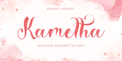 "Kametha" is a beautiful and elegant handwritten font. This font is equipped with uppercase, lowercase, numerals, punctuation, and multilingual support. It is suitable for Christmas, summer, the 4th of July, graduation, a wedding, and others.
 - Christmas Sabila by Yoga Letter,
$18.00 "Christmas Sabila" is an elegant and simple blackletter font. This font is equipped with uppercase, lowercase, numerals, punctuation, and multilingual support. very suitable for Christmas, weddings, invitations, certificates, Valentine's, spring, summer, winter, parties, and others.
