10,000 search results
(0.03 seconds)
- Thaun by Scholtz Fonts,
$19.00 I can best describe the Thaun family as a general purpose display family, inspired by Scholtz Fonts' " "Delikat". I wanted to produce a display font that was more robust than Delikat, without losing the delicacy of the original. In order to do this I thinned solid, curved strokes toward the baseline, and let them dwindle to gently rounded points. As a graphic designer I became aware that designs that used a number of styles from the same family seemed to work well. This was easily done using a standard sans serif font such as Arial or Helvetica. However, when a different look is needed, display fonts do not always have a the variety of different styles that are necessary to produce a coherent design. Thus with Thaun, the challenge was to create a coherent family based on a display font. The archetype of this family is Thaun Regular with six different widths forming closely related styles. There are also two variants of the archetype i.e. Thaun Black & Thaun Rough to add variety to the primary style. An additional sub-family, Thaun Accord, appears in two widths. Thaun Jazz is a wide three dimensional variation. Thaun has all the features usually included in a fully professional font. Language support includes all European character sets, Greek symbols and all punctuation. Opentype features include automatic replacement of some characters and discretionary replacement of stylistic alternatives.
 - Woodpecker by profonts,
$41.99 Woodpecker is a self-confident, sturdy caps-only sans serif design imitating grained wood created and digitized by German type designer Ralph M. Unger for the profonts library. Woodpecker is perfectly suited for any graphic work around timber, lumber, prperty markets, carpenter, furniture and so on.
 - Patika by Plasebo Studio,
$29.00 Patika Typeface is a contemporary neo-grotesque font that combines modern aesthetics with functional legibility. Inspired by the timeless elegance of classic typefaces such as Helvetica, Futura, and Avant Garde, Patika offers a fresh take on the genre with its unique blend of clean lines, balanced proportions, and subtle details. Designed with utmost care and precision, Patika Typeface achieves a harmonious balance between width and height, particularly in its lowercase letters, ensuring optimal legibility across various sizes and applications. Its versatile nature makes it an ideal choice for a wide range of typographic needs, from eye-catching headlines to extensive blocks of text. Equipped with a comprehensive set of OpenType features, including alternative glyphs, fractions, arrows, ligatures, and more, Patika offers designers an array of tools to enhance their typographic compositions and add a touch of uniqueness to their designs.
 - Pragmatica Slab Serif by ParaType,
$30.00 Pragmatica Slabserif was designed as a complement to the popular type family Pragmatica by Vladimir Yefimov and Isabella Chaeva (1989-2004) by addition of square serifs. Inspired by Helserif (Phil Martin, 1978) which was formed in the same way by addition of square serifs to Helvetica (Eduard Hoffman and Max Miedinger, 1957). First sketches of Pragmatica Slabserif were created by Vladimir Yefimov in 1988 during development of Pragmatica. Olga Umpeleva designed the whole slabserif type family of six weights basing on those sketches. All styles of Pragmatica Slabserif coordinate with corresponding Pragmatica styles on metrics, proportions, weights and design. The new family can be used together with Pragmatica and separately. It’s convenient for technical texts, for magazines of general nature, for business applications as well as for advertising and display matter. Pragmatica Slabserif was released by ParaType in 2011.
 - Goga by Narrow Type,
$42.00 Introducing Goga, a versatile sans serif family available in 10 weights from hairline to black. It is a typeface that combines the best of geometric sans serifs and neo-grotesques. It draws inspiration from typefaces like Avenir on the one hand and Helvetica on the other. Although Goga is a universal and neutral typeface, it is rather warmer and friendly in nature. If you want to add more juice to your project, you can do so by using unusual stylistic alternates of the lowercase g (hence the name Goga). Goga is a typeface suitable for both large sizes and smaller text, thanks to its large x-height. It contains Latin-extended character set, and thus supports most Latin languages. It also offers many open type features such as fractions, old-style figures, tabular figures, discretionary ligatures and more.
 - 35-FTR by ILOTT-TYPE,
$29.00 35-FTR was custom drawn specifically for the book Analogue Photography which required the timeless elegance of Futura and the compact utilitarian typesetting of Helvetica. It combines the best of both with the foundation of a geometric sans but the proportions and rhythm of the Swiss classic. The result is a versatile font that bridges the gap between information design and high-end sophistication. 35-FTR can effortlessly traverse the spectrum of friendly and approachable to aspirational exclusivity. This functional elegance excels in the bolder weights and is perfect for setting display and readable body copy. Version 2.1 includes refinements to the two-story "a" and "g", new superior and inferior figures and improved kerning for German text. Original features: 7 weights with obliques, open type features, European characters, symbols, transit icons, circled figures, old style figures, tabular figures, proportional figures fractions, arrows.
 - CA Saygon Text by Cape Arcona Type Foundry,
$40.00 CA Saygon Text is the logic consequence of CA Saygon. It is much calmer and therefore also suitable for reading texts and everyday’s editorial tasks. Basic shapes and proportions were adopted from Saygon and continued in such a way that a font family from Thin to Extrabold resulted. A fundamental inspiration were early static grotesque typefaces such as Akzidenz Grotesk. Nevertheless, the typeface was by no means intended to have a historical look. Thus, a relatively high x-height was chosen, which makes the typeface quite economical in type-setting, since the letters appear visually larger. A relatively small line spacing with good legibility can be achieved due to the small ascenders and the low cap height. Letters like f and t, which otherwise tend to end in curves, were given right angles, which on the one hand meets certain design elements of the original Saygon, but on the other hand also refers to contemporary trends in typeface design. A special feature are the five styles in which CA Saygon Text can be used. The default setting is the Helvetica style, with two-storey a and g. The Futura style has a single-storey a and a two-storey g accordingly. The third style with two-storey a and three-storey g is called the Franklin style. But the real highlight is the Cape style with single-storey a and three-storey g – a real rarity up to now. Let yourself be inspired by this unusual typeface. If you like it even more progressive, you should try the flat style, which continues the right angles in a, g, and y as well. Thanks to the Cyrillic and Latin Extended character sets, a huge linguistic area is covered that even extends to Vietnam! Even the exotic German capital-double-s is available and appears automatically when typed between other capital letters. Numerous OpenType features make life easier for the professional typographer: there are fractions, superscript and subscript numbers, as well as proportional and tabular capitals.
 - ITC Cerigo by ITC,
$29.99ITC Cerigo is the result of a challenge which designer Jean-Renaud Cuaz set for himself: to create a typeface with the grace of Renaissance calligraphy but different from the numerous Chancery scripts. He calls Cerigo a 'vertical italic' and based it on 15th century calligraphic forms. The weights are carefully designed to complement each other and are made more flexible by a number of italic swash capitals. The flexible ITC Cerigo is suitable for both text and display. - Callifornia Script by Ferry Ardana Putra,
$10.00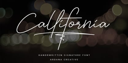 Callifornia is stylish signature script font which support OpenType features and includes, numeral, punctuation, ligatures and it also supports multi-languages. This font is perfect for branding projects, logo, wedding designs, social media posts, advertisements, product packaging, product designs, label, photography, watermark, invitation, stationery and any projects that need elegant feel. FEATURES • Ligatures • Uppercase and Lowercase letters • Numbering, Symbols, and Punctuations • Multilingual Support • Support for Adobe Illustrator, Corel Draw, Indesign or Adobe Photoshop • Support for MAC or WINDOWS
 - Anvil by Tim Rolands,
$29.00 Lend some weight to your words with Anvil! A bold, extended display face, Anvil is ideal for posters and other large design work as well as identity and logo work. This cross-platform OpenType font contains a number of ligatures, fractions, superior and inferior numerals, alternate forms and accented characters -- nearly 300 glyphs in all. Use it with an application like Adobe InDesign to access all the advanced features. Enjoy the future of typography now with this original design!
 - Amanah Script by Alifinart Studio,
$15.00 Amanah Script is a handwritten font with a casual and modern calligraphy style. This font offers a large number of Stylistic Alternates, as well as beginning and ending swashes. This font has a total of 1660 glyphs, including capital letters, lowercase, numeral and punctuation, multilingual accents, swashes, and includes a large number of stylistic alternates and heart swashes (for lowercase letters). Amanah Script can be used for wedding card designs, invitation, best for photographer, traveling, blogging watermark or craft. Key Features: - Multilingual Accents - Stylistic Alternates up to 15 choices - Has a heart connected feature - Activate Stylistic Alternate by simply adding "period" (.) and “number” (1-15) to each lowercase letter. - Has ligature features so that the letters connect well together - Has OpenType and PUA Encodes feature. As I mentioned earlier, Amanah Script has a large number of Stylistic Alternates features, up to 15 options for lowercase letters. Interestingly, you can activate all Stylistic Alternates that are owned by each letter, just by typing; letter + period + number. For example: a.1 a.2 a.3 or b.1 b.2 b.3 and so on. As for activating the heart connected for each lowercase letters is quite easy, just by typing; letter + underscore + underscore + underscore + letter. For example: a___a or b___b and so on. If there are things you want to ask, don't hesitate to contact my email. Alifinart Studio alifinart@gmail.com Thank you.
 - Easter Chalk by Yoga Letter,
$14.00 "Easter Chalk" is handwritten in chalk. This font is very easy to use because it has been specially designed. This font is equipped with uppercase, lowercase, numerals, punctuations, and multilingual support. It is suitable for Easter, summer, spring, back-to-school themes, and others.
 - Christmas Brush by Selvia Design,
$15.00 "Christmas Brush" is a brush font that is perfect for Christmas moments. Besides that, it can also be used for summer, graduation, 4th of July moments, banners, posters, branding, stickers, and more. This font is equipped with uppercase, lowercase, numerals, punctuation, and multilingual support.
 - Tropical Sunday by Yoga Letter,
$18.00 "Tropical Sunday" is a brush font that is perfect for summer moments. This font is very simple because it has been specially designed. Equipped with uppercase, lowercase, numerals, punctuation, and multilingual support. Can be used for holiday moments, vacations, social media, stickers, posters, and more.
 - Kwalett by Ingrimayne Type,
$5.50 Kwalett is a sans serif typeface family with low contrast and a high x-height. Kwalett has two widths, each with five weights and each weight has an italics. The family is derived from the thinnest member of the Qualettee family. As members of that family get bolder, their contrast increases. As members of the Kwalett family get bolder, their contrast remains very low. Kwalett is designed to work better as text than the Qualettee family. The family has two ways to get fractions. A few fractions are preformed and are accessed with the OpenType discretionary ligatures feature. The OpenType fraction feature uses the superscript and subscript numbers to create any fraction.
 - Sunny Bay by Gleb Guralnyk,
$12.00 Introducing a hot summer font Sunny Bay. It's a bold typeface with a smooth vintage look. Sunny Bay font has a west european multilingual support and additional swash characters. To access swash glyphs, just type underscore character and number 1-9, like this _1. Using "standard ligature" feature this symbols will be automatically replaced with one of the swash symbols. Thank you and have a nice day!
 - Honolulu by Ana's Fonts,
$12.00 Honolulu is a cute hand-drawn font with four variations: - Regular, filled, sans and sans filled - Plus jumpy versions of each font (accessed by activating contextual alternates). Each font includes: - Two sets of caps - Numbers and punctuation - Multilingual support Fresh and perfect for the summer, in any design that needs a bold hand-drawn feel, such as postcards, notes and quotes, logos and branding.
 - Retail Packaging JNL by Jeff Levine,
$29.00 The retail storage box for a vintage metal numbering stamp manufactured by the American Numbering Machine Company had its brand name hand lettered in an Art Nouveau style that most likely went back to the 1920s, as the company was in existence from 1908 to around 1971. Numbering machines were used in offices, schools, libraries, and anywhere a series of numbers needed to be marked onto printed items. Similar to what was called a ‘crash numberer’ used in letterpress shops, the machines could be set to do a run of digits [for example: 4000, 4001, 4002] or repeat numbers for forms used as carbon copies. As computers took over most forms of printing, the use of numbering machines dwindled, but they are still available. The American Numbering Machine Company was one of several Brooklyn, New York companies that specialized in the manufacture of these machines. Retail Packaging JNL replicates the lettering from their packaging, and is available in both regular and oblique versions.
 - Moonlight And Wine by The Gelato,
$12.00 The Moonlight & Wine Font is a Handwritten Monoline Font that is perfect for the Neon effect! It can be used as a Neon Handwritten Script Font, Monoline Script Font, Signature Script Font, Summer Handwriting Font, Neon Party Font, Neon Signboard Font, Neon Banner Font, Neon Font for Party Invitations, DJ Logo Font, Y2K Neon Font, Neon Sign Font, Neon Light Font, Neon Wedding Font Perfectly suitable for numerous use such as quotations, banners, logos, product packaging, titles, headers, Business cards, menu lists, and invitation cards! _________________________________ Language Support: Multilingual Support _________________________________ **The preview images are to showcase fonts only and are NOT included.** **The Font comes with a solid version. To add a NEON effect, You can use programs like Canva, Illustrator, Photoshop etc.** _________________________________ 🍦COMPATIBLE PROGRAMS (NOT LIMITED TO): Canva Pro, GoodNotes, Notability, Keynote, Pages, Numbers, Procreate, Photoshop, Illustrator, Cricut, Silhouette, InDesign, Microsoft Word, and more! ++ _________________________________
 - Platz Groteske FJ by Frncojonastype,
$27.00 fj Platz Groteske™ is the new font from frncojonastype project that culminates after almost 5 years of learning and development. fj Platz Groteske™ is a Neo-grotesk font with slight geometrical proportions with humanistic terminations. For this occasion, this font will show the normal version, however, the entire project contemplate condensed family, extended and the development of alphabets as Cyrrilic and Greek. This proposal is to improve the legibility in the Neo-grotesk fonts with generous gaps, vertical and square counter form and ascendents that exceed slightly the capitals. Counts with old numbers, small caps, modern numbers, tabular, numerators and denominators to fraccions, reference numbers to notes and formulas to face confidant and complex different stages. Ideal to editorial projects of informative content - scientific and titular of a huge impact because of the various alternative characters, stylistic options and a optometrical version to risky designers. To exclusive licenses and to follow the develop of this project, please visit frncojonas.com (WIP) Learn about upcoming releases, work in progress and get to know us better! Instagram: @frnco.jonas
 - Therhoernen by Proportional Lime,
$9.99 Arnold Therhoernen. (Arnoldus ther Hornen, Drucker des Dictys , Arnold ter Hoernen, Arnold ther Hoernen, Arnoldus TherHornen.) Who was this guy? He was a printer active in the city of Cologne, having graduating from the university there. He learned his craft under Ulrich Zell. He printed books from 1470 to 1482 when the plague carried him off. Was he just another printer of the era? No, he brought out the first edition of the "Fasciculus temporum'' (The most popular work by a living author at that time.) And he was the first to use both a title page and page numbers. His page numbers, an idea probably suggested to him by Werner Rolevinck, were interesting in that they were centered half way down the page on the outer margin and were set in Roman Numerals.
 - Spring Easter by Yoga Letter,
$14.00 "Spring Easter" is a very beautiful and elegant handwritten font. This font is very easy to use because it has been specially designed. Equipped with uppercase, lowercase, numerals, punctuation, and multilingual support. It is suitable for birthdays, weddings, engagements, spring, summer, Easter, stickers, banners, posters, and others.
 - Pelagic Bird by Yahya Type,
$17.00 Pelagic Bird is a unique ligature font. Clean, delicate, classic. Available in upper and lower cases with numeric, symbol, punctuation, and multilingual support. Pelagic Bird will be perfect for many projects: logo, wedding designs, social media posts, advertisements, product packaging, product designs, label, photography, watermark, invitation, or whatever project you’re working on. WHAT’S INCLUDED? Uppercase & lowercase letters Numbers, punctuation Ligature & Huge Stylistic alternate Multilingual support. Still got a question? Send me a message and I’ll be happy to answer! qura.yahya@gmail.com
 - Foro Sans by Hoftype,
$49.00 Foro Sans is the matching friend of the popular Foro family (Foro and Foro Rounded). It comes with the same number of styles and the form displays the same characteristic features. Foro Sans consists of 16 styles and is well suited for ambitious typography. It comes in OpenType format with extended language support. All weights contain ligatures, superior characters, proportional lining figures, tabular lining figures, proportional old style figures, lining old style figures, matching currency symbols, fraction- and scientific numerals and matching arrows.
 - Jeniver Ellis by OCSstudio,
$14.00 Introducing my new font, Jennifer elis font made with a pen brush refined to look neat. like dance letters, smooth, clean and simple. Jennifer elis font are perfect for weddings, events, invitations, escort cards, table numbers, Quotes, displays, logos, blog sliders, special addresses, stamps, packaging, greeting cards, etc.Features: Basic Latin A-Z and a-z Numeral & Punctuation Ligatures 10 Alternate Swashes Script 592 Glyphs Sans 354 Glyphs Latin Pro Support Character ** Thank you for downloading my font, hopefully it’s useful **
 - Yotin by Stawix,
$40.00 Yotin is a contemporary half-serif inspired by summer days vibe. Vibrant, round with a little bit of contrast makes the design of Yotin unique, friendly and flexible at the same time, suitable for text, headlines, display and other design needs such as layouts, branding and anything in between. Yotin is here to serve your creativities. Yotin comes in 9 weights from Thin to Black, each equipped with Italic plus many OpenType features; tabular numerals, inferiors & superiors, numerators & denominators, fractions, ligatures etc.
 - FranklinGothicHandLight by Wiescher Design,
$39.50 FranklinGothicHandLight is part of a series of hand-drawn fonts from way back in time – before computers changed the way we worked. When I was in advertising – before computers – a very time consuming part of my daily work was sketching headlines. I used to be able to sketch headlines in Franklin Gothic, Times, Futura, Helvetica and several scripts. We had a kind of huge inverted camera – which we called Lucy. We projected the alphabet onto a sheet of transparent paper, outlined the letters with a fineliner and then filled them in. It was very tedious work, but the resulting headline had its own charm and we had a permanent race going on who was best and fastest. I won most of the time! They used to call me the fastest "Magic Marker" this side of the Atlantic. Great days, just like today! Your sentimental type designer from the past Gert Wiescher
 - FranklinGothicHandDemi by Wiescher Design,
$39.50 FranklinGothicHandDemi is part of a series of hand-drawn fonts from way back in time – before computers changed the way we worked. When I was in advertising – before computers – a very time consuming part of my daily work was sketching headlines. I used to be able to sketch headlines in Franklin Gothic, Times, Futura, Helvetica and several scripts. We had a kind of huge inverted camera – which we called Lucy. We projected the alphabet onto a sheet of transparent paper, outlined the letters with a fineliner and then filled them in. It was very tedious work, but the resulting headline had its own charm and we had a permanent race going on who was best and fastest. I won most of the time! They used to call me the fastest "Magic Marker" this side of the Atlantic. Great days, just like today! Your sentimental type designer from the past Gert Wiescher
 - CF Nixt by CozyFonts,
$20.00 The Nixt Font Family is a new font with currently seven styles. As an alternative to Helvetica, Arial, Gill Sans, Futura, & Gotham, Nixt has a similar design aesthetic to those aforementioned in that its design, structure, and feel crosses decades of appeal. From Mid-Century, through the stark '60s, decades of succeeding modern architecture through the turn of the 21st Century, Nixt's glyphs are timeless, clear, ultra-legible in all styles and weights. Best use in Advertising, Branding, Signage, Architecture, Fashion, Posters, Headlines, and By-Lines, Print & Digital, and of course Labels. There are currently, at first release, 7 Styles: Extra Light, Light, Regular, Italic, Book, Bold, & Extra Bold. There are more in process and will be added when completed. The inspiration behind the Nixt Fonts is the Bauhaus, Mid Century Industrial Design, Art Deco through Moderne Era Architecture, American Pottery and American Design of The Twentieth Century.
 - Extra Extra by Comicraft,
$19.00 EXCLUSIVE! Read all about it! The latest scoop from Comicraft is sure to be in all the newspapers today! The Times are a changin' -- comic book letterers everywhere can say a font farewell to typesetting the front pages of Planets and Bugles in Helvetica, Verdana or Gill Sans! Superhero's Pal, Johnny "Roshell" Olsen, was up all night writing copy for the late-night edition, making sure that your newspaper headlines and copy have a warm, pen lettered look... some might say a Rosen-glow! Put a little Extra Extra in your bylines and maybe there's a Pulitzer and an Eisner in your future! Not ready to purchase? Get ExtraExtra Engraved free with any purchase, or by subscribing to our newsletter at the bottom of this page. Features Seven fonts (Regular, Italic, Bold, Bold Italic, Heavy, Heavy Italic & Engraved) with upper and lower case alphabets.
 - Axial cut by deFharo,
$21.00 Axial Cut is a sans serif typeface (Latin Extended-A), a contemporary and rounded evolution of geometric fonts for screen, but this time the letters are built on an axial axis that results in trapezoidal counter-shapes, joints with reduced antlers and rounded corners that correct optical effects in small sizes to make the typography more legible, and at the same time, in large sizes it shows its original shapes. The Axial Cut typeface family is made up of four weights: Light, Regular, Medium and Bold, each with 785 characters. I have taken particular care with the metrics and dimensions of each letter or sign, with a very careful and precise kerning configuration to achieve the For maximum readability, these are fonts with slightly higher ascenders than capitals and short descenders to make it more compact. The editing possibilities and unique designs with these complex typefaces are very wide, the fonts have a complete set of uppercase letters and a lowercase set with alternative characters as well as lowercase letters and numbers in different positions (lowercase, denominators, numerals, and uppercase) that They also work as automatic fractions, they also incorporate small capital letters and three sets of alternative numbers (Normal, Old style numbers, Square numbers), etc. Discover other alternative signs, characters and Open Type functions in the PDF: Specimen & The Cheat Sheet.
 - Body by Zetafonts,
$39.00 Body graphic project at Behance Body is a type family designed for Zetafonts by Cosimo Lorenzo Pancini with Andrea Tartarelli. Conceived as a contemporary alternative to modernist superfamilies like Univers or Helvetica, Body tries to maximize text readability while providing a wide range of options for the designer. It comes in two variants (Body Text and Body Grotesque), each in four widths and four weights: regular and bold for basic typesetting, light and extrabold for display use. Body Grotesque applies to the sans serif modernist skeleton little imperfections and quirks inspired by our research in early 20th century type specimens. Curves are slightly more calligraphic and a light inverse contrast is applied to bold weights, giving the typeface a slight vintage appearance in display use. Body Text, on the contrary, challenges the modernist aesthetics maximizing horizontal lines and using open terminals for letters like “s” and “a” that appear normally dark in modernist grotesques. For both variants, the normal width family is slightly condensed in an effort to maximize space usage; the Slim width is provided for extremely dense texts or side notes while the Fit width is optimized for display usage as in logos, headings or titles. The Large width manages to look elegant in its light weight while becoming a valid heading or subtitle font in its extrabold weights. All the 64 fonts in the Body superfamily include a complete latin extended character set with small caps for over 70 languages, Russian cyrillic, open type positional numbers, stylist sets and alternate forms.
 - Neuzeit Office by Linotype,
$50.99 The Neuzeit Office family is designed after the model of the original sans serif family Neuzeit S™ , which was produced by D. Stempel AG and the Linotype Design Studio in 1966. Neuzeit S itself was a redesign of D. Stempel AG’s DIN Neuzeit, created by Wilhelm Pischner between 1928 and 1939. Intended to represent its own time, DIN Neuzeit must have struck a harmonious chord. DIN Neuzeit is a constructed, geometric sans serif. It was born during the 1920s, a time of design experimentation and standardization, whose ethos has been made famous by the Bauhaus and De Stijl movements in art, architecture, and design. Upon its redesign as Neuzeit S in the 1960s, other developments in sans serif letter design were taken into account. Neuzeit S looks less geometric, and more gothic, or industrial. Separating it from typefaces like Futura, it has a double-storey a, instead of a less legible, single-storey variant. Unlike more popular grotesque sans serifs like Helvetica, Neuzeit S and especially the redesigned Neuzeit Office contain more open, legible letterforms. Neuzeit Office preserves the characteristic number forms that have been associated with its design for years. After four decades, Neuzeit has been retooled once again, and it is more a child of its age than ever before. Akira Kobayashi, Linotype’s Type Director, created the revised and updated Neuzeit Office in 2006. His greatest change was to retool the design to make its performance in text far more optimal. Additionally, he created companion oblique to help emphasize text.
 - Templit JNL by Jeff Levine,
$29.00Templit JNL is one of a number of fonts modeled from actual lettering stencils by Jeff Levine. This one takes its style from a set of individual letters and numbers used for marking and identifying objects. Some of the letters and numbers have solid shapes rather than traditional stencil breaks in the characters. - Egalie by Muksal Creatives,
$15.00 Egalie is a modern display font that is both memorable and stylish.It's a mix between a classic serif and a futuristic sans serif. Gallery comes with a full uppercase, lowercase, numbers and punctuation + European language support. This font is perfect for fashion related branding or editorial design and displays both masculine, feminine qualities and Perfect for editorial projects, Logo design, Clothing Branding, product packaging, magazine headers, or simply as a stylish text overlay to any background image. Features: Lowercase and Uppercase Numerals & Punctuation Multiple Languages Supported
 - Pen Elegant JNL by Jeff Levine,
$29.00 A 1918 lettering instruction book by William Hugh Gordon presented a number of lettering styles that were geared toward sign and show card painters along with tips and tricks regarding the correct construction of such signs for maximum effect. One pen lettered Roman alphabet with a beautiful set of numerals has been recreated digitally as Pen Elegant JNL, which is available in both regular and oblique versions. To note, Gordon was the co-inventor of the Speedball lettering pen with Ross F. George in 1915.
 - Tombstone by Factory738,
$15.00 This year's Halloween is fast!!! When it comes to Halloween projects, Tombstone is a great. Use its scary atmosphere as a springboard for your Horror project. Numbers, punctuation, and multilingual letters are all included. For whatever your imagination may conjure up, these ligatures will come in handy. 7 Styles Basic Latin A-Z and a-z Numerals & Punctuation Stylistic Ligatures Multilingual Support for ä ö ü Ä Ö Ü ... OTF file format Free updates and feature additions Thanks for looking, and I hope you enjoy it.
 - Scarville by Factory738,
$15.00 This year's Halloween is approaching quickly!!! Scarville is an excellent choice for Halloween projects. Use its eerie atmosphere as a jumping-off point for your Horror project. There are numbers, punctuation, and multilingual letters included. These ligatures will come in handy for whatever your imagination brings to mind up.. 7 Styles Basic Latin A-Z and a-z Numerals & Punctuation Stylistic Ligatures Multilingual Support for ä ö ü Ä Ö Ü ... Free updates and feature additions Thanks for looking, and I hope you enjoy it.
 - Bollolo by YuliusParyadi,
$11.00 Bollolo (Handwritten) is a fun and playful font. Bollolo name is made from bolo-bolo which is mean lets be friend. This font is readable, catchy, and easy to use. This font is suitable for quotes, logo designs, kids toys, story book, and many other design projects. Bollolo is includes: - full set uppercase and lowercase letter; - numerals; - multilingual support; - large number of punctuations; - ligatures. Please add this font as your favorite, hit like button, or follow me. I'll very happy for that and appreciated it.
 - Red Hot Mama NF by Nick's Fonts,
$10.00The Zanerian Manual of Alphabets and Engrossing, published in numerous editions since 1895, featured many elegant and elaborate script typefaces. However, it seems that, from time to time, calligraphers just want to have fun, and this little number is definitely fun. Light, lively and just a little loopy, Red Hot Mama is sure to add just the right amount of spice to your special project. Both versions contain the complete Unicode 1252 (Latin) and Unicode 1250 (Central European) character sets, with localization for Romanian and Moldovan.