10,000 search results
(0.081 seconds)
- Whitelisa Script And Sans Font Duo by Maulana Creative,
$16.00 Whitelisa is a complete script and sans combine font. With light and catchy display sans. fun character with some of ligatures, alternates script and extra swash. To give you an extra creative work. Whitelisa font support multilingual more than 100+ language. This font is good for logo design, Social media, Movie Titles, Books Titles, a short text even a long text letter. Make a stunning work with Whitelisa font. Cheers, Maulana Creative
 - Sky Fire by Yock Mercado,
$14.00 Skyfire is a Sans Serif font inspired by digital interfaces, spaceships, and galaxies, embodying cosmic adventure and progress. Its sleek design is perfect for branding and tech projects, promising a future full of possibilities. Ideal for space-related work, it immerses viewers in a universe of wonders. With Skyfire, each stroke is a cosmic journey, merging imagination with design. A guiding light for bold projects, it leads to new horizons and innovates in typography.
 - Cosbycorwin by Maulana Creative,
$11.00 "Cosbycorwin" is a slanted cursive script font. With light contrast stroke, fun character with a bit of ligatures. To give you an extra creative work. "Cosbycorwin" font support multilingual more than 100+ language. This font is good for logo design, Social media, Movie Titles, Books Titles, a short text even a long text letter and good for your secondary text font with sans or serif. Make a stunning work with "Cosbycorwin" font. Cheers, MaulanaCreative
 - Absundo by Kaer,
$19.00 ABsunDO PROJECT is a playful font for your fun and happy design projects. The main idea of this font is a quirky replacement of uppercase and lowercase symbols. Uppercase is heavy and bold, at the same time lowercase is light and narrow. You'll get a playful font for fun advertising, fashion stickers, summer posters, wedding logos, retro sale themes, and much more. Please feel free to request to add characters you need: kaer.pro@gmail.com
 - Jingle by Supfonts,
$15.00 This font was inspired by the game with different signature styles! The result is a light and nice, mono linear font that looks completely handdrawn. Jingle will look beautiful on Christmas and holiday invitations, wedding invites and stationery, logos, and more. I love using it for emphasis words and pairing it with sans serifs Includes: - Ligatures - Uppercase and lowercase - Numbers and punctuation - Foreign language support Check out my blog: - www.instagram.com/dmitriychirkov - pinterest.com/dmitriychirkov7
 - Maffelyns by Maulana Creative,
$14.00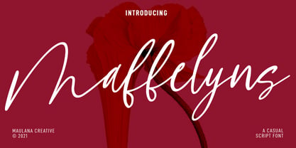 Maffelyns is a casual script font. With contrast light stroke, fun character with a bit of ligatures. To give you an extra creative work. Maffelyns font support multilingual more than 100+ language. This font is good for logo design, Social media, Movie Titles, Books Titles, a short text even a long text letter and good for your secondary text font with sans or serif. Make a stunning work with Maffelyns font. Cheers, Maulana Creative
 - Naughties by Chank,
$59.00The Naughties font was meant to be a happy new typestyle for a naughty new decade. It turned into a neo-classic FUN font. This font is sent to you from the light-hearted, long-ago past of 1999 in an effort to promote a new name for the current decade. Both the font and the decade should be referred to as "the naughties". Please make a note of it. Thank you. - Scary Woods by Maulana Creative,
$16.00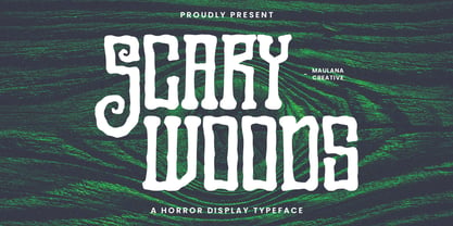 Scary Woods display font. Light stroke, fun character with a bit of ligatures and alternates. To give you an extra creative work. Scary Woods font support multilingual more than 100+ language. This font is good for logo design, Social media, Movie Titles, Books Titles, a short text even a long text letter and good for your secondary text font with script or serif. Make a stunning work with Scary Woods font. Cheers, Maulana Creative
 - Dulcyna Hand by Michael Browers,
$25.00 Dulcyna Hand is a casual hand-drawn typeface developed by Michael Browers and his son Eli. Seeking to bond over a collaborative creative project, this father-son duo leveraged Eli’s emerging interest in lettering and Michael’s font development experience to create Dulcyna Hand. Embedded with Eli’s youthful energy and fun personality, Dulcyna Hand is ideal for greeting cards, invitations, scrapbooking, children’s books and other projects in need of a light-hearted touch.
 - Clafoutis by PintassilgoPrints,
$22.00 Clafoutis: tasty, sweet and tangy, handmade, an all original recipe. Go with the Regular for a richer option and with Rapide if you're on a light mood. Or better yet, go with both - and don't forget to sprinkle some Insolite bits over it! Notes from the test kitchen: Clafoutis Regular and Rapide contains 2 uppercase glyphs for each letter and extended language coverage. Clafoutis Insolite contains over 200 unexpected lovely pics. Use without moderation.
 - Taptalks by Maulana Creative,
$13.00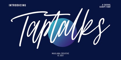 Taptalks is a slanted casual script font. With lights contrast stroke, fun character with many of natural ligatures. To give you an extra creative work. Taptalks font support multilingual more than 100+ language. This font is good for logo design, Social media, Movie Titles, Books Titles, a short text even a long text letter and good for your secondary text font with sans or serif. Make a stunning work with Taptalks font. Cheers, MaulanaCreative
 - Angleface by ArtyType,
$29.00 With initial thoughts of creating something tubular, I had in the back of my mind the kind of contemporary chrome furniture that became ubiquitous throughout the 60s and that concept remained with me throughout the development process. The font-styling idea worked out very well in this case, resulting in plenty of optional character variations for my chosen theme, most of which are included in both styles of light and bold character sets.
 - Julliusy by Maulana Creative,
$11.00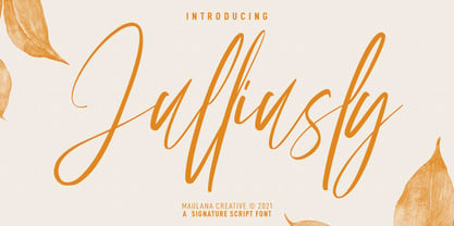 Julliusly is a fancy signature script font. With high contrast light stroke, fun character with a bit of ligatures. To give you an extra creative work. Julliusly font support multilingual more than 100+ language. This font is good for logo design, Social media, Movie Titles, Books Titles, a short text even a long text letter and good for your secondary text font with sans or serif. Make a stunning work with Julliusly font. Cheers, MaulanaCreative
 - Glint by Pesic,
$29.00 The Glint font family is a refined and redesigned version of the BigBang font. Family contains 6 fonts - Glint Black, Bold, Light, Regular, Rought, SemiBold. Glint font is a geometry, modular sans serif font, square glyphs looking. It’s suitable for use in all areas of natural sciences, architecture, urban planning, technology, electronics, medicine, sports, advertising, futuristic themes, modern art, film, multimedia, logo design... Glint contains Cyrillic characters and Latin glyphs of all European languages.
 - Rustico Farmero by Kaligra.co,
$19.00 Rustico Farmero is a Textured ultra condensed Type Family that includes 3 styles: Regular, Rounded & Vintage versions. This family is an All-Caps family with each version contains a textured (Aged) and alternates. With 3 styles and iconic alternates, this font can give a diverse set of aesthetics. With light giving a much more simple modern vintage look, fashionable feel and the bold giving a more rugged vibe for Simple strong and mature design look.
 - Muscat Syrup by Larin Type Co,
$18.00 Muscat Syrup this amazing handwritten font is light and elegant, will emphasize your personality in any project and will charm you with its signature. This font includes alternates for Uppercase and Lowercase, also a lot ligatures for lower case make your signature with them. You can use it to create logos, branding, t-shirts, book covers, stationery, marketing, blogs, magazines, cosmetics, signage, and more. This font is easy to use has OpenType features.
 - Prima Donna by Larin Type Co,
$14.00 Prima Donna is a beautiful font that is light and elegant, and will emphasize your individuality in any project. You can also use them to create a logo or use for small businesses, branding, t-shirts, book covers, stationery, marketing, blogs, web site, magazines, and more. This font includes a basic set of letters and a complete set of alternatives set as well as numbers, fractions, and basic punctuation. This font supported PUA encoded.
 - Blinkest by Maulana Creative,
$13.00 "Blinkest" is a casual signature script font. With light mono-line stroke, fun character with a bit of ligatures. To give you an extra creative work. "Blinkest" font support multilingual more than 100+ language. This font is good for logo design, Social media, Movie Titles, Books Titles, a short text even a long text letter and good for your secondary text font with sans or serif. Make a stunning work with "Blinkest" font. Cheers, MaulanaCreative
 - Solvetta by Grezline Studio,
$12.00 Solvetta is a light and charming handwritten font with a unique feel. It will add a bold feel to any design project! You can use Solvetta font to make a logo for branding, typography design, magazine or book cover, website header, product packaging, invitation, quotes, t-shirt design, label poster and more. Feature : - Multilingual Language - Works on PC & Mac - Simple installations - Accessible in the Adobe Illustrator, Adobe Photoshop, Adobe InDesign, even works on Microsoft Word.
 - Aracne Ultra Condensed Regular is a distinctive typeface designed by Antipixel, an entity known for its unique and versatile font offerings. This particular font stands out due to its ultra-condensed...
- FF Real Text by FontFont,
$50.99 FF Real is a convincing re-interpretation of the German grotesque style from between 1998 and 1908, but with much more warmth and improved legibility as well as a hint towards the warmer American grotesques. Later on, not just slanted styles, but a “proper” italic version was added inspired by the way Roman and Italic are distinguished in traditional serif faces. NEW: a specially created set of obliques were added in 2018 to give designers more design flexibility, for those looking for a less calligraphic look. In 2020 the family was extended with matching condensed weights. FF Real was originally conceived by Erik Spiekermann as one text weight and one headline weight to be used as the only faces in his biography ‘Hello I am Erik’, edited by Johannes Erler, published in 2014. While Spiekermann drew the alphabets, he passed on the font data to Ralph du Carrois and Anja Meiners who cleaned it up and completed it. In the meantime, FF Real has been extended to a family of two styles and 65 weights each. The design of FF Real is rooted in early static grotesques from the turn of the century. Several German type foundries – among them the Berlin-based foundries Theinhardt and H. Berthold AG – released such designs between 1898 and 1908. The semi-bold weight of a poster-size typeface that was lighter than most of the according semi-bolds in metal type at the time, gave the impetus to FF Real’s regular weight. In the words of Spiekermann, the historical example is “the real, non-fake version, as it were, the royal sans serif face“, thus giving his new typeface the name “Real” (which is also in keeping with his four-letter names, i.e. FF Meta, FF Unit). FF Real is a convincing re-interpretation of the German grotesque style, but with much more warmth and improved legibility. With a hint towards the warmer American grotesques, Spiekermann added those typical Anglo-American features such as a three-story ‘g’ and an ‘8’ with a more defined loop. To better distinguish characters in small text sizes, FF Real Text comes in old style figures, ‘f’ and ‘t’ are wider, the capital ‘I’ is equipped with serifs, as is the lowercase ‘l’. What’s more, i-dots and all punctuation are round.
 - FF Real Head by FontFont,
$50.99 FF Real is a convincing re-interpretation of the German grotesque style from between 1998 and 1908, but with much more warmth and improved legibility as well as a hint towards the warmer American grotesques. Later on, not just slanted styles, but a “proper” italic version was added inspired by the way Roman and Italic are distinguished in traditional serif faces. NEW: a specially created set of obliques were added in 2018 to give designers more design flexibility, for those looking for a less calligraphic look. In 2020 the family was extended with matching condensed weights. FF Real was originally conceived by Erik Spiekermann as one text weight and one headline weight to be used as the only faces in his biography ‘Hello I am Erik’, edited by Johannes Erler, published in 2014. While Spiekermann drew the alphabets, he passed on the font data to Ralph du Carrois and Anja Meiners who cleaned it up and completed it. In the meantime, FF Real has been extended to a family of two styles and 65 weights each. The design of FF Real is rooted in early static grotesques from the turn of the century. Several German type foundries – among them the Berlin-based foundries Theinhardt and H. Berthold AG – released such designs between 1898 and 1908. The semi-bold weight of a poster-size typeface that was lighter than most of the according semi-bolds in metal type at the time, gave the impetus to FF Real’s regular weight. In the words of Spiekermann, the historical example is “the real, non-fake version, as it were, the royal sans serif face“, thus giving his new typeface the name “Real” (which is also in keeping with his four-letter names, i.e. FF Meta, FF Unit). FF Real is a convincing re-interpretation of the German grotesque style, but with much more warmth and improved legibility. With a hint towards the warmer American grotesques, Spiekermann added those typical Anglo-American features such as a three-story ‘g’ and an ‘8’ with a more defined loop. To better distinguish characters in small text sizes, FF Real Text comes in old style figures, ‘f’ and ‘t’ are wider, the capital ‘I’ is equipped with serifs, as is the lowercase ‘l’. What’s more, i-dots and all punctuation are round.
 - PF DIN Text by Parachute,
$79.00 The purpose of the original DIN 1451 standard was to lay down a style of lettering which is timeless and easily legible. Unfortunately, these early letters lacked elegance and were not properly designed for typographic applications. Ever since its first publication in the 1930’s, several type foundries adopted the original designs for digital photocomposition. By early 2000, it became apparent that the existing DIN-based fonts did not fulfil the ever-increasing demand for a diverse set of weights and additional support for non-Latin languages. Parachute® was set out to fill this gap by introducing the PF DIN series which has become ever since the most comprehensive and sophisticated set of DIN typefaces. It was based on the original standards but was specifically designed to fit typographic requirements. Its letterforms divert from the stiff geometric structure of the original and introduce instead elements which are familiar, softer and easier to read. The first set of fonts was completed in 2002 as a group of 3 families which included condensed and compressed versions. With its vast array of weights, the extended language support, but most of all its meticulous and elaborate design, it has proved itself valuable to numerous design agencies around the world. Ever since its first release, it has been used in diverse editorials, packaging, branding and advertising campaigns as well as a great number of websites. It was quoted by Publish magazine as being “an overkill series for complex corporate identity projects”. The whole PF DIN Text type system (with normal, condensed and compressed styles) includes 45 weights from Hairline to Extra Black including true-italics. Additionally, every font in the Pro series is powered by 270 very useful symbols for packaging, environmental graphics, signage, transportation, computing, fabric care. There are 2 versions to choose from: The PRO version is the most powerful. All weights support Latin, Cyrillic, Greek, Central/Eastern European, Romanian, Baltic and Turkish, with 20 advanced opentype features including small caps. The standard STD version is more economic. All weights support Latin, Central/Eastern European, Romanian, Baltic and Turkish, with 18 advanced opentype features including small caps. In 2010 Parachute® released 4 new families DIN Monospace, DIN Stencil, DIN Text Arabic and DIN Text Universal. All these are complemented by the popular DIN Display version. Altogether the Parachute DIN series is a set of 8 superfamilies with a total of 96 weights.
 - The Pea Johanna Script font, designed by Fonts For Peas — a unique collection of fonts inspired by handwriting — envelops the essence of personal touch blended with whimsical charm in the realm of ty...
- The Lovesick AOE font by Astigmatic One Eye Typographic Institute is a visual embodiment of affection laced with a touch of nostalgia. This unique typeface delicately balances whimsy and earnest emot...
- Embracing the cosmos’ boundless beauty, Stargazers is a font that transcends traditional design to capture the essence of midnight dreams and the sparkle of distant stars. It is not just a typeface b...
- As of my last update in April 2023, there is no widely recognized font specifically named "Chlorinej". However, let's imagine a font with this unique name and what characteristics it might embody, dr...
- BonvenoCF - 100% free

- Always by Scholtz Fonts,
$19.00 Always is an elegant script font in six styles. Always makes full use of extravagant ascenders and descenders, giving the font a generous, opulent appearance. To use the font to its best advantage, we suggest that the user allows a generous line spacing. (For example: use multiple line spacing of no less than 1.3 when using the MS Word application). Always comes in six styles, condensed light, light, condensed regular, regular, black and fat, giving the user enough variety for all possible uses. Use a combination of styles for product branding, book covers, greeting cards, wedding media, women’s advertising media. The Always combination will enable you to use different styles of the same font for headings, sub-headings and body text. Always makes use of OpenType features and includes a number of automatic and discretionary ligatures, giving the font a varied, handwritten effect. Always contains over 283 characters - (upper and lower case characters, punctuation, numerals, symbols and accented characters are present) as well as characters for ligatures and alternate characters. It has all the accented characters used in the major European languages.
 - Beret by Linotype,
$29.99Brazilian designer Eduardo Omine designed his Beret family of typefaces in an attempt to create a warm counterpart to the clean, minimalist sans serif of the 20th Century. The most individual characteristics of Beret are the terminals at the ends of its vertical strokes. They are slightly bent", simulating a subtle flare. Like many classic sans-serif typefaces (e.g., the original Syntax and Univers), this family does not include true (calligraphic) italics. Instead, a masterful set of obliques has been created. As Stanley Morison articulated in the early 1920s and 30s, these slanted versions of the regular "roman" faces may even work better when one wishes to emphasize certain words or passages within a text. The Beret family of typefaces is suitable for numerous applications, in both text and display sizes. The following nine fonts make up the family's design: Beret Light, Beret Light Italic, Beret Book, Beret Book Italic, Beret Regular, Beret Medium, Beret Medium Italic, Beret Bold, and Beret Bold Italic. Beret was awarded an Honorable Mention in the 2003 International Type Design Contest, sponsored by the Linotype GmbH." - Duvall by John Moore Type Foundry,
$19.95 Duvall is an idealization created from the Edward J. Duvall lettering. Mr. Duvall was a teacher in lettering, who was well known for his book “Modern Sign Painting” in the late 40s and early 50s. Duvall cursive script is presented in five weights, Duvall 1, as a light version, to Duvall 5 as a bold version, and Duvall Style a decorative typeface with Inline, ideal for set in color layers combined with Duvall 5. Duvall is a Script font with low contrast, not intended to be used as a type of reading, but is however well adapted to small sizes because its simple form is easy to read. It is advisable to use this font for large to medium sizes. Duvall is ideal for composition, ordinal, superior and inferior numbers, and thanks to the OpenType features you can compose with alternate characters, old style numbers and with a complete set of glyphs for Eastern and Western European languages. The Duvall set comes with a font called Duvall Ribbons, a dingbats font with which you can create interesting headlines with the taste of the advertising of the 50s. Duvall FunWords is a dingbats playing with funny words in English, French and Spanish phrases. Duvall is ideal for packaging, signs, banners, branding and graphic design in general and can be combined harmonically with your favorite sans fonts.
 - Akagi by Positype,
$25.00 Akagi started as a rough sketch while on a really long plane ride to Tokyo in 2007. I wanted to develop a sans that was a complete departure from my successful Aaux Pro (now Aaux Next) sans serif family. Whereas Aaux and its siblings are rather unforgiving and stark in their presentation, I wanted this new sans serif to "smile" at you when it's on the page. When the plane landed and I realized I did not sleep through the 15 hour trip, my brain shut off, the laptop closed and I hopped in the car to the hotel—forgetting the "new sans" folder on my desktop. Fast forward a few months and I found myself seeing a lot of crisp, rigid, robot-like sans serif typefaces everywhere... I enjoy these new crop of faces but wanted to see something "friendlier" and remembered my earlier sketch work. The groundwork was there screaming at me to complete and Akagi arose from the ashes. To be truly satisfied with it personally, a great deal of time was spent trying to create a harmony between line and curve in an attempt to show that you can be crisp, clean and legible and still keep some personality. The Light and Fat weights (regular and italic) are my favorites and I hope to see them as the workhorses of the typeface.
 - Rufolo by Eurotypo,
$22.00 Rufolo is a family of fonts that can be considered both aesthetic and utilitarian. It has an apparent serif, barely hinted at, whose clear past reference is a beautiful epigraphic script on the marble plate placed at the southern entrance of the Roman amphitheatre, in Pompeii. Perhaps its origin dates back to Ugarit's cuneiform writing (as Morrison suggests as the origin of the serif in "Politics and Scripts") whose characteristic triangular-shaped incision footprint produces a powerful trait that not only gives character to the writing but also facilitates its support and visual compensation of sizes with neighboring signs. Other clear inspirational references have been Robert Hunter Middleton's Stellar (1929); Albertus (1932) by William A. Dwiggins; Optima (1952) by Hermann Zapf; And more recently RRollie (2016) by our foundry. Rufolo collects the attractive characteristic of the stroke endings but the proportions of its structure becomes much more regular, the capitals are in line with a constant square module, while the above references retain the proportions of the Roman Trajan. Some endings strokes have slightly baroque reminiscence with the intention of giving it greater plasticity and aesthetic enrichment, but absolutely controlled, taking special care of the aspects of readability and expressive neutrality. Rufolo Family comes in four weight: Light, Regular, Bold and Black, accompanied by its corresponding Italic versions.
 - MT Bleu Feelin Mono by MametosType,
$20.00 MT Bleu Feelin — is a display font with a monospace typographic feel. Please pay attention to Small Caps, Oldstyle Figures, and Alternates. Good for music album covers, posters and magazines. Inspired by the electronic band from Bandung, Bleu House, which has a light and edgy electronic pop experimental music character, the idea emerged to create a font that changes from sound to visual language, namely font. The use of the design for this font is for Display, and while it is issued one regular weight, in the future will develop multiple masters and other experiments. The design concept of the MT Bleu Feelin Mono Regular font is to take a 45 degree diagonal and geometric cut technique. also every corner is rounded which gives a dynamic impression like electronic music. I created this font design because I like visual experiments, and applied it to the character of the font. By using monospaced font characters have an even width. This is a unique feature in that most fonts are 'proportionally' spaced with characters varying in width. While monospace is perfect in certain ways, it is a proportional font that reigns supreme. Proportional fonts are faster to read. however, the MT Bleu Feelin Mono Regular font is intended for display fonts. MT Bleu Feelin Mono Regular supports language settings - Western Europe - Central Europe - Southeastern Europe - South American - Oceania - Esperanto
 - Multiple by Latinotype,
$39.00 As its name suggests, Multiple is a family with multiple font styles. The idea that sums up the concept behind the typeface is “workhorse”. The challenge was to develop a useful font fit for any scenario and suitable for any design needs: editorial design, packaging, branding, screen use, etc. Multiple features soft, rounded shapes and large counterforms which make it well-suited for both text and display usage. The proportions are based on classic typefaces yet its design was specially created to provide a high degree of versatility. Multiple contains different stylistic sets whose variety of glyphs provides a wide range of choices for any design project. Partly humanist and partly grotesque, Multiple comes with a number of font variants that will help you choose the style that will best meet your needs. The font also includes a serif version with the same number of variants as its sans counterpart. The sans version includes 4 stylistic sets while its slab companion comes with 3 sets, both available as separate alt family packages (ideal for those seeking ready-to-use alternate glyph sets). These alternate characters are also available as OpenType features in the regular versions. Multiple comes in 5 weights—ranging from Extra Light to Bold - with matching italics, and contains a 395-character set that supports 207 different languages. Multiple: one font, multiple faces.
 - Austral Sans by Antipixel,
$15.00 Austral Sans is a hand-drawn layered font designed by Antipixel. Based in the Slab version, it is part of the Austral type family. This sans makes your work unique & noteworthy, because the possibilities of combinations of textures & styles create distictive results. Austral Sans comes in three weights, Regular, Light & Thin, which all share the same crooked look with irregular strokes and outlines. For these reasons this font can be used in a vast variety of projects, such as logos & branding, stationery, book covers, magazine design, clothing prints & tags, packaging, animated videos, and many more! Austral Sans has three sets of alphabets in uppercase and lowercase to avoid repeating the same character pattern, and giving the font a more natural handwritten feel. This is included in the Open-Type Contextual Alternates, which applies an automatic substitution of glyphs as long as the Open-Type features are activated. Also, Austral Sans offers other Open-Type features such as Stylistic Alternates, Ligatures, Discretionary Ligatures, Fractions, Superscript, Subscript, Denominator, Numerator, Scientific Inferiors & Kerning. This font has a very large glyph coverage and can be used in a wide range of languages, including English, Spanish, Italian, French, German, Polish, Czech, Vietnamese, Finnish, Icelandic, among many others. The style Maplines Thin is offered Free for commercial & personal use! Check Austral Slab!
 - Axial cut by deFharo,
$21.00 Axial Cut is a sans serif typeface (Latin Extended-A), a contemporary and rounded evolution of geometric fonts for screen, but this time the letters are built on an axial axis that results in trapezoidal counter-shapes, joints with reduced antlers and rounded corners that correct optical effects in small sizes to make the typography more legible, and at the same time, in large sizes it shows its original shapes. The Axial Cut typeface family is made up of four weights: Light, Regular, Medium and Bold, each with 785 characters. I have taken particular care with the metrics and dimensions of each letter or sign, with a very careful and precise kerning configuration to achieve the For maximum readability, these are fonts with slightly higher ascenders than capitals and short descenders to make it more compact. The editing possibilities and unique designs with these complex typefaces are very wide, the fonts have a complete set of uppercase letters and a lowercase set with alternative characters as well as lowercase letters and numbers in different positions (lowercase, denominators, numerals, and uppercase) that They also work as automatic fractions, they also incorporate small capital letters and three sets of alternative numbers (Normal, Old style numbers, Square numbers), etc. Discover other alternative signs, characters and Open Type functions in the PDF: Specimen & The Cheat Sheet.
 - Beaufort by Shinntype,
$59.00 Engaging the issue of scalability, Beaufort® is configured so that serifs render with great sharpness, independent of type size, limited only by device resolution. This scale of effect empowers the typographer with a design axis stretching from awesomely huge to preciously tiny, further enhanced by weights from Light to Heavy, small caps, and alternate figure styles. In style, Beaufort has a number of affinities. In particular, the bold romans recall a kind of “grotesque with small serifs” style popular with sign painters and package lettering artists in the early 20th century, and still going strong. In proportion, the basic Beaufort is in the vein of the classic oldstyle types that descend from Granjon , via the French Oldstyles, or Elzevirs, to Plantin and Times in the early twentieth century. Designed for optimum clarity, readibility, and word count, these types have a pronounced angle of stress in the lower case, which is quite large and fairly narrow in relation to the caps. None of the caps are exceptionally narrow, and both cases have an evenness of width that makes for a no-nonsense, orthodox appearance. The strength of the capitals distinguishes these types from those of another “optimizing” era, the 1970s and ’80s, when puny caps made for monotonous text. However, strong though they may be, Beaufort’s caps are not as obtrusive in text as those of Times or Plantin.
 - Woodford Bourne PRO by Monotype,
$25.99 Woodford Bourne PRO is the evolution of my original Woodford Bourne typeface that was inspired by the iconic stone cast letters on the façades of the 19th century Woodford, Bourne & Co. buildings in Cork City, Ireland. Woodford Bourne PRO has matured with numerous improvements to make it an even more versatile font family. The fonts have been completely redrawn and spaced, there are now an additional 500 glyphs for you to use across 9 stylistic sets. The additions include underlined caps, small caps, petite caps, catchwords, discretionary ligatures and more. Please view the specification sheet before you purchase to see all the glyphs and features. Key features: • Woodford Bourne PRO is a vintage geometric sans, optically adjusted for improved aesthetics and legibility 2 FONTS IN 1 – Use the default contemporary character set, or switch to vintage style with stylistic sets 9 Weights in Roman and Italic Thin | ExtraLight | Light | Regular | Medium | SemiBold | Bold | Black | Ultra Underlined Caps, Small Caps, Petite Caps, Catchwords, Discretionary Ligatures Full European character set 1000+ glyphs per font UPDATED JULY 2021 (v.3) Woodford Bourne PRO v.3 update includes numerous improvements including rebalanced /S/s/ glyphs to make them less ‘top heavy’. Italics have been redrawn to smoothe out irregularities. Improvements have been made to diacritics and glyph coverage now supports all Latin European languages.
 - San Giuseppe by Mans Greback,
$59.00 San Giuseppe is a serif font with finesse and unique charm. Inspired by the romantic, ornate style of the Victorian era and the bold, captivating geometry of Art Deco, San Giuseppe is the perfect blend of neo-classic and vintage aesthetics. This serif font family is designed to infuse your work with an air of grace and refinement that is sure to leave a lasting impression. Ideal for wine labels, luxury branding and high-end packaging, San Giuseppe is an all-capitals font, featuring a stunning array of alternate characters that allow you to create a truly bespoke typographical experience. With its fine, intricate serifs and delicate, artistic letterforms, this font is a testament to the beauty and craftsmanship of yesteryear, created for a modern setting. The San Giuseppe font family consists of six high-quality styles: In addition to the Regular font, it is provided in both Bold and Light, and each of the weights as Italic. The font is built with advanced OpenType functionality and has a guaranteed top-notch quality, containing stylistic and contextual alternates, ligatures and more features; all to give you full control and customizability. It has extensive lingual support, covering all Latin-based languages, from Northern Europe to South Africa, from America to South-East Asia. It contains all characters and symbols you'll ever need, including all punctuation and numbers.
