6,715 search results
(0.027 seconds)
- Neue Frutiger Georgian by Linotype,
$39.00 Neue Frutiger Georgian was created by Akaki Razmadze and a team of designers and font engineers from the Monotype Studio, under the direction of Monotype type director Akira Kobayashi. The family is available in 10 weights from Ultra Light to Extra Black, with matching italics. Neue Frutiger Georgian embodies the same warmth and clarity as Adrian Frutiger's original design, but allows brands to maintain their visual identity, and communicate with a consistent tone of voice, regardless of the language. It is part of the Neue Frutiger World collection, offering linguistic versatility across environments – suited to branding and corporate identity, advertising, signage, wayfinding, print, and digital environments.
 - Nud Motoya Maru by Motoya,
$229.00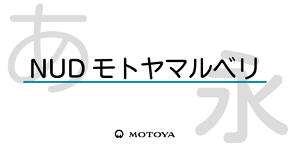 モトヤ書体は活字時代から培った理念により、文字の美しさと優れた可読性を備えており、本来的にユニバーサルデザイン性を有しています。このように、もともとユニバーサルデザインを意識して開発を行ったモトヤフォントですが、社会状況の変化に伴って、より一層の改良を加えて誕生したのがモトヤUD対応フォントです。モトヤUD対応フォントは、可読性・視認性・判読性を併せ持っていますので、あらゆる分野のご使用に自信を持ってお勧めいたします。
 - Revx Neue Rounded by OneSevenPointFive,
$9.00 Revx Neue Rounded is a modern rounded sans serif typeface. It contains 14 styles - 7 uprights and corresponding italics. The typeface supports the OpenType Latin Pro character set of 455 characters. It is packed with powerful OpenType features, alternative glyphs, kerning pairs, guided typing experience, and more which makes the typeface well featured. The typeface is suitable for all platforms (web, display, print, etc.). Revx Neue Rounded blends beautifully in your designs. Revx Neue (Non-Rounded corners): https://www.myfonts.com/fonts/one-seven-point-five/revx-neue/ Feedback: https://forms.gle/iY8Zswmsg689m95M8
 - Neu Phollick Alpha by Typotheticals,
$4.00 - Neue Reman Sans by Propertype,
$45.00 Neue Reman Sans 1.0 --- New Update! CONDENSED - SEMI CONDENSED - SEMI EXPANDED - EXPANDED It has 70 fonts style in total family + 2 Variable Style. --- It is a Roman, Humanist, Grotesk and Geometri sans serif family. The family comes in 7 weights with matching italics + Variable Font File and includes multilingual latin characters. Neue Reman Sans contains 306 glyphs - this is the first version of Neue Reman Family with standard ligatures and a variety of figures and fractions. We create Neue Reman typeface to use in multipurpose project such as on website, systems, printing, embedding, servers, screens, display, digital-ads, branding, logos, titles, headlines, teks, and everything else. This font is a project that we are working on for the long term. We has updating the Condensed and Expanded versions. Then we plan to continue working on Latin Pro, Greek and Cyrillic. It all will be updated gradually. So, hope you would like the first version of Neue Reman Sans Serif Typeface. Thank you very much.
 - Selfie Neue Rounded by Lián Types,
$29.00 INTRODUCTION When I started the first Selfie back in 2014 I was aware that I was designing something innovative at some point, because at that time there were not too many, (if any) fonts which rescued so many calligraphy features being at the same time a monolinear sans. I took inspiration from the galerías’ neon signs of my home city, Buenos Aires, and incorporated the logic and ductus of the spencerian style. The result was a very versatile font with many ligatures, swashes and a friendly look. But… I wasn’t cognizant of how successful the font would become! Selfie is maybe the font of my library that I see the most when I finally go out, (type-designers tend to be their entire lives glued to a screen), when I travel, and also the font that I mostly get emails about, asking for little tweaks, new capitals, new swashes. Selfie was used by several renowned clients, became part of many ‘top fonts of the year’ lists and was published in many magazines and books about type-design. These recognitions were, at the same time, cuddles for me and my Selfie and functioned as a driving force in 2020 to start this project which I called Selfie Neue. THE FONT "Selfie for everything" Selfie Neue, because it’s totally new: All its glyphs were re-drawn, all the proportions changed for better, and the old and somehow naive forms of the first Selfie were redesigned. Selfie Neue is now a family of many members (you can choose between a Rounded or a Sharp look), from Thin to Black, and from Short to Tall (because I noticed the feel of the font changed notoriously when altering its proportions). It also includes swashy Caps, which will serve as a perfect match for the lowercase and some incredibly cute icons/dingbats (designed by the talented Melissa Cronenbold) which, as you see in the posters, make the font even more attractive and easy to use. You'll find tons of alternates per glyph. It's impossible to get tired with Selfie! Like it happened with the old Selfie, Selfie Neue Rounded was thought for a really wide range of uses. Magazines, Book-covers, digital media, restaurants, logos, clothing, etc. Hey! The font is also a VF (Variable Font)! So you can have fun with its two axes: x-height and weight, in applications that support them. Let me take a New Selfie! TECHNICAL If you plan to print Selfie Neue VF (Rounded or Sharp), please remember to convert it to outlines first. The majority of the posters above have the "contextual" alternates activated, and this makes the capitals a little smaller. I'd recommend deactivating it if you plan to use Selfie for just one word. Use the font always with the "fi" feature activated so everything ligatures properly. The slant of the font is 24,7 degrees, so if you plan to have its stems vertical, you may use Selfie with that rotation in mind. THANKS FOR READING
 - Poster Cut Neue by Adam Ladd,
$25.00 Poster Cut Neue is a hand-drawn, rough display family. With some retro grotesque sans serif inspiration, the characters give an informal and active look and feel. The imperfections keep it casual but it is still legible. Ideal for organic and natural settings where a more human touch is required with branding, packaging, headlines, posters, advertising, illustrations, titles, etc. Switch between upper and lowercase letters for a uniquely drawn glyph, adding variety and helping avoid repetition.
 - Nud Motoya Mincho by Motoya,
$229.00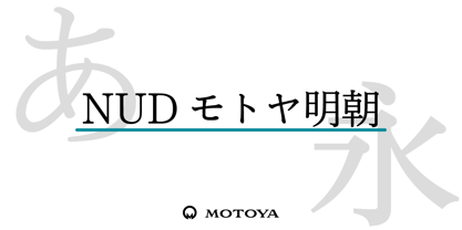 モトヤ書体は活字時代から培った理念により、文字の美しさと優れた可読性を備えており、本来的にユニバーサルデザイン性を有しています。このように、もともとユニバーサルデザインを意識して開発を行ったモトヤフォントですが、社会状況の変化に伴って、より一層の改良を加えて誕生したのがモトヤUD対応フォントです。モトヤUD対応フォントは、可読性・視認性・判読性を併せ持っていますので、あらゆる分野のご使用に自信を持ってお勧めいたします。
 - LT Binary Neue - 100% free

- LT Streetway Neue - 100% free

- (el&font BLOCK) - Unknown license

- Block Tilt BRK - Unknown license

- Block Letters Tryout - Unknown license

- Block Tilt (BRK) - Unknown license

- Spider Web Block - Unknown license

- FF Prater Block by FontFont,
$62.99 German type designers Henning Wagenbreth and Steffen Sauerteig created this display FontFont in 2000. The family contains 3 weights and is ideally suited for advertising and packaging, festive occasions, film and tv, editorial and publishing as well as poster and billboards. FF Prater Block provides advanced typographical support with features such as ligatures, alternate characters, and case-sensitive forms. It comes with tabular lining and proportional lining figures. This FontFont is a member of the FF Prater super family, which also includes FF Prater Sans, FF Prater Script, and FF Prater Serif.
 - D-block A by AType,
$19.95The history of this font is those. Once I assorted the old children's books which have stayed from times of my childhood. On one of them I have seen a trade mark of a printing house consisting of two Russian letters "L" and "B". From they were begun also with my font. And though finally from these letters a little that remained, elements of these letters can be seen in font D-block B. - Super Block MF by Masterfont,
$59.00 - Calendar Blocks JNL by Jeff Levine,
$29.00Calendar Blocks JNL was inspired by old-fashioned wood type used to assemble calendar pages in the days of letterpress printing. The A-Z keystrokes contain the dates 1-26. The lower case a-z keystrokes have the remaining dates 27-31, along with the split dates 23/30 and 24/31 and blank boxes. The days of the week are located on the 1-7 keys. - Architect Small Block by Quiet Designs Inc.,
$20.00This hand-crafted font was designed for architect, blueprint and drawing use. Small font sizes have good contrast and are very easy to read. Larger font sizes create distinguished-looking headings. This font is also a good choice for adding a personal hand lettered touch, as opposed to fonts with perfectly formed lines and curves or other script fonts that are less formal and often difficult to read. The font resembles a cross between comic and VAG fonts. Architect Small Block started its life as small block letters on vellum ... hence its name. - Thorm Block Graffiti by Sipanji21,
$18.00 Thorm Black is a spectacular Display font with a Fatty and Cools graffiti style for your design look awesome. It will elevate a wide range of design projects to the highest level, be it branding, headings, designs, invitations, signatures, logotype, Streetwear, wall art illustration, apparel, labels, and much more!
 - KG Blank Space by Kimberly Geswein,
$5.00 A chunky fat font perfect for titles in both a chalkboard sketch style and a regular solid version.
 - Ungap Blocks Variable by Pedro Teixeira,
$25.00 This font was designed by blocks, square glyphs. Terminals/crossbars of some glyphs can be extended in a way that you can customize the text of your design by using the selection bars in "variable font" button. That button will appear in the text editor of your program, if such option is available, like in recente illustrator and photoshop.
 - PL Barnum Block by Monotype,
$29.99 Designed by Dave West and released in 1960, the name Barnum associates this face with the famous nineteenth-century traveling American circus and showman P.T. Barnum. The wood-cut influence of the letter makes the PL Barnum Block font ideal for posters, signage and creative titling and packaging.
 - Straight Flush Block by Inumocca,
$18.00 Straight Flush font family inspiration from Old school traditional tattoo font, simple and Strong Charachters. come with some simple Alternates for covering your Project, like Branding, Movie Title, Headline Letter, Bookcover or Book Content, Magazine cover, Poster, Quotes Lettering, Logos, and more your project design. - Unique glyphs - Multilingual Characters - UPPERCASE - Lowercase - Numeric - Symbol - Punctuation Character - Alternates inumocca type Studio
 - Boston Blackie NF by Nick's Fonts,
$10.00This bold, bodacious blackletter typeface is based on an offering from the 1832 Boston Type Foundry catalog. Although it generally appears to be a sober Old English font, there are a few quirky turns here and there, which make it a lot of fun. The Postscript and Truetype versions contain a complete Latin language character set (Unicode 1252); in addition, the Opentype version supports Unicode 1250 (Central European) languages as well. - Campus Sans Block by MacCampus,
$30.00Linotype Creative Arrows was designed by Robert Bucan in 1998 and consists mainly of directional symbols. Arrows and symbols in many different variations can also be built together, creating unique combinations for a variety of applications. - Children Block Letters by m u r,
$15.00An child's 3D block letters. - KG PDX Blocks by Kimberly Geswein,
$5.00 This cute flag or banner font contains a unicase font inside. Enclosed PDF guides you on how to use the font effectively.
 - KG Geronimo Blocks by Kimberly Geswein,
$5.00 This is a chunky block with inset unicase font.
 - Cell Block 6 by Enrich Design,
$24.95The concept for Cell Block 6 is based on the rigid structure and design of modern architecture. It is a structural display font created by Enrich Design. Four of six versions of Cell Block 6 are designed to be used as display fonts in order to uphold their detail. The Solid and Solid Outline versions offer additional versatility and can be used at smaller sizes in a wide range of applications. - Rounded Block Display by NDS Fonts,
$15.00 Rounded Block Display is a blocky san serif font perfect for headlines. Its clean facade and easy readability make this a great font to get your message across.
 - Dry Brush Blocks by BW90,
$24.99 It was supposed to be brush-like, but it looks more like sponge. Have fun using it!
 - SK One Block by Salih Kizilkaya,
$3.50 SK One Block was designed by Salih Kızılkaya in 2020. Inspired by Kufic typeface, this font includes many typographic material you will need. SK One consists of 8 different fonts and 2696 glyphs.
 - PIXymbols Baby Blocks by Page Studio Graphics,
$25.00 The PIXymbols™Baby Blocks font is designed to create both single color, and two-color titles or initials. Each package includes a document showing the full character set with key codes. The font package includes both TrueType and PostScript versions, and is available in either PC/Win or Macintosh format. In order to avoid serious problems, be sure not to install the same fonts in both TrueType and PostScript on the same computer. The font offers opportunities for various color treatments, with either single or double characters.
 - Neue Haas Grotesk Text by Linotype,
$33.99The original metal Neue Haas Grotesk™ would, in the late 1950s become Helvetica®. But, over the years, Helvetica would move away from its roots. Some of the features that made Neue Haas Grotesk so good were expunged or altered owing to comprimises dictated by technological changes. Christian Schwartz says Neue Haas Grotesk was originally produced for typesetting by hand in a range of sizes from 5 to 72 points, but digital Helvetica has always been one-size-fits-all, which leads to unfortunate compromises."""" Schwartz's digital revival sets the record straight, so to speak. What was lost in Neue Haas Grotesk's transition to the digital Helvetica of today, has been resurrected in this faithful digital revival. The Regular and Bold weights of Helvetica were redesigned for the Linotype machine; those alterations remained when Helvetica was adapted for phototypesetting. During the 1980s, the family was redrawn and released as Neue Helvetica. Schwartz's revival of the original Helvetica, his new Neue Haas Grotesk, comes complete with a number of Max Miedinger's alternates, including a flat-legged R. Eight display weights, from Thin to Black, plus a further three weights drawn specifically for text make this much more than a revival - it's a versatile, well-drawn grot with all the right ingredients. The Thin weight (originally requested by Bloomberg Businessweek) is very fine, very thin indeed, and reveals the true skeleton of these iconic letterforms. Available as a family of OpenType fonts with a very large Pro character set, Neue Haas Grotesk supports most Central European and many Eastern European languages. - Scratch my back - Unknown license

- Back to 1982 - Unknown license

- Never Writes Back - Unknown license

- Want You Back - Unknown license


