1,919 search results
(0.021 seconds)
- Nipsey by Putracetol,
$28.00 Introducing Nipsey - a unique display font inspired by vintage albums and posters from 1970s music bands. With its classic typeface and groovy impression, Nipsey brings a fun and retro vibe to your designs. What sets Nipsey apart is the combination of various alternates, such as swashes, stylistic sets, stylistic alternates, contextual alternates, and ligatures, making this font even more distinctive and versatile. Nipsey is perfect for a wide range of display purposes, including album covers, posters, labels, t-shirts, apparel, signage, quotes, logos, greeting cards, logotypes, and more. Its eye-catching design adds a touch of nostalgia and personality to any project, making it stand out in a crowd. To access the alternative characters in Nipsey, you can use OpenType savvy programs such as Adobe Illustrator, Adobe InDesign, Adobe Photoshop, Corel Draw X version, and Microsoft Word. The OpenType features allow you to easily switch between uppercase and lowercase letters, as well as apply alternates and ligatures to create unique and customized lettering compositions. In your zip package, you'll find the Nipsey font files in otf, ttf, and woff formats, providing versatility for different design projects. The font includes uppercase and lowercase letters, numerals, punctuation, and symbols, ensuring that you have all the elements you need for your designs. Nipsey also offers multilingual support, making it accessible for designers around the world to create designs in different languages. Whether you're designing for English, Spanish, French, or any other language, Nipsey has got you covered. If you have any questions, feedback, or comments, feel free to reach out to PutraCetol Design Studio via PM or email. The team is happy to assist you in your creative endeavors. In conclusion, Nipsey is a unique and versatile display font that brings a fun and retro vibe to your designs. With its alternative characters and multilingual support, Nipsey offers endless possibilities for creating eye-catching designs for various display purposes. So, let your creativity flow with Nipsey and elevate your design projects to the next level! Thanks for choosing Nipsey from PutraCetol Design Studio. Happy Creating!
 - Gothic Tuscan One by HiH,
$12.00 Gothic Tuscan One is a all-cap condensed gothic with round terminals and decorative “tuscan” center spurs. It was first shown by William H. Page of Norwich, Connecticut among his wood type specimen pages of 1859. Gothic Tuscan One exemplifies the strength of decorative wood types: large, simple type forms that provide the visual boldness sought by advertisers of the Victorian period. While our marketing has gotten so very sophisticated, there is always a place for simple, visually strong typeface. Although about 14 miles inland, Norwich lies at the head of the Thames River. The river is both wide and deep, and therefore was not bridged in the early 20th century. From the 17th century until then, if you wanted to get from Groton on the west bank to the whaling port of New London on the east bank by land, you had to had to go by way of Norwich. Because of its size, the Thames is navigable all the way from Norwich to New London. Docks were built in Norwich around 1685 and the city became Connecticut’s 2nd largest port by 1800. With the construction of the Norwich & Worcester Railroad in 1835, Page could easily ship his wood type north by rail or south by coastal schooner. Included with our font, Gothic Tuscan One, are two 19th century printer’s ornaments of sailing ships similar to those that sailed up the Thames to Norwich. There is also a more contemporary glyph of a whale, looking quite pleased that the only whaling ship left in Connecticut is the Charles W. Morgan, permanently moored at Mystic Seaport. Reference: Moon’s Handbooks, Connecticut 2nd Edition (Emeryville CA 2004). Gothic Tuscan One ML represents a major extension of the original release, with the following changes: 1. Added glyphs for the 1250 Central Europe, the 1252 Turkish and the 1257 Baltic Code Pages. Added glyphs to complete standard 1252 Western Europe Code Page. Special glyphs relocated and assigned Unicode codepoints, some in Private Use area. Total of 332 glyphs. 2. Added OpenType GSUB layout features: pnum, ornm and dlig. 3. Added 330 kerning pairs. 4. Revised vertical metrics for improved cross-platform line spacing. 5. Redesigned mathamatical operators 6. Included of both tabular (std) & proportional numbers (optional). 7. Refined various glyph outlines. Please note that some older applications may only be able to access the Western Europe character set (approximately 221 glyphs). The zip package includes two versions of the font at no extra charge. There is an OTF version which is in Open PS (Post Script Type 1) format and a TTF version which is in Open TT (True Type)format. Use whichever works best for your applications.
 - Gundrada ML by HiH,
$12.00 Gundrada ML was inspired by the lettering on the tomb of Gundrada de Warenne. She was buried at Southover Church at Lewes, Sussex, in the south of England in 1085. The Latin inscription on her tomb, STIRPS GUNDRADA DUCUM, meaning “Gundrada, descendant of the Duke” may have led to the speculation that she was the daughter of William, Duke of Normandy and bastard son of Robert the Devil of Normandy and Arletta, daughter of a tanner in Falaise. In 1066 William defeated Harold at the Battle of Hastings and was crowned William I of England. More commonly known as William the Conquerer, he commissioned a string of forts around the kingdom and charged trusted Norman Barons to control the contentious Anglo-Saxon population. William de Warenne, husband of Gundrada, was one of these Barons. There has also been the suggestion that Gundrada may have been the daughter of William’s wife, Matilda of Flanders, by a previous marriage. According to the Dictionary of National Biography (Oxford University Press, Oxford, England 1921-22), both of these contentions are in dispute. Searching the past of a thousand years ago is like wandering in a heavy fog: facts are only dimly in view. Regardless, I know that I found these letterforms immediately engaging in their simplicity. Unadorned and unsophisticated, they have a direct honesty that rests well in the company of humanistic sans serifs like Franklin Gothic or Gill Sans, appealing to a contemporary sensibility. The lettering on the tomb is in upper case only. Although Gundrada does not sound Norman French to me, her husband certainly and her father probably were Norman French. Nonetheless, the man that carved her tombstone was probably Anglo-Saxon, like most of the people. For that reason, we are quite comfortable with a fairly generic lower case from an Anglo-Saxon document of the time. The time was a time of transition, of contending language influences. This font reflects some of that tension. Features 1. Multi-Lingual Font with 389 glyphs and 698 Kerning Pairs. 2. OpenType GSUB layout features: onum, dlig, liga, salt & hist. 3. Tabular Figures and Alternate Old-Style Figures. 4. Alternate Ruled Caps (line above and below, matching to brackets). 5. Central Europe, Western Europe, Turkish and Baltic Code Pages. 6. Additional accents for Cornish and Old Gaelic. 7. Stylistic alternates A, E, y and #. 8. Ligatures ST, Th, fi and fl. 9. Historic alternate longs. The zip package includes two versions of the font at no extra charge. There is an OTF version which is in Open PS (Post Script Type 1) format and a TTF version which is in Open TT (True Type)format. Use whichever works best for your applications.
 - Lens Grotesk by Typedepot,
$39.99 Lens Grotesk is a Neo-grotesque type family of 16 fonts born as a result of a very conscious research in the field of the neutral Swiss aesthetic. There's a reason for all the prominent examples of this design like Helvetica and Univers to be used on a daily basis for more than 70 years and it's a simple one - they just work. The closed terminals, the low contrast, uniform widths and proportions makes the Neo-grotesques feel just right. Although very often branded as stiff, the neutral Neo grotesques are here to stay and Lens Grotesk is our own reading of the popular style. Lens Grotesk takes the Neo-grotesk model one step further adding a pinch of Geometric sans-serif to the mix thus creating a way more modern and contemporary looking design. Characterized with more generous oval proportions and slightly more open terminals, Lens Grotesk keeps the modulation and rhythm needed for a slightly longer texts while visibly keeping everything in order. Zooming in you'll find traces of the Geometric aesthetic - the robust almost right angled approach of the arches and tails (look t, f, j, y) and the way more circular rounded shapes. Like all our fonts, Lens Grotesk is equipped with a range of OpenType features, stylistic alternatives and of course Cyrillic support. It comes in a pack of 16 fonts with 8 styles and their matching italics or one variable font file available with all full family purchases. Live Tester | Download Demo Fonts | Subscribe
 - Grayfel by insigne,
$- As designers, we seek perfection and originality. The more we step back and look at our work, the more changes we tend to find necessary. Drastic modifications are inevitable. The same is true of Grayfel. Grayfel began as an exercise at insigne to explore the crowded space of neutral sans. While the world of sans serifs is admittedly crowded, I still managed to find something new and different. The final Grayfel consists of 42 full-featured OpenType fonts containing three widths: Regular, Condensed, and Extended. Every width consists of 14 fonts--seven weights with matching italics, making it a good companion for setting clear text and headlines for print and screen. OpenType features are also available. There’s figure choices, such as proportional and old style figures. Additionally, Greyfel includes sophisticated typographic attributes: ligatures, fractions, alternate characters, small caps, superscripts and subscripts. Its extended character set supports Central, Western and Eastern European languages. Optical compensations also mean the outcome of this family is a hybrid of humanistic proportions. It’s a well-finished design with optimized kerning gives it a friendly look. If you like sans serifs within the tradition of Futura, Helvetica, Avant Garde and Avenir, then you’ll love Greyfel, too. Grayfel works well in a variety of applications. Subtly neutral yet fun, it’s suitable for headlines of all sizes as well as for text. Put it to the task for marketing, packaging, editorial work, branding and even on-screen projects. Try it out: it’s not just fun and playful; it’s Grayfel.
 - Smart Sans by Monotype,
$29.99 Smart Sans is a personal tribute to Leslie (Sam) Smart, the first type director to be hired by a major typesetting house in Canada. Smart was a twentieth century design pioneer who raised the standards of Canadian typography. Together with three of his peers, he established the first Type Directors Club in Toronto. After Smart's death in 1998, type designer Rod McDonald decided that something should be done to commemorate Smart's life and achievements. I had first thought of establishing a scholarship in Sam's name, but a typeface design soon replaced this idea," says McDonald. "Once I decided to design a typeface, however, it became a foregone conclusion that it would be a sans serif - for no other reason than that I loved the name Smart Sans." Two typefaces served as inspiration for McDonald's work. "Like thousands of designers, I'm keen on Matthew Carter's Helvetica Compressed series. And, when I was younger, I also loved Fred Lambert's Compacta," says McDonald. "I thought there might be a place for a small range that could take over from these 'old workhorses' and, in the process, bring a fresher look to the genre." McDonald drew three weights for the Smart Sans family, all ideally suited for setting attention-getting headlines and powerful display copy. The two-storied 'g' contributes to the design's lively personality, and the short 'r' helps maintain tight, even spacing. Smart Sans is the perfect homage to a great typographer, because it raises the bar on what to expect from condensed sans serif typefaces. Sam Smart would be pleased."
 - Body by Zetafonts,
$39.00 Body graphic project at Behance Body is a type family designed for Zetafonts by Cosimo Lorenzo Pancini with Andrea Tartarelli. Conceived as a contemporary alternative to modernist superfamilies like Univers or Helvetica, Body tries to maximize text readability while providing a wide range of options for the designer. It comes in two variants (Body Text and Body Grotesque), each in four widths and four weights: regular and bold for basic typesetting, light and extrabold for display use. Body Grotesque applies to the sans serif modernist skeleton little imperfections and quirks inspired by our research in early 20th century type specimens. Curves are slightly more calligraphic and a light inverse contrast is applied to bold weights, giving the typeface a slight vintage appearance in display use. Body Text, on the contrary, challenges the modernist aesthetics maximizing horizontal lines and using open terminals for letters like “s” and “a” that appear normally dark in modernist grotesques. For both variants, the normal width family is slightly condensed in an effort to maximize space usage; the Slim width is provided for extremely dense texts or side notes while the Fit width is optimized for display usage as in logos, headings or titles. The Large width manages to look elegant in its light weight while becoming a valid heading or subtitle font in its extrabold weights. All the 64 fonts in the Body superfamily include a complete latin extended character set with small caps for over 70 languages, Russian cyrillic, open type positional numbers, stylist sets and alternate forms.
 - Neuzeit Office by Linotype,
$50.99 The Neuzeit Office family is designed after the model of the original sans serif family Neuzeit S™ , which was produced by D. Stempel AG and the Linotype Design Studio in 1966. Neuzeit S itself was a redesign of D. Stempel AG’s DIN Neuzeit, created by Wilhelm Pischner between 1928 and 1939. Intended to represent its own time, DIN Neuzeit must have struck a harmonious chord. DIN Neuzeit is a constructed, geometric sans serif. It was born during the 1920s, a time of design experimentation and standardization, whose ethos has been made famous by the Bauhaus and De Stijl movements in art, architecture, and design. Upon its redesign as Neuzeit S in the 1960s, other developments in sans serif letter design were taken into account. Neuzeit S looks less geometric, and more gothic, or industrial. Separating it from typefaces like Futura, it has a double-storey a, instead of a less legible, single-storey variant. Unlike more popular grotesque sans serifs like Helvetica, Neuzeit S and especially the redesigned Neuzeit Office contain more open, legible letterforms. Neuzeit Office preserves the characteristic number forms that have been associated with its design for years. After four decades, Neuzeit has been retooled once again, and it is more a child of its age than ever before. Akira Kobayashi, Linotype’s Type Director, created the revised and updated Neuzeit Office in 2006. His greatest change was to retool the design to make its performance in text far more optimal. Additionally, he created companion oblique to help emphasize text.
 - Familiar Pro by CheapProFonts,
$- This family was inspired by a Type Battle over at Typophile: How would you design a font metrically compatible with Helvetica, but better than Arial? Working with preset letter widths was an interesting constraint, both a relief and a limitation at the same time. I have done all the 4 basic weights, and the skewed obliques (done to a slightly less steep 10 degrees angle as opposed to the originals 12) has been optically adjusted. The letters have been designed quite close to the german/swiss grotesk tradition, but by using super-elliptical rounds, rounded dots and slightly curved outer diagonals the end result is a friendly looking font family that still looks... familiar. ALL fonts from CheapProFonts have very extensive language support: They contain some unusual diacritic letters (some of which are contained in the Latin Extended-B Unicode block) supporting: Cornish, Filipino (Tagalog), Guarani, Luxembourgian, Malagasy, Romanian, Ulithian and Welsh. They also contain all glyphs in the Latin Extended-A Unicode block (which among others cover the Central European and Baltic areas) supporting: Afrikaans, Belarusian (Lacinka), Bosnian, Catalan, Chichewa, Croatian, Czech, Dutch, Esperanto, Greenlandic, Hungarian, Kashubian, Kurdish (Kurmanji), Latvian, Lithuanian, Maltese, Maori, Polish, Saami (Inari), Saami (North), Serbian (latin), Slovak(ian), Slovene, Sorbian (Lower), Sorbian (Upper), Turkish and Turkmen. And they of course contain all the usual "western" glyphs supporting: Albanian, Basque, Breton, Chamorro, Danish, Estonian, Faroese, Finnish, French, Frisian, Galican, German, Icelandic, Indonesian, Irish (Gaelic), Italian, Northern Sotho, Norwegian, Occitan, Portuguese, Rhaeto-Romance, Sami (Lule), Sami (South), Scots (Gaelic), Spanish, Swedish, Tswana, Walloon and Yapese.
 - Ballade - Personal use only

- Craw Modern by GroupType,
$19.00 Craw Modern was designed by Freeman Craw in 1958 and first released by The American Typefounders Company, (ATF). In typography, 'Modern' is a style of typeface (classification) developed in the late 18th century that continued through much of the 19th century. Characterized by high contrast between thick and thin strokes and flat serifs. Bodoni is among the most popular of the Moderns. Moderns are also known as Didone and New Antiqua.
 - Neon LED V2 by Qaratype,
$16.00 Neon LED V2 is a New Version of Neon LED Light font, It is a bold, chunky lettered and retro display font. Perfect for quotes, retro style design, logo, logotype, badges, packaging, branding, sign, craft needs, mockup, merchandise, and many more. Add this neon font to your creative ideas and notice how it makes them stand out! Main Features: Uppercase & Lowercase letters Punctuation and special characters Multilingual support OTF
 - Bernhard Modern by Bitstream,
$29.99Bernhard Modern was designed in 1937 by Lucian Bernhard for ATF. It is his personal version of the small x-height engravers’ old styles popular at the time. A perennial best-seller, Bernhard Modern remains popular in a wide variety of design and typesetting uses more that 60 years after its initial release. Bitstream’s version offers a wide array of typographer sets, including alternates, extensions, small caps and italic swashes. - Hancock Pro by Red Rooster Collection,
$60.00 Hancock Bold Condensed is slab serif typeface. The original Hancock design was produced by the Keystone Type Foundry, circa 1903; a condensed version was added circa 1917 by Lanston Monotype. Steve Jackaman (ITF) designed and produced a digital version of Hancock in 1994, and completely redrew the typeface for its 2017 release. The new version has a 40% larger glyph set, and supports Latin 1 plus Central/Eastern European languages.
 - Hugnesh by Ditatype,
$29.00 Introducing Hugnesh Font. Hugnesh font is a monoline display font. Create from our talented font designer. The design of typeface will make your design more beautiful and inspiring. This font will suitable for any project, like branding, print template, logo and etc. Includes : Hugnesh (OTF) Features : Multilingual Support Beautiful Ligature PUA encoded Stylistics Set Numerals and Punctuation (OpenType Standard) Full Support Thanks for visiting and purchasing my font!
 - Pondspell by Din Studio,
$29.00 Introducing Pondspell Brush Font Pondspellt is a brush font, Made with naturally brush. The texture from the brush font will make your design more beautiful and powerful. This font is suitable for any design like branding, quotes, book title and etc. Included: Pondspell (otf) Features: Accents (Multilingual Characters) Ligatures PUA encoded Numerals and Punctuation (OpenType Standard) Swash I hope you enjoy it !! Thanks for visiting and purchasing my font!
 - Alternate Gothic Pro EF by Elsner+Flake,
$35.00 In 1903, the typeface family Alternate Gothic was developed for ATF (American Type Foundry) by Morris Fuller Benton. It was Benton’s intent to solve many diverse layout problems with the development of a narrow Sans with different width values. The Alternate Gothic enjoys great popularity to this day. Therefore, Elsner+Flake re-worked the typeface family, added all European fixed accents and complemented it with an Antique version.
 - Good Reporting JNL by Jeff Levine,
$29.00 A September 29, 1920 edition of The San Diego Union ran the headline “Cicotte Confesses Baseball Fraud; Eight White Sox Players Indicted”. The White Sox baseball scandal was the first to reveal illegal gambling on the game. However, the headline itself was set in a bold slab serif type style [likely ATF Foster] which served as the model for Good Reporting JNL; which is available in both regular and oblique versions.
 - Foda Egypt by Fo Da,
$20.00 Foda Egypt is a sans-serif font family comes with 6 main weights and their italics, with 599 glyphs that support many languages and cover many OTF features such as accents, ligatures, kerning and more … Foda Egypt is a stylish modern sans-serif suited for headlines, newspapers and many purposes thanks to the clean lines and sharp edges that render out so clearly on screens which increases legibility for all users.
 - Alternate Gothic Pro Antique by Elsner+Flake,
$35.00 In 1903, the typeface family Alternate Gothic was developed for ATF (American Type Foundry) by Morris Fuller Benton. It was Benton’s intent to solve many diverse layout problems with the development of a narrow Sans with different width values. The Alternate Gothic enjoys great popularity to this day. Therefore, Elsner+Flake re-worked the typeface family, added all European fixed accents and complemented it with an Antique version.
 - Benton Modern by Font Bureau,
$40.00 Benton Modern was first prepared as a text face by Font Bureau for the Boston Globe and the Detroit Free Press. Design and proportions were taken from Morris Fuller Benton’s turn-of-the-century Century Expanded, drawn for ATF, faithfully reviving this epoch-making magazine and news text roman. The italic was based on Century Schoolbook. These display cuttings were prepared by Dyana Weissman and Richard Lipton; FB 2008
 - Brushin by Mandarin,
$15.00 Brushin is an handwritten display font inspired by the straightforward rigidness of Grotesque sans-serif fonts. It features two stylistic sets for every glyphs in font so it gives you the choice to not repeat the same glyph design in big titles and/or small statements. The font was designed on paper with a brush and then scanned, vectorised through Photoshop and finally compiled in Glyphs as and OTF font file.
 - Ascender Uni by Ascender,
$197.99Ascender™ Uni is a proportionally spaced comprehensive Unicode-compatible font with support for the Unicode Standard, v2.1 (supporting most major code pages and character sets in modern use). Ascender Uni is a 39MB TrueType (TTF) font with approximately 53,000 glyphs. The Latin and related glyphs (designed by Steve Matteson) are Sans Serif, with Gothic ideographs drawn in Japanese style, and complementary styles for other scripts. There are also versions of Ascender Uni that provide localized support for Korean, Simplified Chinese and Traditional Chinese. OpenType layout support is included for Arabic (initial, medial, final, isolate, and required ligature forms, as well as basic mark positioning), and vertical writing for CJK locales (consisting mostly of Latin, symbol, punctuation, and kana glyph variants). Character Set: Latin-1, WGL Pan-European (Eastern Europe, Cyrillic, Greek and Turkish), Chinese, Japanese, Korean, Thai, Vietnamese, Hebrew, Arabic. NOTE: Not all applications provide complete support for all the glyphs in this Unicode font. - Victualia X by Dawnland,
$13.00 Victualia - casual, hand drawn (Wacom, illustrator) brush font. "Ligatures" have been created for some double letters to enhance the illusion of handwritten text. (TT, tt, ff, oo, OO, mm, MM, ll & LL - open type version of the font and open type compatible layout application required). Victualia was initially created in 2005 as part of a course that I attended to At Berghs , but has now been given a face lift as well as a full set of special characters.
 - Significa - Unknown license

- Freigeist by René Bieder,
$29.00 The story of Freigeist is a journey into the past, back to the early grotesk fonts and long before Helvetica and Co were standard fonts in operating systems. For what we take for granted today is the result of innovation and pioneering spirit of type foundries such as Caslon or Stephenson Blake in the 19th century, whose expressive designs are mostly forgotten today. The Freigeist family captures this untamed spirit — hence the name (German for “free spirit”) — and puts it into a contemporary context, resulting in a multi-faceted family with a wide range of applications, font styles and features for modern typesetting. Design Details Unlike other modern grotesk typefaces like Helvetica or Univers, Freigeist is characterized by a warm and dynamic appearance. It draws inspiration from various historical models such as Caslon’s Doric or the Grotesque variants of Stephenson Blake. Particularly noticeable are the narrow terminals, the serpentine S or the dynamic g in combination with ascenders that reach to the cap-height only. Italics Many italic grotesk fonts are strongly oriented towards their upright counterparts. Unfortunately, this often means that they cannot do justice to their actual task, which is to highlight words or sections of a text. The italic cuts of Freigeist try to remedy this situation by using the greatest possible formal distance while reinforcing the untamed spirit. What adds to this, is a reminiscent of handwritten forms, which can be found in a, n, y or g, as well as the German sharp s or the ampersand. Alternate Characters Alternative letterforms are ideal for customizing the overall appearance of a text, for usage in logos or they can even work as custom fonts for companies. Freigeist comes with ten stylistic alternatives that are easy to insert via the Opentype window, such as the single-storey a, a tail-less version of the a for compact text, when uses in condensed widths or a dialed down version of the r. Languages Freigeist has a built-in support for Latin and Cyrillic based languages and covers more than 210 languages. Opentype Features and Symbols The family comes with many opentype features to support modern typesetting. This includes ligatures, different number sets or alternative shapes for texts set in all caps. Styles Freigeist is available in five widths (XCon, Con, Normal, Wide, XWide) and six weights (Thin, Light, Regular, Medium, Bold, Black). Including the accompanying italics, the family comes in 60 cuts that are suitable for any application. Testfonts If you like to test the fonts before buying the full version, please follow the link below: https://www.renebieder.com/test-fonts Update 1 A lot has changed in this first update. It is more than just a 1.01 or 1.02. It is actually the 2.0! I’ve gone through all! single glyphs of the 18 master files, making the family more sharp and even a bit more modern. I’ve added some new opentype features and redesigned the italics, because I wasn’t happy enough with the result. I’ve added new kerning pairs, new metrics, and even new glyphs. Please check my website for more details on the new design and overview about the opentype features and alternate shapes. If you purchased the Freigeist family already, thanks a lot!! It is the most advanced family that I published so far. I hope that you’re happy with this new version. Thanks!
 - Full Sans by Bülent Yüksel,
$19.00 Full Sans is a geometric sans in the tradition of Futura, Avant Garde and the like. It has a modern streak which is the result of a harmonization of width and height especially in the lowercase letters to support legibility. Full Sans is the younger brother of original Full Neue, Full Slab and Full Tools. Ideally suited for advertising and packaging, editorial and publishing, logo, branding and creative industries, poster and billboards, small text, wayfinding and signage as well as web and screen design. Full Sans provides advanced typographical support for Latin-based languages. An extended character set, supporting Central, Western and Eastern European languages, rounds up the family. The designation “Full Sans LC 50 Book” forms the central point. The first figure of the number describes the stroke thickness: 10 Thin to 90 Bold. Full Sans LC comes 5 weights and italics also Full Sans SC comes 5 weights and italics total 20 types. The family contains a set of 485 characters. Case-Sensitive Forms, Classes and Features, Small Caps from Letter Cases, Fractions, Superior, Inferior, Denominator, Numerator, Old Style Figures just one touch easy In all graphic programs. Full Sans is the perfect font for web use. You can enjoy using it. UPDATE: 08 March 2019 - Fixed extension of glyhps "y" and "g". - "LineGap" error has been fixed. - Fixed bug in "onum", "pnum", "tnum" and "tnum" software in OpenType feature.
 - Sánchez Niu by Latinotype,
$- Sánchez Niu is a redesign of Sánchez—one of the first font families by Latinotype designed in 2011. In the typedesign industry the terms ‘nova’, ‘neue’, ‘next’, ‘new’ are often used to refer to a typeface that has been modified in different ways: redesign, technical readjustments, greater number of characters, etc. At Latinotype we are now starting to use the word ‘niu’ to refer to these kinds of typefaces. Niu is an adaptation of the original word ‘new’, i.e., we have adapted this English word to the phonology and spelling of our own language but keeping the original meaning. Race mixing, diversity, change and adaptation are part of the essence of Latin American culture and, at Latinotype, we are all constantly expressing these elements in everything we do. Latin Power! This new version includes improvements that make it work well with longer text. Such improvements have not had a major effect on the look of the font, though. We have adjusted the original proportions and added a number of new characters as well as OpenType features such as small caps, oldstyle figures, tabular numbers and stylistic alternates. Sánchez Niu contains a set of 720 characters that support 219 languages. The font is well-suited for long text, headlines and logotypes, and it has been optimised for web usage. Sánchez Niu comes with two free fonts—Regular and Regular Italic! Corrections, digital editing and review by César Araya, Rodrigo Fuenzalida and Alfonso García.
 - The Longlight by Colllab Studio,
$15.00 Presenting The Longlight! An Elegant Calligraphy Font with some alternates and ligatures. This font made with the perfect combining of each character. It looks original and can be used for all your project needs. Each glyph has its own uniqueness and when meeting with others will provide dynamic and pleasing proximity. This font can be used at any time and any project. You can see in the presentation picture above, The Longlight looks elegant and stylish on design projects. So, The Longlight can't wait to give its touch to all your design projects such as quotes, poster design, personal branding, promotional materials, website, logotype, product packaging, etc. Besides that, The Longlight also has some ligature that gives a surprise when you type certain characters combining. The ligatures are ee, ff, gg, gg1, ii, jj, ll, ll1, mm, nn, oo, pp, ss, tt, tt1, pp, and yy. WHAT'S INCLUDED? 1. The Longlight • The first version comes with uppercase, lowercase, ligatures, numeral, punctuation, symbols, and Standard Latin Multilingual Support (Afrikaans, Albanian, Catalan, Danish, Dutch, English, French, German, Icelandic, Indonesian, Italian, Malay, Norwegian, Portuguese, Spanisch, Swedish, Zulu, and More). 2. The Longlight Alternate • Included some alternates: f, g, i, j, l, p, s, t, y, and g. A Million Thanks Colllab Studio
 - Peter Schlemihl - Unknown license

- Kleist-Fraktur Zierbuchstaben - Personal use only

- Morris Roman Alternate - Personal use only

- Balboa by Parkinson,
$20.00 Balboa is a display design combining elements of early sans serif and grotesque types with contemporary types. It evolved from ATF Headline Gothic, Banner (a headline typeface I drew for the San Francisco Chronicle), and Newsweek No.9, a Stephenson Blake-like grotesque I designed for Roger Black's 1980 redesign of Newsweek Magazine. There are nine styles, including the three new styles that have been added in 2014: Medium, Light and Ultra Light.
 - Oval Monogram by MonogramBros,
$12.00 Oval Monogram is a perfect oval shaped monogram font consisting of 78 letters. With just a single font file you will be able to create beautiful monograms in just a matter of minutes after the purchase! Oval Monogram Font comes with font file in OTF format. It features all the modern advanced font features such as Contextual Alternates, effectively eliminating the need to use multiple separate font files for left, center and right letters.
 - Leighton by Red Rooster Collection,
$45.00 Leighton is a four-weight serif font family that was created in 1993 by Paul Hickson (P&P Hickson) and Steve Jackaman (ITF) exclusively for ITF’s Red Rooster Collection. Its designs are loosely based on the typeface Lectura, which was designed in 1966 by Dick Dooijes for the Amsterdam Foundry. Leighton is a conservative, demi-serif font in a Dutch style. It is ideal for upscale corporate projects and excels at any size.
 - Richmond Script by Rotterlab Studio,
$14.00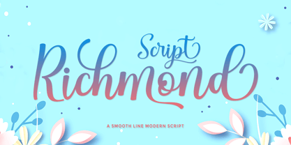 Richmond Script is a beautiful script font with many alternative styles, this font looks natural, elegant, and perfect for extraordinary projects. Richmond Script is suitable for various products such as invitations, product packaging, quotes, product designs, crafters, labels, photography, watermarks, logos & branding. Everything can be accessed using software that supports Opentype, such as Adobe Indesign, Adobe CS Illustrator, Adobe Photoshop CC, and Corel Draw. You will get: Richmond Script OTF Thank you :)
 - Sweet Orange Blossom by The Gelato,
$10.00 The Sweet Orange Blossom font is a handwritten font that gives neat but realistic roller pen feelings when being displayed! It offers support for all the characters in all western European languages as well as standard punctuation glyphs. Perfectly suitable for numerous use such as product labels, quotations, banners, logos, product packaging, titles, headers, menu lists, and even for digital note taking! It comes in OTF format. Feel free to purchase and try!
 - Gerova by Asenbayu,
$15.00 Gerova is a serif display font that is aesthetically pleasing and has beautiful curves. Gerova font also gives the impression of luxury with a sleek and sharp serif. This font provides a unique collection of glyphs that are perfect for completing a variety of projects, such as logo designs, identities, product labels, fashion, magazines and more. Gerova font features Open Type Format (OTF), alternative styles, ligatures, kerning, uppercase & lowercase letters, numeral, punctuation and multilingual support.
 - Poynter Gothic by Font Bureau,
$40.00 Morris Fuller Benton’s drawings at the Smithsonian show a creative concern for effects of scale on typeface design. Tobias Frere-Jones began with 4pt ATF Franklin Gothic drawings, modifying proportions to mix with Poynter Oldstyle and Benton Gothic, and adjusting ends of the curved strokes of C G S a c e r s to suit news printing conditions. Poynter Gothic Text excels as subheads used with Poynter Oldstyle Text; FB 1997–99
 - Umidus Font by Softulka,
$10.00 Umidus font - Trippy wavy liquid decorative font, which works perfectly for bold titles, Festival posters, as a graphic element for bright T-shit or hoodies, or even backgrounds! This weird and ugly font likes an experiment with spacing and different deformation. Please, don't hold back on your bold modern ideas! ------------------- You will receive: - 3 OTF files (3 font styles: plane black, transparent outline, black with highlights) - ATTENTION! font comes WITHOUT any photos, textures, or effects.


