10,000 search results
(0.047 seconds)
- P22 Ching Mang by IHOF,
$24.95 Ching Mang is a cartoon character created by Hajime Kawakami for a magazine in Japan in the 1980s. This picture font features various expressions of this fun creature. It features solid and outline variations for multi-color overlay effects in layout.
 - Melindya by Good Java Studio,
$22.00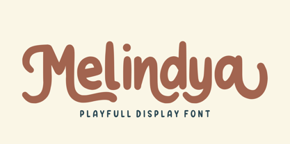 Introducing Melindya | Playfull Display Font Melindya is a playfully display font make from handdrawn ideas in typeface. This font includes full of Alphabetical glyphs, Numerals, and punctuation. This is so perfect for invitations, monograms, wedding, fashion, branding, label, handdrawn or logotype.
 - Just Realize by Kimberly Geswein,
$5.00 This messy, natural handwriting font is a mix of cursive and print. It seems that the busier my life is, the messier my handwriting gets- and this is based on my real-life scribbled notes to myself and shopping lists.
 - Frankie by Type-Ø-Tones,
$60.00 Frankie remains a classic among classics. A pioneer of the Type-Ø-Tones catalog, this is their personal eroded Franklin Gothic. Avoid imitations. Try Frankie, today still their best-seller. Now, in this updated version with a complete CE Character Set.
 - Tenderfoot by FontMesa,
$20.00This font definitely reflects the name: Tenderfoot sort of gives that Home Sweet Home feeling. No, the little cowpoke on the pony isn't me, a close friend was kind enough to let me use his childhood photo for this font. - Crimson Queen by Rillatype,
$15.00 Introducing, Crimson Queen! Crimson Queen is a modern serif font with condesed style and clean look. this font is perfect for any of your project such as headline, logo, book, magazine, movie, etc. This font also comes with multilingual support.
 - Celtic Astrologer Symbols by Deniart Systems,
$15.00 Containing over 130 symbols. Unlike traditional western zodiacs, the Celtic zodiac contains 13 signs instead of 12. This series contains the zodiacs, the planets as well as the Ogham numbers. NOTE: this font comes with an interpretation guide in pdf format.
 - Trading Hoss NF by Nick's Fonts,
$10.00 Speedball pen master Ross George presented this face as D-nib Display. Its wide stance and quaint attitude make for some unavoidable whimsy. Both versions of this font support the Latin 1262, Central European 1250, Turkish 1254 and Baltic 1257 codepages.
 - Sentingo by Matra Creative,
$14.00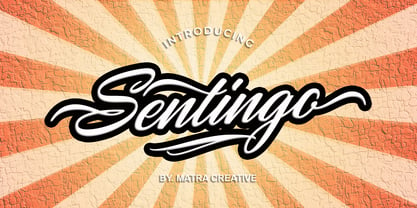 Santiago is both charming and elegant. This stunning script font is a stylish homage to classic calligraphy. This will elevate a variety of design projects to the highest level, be it branding, headings, wedding designs, invitations, signatures, logos, labels, and more!
 - Italican Script by Typotheticals,
$4.00 This font is an addition to the Italican Oblique family, where the lower case characters have been redeveloped to give an impression of script. While some characters join together, there was no intention to create this style throughout the whole font.
 - Father Love by Yoga Letter,
$16.00 "Father Love" is a beautiful and unique handwritten font. This font is equipped with uppercase, lowercase, numerals, punctuation, ligatures, and multilingual support. This font is perfect for Christmas, Father's Day, Memorial Day, the 4th of July, teacher appreciation, graduation, and others.
 - Shopping Basket JNL by Jeff Levine,
$29.00 The cover of the vintage sheet music for "This Little Piggie Went to Market" (from the 1934 film "Eight Girls in a Boat") features a hand-lettered sans serif with intermittent chamfered angles. This became the model for Shopping Basket JNL.
 - Aquaboy by ZetDesign,
$16.00 Aquaboy fonts are display fonts that are inspired from water, bringing you to a feeling of relaxation and peace. This font is very suitable for use in water nuanced design work. let your mind flow by using this nice font. Thanks ...!
 - Beachside by Epiclinez,
$17.00 Beachside is a cool handwritten font. Clean and a little bit quirky, this font is suitable for all of your logos, branding, social media, and crafty DIY projects. This font beachside contains 194 glyphs, supporting 66 languages from English to Zulu.
 - Manunggal by Differentialtype,
$10.00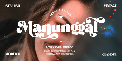 Manunggal is a cool, stylish, modern and fun serif display font. This font is great for headlines, magazines, logos, branding and more! This font is PUA encoded which means you can access all of the glyphs and alternates with ease!
 - Franklin Gothic by ITC,
$57.99This version of ITC Franklin Gothic contains a PanEuropean character set supporting Greek and Cyrillic languages, in addition to Western, Central and Eastern European languages. Customers seeking a Franklin Gothic that matches the Microsoft Windows version should select this version. - Vapor by The Hiscott Foundry,
$35.00This font was inspired by the swirling steam drawn on a chalkboard at a coffee shop. Not actually a script font though it has a similar feel. This font dances and twirls the way a wisp of smoke or steam would. - Chieftain NF by Nick's Fonts,
$10.00 The American Typefounders 1893 specimen book included the pattern for this face, originally called Pontiac. Its subtle idiosyncrasies make it warm and inviting. Both versions of this font support the Latin 1252, Central European 1250, Turkish 1254 and Baltic 1257 codepages.
 - Loopy Loo NF by Nick's Fonts,
$10.00 The Hunt Brothers, penmen extraordinaire, presented the pattern for this face as Upright Ornamental, it's a little loopy and a whole lotta fun. Both versions of this font support the Latin 1252, Central European 1250, Turkish 1254 and Baltic 1257 codepages.
 - Motherline by Letterhend,
$16.00 Motherline Reguler : a monoline vintage script typeface which is created based on manual hand lettering with many features such as ligatures, stylistic set alternate, swashes, etc with total 650++ GLYPHS! which is obviously support multi language characters! Provided in both OTF and TTF. Motherline Bold : The bold version of the Motherline Reguler, looks awesome to be used as logotype, badge, emblem which is needed a strong and bold text. Motherline Sans : A complementary sans type font which is perfectly matched with the main font. Motherline Sans Rough : The rough version of the Motherline Sans.
 - Winsel Variable by insigne,
$129.99 At this pivotal juncture, where every choice casts long shadows, the imperative of pinpointing the archetype of typefaces is of paramount importance. One mere oversight, and the soul of your endeavor risks being lost in the mists of time. Yet, amidst these crossroads, "Winsel" emerges as the North Star in your typographical odyssey. Birthed in the revered sanctums of insigne design, this typeface is a magnum opus, echoing the artistic brilliance of British poster craft from epochs of golden jazz to times of renaissance. Winsel, in its sheer magnificence, stands as a testament to artistry, each stroke demanding undivided reverence. Be it the valiant weights reminiscent of a guardian sentinel or the graceful finesse mirroring a maestro's touch, Winsel is an unparalleled behemoth. Imbued with the finesse of OpenType, it's poised to embrace the multifaceted European Latin tapestry, while its Small Caps and Titling Caps take pride of place across its grand suite of nine weights. Sculpted with precision, Winsel is the beacon that challenges the ordinary and pledges to be an immortal testament. Seldom has the cosmos aligned to present such an illustrious moment. Fortified with Winsel, you stand on the precipice of legend. Carve your tales into the annals of perpetuity, voice your ethos with unyielding conviction, and let each letter be a symphony of undying commitment. In this epoch, in this narrative, Winsel beckons you to etch history.
 - Cesium by Hoefler & Co.,
$51.99 An inline adaptation of a distinctive slab serif, Cesium is an unusually responsive display face that maintains its high energy across a range of different moods. The Cesium typeface was designed by Jonathan Hoefler in 2020. An energetic inline adaptation of Hoefler’s broad-shouldered Vitesse Black typeface (2000), Cesium is named for the fifty-fifth member of the periodic table of the elements, a volatile liquid metal that presents as a scintillating quicksilver. From the desk of the designer, Jonathan Hoefler: I always felt that our Vitesse typeface, an unusual species of slab serif, would take well to an inline. Vitesse is based not on the circle or the ellipse, but on a less familiar shape that has no common name, a variation on the ‘stadium’ that has two opposing flat edges, and two gently rounded sides. In place of sharp corners, Vitesse uses a continuously flowing stroke to manage the transition between upright and diagonal lines, most apparent on letters like M and N. A year of making this gesture with my wrist, both when drawing letterforms and miming their intentions during design critiques, left me thinking about a reduced version of the typeface, in which letters would be defined not by inside and outside contours, but by a single, fluid raceway. Like most straightforward ideas, this one proved challenging to execute, but its puzzles were immensely satisfying to solve. Adding an inline to a typeface is the quickest way to reveal its secrets. All the furtive adjustments in weight and size that a type designer makes — relieving congestion by thinning the center arm of a bold E, or lightening the intersecting strokes of a W — are instantly exposed with the addition of a centerline. Adapting an existing alphabet to accommodate this inline called for renovating every single character (down to the capital I, the period, and even the space), in some cases making small adjustments to reallocate weight, at other times redesigning whole parts of the character set. The longer we worked on the typeface, the more we discovered opportunities to turn these constraints into advantages, solving stubbornly complex characters like € and § by redefining how an inline should behave, and using these new patterns to reshape the rest of the alphabet. The New Typeface The outcome is a typeface we’re calling Cesium. It shares many of Vitesse’s qualities, its heartbeat an energetic thrum of motorsports and industry, and it will doubtless be welcome in both hardware stores and Hollywood. But we’ve been surprised by Cesium’s more reflective moods, its ability to be alert and softspoken at the same time. Much in the way that vibrant colors can animate a typeface, we’ve found that Cesium’s sensitivity to spacing most effectively changes its voice. Tighter leading and tracking turns up the heat, heightening Cesium’s sporty, high-tech associations, but with the addition of letterspacing it achieves an almost literary repose. This range of voices recommends Cesium not only to logos, book covers, and title sequences, but to projects that regularly must adjust their volume, such as identities, packaging, and editorial design. Read more about how to use Cesium. About the Name Cesium is a chemical element, one of only five metals that’s liquid at room temperature. Resembling quicksilver, cesium is typically stored in a glass ampule, where the tension between a sturdy outer vessel and its volatile contents is scintillating. The Cesium typeface hopes to capture this quality, its bright and insistent inline restrained by a strong and sinuous container. Cesium is one of only three H&Co typefaces whose name comes from the periodic table, a distinction it shares with Mercury and Tungsten. At a time when I considered a more sci-fi name for the typeface, I learned that these three elements have an unusual connection: they’re used together in the propulsion system of nasa’s Deep Space 1, the first interplanetary spacecraft powered by an ion drive. I found the association compelling, and adopted the name at once, with the hope that designers might employ the typeface in the same spirit of discovery, optimism, and invention. —JH Featured in: Best Fonts for Logos
 - Leifa by Identity Letters,
$39.00 A flare-serif socialite. Elegant and affable at once. Leifa is a flare-serif typeface that strikes a balance between elegant and affable. It’s pleasant to read in text sizes yet takes center stage in headlines and display applications. With its higher-than-usual contrast, Leifa might evoke Didone typefaces at first. However, it differs from strictly Didone designs in the details: flattened serifs and deeply incised, tapered spurs provide an organic effect. These humanist elements are restrained and almost inconspicuous in body copy. It’s in display sizes that they realize their full potential. Set your message in Leifa, set it large, and it will get noticed. A true socialite, Leifa is a most welcome guest on any party. With its dual character and a range of weights that allow for fine-tuning the desired visual voice, it’s a brilliant choice for branding and editorial design. Its good-natured yet sophisticated character makes Leifa the perfect typeface for fashion, sports, lifestyle, social media, food and cooking, health, beauty, architecture, interior design, art, literature, theater, and travel. (And any other topic that you’d love to talk about at a dinner in good company.) The entire font family consists of eight weights. Each comes with an italic counterpart, totaling 16 styles. Leifa’s italics are oblique, optically corrected versions of the upright styles. Each style comprises a character set of 883 glyphs that includes small caps, a set of ligatures, tabular and old-style figures, case-sensitive forms, fractions, symbols, and many other features. Four stylistic sets allow you to adjust the appearance of the Leifa fonts: a single-story a (SS01), a simple f (SS02), a triple-story g (SS03), and thin punctuation marks (SS04) are at your disposal. If you’re looking for a typeface with some debonair spirit, look no further than Leifa.
 - Chalk Hand Lettering by Fontscafe,
$39.00 If you are into the vintage feel, you will love this one. This is as vintage as it probably gets. There are probably only a handful of places in the world where schools still use blackboards and chalk – they’ve given way to their white board and marker counterparts for decades now. White boards are definitely more practical and less messy when compared to chalk, but then if you are creatively inclined you will agree that a little bit of mess is worth it if you are going to get the effects that you desired! Well, we can give you the effects minus the mess with our chalk hand lettering fonts! As the name suggests, this font gives you that distinctly unique chalk on slate feel, and if you are wondering what’s distinct about it; writing on slate or blackboard was a slow process which required deliberated and concentrated efforts resulting in a handwriting which was usually quite different to a person’s handwriting on paper. Typography of chalk on slate was an everyday event in the classrooms of yesterday, and today we hardly ever get to see one of these if it all. Writing on a black board with chalk was quite an interesting achievement in its own right, if you ended up with anything legible and if your writing remained focused and ‘in-line’! But of course like everything else, his took time to master and when you did get it right, chalk hand lettering was quite an enjoyable experience! For semi-permanent designs, say for example an eventful day at school; students of the day would create beautiful typography on the boards, and add a solidarity to it sometimes by shading one side of the lettering – usual y the right side towards which the lettering leaned. This is the effect our chalk hands lettering shaded variation gives you. You could get this font individually, but we strongly advise you check out the “chalk hand lettering pack” font. It includes the simple “chalk hand lettering” (minus the shading effect) and also a “chalk hand elements” bag of tricks. The elements is a collection of graphic art which resemble shapes and designs that used to be added to chalk art, to beautify the typography. If you enjoyed seeing the effects of our Chalk Hands font, and the shaded variant – you are simply going to go gaga over Chalk Hand Elements! The chalk hand font of course enables you to make typographic art similar to the effect of chalks on slates and black boards. This was quite the art form in the days gone by! The shaded variation added a bit of solidarity and the technique was commonly used to make semi-permanent designs say for example a welcome note when somebody important was to visit. Classic chalk hand designs, especially the semi permanent ones often had little pieces of art to help beautify the creation as a whole. It could simply be symmetrical graphics appearing before and after the title and headings, maybe just an interesting shape to fill in an empty area on the board, and such…our Chalk Hand Elements offers you a ton of such graphics. The two chalk hand variations and the elements are all included in the Chalk Hand Family, and this is strongly recommended if you want to make designs that are truly reminiscent of the days of chalk on slate.
 - Rothena by Haksen,
$14.00 Hand-lettered with style, Rothena Script is a must have for all your design needs. Perfect for greeting cards, branding, stationery design, social media, packaging, magazine layouts, prints and more! Utilize all caps for a completely alternate style, or mix and match lowercase script + all caps for creative designs. Rothena Script has a variety of unique, coded features to create compelling, handmade outcomes: 4 stylistic alternates, 5 initial characters, 4 end characters, 1 discretionary ligature and 25 standard ligatures. Multilingual support is included for Western European languages. PUA Encoded. OTF is included for the full, Rothena Script font. Happy Designing! This is the personal license font that can be used for all personal needs. If you want to use this font on items you are going to sell or on anything promoting your business, please purchase the extended license version.
 - ATFAntique - Unknown license

- ITC Stone Humanist by ITC,
$40.99 Type designers have been integrating the design of sans serifs with serifed forms since the 1920s. Early examples are Edward Johnston's design for the London Underground, and Eric Gill's Gill Sans. These were followed by Jan van Krimpen's Romulus Sans, Frederic Goudy's ITC Goudy Sans, Hermann Zapf's Optima, Hans Meier's Syntax and Adrian Frutiger's Frutiger. Now, ITC Stone Humanist joins this tradition. It is a careful blend of traditional sans serif shapes and classical serifed letterforms. ITC Stone Humanist grew out an experiment with the medium weight of ITC Stone Sans, a design that already showed a relationship to these sans serif-serif hybrids. ITC Stone Sans has proportions based on those of ITC Stone Serif, and its thick-and-thin stroke contrast suggests the bloodline of humanistic sans serif typefaces. But other aspects of ITC Stone Sans are more closely aligned to the gothics and grotesques, a tradition that accounts for the largest portion of sans serif designs. Enter ITC Stone Humanist. During his experiments with the earlier design, Sumner Stone recalls, I was actually quite surprised at how seemingly subtle changes transformed the face," moving the design firmly into the humanist tradition. "The form of the 'g,' 'l,' 'M,' 'W,' and more subtly the 'a' and 'e' are part of the restructuring of the family," he explains. The top endings of vertical lower case strokes have been cropped on an angle, as have the ascender and descender stroke endings. ITC Stone Humanist is a full-fledged member of the ITC Stone family. It has been produced with the same complement of weights, and the x-heights, proportions, and underlying character shapes are completely compatible with the three original designs. The original ITC Stone Sans is a popular typeface, in part because of its notable versatility. ITC Stone Humanist shares this virtue, and can be used successfully at very small sizes, in long passages of text copy, and even as billboard-sized display type."
 - Ekberg by Scriptorium,
$12.00Ekberg is based on a sample of poster lettering by Samuel Welo. It's got a spare but stylish and rather modern look. It's a bit of a change from our usual fare, but a gap we need to fill. Ekberg features more than one version of a lot of the characters. - Glypster by Ardyanatypes,
$15.00 Glypster - Bold Aesthetic Serif Fonts is a font that has boldness in every line. This font's robust and bold style conveys a luxurious, elegant, retro, and aggressive feel. The serenity afforded by this font's blend of boldness and subtlety makes Glypster suitable for a wide variety of design choices. Apart from that, the strengths of Glypster are its ability to support multiple languages and additional features that can add interest to every design you make. In terms of marketing, Glypster is very suitable for purposes such as logos, posters, business cards, and many more, so you can explore the potential of this font for various designs. Glypster's simplicity, but still elegant and luxurious, makes it the right choice for all procedures.
 - 1467 Pannartz Latin by GLC,
$38.00 This family was inspired by the edition De Civitate Dei (by Sanctus Augustinus) printed in 1467 in Sobiano (Italy, Roma) by Konrad Sweynheym and Arnold Pannartz who was the Punchcutter. It is one of the first few “Roman style” fonts, just before the birth of Jenson’s pattern (look at 1470 Jenson Latin). The present font contains all of the specific latin abbreviations and ligatures used in the original (about 54). Added are the accented characters and a few others not in use in this early period of printing. Decorated letters such as 1512 Initials, 1550 Arabesques, 1565 Venetian, or 1584 Rinceau can be used with this family without anachronism. If Italic style is required (not yet existing in early time of printing), we recommend using 1557 Italique.
 - ITC Coconino by ITC,
$29.99ITC Coconino is the work of Serbian designer Slobodan Miladinov. His original inspiration for this monostroked typeface was the idea of translating certain auditory impressions into type, in this case, the surprising and confusing music of the Serbian hip hop musician Voodoo Popeye." Miladinov is an art director in Belgrade and created Coconino using a "freemouse" technique with Adobe Illustrator and sees his work as "computer calligraphy which allows for a specific directness and immediacy in notation." The strokes of this font are simple and abrupt with a studied irregularity. The forms can look either cheerful and lighthearted or chaotic and subtly disturbing. Coconino was named for the home of hte Krazy KAt comics and even includes a few additional characters from the strip." - Dos De Tres by Volcano Type,
$19.00 This is an idea to reproduce the masks of the Mexican wrestlers of the late 60s and 70s. The typography is based in keeping the shape of the face in the wrestler's masks.
 - YT Rain Latin by Yangtype,
$9.00The concept of this letter is ‘pleasure’. The shape of the letters with the rain is refreshing. The hardness of the letters, which can tolerate a certain amount of rain, and the intensity of the strong rain create a sense of pleasure. - Quinn Display Typeface by FoxType,
$50.00 Introducing Quinn Display new generation Typeface created for building brand identity. Quinn Typeface created with the vision of to attract the audience to your brand . The finest details of this typeface are methodically and mathematically created. Quinn is created with all the tasks of a corporate font and also for the usage in a variety of projects, including branding, logos, titles, headlines, servers, posters, screens, display, digital ads, and everything else. We are putting a lot of effort on this font as a long-term project.
 - Belkin Display Typeface by FoxType,
$12.00 Belkin Display new generation Typeface. Belkin Dispaly Typeface created with the vision of attract the audience to your brand . The finest details of this typeface are methodically and mathematically created. Belkin is created with all the tasks of a corporate font and also for the usage in a variety of projects, including branding product, logos, titles, headlines, servers, posters, screens, display, digital ads, and everything else. We are putting a lot of effort on this font as a long-term project. 6 Weights Included.
 - Flank Steak by Mysterylab,
$17.00 This duo of handlettered-style vintage Americana fonts is a versatile package that can not only provide that subtle secret sauce that transports the viewer back 60 or 70 years to the neighborhood grocery store, it's also capable of conjuring up a very forward-looking and relaxed modern vibe. Whether it's the extra bold mid-century signpainter style of the sans serif, or the quick-brush liveliness of the casual script, you'll find this versatile pair is a real go-to for a variety of great looks.
 - Moraco by FoxType,
$50.00 Introducing Moraco Display new generation Typeface created for building brand identity. Moraco Typeface created with the vision of to attract the audience to your brand. The finest details of this typeface are methodically and mathematically created. Moraco is created with all the tasks of a corporate font and also for the usage in a variety of projects, including branding, logos, titles, headlines, posters, screens, display, digital ads, and everything else. We are putting a lot of effort on this font as a long-term project.
 - ITC Silvermoon by ITC,
$29.99 ITC Silvermoon was designed by Akira Kobayashi in the style of the advertisements of the 1920s. Art Deco was the artistic movement which marked the years between the two world wars, combining elements of Jugenstil, futurism and east Asian influences. This font carries on in that tradition. The small, high reaching figures with their elegant forms and reserved but distinguishing loops give Silvermoon its unmistakable look. Kobayashi designed this font in two weights, regular and bold. To retain the elegance of the bold weight, the consistent stroke width of the regular weight was exchanged for contrasting strokes. This gives the weight more weight without detracting from its grace. The nostalgic, romantic ITC Silvermoon is best used for headlines and short texts in point sizes of 12 and larger.
 - Cumhuriyet World by Fontuma,
$34.00 Cumhuriyet means “the form of government in which the nation holds the sovereignty and uses it through deputies elected for certain periods”. The reason why I gave this name to the font is that 2023 is the centennial anniversary of the Republic of Turkey, which was founded by Atatürk. This typeface, which is sans serif, consists of three families: ▪ Cumhuriyet: Font family with Latin letters ▪ Cumhuriyet Pro: Font family including Latin, Arabic and Hebrew alphabets ▪ Cumhuriyet World: Font family including Latin, Cyrillic, Greek, Arabic and Hebrew alphabets Cumhuriyet World is a family of multi-purpose typefaces designed in a geometric style. This font is suitable for use in printed products, media and digital media, as well as in every field that is the subject of writing.
 - Lonarue by Twinletter,
$13.00 Introducing “Lonarue Font” – Where Playfulness Takes Center Stage! Lonarue Font is your passport to a world of creativity and fun in typography. This whimsical typeface is carefully crafted to bring joy and a touch of playfulness to your designs. With its lively and distinctive characters, Lonarue Font is the ideal choice for projects that demand a dash of imagination. Whether you’re designing children’s books, cheerful greeting cards, or vibrant logos, this font adds a delightful charm that captivates your audience. Embrace the playful spirit of Lonarue Font and let your creativity shine. Elevate your designs, capture attention, and create lasting impressions effortlessly with this versatile typeface. Experience the magic of Lonarue Font and infuse your projects with the joy of playful typography today! – PUA Encoded Characters – Fully accessible without additional design software.
