9,799 search results
(0.034 seconds)
- Anfalas - 100% free

- UglyQua - 100% free

- Gaheris Demo - Unknown license

- Schwabacher - Personal use only

- Stonecross - Unknown license

- CA No Dr. by Cape Arcona Type Foundry,
$30.00 No Dr. was inspired by an old movieposter lettering for the 1962 movie "James Bond: Dr. No". Just like the original Dr. No, No Dr. has a diabolical charm. It was developed into a font family that combines distinctiveness with versatility. It has a good readibility as a textfont but also looks great as a Headline. The two widths and the two weights give you a big choice. Intended to become an interesting alternative to the much used DIN Schrift, it has now developed into a highly functional family of it's own.
 - Winter Beast by Figuree Studio,
$18.00 Winter Beast is a captivating winter brush font that unleashes the untamed spirit of the season. With its bold, brisk strokes, this font encapsulates the raw beauty and power of winter, making it the perfect choice for projects that demand a rugged, cold, and untamed aesthetic. Whether used in winter-themed designs, holiday graphics, or any project that seeks to embody the frosty allure of the season, Winter Beast adds a chilly and visually striking element to your typography, making your text stand out like fresh snow on a moonlit night.
 - Finocchio by The Ampersand Forest,
$45.00 Finocchio (yes, we know — wink) has the playful, round shapes of a French Ronde with the sharp angles of Italian Futurism. It's a bold, fun, excellent branding face — wherever you need some gusto or brio or forza! Finocchio comes with a large number of ligatures for fluidity. It also comes with a solid, readable set of non-script small caps, so all you need for that sign is one coordinated font! It also comes with loads of fun alternates! Finocchio is made with love in The Ampersand Forest.
 - Smiley by Dear Alison,
$24.00Ever think that supermarkets are becoming less personal and more clinical and cold? What will cost you less than a trip to the supermarket and put a smile on your face? Smiley was inspired by the hand-brush lettered signage at country grocery stores. There's something about the feeling you get when you visit a small town and stroll on over to the corner market. Everyone is pleasant, courteous, and they all have a smile on their face. You can have that local small town grocery store charm for yourself when you buy Smiley today. - Bon Mot NF by Nick's Fonts,
$10.00What’s the good word? This elegant, stylish typeface, based on an early twentieth-century Barnhart Brothers & Spindler release, named simply "Engravers Upright Script". Based on French ronde letterforms, this version is bolder—which makes it suitable for text settings, even at smaller sizes—and has more pronounced stroke contrast—which makes it suitable for headlines. Versatile, handsome and charming, this typeface is an invaluable addition to any type repertoire. Both versions of the font contain the complete Unicode 1252 (Latin) and Unicode 1250 (Central European) character sets, with localization for Romanian and Moldovan. - 1890 Registers Script by GLC,
$38.00 This script font was inspired by the “Ronde” French script. It was in use from 1700s to 1900s (until 1960s in special circumstances) for registers, legal documents and texts, certificates, labels and other documents that must be particularly legible. Today in France, it is still being used for menus, advertising, and labels. The present version is a late 19th Century pattern. This font supports very strong enlargements as well as small sizes. When printed, it remains perfectly legible and elegant from 9/11 pts even if using an ordinary inkjet printer.
 - Kapsalon by Hanoded,
$12.00 It could be you’ve never heard of Kapsalon and I will forgive you for that. Kapsalon is a Dutch word, meaning ‘hairdresser’s’. Since 2003 it is also a very popular snack food, which consists of french fries, döner kebab, lettuce, sambal, garlic sauce and melted Gouda cheese, served in an aluminium tray. I have to admit that I have never eaten a Kapsalon myself, as I am not too fond of fast food. I named this font package Kapsalon, because, like its namesake, it consists of several unrelated elements that work really well when combined.
 - Molly Louie by Pelavin Fonts,
$18.00 Conceived on a cold evening to the hot Jazz of the Eri Yamamoto Trio at Arthur’s Tavern in the Village, font Molly Louie is best described by the person for whom it was named. “Very intricate, like a whole little world in each of them” and “The solid is nice too, like little cut up sandwiches.” The detailed and solid versions facilitate a variety of two-color applications. You might not use this decorative display font at smaller sizes, but you are encouraged to let your imagination guide you.
 - Lemon Flush by PizzaDude.dk,
$15.00 According to my own knowledge, and the info found around the internet, lemons are good for your health. Not only do I care about my health, I also care for a good dessert! :) And this is where the lemon enters the the arena! I love the sweet and sour taste of the lemon - I love it in drinks (hot or cold) in ice creams, cakes, sweets ... you name it! I just had to name this font something with the word "lemon" in it, because I find it mouth watering! :)
 - GHEA Granshan by Edik Ghabuzyan,
$40.00 GHEA Granshan is a super font family. It has 9 upright weights and their Italics. It supports Latin Pro, Armenian, Greek, Cyrillic, Bulgarian & Ukrainian alternatives alphabet systems. The weights from Regular to Bold and their Italics can be used as text fonts. The weights thinner than Regular and thicker than Bold can be used as Display fonts. It is an easily readable fond and the eyes don't get tired while reading. GHEA Granshan has a slight contrast style and at the same time is quite bright and clear.
 - Precolombina by Juan I. Siwak,
$20.00 "Precolombina" consists on a series of graphic symbols native to South America, decorative trims, and a minimal set of typographic characters. The signs were taken from ceramic pottery, clothing, and petroglyphs from the southern cone of South America. We try to select a varied range of signs representing shamans, jaguars, rheas, monkeys, birds, and mythological beings. The decorative trims are taken from the same places and occupy the set of numbers. Finally, it contains the minimum characters of a font to achieve a brand or a title. They take place in the OpenType resources.
 - Jasan by Storm Type Foundry,
$49.00 Jasan is the Czech expression for ash tree (Fraxinus Excelsior) which provides great wood for tools and furniture. In a landscape it’s a rather inconspicuous tree which forms beautiful alleys. Jasan typeface represents a synthesis of many famous sans-serifs: despite the concept being strictly rational, it’s not at all cold. Simple shapes & human expression will make your projects nicely colored. It brings excellent clarity for printed and web publishing, visual identity & information systems. The 36-font family contains multi-lingual support including Cyrillics, Small Caps & rich palette of OpenType Features.
 - Liaisons by The Ampersand Forest,
$35.00 A Belle Époque humanist serif in two styles: crisp, high-contrast Haut-Monde and soft, low-contrast Demimonde… When you design a lot of display pieces, you’re often in need of tall, slim type. Liaisons provides that, in a distinct fin-de-siècle style inspired by the great posters of the Gilded Age from Sweden, Denmark, France, and Scotland. (The ampersand alone is a bit of a love letter to Charles Rennie Mackintosh!) Both styles use the same slim skeleton, and are named after the stratum of society where one might find… a “dancing partner.” HAUT-MONDE is a high contrast face of the sort that says “High Society.” Elegant and sleek, it speaks to the refinement of the moneyed classes of a bygone era. Great for high-end products, too! DEMIMONDE is soft and low-contrast — more reminiscent of hand-lettering on Art Nouveau/Jugendstil/Wiener Werkstätte advertisements and posters. A comfortably chic display face all around! Both typefaces feature full Western and Eastern Latin character sets, as well as full Cyrillic/Slavic ones. And, perhaps best of all, both typefaces feature capitals with high, middle, and low waists, so you can change up the look as you see fit! Part of The Ampersand Forest's Sondheim Series
 - Golden Metafor by Kulokale,
$17.00 Thanks for checking out Golden Metafor! It's a classy, cold serif font with beautiful characters and also ligatures which makes it easy for you to create a logo for your personal branding and your business beautifully. Golden Metafor is perfect for many different projects such as logos & branding, invitation, stationery, wedding designs, social media posts, advertisements, printed quotes, product packaging, product designs, label, photography, watermark, special events or anything. I highly recommend using a program that supports OpenType features and Glyphs panels such as Adobe Illustrator, Adobe Photoshop CC, Adobe InDesign, or CorelDraw, so you can see and access all Glyph variations. This font is encoded with Unicode PUA, which allows full access to all additional characters without having special design software. Mac users can use Font Book, and Windows users can use Character Map to view and copy one of the extra characters to paste into your favorite text editor / application. Thank you.
 - SK Akropol by Salih Kizilkaya,
$9.99 SK Akropol is a sans serif and condensed font. Designed by Salih Kizilkaya in 2020. There are six different options: Regular, Italic, Medium, Medium Italic, Bold and Bold Italic. Includes 6 fonts and 1122 glyphs.
 - DS Narrow - Unknown license

- Serpentine by Image Club,
$29.99Dick Jensen (USA) designed Serpentine, is a contemporary-looking display font, for the Visual Graphics Corporation in 1972. With the rise of digital typesetting and desktop publishing, this typeface quickly became both popular and ubiquitous. This dynamic, wide, boxy design is identifiable via tiny triangular swellings at the stroke endings - what might be called semi-serifs. Serpentine is available in six different font styles: Light, Light Oblique, Medium, Medium Oblique, Bold, and Bold Oblique. Serpentine" is a greenish rock that sometimes resembles a serpent's skin, and is often used as a decorative stone in architecture. Though this font doesn't seem at all snaky or sinuous, it does have an architectural, stone-like solidity. The subtle, almost non-existent curves and semi-serifs keep it from being too stern or cold. Although the underlying strokes of each weight are similar, the six members of the Serpentine font family all present their own individual personalities. Serpentine Light lends itself well to text for onscreen displays, for instance, while the numbers from typeface's heavier weights are seen around the world on soccer jerseys! Additionally, the oblique styles convey a streamlined sense of speed, furthermore lending Serpentine well to sport and athletic applications (especially the faster, high-speed varieties). Because of its 1970s pedigree, Serpentine has come to be known as a genuine "retro" face. This makes the typeface even more appropriate for display usage, in applications such as logo design, magazine headlines, and party flyers. If you like Serpentine, check out the following similar fonts in the Linotype portfolio: Copperplate Gothic (similar serifs) Eurostile (similar width) Princetown (another "athletic" font) Insignia (similar "techno" feeling)" - Serpentine by Linotype,
$29.00Dick Jensen (USA) designed Serpentine, is a contemporary-looking display font, for the Visual Graphics Corporation in 1972. With the rise of digital typesetting and desktop publishing, this typeface quickly became both popular and ubiquitous. This dynamic, wide, boxy design is identifiable via tiny triangular swellings at the stroke endings - what might be called semi-serifs. Serpentine is available in six different font styles: Light, Light Oblique, Medium, Medium Oblique, Bold, and Bold Oblique. Serpentine" is a greenish rock that sometimes resembles a serpent's skin, and is often used as a decorative stone in architecture. Though this font doesn't seem at all snaky or sinuous, it does have an architectural, stone-like solidity. The subtle, almost non-existent curves and semi-serifs keep it from being too stern or cold. Although the underlying strokes of each weight are similar, the six members of the Serpentine font family all present their own individual personalities. Serpentine Light lends itself well to text for onscreen displays, for instance, while the numbers from typeface's heavier weights are seen around the world on soccer jerseys! Additionally, the oblique styles convey a streamlined sense of speed, furthermore lending Serpentine well to sport and athletic applications (especially the faster, high-speed varieties). Because of its 1970s pedigree, Serpentine has come to be known as a genuine "retro" face. This makes the typeface even more appropriate for display usage, in applications such as logo design, magazine headlines, and party flyers. If you like Serpentine, check out the following similar fonts in the Linotype portfolio: Copperplate Gothic (similar serifs) Eurostile (similar width) Princetown (another "athletic" font) Insignia (similar "techno" feeling)" - The Nue font by Antipixel, a distinctive and contemporary typeface, embodies a seamless blend of elegance and innovation. This unique font stands out due to its creators' commitment to both functiona...
- Bagilean Geliayditan by Gold Type,
$12.00 Bagilean Geliayditan is the new editorial serif with all clean and soft lines, tight curves, and a trendy and elegant look! Bagilean Geliayditan has 16 fonts. which comes with 2 font family styles: - Bagilean Geliayditan: Regular, Italic, Medium, Medium Italic, Condensed, Condensed Italic, Outline and Outline Italic. - Bagilean Geliayditan Elegant: Regular, Italic, Medium, Medium Italic, Condensed, Condensed Italic, Outline and Outline Italic. Bagilean Geliayditan is perfect for your design needs such as to create nostalgic designs but still clean and elegant such as headlines, magazines, logos, packaging, editorials, titles, branding projects, logo designs, packaging, magazine titles, advertisements, short or long texts. Etc......
 - Reina by Lián Types,
$37.00ATTENTION! See the newest version of Reina here. Reina Neue is now a family of 45 styles and it's also a Variable Font! Have a look. For the traditional version of Reina, you may stay here ;) --- Reina is Sproviero’s didone of the year. We recommend seeing its user’s guide . Inspired in the sweet letters of calligraphy and typography masters of our past; such as Didot, Bodoni and the incredible Herb Lubalin, its aim was to incorporate the decorative accolades from blackletter and copperplate styles of calligraphy into a Modern Roman typeface. Reina reflects sovereignty due to the enveloping atmosphere and the sensation of greatness that can be felt when using it. It has an unique way of standing over paper and screen, being its swashes responsible of an extreme elegance. Similar to what Lian did in his last font Breathe , Reina was designed to be playful yet formal: While none of its alternates are activated it can be useful for short to medium length texts; and when the user chooses to make use of its open-type decorative glyphs, it can be useful for headlines with dazzling results. TECHNICAL Reina is a family with many members. In order to achieve better results when printing, Lian took his time to design the necessary styles: Reina 72 Pro, prepared for display sizes; Reina 36 Pro, for medium sizes; and Reina 12 Pro, the best for text or decorative words in small size. Each of these members have variants inside, which are open-type programmed: The user decides which glyph to alternate, equalizing the amount of decoration wanted. Reina Engraved Pro has the same features than the variants mentioned above. The family also contains variants which were made exclusively for decoration. These are: Reina Words, a set of the most common words used in english, german, italian, french and spanish; Reina Capitals, which consists in a big set of ornamented capitals; and Reina Fleurons, those little friends which always help to embellish our work. - Botija by Tipo,
$69.00With a gentle, modulating effect and very neat from a formal point of view, Botija is ideal for medium sized texts: it is a font family with a unique style. Created initially as a reinterpretation of Bodoni, it maintains a sharp vertical axis and a medium level of contrast, suitable to function in smaller bodies and featuring subtle details which stand out in medium-sized bodies of text. - ITC Fenice by ITC,
$29.99 ITC Fenice font (pronounced fe-nee-chay) is the work of designer Aldo Novarese and was influenced by the traditional designs of Didot, Bodoni, and Ibarra. It displays the fine serifs of a Bodoni but blends such characteristics with a contemporary structural style. ITC Fenice font is perfect for applications requiring the economical use of space.
 - Boscha by Maulana Creative,
$17.00 Boscha is a condensed sans serif font. With medium tall stroke, fun character with a bit of ligatures. To give you an extra creative work. Boscha font support multilingual more than 100+ language. This font is good for logo design, Social media, Movie Titles, Books Titles, a short text even a long text letter and good for your secondary text font with sans or serif. Make a stunning work with Boscha font. Cheers, Maulana Creative
 - Coopslight by Maulana Creative,
$15.00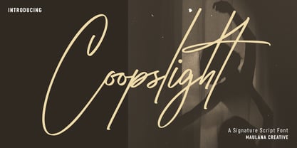 Coopslight is a tall expressive signature font. With medium stroke, fun character with a bit of ligatures and alternates. To give you an extra creative work. Coopslight font support multilingual more than 100+ language. This font is good for logo design, Social media, Movie Titles, Books Titles, a short text even a long text letter and good for your secondary text font with sans or serif. Make a stunning work with Coopslight font. Cheers, MaulanaCreative
 - Mistoms by Maulana Creative,
$14.00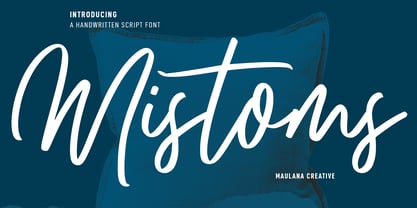 Mistoms is a casual script font. With medium contrast stroke, fun character with a bit of ligatures and alternates. To give you an extra creative work. Mistoms font support multilingual more than 100+ language. This font is good for logo design, Social media, Movie Titles, Books Titles, a short text even a long text letter and good for your secondary text font with sans or serif. Make a stunning work with Mistoms font. Cheers, MaulanaCreative
 - Rotarry Semi Geometric Font by Maulana Creative,
$15.00 Rotarry is a modern sans display font. Medium stroke, fun character with a bit of ligatures and alternates. To give you an extra creative work. Rotarry font support multilingual more than 100+ language. This font is good for logo design, Social media, Movie Titles, Books Titles, a short text even a long text letter and good for your secondary text font with script or serif. Make a stunning work with Rotarry font. Cheers, Maulana Creative
 - MC Raktor by Maulana Creative,
$18.00 Raktor is a modern Display serif font with medium-low stroke contrast, fun characters with a few ligatures and alternates to let you unlock extra creative work. Raktor supports more than 100+ languages. This font is good for logo design, social media, movie titles, books titles, short and even long text, lettering. Raktor also works great when combined with other script or serif fonts as a secondary text font. Create stunning work with Raktor!
 - Bigteeth by Maulana Creative,
$13.00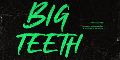 Bigteeth is a horror vibes handwritten font. With slanted medium rough brush stroke, fun character. To give you an extra creative work. Bigteeth font support multilingual more than 100+ language. This font is good for logo design, Social media, Movie Titles, Books Titles, a short text even a long text letter and good for your secondary text font with sans or serif. Make a stunning work with Bigteeth font. Cheers, Maulana Creative
 - Brominates by Maulana Creative,
$11.00 "Brominates" is an expressive signature font. With medium mono-line stroke, fun character with a bit of ligaturess. To give you an extra creative work. "Brominates" font support multilingual more than 100+ language. This font is good for logo design, Social media, Movie Titles, Books Titles, a short text even a long text letter and good for your secondary text font with sans or serif. Make a stunning work with "Brominates" font. Cheers, MaulanaCreative
 - Servat by Maulana Creative,
$14.00 Servat is a retro semi slab serif font. With medium stroke, fun character with a bit of ligatures and alternates. To give you an extra creative work. Servat font support multilingual more than 100+ language. This font is good for logo design, Social media, Movie Titles, Books Titles, a short text even a long text letter and good for your secondary text font with sans or script. Make a stunning work with Servat font.
 - FranklinGothicHandCond by Wiescher Design,
$39.50 FranklinGothicHandCond is another part of a series of hand-drawn fonts from way back in time – before computers changed the way we worked in advertising. When I was in advertising – before computers – a very time consuming part of my daily work was sketching headlines. I used to be able to sketch headlines in Franklin Gothic, Times, Futura, Helvetica and several scripts. We had a kind of huge inverted camera – which we called Lucy. We projected the alphabet onto a sheet of transparent paper, outlined the letters with a fineliner and then filled them in. It was very tedious work, but the resulting headline had its own charm and we had a permanent race going on who was best and fastest. I won most of the time! They used to call me the fastest "Magic Marker" this side of the Atlantic. Great days, just like today! Your sentimental type designer from the past, Gert Wiescher.
 - Basic Commercial by Linotype,
$57.99 Basic Commercial is a family of fonts based on historical designs from the hot metal type era. First appearing around 1900, these designs were created by type designers whose names have not been recorded, but whose skills cannot be overlooked. These typefaces were popular among groups and movements as diverse as the Bauhaus, Dadaism, and the masters of Swiss/International-Style typography. They influenced a variety of later grotesque fonts, such as Helvetica and Univers. Basic Commercial was distributed for many years in the United States under the name Standard Series. The typeface worked its way into many aspects of daily life and culture; for instance, it became the face chosen for use in the New York City subway system’s signage. The Basic Commercial family members have a clear and objective design. Their forms exhibit almost nothing unusual, but remain both lively and legible nonetheless. Perhaps for this reason, Basic Commercial’s design has been popular with graphic designers for decades.
 - FranklinGothicHandBold by Wiescher Design,
$39.50 FranklinGothicHandBold is another part of a series of hand-drawn fonts from way back in time – before computers changed the way we worked in advertising. When I was in advertising – before computers – a very time consuming part of my daily work was sketching headlines. I used to be able to sketch headlines in Franklin Gothic, Times, Futura, Helvetica and several scripts. We had a kind of huge inverted camera – which we called Lucy. We projected the alphabet onto a sheet of transparent paper, outlined the letters with a fineliner and then filled them in. It was very tedious work, but the resulting headline had its own charm and we had a permanent race going on who was best and fastest. I won most of the time! They used to call me the fastest "Magic Marker" this side of the Atlantic. Great days, just like today! Your sentimental type designer from the past Gert Wiescher
 - Scala Sans Pro by Martin Majoor,
$49.00 The award-winning Scala family (1990-1993) is a worldwide bestseller and has established itself as a ‘classic’ among digital fonts. It was one of the first serious digital text fonts to support small caps, ligatures and different set of numbers. In fact Scala and Scala Sans (1990-1993) are two workhorse-like typefaces sharing a common form principle: the skeletons of both Scala and Scala Sans are identical, therefore they can be combined perfectly. Where many of the modern sans serifs (like Helvetica and Univers) have rather ‘closed’ letter shapes, the same elements in Scala Sans are much more ‘open’. This greatly improves legibility, especially in the smaller point sizes. The italic of Scala Sans is not a slanted version of the roman, but rather a ‘real’ italic. Another part of Scala is very popular among its users: Scala Hands, containing more than one hundred decorative hands and pointers, is included in the Scala fonts and is a free bonus.


