10,000 search results
(0.352 seconds)
- Happy Friday by Mix Fonts,
$9.00 HAPPY FRIDAY is a font that looks ahead to the long weekend. This typeface is cute and clean, but with an undercurrent of sickening sweetness. The font turns up the volume on your social media posts, making them stand out from the crowd. Along with HAPPY FRIDAY MIX, an adorable set of dingbats made up of doodles and swashes, this font pair is perfect for your marketing collaterals and your at-home DIY projects. MIX HAPPY FRIDAY comes with the following glyphs: ABCDEFGHIJKLMNOPQRSTUVWXYZ abcdefghijklmnopqrstuvwxyz 0123456789 !@#$%^&*()`~♥✿•· ÷×+−±≈=≠≥≤[]<>:;’”,.\|/?{}“”‘’-–—_ …‚„©®™‹›«»°¹²³ªº¡¿₱¢€£¥½¼¾¶§№† ÁÀÂÄÃÅĂĀĄÆĆĈČÇÐĐÉÈÊËĖĒĘĜĤIÍÌÎÏĪĮĴŁŃÑŇ ÓÒÔÖÕŌŐØŒŔŘŚŜŠŞȘŤȚÚÙÛÜŮŬŪŰŲẂẀŴÝŶŸŹẐŽŻÞẞ áàâäãåăāąæćĉčçðđéèêëėēęĝĥıíìîïīįĵłńñň óòôöõōőøœŕřśŝšşșťțúùûüůŭūűųẃẁŵýŷÿźẑžżþß MIX HAPPY FRIDAY MIX (Dingbats) comes with the following glyphs: ABCDEFGHIJKLMNOPQRSTUVWXYZ abcdefghijklmnopqrstuvwxyz 0123456789 !@#$%^&*()
 - Nambya by Ahmad Jamaludin,
$17.00 Introducing new sharp style font, Nambya! Nambya - A serif typeface with an experimental and sharp style. Nambya is inspired by timeless packaging from a forgotten era. It has a beautiful range of stylistic alternates with unique characters. Nambya - fearless and chic typeface perfect for big headlines for both print and web. It comes with Italic style, unique lower and uppercase plus numbers, punctuation & multilingual letters File Included: Unique letterforms Works on PC & Mac Simple Installations Accessible in Adobe Illustrator, Adobe Photoshop, Microsoft Word even work on Canva! PUA Encoded Characters Fully accessible without additional design software. Come and say hello over on Instagram! https://www.instagram.com/dharmas.studio/ Dharmas Studio
 - Manadis Deadly by Allouse Studio,
$16.00 Proudly Present, Manadis Deadly a Quirky Font. Manadis Deadly come with many Stylistic-Alternates for Uppercase and Lowercase. This also come along with Multi-Lingual Support so thats all will give you more choices to play arround. We highly recommend using a program that supports OpenType features and Glyphs panels like many of Adobe apps and Corel Draw, so you can see and access all Glyph variations. Manadis Deadly is perfect for any tittle, logo, product packaging, branding project, megazine, social media, or just used to express words above the background. Enjoy the font, feel free to comment or feedback, send me PM or email. Thank You!
 - Panton Rust by Fontfabric,
$30.00 The long-awaited Rust Bundle addition to our Panton type family has arrived, featuring the headliner Panton Rust and its trusted partner Panton Script Rust. Start your engines and get ready for 72 fonts, grouped into five weights ranging from SemiBold to Heavy, and including multiple Base combinations with different Shadows and Grunge Textures. All of the above is also a part of the accompanying Panton Rust Script, whose natural flow is further emphasized with specifically adjusted Contextual Alternates. The list of OpenType features wouldn’t be complete without localizations, figures, fractions, superiors and inferiors, numerators and denominators, as well as tabular numerals for Panton Rust. The Rust Bundle includes Extended Latin and Cyrillic coverage, providing support for more than 130 languages. This handcrafted package was created to bring about authentic and original vintage type, making it especially suitable for any design that speaks of craftsmanship, a sublime human touch, and a mature signature with undeniable flavor. In Rust we trust! Features: • Textures, Shadows and Inline versions of the fonts which can be combined for a multicolor effects • 72 styles in total, including 42 fonts for Panton Rust and 30 fonts for Panton Script Rust; • 5 weights from SemiBold to Heavy; • Extended Latin and Cyrillic coverage with support for more than 130 languages; • A broad set of contextual alternates and ligatures for Panton Script Rust
 - Josef K Paneuropean by Juliasys,
$38.95 With the Josef K *, Julia Sysmäläinen continues her artistic debate on Franz Kafka’s writing style. This time the designer of FF Mister K is not drawn to Kafka’s literary works created at night but to those the writer produced at daytime as a high-ranking, confident bureaucrat – Dr Franz Kafka. The typefaces Josef K “Paneuropean” and “Strong European” echoe Kafka’s prestigious status at the Workmen’s Accident Insurance Institute of the Austro-Hungarian Empire. Their ductus, originating from a broad-nibbed ink pen combines a clear, self-confident stroke with the calligraphic features so typical for Franz Kafka’s handwriting. While both typefaces are more straightforward and bolder than the wonderfully erratic fonts of the FF Mister K family Josef K Paneuropean is best characterized as a semibold handwriting textface. Josef K Strong European, Sysmäläinen’s latest “K”-accomplishment, provides an ideal complement to it as a distinctly bold display face – great for headlines, product names and branding. It combines perfectly not only with Josef K Paneuropean but also with all the FF Mister K textfaces. Both Josef K Paneuropean and Josef K Strong European have Western, Central European and Extended Cyrillic character sets. With more than 2500 glyphs they support over 100 languages. *Kafka’s persona Josef K is a leading bank officer – reminiscent of the author himself – in the novel The Trial.
 - Breakfast Pastry by Missy Meyer,
$12.00 I’d been thinking for a while about making a serif font with ball terminals: big fun round ends to the letters anywhere I can squeeze them in. So I made Breakfast Pastry! I started with a hand-drawn set of basic letters, then went hog-wild making alternates and ligatures galore with fun swirls, curls, and even more balls! I’ve cleaned the letters up significantly to make them smooth and easy for any cutting or printing you may want to do, but I’ve also left in some of the hand-drawn character so that the letters are warmer and not too formal. Then I took the first font, and made a second solid version without the cutouts. After that I thought: I tend to make plumper fonts ... why not make an even thinner version? So I did! All three versions have the same character set (over 700 glyphs total), which means they all have the same extras and alternates. All three fonts have over 300 extended Latin characters for language support, as well as over 200 bonus items: alternate letters, letters with swashes, two-letter ligatures, small caps, catchwords, and even some bonus ornaments and elements to make the fonts even more flexible. (After all, if one swash on a letter is good, two or three might be great!)
 - Crafter Pieces by Putracetol,
$28.00 Crafter Pieces - Multi-Style Font is a truly unique font that offers multiple styles within a single typeface. With a total of 8 different styles accessible through alternate characters, this font provides versatility and creative options for various design applications. From super bold and stencil to thin, slab, serif, sans-serif, sport, and postage stamp styles, Crafter Pieces is a font that can be applied to any design and suit any theme or style. Each style can stand on its own or be combined with others, making it a perfect choice for branding, logos, posters, quotes, books, magazines, headlines, and more. The versatility of Crafter Pieces is truly exceptional, as it allows you to experiment with different styles within a single font. The availability of 8 distinct styles in one typeface opens up a world of possibilities for your creative projects. Whether you need a super bold look for a striking poster, a stencil style for an edgy branding design, or a thin font for an elegant quote, Crafter Pieces has it all. With Crafter Pieces - Multi-Style Font, your design possibilities are endless. Whether you're working on a modern or vintage theme, an edgy or elegant concept, this font will be your go-to choice, offering a wide range of styles to suit every project and creative vision.
 - Cabrito Flare by insigne,
$35.00 Cabrito Flare joins the Cabrito font family, a family designed to help younglings with the recognition of letter shapes. The original fonts are part of the development of a children's book, The Clothes Letters Wear. Cabrito Flare combines the simplicity and readability of the original Cabrito with an elegant flare serif. Now, this latest addition brings a new flavor to the table. Cabrito Flare brings fluid, carefree, medium contrast fun. It takes a more calligraphic direction than most. Cabrito combines structure and handwriting. There's a fluid balance of both characteristics, and Flare is no exception. It’s a unique combination of functional elegance with a little spice and a dollop of friendly. Fifty-four well-designed fonts give you many readable options to work with while developing your design. Cabrito Flare includes a suite of OpenType features. Alternative forms, ligatures, figures, and titling caps are all here. Preview these functions in the interactive PDF manual. There are glyphs for 72 languages; more than 600 glyphs await you. Cabrito Flare is an excellent choice for websites, as well as for brochures and packaging. Like Cabrito, used by several visible brands, Cabrito Flare is also an excellent option to define your logo. Try the taste of Cabrito Flare and be sure to dip in and sample some of the other Cabrito members: Original flavor, Didone, Sans, Serif, Semi, Contrast, and Inverto.
 - ALS SyysScript by Art. Lebedev Studio,
$63.00 Handwriting of a strong Carelian personality revived: It’s autumn time once again, harvesting season, mushroom & berry time – the favourite season of my Karelian aunt Katri. A postcard she sent me more than twenty years ago had inspired me to SyysScript, “Script of Autumn” in Finnish. Katri had a very kind but also energetic personality, and I always thought her handwriting was a mirror of it. By making SyysScript I felt I could revive some of her unforgettable character. My Finnish autumn font has by now become a favourite for many and is branding fine food in both the Eastern and the Western hemisphere – even far beyond the arctic circle. “SyysScript“ is actually a growing family. For enhanced functionality in small sizes I added “SyysScript Eco” a year ago, a style with shortened extensions and simplified letterforms especially suited for packaging. And this autumn, a special one for Finland which is celebrating its 99th birthday, SyysScript grew again: Two long awaited newcomers, “SyysScript FeltTip” and “SyysScript FeltTip Eco” joined the family. They are bolder and softer than the previous styles but keep their positive, lighthearted feel. Use them to make a powerful individual mark on any background. – They are equally well suited for paper, packaging, a screen or even a concrete wall! Language support: Western and Central European, Extended Cyrillic.
 - Directa Serif Variable by Outras Fontes,
$170.00 Directa Serif Variable is a text type family in one single font file. It explores new possibilities for the original type family released by Outras Fontes some years earlier, which is designed to save space with the highest readability. The variable font is composed of two axes of variation: Weight (100–900) and Italic (0–1). It also contains 18 predefined styles between Thin and Heavy and their respective italics. So now you can adjust the weight of the type by interpolating it in real time using any variable font compatible app. There are hundreds of possibilities between the values of 100 (Thin) and 900 (Heavy). And if you're feeling adventurous, you can also use the Italic axis to interpolate instances between Roman (0) and Italic (1) and see what happens in the middle. This new technology can be very useful for web and video animations. Directa Serif Variable is also highly recommended for newspapers, magazines, corporate communication and so on. It has a large set of characters, including Western, Central European, Baltic, Scandinavian, Icelandic, Romanian and Turkish unicode ranges. The variable font also includes several ligatures, a complete set of small caps, sets of lining, old style and tabular figures, as well as fractions, superior and inferior numbers. These features can be easily accessed using any OpenType-compatible software.
 - Archeron Pro by Mostardesign,
$25.00 Archeron Pro is a modern serif font family with 18 fonts ranging from light to Heavy with the corresponding italics. This new font family revisits the neo-classical style of highly contrasted serifs and brings a resolutely contemporary touch to graphic or editorial projects. Archeron Pro has also been designed with high-contrast character ratios and a high x-height to give sentences more rhythm and legibility to long texts for on-screen display or printed materials. The italic styles of this family of characters are voluntarily removed from the calligraphic style to bring modernity to the italicized style, thus giving more of a typographic style. With these features, Archeron Pro is an elegant and contemporary serif specially adapted for modern communication as well as complex typographic projects. Archeron Pro also has a complete set of real small capitals with a little more tension than uppercase and generous proportions to give more emphasis to the texts you want to highlight. In terms of features, Archeron Pro is equipped with professional features such as case sensitivity, alternative glyphs, F-ligatures, circled numbers, localized letters, ordinals, or “Pro Kerning” with more than 5,000 pairs of glyphs which brings more clarity when reading long paragraphs. Archeron Pro also has a complete set of proportional and tabular numbers, fractions, and circled numbers for complex realizations such as tables or numerical lists.
 - Limes by Piñata,
$9.90 The idea of Limes emerged at the seashore last year in late summer. Getting ready in advance for a dark winter, we've decided to design a special fontfamily which would bring a bit of vitamins and summer sun into the rough everyday routine and help us survive the cold winter. Limes is both a dream of the sun while it’s gone and a refreshing breeze for the time when it finally gets warm! Limes is a completely handwritten fontfamily and consists of 23 typefaces. To create Limes Sans and Limes Slab families, we've used regular watercolor brushes, and to create monolinear Limes Script, as well as for Catchwords and Dingbats, we've used a felt-tip pen with circular section. Limes Sans and Limes Slabs fonts work perfectly together with Limes Script due to the general handwritten idea, as well as due to the widths contrast – despite its width, Limes Script mixes well with narrower opponents and adds a bit of human spontaneity into the general handwritten concept. The Limes collection includes: Limes Sans (Thin, Light, Regular, Bold, Black & italics), Limes Slab (Thin, Light, Regular, Bold, Black & italics), Limes Script, Catchwords and Dingbats. Limes Sans and Limes Slab widely support OT features: tnum, ordn, frac, case, numr, dnom, subs, sups, and Limes Script uses a large number of context alternatives.
 - Sofia Pro by Mostardesign,
$25.00 Sofia Pro is a geometric sans font family who dares the modernism and the harmony of the curves. Created in 2009 and completely redesigned in 2012, it has become over time a popular alphabet and has received many accolades from graphic industry professionals. It has very rounded curves with very open terminals that makes this font family elegant, friendly and contemporary. Sofia Pro has been designed with a higher x-height than other fonts in its class to make tiny readability more obvious in any use situation. It will be ideal for use in small sizes such as business cards or mobile applications. This typeface is also equipped with powerful OpenType features to satisfy the most demanding professionals. It has solid features like case sensitivity, small, true capitals, full ligatures, tabular figures for tables, old style figures to elegantly insert numbers into your sentences, circled numbers, and more alternative characters to give personality to your projects. This typeface already has a powerful home kerning system called “Pro Kerning”. With all its specificities, Sofia Pro is a geometric sans that can meet the needs of professionals who want a family of clean geometric font; elegant with a wide character set for more than 130 languages of Western Europe, Europe Eastern, Central Europe, Greek and Cyrillic for international communication.
 - LC Trinidad by Compañía Tipográfica de Chile,
$34.00 Lc Trinidad is the result of a series of wonderings regarding geometric Sans Serif typography design, in particular; Futura of Paul Renner. A “conversation” arose between me and the designer – actually there was no conversation, it is an euphemism for “I saw his designs, I draw them and discussed with myself some of his decisions – that ended up being the origin of this font firsts glyphs: A, H, N, O, R and S. I started with uppercase letters, and here is when Rudolf Koch with Kabel and his “Das schreibbuchlein” joined the conversation. This is how I could develop some alternative lowercase letters so as to illustrate this imaginary discussion. The result is a sans serif, geometric, modern typeface with classical Roman proportion in the uppercase letters; two stylistic sets for lowercase letters (setKoch and setRenner), rational, open and sharp ends. It is ideal to form titles, medium length texts, branding, exhibitions and animations. The family consists of 9 weight variants and their corresponding oblique versions and small caps. With more than 900 glyphs, it covers more than 190 Latin languages and together with its Opentype functions it creates a modern and versatile family. Besides, it has powerful OpenType features for each style, including stylistic sets, extended language support, ligatures, contextual alternates, lining figures, oldstyle figures, small caps numbers, arrows, fractions, superscripts, subscripts and many more.
 - Kubrick by Quadrat,
$25.00 Kubrick is an experiment in extremes. The Light font is very tall and slender, the Black font is very massive, and Kubrick's slender counters push some of its glyphs to the edge of recognition. The thin counters and negative spaces also give text set in Kubrick a definite visual sparkle, especially in all-uppercase settings. Because of its extreme letterforms, Kubrick is recommended only for large display use. The default letterspacing is set fairly wide to keep text legible. Kubrick was a double-experiment. One part of it was to see how heavy and massive a typeface I could make while still keeping it legible. The other part was to develop a Multiple Master font. Multiple Master fonts were a format developed by Adobe that allowed the user to change things like the weight and width of a typeface. Monollith started as just such a Multiple Master typeface, but when Adobe discontinued the Multiple Master format, I stopped work on the typeface. Later I decided to continue work on it, but as five separate font weights: Light, Medium, Bold, ExtraBold and Black. Very rectilinear letterforms with extremely narrow counters and negative spaces. The five fonts go from very thin and condensed to very heavy and extended. Use in large display settings where unornamented high visual impact is desired.
 - FS Hackney by Fontsmith,
$80.00 Elliptical The squareness of curves. That was the elliptical – in more than one sense – notion being explored in the making of FS Hackney. The squareness of curves and vertical terminals to create a gentle, soft sans serif, with a little bit of magic. A momentary thought – “It doesn’t have to be like this” – provided the spur to explore the verticals and skeletons of letterforms beyond conventional type design limits. A 12-month gestation period gave rise to a font with a larger-than-usual character set, including non-lining figures, small caps and superior and inferior numbers. It’s a collection that speaks confidently for itself. Assertive It was the Hackney carriage – the black London cab – that gave this font its name, not the north London neighbourhood. Solid, dependable, effective and built to last, FS Hackney was honed to perform in all conditions. Cool, compelling lines and a satisfying overall simplicity lend FS Hackney its assertive air. Assured, versatile and effective; just like a black cab (but without the grumbling). Machined Over a string of meetings, Jason Smith and FS Hackney designer Nick Job worked out how to infuse Nick’s sketched letterforms with Fontsmith’s familiar geniality. “Nick is very meticulous and produces very clean design work,” says Jason. “Hackney is ideal for branding as it’s very clear and its quirks are sensible ones, not odd ones, that don’t distract from the message.”
 - Range Sans by Eclectotype,
$36.00 This is Range Sans, the sans-serif counterpart to Range Serif . It can be categorized as a grotesque, with the idiosyncratic angular details from the serif family making themselves known in the arches and bowls of the lower case. The range of weights is larger than Range Serif, with two more weights at the lighter end of the spectrum. The weights from light to black correspond to their seriffed sisters, so can be interchanged with them freely while maintaining a similar text color and vertical metrics. This is useful for adding emphasis; Range Sans is deliberately lacking an italic, but the italics from Range Serif work better than you might expect in running text, particularly for the light and regular weights. Range Sans has a contemporary, somewhat geometric look that lends itself to uses such as corporate identities, minimalist graphic design, and logos. The middle weights do work well in running text, however, with the angled details being less noticeable at small sizes. Designed for demanding typography, supporting most Latin-based languages, Range Sans is equipped with true small caps for all weights, an array of numeral styles (proportional- and tabular- lining and oldstyle figures, small cap figures, numerators, denominators, superscripts and subscripts/scientific inferiors), automatic fractions, a set of useful arrows, case-sensitive forms, and a range of currency symbols including recent additions: Turkish Lira, Indian Rupee and Russian Ruble.
 - FS Rome by Fontsmith,
$50.00 Trajan The original template for this one-weight, all-caps font was the inscription on Trajan’s Column, carved in AD 113 to celebrate the emperor Trajan’s victory in the Dacian Wars. College student Jason Smith copied the stone lettering from the cast on display in London’s Victoria & Albert Museum. In Roman times, the signmaker would paint letters onto stone with a wide brush for the stone mason to chisel out later. The signwriter would end each stroke with a flick of his brush, which the mason would also carve into the stone. Ecce (as they would have said in Rome): the serif was born. Hand-crafted “I first drew this typeface when I was 17,” says Jason. “I drew it with a very sharp 9H pencil on polydraw film. “Then, using a Rotring pen, I inked the letters in and scraped back the serifs so they were perfectly sharp. These letters were then reduced on a PMT camera. I’d designed my first typeface, although it wasn’t digitised till much later.” Digitised Years after Jason had drawn the original typeface, its transfer into digital form made further refinements necessary. The serifs and weights needed thickening slightly, creating a crisp, new version whose delicate elegance is best appreciated in larger sizes. A classically-inspired font, timeless and perfectly-proportioned, to reflect the refinement of premium brands.
 - Alimentary by Missy Meyer,
$12.00 Alimentary (adjective): relating to nourishment or sustenance. If you've seen my other fonts, you know I tend to lean into food-based names. This name has to do with food and science combined, so it's double nerdy in the ways I like to be nerdy! I started with Alimentary Medium, which was inspired by my shorter, wider font MacGuffin - I wanted something taller, narrower, with a hip and retro feel. When I finished the Medium weight, I felt like I wanted a Light weight. Then a Heavy weight. Then I figured, "what the heck," and made an outline version of the Medium weight too. In the end, I wound up with four members of the Alimentary family, each with over 700 glyphs! Not only do they all have the basics (A-Z, a-z, 0-9, and tons of punctuation), but they also each have 330 characters for European language support, and a limited selection of Greek, Coptic, and Cyrillic characters. Plus a double handful of alternates and ligatures to add a little variety to your designs! And of course, all of the Alimentary fonts are super-smoothed, with reduced nodes and clean curves, so whether you're cutting them out, printing them, engraving them, or using them in a way I haven't even thought of, these fonts will be sharp and crisp!
 - Quartila by Tegaki,
$16.00 Hi all, I proudly present this "Quartila" script font . Quartila created with stylist and handwritten characters. This great font was PUA encoded . Quartila is a natural handwritten style that comes with Extended Latin Characters. Quartila works perfectly for logos, display, product branding, wedding invitation card, stationary, packaging, clothing, flyer, apparel, magazines, brochures, lable, posters, badges, etc. Quartila comes with 339 glyphs and 52 alternate characters contain with opentype features. Quartila also comes with 67 ligatures that allowing you to make stuff looks more exclusive and pro standard. You can access all those alternate characters by using OpenType savvy programs such as Adobe Illustrator, Adobe InDesign and CorelDraw X6-X7, Microsoft Word 2010 or later versions. There are additional ways to access alternates/swashes, using Character Map (Windows), Nexus Font (Windows), Font Book (Mac) or a software program such as PopChar (for Windows and Mac). For other programs that doesn't support OpenType features or Glyphs Panel such as Photoshop, you can use Character Map in Windows to access the alternate characters. Files included: Quartila (otf)
 - Angilena by Mantype Studio,
$14.00 Angilena is an elegant, unique font that uses ligatures to smoothly link letters. Perfect for adding a unique twist to word-mark logos, monograms or pull quotes. Angilena has 51 ligatures as well as numbers and punctuation making it super versatile. Ligatures are able to be turned off if needed for body copy. To make it look more unique, here we prepared some ligatures:ca cb ch ck cm cn cp cr ea eb eh ek em en ep er ib id ih ik il iga ig ga gi mg ng ob oh ok om on op or oo tb th tk tm tn tp tt ti tu ro vo wo yo vi wi yi
 - Cantarell - 100% free

- Chino Tattoo by Otto Maurer,
$25.00 Chino Tattoo is best for all Tattooartists and Tattoofans. You can use it to make Tattooflashs for your Tattoostudio. Chino Tattoo is a typical Tattoostyle Font. The Chinostyle comes from the Gangs of the USA (with latin roots). They often have Chist-Symbols.
 - Mady Risaw by Stringlabs Creative Studio,
$29.00 Mady Risaw is a delicate, elegant and flowing handwritten font. It has beautiful and well balanced characters and as a result, it matches a wide pool of designs. Add it to your most creative ideas and notice how it makes them come alive!
 - FF World by FontFont,
$30.99 British type designer Neville Brody created this display FontFont in 1993. The family contains 3 weights and is ideally suited for poster and billboards and sports. FF World provides advanced typographical support with features such as ligatures. It comes with proportional lining figures.
 - Semarang by Hanoded,
$15.00 Semarang is a stylish, all caps Art Deco font. It is not a recreation of a particular typeface; merely my salute to a bygone era and to the birthplace of my father in law, who recently passed away. Semarang comes with all diacritics.
 - Angika Jaya by Stringlabs Creative Studio,
$29.00 Angika Jaya is a delicate, elegant and flowing handwritten font. It has beautiful and well balanced characters and as a result, it matches a wide pool of designs. Add it to your most creative ideas and notice how it makes them come alive!
 - TBS Gartek by TypoBureau Studio,
$19.00 Meet the new Strong and Bold typeface from TBS. TBS GARTEK is a Display typeface It has a single weight ultra bold It come with multilingual glyphs. Good amount at Large Point sizes with combine with any suit typefaces, Headline, Logo font.
 - Symptomatic by Hanoded,
$15.00 No, rest assured - I am not ill. I just liked the letter combination of Symptomatic! Symptomatic is a messy connected brush script. Use if for your book titles, posters and product packaging. Comes with double letter ligatures and a whole lotta diacritics.
 - Tomseig Northek by Warisand,
$17.00 Tomseig Northek is a Vintage Font inspired by beautiful vintage sign art and lettering. The font comes with unique alternate design characters to give your designs an elegant and artistic look. It is perfect for logo and packaging design, short phrases or headlines.
 - Knocked by Crumphand,
$25.00 Introducing a new Slab Serif fonts "Knocked" Knocked fonts is an inspiration to College fonts, Varsity fonts, Athletic fonts and Retro fonts. this Knocked fonts is pretty good and good for experimenting with your design. comes with 3 styles; Regular, Rough and Stripes.
 - Gimoc Botuned by Warisand,
$17.00 Gimoc Botuned is a Vintage Font inspired by beautiful vintage sign art and lettering. The font comes with unique alternate design characters to give your designs an elegant and artistic look. It is perfect for logo and packaging design, short phrases or headlines.
 - Franklin Notes by Letteralle,
$19.00 Introducing Franklin Notes Font! Franklin Notes is a quirky handwritten font display. This font is suitable for handwriting logos, T-shirts, merchandise, quotes, social media posts, advertising, and a lot more! Franklin Notes comes with an accent language and ligatures. Thank You!
 - Barinek by Warisand,
$17.00 Barinek is a Vintage Font inspired by beautiful vintage sign art and lettering. The font comes with unique alternate design characters to give your designs an elegant and artistic look. It is perfect for logo and packaging design, short phrases or headlines.
 - Poetry Grow by Carpiola Studio,
$12.00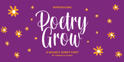 Poetry Grow is a bouncy and timeless handwritten font. It is the best choice for creating eye-catching logos, branding, and quotes. Every letter adds a unique and beautiful touch to your design, making it come alive with a classy and elegant look.
 - Kaweah by RMtype,
$15.00 Kaweah is a sharp, condensed, serif typeface with wide language support and strong historical roots. The original inspiration for this typeface comes from text in the museum collection of Kings Canyon National Park. It is designed to be used in titles and subheads.
 - Butterfly by Stringlabs Creative Studio,
$29.00 Butterfly is a delicate, elegant and flowing handwritten font. It has beautiful and well balanced characters and as a result, it matches a wide pool of designs. Add it to your most creative ideas and notice how it makes them come alive!
 - Da Mane by Tugrul Mustafa Gunaydin,
$15.00 DaMane Display combines the decorative design style used in the past and the minimal design used today. Simple lines, sharp and radius corners come together harmoniously in the letters. High contrast letters create an elegant visual perception. It has nearly 400 glyph sets.
 - Nurekas by Warisand,
$17.00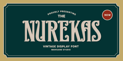 Nurekas is a Vintage Font inspired by beautiful vintage sign art and lettering. The font comes with unique alternate design characters to give your designs an elegant and artistic look. It is perfect for logo and packaging design, short phrases or headlines.
 - Hamidey by dotHK Studio,
$20.00 Hamidey is a delicate, elegant and flowing Signature font. It has beautiful and well balanced characters and as a result, it matches a wide pool of designs. Add it to your most creative ideas and notice how it makes them come alive!
