10,000 search results
(0.034 seconds)
- Imagine a font that captures the spirit of creativity and rebellion, all while paying homage to one of the most iconic bands in music history. That's where AbbeyRoad by Flop Design steps into the spo...
- La Flama y La Espina - Personal use only

- Romance Fatal 2.00 - Personal use only

- CheckerHat - Unknown license

- TOMO Joseph by TOMO Fonts,
$12.00
- Double Quick by Hanoded,
$15.00
- Lugano by Greater Albion Typefounders,
$14.00
- Wofisty by Jadatype,
$15.00
- Hedon by Tour De Force,
$25.00
- Savour Pro by profonts,
$51.99
- EbuScript by Type-Ø-Tones,
$40.00
- Death World by Typefactory,
$14.00
- Goombah by Cool Fonts,
$24.00
- Caffe Lungo by Hanoded,
$15.00
- Jumbox by Tour De Force,
$25.00
- Maravilla by madeDeduk,
$14.00
- Ranira by Differentialtype,
$10.00
- Resotho by Glukfonts,
$10.00
- Amanet by Tour De Force,
$25.00
- Mountain Side by Epiclinez,
$18.00
- Choco Chips by Fikryal,
$16.00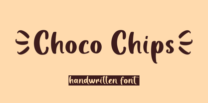
- FF Papertape by FontFont,
$41.99
- Maebashi by CBRTEXT Studio,
$20.00
- Jambo by Hanoded,
$15.00
- Deco Romance JNL by Jeff Levine,
$29.00
- Veronica by Miller Type Foundry,
$29.00
- Simply Happy by Seemly Fonts,
$14.00
- Rawbeat by Wasabib Type Foundry,
$9.00
- Dreame Patter by Viswell,
$12.00
- Crimson Skyline by Hanoded,
$15.00
- Rough Therapy by Hanoded,
$15.00
- Lofita by Awan Senja,
$14.00
- Spiky by Aah Yes,
$3.95 - FF Vortex by FontFont,
$41.99
- Luckmeister PB by Pink Broccoli,
$14.00
- Liong by Dikas Studio,
$15.00
- Emilston by Stripes Studio,
$20.00
- Halloween Park by AEN Creative Studio,
$15.00
- SK Kalender by Salih Kizilkaya,
$9.99
- SF Mada by Sultan Fonts,
$19.99


