10,000 search results
(0.082 seconds)
- Schism Two by Alias,
$55.00 Schism is a modulated sans-serif, originally developed from our Alias Didot typeface, as a serif-less version of the same design. It was expanded to three sub-families, with the thin stroke getting progressively heavier from Schism One to Schism Three. The different versions explore how this change in contrast between thick and thin strokes changes the character of the letterforms. The shape is maintained, but the emphasis shifts from rounded to angular, elegant to incised. Schism One has high contrast, and the same weight of thin stroke from Light to Black. Letter endings are at horizontal or vertical, giving a pinched, constricted shape for characters such as a, c, e and s. The h, m, n and u have a sharp connection between curve and vertical, and are high shouldered, giving a slightly square shape. The r and y have a thick stress at their horizontal endings, which makes them impactful and striking at bolder weights. Though derived from an elegant, classic form, Schism feels austere rather than flowery. It doesn’t have the flourishes of other modulated sans typefaces, its aesthetic more a kind of graphic-tinged utility. While in Schism Two and Three the thin stroke gets progressively heavier, the connections between vertical and curves — in a, b, n etc — remain cut to an incised point throughout. The effect is that Schism looks chiselled and textural across all weights. Forms maintain a clear, defined shape even in Bold and Black, and don’t have the bloated, wide and heavy appearance heavy weights can have. The change in the thickness of the thin stroke in different versions of the same weight of a typeface is called grading. This is often used when the types are to used in problematic print surfaces such as newsprint, or at small sizes — where thin strokes might bleed, and counters fill in and lose clarity, or detail might be lost or be too thin to register. The different gradings are incremental and can be quite subtle. In Schism it is extreme, and used as a design device, giving three connected but separate styles, from Sans-Didot to almost-Grotesk. The name Schism suggests the differences in shape and style in Schism One, Two and Three. Three styles with distinct differences, from the same start point.
 - Rezak by TypeTogether,
$36.00 Nothing is hidden in the simplistic forms and overt aesthetic of Anya Danilova’s Rezak font family. Rezak is not a type family directly from the digital world, but was inspired by the stout presence of cutting letters out of tangible material: paper, stone, and wood. With only a few cuts, the shapes remain dark and simple. With more cuts, the shapes become lighter and more defined, resulting in a dynamic type family not stuck within one specific category. The Black and medium weights began as one approach before separating into display and text categories. The four text weights were created through pendulum swings in design direction that experimented with contrast, angles, tangent redirections, and the amount of anomalies allowed. The text weights are vocal when set larger than ten points and subtle at smaller sizes. The tech-heavy Incised display style came last, employing a surprising range of trigonometric functions to make it behave exactly as desired. Its look can result in something distinctive and emotional or completely over-the-top. Most normal typefaces change only in thickness; Rezak changes in intention, highlighting the relationship between dark and light, presence and absence, what’s removed and what remains. Rezak’s Black and Incised display styles are like a shaft of light in reverse and are perfect in situations of impact: websites, headlines and large text, gaming, call-outs, posters, and packaging. The tone works for something from youthful or craft-oriented to organic and natural products. Try these two in logotypes, complex print layering, branding, and words-as-pattern for greater experimentation. The text styles are bold, energetic, well informed, and round out the family with four weights (Regular, Semibold, Bold, Extrabold) and matching italics for a family grand total of ten. These jaunty styles work well in children’s books, call-outs, movie titles, and subheads for myriad subjects such as architecture, coffee, nature, cooking, and other rough-and-tumble purposes. Rezak’s crunchy letters are meant to expose rough, daring, or dramatic text. A further benefit is that this family is not sequestered within one specific genre or script, so it can be easily interpreted for other scripts, such as its current Latin and extended Cyrillic which supports such neglected languages as Abkhaz, Itelmen, and Koryak. Rezak’s push toward creativity and innovation, with an eye on typography’s rich history, reinforces our foundry’s mission to publish invigorating forms at the highest function and widest applicability.
 - Anaglyph by Luxfont,
$18.00 Introducing incredible COLOR ANAGLYPH font. Unique font family with anaglyph stereo effect - a novelty in the field of color fonts. Inspired by global trends in contemporary design with a touch of retro 90s, electric music and minimalistic purity of glyphs. Truly a reflection of modern POP culture. Font is ideal in entertainment design. Night club poster design, fashionable business card, website title, magazine illustration - there are countless options for using it. Font family has two thicknesses - bold & regular, 3 types of stereo effect, 2 font colors with stereo effect (black and white). Font consists of letters of the same height without division into uppercase and lowercase glyphs. This font family is based on the Regular & Bold fonts Boldini - which means that if necessary you can combine these two families and they will be absolutely stylistically identical and complement each other. Check the quality before purchasing and try the FREE DEMO version of the font to make sure your software supports color fonts. Features: Free Demo font to check it works. 36 OTF SVG fonts in the family 2 thicknesses: Bold, Regular 3 types of stereo anaglyph effect 6 font colors with stereo effect Kerning IMPORTANT: - OTF SVG fonts contain vector letters with gradients and transparency. - Multicolor OTF version of this font will show up only in apps that are compatible with color fonts, like Adobe Photoshop CC 2017.0.1 and above, Illustrator CC 2018. Learn more about color fonts & their support in third-party apps on www.colorfonts.wtf - Don't worry about what you see all fonts in black and not in multicolor in the tab “Individual Styles” - all fonts are working and have passed technical inspection, but not displayed in multicolor they, just because the website MyFonts is not yet able to show a preview of colored fonts. Then if you have software with support colored fonts - you can be sure that after installing fonts into the system you will be able to use them like every other classic font. Question/answer: How to install a font? The procedure for installing the font in the system has not changed. Install the font as you would install the classic OTF | TTF fonts. How can I change the font color to my color? · Adobe Illustrator: Convert text to outline and easily change color to your taste as if you were repainting a simple vector shape. · Adobe Photoshop: You can easily repaint text layer with Layer effects and color overlay. ld.luxfont@gmail.com
 - Migae by Jolicia Type,
$25.00 Migae is a versatile and elegant display font designed to captivate and engage audiences across a wide range of design applications. With 14 distinct weight variants spanning from delicate Light to commanding Black, and complemented by a refined set of italics, Migae offers a harmonious balance of strength and elegance to fulfill your typographic needs. Key Features: 1. 14 Weight Variants: Migae's extensive weight range, including Light, Regular, Medium, Semi-Bold, Bold, Extra Bold, and Black variants, allows you to choose the perfect weight for your design, whether it's a subtle headline or a bold statement. 2. Italics: In addition to its standard upright styles, Migae boasts a comprehensive set of italics that adds versatility to your typography, conveying an air of sophistication and style. 3. Strong to Elegant Styles: Migae's design philosophy seamlessly combines strength and elegance. Its strong weights provide a bold and impactful presence, while the lighter weights exude an effortless elegance, making it suitable for a wide array of creative projects. 4. Modern Aesthetic: Migae's clean, contemporary lines and carefully crafted details make it an ideal choice for modern graphic and web design, editorial layouts, branding, and advertising. 5. Legibility: Migae prioritizes legibility across all weights and styles, ensuring that your messages are communicated effectively, regardless of the chosen variant. 6. Versatile Applications: From branding and packaging to posters, editorial design, and web headings, Migae adapts to various design contexts, making it a versatile choice for graphic designers, typographers, and creative professionals. Design Inspiration: Migae draws inspiration from the harmony of nature, where strength and elegance coexist. Its name, derived from the Korean word "미래" (miraee), meaning "future," reflects its forward-thinking design approach that is equally rooted in tradition and innovation. Ideal Usage: Migae is an ideal choice for those seeking a display font that can effortlessly transition between bold and delicate, exuding confidence and refinement in every style. It's perfect for branding, packaging, advertising, editorial layouts, and any design project where typography plays a pivotal role. Migae is more than just a font; it's a design companion that empowers creatives to achieve a perfect balance between strength and elegance in their visual communications. Explore the world of Migae and let your design projects shine with its captivating charm and versatility.
 - Gather around, typography enthusiasts and history buffs, for a tale of a font that summons the spirit of centuries past with a modern twist. Plakat-Fraktur, created by the talented Dieter Steffmann, ...
- Pasión Acústica - Personal use only

- Sobriquet by Hanoded,
$15.00 Sobriquet means 'nickname'. The font is a narrow, handmade typeface, in an art-deco-ish style. It comes with a bunch of ligatures, distinct upper and lower case letters and extensive language support.
 - Benjor by Megami Studios,
$12.50 Named in honor of the great bossa nova artist, Benjor is a fat display meant for headlines, attention-grabbing displays and even Brazilian record covers! Striking and eye pleasing, it's simply que bom!
 - Whacker by PizzaDude.dk,
$20.00Whacker is made using a fat, inky marker. Comes with ligatures for double letters and alternate versions of the lowercase letters. You will need to use OpenType supporting applications to use the ligatures. - Santup by Jadatype,
$15.00 Santup is a display font that comes with a playful style. suitable for posters, tshirt, branding, social media, and so on. contains standard English letters, numbers, punctuation, and several accents that support multilingualism.
 - Band Wagon by Hanoded,
$15.00 I don't know why exactly, but I felt the need to create a Western font. Band Wagon is a handcrafted cowboy font. It comes with curly slabs, spurs and ye olde outlaw spirit.
 - J Scott Campbell Sketchbook by Comicraft,
$29.00 Created for J. SCOTT CAMPBELL'S DANGER GIRL SKETCHBOOK, this slick and stylish font is perfect for architectural drawings, marker comps or, um, sketchbooks! Artwork from Elephantmen: Man and Elephantman by J. Scott Campbell
 - Clochard by Hanoded,
$15.00 Clochard is a handmade, Bodoni-like font. It is a little loose, a little rough in places and a little uneven, but it all adds to Clochard's charm. Comes with plenty of diacritics!
 - Bacon Buffet by PizzaDude.dk,
$20.00 Is there anything more satisfying, alluring or mouth-watering than bacon? Comes with contextual alternates, which means that the font has got 8 different versions of each letter - this cycles as you type!
 - Becka Brush by Sulthan Studio,
$14.00 Becka Brush is a bold and chunky lettered display font, created with the help of a brush pen. Add it to your most creative ideas and notice how it makes them come alive!
 - Cybestpunk by Jadatype,
$15.00 Cybestpunk is a display font that comes with a cyber tech style. suitable for tshirt, branding, social media, and so on. contains standard English letters, numbers, punctuation, and several accents that support multilingualism.
 - Bethari by Studio Sun,
$20.00 Bethari Font Display is Deco's inspired font with swashes combinations, comes with 2 versions, fill and outlined, also 3 optional optical contrast. The font was created with fully crafted and smooth curve swashes.
 - Brushcrazy by Hanoded,
$15.00 Brushcrazy is a crazy brush font. Yes, you read that right! It comes with a lot of attitude, serious brush strokes, nice detail and a handful of alternate glyphs and ligatures as well!
 - Neosonic by limitype,
$21.00 Neosonic is a modern display font made in a more dynamic, fast racing style, suitable for your modern designs with technology or sports themes. Neosonic comes complete with : - Allcaps Font - Multilingual - Number & Symbols
 - Cubissimo by Hanoded,
$15.00 Cubissimo is a geometric font inspired by a 1929 poster advertising a museum exhibition. It is an all-caps cubist typeface designed to look good on posters. It comes with extensive language support.
 - Triunfo by Corradine Fonts,
$19.95 Triunfo is a modern slab serif font family with sports flavor. It comes in 21 variants of weight and wide that allows you to choose the best option to use in your work.
 - Scrouble Outline by Jadatype,
$12.00 Scrouble is a display font that comes with a playful scribble style. suitable for tshirt, branding, social media, and so on. contains standard English letters, numbers, punctuation, and several accents that support multilingualism.
 - Winter Beauty by Typestory,
$12.00 Winter Beauty is a sweet, fancy hand-lettered script. The playful rounded characters make it the perfect font for creating stunning calligraphy art. Add it to your designs and make them come alive!
 - Cuba by TrendGFX Design Studios,
$8.00 A Geometrical font. This idea flashed to me in one of the boring classes we had in college. Since its my special masterpiece we come really cheap at its price of just $8.
 - Beautiful Agatha by Yoga Letter,
$30.00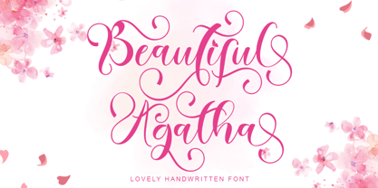 "Beautiful Agatha" is the best beautiful handwritten font. This font comes with uppercase, lowercase, ligature, swash, alternate, punctuation, and multilingual support. very suitable for weddings, engagements, invitations, Christmas, Valentine's, spring, summer, autumn, etc.
 - Gritstomper by Hanoded,
$15.00 Gritstomper is a gritty, charcoaly, pencilly font. Quickly written, handcrafted and with sharpened edges. Comes with a full load of diacritics, double letter ligatures for the lower case and a boss-like attitude.
 - Dynamic Schematic by Trustha,
$17.00 Dynamic Schematic is a natural handwritten font, written with fun and relaxed. It comes with 400+ glyphs, which also include multilingual languages. Dynamic Schematic is perfect for headlines, branding, quotes, and many more.
 - Quartro by Brainware Graphic,
$12.00 Quartro typeface is a reverse contrast display typeface, stylistic, and uniquely humanist sans. It's design influenced by modern typography and contemporary art. Quartro typeface comes in single-weight. Multi-lingual Supported (Latin Extended).
 - FF Identification by FontFont,
$30.99 British type designer Rian Hughes created this display FontFont in 1993. The family has 5 weights, and is ideally suited for music and nightlife. It comes with tabular lining and proportional lining figures.
 - Lotustail by Letterhend,
$9.00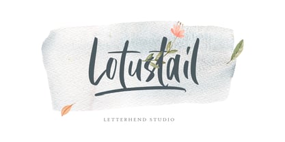 Lotustail is a handwritten font that includes many OpenType features. It also includes alternates and ligatures. This font also comes with numbers, symbols, punctuation and multi-lingual characters. It is also PUA Encoded.
 - Hefty Galloon by PizzaDude.dk,
$20.00Letters torn apart...did you say punk? Or did you say misprinted? Comes with 2 alternatives for each letter, and with kerning for both lower/lower, caps/lower, caps/caps and lower/caps - Bibiana by Otto Maurer,
$19.00 Swashy Newstyle Tattoo-Font Gangsterstyle. Bibiana is the Sisterfont to Tinka Babe Tattoofont. Bibiana is best for Tattoart like Tattooflash.Bibiana Tattoofont comes with many OpenType Features. Alternate Ends Alternate Caps Ligatures Extra swashes
 - Grischel by Martype co,
$18.00 Grischel Is a condensed serif font that comes with tall style for display purposes to make it satisfying, also suitable for minimalist, chic, branding, packaging and merch design to boost your design exploration.
 - Walburn by Shinntype,
$39.00 Condensed “modern” family based on the early 19th Century Walbaum typeface. A variety of treatments for use at sizes ranging from text to large display, where the micro-detailing comes into full effect.
 - English1707 by PojolType,
$12.00 English1707 comes from combining two thick and thin and dashed lines. We can use this font for book titles, billboards, posters, logo designs, clothes, t-shirts, and can also be used for brands.
 - Winslow Title by Kimmy Design,
$25.00 Winslow Title is a high contrast modern type family comes in two styles and a monolinear script family. The traditional proportions of Winslow Title are historical in nature and follow the design and style of Winslow Book as a high contrast variant. The Winslow Title Mod family is a contemporary take on the style, with tapering terminals and less pronounced finials. Each family includes both styles, to be accessed through the opentype panel as a stylistic alternate. If preferable, you can purchase the entire family collection to have easier access to both styles, but it's not necessary. The typeface family comprises of roman and italic styles in six weights from Thin to Black and two widths in the roman style: Regular and Narrow. The accompanying script family has a single weight but offers five tracking widths, from Narrow to Wide. The bundle is an elegant combination of styles perfect for titling and display design. The serif typeface is packed with features that make ideal titling styles. Not only do they include the Stylistic Alternates, but also Titling Alternates, Discretionary Ligatures, Small Capitals, Swashes and Contextual Ligatures. As noted previously, the typeface comes in two styles, Traditional and Modern. Each can be accessed either by the Stylistic Alternates or Stylistic Sets. Titling Alternates are alternates that expand the ball terminals to K, R, V, W, and Y (see Titling Alternates slide). Contextual Ligatures are for capital combinations with A that tighten the gap created by the extended serifs. It connects characters with a pairing serif (the lower right serif of the M with the lower right serif of the A) and bridges them together. This combination works for single and multiple A combinations. It is turned on automatically in the Opentype panel and shouldn’t need to be accessed individually. Alternatively, the Discretionary Ligatures feature combines diagonal or baseline stems with lifted small capitals, creating a unique combination of characters. Swashes is an extensive feature that offers up to five swash options per many of each character. These can be selected via the Glyphs panel or as character alternates in Adobe programs. The Script family has a feature set of it’s own, with initial and final swashes on lowercase letters, middle swashes for select characters, and a titling feature that joins words together by replacing the space with a line. Stylistic alternates create a bouncing baseline on connecting strokes. *Note: there is no great need to purchase both families as all styles can be accessed via Opentype features, but if customers prefer to purchase both styles, it can be done by selecting the Complete Typeface Family collection.
 - Oxford Street by K-Type,
$20.00 Oxford Street is a signage font that began as a redrawing of the capital letters used for street nameplates in the borough of Westminster in Central London. The nameplates were designed in 1967 by the Design Research Unit using custom lettering based on Adrian Frutiger’s Univers typeface, a curious combination of Univers 69 Bold Ultra Condensed, a weight that doesn’t seem to exist but which would flatten the long curves of glyphs such as O, C and D, and Universe 67 Bold Condensed with its more rounded lobes on glyphs like B, P and R. Letters were then remodelled to improve their use on street signs. Thin strokes like the inner diagonals of M and N were thickened to create a more monolinear alphabet; the high interior apexes were lowered and the wide joins thinned. The crossbar of the A was lowered, the K was made double junction, and the tail of the Q was given a baseline curve. K-Type Oxford Street continues the process of impertinent improvement and includes myriad minor adjustments and several more conspicuous amendments. The stroke junctions of M and N are further narrowed and their interior apexes modified. The middle apex of the W is narrowed and the glyph is a little more condensed. The C and S are drawn more open, terminals slightly shortened. The K-Type font adds a new lowercase which is also made more monolinear so better suited to signage, loosely based on Univers but also taking inspiration from the Transport typeface both in a taller x-height and character formation. The lowercase L has a curled foot, the k is double junctioned to match the uppercase, and terminals of a, c, e, g and s are drawn shorter for openness and clarity. A full repertoire of Latin Extended-A characters features low-rise diacritics that keep congestion to a minimum in multiple lines of text. The font tips the hat to signage history by including stylistic alternates for M, W and w that have the pointed middles of the earlier MOT street sign typeface. Incidentally, Alistair Hall (‘London Street Signs’, Batsford, 2020) notes that when the manufacturer of signs was changed in 2007, Helvetica Bold Condensed was substituted in place of the custom design, “an unfortunate case of an off-the-peg suit replacing a tailored one” and a blunder that has happily since been rectified, though offending nameplates can still be spotted by discerning font fans.
 - Albert Einstein by Harald Geisler,
$29.00 Harald Geisler wants to make you as brilliant as Albert Einstein. Or at least let you write like him. Or at least write in his handwriting. — The Wall Street Journal Imagine you could write like Albert Einstein. The Albert Einstein font enables you to do exactly that. In an joined effort, creators Harald Geisler and Elizabeth Waterhouse, spend over 7 years on finalising the project. It was made possible with the help of the Albert Einstein Archive, the Albert Einstein Estate, and funding by a successful Kickstarter Campaign of 2, 334 backers. The outcome was worth the effort: a font unprecedented in aesthetic technique and a benchmark for handwriting fonts. To create a result that is true to the original, Harald Geisler developed a method to analyse the movement of the famous writer. Letter by letter, every glyph was digitally re-written to create a seamlessly working font. It is the only font that holds 5 variations for each lowercase and uppercase-letter, number, and punctuation sign. Each based on meticulous detail to the original samples of Albert Einstein’s handwriting. The OpenType contextual alternates feature dynamically arranges the letters automatically as you type to ensure that no repeated letter forms are placed next to each other. Stylistic variants can also be accessed through stylistic sets. The font has 10 fine-tuned weights ranging from extra-light to fine and extra bold to heavy. The result is a vivid handwritten text true to the original. A PDF documentation, showing step by step how the font was made and comparing numerous original samples, is included with the font and can be downloaded here. The work has been recognised internationally, by press, Einstein fans, and designers. Some quotes used in images: “The font is beautiful“ — Washington Post “If you could write like Einstein, would it help you to think like Einstein?” — The Times (London) “Finally, if your colleagues aren’t taking you seriously, then perhaps you could start sending e-mails in a new font that mimics the handwriting of Albert Einstein.” — Physics World “Geisler and Waterhouse are really asking deeper questions about the diminishing (or evolving) role of our flawed, variable penmanship as a conduit of thought in today’s pixel-perfect landscape.” — QUARTZ “Your writing will look imaginative — which is exactly what Einstein would've wanted." — Huffington Post Arts & Culture "Forget Myriad Pro, Helvetica or Futura. The only font you’ll ever need" — Gizmodo “Capture a piece of Einstein's genius in your own writing." — Mashable
 - Air Superfamily by Positype,
$29.00 In B-movie awesomeness, Air began as Grotesk vs. Grotesque. I was trying to unify the prevailing traits of German and English Grotes(que/k)s in order to make something different but familiar. I am NOT trying to reinvent Helvetica (snore), so get that out of your system. From the onset, I intended this typeface to be a true workhorse that offers infinite options and flexibility for the user. At its core, it is the maturation of the Aaux Next skeleton I developed years ago. I worked out Aaux Next to settle my issues and love for Akzidenz. With Aaux Next, I strove to be mechanical, cold and unforgiving with it. I was single, young, cocky and it fit. Now I'm married, kids, dog and have found that I've turned into a big softy. When I look at Aaux Next (and have for the past few years) I see another typeface trying to eek out. I wanted it to avoid the trappings of robotic sans, quick tricks and compromises. The typeface’s DNA needed to be drawn and not just generated on a screen — so I set aside a year. I love type. I love working with type. I hate when my options for a slanted complement is only oblique or italic. I set out to produce both to balance usage — there are more than enough reasons to prepare both and I want the user to feel free to consciously choose (and have the option to choose) the appropriate typeface for print, web, etc. That flexibility was central to my decision-making process. The Oblique is immediate and aggressive. The Italic was redrawn at a less severe angle with far more movement and, as a result, is far more congenial when paired with the Uprights. Condensed and Compressed. Yep, why not? I know I would use them. There are nine weights currently available. The logical progression of weights and the intended flexibility demanded I explore a number of light weights and their potential uses — this has produced a number of ‘light without being too light’ options that really work based on the size. The result is a robust 81-font superfamily that is functional, professional, and highly legible without compromising its personality. Pair that with over 900 characters per font that includes ligatures, discretionary ligatures, stylistic alternates, fractions, proportional/tabular lining and proportional/tabular oldstyle figures, numerators, denominators, ordinals, superiors, inferiors, small caps, case-sensitive functionality and extensive language support and you have a versatile superfamily well-suited for any project.
 - Malik by Zetafonts,
$39.00 Taking its name from the arabic word for "king", Malik is a flared sans serif typeface family designed in 2020 by Andrea Tartarelli. The designer wanted to find a way to bridge the classical letterforms of Roman Old Style typefaces with the readability of contemporary sans typefaces. This was achieved by using the so-called flared serif that emerges gradually from the stem of the letter, ending in a sharp angle. It's something that also reminds of the peculiar shapes of the Simoncini Method, invented by italian type designer Francesco Simoncini to get a sharper definition of letterforms. To this blend of classical elegance and modernist expertise, Malik adds the calligraphic influence of modern masters like Frederic Goudy or Ed Benguiat, visible in signature details like the reverse contrast uppercase B, or the calligraphic lowercase k. Malik also means "owner", and this font surely wants to rule the page. It manages to be extremely readable when used in body text size, but looks surprising and expressive in display use. The inclusion of the Malik Heavy Display weight, with its black texture balanced by deep inktraps, allows for striking logo design. The weight range of the family is extremely wide, including a Book alternative to the Regular weight for fine-tuning readability, a range of light display weights and a solid choice of bold weights for branding, all coming with matching true italics. The 16 cuts of Malik have been equipped with all the features you need to solve your editorial and design challenges, including a wide language coverage (thanks to over one thousand latin and cyrillic characters) and a complete set of open type features (including small capitals, positional numbers, case sensitive forms). Alternate characters and stylistic sets allow you to fine-tune your editorial and branding design by choosing variant letter shapes. Malik is the typeface for everyone who wants to design like a king...or like he doesn't care who the king is!
