10,000 search results
(0.032 seconds)
- LT Streetway Neue - 100% free

- Typewriter from hell - Unknown license

- Raketta From Mars - Unknown license

- Bubbly Frog Hollow - Unknown license

- Spiky Frog Graffiti by Sipanji21,
$18.00 Spiky Frog is a spectacular decorative font with a graffiti style and included some swash for your design look awesome. It will elevate a wide range of design projects to the highest level, be it branding, headings, wedding designs, invitations, signatures, logotype, wall art illustration, apparel, labels, and much more!
 - Funny Frog Display by Sipanji21,
$15.00 Funny Frog - A Fun Display Font With Cute Characters. It will elevate a wide range of design projects to the highest level, be it branding, headings, Kids Zone, designs, invitations, Snack Package, logotype, wall art illustration, apparel, labels, and much more!
 - Freaky Frog BF by Bomparte's Fonts,
$14.95A revival of sorts, Freaky Frog BF is modeled after an 1887 design from Central Type Foundry, called Grimaldi. Much warmth and charm have been instilled into the original design through among other means, reworked contours and serifs. Contours are smoothened, liberated from its roughness, while serifs have become somewhat concave. Verticals and horizontals appear to "swell" owed in part to flared shapes. The overall effect, I believe, is one of pure typographic endearment. - From The Stars by Typodermic,
$11.95 Welcome to the world of industrial design and technology with From the Stars, the pragmatic sans-serif rectilinear typeface that will take your design game to the next level. Inspired by the ultra-modern industrial design, From the Stars is a powerful typeface that features a tight style and closed curves, making it an ideal choice for designers seeking to create clean and contemporary layouts. This typeface is a perfect reaction to the popularity of open types in the 1990s and 2000s, offering a new level of sophistication and professionalism to your designs. From the Stars’ compact aesthetic and rounded rectangular form are tailored to complement new industrial design and technological gadgets. Whether you’re designing for digital products or creating prints, From the Stars is the ultimate typeface that will make your work stand out. With seven weights and italics, From the Stars provides unparalleled flexibility to your designs, allowing you to achieve the perfect balance between elegance and readability. Its versatility makes it suitable for various applications, from bold headlines to body copy, making it an excellent choice for designers looking to make a statement. Embrace the power of pragmatic design with From the Stars, the typeface that will elevate your work and make you stand out from the crowd. Most Latin-based European writing systems are supported, including the following languages. Afaan Oromo, Afar, Afrikaans, Albanian, Alsatian, Aromanian, Aymara, Bashkir (Latin), Basque, Belarusian (Latin), Bemba, Bikol, Bosnian, Breton, Cape Verdean, Creole, Catalan, Cebuano, Chamorro, Chavacano, Chichewa, Crimean Tatar (Latin), Croatian, Czech, Danish, Dawan, Dholuo, Dutch, English, Estonian, Faroese, Fijian, Filipino, Finnish, French, Frisian, Friulian, Gagauz (Latin), Galician, Ganda, Genoese, German, Greenlandic, Guadeloupean Creole, Haitian Creole, Hawaiian, Hiligaynon, Hungarian, Icelandic, Ilocano, Indonesian, Irish, Italian, Jamaican, Kaqchikel, Karakalpak (Latin), Kashubian, Kikongo, Kinyarwanda, Kirundi, Kurdish (Latin), Latvian, Lithuanian, Lombard, Low Saxon, Luxembourgish, Maasai, Makhuwa, Malay, Maltese, Māori, Moldovan, Montenegrin, Ndebele, Neapolitan, Norwegian, Novial, Occitan, Ossetian (Latin), Papiamento, Piedmontese, Polish, Portuguese, Quechua, Rarotongan, Romanian, Romansh, Sami, Sango, Saramaccan, Sardinian, Scottish Gaelic, Serbian (Latin), Shona, Sicilian, Silesian, Slovak, Slovenian, Somali, Sorbian, Sotho, Spanish, Swahili, Swazi, Swedish, Tagalog, Tahitian, Tetum, Tongan, Tshiluba, Tsonga, Tswana, Tumbuka, Turkish, Turkmen (Latin), Tuvaluan, Uzbek (Latin), Venetian, Vepsian, Võro, Walloon, Waray-Waray, Wayuu, Welsh, Wolof, Xhosa, Yapese, Zapotec Zulu and Zuni.
 - Notes From Home by Ana's Fonts,
$15.00 Notes From Home is a serif and ornaments font family made using hand-carved linoleum. This collection has a quirky handmade look, but can also be used in retro and vintage designs, such as collages. The fonts have a realistic ink stamp texture that will look great in logos, notes and quotes, social media posts, and branding and packaging. Notes From Home includes: Notes From Home serif font in three variations: regular, dirty and faded An ornaments font, with 62 glyphs, including doodles, swashes, smudges and frames
 - From the Internet by Typodermic,
$11.95 Introducing From the Internet, a sleek and pragmatic sans-serif typeface that exudes technical sophistication. The narrow and square shapes of this typeface create a compact and organized appearance, perfect for modern industrial design. With softened edges, the boxy letterforms have a sense of approachability that is sure to draw in any reader. From the Internet’s austere and uncomplicated style ensures that your message is delivered with clarity and precision. Its lack of intricate detail prevents any distractions, keeping the focus on the essential message. This typeface avoids clichés, ensuring that your designs are always fresh and unique, without any conspicuous sci-fi influences. This font’s versatility is enhanced by the “stylistic alternatives” feature available in OpenType-savvy applications, allowing for access to alternate versions of the “f” and “t” letters. From the Internet offers a range of styles, including Regular, Italic, Bold, and Bold Italic, each with its unique personality. Whether you’re looking to create sleek tech manuals or modern business presentations, From the Internet is the perfect typeface to convey your message with sophistication and style. Its pragmatic and precise style ensures that your designs will always be on-trend and highly readable, making it an excellent choice for any designer looking to create an impact. Most Latin-based European writing systems are supported, including the following languages. Afaan Oromo, Afar, Afrikaans, Albanian, Alsatian, Aromanian, Aymara, Bashkir (Latin), Basque, Belarusian (Latin), Bemba, Bikol, Bosnian, Breton, Cape Verdean, Creole, Catalan, Cebuano, Chamorro, Chavacano, Chichewa, Crimean Tatar (Latin), Croatian, Czech, Danish, Dawan, Dholuo, Dutch, English, Estonian, Faroese, Fijian, Filipino, Finnish, French, Frisian, Friulian, Gagauz (Latin), Galician, Ganda, Genoese, German, Greenlandic, Guadeloupean Creole, Haitian Creole, Hawaiian, Hiligaynon, Hungarian, Icelandic, Ilocano, Indonesian, Irish, Italian, Jamaican, Kaqchikel, Karakalpak (Latin), Kashubian, Kikongo, Kinyarwanda, Kirundi, Kurdish (Latin), Latvian, Lithuanian, Lombard, Low Saxon, Luxembourgish, Maasai, Makhuwa, Malay, Maltese, Māori, Moldovan, Montenegrin, Ndebele, Neapolitan, Norwegian, Novial, Occitan, Ossetian (Latin), Papiamento, Piedmontese, Polish, Portuguese, Quechua, Rarotongan, Romanian, Romansh, Sami, Sango, Saramaccan, Sardinian, Scottish Gaelic, Serbian (Latin), Shona, Sicilian, Silesian, Slovak, Slovenian, Somali, Sorbian, Sotho, Spanish, Swahili, Swazi, Swedish, Tagalog, Tahitian, Tetum, Tongan, Tshiluba, Tsonga, Tswana, Tumbuka, Turkish, Turkmen (Latin), Tuvaluan, Uzbek (Latin), Venetian, Vepsian, Võro, Walloon, Waray-Waray, Wayuu, Welsh, Wolof, Xhosa, Yapese, Zapotec Zulu and Zuni.
 - Message from Mars by PizzaDude.dk,
$18.00 This is a live recording from Mars: Your planetary system is about to be invaded by the inhabitants of Mars. We come in peace, we come with party! Heh-heh. Say hello to my interplanetary font, Message from Mars. Handmade, yet super digital. Play around with the weird shaped letters, and make your own galactic text - use upper- and lowercase as well as the alternate version
 - Notes from Paris by PeachCreme,
$18.00 "Notes from Paris" will make your letters look très chic while still maintaining its functionality with easy-to-read letterforms. Furthermore, the comforting vibe of this font brings a touch of relaxation to your typography. The words flow with ease and grace, like a gentle breeze on a summer day in the city of love. So, whether you're crafting a logo design or wedding invite, "Notes from Paris" is a font that you must have for a chic and legible typographic journey. With 59 Opentype ligatures, this font blurs the line between script and handwriting, allowing for a seamless transition between letters and creating a truly genuine sensation.
 - Word From Radio by Dharma Type,
$14.99 Based on retro vinyl records in the middle of 20th century. the mixture of funky, hippie and mid-century’s futuristics. There are three other fonts designed by in the same concept. -African Elephant Trunk -Moon Star Soul -Rebel Train Goes -Word From Radio
 - Rocketship From Infinity by Device,
$29.00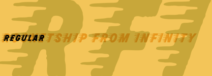
- Neuer Weltschmerz by Hanoded,
$15.00 About 7 years ago, I released a beautiful (imho) Art Deco inspired font called Weltschmerz. Weltschmerz was an all-caps font and I always wanted to do a lower case version as well. But as things so often go in life, I never found the time and forgot about it. Some time ago, I ‘rediscovered’ my good old Weltschmerz font and remembered that I wanted to create a lower case version. Without further ado: here is Neuer Weltschmerz (‘New Weltschmerz’). I redid the whole font, better kerning, better spacing, better looks… and with a proper lower case! I did keep the original handwritten look intact - because, well, it IS hand made!
 - Neug Asia by Allouse Studio,
$16.00 Proudly Presenting, Neug Asia. A font duo that will give you an a classy impression! Neug Asia can be display for any titles, logo, product packaging, branding project, megazine, social media, wedding, or just used to express words above the background. Neug Asia come with Multi-Lingual Support. Enjoy the font, feel free to comment or feedback, send me PM or email. Thank You!
 - Neue Haas Grotesk Text by Linotype,
$33.99The original metal Neue Haas Grotesk™ would, in the late 1950s become Helvetica®. But, over the years, Helvetica would move away from its roots. Some of the features that made Neue Haas Grotesk so good were expunged or altered owing to comprimises dictated by technological changes. Christian Schwartz says Neue Haas Grotesk was originally produced for typesetting by hand in a range of sizes from 5 to 72 points, but digital Helvetica has always been one-size-fits-all, which leads to unfortunate compromises."""" Schwartz's digital revival sets the record straight, so to speak. What was lost in Neue Haas Grotesk's transition to the digital Helvetica of today, has been resurrected in this faithful digital revival. The Regular and Bold weights of Helvetica were redesigned for the Linotype machine; those alterations remained when Helvetica was adapted for phototypesetting. During the 1980s, the family was redrawn and released as Neue Helvetica. Schwartz's revival of the original Helvetica, his new Neue Haas Grotesk, comes complete with a number of Max Miedinger's alternates, including a flat-legged R. Eight display weights, from Thin to Black, plus a further three weights drawn specifically for text make this much more than a revival - it's a versatile, well-drawn grot with all the right ingredients. The Thin weight (originally requested by Bloomberg Businessweek) is very fine, very thin indeed, and reveals the true skeleton of these iconic letterforms. Available as a family of OpenType fonts with a very large Pro character set, Neue Haas Grotesk supports most Central European and many Eastern European languages. - Bebas Neue Semi Rounded by Dharma Type,
$4.99 Bebas Neue SemiRounded is the Bebas Neue with rounded corners. As you know, Bebas Neue is the most widely used free font recently. This semi-rounded version is the new style for more widely use. The basic theory and proportion are same as Bebas Neue but rounded shape gives a warm, soft and natural impression. A bit more rigid than Bebas Neue Rounded. Available at an affordable price.
 - Neue Haas Unica Paneuropean by Linotype,
$65.00Neue Haas Unica by Toshi Omagari: The original purpose behind the creation of the typeface Haas Unica was to provide a sympathetic update of Helvetica. But now the font designer Toshi Omagari has decided to make this typeface his own and has thus significantly supplemented and extended it. In the late 1970s, at the same time at which hot metal typesetting was being replaced by phototypesetting, the Haas Type Foundry commissioned a group of specialists known as "Team '77" consists of Andre Gurtler, Christian Mengelt and Erich Gschwind to adapt Max Miedinger's font The characters of Haas Unica are somewhat narrower than those of Helvetica so that the larger bowls, such as those of the "b" and "d", appear more delicate and have a slightly more pleasing effect. In general, the spacing of Haas Unica was increased to provide for improved kerning and thus enhance the legibility of the typeface in smaller point sizes. Major changes were made to the lowercase "a", in that the curve of the upper bowl became rounder and its spur was eliminated. The form of the "k" was additionally modified to remove the offset leg so that both diagonals originate from the main stem. The outstroke of the uppercase "J" was also significantly curtailed. In addition to many minor alterations, such as to the length of the horizontal bars of the "E", "F" and "G" and to the angle of the tail of the "Q", the leg of the "R" was extended and made more diagonal. In the case of the numerals, the upper curve of the "2" was reduced and the lower loops of the "5" and "6" were correspondingly adapted. The sweep of the diagonal of the "7" was also reduced. Several decades later, Toshi Omagari returned to the original sketches with the objective of reinvigorating this almost totally forgotten typeface. First, however, he needed to revise the drafts prepared by Team '77 to adapt them for digital typesetting. So Omagari carefully adjusted the proportions of the glyphs, achieving a more uniform overall effect across all line weights and removed details that had become redundant for contemporary typefaces. It was also apparent from the old drafts that it had been the case that the original plan was to create more than the four weights that were published. Omagari has added five additional styles, giving his Neue Haas Unica? a total of nine weights, from Ultra Light to Extra Black. He has also greatly extended the range of glyphs. Providing as it does typographic support for Central and European languages, Greek and Cyrillic texts, Neue Haas Unica is now ready to be used for major international projects. In addition, it has been supplied with small caps and various sets of numerals. With its resolute clarity and excellent typographic support, Neue Haas Unica is suitable for use in a wide range of new contexts. The light and elegant characters can be employed in the large point sizes to create, for example, titling and logos while the very bold styles come into their own where the typography needs to be powerful and expressive. The medium weights can be used anywhere, for setting block text and headlines. - Neue Luthersche Fraktur SB by Scangraphic Digital Type Collection,
$39.50 Since the release of these fonts most typefaces in the Scangraphic Type Collection appear in two versions. One is designed specifically for headline typesetting (SH: Scangraphic Headline Types) and one specifically for text typesetting (SB Scangraphic Bodytypes). The most obvious differentiation can be found in the spacing. That of the Bodytypes is adjusted for readability. That of the Headline Types is decidedly more narrow in order to do justice to the requirements of headline typesetting. The kerning tables, as well, have been individualized for each of these type varieties. In addition to the adjustment of spacing, there are also adjustments in the design. For the Bodytypes, fine spaces were created which prevented the smear effect on acute angles in small typesizes. For a number of Bodytypes, hairlines and serifs were thickened or the whole typeface was adjusted to meet the optical requirements for setting type in small sizes. For the German lower-case diacritical marks, all Headline Types complements contain alternative integrated accents which allow the compact setting of lower-case headlines.
 - Neue Haas Grotesk Display by Linotype,
$33.99 The first weights of Neue Haas Grotesk were designed in 1957-1958 by Max Miedinger for the Haas’sche Schriftgiesserei in Switzerland, with art direction by the company’s principal, Eduard Hoffmann. Neue Haas Grotesk was to be the answer to the British and German grotesques that had become hugely popular thanks to the success of functionalist Swiss typography. The typeface was soon revised and released as Helvetica by Linotype AG. As Neue Haas Grotesk had to be adapted to work on Linotype’s hot metal linecasters, Linotype Helvetica was in some ways a radically transformed version of the original. For instance, the matrices for Regular and Bold had to be of equal widths, and therefore the Bold was redrawn at a considerably narrower proportion. During the transition from metal to phototypesetting, Helvetica underwent additional modifications. In the 1980s Neue Helvetica was produced as a rationalized, standardized version. For Christian Schwartz, the assignment to design a digital revival of Neue Haas Grotesk was an occasion to set history straight. “Much of the warm personality of Miedinger’s shapes was lost along the way. So rather than trying to rethink Helvetica or improve on current digital versions, this was more of a restoration project: bringing Miedinger’s original Neue Haas Grotesk back to life with as much fidelity to his original shapes and spacing as possible (albeit with the addition of kerning, an expensive luxury in handset type).” Schwartz’s revival was originally commissioned in 2004 by Mark Porter for the redesign of The Guardian, but not used. Schwartz completed the family in 2010 for Richard Turley at Bloomberg Businessweek. Its thinnest weight was designed by Berton Hasebe.
 - Neue Luthersche Fraktur EF by Elsner+Flake,
$35.00 - MartiniThai Neue Slab V2 by Deltatype,
$39.00 Award winning 2017 font from Demark (Thailand) and G-Mark (Japan) in Graphic Design, MartiniThai Neue Slab is now available with better taste. Deltatype created a better version of MartiniThai Neue Slab V2: refined for better outline, we fine-tuned all outlines for better letterforms. Proportion were adjusted for better consistent. Metrics got new values for increased readability. Kerning, fine-tuned kerning pair for better spacing between the letters. MartiniThai Neue Slab V2 comes in six weights: Thin, Light, Regular, Bold, Extra Bold, Black. Thai Language is included in this package. MartiniThai Neue Slab is a unique slab serif in Thai Script that creates a sense of timeless and contemporary feel and is used by a media provider and nationwide in Thailand.
 - LT Flode Neue News - 100% free

- From Where You Are - Personal use only

- Stars From Our Eyes - Personal use only

- KR Frogs for Jennifer - Unknown license

- Pea XOXO from Karen - Personal use only

- Little Brown Frog SG by Spiece Graphics,
$39.00 Here’s a typeface that’s both primitive and playful. It could aptly be described as having a modest bounce, unusual web feet, and a slightly grotesque croak. Joking aside, this amphibious creature-font is ideally suited for funny headlines as well as other goofy stuff. Great for party announcements, cartoon lettering, or just about anything involving kids. Or even fun-crazed adults! Little Brown Frog is also available in the OpenType Std format. Some new alternate characters have been added to this OpenType version. Advanced features currently work in Adobe Creative Suite InDesign, Creative Suite Illustrator, and Quark XPress 7. Check for OpenType advanced feature support in other applications as it gradually becomes available with upgrades.
 - From Where You Are by Kimberly Geswein,
$5.00 Created from real hand-painted letters, this font is designed to look like a painted sign.
 - Nue Medium - Personal use only

- Dael Neu - Unknown license

- De Roos Mediaeval NF by Nick's Fonts,
$10.00 Here’s a classic face from Dutch master type designer Sjoerd H. de Roos. Use it where timeless elegance is the goal. Both versions of this font support the Latin 1252, Central European 1250, Turkish 1254 and Baltic 1257 codepages.
 - Foo Bar Inline NF by Nick's Fonts,
$10.00One of countless variations possible from the modular lettering system called "Super Veloz", developed by Spanish type designer Joan Trouchut-Blanchard in the 1930s. The name is a play on the old G.I. acronymn FUBAR, translated politely as "fouled up beyond all recognition". Both versions of this font contain the Unicode 1252 Latin and Unicode 1250 Central European character sets, with localization for Romanian and Moldovan. - Jam Grotesque by JAM Type Design,
$25.00 Inspired by the beautiful typefaces like Helvetica and Neue Haas Unica, this beautiful typeface looks fantastic in print as well as online.
 - Linoset by Ensor Creative,
$20.00 Linoset was created from cut and printed linoleum. The lettering is based on Helvetica Neue Condensed Bold – it has been cut, printed and re-drawn to take on a completely new life – it's rough, tough and downright nasty!
 - Black Eye Nue - Unknown license

- P22 Platten Neu by IHOF,
$39.95 The P22 Platten font family has been revisited and expanded by designer Colin Kahn. Platten is based on lettering found in German fountain pen practice books from the 1920s (you may have seen the similar Speedball books in the US). This round tip pen lettering is comparable to the basic forms used in grammar school teaching alphabets, but with a few original characteristics. The Italic version has even more of these unusual features. Geometric and simple yet casual and timeless. Perfect for many uses.
 - Neu Phollick Alpha by Typotheticals,
$4.00 - Miedinger by Canada Type,
$24.95 Helvetica’s 50-year anniversary celebrations in 2007 were overwhelming and contagious. We saw the movie. Twice. We bought the shirts and the buttons. We dug out the homage books and re-read the hate articles. We mourned the fading non-color of an old black shirt proudly exclaiming that “HELVETICA IS NOT AN ADOBE FONT”. We took part in long conversations discussing the merits of the Swiss classic, that most sacred of typographic dreamboats, outlasting its builder and tenants to go on alone and saturate the world with the fundamental truth of its perfect logarithm. We swooned again over its subtleties (“Ah, that mermaid of an R!”). We rehashed decades-old debates about “Hakzidenz,” “improvement in mind” and “less is more.” We dutifully cursed every single one of Helvetica’s knockoffs. We breathed deeply and closed our eyes on perfect Shakti Gawain-style visualizations of David Carson hack'n'slashing Arial — using a Swiss Army knife, no less — with all the infernal post-brutality of his creative disturbance and disturbed creativity. We then sailed without hesitation into the absurdities of analyzing Helvetica’s role in globalization and upcoming world blandness (China beware! Helvetica will invade you as silently and transparently as a sheet of rice paper!). And at the end of a perfect celebratory day, we positively affirmed à la Shakti, and solemnly whispered the energy of our affirmation unto the universal mind: “We appreciate Helvetica for getting us this far. We are now ready for release and await the arrival of the next head snatcher.” The great hype of Swisspalooza '07 prompted a look at Max Miedinger, the designer of Neue Haas Grotesk (later renamed to Helvetica). Surprisingly, what little biographical information available about Miedinger indicates that he was a typography consultant and type sales rep for the Haas foundry until 1956, after which time he was a freelance graphic designer — rather than the full-time type designer most Helvetica enthusiasts presume him to have been. It was under that freelance capacity that he was commissioned to design the regular and bold weights of Neue Haas Grotesk typeface. His role in designing Helvetica was never really trumpeted until long after the typeface attained global popularity. And, again surprisingly, Miedinger designed two more typefaces that seem to have been lost to the dust of film type history. One is called Pro Arte (1954), a very condensed Playbill-like slab serif that is similar to many of its genre. The other, made in 1964, is much more interesting. Its original name was Horizontal. Here it is, lest it becomes a Haas-been, presented to you in digital form by Canada Type under the name of its original designer, Miedinger, the Helvetica King. The original film face was a simple set of bold, panoramically wide caps and figures that give off a first impression of being an ultra wide Gothic incarnation of Microgramma. Upon a second look, they are clearly more than that. This face is a quirky, very non-Akzidental take on the vernacular, mostly an exercise in geometric modularity, but also includes some unconventional solutions to typical problems (like thinning the midline strokes across the board to minimize clogging in three-storey forms). This digital version introduces four new weights, ranging from Thin to Medium, alongside the bold original. The Miedinger package comes in all popular font formats, and supports Western, Central and Eastern European languages, as well as Esperanto, Maltese, Turkish and Celtic/Welsh. A few counter-less alternates are included in the fonts.


