7,258 search results
(0.125 seconds)
- Jonny Quest Classic - Unknown license

- Rackham Italic - Unknown license

- Belphebe - Unknown license

- Hoochie by Etewut,
$27.00 Hoochie is a display font family based on sans serif. It has 4 styles: regular, display, mono and rough. All european languages with special characters are included.
 - Dogwood by Jonahfonts,
$35.00 Dogwood is suitable for captions, packaging, logos and the web. In 4 styles with a distinct authoritative character. There are a variety of ligatures and alternate glyphs.
 - Banbury - Personal use only

- CP Company by FSD,
$23.37 C.P. Company is a group of types including 4 different forms and it is a complementary sign of communication for the C.P. Company clothes maker. C.P. Company communication makes use of media such as the press and the web and that’s the reason why we have always felt the need for a font that would not show incongruities through the monitor. Therefore we have decided to change the structure of glyphs like a, e, g, s… in the most contrasted versions to prevent the serifs from touching the internal parts of the letters and in this manner we have made a really unusual stylistic choice for a group of types. The difference between the height of caps and smalls is very low (about 20%) so that the smalls are easy to read even when their dimensions are on a very small scale. Moreover this stylistic solution gives the possibility to avoid using the small capitals in case of charts and catalogue codes (i.e. Tricot M5) and provides more vertical compactness between the lines. Even a sentence written in capital letters next to another one written in smalls does not look so much contrasted from a typographical point of view and then it is not unpleasant. The limits due to different constructive principles have been overcome by means of a grid based on the automatic division of EM square of 9-point type and in this manner the letters have a wider face. The font is even more unusual owing to the style chosen that belongs to the classical tradition of hair-lined types for glyphs like e and also thanks to ligatures like ? in the characters set. CP Company is a geometrical font whose alphabet makes use of the style of types that preceded the Helvetica, matched with more experimental and updated solutions. Numbering is monospaced. The bending of number 2, the slight raising of the oblique serif of number 4 and the presence of a hair-line in number 7 are the solutions adopted to make the types match in a more balanced manner.
 - Kirshaw by Kirk Font Studio,
$24.00 Kirshaw is not your grandfather's sans serif from the 1950s and 1960s. All those old classics like Helvetica, Futura, Franklin Gothic, and Univers are showing their age like an old Elvis Presley song. Kirshaw is a clean, rounded design with sharp contrasting edges. Like those classics, Kirshaw is easy to read in small body copy and captions, plus it's delightfully modern and stylish for headlines and logos. I designed Kirshaw and Kirkly while undergoing cancer treatment at Stanford Medical Center. Font design was always in the back of my mind and now I had extra time. Kirshaw is a distinctive, modern, easy-to-read sans serif family consists of 14 weights (including italics). It’s an Adobe Latin 3 Character Set containing 350 glyphs per style (including special characters).
 - Cosan by Adtypo,
$45.00 The idea was to find common intersections between the humanistic and the neo-grotesque model of sans. This variable font offers everything from the world of sans serif in one place – a broad range of weights, adjustable contrast, and a lot of alternative glyphs. As a bonus, you can choose the “cold” or “warm” impact of the text. The Cosan Cold variant has closed apertures and minimal tension in the manner of Helvetica, and the Cosan Warm is open, more dynamic, and airy. Cosan is very suitable for a parallel bilingual setting, as both types are equivalent in their proportions and text color. Like Yin and Yang, each has a piece of the other in him. The Warm version is not totally dynamic, nor is the Cold version totally rigid.
 - Nimbus Sans L by URW Type Foundry,
$89.99The first versions of Nimbus Sans have been designed and digitized in the 1980s for the URW SIGNUS sign-making system. Highest precision of all characters (1/100 mm accuracy) as well as spacing and kerning were required because the fonts should be cut in any size in vinyl or other material used for sign-making. During this period three size ranges were created for text (T), the display (D) and poster (P) for small, medium and very large font sizes. In addition, we produced a so-called L-version that was compatible to Adobe’s PostScript version of Helvetica. Nimbus was also the product name of a URW-proprietary renderer for high quality and fast rasterization of outline fonts, a software provided to the developers of PostScript clone RIPs (Hyphen, Harlequin, etc.) back then. - TradaSans by Hoftype,
$49.00 TradaSans is a new addition in the range of Univers and Helvetica. It represents a fresh face in this ongoing strong category of sans serif typefaces. TradaSans slightly squarish tendency, and its technical and neutral look create an objective and factual appearance. TradaSans is an ideal typeface for universal use. It offers high reading qualities with longer text applications and its sophisticated design details make it a distinctive headline typeface. TradaSans consists of 20 well tuned weights and is well equipped for advanced typography. It comes in OpenType format with extended support for up to 80 languages. All weights contain small caps, ligatures, superior characters, proportional lining figures, tabular lining figures, proportional old style figures, lining old style figures, matching currency symbols, fraction- and scientific numerals, matching arrows and alternate characters.
 - Preface by Shinntype,
$39.00 Preface vs. Helvetica/Futura/Gill: a different strategy of text color. Whereas the established classes of sans serif typeface achieve a dynamic balance between stroke and space by combining a diversity of letterform with an evenness of fit, Preface switches the emphasis, driving out diagonals to create a dominant harmony of curves and perpendiculars, matched with a greater variety of inter-character space shapes—the result of extra width introduced in the “f” and “t”, and by the openness that accompanies the wide tails of the “ a” and “l”, the long ear of the “r”, and the serif of the “i”. En masse, and in keeping with the present trend in typography, Preface exhibits a coarser texture than the traditional sans serif faces, but one that is nonetheless even and precise. With tabular, oldstyle figures.
 - Tusker Grotesk by Lewis McGuffie Type,
$35.00 Tusker Grotesk is a headline typeface designed for robust and high-impact use. The initial inspiration for Tusker came from postwar typefaces like Haettenschweiler, Impact and Helvetica Inserat which use very high x-heights. Other influences in the condensed end of the Tusker family are old grotesques like Folio Extra Condensed and Stephenson Blake Elongated Sans No.1 with their flat terminals and closed-up apertures. Then as the widths in Tusker grow, the lettering takes some more inspiration from gothic style sans such as Inland Type's Title Gothic No.8, while maintaining the optical weight established in the narrow end of the family. Each width set is duplexed, stackable and is ideal for headlines, logos and bold attention-grabbing editorial design. Tusker has extended latin coverage ideal for western, central and eastern European languages.
 - Neto - Personal use only

- Portage - Unknown license

- ympyroity - Unknown license

- HipHopDemi - Unknown license

- Odeon Demo - Unknown license

- BlueCake - Unknown license

- Downtempo by Sudtipos,
$39.00 Downtempo is a 4-weight font family with some uniques characters including the ch ligature and some other Spanish language characters together with a really special italic style.
 - Ramaskrig by Bogstav,
$17.00 Interesting script font with lovely crunchy details - comes with multilingual support and contextual alternates with 4 different versions of each letter, and they cycle automatically as you type!
 - Celeb MF by Masterfont,
$59.00 This happy font family derives its geometric shapes from old Hebrew typefaces with added a modern twist. Suitable for any point size with a variety of 4 weights.
 - Niks by dooType,
$20.00 Niks is the first sans serif created by dooType. It has 4 weights with corresponding italics. The character set supports more than 30 languages and some Opentype Features.
 - Cuantica by Graviton,
$12.00 Cuantica font family has been designed for Graviton Font Foundry by Pablo Balcells in 2012. It is display typeface with a geometric look. Cuantica consists of 4 styles.
 - BB book B by bb-bureau,
$65.00 A font family in continuation of the bb-book A , also kicking up weight, width and contrast, but upside down. 4 styles: condensed, regular, expanded and ultra-expanded.
 - Ronita by Typadelic,
$19.00Even as a child, I was interested in letterforms. I admired my grade 4 teacher's handwriting and so Ronita is based on fuzzy memories of her elegant script. - Q-bo - Personal use only

- Bright Rainbow by Din Studio,
$29.00 Bright Rainbow is a classy brush font. The brush combined with handwritten font will make your design project more beautiful. Made for any professional project branding. It is the best for logos, branding and quotes. Every letter has a unique and beautiful touch. Features: Multilingual Support PUA Encoded Numerals and Punctuation Thank you for downloading from Din Studio.
 - Rankfine by Din Studio,
$29.00 Rankfine is a elegant calligraphy with natural and handwritten style. It brings a modern and attractive typeface. Made for any professional project branding. It is the best for logos, branding, wedding and quotes. Includes: Rankfine (OTF) Features: Stylistic Set Beautiful Ligatures Multilingual Support PUA Encoded Numerals and Punctuation Thank you for downloading premium fonts from Din Studio
 - Dittanila by Ditatype,
$29.00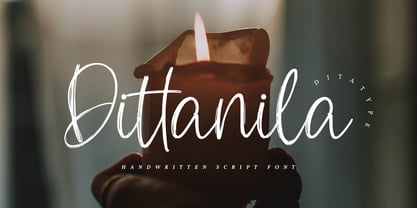 Dittanila is a beautiful handwritten font. The handwritten combined with brush font will make your design project modern and attractive. Made for any professional project branding. Dittanila is best used for branding logotype, and quotes. Features: Standart Ligatures Stylistic Set Multilingual Support PUA Encoded Numerals and Punctuation Thank you for downloading premium fonts from Dita Type
 - Minigame by Gienlee,
$15.00 Description Yo! Welcome to gienlee cartoon, design, and Other artwork Minigame is Modern Font. Commonly used to promote any tech and modern stuff kind of life. It's a futuristic text for the Generation Alpha lifestyle and higher. Item Description Standard Glyphs (Uppercase, Lowercase, Numeral & Punctions) Works on PC & Mac No Special Software is required Do enjoy your download
 - Hawken by Din Studio,
$29.00 Hawken is a powerful sans serif display typeface come with sporty themes. Perfect for quotes, posters, logo, logotype, branding, business card, crafting needs, print, t-shirt, mug, merchandise, packaging, and many more. Includes: Hawken (OTF) Features: Alternates Stylistic Set Swashes Multilingual Support PUA Encoded Numerals and Punctuation Thank you for downloading premium fonts from Din Studio
 - Fiosthic by Din Studio,
$29.00 Fiosthic is a modern signature font with natural and handwritten style. It brings a elegant and attractive typeface. Made for any professional project branding. It is the best for logos, branding, wedding and quotes. Includes: Fiosthic (OTF) Features: Stylistic Set Beautiful Ligatures Multilingual Support PUA Encoded Numerals and Punctuation Thank you for downloading premium fonts from Din Studio
 - Quitgan Script by FallenGraphic,
$16.00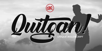 Introducing Quitgan, an amazing handwritten font . This font will make your design more beautiful and powerful. Quitgan is suitable for any design like branding, quotes and much more. I hope you enjoy it. Quitgan is multi-lingual, PUA encoded and contains Numerals and Punctuations (OpenType Standard) and many alternates. Thanks for visiting and downloading my font.
 - Roaster Brush by Din Studio,
$29.00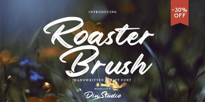 Roaster Brush is a elegant handwritten font. The handwritten combined with brush font will make your design project more attractive. Made for any professional project branding. It is the best for logos, branding and quotes. Every letter has a unique and beautiful touch. Features: Multilingual Support PUA Encoded Numerals and Punctuation Thank you for downloading from Din Studio.
 - Little Brownie by The Ocean Studio,
$10.00 Little Brownie is playful font family which puts a smile on your projects and will inspire you to create something fun and memorable. It is perfect for headings, flyer, greeting cards, product packaging, book cover, printed quotes, logotype, apparel design, album covers, etc. Features: – Multilingual Support – PUA Encoded – Numerals and Punctuation Thank you for downloading from Ocean Stud.
 - Rithem by Din Studio,
$29.00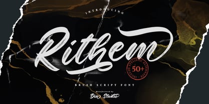 Rithem is a classy brush font. The brush combined with calligraphy font will make your design project more powerful. Made for any professional project branding. It is the best for logos, branding and quotes. Every letter has a unique and beautiful touch. Features: Multilingual Support PUA Encoded Numerals and Punctuation Thank you for downloading from Din Studio.
 - Sawah by Din Studio,
$29.00 Sawah is a modern and elegant display font. It celebrates abstract shapes in all their eclectic beauty. This font will look truly outstanding in a wide range of contexts. It is the best for logos, branding and quotes. Featured : Accents (Multilingual characters) PUA encoded Numerals and Punctuation (OpenType Standard) Thank you for downloading premium font from Din Studio.
 - Dellons Signature by Din Studio,
$29.00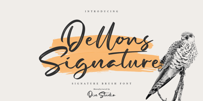 Dellons Signature is a elegant brush font. Combined with brush textured handwritten will make your design project more special. Made for any professional project branding. It is the best for logos, branding and quotes. Every letter has a unique and beautiful touch. Features: Beautiful Ligatures Multilingual Support PUA Encoded Numerals and Punctuation Thank you for downloading from Din Studio.
 - Nautical Doodles by Outside the Line,
$19.00 Sail the seas with Nautical Doodles. This seaworthy font has 32 illustrations of water craft, anchors, star, compass, flags, whale, shark, birds, starfish, seahorse, rope etc. Even a mermaid... and the scripted word Ahoy! If you would like the character chart go to the Gallery Tab and print. (PDFs are no longer downloaded with the font.)


