419 search results
(0.026 seconds)
- Mediator by ParaType,
$30.00 Mediator is a balanced contemporary sans serif typeface that performs well both in display sizes and body text. The family contains 30 fonts in 3 widths: 8 romans with matching italics, of slightly extended proportions, from Thin to Black; 7 narrow and 7 condensed, from Thin to ExtraBold. The character set in normal upright faces was expanded to include small caps and all faces include old style figures. The typeface was designed by Manvel Shmavonyan with the participation of Alexander Lubovenko and released by ParaType in 2016.
 - Maine by Fenotype,
$25.00 Maine is a modernized book antiqua consisting of six styles and matching italics. Maine's cuts are from Light to Extrabold, of which Regular and Slightly Bolder Book are especially suitable for longer texts. Thanks to its clear features and high x-height, Maine creates a beautiful and legible body text. Maine gives a professional, no-nonsense impression and it’s best used in editorial, books, magazines and everywhere where you can use many different styles and sizes of the same typeface. Go dignified with Maine.
 - Shallot by Eko Bimantara,
$24.00 Shallot is a serif font family with sharp and exquisite characteristic. The initial letterforms are made not completely based on calligraphic strokes, which make it more likely close to transitional serif style. The letterforms have high contrast strokes and sharp serif with curved brackets. The upright styles have a fairly wide proportion. The italic styles have 12 degree angle and redrawn lowercase letters. Shallot consist of 4 styles from regular to extrabold with each matching italics. It contains 462 glyphs that support broad latin languages.
 - Le Monde Courrier Std by Typofonderie,
$59.00 A rounded slab in 4 styles In our age, since the arrival of microcomputing, the majority of professional letters have been composed in quality typefaces. Typewriters & the typestyles they used have become antiques. A letter set in Times or Helvetica & printed with a laser printer at 600 dpi or more are of such quality that one can no longer distinguish it with a document produced by offset printing. But letters composed in this way appear overly institutional when a bit of informality is needed. Le Monde Courrier, designed by Jean François Porchez, attempts to re-establish a style halfway between writing and printing. Informal neo-tech style This rounded slab serif returns the informal character of “typewritten” fonts to letters and suit well all bad conditions, from inkjet printed memos to webfonts use. With a unique typographic colour, it integrate itself with the rest of the Le Monde family with effective contrast. The verticals metrics and proportions of Le Monde Courrier are calibrated to match perfectly others Typofonderie families. Bukva:raz 2001 Type Directors Club .44 1998 European Design Awards 1998
 - Recta by Canada Type,
$24.95 Recta was one of Aldo Novarese’s earliest contributions to the massive surge of the European sans serif genre that was booming in the middle of the 20th century. Initially published just one year after Neue Haas Grotesk came out of Switzerland and Univers out of France, and at a time when Akzidenz Grotesk and DIN were riding high in Germany and Gill Sans was making waves in Great Britain, it was intended to compete with all of those foundry faces, and later came to be known as the “Italian Helvetica”. It maintains traditional simplicity as its high point of functionality, while showing minimal infusion of humanistic traits. It shows that the construct of the grotesk does not have to be rigid, and can indeed have a touch of Italian flair. While the original Recta family lacked a proper suite of weights and widths, this digital version comes in five weights, corresponding italics, four condensed fonts, and small caps in four weights. It also includes a wide-ranging character set for extended Latin language support.
 - Rabie by Ethar Elaagib,
$29.00 Rabie is a cute, bubbly handwritten typeface that makes your design projects look friendlier, thanks to its curviness and cuteness. With over 300 ligatures, Rabie has the look of a truly handcrafted typeface with naturally flowing letters. Rabie comes as a variable font, ranging from extralight to extrabold weights, to help you customize the look as needed. Rabie is full of love, hugs and cuddles. This playful typeface has an inviting vibe that suits a variety of design projects from branding design and logos, to children's books and stationery.
 - Aftermath by Bosstypestudio,
$15.00 AFTERMATH?? has been designed to come in four different widths; Normal, Italic, Narrow and Condensed, additional to add weight to support various uses ranging from Thin, Light, Regular, Medium, Bold, Extrabold, and Black. AFTERMATH It comes in 40 weights with various features that support designer creativity from the Font Menu and extended language support. AFTERMATH will suit many projects: fashion, magazines, logos, branding, photography, invitations, wedding invitations, quotes, blog headers, posters, advertisements, postcards, books, websites, etc. If you have any questions, you can contact us by email: bosstypestudio@gmail.com| Thank you!
 - Vasarely by B2302,
$33.00 VASARELY has famous roots, its name is related to optical arts own Victor Vasarely. Dropping the field of Op-Art, you already know where we have been aiming at. The REGULAR and LIGHT cuts of VASARELY are quite ordinary, rectangular, but legible typefaces, but with the BOLD and EXTRABOLD versions you will be able to build diverse illusive type illustrations and layouts. Being build on a strict grid with same dimensions, the eye-affecting black-and-white contrast should trigger different optical effects. As an extra we build an EXTRUDED version as well. Have fun!
 - Gilroy by Radomir Tinkov,
$25.00 Gilroy is a modern sans serif with a geometric touch. A younger brother of the original Qanelas font family. It comes in 20 weights, 10 uprights and its matching italics. The Light & ExtraBold weights are free of charge, so you can use them to your heart’s content. Designed with powerful opentype features in mind. Each weight includes extended language support (+ Cyrillic), fractions, tabular figures, arrows, ligatures and more. Perfectly suited for graphic design and any display use. It could easily work for web, signage, corporate as well as for editorial design.
 - Brastag by Ekahermawan,
$17.00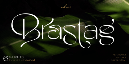 Introducing Brastag is an unique display family font that consists of 6 weights from ExtraLight to ExtraBold. Brastag includes a lot of alternates and ligatures characters that are specially designed to make your typography design result looks more unique and beautiful. Brastag is perfect for many different projects such as logo design, wedding, branding, poster, magazines, labels, merchandise, invitation, presentation, advertising and so much more! If you need support or more information about this item, please kindly contact me: ekahermawanputu@gmail.com Thank you so much...I really hope you enjoy when using it!
 - Ciutadella Display by Emtype Foundry,
$69.00 Ciutadella Display is the extreme partner of the popular Ciutadella family for use in large sizes. The weight has been taken to the limit in both directions. It is available in Open Type format and includes Alternate Characters, Ligatures, Tabular Figures, Fractions, Numerators, Denominators, Superiors and Inferiors. It supports Central and Eastern European languages. The type family consists of 12 styles, 6 weights (Thin, UltraLight, ExtraLight, ExtraBold, Black and UltraBlack) plus italics, creating an expanded and really flexible system. See also the original Ciutadella, Ciutadella Rounded and Ciutadella Slab.
 - Mitram by JAM Type Design,
$14.00 The Mitram family has 7 weights, ranging from Thin to ExtraBold (including italics) and is ideally suited for advertising and packaging, book text, logo, branding and creative industries, small text, way finding and signage as well as web and screen design. Mitram provides advanced typographical support with features such as ligatures, alternate characters, case-sensitive forms, fractions, and super—and subscript characters. It comes with a complete range of figure set options—old style and lining figures, each in tabular and proportional widths. The typeface supports Western, Central and South-Eastern European and Vietnamese languages.
 - Eternal Spring by Krismagraph,
$19.00 Eternal Spring is an elegant and modern San serif font family. It's sans serif in 8 weights from Thin to ExtraBold font. Comes with 76 unique ligatures and 27 alternates. Eternal Spring is a multipurpose font perfect for any project, with high contrast glyphs, giving it a feminine and masculine quality, modern, and easy to read. Excellent in layout design for quotes or body copy, best used as a display for headings, logos, branding, magazines, product packaging, invitations, and others. This font is easy to use and has OpenType features.
 - Royale Milano by Krismagraph,
$15.00 Royale Milano is an elegant and modern serif font family. It's serif in 8 weights from Thin to ExtraBold, with regular and italic versions. 16 fonts in total, Font Royale Milano is the perfect multipurpose font for any project, with high contrast glyphs, giving it a feminine and masculine quality, modern, and easy to read. Great in layout design for quotes or body copy, best used as a display for headings, logos, branding, magazines, product packaging, invitations, and more. This font is easy to use and has OpenType features.
 - Morning Edition JNL by Jeff Levine,
$29.00 The front page headline of the April 6, 1917 edition of the Bemidji Pioneer [from Bemidji, Minnesota] says in extrabold letters: “State of War is Declared”. The subtext underneath reads: “President Signs Resolution 1:13 P.M., Passed by House 3 O’Clock this Morning”. Thus, the United States formally entered into World War I. However… that subtext was set in a sans serif type face which was a perfect addition to the numerous newspaper-inspired type revivals offered by Jeff Levine Fonts. Morning Edition JNL is available in both regular and oblique versions.
 - Kamp Ingriana by Ingrimayne Type,
$6.00 KampIngriana was originally constructed in 1995-6. It was not constructed to meet any specific purpose but out of curiosity, to see what the result would be if two quite different faces were blended. KampIngriana is the offspring of Ingriana, a friendly, soft face, and KampFriendship, which mimics a serifed face drawn by hand. The original blending had many oddities that I did not clean up until 2020. It originally had five styles: regular, italic, bold, bolditalic, and extrabold. Medium, mediumitalic, semibold, semibolditalic, and extraboldItalic were added in 2022.
 - Nimbus Sans Novus by URW Type Foundry,
$89.99 The first versions of Nimbus Sans have been designed and digitized in the 1980s for the URW SIGNUS sign-making system. Highest precision of all characters (1/100 mm accuracy) as well as spacing and kerning were required because the fonts should be cut in any size in vinyl or other material used for sign-making. During this period three size ranges were created for text (T), the display (D) and poster (P) for small, medium and very large font sizes. In addition, we produced a so-called L-version that was compatible to Adobe’s PostScript version of Helvetica. Nimbus was also the product name of a URW-proprietary renderer for high quality and fast rasterization of outline fonts, a software provided to the developers of PostScript clone RIPs (Hyphen, Harlequin, etc.) back then. Also in the 80s, a new, improved version of the Nimbus Sans, namely Nimbus Sans Novus was designed. Nimbus Sans Novus was conceptually developed entirely with URW’s IKARUS system, i.e. all styles harmonize perfectly with each other in terms of line width, weight, proportions, etc. On top of that, Nimbus Sans Novus contains more styles than Nimbus Sans.
 - ITC Quay Sans by ITC,
$41.99 London-based designer David Quay designed ITC Quay Sans in 1990. One of the precursors to the long run of functionalist European sans serif faces that has been a dominating force in type design since the 1990s, ITC Quay sans is based on the proportions of 19th Century Grotesk faces. Grotesk, the German word for sans serif, defines an entire branch of the sans serif movement, which culminated in the 1950s with the design of Helvetica. ITC Quay Sans is made up of very simple, legible letters. The weights of the strokes throughout the alphabet vary very little. Microscopic flares on the ends of each terminal add a bit of dimension to the design. This helps prevent the onset of the monotony, a danger when one repeats countless near mono-weight stroked letters throughout a large body of text. ITC Quay Sans is a very readable face; it works equally well in all sizes. Six fonts of the ITC Quay Sans typeface are available: Book, Book Italic, Medium, Medium Italic, Black, and Black Italic. ITC Quay Sans is similar to Hans Eduard Meier's Syntax, and Tim Ahrens' Linotype Aroma."
 - Vellvé by ITC,
$29.99For over 30 years, Tomás Vellvé created beautiful graphics and distinctive typefaces in his native homeland of Spain. First drawn as a phototype display design in 1971, Vellvé’s only typeface in digital form is an uncommon solution to the problem of creating a new sans serif design. The end result, which bears his name, is a design that stands out from the crowd of other sans serif typefaces. The phototype version was only available in a single, light weight. With the release of the digital fonts, however, three additional weights as well as a companion italic for the light weight were created.The typeface designs were originally drawn for Agfa Monotype (now Monotype Imaging) in 1996 as part of the company’s “Creative Alliance” initiative. Through an exclusive licensing arrangement, the Vellvé™ family has now been added to the ITC Typeface Library.ITC Vellvé is a wide design with strong calligraphic overtones. This is no “anonymous” design like so many modern sans. Letters like the `R, `e and `s clearly show the hand of Tomás Vellvé in the design process. Vellvé provides a fresh choice between geometric sans serifs such as Helvetica® and industrial sans serifs like Futura®. - Standard CT by CastleType,
$59.00 CastleType was commissioned in 1991 by San Francisco Focus magazine to digitize three members of the Standard family. This is a Continental lineale that was popular in Switzerland in the 1950s and later in the United States. A cousin to the classic sans serifs, Standard is an alternative that is considerably warmer and a bit more idiosyncratic. In 2008, CastleType released additional members of the Standard CT family to make it a complete typographic solution with three widths (normal, condensed, extended) of four weights each (Regular, Medium, Bold, and Extra Bold). Some of the original Standard fonts, particularly Standard Regular, appear to have been hastily designed (or perhaps too closely imitated Helvetica); these have been greatly improved in the CastleType versions with more harmonious proportions and other refinements. The three lighter weights of the Extended subfamily were designed from scratch based on the new Standard CT Regular and Standard CT Extended Extra Bold. More recently, four light weights (Light, Extra Light, Ultra Light, and Hairline) have been added to each of the three widths. The entire Standard CT family includes support for most European languages, OpenType features, arbitrary fractions, and a collection of geometrics, dingbats & fleurons.
 - Basic Commercial Soft Rounded by Linotype,
$29.99 Basic Commercial is a font based on historical designs from the hot metal typeface era. It first appeared around 1900, and was created by type designers whose names have not been recorded but whose skills cannot be overlooked. This typeface's design has been popular among groups and movements as diverse as the Bauhaus, Dadaism, and the masters of Swiss/International-Style typography. It influenced for a variety of later grotesque fonts, such as Helvetica and Univers. Basic Commercial was distributed for many years in the United States under the name Standard Series. The typeface worked its way into many aspects of daily life and culture; for instance, it became the face chosen for use in the New York City subway system's signage. The Basic Commercial's font family members have a clear and objective design. Their forms exhibit almost nothing unusual, but remain both lively and legible nonetheless. Perhaps for this reason, Basic Commercial's design has been popular with graphic designers for decades. To read more about the history of typefaces like Basic Commercial, visit our font feature, The Sans Serif Typefaces. In addition several weights of this typefamily are available as soft rounded versions."
 - Core Gothic E by S-Core,
$72.00 Core Gothic E is a simple and modern sans-serif Korean font consists of 9 weights (Thin, ExtraLight, Light, Regular, Medium, Bold, ExtraBold, Heavy & Black). Character set is consist of Korean 11,172 characters, Hirakana & Katakana, Latin and Korean symbols. It is well balenced between Korean and Latin characters. Latin typeface (Core Sans E) was adjusted to be matched with korean typeface. Spaces between individual letter forms are adjusted in detail so that it makes perfect typesetting. Supported codepages are MS Windows 1252 Latin1 and MS Windows 949 Korean. We recommend to use for books, web, screen displays and so on.
 - Mollen by Eko Bimantara,
$19.00 Mollen is sans serif font family that designed to be functional. Each glyphs are shaped by geometrical form with specific visual structure: Simple and clean form with low contrast stroke, rounded 'o' in the normal width, mix diagonal and straight cuts on terminals and finials. Low capitals, with flat top and low descenders. With this personality, Mollen meant be fit for modern, contemporary and technological nuance. Mollen consist of 48 font with 8 weight: From Thin to ExtraBold and 3 width: Condensed, Narrow and Normal. With each matching Italics. It also contain 425 glyphs and several opentype features.
 - US Bill Sans by Unidaas,
$39.00 US Bill™ Sans A Humanist typefaces sans serif. US Bill Sans has 12 weights, ranging from Light to Extrabold (including italics) and is ideally suited for advertising and packaging, book text, logo, branding and creative industries, small text, wayfinding and signage as well as web and screen design. Provides with features such as ligatures, small capitals, alternate characters, fractions, and super—and subscript characters. It comes with a complete range of figure set options as well as Latin-based languages. Designed and produced by Firman Suci Ananda, Fajar Wahyu Pribadi & Irfan Ulya. Published under Unidaas® Std — Formatika Aksa IDN, 2018.
 - Core Gothic M by S-Core,
$72.00 Core Gothic M is a simple and modern sans-serif Korean font consists of 7 weights (Light, Regular, Medium, Bold, ExtraBold, Heavy & Black). Character set is consist of Korean 11,172 characters, Hirakana & Katakana, Latin and Korean symbols. It is well balenced between Korean and Latin characters. Latin typeface (Core Sans M) was adjusted to be matched with korean typeface. Spaces between individual letter forms are adjusted in detail so that it makes perfect typesetting. Supported codepages are MS Windows 1252 Latin1 and MS Windows 949 Korean. We recommend to use for books, web, screen displays and so on.
 - Distrela by Ekahermawan,
$25.00 Introducing, Distrela is a romantic serif family that consists of 6 weights from ExtraLight to ExtraBold. Distrela comes with lots of alternates and ligatures characters that are specially designed with a romantic theme to make your design projects look more beautiful such as logo design, wedding, branding, poster, magazines, labels, merchandise, invitation, presentation, advertising and so much more! FEATURES: OpenType support Playful to use (with ligatures and alternates options) Multilingual support PUA Encoded If you need support or more information about this item, please kindly contact me: ekahermawanputu@gmail.com Thank you so much...I really hope you enjoy when using it!
 - Squid GT Display by FoxType,
$15.00 Introducing Squid GT Display new generation Typeface with 9 Weights. Squid GT Typeface created with the vision of to attract the audience to your brand . The finest details of this typeface are methodically and mathematically created. Squid GT is created with all the tasks of a corporate font and also for the usage in a variety of projects, including branding, logos, titles, headlines, servers, posters, screens, display, digital ads, and everything else. We are putting a lot of effort on this font as a long-term project. The Typeface includes Nine Weights. Thin, ExtraLight, Light, Regular, Medium, SemiBold, Bold, ExtraBold, Black.
 - Core Gothic D by S-Core,
$72.00 Core Gothic D is a simple and modern sans-serif Korean font consists of 9 weights (Thin, ExtraLight, Light, Regular, Medium, Bold, ExtraBold, Heavy & Black). Character set is consist of Korean 11,172 characters, Hirakana & Katakana, Latin and Korean symbols. It is well balenced between Korean and Latin characters. Latin typeface (Core Sans D) was adjusted to be matched with korean typeface. Spaces between individual letter forms are adjusted in detail so that it makes perfect typesetting. Supported codepages are MS Windows 1252 Latin1 and MS Windows 949 Korean. We recommend to use for books, web, screen displays and so on.
 - Bionik by Fontador,
$24.99 Bionik is a squarish serif, especially designed for contemporary typography on print and screen. The super ellipse-based forms and high x-height allow large and open letterforms, perfectly adapted to the pixel grid on screen. With light rounded corners Bionik provides a soft and friendly atmosphere. The font contains 6 weights from ExtraLight to ExtraBold plus true italics. 944 glyphs include 218 ligatures, small caps, tabular, old style, fractions …, and a wide range of flexibility for latin language support for every typographical needs. Bionik is a contemporary serif typeface, special for logotypes, brands, magazines and editorial.
 - Kopitha by Ekahermawan,
$15.00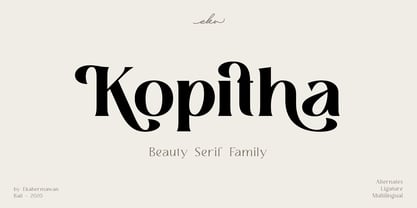 Kopitha is a beauty serif family with 5 weights from Light to ExtraBold. Kopitha also includes alternate characters (PUA Encoded) and ligatures to give you a wide range for create an unique typographic design results. Kopitha is suitable font for many different projects such as logo, branding, poster, magazines, label, merchandise, invitation, presentation, advertising, quotes and so much more! FEATURES: OpenType support Playfull to use (with ligatures and alternates options) Multilingual support PUA Encoded If you need support or more information about this item please kindly contact me : ekahermawanputu@gmail.com Thank you so much I really hope you enjoy when using it!
 - Oxine Display by FoxType,
$20.00 Introducing Oxine Display new generation Typeface with 7 Weights. Oxine Typeface created with the vision of to attract the audience to your brand . The finest details of this typeface are methodically and mathematically created. Oxine is created with all the tasks of a corporate font and also for the usage in a variety of projects, including branding, logos, titles, headlines, servers, posters, screens, display, digital ads, and everything else. We are putting a lot of effort on this font as a long-term project. The Typeface includes Seven Weights. ExtraLight, Light, Regular, Medium, SemiBold, Bold and ExtraBold
 - Syabil by Eko Bimantara,
$16.00 Syabil is a sans serif font family designed by Eko Bimantara. This font crafted with the intention to present a clean, legible, multipurpose that easy to read wether it on screen or print. Fit for all purposes; Text, display, headline, print, corporate identity, logo, branding, product, infographic, photography and other application and medium. This font consist of 9 weight; Thin, Light, Book, Regular, Medium, SemiBold, Bold, ExtraBold and Heavy with each weight paired by italic. Also including Latin Plus language support with more than 11.700 glyphs in all weight which make this font contain broad language support.
 - Krong by Joelmaker,
$18.00 Krong is a set of font family, modern Geometric in which there are several combinations of unique style sets, so ready to help you to make your designs look elegant. Krong Each contains nine weights ranging from Thin to ExtraBold, all with companion italics. The font includes more than 819 glyphs, covering all European languages written in Latin script. Krong OpenType features: Stylistic Alternates, Sylistic Set, Standard Ligatures, Discretionary Ligatures for lowercase and uppercase, Case Sensitive Forms, Arrows, Circled and Black Circled Figures, Proportional Old Style figures, Tabular Lining figures, Slashed Zero, Fractions, Superscript and Subscript figures.
 - Quiet Sans by Dharma Type,
$29.99 Quiet Sans is a super geometric sans-serif family for text designed by Ryoichi Tsunekawa and the whole family consists of 6 weights from ExtraLight to ExtraBold and their matching Italics. The basic concept of this family is not only to make crisp, sharp and strong impact by geometric letter form but also to be legible and readable even on small size screen by their sophisticated design. Quiet Sans supports almost all European languages: Western, Central, South Eastern Europeans and afrikaans. And proportional figures, superior figures, inferior figures, denominators, numerators, fractions, ordinals and case-sensitive-forms can be accessed by using OpenType features.
 - FreeSet by ParaType,
$30.00 The type family in four basic styles was designed in ParaType (ParaGraph) in 1992 by Tagir Safayev. Based on Frutiger, of Mergenthaler Linotype, 1976 by Adrian Frutiger. Frutiger font was originally designed for use on signs at the new Charles de Gaulle Airport at Roissy. The straightforward sans serif shapes are suited well for both text and display setting. Six additional styles were added in 1998-2000. Multilingual versions of 6 styles (Light, Demi and Extrabold) include Armenian alphabet designed by Manvel Shmavonyan in 1997. Two condensed Cyrillic styles (Demi Condensed and Bold Condensed) designed by Manvel Shmavonyan in 2005.
 - Core Gothic N by S-Core,
$72.00 Core Gothic N is a simple and modern sans-serif Korean font consists of 9 weights (Thin, ExtraLight, Light, Regular, Medium, Bold, ExtraBold, Heavy & Black). Character set is consist of Korean 11,172 characters, Hirakana & Katakana, Latin and Korean symbols. It is well balenced between Korean and Latin characters. Latin typeface (Core Sans N) was adjusted to be matched with korean typeface. Spaces between individual letter forms are adjusted in detail so that it makes perfect typesetting. Supported codepages are MS Windows 1252 Latin1 and MS Windows 949 Korean. We recommend to use for books, web, screen displays and so on.
 - Sundash by Jehoo Creative,
$16.00 Sundash versatile typeface with wide allternate allcaps. This bold modern font explores the style of Allcaps, we add a wide character to make it look more flexible. based on forms inspired by free urban culture, Sundash has a modern and vibrant spirit. Sundash explores how the shapes and curves of letters change their Focus. This font has a variable weight of 5 Light, regular, medium, bold, extrabold to make the sundash more solid. Sundash has 247 glypghs with a unique and bold character perfectly suited for a wide variety of applications from editorial design to branding, advertising, publications and digital.
 - Vanio by Eko Bimantara,
$24.00 Vanio is a wedge serif font family that crafted with precision, focused on both aesthetic and legibility. The letterforms and other typographic elements are made in a way to achieve optical recognition and fit for various typesetting. Its have a strong serif and spacious width letterforms on the upright styles. Its shown a medium contrast and caligraphic strokes. Its have a moderate vertical heights either at the x-height, caps, ascender or descender. Vanio consist of 10 styles from regular to extrabold with each matching italics. Its contain more than 460 glyphs which support broad latin languages. Also contain several opentype features; Ligature, oldstyle figures, fraction, and other variation of figures.
 - Aeternus by Unio Creative Solutions,
$4.50 “Aeternus”, a new geometric Sans Serif typeface, with matching italics. The combination of several weights, provides versatility in any text usage. Developed in a range of nine weights from thin to heavy, with a matching set of italics, Aeternus has been designed to optimize the space and preserve the legibility in any text size. Use effortlessly this typeface for titling, contemporary branding, web design, UI/ UX design, clothing, large print formats. Specifications. - Files included: Aeternus Thin, Aeternus ExtraLight, Aeternus Light, Aeternus Regular, Aeternus Medium, Aeternus SemiBold, Aeternus Bold, Aeternus ExtraBold, Aeternus Heavy with corresponding italics - Formats:.otf - Multi language support (Central, Eastern, Western European Languages)
 - Gomme Sans by Dharma Type,
$29.99 Gomme Sans is a wide and masculine sans-serif family for text designed by Ryoichi Tsunekawa and the whole family consists of 6 weights from ExtraLight to ExtraBold and their matching Italics. The basic concept of this family is not only to make an impact by masculine, squarish letter form but also to be legible and readable even on small size screen by the sophisticated design, and their large x-heights. Gomme Sans supports almost all European languages: Western, Central, South Eastern Europeans and afrikaans. And proportional figures, superior figures, inferior figures, denominators, numerators, fractions, ordinals and case-sensitive-forms can be accessed by using OpenType features.