10,000 search results
(0.023 seconds)
- I know a ghost by Dismantle Destroy,
$19.00 This font was inspired by music from the band The Devil Wears Prada.
 - ASTYPE Ornaments Christmas A by astype,
$28.00 Christmas A uses the following OpenType features to set up to four different color layers. - Superscript/Superior (Trees) - Subscript/Inferior (Stars) - Numerator (Candles) - Denominator (Light, Bells) Note: Due to the complexity of some parts of the font, some printers may have problems of rendering it smoothly. To avoid this problem you should always outline the font data for the final documents. On lower systems turn font antialiasing off for faster screen redrawings.
 - Have A Great Day by Roland Hüse Design,
$10.00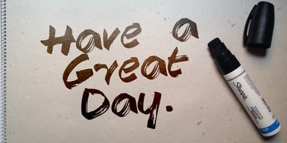
- Ongunkan Khazar Rovas A by Runic World Tamgacı,
$50.00 Khazar, member of a confederation of Turkic-speaking tribes that in the late 6th century CE established a major commercial empire covering the southeastern section of modern European Russia. Although the origin of the term Khazar and the early history of the Khazar people are obscure, it is fairly certain that the Khazars were originally located in the northern Caucasus region and were part of the western Turkic empire (in Turkistan). The Khazars were in contact with the Persians in the mid-6th century CE, and they aided the Byzantine emperor Heraclius (reigned 610–641) in his campaign against the Persians. Although the Khazar Empire had a secular administrative structure, the administrative staff chose the Jewish religion. The Khazars are the only Turkish state that converted to Judaism.
 - ZP A Dorky Print by Illustration Ink,
$2.00 This fun and whimsical font features a very youthful lettering with a bit of toggle and bounce in the baseline.
 - Still Time Cyr - Unknown license

- DS VTCorona Cyr - Unknown license

- DS Stamp Cyr - Unknown license

- DS Army Cyr - Unknown license

- DS Eraser Cyr - Unknown license

- DS Supervixen Cyr - Personal use only

- nya-memo Font - Unknown license

- DS Podd Cyr - Unknown license

- Sevenet 7 Cyr - Unknown license

- DS Reckoning Cyr - Unknown license

- DS Zombie Cyr - Unknown license

- DS Down Cyr - Unknown license

- DS Comedy Cyr - Unknown license

- BM stamp Cyr - Unknown license

- Soul Adventures Cyr by Ira Dvilyuk,
$18.00 Soul Adventures Cyrillic Script adds hand look style to all your design projects: logos, signatures, labels, packaging design, and blog headlines. Also, it will look great in mugs, cards, gorgeous typographic designs, wedding stationery, and much more. An additional font Soul Adventures Symbols Font can help you to make a lot of pretty designs and logos. Soul Adventures script includes a full set of uppercase 2 sets of lowercase letters, numerals, a large range of punctuation, and 70 ligatures, giving a realistic hand-lettered style. The Cyrillic part of the font contains the uppercase letters and lowercase letters and 20 ligatures, giving realistic hand-lettered style. Soul Adventures Symbols is a font with over 36 unique, hand-drawn elements and swashes that can help to make your design more original. A different symbol is assigned to every uppercase or lowercase standard character plus numbers 0-9 so you do not need graphics software just simply type the letter you need. Multilingual Support for 32 languages: Latin glyphs for Afrikaans, Albanian, Basque, Bosnian, Catalan, Danish, Dutch, English, Estonian, Faroese, Filipino, Finnish, French, Galician, Indonesian, Irish, Italian, Malay, Norwegian Bokmål, Portuguese, Slovenian, Spanish, Swahili, Swedish, Turkish, Welsh, Zulu. And Cyrillic glyphs support for Russian, Belorussian, Bulgarian, Ukrainian, and Kazakh languages.
 - Decima Mono Cyr by TipografiaRamis,
$39.00 Decima Mono Cyr is an upgraded edition of Decima Mono X fonts (released in 2014). The new version consists of the same (six) styles updated with larger character sets by extending number of Latin and Cyrillics Asian region languages. The typeface is intended for use in display sizes, but is also quite legible in text and is well suited for editorial and brand design.
 - Play Day - Personal Use - Personal use only

- Child's Play Trial Version - Unknown license

- Play Day Stencil JNL by Jeff Levine,
$29.00 The typography on a 1964 children’s activity book published by Whitman entitled “Build with Stencils” was in a bold, condensed design. The only problem was that the ‘rails’ [the parts that divide a letter into stencil pieces] were too narrow and would disappear at smaller point sizes. Widening the ‘rails’ just a bit greatly improved the appearance of the stencil characters. Play Day Stencil JNL is now available in both regular and oblique versions. In its day, the Whitman Publishing Company of Racine, Wisconsin published dozens of activity books for children, including a number of them with stencils. The company was a division of Western Publishers from the early 1900s through the 1970s, but went through a number of sales and name changes. Currently [as Whitman once again] it is owned by Anderson Press, and is known for its line of coin folders and books on coin collecting.
 - CA Trasher by Cape Arcona Type Foundry,
$19.00 A great UGLY font. Beauty lies in the eye of whoever. Maybe the beholder is a beast or a Swiss artist. The SHIFT key will give you alternative character shapes. Remember: beauty doesn’t lie in the eye of the beholder – it lies in yours!
 - CA Sensuell by Cape Arcona Type Foundry,
$37.00 Stefan Claudius developed this font while he was sitting in a small chalet in Denmark with a hot wood-oven and nothing but snow outside. Probably the amount of white led him to make it so thin and to have as much space between the lines as possible. If you have that in mind, it looks best in large sizes.
 - Sadina CA by NumidiaType,
$20.00 Sadina™ CA is a small caps version of Sadina™ font family, designed separately to minimize the font incompatibility for applications that cannot support this feature. Generally, some applications support this feature, but not exactly with the right stems. For example, in some apps, all glyphs applied with this feature are scaled only, which makes characters not have the approximative proportional thickness with capital characters. Specimen
 - CA Coronado by Cape Arcona Type Foundry,
$19.00 CA Coronado is a nice display font for use in titles, logos and headlines. With its used look it creates a friendly and human feeling. Upper- and lower-case characters differ in details and can be mixed to get a vivid look. For the best authentic look, the ‘Regular’ can be used as filling and complements the Shadow-style.
 - CA 12c13c by Cape Arcona Type Foundry,
$28.00 CA 12C13C was designed by sticking letters together with tape. Use it when right angles are strictly forbidden!
 - Ya Vez by Volcano Type,
$19.00Ilustrations of different "moves" in Mexican wrestling; a sport popular in the late 60s and 70s. - CA Texteron by Cape Arcona Type Foundry,
$40.00 CA Texteron is a modern text font family to cover the most common typographical needs with a minimum of weights. It is aiming for a serious but unconventional look, which is achieved by combining round and edgy forms in the same font, often in the same glyph, and by using Humanist and modern form-principles at the same time. It merges classical type-design with an experimental spirit. CA Texteron combines elements of the dynamic renaissance principle with the static neo-classic style, which makes it hard to classify. The result is a post-modern hybridization. The Regular weight works best in text size, and with more letter-space also for footnotes. The low contrast makes it robust and legible even in very small sizes. Bold, Italic and Small Caps are intended for emphasis. Bold, Bold Italic and Heavy make good headlines, that reveal the unconventional details. The Italic is not just a slanted version of the Regular weight but has individual forms and typical italic characteristics.
 - CA Negroni by Cape Arcona Type Foundry,
$29.00 A dinner is not complete without a fine appetizer. Whatever you dinner will be, CA Negroni is the perfect introduction. Delivered in three flavors, Normal (Light + Black + Fill), Inline and Round. Versatility is proved by the extensive language support, covering whole Central Europe. CA Negroni is the well aged and improved version of a typographic classic: in the beginning of the 20th century, type in advertising was mostly drawn by hand. A master of this art and pioneer in logo-design was Wilhelm Deffke (1187–1950). CA Negroni is inspired by his kind of bold and solid letterings, picking up some of the charming details while leaving away other that might have a disturbing effect on the general look. Two stylistic sets let you choose between a more serious or a more playful look.
 - CA Spotnik by Cape Arcona Type Foundry,
$40.00 The initial inspiration for CA Spotnik was the opening title of an early Andrei Tarkovsky movie. There was this very unconventional hand drawn “s” which drew my attention. Despite its strange shape, it felt totally natural in that context. So we made a few screenshots and started to sketch some more letters in order to catch the spirit that attracted us so much. The result is a grotesque typeface with a slight contrast, the proportions are rather wide with a large x-height. The bolder the weight, the wider it gets. In case you find the swirly “s” uncomfortable, there is a standard s included as well. The general atmosphere of the typeface, which could be described as “nerdy but friendly” doesn’t depend on this detail. It’s rather the sum of details derived from the original inspiration.
 - CA Postal by Cape Arcona Type Foundry,
$39.00 CA Postal is a cute and clever little stamp-font. It was originally intended for a record-cover only, but when the artist wanted all lyrics printed in the booklet, it was time for a font. The initial inspiration was a moveable-stamp printing-set, which had a nice Futura-like style, being very pleasant to read, especially in small sizes. But of course it’s the loose and irregular outlines that give the font its special charms. CA Postal features two sets of characters and the "Contextual Alternates" feature will make sure that never two identical characters will stand next to each other, so that the stamp-look becomes even more authentic.
 - CA Capoli by Cape Arcona Type Foundry,
$29.00 CA Capoli is a fine script typeface with a vintage touch. Perfect for illustrative titles or logotypes. It comes in two styles, Regular and Stroke. The inspiration came during our trip to Italy, where we took a short rest in a bar during a hot day. We discovered a simple ceramic ashtray on the table. The word “Nido” was inscribed in a typeface that looked like it dated back to the 1950s. We made some investigations about the word, its meaning and origin but it still remains a big mystery. Was it the name of a hotel or a restaurant or some vintage Italian cigarettes? We don’t know. We were so amazed about the design of the logo that we decided to create a typeface out of it. A sophisticated endeavor because we just had four letters. How could the rest of the letters – if it ever existed – have looked like? Our hypothesis is CA Capoli. A typeface with a full Central European character set and some nice alternative letters to chose from. When we thought about “Nido” and its possible derivation of hotel business, we felt like creating a small side project for this typeface, a brand for a fictional hotel called Hotel Capoli with business cards, letterheads, a reception book, key fobs and embroidered patches for the service dress of the hotel service stuff. The Hotel Capoli is located at the wonderful beach of Cape Arcona on the fictional country of Arcona Islands where our type foundry is located.
 - CA Edwald by Cape Arcona Type Foundry,
$40.00 CA Edwald, the superbly crafted alphabet design now available in 5 weights, combining the familiar, the unusual, the practical and the aesthetic. Plan ahead and make use of the assorted logo letters that add distinction to your headline. CA Edwald is a welcome addition to our ever-growing collection of alphabet designs. It is prepared to meet your graphic requirements. Now there is one trusty Musketeer for today’s advertising. The illegitimate child of Oswald Bruce Cooper and Ed Benguiat, a mixture or even the “best of”: CA EDWALD.
 - CA Cula by Cape Arcona Type Foundry,
$40.00 CA Cula is standing in the tradition of cool tempered sans serif typefaces like DIN. But at a closer look it reveals a tendency towards rounder reading-friendly forms. The denaturalized ink traps give CA Cula a very special and individual look in display sizes, whereas in smaller sizes the positive aspects of huge ink traps show effect. The text looks clean and bright without black dots in the typographic image. This makes CA Cula suitable even for longer text, while the bold weight makes pretty cool headlines. The choice of weights aims at an easy straight forward use. A set of five well balanced weights ought to be enough to cover most needs without throwing the typographer into questions like: demibold or semibold? If you are looking for the extra kick, look out for CA Cula Superfat.
 - CA Smut by Cape Arcona Type Foundry,
$19.00 Sometimes the ugliest pets can be the cutest ones. And the dirtiest fonts can be the most charming ones. Like CA Smut which comes in two styles that can be stacked on top of each other. “Regular” is the shadow, while “Fill” is the filling. Create little masterpieces by playing with different colors, offset or deviating tracking. You can even try to use the “Fill” style on its own, but do so at you own risk. The spacing and kerning is optimized for the use with “Regular”, so be open minded for surprising results. If you ever had the intention to design a horror movie poster, there’s no way around CA Smut.
 - CA Slalom by Cape Arcona Type Foundry,
$40.00 The starting point for CA Slalom was the aspiration to create a contemporary interpretation of classics like Gill and Antique Olive in terms of aesthetics, flexibility and usefulness. The outstanding S soon became the visual hook and starting from the extra bold extended weight, CA Slalom evolved into a huge family with four widths. It’s rather round instead of squarely with stroke-ends pulled deep and a relatively low x-height. This gives CA Slalom a taste of its own, and although it is clearly contemporary, it has the potential to become a classic.
 - CA Kometo by Cape Arcona Type Foundry,
$19.00 CA Kometo is an oblique headline typeface that consists of two styles, “Regular” (the Shadow) and “Fill”. Kometo has come to save the world. A superhero typeface featuring the super powers “shadow” and “imperfection”. It comes to save you from a world of boredom. Join Kometo and experience the fun of stacking fonts! Write something with “Fill”, copy paste it to another layer and switch to “Regular“. Maybe you will want to give it a little offset? Or you can also try to use the “Fill” style for body text, but do so at your own risk, spacing and kerning is optimized for the use with the “Regular“ style, so don't be too harsh if the results looks more vivid than text normally does. The character set is well built, supporting Western and Central European languages.


