10,000 search results
(0.022 seconds)
- Yahoo!© - Unknown license

- Night Light Neon by Wing's Art Studio,
$24.00 Night Light is a specially created collection of seven neon inspired fonts giving designers the power to replicate traditionally hand-made lettering from the comfort of their own computer. Choose from the selection of script, sans serif and outline fonts to set your text. Then apply our custom graphic styles for a life giving jolt of electricity! The appeal of neon lettering lives in its power to display a message in a functional, eye-catching and timelessly cool way. How many times have you stopped in the street to admire a bar sign or shop front blazing with neon colors? It's aesthetic works equally well for a Hot Dog stand or high-end fashion brand, providing a tried and tested technique for grabbing customer attention. I've designed these fonts to make the power of neon accessible to all, investing time to research real neon signs and how they are made, paying attention to their human imperfections and inherent limitations (all of which makes them). This research has been distilled into these essential styles; Script, Outline, Inline, Square and Compressed. These seven core fonts give designers a new opportunity to take advantage of realistic neon lettering in their print and online projects, perfect for music promotion, film titles, YouTube tutorials and gig posters. Ready to be moulded to any requirement, the power of neon is in your hands. Neon Graphic Style Presets Available Here The link above provides access to the graphic styles seen in the visuals with support for Adobe Photoshop, Adobe Illustrator, Adobe After Effects. Simply download and follow the instructions provided.
 - Tina by Autographis,
$39.50 Tina is another powerful script designed in the style of the classic forties and fifties American advertising fonts.
 - Kica by iframe,
$32.00 3 weights (Light, Regular, Bold) 613 glyphs Character set A-Z Uppercase & Lowercase Numerals & Punctuation Multilingual Language support: Latin, Greek, Cyrillic Works on PC & Mac Kica is a modern display typeface that is characterized by its clean lines, bold strokes, and geometric shapes. This typeface was designed with the intention of creating a strong visual impact and capturing attention.
 - Taca by Rúben R Dias,
$42.00 Taca is a typeface built around a shape that Portuguese designer Rúben R Dias calls a “squircle” — neither square nor circle. We usually associate the rounded, convex box with the television screens of the 1960s and Aldo Novarese’s classic typeface, Eurostile. But whereas Eurostile is cold and machined, Taca is warm and rugged, as if it was molded from clay or carved from stone. Taca’s organic nature is also derived from another unique feature: rounded crotches at the right angles where perpendicular strokes meet. This subtle finish, along with blunt stroke endings, softens the otherwise rigid skeleton. With such a strong conceptual vision, Taca could be relegated to the bin of experimental designs, severely limited in their application. But that fate is usually born of a less experienced maker. As a teacher, designer, and letterpress printer, Dias is a type user, keenly aware of the functional requirements of good type. Taca is therefore not a slave to its concept, but a working font family, effective in various sizes and environments. Its lettershapes break away from the base shape whenever it makes sense for legibility, while still maintaining the flavor of the design as a whole. That said, a set of squircle-shaped alternates give the user the flexibility to get more stylized if the situation calls for it. Fitting to its functional aims, Taca has many of the features one expects of a proper text font: upper and lowercase figures, case-sensitive punctuation, and Extended Latin language support. The simplicity, openness, and squareness of Taca’s forms also make it an ideal design for the pixel grid of screen displays.
 - Cica by Alive Fonts,
$40.00 Ok, I'm allergic to cats and have never had one, but I can still create a typeface that embodies feline character! Cica combines the careful nature of cunning cats with the playfulness of kittens. It's simply fun to use and expresses multiple personalities depending on your choice of all upper case, lower case or mixing the two. Take Cica home with you today!
 - Tiva by Laura Worthington,
$29.00 Tiva is a light and breezy casual script reminiscent of handwriting and packed with contextual and stylistic alternates. This easy and friendly style adds a personal touch to any project. See what’s included! http://bit.ly/2c5Nn4K This font has been specially coded for access of all the swashes, alternates and ornaments without the need for professional design software! Info and instructions here: http://lauraworthingtontype.com/faqs/
 - Tico by SoftMaker,
$9.99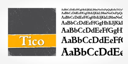 Tico is a decorative typeface published by SoftMaker.
 - Tiza by Sudtipos,
$39.00 Tiza is a rough take on informal faces and handwriting, brought on by the recent demand for scripts and brush lettering. Its flow leaves traces simulating runny pen ink, which makes it very suitable for handwriting-like paragraphs as well as casual greeting card and invitation setting. The bold weight, Tiza Negra, fits very nicely on book covers as well as large signs. Tiza is the proverbial reminder that typefaces can sometimes be more human than they are normally perceived. Designed by lettering great Angel Koziupa, and digitized and completed for Sudtipos by Alejandro Paul.
 - Sica by dooType,
$30.00The Sica Family was designed in order to address issues related to technology, while maintaining humanistic forms. Thus, a font with square shapes emerged, but with smooth curves and slightly rounded terminals making it friendly. The family has three widths – condensed, normal and expanded – each of them with six weights and their respective italics, resulting in 36 fonts. With particular details and open shapes that increase legibility, it can be used for both text compositions as well for display sizes. It has 774 glyphs, covering more than 50 languages, as well as ligatures, lining, oldstyle, tabular and proportional figures, fractions, superiors, inferiors, and small caps, all of them accessible through OpenType features. - Lightness by Arendxstudio,
$15.00 Lightness - Bold Signature Font that has a distinctive character that is very thick and elegant to use Lightness is a relaxed and flowing Handwritten Font. Incredibly versatile, this font fits a wide pool of designs, elevating them to the highest levels. Add this font to your favorite creative ideas and notice how it makes them come alive! Features : • Character Set A-Z • Numerals & Punctuations (OpenType Standard) • Accents (Multilingual characters) • Ligature Multilingual Support : Afrikaans, Albanian, Asu, Basque, Bemba, Bena, Catalan, Chiga, Cornish, Danish, English, Estonian, Faroese, Filipino, Finnish, French, Friulian, Galician, German, Gusii, Icelandic, Indonesian, Irish, Italian, Kabuverdianu, Kalenjin, Kinyarwanda, Low German, Luo, Luxembourgish, Luyia, Machame, Makhuwa-Meetto, Makonde, Malagasy, Malay, Manx, Morisyen, North Ndebele, Norwegian Bokmål, Norwegian Nynorsk, Nyankole, Oromo, Portuguese, Romansh, Rombo, Rundi, Rwa, Samburu, Sango, Sangu, Scottish Gaelic, Sena, Shambala, Shona, Soga, Somali, Spanish, Swahili, Swedish, Swiss German, Taita, Teso, Vunjo, Zulu There it is! I really hope you enjoy it !
 - Crop©Bats AOE - Unknown license

- One Ton by Luke Thompson,
$10.00 One Ton is a really chunky stencil face that sticks to some strict rules, giving it a distinctively industrial, angular look. It's designed so that the spaces between characters all align in a strong grid. It can bring a ton of personality to signage, branding, editorial and packaging projects where you can afford to be a bit experimental.
 - Tecna Light Right Triangle BNF by Descarflex,
$30.00 The Tecn@ Dark&Light Triangle Background Nomenclature Font family is differentiated by the direction of the triangle tip in the 4 cardinal points. The family were designed to head, enumerate, indicate or highlight writings or design plans, for this reason, the characters are available only in capital letters and some signs or symbols that can serve such purposes. A triangle or empty character is included so that the user can use it overlaying any character of his choice or to be used alone.
 - Costa Rica by Din Studio,
$25.00 Costa Rica is a handwritten brush font. The texture from the brush font will make your design more beautiful and powerful. This font is suitable for any design like branding, quotes, t-shirt printing and more. Features: - Accents (Multilingual Characters) - 26 Alternates - 26 Extra Swashes - PUA encoded - Numerals and Punctuations (OpenType Standard) I hope you enjoy it! Best Regards Donis M
 - Tita Script by Latinotype,
$59.00 Tita is dedicated to my grandmother Hebe, witty and arrabalera 1. The font is inspired by Milonga 2 music and the fileteado porteño 3. I picture it at The Moulin Rouge, sparkling, provocative, loving. It evokes Tita Merello and my grandmum singing her music. Tita is Argentinean to its very core. A font to shout goal and dulce de leche 4 with passion! Its curves originate from polirhythmic calligraphy, which I learnt from my mentor Silvia Cordero Vega. Tita is a pedigree script that is based on hand lettering and Sandra Biondi’s calligraphy works. Font digitalisation by Daniel Hernández. Edited by Javier Quintana / Programmed by Manuel Corradine. 1. A person from the arrabal (a working class neighborhood on the outskirts of the city of Buenos Aires) 2. Musical genre originated in the Río de la Plata areas of Argentina and Uruguay 3. Decorative hand lettering and artistic style that is frequently spotted in Buenos Aires 4. Sweet milk sauce
 - Love Pica by Sipanji21,
$16.00 Love Pica is a lovely Typeface with Ligature inside. It features gorgeous hearts in each letter which give it an incredibly romantic feel. this font suitable for valentine day poster, logo, t shirt, event banner and etc. you can use this font for any design, apparel, kids logo, logo type, with many Ligature for make your design awesome.
 - Sica Condensed by dooType,
$30.00 The Sica Family was designed in order to address issues related to technology, while maintaining humanistic forms. Thus, a font with square shapes emerged, but with smooth curves and slightly rounded terminals making it friendly. The family has three widths – condensed, normal and expanded – each of them with six weights and their respective italics, resulting in 36 fonts. With particular details and open shapes that increase legibility, it can be used for both text compositions as well for display sizes. It has 774 glyphs, covering more than 50 languages, as well as ligatures, lining, oldstyle, tabular and proportional figures, fractions, superiors, inferiors, and small caps, all of them accessible through OpenType features.
 - FF Tisa by FontFont,
$68.99 Slovenian type designer Mitja Miklav?i? created this serif FontFont between 2008 and 2010. The family has 14 weights, ranging from Thin to Black (including italics) and is ideally suited for advertising and packaging, book text, editorial and publishing, logo, branding and creative industries, poster and billboards, small text as well as web and screen design. FF Tisa provides advanced typographical support with features such as ligatures, small capitals, alternate characters, case-sensitive forms, fractions, and super- and subscript characters. It comes with a complete range of figure set options – oldstyle and lining figures, each in tabular and proportional widths. In 2007, FF Tisa received the TDC2 award. This FontFont is a member of the FF Tisa super family, which also includes FF Tisa Sans.
 - Mica Valo by Jolicia Type,
$19.00 Mica Valo is a sophisticated serif font that exudes timeless elegance and refinement. Its graceful curves and meticulous detailing make it the perfect choice for projects that demand a touch of class. The inspiration for Mica Valo is drawn from the seamless marriage of classic serif aesthetics and a modern sensibility. The result is a font that transcends time, adding a touch of grace and poise to any visual composition. What sets Mica Valo apart is its Alternate version, which introduces a unique twist to the classic serif style. The alternates offer a subtle variation in letterforms, providing designers with the flexibility to experiment and create distinct, personalized looks. This feature makes Mica Valo an ideal choice for branding, editorial design, and other creative projects where a touch of individuality is desired. Incorporate Mica Valo into your creative toolkit and let its elegant vibes and alternate options elevate your designs to new heights, leaving a lasting impression on your audience.
 - Utica JNL by Jeff Levine,
$29.00Utica JNL takes the basic components of Boat Decals JNL and reworks the characters into a bold, block font with thick-and-thin line variations. - Sica Expanded by dooType,
$30.00The Sica Family was designed in order to address issues related to technology, while maintaining humanistic forms. Thus, a font with square shapes emerged, but with smooth curves and slightly rounded terminals making it friendly. The family has three widths – condensed, normal and expanded – each of them with six weights and their respective italics, resulting in 36 fonts. With particular details and open shapes that increase legibility, it can be used for both text compositions as well for display sizes. It has 774 glyphs, covering more than 50 languages, as well as ligatures, lining, oldstyle, tabular and proportional figures, fractions, superiors, inferiors, and small caps, all of them accessible through OpenType features. - La Pica by RodrigoTypo,
$30.00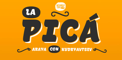
- LFT Etica by TypeTogether,
$35.00 LFT Etica, the-moralist-typefamily-project, was born at the end of 2000, but its development is ongoing, overcoming many hurdles and diversions. The starting point for the designers at Leftloft were the common "cold" grotesk sans serifs, ubiquitous and often badly applied in their everyday visual environment. The challenge was to obtain the same force, versatility and color, but with a much warmer feel. The resulting design has soft strokes, open counters and terminals; aesthetically resting somewhere between a grotesque and humanist sans serif. It successfully combines masculine force with female delicacy. LFT Etica’s wide range of styles, together with a large character set and OpenType features, such as 4 sets of numerals, fractions, several stylistic alternates and a set of arrows and dingbats, allows for a vast variety of applications, be they editorial or corporate.
 - Retro Pica by Creativemedialab,
$18.00 Introducing Retro Pica, a bold and fun display font. Retro Pica features a bold retro style with many alternate characters ideal for design, such as posters, t-shirts, branding, logos, etc. Retro Pica Lite, with this style, we replaced the uppercase character with the alternate version for those who use applications that do not support open-type features.
 - Bebas Neue - 100% free

- Walto Neue - Personal use only

- Neues Bauen - Unknown license

- Neue Goth - Personal use only

- Neue Swift by Linotype,
$50.99 The original Swift (1985) proved its worth in corporate identities, magazines and newspapers and occasionally in books. It is a versatile type and can be used in a wide range of circumstances. It is a striking type, with large serifs, large counters and letters that produce a particularly strong horizontal impression. This means that words and lines in Neue Swift are easily distinguished, even where there are large spaces between words, as can occur in newsprint. Neue Swift's large, robust counters were designed to improve legibility particularly in newspapers. It was designed in the early eighties, when papers were less well printed than they are today, and its special features help it survive on grey, rough paper printed on fast rotary presses. Today it is used more often outside newspapers than in them. Neue Swift (2009) is the newest version of the Swift concept. It has been improved by technical and aesthetic enhancements, and has been expanded into a family of twelve variants. Featured in: Best Fonts for Logos, Best Fonts for Websites, Best Fonts for PowerPoints
 - Neue Kurier by RMU,
$35.00 Typoart's popular script font in a new, completely remastered version.
 - Neue Yokarto by Kereatype,
$17.00 Introducing our new exploration Neue Yokarto, another vintage-inspired font pairing between Script and Slab Serif, with the additional effects Normal and Spurs, including italic styles. Developed from various references such as vintage signage, logos, badges, and old-fashioned graphics, Neue Yokarto is an all-caps font, meticulously crafted with a highly ornamental taste. Neue Yokarto is perfect for various display purposes. You can use this font for posters, labels, logos, signboards, T-shirts, book covers, decorations, merchandise, and more!
 - Andes Neue by Latinotype,
$29.00 Unlike its predecessor, Andes Neue contains a larger character set of 759 glyphs which support 219 Latin-based languages from 212 countries. The font comes in 4 variants that provide a wide stylistic range. Andes Neue is the most similar to the original Andes design. The Alt1 character set bears some similarity to the old Andes's (yet cleaner); Alt2 uses the alternates in the font as default glyphs; and Alt3 is a mixture of the other three variants that offers a balanced set of characters. Andes Neue also includes new accents and glyphs for a wider language support, and a set of small caps (in each variant). All of these features give the font a strong personality that helps make text look more appealing. Andes Neue varied weights work well with both short and mid-length text sections, providing a wide range of choices for any design project.
 - Maison Neue by Milieu Grotesque,
$99.00 Maison Neue is the completely reworked version of our original Maison typeface family. While the earlier version was constructed using rigid elements, Maison Neue has been meticulously redrawn to be less formulaic and have a stronger focus on optical criteria to create a distinct grotesque paying greater attention to harmony, rhythm and flow. In 2017, Maison Neue was further developed and expanded into a super family of 40 styles. This includes the subtly condensed original version, an extended counterpart, a mono-spaced alignment—all featuring additional weights within each family.
 - Neue Echo by RMU,
$30.00 Inspired by the former Schriftguss, Dresden, font Echo, this fresh-drawn und designed Neue Echo can be filled in many different ways, and makes it a great display font for labels, posters, headlines etc.
 - Kapra Neue by Typoforge Studio,
$29.00 Kapra Neue was the #1 bestselling Grotesque Sans released in 2017 on MyFonts. Kapra Neue is a younger brother of Kapra. This new family has refreshed proportions, rounded corners, and a new shape of glyphs. It is characterised by a wide range of instances – 24 new weights, from Thin Condensed to Black Expanded, allowing use of the family in complex ways, depending on the user’s needs. Every instance comes with its italic version. The font has a glyph set for latin script and old-style figures. Kapra Neue is inspired by a “You And Me Monthly” magazine, published by National Magazines Publisher RSW "Prasa” in Poland, from May 1960 till December 1973.
 - Neue Metana by Dirtyline Studio,
$20.00 Neue Metana is a modern minimalist design typeface with geometric type and more feature alternative character. there include some ligature. It is inspired by hype and urban design - a font suited for lifestyle with trend design. It was designed to be versatile, to blend in your design with light through bold weights add touch a lot of personality.
 - Dikta Neue by Atasi Studio,
$16.00 Dikta Neue is a neo-grotesque sans serif typeface inspired by Swiss Design in The 1960s. With a solid and minimalist letterform make this typeface suitable for text and display. Dikta Neue is available in 18 different styles from thin to black including italics.
 - Reina Neue by Lián Types,
$29.00 Hey! See Reina Neue in action here! INTRODUCTION When I designed the first Reina¹ circa 2010, I was at the dawn of my career as a type designer. The S{o}TA, short for the Society of Typographic Aficionados, described it as complex display typeface incorporating hairline flourishes to a nicely heavy romantic letterform². And it was like that; that’s what I was pursuing at that time since I was very passionate about ornaments and accolades of Calligraphy. Why? I felt that Typography, in general, needed more of them. These subtle flourishes could breathe life into letters. Maybe, I thought it was the only way I could propose something new into the field of type. However, after some years, I came across a very interesting quote: –Beautiful things don’t ask for attention– Wow! What did this mean? How could something be attractive if it’s not actually showing it. Could this be applied to my work? Sure. I think every type-designer goes through this process (aka crisis) regarding his or her career. At the beginning we love everything. We are kind of blind, we only see the big picture of a project. And that’s not because we are lazy. We actually can’t see the small mistakes nor the subtleties that make something simpler beautiful. We are not able. But, the small subtleties… They are actually everything: With experience, one puts more attention into the details and learns that every single decision in type has to be first meticulously planned. Here I am now, introducing a new Reina, because I felt there was a lot of it that could be improved, also the novelty of Variable Fonts caught my attention and I had to take that to my type library. THE FONT A thing of beauty is a joy forever Now, a decade later, I’m presenting Reina Neue. This font is not just an update of its predecessor: –A thing of beauty is a joy forever– is the first line of the poem ‘Endymion’ by John Keats, and despite the meaning of “beauty” may vary from person to person, and even from time to time (as read in the last paragraph), with Reina I always wanted to bring joy to the eye. In 2010, and now, in 2020. I believe the font is today much better in every aspect. It was entirely re-designed: Its shapes and morphology in general are much more clean and pure. The range of uses for it is now wider: While the old Reina consisted in just one weight, Reina Neue was converted into a big family of many weights, even with italics, smallcaps and layered styles. The idea behind the font, this kind of enveloping atmosphere made out of flourishes, is still here in the new Reina. This time easier to get amazing results due to the big amount of available alternates per glyph and also more loyal from a systemic point of view. However, and as read in the introduction -Beautiful things don’t ask for attention-, if none of the flourishes are activated the font will look very attractive anyway. Reina Neue is ready to be used in book covers, magazines, wedding cards, dazzling posters, storefronts, clothing, perfumes, wine labels and logos of all kind. Like it happened with the previous Reina, I hope this new font satisfies every design project around the world if used, and can be a joy forever. SOME INSTRUCTIONS Before choosing the right style for your project, hear my advice: -Reina Neue Display was meant to be used at big sizes. If you plan to print the font smaller than 72pt, I suggest using Reina Neue, not Display. Otherwise, if the font will be BIG or used on a digital platform, Reina Neue Display should be your choice. For even smaller sizes, use Reina Neue Small. This style was tested and printed in 12pt with nice results. (Note for variable fonts: Print them in outlines) -Reina Italic is not a slanted version of the roman, and this means some flourishes are different between each other. The Italic version has other kind of swirls. More conservative, in general. -All the styles of Reina Capitals have Small Capitals inside. -Reina Capitals Shine should be used/paired ONLY with Reina Capitals Black. The engraved feeling can be achieved if Reina Capitals Black and Reina Capitals Shine are used as layers, with the same word. Variable fonts instructions: -For more playful versions, choose Reina Neue VF, Reina Neue Italic VF or Reina Neue Capitals VF: With them you can adjust between 3 axes: Weight (will change the weight of the font) – Optic Size (will thicken/lighten the thin strokes and open/close the tracking) – Accolades (will modify the weight of the active flourishes). SOME VIDEOS OF REINA NEUE VF https://youtu.be/8cImmT5bpQM https://youtu.be/1icWfPmKAkg https://youtu.be/YC9GkJDL1a8 NOTES 1. The original Reina, from a decade ago: https://www.myfonts.com/fonts/argentina-lian-types/reina/ 2. In 2011, Reina received an honourable mention by S{o}TA. “Great skill is shown in the detailing, and an excellent feel for the correct flow of curves and displacement of stroke weight.” https://www.typesociety.org/catalyst/2011/ Reina was featured in the “Most Popular Fonts of the year” in MyFonts in 2011 https://www.myfonts.com/newsletters/sp/201201.html In 2012, the font was also selected in Tipos Latinos, the most prestigious competition of type in Latinoamerica. https://www.tiposlatinos.com/bienales/quinta-bienal-tl2012/resultados Also, chose as a “Favorite font of the year” in Typographica. https://typographica.org/typeface-reviews/reina/
 - Basel Neue by Isaco Type,
$30.00 Basel Neue is the complete redesign of BaselSans ITD font, the first typeface of Isaco Type foundry, launched in 2009. As with the predecessor version, Basel Neue is a legible and discrete typeface, a sans serif with thickness variation and humanistic touch. The family consists of 8 styles, 4 weights plus their respective italic versions. Download the “OT Features” pdf to know and take advantage of all font features as best as possible (in OpenType-savvy applications)! You can also view all symbols in the glyph panel of your program, or in Character Map tool (Win) or Character Viewer/Palette (Mac). 1) Basel Neue has ligatures strategically chosen. Herbert S. Zim, in the book “Codes and secret writing”, elected the most common letter pairs of English, that in the Basel Neue became discretionary ligatures. And, of course, it also has standard ligatures. 2) It’s a fun typeface. Basel Neue has a set of emoticons and fun symbols that can be activated by discretionary ligatures. Type “:-)” and a smileface appears. Type “8-)” and a smiley with glasses appears. Type “ ”, “ ” and “ ” and a telephone, star and heart appears. Or “ ”... and a graceful corresponding symbol will appear. 3) Basel Neue contains lots of useful glyphs and features. All versions have 12 recycling symbols, 7 to different types of plastic, and over 30 currency symbols. It also has fractions, old style-, lining-, tabular numbers and other OpenType features. 4) It has an organized and large character set. The fonts have extended character set to support CE, Baltic, Turkish as well as Western European languages. If you work with languages like Catalan, German, Croatian, Romanian, Dutch, Turkish, for example, the font will use the correct ligatures or characters used in these languages. 5) It’s rigorously tested. Basel Neue is available in OpenType PS e TT flavors and each version undergoes a battery of tests, with a systematic review of nodes, curves, spacing and internal data. This eliminates the possibility of errors in the font.


Page 1 of 250Next page