10,000 search results
(0.028 seconds)
- Brahmasta by Flawlessandco,
$9.00 Brahmasta is a modern serif with a classic retro style that perfect for your retro-themed projects. Try out some alternate characters for another visual result! There's some connected letters and some alternates that suitable for any graphic designs such as branding materials, t-shirt, print, business cards, logo, poster, t-shirt, photography, quotes .etc This font support for some multilingual. Also contains uppercase A-Z and lowercase a-z, alternate character, numbers 0-9, and some punctuation. If you need help, just write me! Thanks so much for checking out my shop!
 - Nadier by Flawlessandco,
$9.00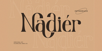 Nadier is a Modern Serif Font that made with a classic style in each character, so it's fitted for some wedding invitation display. There's some connected letters and some alternates that suitable for any graphic designs such as branding materials, t-shirt, print, business cards, logo, poster, t-shirt, photography, quotes .etc This font support for some multilingual. Also contains uppercase A-Z and lowercase a-z, alternate character, numbers 0-9, and some punctuation. If you need help, just write me! Thanks so much for checking out my shop!
 - Renaf by Flawlessandco,
$9.00 Renaf is a Groovy Retro Font that made with an additional shiny mode in each character, so it's fitted for some retro project. There's some connected letters and some alternates that suitable for any graphic designs such as branding materials, t-shirt, print, business cards, logo, poster, t-shirt, photography, quotes .etc This font support for some multilingual. Also contains uppercase A-Z and lowercase a-z, alternate character, numbers 0-9, and some punctuation. If you need help, just write me! Thanks so much for checking out my shop!
 - Gliny by Typesketchbook,
$45.00 Gliny was created by mixing different styles of handwriting fonts that derived from various tools such as pen, markers, drafting pens, painting brushes, writing brush and etc. In order to develop a new and diverse font styles. We also keep incomplete details and uneven textures that resulted from a writing process. We provide various font styles to help you mix and match them to suit your creative work harmoniously. Gliny comes with different font families such as brush, slab serif, heavy, handmade script for making your amazing work !!
 - ITC Bolthole by ITC,
$29.99I fell in love at the age of twelve in Wales, recalls Bernard Philpot. "My father brought me to a small graveyard in the Welsh hills to show me two headstones carved by the great Eric Gill. I instantly fell in love with the beauty of the carving and the perfection of the letterforms. I still go back to marvel at these works of art." However, the ITC Bolthole™ design, Philpot's first commercial typographic endeavor, is quite unlike the works of Eric Gill that first captured his heart. Bolthole is a craggy sans serif with a definite grumpy attitude. It's not terribly legible, and, if more than a few words are set in the design, it's not very readable. To round out its cranky personality, Bolthole does not like to be set in small sizes. Like Cheez Whiz® and bullfights, you either love or hate this typeface. But whichever emotion dominates, there is no denying that Bolthole has a personality to be reckoned with - one with ample magnetism to ensure reader attraction. If used to set brief blocks of display copy, the typeface makes a powerful statement. Bolthole was originally designed to complement a whimsical ad for the Royal Society for the Prevention of Cruelty to Animals. As Philpot recalls, "although the ad didn't win any awards, the type attracted some very positive comments for its original look and feel." Philpot studied graphic design and typography at the London School of Printing, and soon after graduation found himself working in a large advertising agency in London. According to Philpot, "After designing type for everything from packaging to ads, I thought it time to convert one of my designs into a complete font - and Bolthole was born." ITC Bolthole could very well be the Shrek™ of typeface design - which might not be such a bad thing." - Mont Blanc by Fontfabric,
$35.00 A new type giant emerges taking after the legendary geometric sans serif Mont! Mont Blanc elevates all prized unique details of Mont and translates them into an independent flawless text font family. This type prodigy comes with heaping legibility improvements dedicated to the smaller sizes and challenging paragraphs. The new type family is set to climb to the top of your “favorite design tools” with adjusted x-height, refined weight, and glyphs redesign to name but a few. Venture into new projects equipped with 8 font weights and matching italics, multi-script support, and rich OpenType features set. Language Support: Extended Latin (all Western languages), Cyrillic, Greek OpenType Features: Localized Forms Subscript Scientific Inferiors Superscript Numerators and Denominators Fractions Ordinals Lining Figures Proportional Figures Tabular Figures Oldstyle Figures Case-Sensitive Forms Standard Ligatures Stylistic Alternates Contextual Alternates
 - dearJoe 7 by JOEBOB graphics,
$39.00 The dearJoe series of fonts came to life around the year 1999, when I created dearJoe 1, which was a first (and half-assed) attempt to convert my own handwriting into a working font. Being able to type in my own hand had always been a childhood fantasy, and even though I only partly understood the software, a working font was generated and I decided to put it on the internet for people to use in their own personal projects. Which they did: at this moment the dearJoe 1 font has been downloaded millions of times and can be found on Vietnamese riksjas, Tasmanian gyms and chocolate stores on 5th Avenue for instance. The font is not something I am particularly proud of, but it started me of in building what's now the JOEBOB graphics foundry. Inbetween creating other fonts, the dearJoe series has become a theme I revisit every once in a while, trying to create an update on how my handwriting has evolved, along with my abilities in creating fonts that mimic actual handwriting. In the last decade or so I started implementing ligatures and alternate characters, which helped a lot in coming to a result that can almost pass for actual handwriting. The 2019 dearJoe 7 font is the latest addition to this font family. All characters were scanned from handwritten notes, cherrypicking the characters and letter-combinations I liked best. They were written with a Lamy M66 B pen and only minor adjustments were made to the original scans, leaving most little flaws and rough edges as they were for a convincing ball-point on paper result. The font comes with over 150 ligatures, making sure the font has a variated and credible overall look and feel.
 - Neudoerffer Fraktur by Linotype,
$29.99Johann Neudörffer the Elder's 1538 writing manual fascinated the German designer Helmut Bomm for years. Together with Albrecht Dürer and Hieronymus Andreä, Neudörffer helped create Fraktur, perhaps the most Germanic of all the blackletter styles. As a tribute to this master, and bringing its letterforms to a 21st century public, Boom released the Neudoerffer Fraktur family through Linotype in 2009. Neudoerffer Fraktur's appearance is based very much in handwriting, and Bomm had already begun using letters from prototype versions of this typeface as early as the 1990s. For years, Neudoerffer Fraktur'sletters would appear secretly and seductively in design projects like historical sign restorations or heraldry pieces. The sources that Bomm used while drawing the typeface were images from Jan Tschichold's Treasures of Calligraphy" and Albert Kapr's "Schriftkunst." The Neudoerffer Fraktur family has four separate fonts. Any user of Adobe CS applications should consider licensing Neudoerffer Fraktur Regular (the font without any numeral suffixes). This font contains three different OpenType stylistic sets. Users can pick and choose which versions of the letters that they would like to set. Anyone using Quark XPress, Microsoft Word, or other applications without support for Stylistic Sets should license Neudoeffer Fraktur Regular 1, Neudoeffer Fraktur Regular 2, and Neudoeffer Fraktur Regular 3. Each of these three fonts has letters with slightly different style of flourish, and all three may be combined with each other. Neudoerffer Fraktur Regular 1 is optimal for longer texts; Neudoerffer Fraktur Regular 2 contains alternate letters, and well as more ornamented capitals; Neudoerffer Fraktur Regular 3's letters have a stronger calligraphic accent." - Moritza Script by Max.co Studio,
$15.00 Moritza Script is a calligraphy script font that comes with a very beautiful character change, a kind of classic decorative copper script with a modern touch, designed with high detail, it took time since July 2019 - September 2020 to present an elegant style. Moritza Script is attractive as a typeface that is smooth, clean, feminine, sensual, glamorous, simple and very easy to read, because there are many fancy letter connections. I also offer a number of viable style alternatives for many letters. The classic style is perfect to be applied in various formal forms such as invitations, labels, restaurant menus, logos, fashion, make up, stationery, novels, magazines, books, greeting / wedding cards, packaging, labels or any type of advertising purpose. Moritza Script including various language support. With OpenType features with alternative styles and elegant ligatures. The OpenType feature does not work automatically. I highly recommend using a program that supports OpenType features and Glyphs panels such as Adobe Illustrator, Adobe Photoshop CC, Adobe InDesign, or CorelDraw, so you can see and access all Glyph variations. Moritza Script is encoded with Unicode PUA, which allows full access to all additional characters without having special design software. Mac users can use Font Book, and Windows users can use Character Map to view and copy one of the extra characters to paste into your favorite text editor / application. How to access all alternative characters using Adobe Illustrator: https://www.youtube.com/watch?v=XzwjMkbB-wQ How to access all alternative characters, using Windows Character Map with Photoshop: https://www.youtube.com/watch?v=Go9vacoYmBw If you need help or have questions, please let me know. I'm happy to help. Thanks & Happy Designing! New Update • Moritza Script! Moritza has now been updated to include 3 styles; bold version, regular & italic version. This gives you the option to completely change your font style with the click of the mouse, whether you're looking for a smoother style, a bold version, or an italic finish. And don't forget the elegant touch of ornament.
 - Chocolate Banana by madjack.font,
$15.00 Chocolate Banana Script is a modern calligraphy design including Regular. This typeface is casual and beautiful with grids. Can be used for various purposes. such as logos, product packaging, wedding invitations, branding, headlines, signage, labels, signatures, book covers, posters, quotes, and much more. Chocolate Banana Script includes OpenType language styling changes, binding and international support for most Western languages. To enable alternative OpenType features, you need a program that supports OpenType features such as Adobe Illustrator CS, Adobe Indesign & CorelDraw X6-X7, Microsoft Word 2010 or later versions. How to access all alternate characters using Adobe Illustrator: https://www.youtube.com/watch?v=XzwjMkbB-wQ Chocolate Banana Script is encoded with Unicode PUA, which allows full access to all additional characters without having to have special design software. Mac users can use Letter Book, and Windows users can use Character Maps to view and copy any additional characters to attach to your favorite text editor/application. How to access all alternate characters using Windows Character Map with Photoshop: https://www.youtube.com/watch?v=Go9vacoYmBw If you need help or have any questions, let me know. I'm happy to help :) Thank you & Happy Designing!
 - Samhain by Hanoded,
$15.00 Samhain is a Gaelic festival marking the end of the harvest season and the beginning of winter. There is no set date, but normally it is held around the end of October and beginning of November. Samhain font was made with a bamboo pen and Chinese ink on rough paper - hence the grungy look. It is quite a heavy font, so I wouldn't set a complete text in it, but it is ideal to create headlines, posters, postcards and invitations. Of course, Halloween comes to mind! Samhain comes with extensive language support.
 - AZN Knuckles Varsity by AthayaDZN,
$10.00 Introducing "AZN Knuckles Varsity" font by AthayaDZN. Revolutionizing a varsity slab serif, combining sharp and rounded edges, angled serif, and a variety of weights, fitting it into the modern scene. Equipped with 3 styles ( Defined, Regular, Stencil ) Use the Defined version if you are aiming for that slab serif look, just like the name suggested, it defines the modernized slab serif on each letter, giving it that retro look yet still in the modern scene. Especially on the light weight of this version, the slab serif is really prominent. Use the Regular Version if you are aiming for any type of design that you see this font fits especially the modern scene, just like how it's advertised. Use the Stencil version if you are aiming to make a statement, my favorite one is the Bold and Italic version of the Stencil if I was to make a statement, just like the preview where it says "Anarchy", the separated shapes of the letter combined with it's bold and slanted shape is perfect to make a strong statement. Language Support : Afrikaans, Albanian, Danish, Dutch, English, Estonian, Filipino, Finnish, French, Galician, Indonesian, Irish, Italian, Luxembourgish, Norwegian, Portuguese, Romansh, Scottish Gaelic, Spanish, Swedish, Swiss German, Uzbek (Latin). And that's it for this font, thank you for purchasing the product, I wish you success on your projects. Please enjoy the font and let me know if you needed any help or if you have any questions -Athaya twitter.com/Athaya_DZN behance.net/athayadzn
 - FS Meridian Variable by Fontsmith,
$199.99Timeless imperfection FS Meridian is a rhythmic geometric grotesque which takes inspiration from the precise yet imperfect nature of time. There are 24 hours in a day. 60 minutes in an hour. 60 seconds in a minute. Well, almost. The Earth’s orbit isn’t a perfect circle – and nor is the Earth itself. Each day varies a few dozen seconds and up to 16 minutes each year. Look closer and time is more flexible than we think. Geometry with a twist From a geometric base, FS Meridian’s rounded forms veer and extend, creating unexpected humanistic shapes – while the straight terminals remain reliably rigid. This combination of forms gives this grotesque sans serif a pleasingly dynamic rhythm, every time it’s read. Added quirks The unconventional character of rigid terminals and ink traps are balanced with emphasized extended forms to develop visual differentiation. Designed by Kristina Jandová, the complete family has been carefully crafted with distinguishing marks. Take a look at the cap ‘Q’ which comes with three alternative options. Deliciously loopy FS Meridian has a wide geometric, mono-liner appearance with humanistic elements. Quirky individual touches like the loopy expressive pound sign help the typeface to stand out. Available in five weights, FS Meridian is both timeless and timely, a distinctive font for all screens and surfaces. - FS Meridian by Fontsmith,
$80.00 Timeless imperfection FS Meridian is a rhythmic geometric grotesque which takes inspiration from the precise yet imperfect nature of time. There are 24 hours in a day. 60 minutes in an hour. 60 seconds in a minute. Well, almost. The Earth’s orbit isn’t a perfect circle – and nor is the Earth itself. Each day varies a few dozen seconds and up to 16 minutes each year. Look closer and time is more flexible than we think. Geometry with a twist From a geometric base, FS Meridian’s rounded forms veer and extend, creating unexpected humanistic shapes – while the straight terminals remain reliably rigid. This combination of forms gives this grotesque sans serif a pleasingly dynamic rhythm, every time it’s read. Added quirks The unconventional character of rigid terminals and ink traps are balanced with emphasized extended forms to develop visual differentiation. Designed by Kristina Jandová, the complete family has been carefully crafted with distinguishing marks. Take a look at the cap ‘Q’ which comes with three alternative options. Deliciously loopy FS Meridian has a wide geometric, mono-liner appearance with humanistic elements. Quirky individual touches like the loopy expressive pound sign help the typeface to stand out. Available in five weights, FS Meridian is both timeless and timely, a distinctive font for all screens and surfaces.
 - Relato by Emtype Foundry,
$69.00 Relato has a low contrast and “a muscular” structure that makes it useful for setting longer text. In display sizes it has a variety of details that lends it a unique and personal expression. The formal principle of the serif, the variety of terminal strokes and the combination of curves and semi-straight lines gives the Relato a more “human” flavor. The inspiration for the design comes from different traditional calligraphic styles. The upper case letter, for example, is based on roman capitals from the Rennaissance, whereas the lower case relates to humanist handwriting. Even so, Relato is a decidedly contemporary typeface, proposing individual ideas on the design of type. The italic has a distinct typographic color thanks to the construction principle of broken lines. The bold weights have an increased contrast in the union of the strokes which helps improve legibility in small sizes and reinforce their personality in display sizes. The family consists of a Regular version, Italic, Small caps, Semibold and Bold. For a sans serif version of Relato, please see Relato Sans.
 - Hurringtown Script by OldStudioo,
$16.00 Hurringtown is a collective modern hand lettering. Come with uppercase and lowercase, stylistic set, alternates, multilingual, etc to mix and match your design. This font is perfect for your design, logo, label, badges, apparel design, etc. I also made a design to mix and match pairs of letters to fit your design. Files included: Hurringtown (OTF) Features you get: - Latin A -Z and a – z - Numbers - International Symbols - Multilingual Supports - Alternatives - Ligatures All characters are available through Glyph panel as well, even more each of the alternate letter has it’s own unicode (PUA) so you can copy/paste from Apple Font Book or Windows Character Map. Need to test out a word in this font? Just type it into the box below, and see what it looks like :) That's it! I really hope you enjoy it - please do let me know what you think, comments & likes are always hugely welcomed and appreciated. If you need help or advice, please contact me by e-mail " old.studio87@gmail.com "
 - Little Delights by Set Sail Studios,
$16.00 Why not treat yourself to some Little Delights? This super playful & versatile brush font includes 429 glyphs in total - and is designed to perfectly recreate natural, free-flowing brush script lettering while maintaining a relatable charm. Hand painted with a real paintbrush, and packed with 48 Ligatures, you're bound to enjoy this go-to brush font for years to come on a variety of projects. As well as a full alternate set of upper & lowercase characters in it's own separate font, Little Delights also includes a set of 6 Swashes, ideal for underlining your lettering and adding that extra 'custom' style. Swashes can be accessed via a glyphs panel. Accessing Ligatures; These 48 unique double letter combinations will help letters connect and flow more naturally. The ligatures will automatically generate when using the Little Delights fonts with most software. Language Support; English, French, Italian, Spanish, Portuguese, German, Swedish, Norwegian, Danish, Dutch, Finnish, Indonesian, Malay, Hungarian, Polish, Croatian, Turkish, Romanian, Czech, Latvian, Lithuanian, Slovak, Slovenian.
 - Cagier by Nathatype,
$29.00 Do you dream of creating headings that stand out and inspire creativity, imagination, and endless fun? If you are looking for an elegant font with flair. Something that can makes your project or design being so special. You better not going to want to miss this one! Cagier-A Display Font Cagier is a display font in a luxurious, classy, and timeless style. Inspired from classic and vintage flair combine with recently trend style making this font the best choice to whatever your design is. Cagier is mainly intent for logo, headings, branding, magazine, cover album, book cover, movie, apparel design, quotes, invitations, flyer, poster, greeting cards, product packaging, printed quotes, etc. Hope it helps to capture the soul of any design. Our font always includes Multilingual Support to make your branding reach a global audience. Features: Alternates Ligatures Stylistic Set Swashes PUA Encoded Numerals and Punctuation Thank you for downloading premium fonts from Natha Studio
 - Ogilen by Nathatype,
$29.00 Are you looking for a serif font? Do you dream of creating headings that stand out and inspire creativity, imagination, and endless fun? If you are looking for a modern but still elegant, something that can makes your project or design being so special. You better not going to want to miss this one! Ogilen-A Serif Font Ogilen is a serif font in a luxurious, classy, and timeless style. A font that is inspired from recently trend style making this font the best choice to whatever your design is. Ogilen is mainly intent for logo, headings, branding, magazine, cover album, book cover, movie, apparel design, quotes, invitations, flyer, poster, greeting cards, product packaging, printed quotes, etc. Hope it helps to capture the soul of any design. Our font always includes Multilingual Support to make your branding reach a global audience. Features: Ligatures PUA Encoded Numerals and Punctuation Thank you for downloading premium fonts from Natha Studio
 - Bennet Display by Lipton Letter Design,
$29.00 Bennet, Richard Lipton’s spirited serif superfamily, was inspired by Moth Design’s logotype and stationery system for the North Bennet Street School in Boston. Initially modest in concept, Bennet grew to an expansive suite of 96 fonts tuned for editorial use. The three widths of Bennet’s Display and Banner sizes—Regular, Condensed, and Extra Condensed—are ideal for precise fitting of newspaper and magazine headlines. Lipton developed graded text styles for the series, offering users precise variations to help compensate for varying degrees of ink spread on different types of paper stock during the printing process. For example, because of ink absorption, the lightest grade—Bennet Text One—printed on low-quality newsprint stock will have the same gray value as the darkest grade—Bennet Text Four—on superior coated paper. (Bennet Text Two is the default grade and offered here.) Bennet also provides for a stellar reading experience in digital media, its carefully considered details vibrant yet legible on-screen.
 - Scrans by Corradine Fonts,
$29.95 Scrans (Script + Sans) is a modern script family that gets both, conceptual and formal elements, from classic rational and geometric styles. It's main purpose is to make the difference in an innovative manner. In other words, you can use Scrans in texts where traditionally the classic scripts won’t fit. Scrans is a powerful tool that helps you to obtain clean, minimalists, geometric, contemporary, and mostly, highly legible designs. Each detail in the design of Scrans (like it's compact proportions, it's soft connections, it's cutted endings and it's subtle slant angle), was carefully crafted so you can get a high quality font to use in any project. You can also take advantage of its Open Type features that improve the potential of the typeface, with stylistic alternates and the options to underline smartly the words. Each one of the eight weights supports many languages, including Central and Eastern European as well as Western European languages.
 - Bennet Text by Lipton Letter Design,
$29.00 Bennet, Richard Lipton’s spirited serif superfamily, was inspired by Moth Design’s logotype and stationery system for the North Bennet Street School in Boston. Initially modest in concept, Bennet grew to an expansive suite of 96 fonts tuned for editorial use. The three widths of Bennet’s Display and Banner sizes—Regular, Condensed, and Extra Condensed—are ideal for precise fitting of newspaper and magazine headlines. Lipton developed graded text styles for the series, offering users precise variations to help compensate for varying degrees of ink spread on different types of paper stock during the printing process. For example, because of ink absorption, the lightest grade—Bennet Text One—printed on low-quality newsprint stock will have the same gray value as the darkest grade—Bennet Text Four—on superior coated paper. (Bennet Text Two is the default grade and offered here. Additional grades are available upon request.) Bennet also provides for a stellar reading experience in digital media, its carefully considered details vibrant yet legible on-screen.
 - Ador Hairline by Fontador,
$24.99 Ador Hairline is the high contrast version of Ador . A humanist sans serif that falls in the “evil serif” genre, especially designed for contemporary typography and comes up with 7 weights from extralight to black plus true italics and 293 ligatures and initial letters. A large x-height not only creates space in the letters for extra-bold styles, but also lends Ador Hairline an open and generous character in the more narrow and semi-bold versions. The nice balance between sharp ink trapped and soft, dynamic shapes helps to work in small sizes. Diagonal stress, angled finials and the 4 degree true italic styles give Ador Hairline a dynamic look. The font contains 1,026 glyphs and a wide range of flexibility for Latin language support for every typographical need. Ador Hairline is a contemporary sans serif typeface, special for logotypes, brands, magazines, editorial, and advertising uses. Ador Hairline was on the shortlist of Communication Arts 2020.
 - Bennet Banner by Lipton Letter Design,
$29.00 Bennet, Richard Lipton’s spirited serif superfamily, was inspired by Moth Design’s logotype and stationery system for the North Bennet Street School in Boston. Initially modest in concept, Bennet grew to an expansive suite of 96 fonts tuned for editorial use. The three widths of Bennet’s Display and Banner sizes—Regular, Condensed, and Extra Condensed—are ideal for precise fitting of newspaper and magazine headlines. Lipton developed graded text styles for the series, offering users precise variations to help compensate for varying degrees of ink spread on different types of paper stock during the printing process. For example, because of ink absorption, the lightest grade—Bennet Text One—printed on low-quality newsprint stock will have the same gray value as the darkest grade—Bennet Text Four—on superior coated paper. (Bennet Text Two is the default grade and offered here.) Bennet also provides for a stellar reading experience in digital media, its carefully considered details vibrant yet legible on-screen.
 - Salt & Spices Mono by Fontforecast,
$29.00 Salt&Spices Mono is the mono lined version of Salt & Spices Pro. Where Salt & Spices Pro has the rough contours and high contrast that is typical for dip pen calligraphy, Salt & Spices Mono has clean crisp smooth letterforms that result in a totally different look and feel. Great for creating neon effects. Fun features like connecting spaces and long swashes for customization of words and phrases are preserved in Salt & Spices Mono. This versatile 10 font family, consisting of 4 casual script styles: Regular, Bold, Shadow and Bold Shadow offers great flexibility. For instance: the appearance of initial and terminal letters can be customized using the glyph pallet. Contextual alternates, Swashes and Stylistic sets give you the ability to replace spaces by 3 alternate connecting spaces or add swashes to initial/terminal letters. Double letter ligatures help sustain the natural flow of handwriting. In addition to the 4 script styles 3 SmallCaps Sans styles and 3 SmallCaps Serif styles were added, all mono lined. They add great variation to your designs and supplement and support each other perfectly. Add exceptional language support to all that and you have the perfect ingredient to spice up even the most demanding design project. You'll need an Open Type savvy application to get the most out of Salt & Spices Mono.
 - Cyan Sans by Wilton Foundry,
$29.00The design of Cyan was inspired by features found in classic Roman and styles like Trajan and Bodebeck. The characters stay true to the same features as the capitals, resulting in an unusually distinctive style. The Capitals version contains Roman numerals. Cyan's weight is similar to Trajan's but the horizontal strokes are slightly bolder resulting in better legibility for small sizes, especially for lowercase characters. Cyan Sans evolved out of the hugely successful Cyan Serif family. Cyan Sans retains the same geometric Roman proportions with open centers in B,P,R b, d, p . This helps create a thick and thin stroke illusion since the actual strokes don't vary much. There are many subtle details in Cyan Sans that become more interesting in larger sizes. The beauty of Cyan Sans is that it has no features that "jar" the eye. The result is a very pleasing and distinctive sans that scales well. Cyan Sans is a robust font that will exceed expectations in areas never explored before. The name is inspired by the Greek word cyan, meaning "blue". Blue as a primary color that has many hues and uses. Cyan the font, we hope will be seen in a similar light. Obviously Cyan Sans is a perfect companion to the Cyan Serif family. - Makika Sun by Andinistas,
$39.00 Makika Sun enhances the handwritten expressive possibilities of an architect mom and a graphic designer dad in Bogotá, Colombia. In other words, it is a versatile handwritten font family designed for writing short messages in children's contexts. Makika Sun shines for its conceptualization and logic, combining ideas from the American calligrapher Austin Norman Palmer and the Italian calligrapher Ludovico degli Arrighi. Makika Sun, a creative font family specializing in titles and paragraphs for children's books, emerged in 2009 and has developed over the years. Its essence lies in the simplicity of handwriting. In 2023, Makika Sun was applied in the book "Secret Files Tardigrades 1" for children ages 5-6 on Amazon from MyMicroSchool. The main goal of Makika Sun is to emulate handwriting that is legible and accessible to everyone. Makika Sun stands out for its readability and uncomplicated, artisanal style. It offers four typographic styles that simulate different calibers of markers: thick tip (Makika Sun Black), medium tip (Makika Sun Bold), normal tip (Makika Sun Regular) and Makika Sun Dingbats, a set of arrows and figures perfect to enrich your writing. . In short, Makika Sun's versatility and stylistic uniformity make it easy to create writing in various typographic settings. Its typographic heart communicates harmony in messages meticulously designed for spontaneous contexts that require high readability. Makika Sun offers a dynamic range of styles in 4 fonts notable for their outstanding performance in the field of children's book design and the creation of playful brand identities.
 - Love Bird by Bal Studio,
$14.00 Love Bird Script is a stylish calligraphy font that features a varying baseline, smooth line, classic and elegant touch. Can be used for various purposes such as headings, signature, logos, wedding invitation, t-shirt, letterhead, signage, labels, news, posters, badges etc. Love Bird Script features 213 + glyphs and 143 alternate characters. including initial and terminal letters, alternates, ligatures and multiple language support. To enable the OpenType Stylistic alternates, you need a program that supports OpenType features such as Adobe Illustrator CS, Adobe Indesign & CorelDraw X6-X7, Microsoft Word 2010 or later versions. How to Access Alternate Characters in Photoshop CC. https://www.youtube.com/watch?v=xFlMwARHusY How to access all alternative characters using Adobe Illustrator: https://www.youtube.com/watch?v=XzwjMkbB-wQ How to use stylistic sets font in Microsoft Word 2010 or later versions: https://youtu.be/x1A_ilsBsGs https://www.youtube.com/watch?v=NVJlZQ3EZU0 There are additional ways to access alternates/swashes, using Character Map (Windows), Nexus Font (Windows), Font Book (Mac) or a software program such as PopChar (for Windows and Mac). How to access all alternative characters, using Windows Character Map with Photoshop: https://www.youtube.com/watch?v=Go9vacoYmBw Need help? If you need help or advice, please contact me by e-mail "balstudio2018@gmail.com" Thank you for your purchase!
 - Brake by Black Studio,
$19.00 New from Black Studio, presenting Brākė is a typeface that is feminine, adaptable, contemporary aesthetic and creates endless variations for your creative needs. Its striking contrasts and subtle details, together with its sumptuous strokes and voluptuous curves, create a beautiful and powerful statement for any typographic composition, blending glamor with a contemporary aesthetic. Brākė really helps you create unlimited variations for your creative needs in making your project titles: such as Books, fashion, magazines, logos, branding, photography, invitations, wedding invitations, quotes, blog headers, posters, advertisements, postcards, books, websites, etc. WHAT IS INCLUDED • Brākė – Regular • Brākė – Oblique • Brākė – Outline This type of family has become the work of true love, making it as easy and fun as possible. I can't wait to see what you do with Brākė! Feel free to use the #Black Studio tag and the #Brākė font to show what you've been up to, I really hope you enjoy it! Thank You!
 - Versus by Latinotype,
$29.00 A unicase typeface inspired by Latin American wrestling. Versus is a type system designed for use with short and block text. The font, based on well-known typefaces found on boxing posters, combines Latin American elements and wrestling; it is this mixture of widths and weights and different styles which helps give your designs a unique flavour and personality. Versus is a unicase sans serif font well-suited for display use; its orthogonal terminals and short ascenders and descenders make it ideal for block of texts. By mixing different weights, you can have a wide range of design options—short text, isolated words, logos, titles, branding design, posters, etc. The Versus family comes in 9 weights—from a lightweight and condensed Extra Light to an expanded and heavy Ultra. Its character set supports over 200 different languages. The font also includes a large number of stylistic alternates and a complete ligature set which give your compositions a strong identity and personality.
 - Valiety by Din Studio,
$25.00 Valiety is a serif font family to better charm your designing experiences. It consists of eight different levels to add elegant, modern touches to your designs. Valiety has a continuity aspect produced from each small stroke in order to help the eyes smoothly move from one letter to another. Besides, the thickness differences are unnoticeable so that it leaves stable, legible impressions. With such flexibility, you can use it in either bigger- or smaller-sized texts. Include 8 different weight fonts : Valiety Hairline Valiety Thin Valiety Extra Light Valiety Light Valiety Regular Valiety Medium Valiety Semi Bold Valiety Bold Features: Multilingual Supports PUA Encoded Numerals and Punctuation Valiety is best for any design projects, such as posters, banners, logos, book covers, invitations, quotes, headings, printed products, merchandise, social media, etc. Find out more ways to use this font by taking a look at the font preview. Thank you for purchasing our font and happy designing.
 - Bentoga by Black Studio,
$25.00 New from Black Studio, presenting bentoga is a typeface that is feminine, adaptable, contemporary aesthetic and creates endless variations for your creative needs. Its striking contrasts and subtle details, together with its sumptuous strokes and voluptuous curves, create a beautiful and powerful statement for any typographic composition, blending glamor with a contemporary aesthetic. Bentoga really helps you create unlimited variations for your creative needs in making your project titles: such as Books, fashion, magazines, logos, branding, photography, invitations, wedding invitations, quotes, blog headers, posters, advertisements, postcards, books, websites, etc. WHAT IS INCLUDED • Bentoga – Regular • Bentoga – Italic This type of family has become the work of true love, making it as easy and fun as possible. I can't wait to see what you do with Bentoga! Feel free to use the #Black Studio tag and the #Bentoga font to show what you've been up to, I really hope you enjoy it! Thank You!
 - Bohemian Initials by Kaer,
$24.00 I’m happy to present you the Bohemian initials font family. Regular and Colored styles (Uppercase & Numbers) based on Codex Gigas originated in medieval Bohemia. The manuscript has been dated 1230. The elaborate initials are at the beginning of the main texts and their principal divisions. The painter was aiming to achieve a plastic depiction of the trailing vines of the initials, and he painted with solid colours. He used only four of the primary colours cinnabar red, blue, green and yellow, brightly toned, as well as white accents and contours. The trailing vines of the initial letters are painted in a decorative, advanced Romanesque style, already bordering on naturalism. The plant taken as the starting point is the acanthus, a thistle-like plant which grows wild in the Mediterranean countries. The decoration of the Devil’s Bible is not the work of an amateur. Scholars have concurred: it is book illuminations created in Northeast France and Southern England in the so-called Channel style which provided the starting point for the coiled trailing-vine shapes in the initials of the Devil’s Bible. --- You can use color fonts in PS CC 2017+, AI CC 2018+, ID CC 2019+, macOS 10.14 Mojave+ Please note that the Canva & Corel & Affinity doesn't support color fonts! --- Please feel free to request any help you need: kaer.pro@gmail.com Thank you!
 - Devils Haircut by PintassilgoPrints,
$24.00 Devils Haircut is an explosive font duo, consisting of two completely different styles, creative and expressive in their own way, with a touch of punk and counter-culture aesthetic. Together they make a decidedly eye-catching pair and a rad option for numerous display moods, from album covers to food packaging, from title screens to editorial pages. Both fonts are all caps with different designs stored on upper- and lower-case slots, so you can reach the alternate forms easily through the keyboard. Or use the Contextual Alternates OpenType feature to instantly cycle the alternate glyphs and get an even more uneven look. Make Devils Haircut yours and fire up your designs, hell yes!
 - Astralaga by SG Type,
$19.00 Elegant, graceful, and timeless. Astralaga is a versatile font family with a timeless, classic appeal, over 50 alternates & ligatures and multilingual support. Every letter has been hand-drawn and crafted with the upmost care. The variety of weights provide a range of choices that will help you find the best typographic character for your project. All 5 weights are well-suited for large display uses and high impact headlines. The available stylistic alternates and ligatures offer a number of different options that give your project a unique look. This high contrast serif typeface features a total of 1850 glyphs and offers comprehensive language support. THE 5 WEIGHTS OF ASTRALAGA Astralaga Light – very delicate and elegant Astralaga Regular – a classic beauty with gorgeous shapes Astralaga Medium – a great midground between lights and bolds Astralaga Semibold – high contrast and high impact Astralaga Bold – pure boldness and elegance FEATURES 5 weights High contrast 40 ligatures per weight 11 alternate glyphs per weight 1850 glyphs Comprehensive language support OpenType features: Access All Alternates, Discretionary Ligatures, Fractions, Kerning, Standard Ligatures, Stylistic Alternates, Stylistic Set 1, Superscript
 - Guau by Cuchi, qué tipo,
$9.95 From the abyss and the quarantine hell, drawn in absolute lonelyness, and finished during the darkest hours of confinement… "Guau" is born, the type that barks directly at your face! "Guau" is a high-contrast display font with as many weights and versions as there are types of puppies in this fantastic world. It is thought to bring up glances in middle and heavy boxing weights, although you can also take its compressed and italic styles just for a walk. "Guau" is a font with three axes (italic, weight and width) and 20 instances, and it also contains thousands of glyphs and Opentype features that means a "guaorld of posibilities". This name comes from the time when you could only go to the street to take a walk to your pooch. Definitely, "Guau!, your new best friend!".
 - Meastro by Ferry Ardana Putra,
$39.00 It's been a while... more than three months we developed our brand new font. We call them "Meastro". Fun fact though, we want to call it "Maestro", but you know... we were afraid of the copyright thing. Meastro Script is a fun, bold, luscious, retro display script font. We crafted this font very carefully and make them very smoothly attach to each other. Especially, on the script version. You can see every character's tail beautifully connected one to another without using ligatures' help. This font takes full advantage of the Open Type format with several automatic ligatures that occur as you type for your preferred design. Moreover, the manual stylistic alternates allow you to choose the letters you prefer. Alternates occur automatically as you type in supported programs when you have "Ligatures" or "Stylistic Alternates" turned on. Meastro is Created with a ton of stylistic alternates, swashes, and ligatures, and also comes with layerable fonts to recreate the effect without uncomfortable overlaps of the extruded shadow effect. On this pro pack, you will also get the Meastro Display font! On this font you will meet the unique blocky and squared design, making your design feel classic and retro-like. Combine them and “boom”, you will be the “Maestro” of the vintage design! This retro typeface is perfect for logotypes, t-shirts, vintage badges, retro quotes, branding, packaging, posters, signboards, social media needs, etc. ——— Meastro features: A full set of uppercase and lowercase characters Layered Style Numbers and punctuation Multilingual language support PUA Encoded Characters OpenType Features +553 Total Glyphs (Script) +235 Total Glyphs (Display) +238 Stylistic Alternates +30 Ligatures +69 Swashes and more (Shiny and Graffiti Spray Effect Included!) ——— ⚠️To enable the OpenType Stylistic alternates, you need a program that supports OpenType features such as Adobe Illustrator CS, Adobe InDesign & CorelDraw X6-X7, Microsoft Word 2010, or later versions. There are additional ways to access alternates/swashes, using Character Map (Windows), Nexus Font (Windows), Font Book (Mac), or a software program such as Pop Char (for Windows and Mac).
 - Heavyrust by Invasi Studio,
$12.00 Heavyrust is All Aggressive with Brush style font special for your Display Design, which puts a bold on your projects and will inspire you to create something strong and aggressive. Heavyrust will help you to create special and touching typographical designs for bold or strong projects, It is perfect for headings, flyers, greeting cards, product packaging, book cover, printed quotes, logotype, apparel design, album covers. Features: Multilanguage Ligatures Alternates Punctuation
 - American Signer by Dikas Studio,
$19.00 American Signer is a script brush font that inspired from traditional 1980’s Sign Painting. Made directly based on brush lettering and through a comprehensive digitization process, an American Signer was created that is suitable to help you get a sense of sign painting letter. American Signer comes with many ligature, alternate character and swashes that very suitable for makes logo, badge, label, packaging, certificate and other vintage design.
 - Strawberry Cheesecake by Supersemarletter,
$10.00 Strawberry Cheesecake is a handwritten style in Uppercase and Lowercase feel nice balanced. Provide ligatures with special character. Honestly it works perfectly for headlines, logos, posters, packaging, T-shirts and much more. Font Features : • Ligatures • Numerals & Punctuation • Accented Characters • Multiple Languages Supported Recommended to use in Adobe Illustrator or Adobe Photoshop with opentype feature. If you have questions, just send me a message and I'm glad to help.