10,000 search results
(0.026 seconds)
- Linotype Nautilus by Linotype,
$29.99According to Hellmut G. Bomm "Nautilus was based on a handwritten type used for the text Li. Das Helle, Klare from the I Ging. "The intention was to create a clear, highly legible typeface. While the even strokes of sans serif types eventually tire the eyes in long texts, the marked stroke contrast of Nautilus lends the type its legibility. The characters were drawn with a broad tipped pen, and like an antiqua type, the forms of Nautilus display a variety of elements. The narrow figures with relatively large spaces between them create an overall open appearance and allow a large quantity of text to fit into a small space. "The headstrong forms of Nautilus make this an excellent display type. The italic weights are independent typefaces with hints of a handwritten character." - Monaz by Craft Supply Co,
$20.00 Introduction to Monaz – Bubble Font Monaz – Bubble Font, a playful and airy display font, is inspired by the lightness and roundness of bubbles and balloons. Perfect for creating eye-catching headings, logos, and children’s books, this font not only grabs attention but also serves as an ideal choice for fun and whimsical projects. Design and Aesthetics In its design, Monaz – Bubble Font features characters that resemble bubbles, with rounded edges and a bouncy feel. Furthermore, the letters mimic the floating appearance of balloons, thus adding a cheerful and lighthearted touch to any design. Additionally, its rounded forms are easy on the eyes, ensuring readability while preserving its playful charm. Versatility and Usage Monaz – Bubble Font boasts high versatility, fitting a variety of design needs effortlessly. Not only does it shine in party invitations and product packaging, but it also excels in promotional materials. Moreover, its effectiveness extends to educational materials for children, making learning engaging with its friendly appearance. As a result, its readability and unique style make it a top choice for designers seeking to add a fun element to their projects. Accessibility and Appeal Designed for a wide audience, Monaz – Bubble Font features a simple and clear style that is easy to read. It appeals to all ages, capturing the whimsy of childhood while still being sophisticated enough for adult projects. In summary, this font brings a unique joy and playfulness to any design, making it a valuable addition to any font collection.
 - Sworded by Fabulous Rice,
$35.00 Sworded is a font family of 8 fonts that was inspired by such diverse things as architecture, tombstones, video games, watching old movies or reading comic books. The art of creating beautiful letters has slowly declined with the rise of the digital age and its solid-colour, 2D fonts. And most of the time, the care given to typography in cultural products just isn't what it used to be anymore. This was the inspiration for Sworded, a family of 4 layerable fonts that can bring a feeling of depth to its letters, and offers endless possible combinations. Sworded Regular is the basic shape of all the characters. Sworded Deep gives an impression of depth to characters or acts on its own as an illusion. Sworded Bright can be used as the bright side of a bevel. Sworded Dark can be used to flesh out the dark side of a bevel. Sworded Shadowed is a contour font with a shadow effect. Sworded Wire is a wire font without depth indication. Sworded Outline is an outline font. Sworded Hatched is a variation of Sworded Shadowed with lines giving a gradient illusion. But of course, any font can be combined with any other font(s) to obtain various results. There are hundreds possible combinations with these eight fonts. Have fun!
 - Preto Semi OT Std by DizajnDesign,
$- Preto Semi is an experiment. It is an attempt to create a readable type for text point sizes (other than sans-serif and serif). Preto Semi is not a Sans with added serifs or Serif with serifs removed. The use of the serifs is redefined and used for other purpose(s). The serifs became the extension of the stroke, they help to solve the spacing problem of sans-serif types and they use the primary function of serifs – keeping the eye on the baseline and emphasize the horizontal rhythm of the lines of text. Preto Semi is intended for magazines and editorial design, as other members of Preto family. Preto is an extensive type family, which explores the function of serifs on readability and legibility. Preto consist of three subfamilies: Sans, Semi and Serif. Preto is designed for multilingual typesetting. All of the subfamilies have equal gray value but different texture which can be use to differentiate languages. Preto sub-families have two text weights and two bold styles (Regular -> Bold, Medium -> Black). Every weight has a companion Italic style as well.
 - Preto Semi by DizajnDesign,
$24.00 Preto Semi is an experiment. It is an attempt to create a readable type for text point sizes (other than sans-serif and serif). Preto Semi is not a Sans with added serifs or Serif with serifs removed. The use of the serifs is redefined and used for other purpose(s). The serifs became the extension of the stroke, they help to solve the spacing problem of sans-serif types and they use the primary function of serifs – keeping the eye on the baseline and emphasize the horizontal rhythm of the lines of text. Preto Semi is intended for magazines and editorial design, as other members of Preto family. Preto is an extensive type family, which explores the function of serifs on readability and legibility. Preto consist of three subfamilies: Sans, Semi and Serif. Preto is designed for multilingual typesetting. All of the subfamilies have equal gray value but different texture which can be use to differentiate languages. Preto sub-families have two text weights and two bold styles (Regular -> Bold, Medium -> Black). Every weight has a companion Italic style as well.
 - Fux by Rodrigo Fuenzalida,
$25.00 Fux is a condensed, neutral looking font, that features and extended ligature set, small caps, old style numbers and stylistic alternates, that should help to fulfill all your type setting needs. Is perfect to be used as big display and title font, and works very good in small sizes and paragraphs.
 - Sontira by Brand Type,
$25.00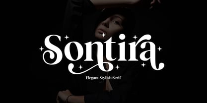 Sontira - Elegant Stylish Sontira is a stylish font that is chic, elegant and unique font that uses ligatures to smoothly link letters. Perfect for branding, logos, invitation, masterheads and more. Wish you enjoy our font and if you have a question, don't hesitate to drop message & I'm happy to help :)
 - Agasiz by Putracetol,
$24.00 Agaiz - Modern Display Font. Inspired from unique typography and lettering in the elegant alphabet from modern megazine and we combine with elegant typography style. With modern ligature you can make great lettering for beautiful artwork. Come with open type feature ( a lot of alternates and end swash), its help you to make great lettering. Agaiz best uses for Logotype, heading,cover, poster, logos, quotes, product packaging, header, merchandise, social media & greeting cards and many more. Agaiz font is also support multi language.
 - Khanza Script by Suamzu Art,
$12.00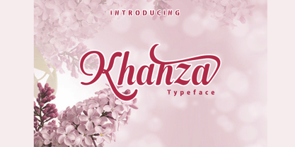 Khanza is a script font that is connected with clear style and dramatic movements. Khanza comes with uppercase, lowercase letters, numbers, punctuation, and so many variations on each character including alternative opentypes, common binders, and also additional cuts to allow you to customize your design. Perfect for use for Logotype, Letterhead, Posters, Clothing Designs, Labels and others. khanza font will help all the design projects that you are working on Khaza script features: Uppercase & lowercase Alternates & swashes Ligatures Standart international characters Punctuation & symbols
 - Nagbuloe by Luhop Creative,
$24.00 Nagbuloe is a offers beautiful typographic harmony for a diversity of design projects, including logos & branding, social media posts, and others.So Nagbuloe come with 4 style Regular,Italic,Outline and Shadow. Nagbuloe Come with Opentype feature with a lot of alternates, its help you to make great lettering. Nagbuloe is also support multi language. To access the alternate glyphs, you need a program that supports OpenType features such as Adobe Illustrator CS, Adobe Photoshop CC, Adobe Indesign and Corel Draw.
 - Faikinlan by IRF Lab Studio,
$11.00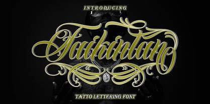 Introducing Faikinlan Tattoo Lettering Font with more details, clean, and more complex. Faikinlan includes uppercase and lowercase letters, numerals, a large range of punctuation, ligatures and multilingual language. All lowercase letters include ending swashes and alternative font. Faikinlan swash In order to use the beautiful swashes, you need a program that supports OpenType features such as Adobe Illustrator CS, Adobe Photoshop CC, Adobe Indesign and Corel Draw. Please contact us if you have any question, we are happy to help you! Thank you !
 - Space Traveler JNL by Jeff Levine,
$29.00 The 1990s was a time of creativity, experimentation and exploration into the world of digital typography by amateur and professional alike. Ray Larabie [through his Larabie Fonts] offered dozens upon dozens of wide-ranging (and often most unusual) freeware fonts. Ray was the driving force of encouragement and a behind-the-scenes “mentor” who helped Jeff Levine Fonts get underway in January of 2006. As his focus changed to high-quality commercial type with the launch of Typodermic, Inc., many of Ray’s “less than perfect” font experiments were withdrawn. He eventually turned those typefaces into a bundled zip archive released into the public domain through Creative Commons. “Webster World” resembles a fusion of Techno and Western styles. With Ray's permission, the original characters have been cleaned up and re-made as Space Traveler JNL, which is available in both regular and oblique versions.
 - Bellfort Draw by GRIN3 (Nowak),
$19.00 Bellfort Draw family is a hand-drawn version of the Bellfort family. It features 5 different sub-families: Regular, Rough, Hollow, Dark, Script. Each of these sub-families contains up to three font weights. When the font is used in OpenType-savvy applications, the 3 variants of glyphs are automatically alternated to achieve a random-like effect. When not using the Contextual Alternates feature, you can still pick the alternates in the Glyphs palette or use the alternates available from the keyboard upper and lower case. Bellfort Draw Script is a handwritten, fully connected script with ligatures and contextual alternates to help with flow and readability. Language support includes Western, Central and Eastern European character sets, as well as Baltic and Turkish languages.
 - Totemic by Canada Type,
$29.95 Jim Rimmer’s first typeface was originally published in 1970 as a basic film type alphabet through a small, independent type house in central California. Its sources of influence (now calligraphic type standards by Dair, Goudy and Zapf) are ones that remained with Jim for the rest of his career. If you squint at Totemic in just the right way, you can see some recognizable themes Jim would later flesh out and make his own in later works throughout his career as a type designer and printer. Totemic is now available for the first time as a digital font, of the refined and expanded kind now expected from Canada Type. It comes with quite a few standard advanced typography features: Small caps, caps-to-small-caps, automatic fractions and standard ligatures, stylistic alternate sets, six kinds of figures, case-sensitive forms, and extended Latin language support. It also comes with a very unique and unprecedented feature: Variably stackable totem poles. Simply enable the discretionary ligatures feature, type any unique three-digit combination using numbers between 1 and 4, and watch the magic happens. With a name like Totemic, we just couldn't help ourselves. Many thanks to Andrew Steeves of Gaspereau Press for finding Jim’s lost gem in a most unexpected place, and for helping us bring it back to life 45 years after its analog birth. 20% of Totemic’s revenues will be donated to the Canada Type Scholarship Fund, supporting higher typography education in Canada.
 - Steamfunk by MKGD,
$13.00 The font Steamfunk is based on Steampunk. A form of science fiction that couples Victorian era style with futuristic devices operated by early industrial age technology. Each Steamfunk letter is constructed in two symbolic parts. A thick stroke, for the machine’s outer shell, and a second, wire-like, stroke for that machine's delicate inner workings. The result is a look that is Steampunk in appearance, without it being exclusively so. Steamfunk has a glyph count of 398 and supports the following languages; Afrikaans, Albanian, Asu, Basque, Bemba, Bena, Bosnian, Catalan, Chiga, Colognian, Cornish, Croatian, Czech, Danish, Embu, English, Esperanto, Estonian, Faroese, Filipino, Finnish, French, Friulian, Galician, German, Gusii, Hungarian, Icelandic, Indonesian, Irish, Italian, Kabuverdianu, Kalaallisut, Kalenjin, Kamba, Kikuyu, Kinyarwanda, Latvian, Lithuanian, Low German, Lower Sorbian, Luo, Luxembourgish, Luyia, Machame, Makhuwa-Meetto, Makonde, Malagasy, Malay, Maltese, Manx, Meru, Morisyen, North Ndebele, Norwegian Bokmål, Norwegian Nynorsk, Nyankole, Oromo, Polish, Portuguese, Romanian, Romansh, Rombo, Rundi, Rwa, Samburu, Sango, Sangu, Scottish Gaelic, Sena, Shambala, Shona, Slovak, Slovenian, Soga, Somali, Spanish, Swahili, Swedish, Swiss German, Taita, Teso, Turkmen, Upper Sorbian, Vunjo, Walser, Zulu.
 - Herschel by Tried & True Supply Co.,
$30.00 Herschel ventures into the elaborate world of late 19th-century typography to bring its winsome charm and compelling aesthetics into modernity. Staying true to the spirit of its historical era of inspiration, Herschel was designed with extreme attention to detail. Although its aesthetic roots are firmly planted in the treasury of Gilded Age typography, it has been technically constructed to withstand all the rigorous demands that modern technology places on type today. Herschel’s nostalgic, flared, and gently bifurcated serifs shine brightest when employed as display type, but are suited well for any application where inimitable character is needed. Named after designer Brian Brubaker’s maternal grandfather, a retired dairy farmer of more than 60 years, Herschel is available in six delectable weights: Skim, One Percent, Two Percent, Whole, Creamline, and Butter. Features overview: • 800+ glyphs per weight • 120+ stylistic alternates • Upper and lower case • Titling/Drop capitals with multiple and contextual ligatures • Lining, oldstyle, proportional, and tabular figures • Standard and discretionary ligatures • Unique dingbats and special characters • International language support for 200+ latin-based languages, including Vietnamese
 - Asoka by Gian Studio,
$12.00 Asoka font is a modern, dynamic handcrafted font that also has beautiful opentype features. Antares font is great for Branding, Logo Design, Fonts, Logotype, Clothing, Posters, magazines and other design projects. Asoka featuring OpenType style alternatives, ligatures and International support for most Western Languages is included. To enable the OpenType Stylistic alternative, you need a program that supports OpenType features such as Adobe Illustrator CS, Adobe Indesign & CorelDraw X6-X7, Microsoft Word 2010 or a later version. How to access all alternative characters using Adobe Illustrator: https://www.youtube.com/watch?v=XzwjMkbB-wQ Asoka Script is encoded with PUA Unicode, which allows full access to all additional characters without having to design special software. Mac users can use Font Book , and Windows users can use Character Map to view and copy any additional characters to paste into your favorite text editor/application. How to access all alternative characters, using the Windows Character Map with Photoshop: https://www.youtube.com/watch?v=Go9vacoYmBw If you need help or have any questions, let me know. I'm happy to help :) Designers: Afri Giani Publisher: Gian Studio Thanks & Happy Designing! Thank you very much.!
 - Hello Cartel Story Script Duo by Attract Studio,
$13.00 Hello Cartel Story Script FONT DUO is a new modern script font with irregular base lines. Trendy and feminine style. Hello Cartel Story Script looks beautiful in wedding invitations, thank-you cards, quotes, greeting cards, logos, business cards, and more. Perfect for use in ink or watercolors. Includes initial letters and terminals, alternatives and support for many languages. Include file: Hello Cartel Story Script.OTF Hello Cartel Story Sans.OTF To activate the OpenType Stylistic alternative, you need a program that supports OpenType features such as Adobe Illustrator CS, Adobe Design & CorelDraw X6-X7, Microsoft Word 2010 or newer versions. There are additional ways to access alternatives / swash, using Character Map (Windows), Nexus Fonts (Windows), Font Books (Mac) or software programs such as PopChar (for Windows and Mac). How to access all alternative characters, using Windows Character Map with Photoshop: https://www.youtube.com/watch?v=Go9vacoYmBw How to access all alternative characters using Adobe Illustrator: http://youtu.be/iptSFA7feQ0 How to use a stylish font set in Microsoft Word 2010 or later versions: https://youtu.be/x1A_ilsBsGs Need help or have questions, let me know. I am happy to help :) Thank you & Congratulations on the Design!
 - Celestina by Piñata,
$- Celestina is the lively spirit, just like drops of ink on a piece of paper or clouds in the sky. The same spirit is maintained by the rounded letters of the script and by the characters' small whorls. Celestina has come to life as a result of a peculiar game in which I tried to bring together the letters with different tempers with help of calligraphic instruments. I wanted to create a very light and playful font which would look like a quick inscription on a piece of paper, but would also be easy to read in a text array. As I was working on the font, my cat Celestina has been very interested in the brush painting process, and I had no other option but to name the font after her! Celestina works perfect for both Moomins stories and personal blogs, as well as for the design of hand-made things, and even just then when you want to put yourself into a good mood!
 - Benda by Suitcase Type Foundry,
$45.00 Benda is a modern geometric script font with roots in the calligraphy and lettering of legendary artist Jaroslav Benda. With bold, predominantly low joins, the robust monolinear character strokes shine in one-word and short inscriptions as well as in longer headlines. The practical letterforms do not clutter the space with loops and curlicues, while the emphasised baseline helps to underline the importance of the message. What’s more – Benda is a smart font, automatically replacing conflicting characters with suitable alternatives as you write so that the final text flows seamlessly. Because Benda is the sequel to Jaroslav, it derives the slant, colour, and geometric characteristics from the sans typeface, forming the perfect companion to the font. So much so, it can serve as a second italic emphasis in long texts.
 - Sangect Display by Pista Mova,
$14.00 The display typeface is a modern take on a classic style. While paying homage to old-style type sensibilities, Sangect Display takes the characteristics of serif type and leans into drama and boldness with strong contrast in stroke width, and soft edges. Sangect Display appearance emphasizes elegance and elegance; ideal for loud and proud headlines. Which is included in the file Capital letters Lowercase Number Ligatures Alternative Symbol Multilingual Accents (Uppercase and Lowercase) The download includes the Sangect Display font in an (Open Type Font) file, and as a (True Type Font) file. If you have any questions, or are experiencing technical difficulties with a downloaded file, please send a message and I will be happy to help you!
 - LOLO Animals by Okaycat,
$24.50Ready for the wild & wooly world of LOLO Animals? These animals are happy to explore new habitats with you. There are more than 50 different animals residing in here, its a full out ecosystem. Looking for specific animals? Check out the keyword list above, for an idea of what kind of animals are included, or see the full character map to meet them up close & personal. Each vector illustration was developed by Luke Turvey, a professional artist, who's nature-themed art has appeared in exhibitions in Montreal, Tokyo, & N.Y.C. LOLO Animals are a great help, whenever you need some cool looking animals. LOLO Animals is a fully extended character set, with animals stampeding all over the alternate spots that are typically reserved for the West European diacritics & ligatures. You never know what you might find stomping around in there. - Marriage Monograms by Kaer,
$24.00 At this time I found the Album of monograms – a guide for doing handicrafts in families and educational institutions. It was published in St. Petersburg in 18ХХ. Finally, I found an authentic English style monograms set. These monograms are characterized thin swirled lines and lush foliage patterns. I manually redesigned and vectorized two sets of alphabets (narrow and wide) and happy to introduce you Marriage Monograms font. You’ll get the set includes Wide and Narrow capitals, so you can make your own monogram, by combining letters you want. +SVG file as well. Please note, you should use graphic applications such as Adobe Illustrator or Photoshop, but not Microsoft Word. All you need is place the Narrow one on top of the Wide one. Please feel free to request any help you need: kaer.pro@gmail.com All the best, Roman.
 - Giulietta by GRIN3 (Nowak),
$26.00 Giulietta is a handwritten, fully connected script with ligatures and contextual alternates to help with flow and readability. It can be used for invitations, greeting cards, posters, advertising, weddings, books, menus etc. Giulietta pro is the most complete style, it contains over 830 glyphs, 7 stylistic sets, contextual alternates and ligatures. Every lowercase letter has seven variations (uppercase letter has three). To get the alternate glyphs choose various stylistic sets or just add "*1", "*2", "*3", "*4", "*5","*6" or "*7" before the letter in any OpenType savvy application or manually select the characters from Glyph Palette. Giulietta A, Giulietta B and Giulietta C have less glyphs than the Pro one, they only contain some selected alternates and ligatures. Language support includes Western, Central and Eastern European character sets, as well as Baltic and Turkish languages.
 - Second Reign by Mans Greback,
$59.00 Second Reign is a decorative medieval typeface. With borders and diamonds, this magic typeface of extreme variability brings us to glorious worlds in the golden times of epic sagas. Second Reign is the typeface of a viking king or a knight order. Use it for a Middle Ages game, a fantasy headline, or as a logotype for anything of historical theme. With usage in any modern software, the letters will automatically overlap and embrace in an elegant way. To make heraldic symbols, copy these icons: 🐉 🐎 👑 🗡 🦁 🦅 🦌 + ♖ × ✝ ⚓ * ⚔ † ‡ Alternatively write %A %B %C ... etc to create the heraldry. (Download required.) Dragon, Horse, Crown, Sword, Eagle, Deer, Cross, Anchor are some of the logos. Use [ ] for side borders. Example: [Royal⚔Thrones] The Second Reign family consists of four variations: The weight styles Thin, Medium and Bold, plus the decorated Border style. The font is built with advanced OpenType functionality and has a guaranteed top-notch quality, containing stylistic and contextual alternates, ligatures and more features; all to give you full control and customizability. It has extensive lingual support, covering Greek and Cyrillic, as well as all Latin-based languages, from North Europe to South Africa, from America to South-East Asia. It contains all characters and symbols you'll ever need, including all punctuation and numbers.
 - Rex Stephane by Mans Greback,
$79.00 Rex Stephane, designed by Mans Greback, is a striking blackletter font that artfully blends medieval influences with modern geometric shapes. Inspired by the tall stature of Gothic architecture, merged with sharpened edges, this font captures the essence of strict ruling while having an elegance of the Middle Ages. First imagined while exploring an abandoned castle, the typeface is based on ancient manuscripts adorned with calligraphic lettering. These texts became the foundation for Rex Stephane, as Mans Greback aimed to recreate the rich history and grandeur of the medieval era while adding his own contemporary twist. The font is built with advanced OpenType functionality and has a guaranteed top-notch quality, containing stylistic and contextual alternates, ligatures, and more features; all to give you full control and customizability. It has extensive lingual support, covering all Latin-based languages, from Northern Europe to South Africa, from America to South-East Asia. It contains all characters and symbols you'll ever need, including all punctuation and numbers. Mans Greback is a Swedish typeface designer with a passion for creating unique and versatile fonts. With an extensive background in design and typography, Mans has built a reputation for his meticulous attention to detail and prolific craftsmanship. His many fonts are widely used by designers around the world, making his work synonymous with creativity and innovation.
 - Ervha by Yukita Creative,
$9.00 Introducing Ervha Modern Sans Serif Typeface Ervha is a modern sans serif font with a minimalist and trendy style. This font has 10 styles from thin to extra black Perfect font for print and digital projects. Quality fonts can help your projects become more modern and classy. This font also supports other languages The clean and sharp lines of sans serif fonts are the main reason many graphic designers prefer this font style for both screen and print use. Clean lines and sharp edges can be displayed more clearly on the screen which improves legibility for users. What do you get when you buy this font? Ervha is one font you need Affordable and versatile Multilingual support and complete character set Designed by a Typeface Designer Get one font for any occasion Multilingual support in this modern sans serif font Well known for its exceptional readability Enhance your Project by using Ervha Sans Serif Modern as your font of choice.
 - Gene Condensed JNL by Jeff Levine,
$29.00 Gene Gable is known to many graphic artists from his on-line column 'Scanning Around with Gene', which was on the Creative Pro website for a number of years, covering a variety of topics ranging from printing techniques to paper ephemera; water applied decals to lettering stencils. Gene has also been a great help in providing vintage source material to Jeff Levine, which resulted in many additional font designs. It seems only fitting that he should be bestowed with his own-named font as well. Gene Condensed JNL is offered in both regular and oblique versions.
 - Drumbeat by EdyType,
$60.00 DRUMBEAT, a brand new face from Edy Type, coming to help resolve the necessities of loose scripts in Packaging and Editorial Design. Its' very particular thicks and thins and ups and down, makes it very suitable whenever informalities is required. Used with tiny little characters, enlarged to mammoth sizes or filling a large page with it, would show it’s perfect balance and color, almost as if where hand writen. In fact, a truly different script, a graphologist would declare that is written by a person very sure of what he wants, and besides and best of all, it’s pretty.
 - Kiperman by Harbor Type,
$29.00 🏆 Selected for Tipos Latinos 9. 🏆 Selected for the 13th Biennial of Brazilian Graphic Design. 🏆 Hiii Typography 2018 Merit Award. Kiperman is a text typeface designed in honor of Henrique Leão Kiperman, founder of the publishing house Artmed, now Grupo A. Its forms are simple and straightforward, with no unnecessary embellishments that could disturb the reading. The fonts are slightly narrower than normal, which yields higher efficiency without compromising reading comfort. Besides that, its italics are not just a slanted version of the romans, but rather a separate drawing. With a slope of 8°, its calligraphic structure provides the right amount of emphasis when necessary. The Kiperman typeface works best when setting books, magazines, ebooks and websites. It will also work very well in branding and packaging projects where a sober typeface is needed. The inspiration for the design came from the personality of the honoree. Just as Henrique always wanted to stay away from spotlights, the Kiperman typeface was designed so that it would not call attention to itself or impose any obstacles in the understanding of the text. In this way, the fonts revere Henrique’s legacy by respecting and honoring the published content. Henrique Leão Kiperman began his career in 1958, selling medical books in travels through the interior of the Brazilian states of Paraná and Santa Catarina. In 1973, he opened a bookstore in downtown Porto Alegre, the Artes Médicas Sul, and a few years later edited his first book. Since then, his company has grown to become one of the most important publishers in Brazil in the area of scientific, technical and professional books, with more than 2400 active titles distributed among the McGraw Hill, Bookman, Artmed, Penso and Artes Médicas imprints. Henrique passed away in 2017 at the age of 79. The Kiperman type family has been commissioned by Grupo A and is available for licensing. This was the way found for the fonts to be read by more people, spreading some of his spirit around the world.
 - Stout Boots by Putracetol,
$24.00 Stout Boots is a bold style serif font with strong character and soft features. Stout Boots is equipped with Swash, Stylistic and Titling alternates as well as with Standard and Discretionary Ligatures And this font Stout Boots is a stylish font that is both retro and bold font. It's thick curves give a groovy vibe with the serifs bringing it slightly back to traditional. Comes with alternatives and ligatures, helps to create stunning logos, quotes, posts, blog posts. branding projects, magazine imagery, wedding invitations, and much more. The alternative characters were divided into several Open Type features such as Swash, Stylistic Sets, Stylistic Alternates, Contextual Alternates, and Ligature. The Open Type features can be accessed by using Open Type savvy programs such as Adobe Illustrator, Adobe InDesign, Adobe Photoshop Corel Draw X version, And Microsoft Word. This font is also support multi language.
 - Sheridan Gothic SG by Spiece Graphics,
$39.00 Sheridan Gothic, also known as Grant Antique, is a quaint design produced in the late nineteenth century. Its proportions are in keeping with extra condensed faces of the times. Its uppercase letters are quite narrow. Its lowercase letters are equally narrow and tall. This pleasant and enduring design contains a touch of novelty, too. Swelled terminal flourishes on such characters as C, J, S, c, e, r, and s help add interest and warmth to what is basically a friendly old soul. Sheridan Gothic is now available in the OpenType Std format. Some new stylistic alternates have been added to this OpenType version. Advanced features work in current versions of Adobe Creative Suite InDesign, Creative Suite Illustrator, and Quark XPress. Check for OpenType advanced feature support in other applications as it gradually becomes available with upgrades.
 - Korsen by Asenbayu,
$12.00 Korsen font is a unique multipurpose font that consists of 5 styles. Korsen font has an attractive appearance which is a combination of serif, slab and decorative fonts. Each letter is carefully crafted with rounded edges. You can use this font for retro, vintage and modern designs. Korsen font can help you complete various projects such as brand logos, headlines, products, social media posts, web and much more. Korsen fonts feature opentype, kerning, ligature and alternate packed in 5 styles: Light, Regular, Medium, SemiBold and Bold. Korsen fonts include uppercase letters, lowercase letters, numeral, punctuation and multilingual support. Thank you! FYI: To use the alternate and ligature features, please look in the Glyph Panel / Character Map in your software to be able to access all the glyphs in this font. There are standard and discretionary ligatures.
 - Sgraffio by Eurotypo,
$48.00 Sgraffio is a classic script font with an elegant contemporary style. Inspired by the CopperPlate script, it is an updated viewpoint. The special characteristics of this typeface is that its strokes are agile and dynamic, with slight and smooth variations in thickness, giving to the final art a sophisticated atmosphere. It is attractive and readable. It can be used in decorative titles, as well as in large readable text. Contain a useful set of OpenType features that can help you in many typographic fine adjustments, you can choose from different alternates, swashes, discretionary and standard ligatures. This fonts is completed with Old Style figures and Central European languages. It is ideal for fashion magazines, advertising, business web, logotypes, lettering - logotypes, e-commerce brands, books, greeting / wedding cards, packaging, labels or any type of effective visual communication purpose.
 - Retroparty by Putracetol,
$21.00 Introducing Retro Party - A Display Retro Script Font. In creating this font, I just wanted to combine classic style with modern retro style, so be this font. Hope you like it. Inspired by some retro fonts that I made before. Retro Party is perfect for vintage and retro design, badge, logos,t-shirt, poster, branding, packaging, signage, book coverand so much more! Come with Opentype feature with a lot of alternates, its help you to make great lettering. This font is also support multi language.
 - Ballpricks by Martype co,
$18.00 Ballpricks Script is a vintage script font designed with carefully handcrafted. Good for branding, T-shirts, label design, any vintage and retro design, headlines, logotypes, and any project with script font purposes. This font also can make you happy when you design something even that you don't like, and of course, this font makes your design flawless and come with reasonable prices for this unique font. Multilingual Support support many different languages 20+ . Additional Information Need anything to help? Email me at: hello@martype.co Thanks! Umar
 - Anton Charlote by Gloow Studio,
$16.00 Introducing Anton Charlote - A Display Retro Script Font. In creating this font, I just wanted to combine classic style with modern retro style, so be this font. Hope you like it. Inspired by some retro fonts that I made before. Anton Charlote is perfect for vintage and retro design, badge, logos,t-shirt, poster, branding, packaging, signage, book coverand so much more! Come with Opentype feature with a lot of alternates, its help you to make great lettering. This font is also support multi language.
 - Mariage by Linotype,
$40.99Morris Fuller Benton, the principal designer of the American Type Founders, designed Mariage in 1901. Mariage, which has been sold under a plethora of different names during the last century, is a blackletter typeface belonging to the Old English category. The term blackletter refers to typefaces that stem out of the historical printing traditions of northern Europe. These letters, called gebrochene Schriften, or "broken type" in German, are normally elaborately bent and distorted. Their forms often print large amounts of ink upon the page, creating text that leaves a heavy, black impression. The Old English style is a subset of blackletter type that dates back to 1498, when Wynken de Worde introduced textura style printing to England. Continental printers had been printing with textura style letters since Gutenberg's invention of the printing press fifty years earlier. Italian printers stopped using them around 1470. For northern Europeans, texturas remained the most popular form of typeface design until the invention of the fraktur style in Nuremberg. Mariage is heavily classicized sort of Old English type. During the Victorian era, designers admired the Middle Ages for its chivalric, community-based values and its pre-industrial lifestyle. Yet they also found the basic medieval textura letterform too difficult to read by present standards. They desired to modernize this old style. Today, this sort of update is often referred to not as "modernization" but as classicism. Benton's design for ATF builds upon earlier Victorian classicist interpretations of Old English/textura letters. For an example of what these Victorian designs looked like, check out the popular 1990 revival of the genre, Old English . Old English style types often appear drastically different from other blackletters. For contrast, compare Mariage to a classical German fraktur design, Fette Fraktur , a schwabacher style face, or the popular early 20th Century calligraphic gothic from Linotype, Wilhelm Klingspor Gotisch . Especially in the United States, classicist Old English typefaces are thought to espouse tradition and journalistic integrity. These features, together with the inherent, complex beauty of Mariage's forms, make this typeface a perfect choice for certificates, awards, and newsletter mastheads. - Rainier by Kimmy Design,
$10.00 I was inspired to create the Rainier type family during my summer back home in the Pacific Northwest. The concept behind it may be simple - a hand crafted font family - but what it delivers is quite complex! Here is a breakdown of everything you get: FONT FAMILIES: Two sub-families with unique styles - Rainier North and Rainier West WEIGHTS: 4 weights per family, broken down numerically - 100 (light), 300 (regular), 500 (bold), 700 (black) OPENTYPE: In each family, there are tons of OpenType options, offering lots of customizable opportunities (in order to access all these goodies, you must be using Illustrator, Photoshop, Indesign or Publisher). Because Rainier is 100% handmade, contextual alternatives allow each letter has three subtle variations, this way it keeps that authentic hand-drawn look. Additionally, a full alphabet with special descending swashes, as well as start and end swashes for capitals and small caps. Titling alternatives offer a full character set just to help with readability! Meant for captions or smaller text, these letterforms are easy on the eye and a great complement to the regular alphabet. Stylistic Alternatives add a little fun, providing a unified cap height, no matter what case you are using (all caps, small caps or lowercase.) Discretionary Ligatures are created only for capitals, and takes specific letter pairs and creates a unique ligature between them To get a better understanding of everything, please check out the quicker user guide (http://bit.ly/1W0Bfma) and print if you so desire (http://bit.ly/23W9ZV6) that helps you navigate your way around and get the most out of Rainier! Unfortunately those links aren't working right now and soon I will have them fixed. So sorry! ORNAMENTS: In addition to the font, you get a set of awesomely rustic ornaments designed and drawn to go specifically with Rainier! - Rustic Northwest Illustrations - Banners & Flags - Frames - Flourishes - Lines & Line Breaks - Arrows There are a lot of extras packed in this set, so make sure you check out the Ornaments User Guide to get the most out of it! Check it out here: http://bit.ly/1rRVJRx And that’s all folks! Hope you enjoy Rainier!
 - Cowgirl by By Meg Burk,
$25.00 An uppercase font that has versatile character. Got a story to tell? Cowgirl can help you tell it. Includes western-themed vector illustrations handmade by Meg Burk. I grew up spending almost every family vacation as a road trip across the southwestern US. In these adventures, I fell in love with learning about the nature around us; deserts, mountains, plains, piñon trees, rainbow trout, black bears, eagles, and more. I fell into freezing cold white water rapids, explored long-abandoned cliff dwellings, camped under the Milky Way, saw old cave markings, stone markings, preserved art, and read many a many old map legends. These memories are visceral and the inspiration that I get from them permeates my every day. Take a piece of these stories with you and use them in your designs, too. Handmade, meant to last a lifetime and inspire others for decades to come.