4,812 search results
(0.022 seconds)
- Hyper Turfu by Bisou,
$10.00 Made in La Chaux-de-Fonds (Switzerland), HyperTurfu was born during the shooting of “The Return of Hyperturfu Xpress 2”. A GoPro on a lego electric train, meters and meters of rails, an empty industrial space, loads of puppets, paper, cardboard, pizza boxes, lights, hot glue and a bunch of friends preparing a one shot scene for a month. The title of the movie was made out of lego pieces, painted with golden spray and hanged over the rails. It was the first inspiration for this awsome superbold font. HyperTurfu is thought from ground up to give a strong impact. It’s gothic retro science fiction 80’s style makes it best suitable for metal music albums or posters. As the “Banco” font it works perfectly with short texts for advertisement, bar, cofee shops concert places or even fancy hairdresser. Just hang it over a pet shop and see what cool animals will come in.
 - Mundbind NL by Hanoded,
$15.00 I just visited my good friend Jakob Fischer from Pizzadude.dk in Denmark. As always we talked fonts, drank coffee and walked endlessly through Copenhagen, the city where he lives. We thought it would be a fun idea to each create a font from a handmade sign we saw in the city. We only had like 7 glyphs to work with, so the rest was up to our imagination. We also thought it would be nice to give the fonts a similar name. Mundbind means mask in Danish. When you Google translate it, it will give you the wrong translation (it will say 'mouth piece'), so trust me on this one! My font is called Mundbind NL - where the NL stands for Netherlands. Jakob will hopefully call his finished font Mundbind DK - where the DK stands for Denmark. Mundbind NL comes with a monster load of diacritics (including Vietnamese) and two alternate glyphs for the lower case letters that will cycle as you type.
 - Quars by Letterjuice,
$66.00 Quars is a text and display typeface family designed to work on magazines. However, it is also suitable for books and other editorial material. It has a strong personality with elegant, sharp and contemporary features. This typeface comes from several subtle influences, from the contrast of the Scotch Romans to the sharpness of contemporary Dutch designers. Quars is a crystal clear and neat typeface full of small details, its structure is bursting with curves and accurate features which gives it its firm personality. Its italic experiments with the boundaries of italics themselves; with just 1 degree of slant Quars Italic accomplishes its purpose of highlighting pieces of text within its Roman. This carefully thought out inclination protects the uppercase from the usual distortion which Italic caps suffer. It offers a generous glyph set with many ligatures specially crafted for titling and ornaments based on anonymous metal types found in the drawers of an old printing workshop in a coast town near Barcelona.
 - The Beatrix by Shakira Studio,
$17.00 Say hello to new serif font, The Beatrix! The Beatrix is a serif font that offers the perfect combination of modern and retro feel to each letter. Bold and well-contoured in character, The Beatrix embodies a boldness and charm that cannot be overlooked. The design exudes classic serif elegance but with a touch of fresh, up-to-date style. The Beatrix accentuates uniqueness with a variety of stylish alternatives. Each character alternative provides an interesting creative dimension, presenting a fun combination of modern and retro styles. You as a designer have the freedom to explore and express your unique ideas through captivating typography. The Beatrix is an ideal choice for a variety of design projects. With a modern and retro feel, this font is suitable for use in headlines, logos, branding, marketing materials, posters, and many more. Whether it's a project that wants to convey a contemporary feel or explore the charm of the retro era, The Beatrix has the flexibility to adapt and deliver a strong message. Here's what you get: The Beatrix Regular All Multilingual symbol Opentype features ( ligature, alternate ) Accessible in the Adobe Illustrator, Adobe Photoshop, Adobe InDesign, even work on Microsoft Word. PUA Encoded Characters - Fully accessible without additional design software. Multilingual character supports : (Afrikaans, Albanian, Catalan, Croatian, Czech, Danish, Dutch, English, Estonian, Finnish, French, German, Hungarian, Icelandic, Italian, Lithuanian, Maltese, Norwegian, Polish, Portuguese, Slovenian, Spanish, Swedish, Turkish, Zulu) Follow my shop for upcoming updates, and for more of my work, Thank you!
 - Store Clerk JNL by Jeff Levine,
$29.00 The cover of the 1929 sheet music from the First National/Vitaphone picture “The Girl from Woolworth’s” had its title (“Someone”) hand lettered. This single word title was the model for Store Clerk JNL, which is available in both regular and oblique versions as well as solid and solid oblique versions (without an inline). A bold, casual sans serif with rounded ends and an inline, Store Clerk JNL is perfectly suited for projects where a strong, yet playful title is necessary to grab the reader’s attention. For those old enough to remember, Woolworth’s was a leading “Five and Dime” store chain, especially in the days when a nickel or a dime actually could purchase something.
 - 1492 Quadrata by GLC,
$38.00 Font designed from that used in France in 1492 to print the peace treaty between French and Enqlish Kings in Etaples, French town in Normandy. This font include "long s", naturally, as typically medieval, and only a few special characters as there were not very often used in the text, no more than abbreviations. Added, a lot of accented characters no longer existing on this time. A render sheet, joined with the font file, makes it easy to identify on a keyboard. This font is used as variously as web-site titles, posters and fliers design, editing ancient texts, greetings... This font supports as easily enlargement as small size, remaining a readable and beautiful regular gothic.
 - Universal College by Fontscafe,
$39.00 If there is one Fonts Café specially-priced pack that deserves the title "TEAM" it's "Universal College." Together, these two vintage, college-style fonts: the original CLASSIC, and our latest "DRAFT" pick, are the no-sweat, first line players for all your varsity design challenges and goals. Classy enough for every sport, season or celebration, and casual enough for any campus clothing creation. "Universal College" typefaces are also available individually: our original classic version has the handcrafted, retro feel that Fonts Café best-selling typefaces are world famous for. "Draft" has the edge that designers worldwide have come to expect from fontscafe.com and that you can find in many of our other retro and vintage typefaces.
 - Gilway by Art Grootfontein,
$20.00 Gilway is a playful, rounded display with tons of personality. This versatile typeface is inspired by the earliest examples of rounded types from the 19th century, such as Caslon Rounded (1836) and Schmale Runde Grotesk (1885). Gilway has a distinctive hand-lettered feel because of its subtle variances, which make it powerful and impactful yet incredibly friendly. Layered options allow you to combine the various styles, and a unique Opentype feature makes your letters dance! To take full advantage of Gilway's features, please download this one-sheet pdf file. Please take a look at this video demo to see Gilway family in action ! Gilway’s design is suited for a wide range of uses, including headlines, displays, packaging and logotypes.
 - Dip Pen JNL by Jeff Levine,
$29.00 Answer Songs have been around for [probably] just as long as there have been songs. 1917's "If I Catch the Guy Who Wrote Poor Butterfly" was the answer to the 1916 hit "Poor Butterfly" [by Raymond Hubbell and John Golden], which in turn was inspired by the Puccini opera "Madame Butterfly". "Poor Butterfly" was so popular that this "answer" tune had as part of its lyrics "That melody haunts me in my sleep; it seems to creep." Nonetheless, the sheet music for William Jerome and Arthur Green's comic lament had the title hand lettered with an oval nib lettering pen and is now availably as a digital type face called Dip Pen JNL.
 - Deadline Remastered by Comicraft,
$29.00 The hands on the clock tick inexorably on... the numbers on the digital display roll inevitably toward zero... time is tight, the fuse is getting shorter and the beads of sweat on your forehead are glistening in the red light of the LCD... you have come to a place where the only thing you feel are loaded guns in your face... can YOU handle the DREADED DEADLINE DOOM?!? TICK TICK TICK TICK TICK TICK TICK TICK TICK THRAKAKAKATHOOM! Uh oh… you blew it. Deadline Remastered features 18 static weights, including the new nearly square "Block", each with complete Western & Central European language support. Use the Solid & Open Variable fonts to access unlimited width and angle options.
 - 1859 Solferino by GLC,
$38.00 This font is a late 19th Century French script overview inspired by numerous French letters, from around years 1850-1860, during the second French empire, under Napoleon the third. Most of them were written with very tiny characters on light sheets of paper, as postage prices were calculated from the letter's weight. The TTF and OTF versions are enriched with more than 50 ligatures and/or alternate characters. We also offer a choice of two sorts of Capitals. Why "1859 Solferino"? It was the last battle of the Italian independence war, opposing the victorious Franco-Italian army to Austria in June 24, 1859. The Red Cross was inspired directly from the carnage remaining on the battle field.
 - Linotype Sicula by Linotype,
$29.99Linotype Sicula, from German designer Roberto Manella, is part of the TakeType Library, chosen from the entries of the Linotype-sponsored International Digital Type Design Contest 1999 for inclusion on the TakeType 3 CD. It is available in two weights, regular and oblique. Linotype Sicula will quickly win over any nostalgic spirits. Ornamental and sweeping, the figures line up on the paper, their contrasting strokes and playfully irregular forms giving them an exuberant, decorative character. The careful details of each figure come to light best when used in larger point sizes. Linotype Sicula is therefore best for headlines and can easily inspire typographic experiments and its capitals can serve as initials combined with other typefaces, especially sans serif. - Lunation by Ditatype,
$29.00 Lunation is a versatile script font that marries the charm of script fonts with a contemporary twist. Crafted with a fairly bold weight to command attention. Its slightly reduced contrast ensures that each character stands out clearly, providing optimal readability in various design applications. The defining characteristic of Lunation is its carefully crafted swinging endings. These artistic flourishes gracefully embellish specific letters, lending an air of sophistication to your text. The subtle yet distinctive curves and sweeps add a playful rhythm. Lunation fits in headlines, logos, posters, flyers, invitations, branding materials, print media, editorial layouts, and many more designs. Find out more ways to use this font by taking a look at the font preview.
 - 1532 Bastarde Lyon by GLC,
$38.00 Font designed from work by an anonymous printer in Lyon (France) to print the French popular novel Les Grandes et inestimables Chroniques du grand et enorme geant Gargantua [...] in 1532. The original font has a relatively small number of characters. This font include a “long s”, as typicaly medieval, but also a few ligatures . A render sheet, enclosed with files help to identify them and accented or special others characters on keyboard. It can be used as web-site titles, posters and fliers, editing ancient texts, menus or greeting cards as a very decorative font... Although this font remains clear and easy to read from 8 or 9 points on screen, it is clearly designed for print works.
 - Nouveau Theme JNL by Jeff Levine,
$29.00 As long as there’s been movie theaters, those establishments became the perfect hideaway for couples who wanted to kiss, hug and snuggle without the watchful eyes of disapproving parents or the pesky attention of younger siblings. Such was evident in the [13 word] title of the 1919 composition “Take Your Girlie to the Movies (If You Can’t Make Love at Home)”. On the sheet music for this song, it is hand lettered in the Art Nouveau fashion of the time by a round nib pen, and made a perfect candidate to be redrawn as a digital typeface. The end result is Nouveau Theme JNL, which is available in both regular and oblique versions.
 - Uptown Review JNL by Jeff Levine,
$29.00 Cover art for the 1933 sheet music of Harold Arlen and Ted Koehler's "Stormy Weather" (from the musical production "Cotton Club Parade") listed the cast of the show in a condensed hand lettered sans that typified the 1930s and the Art Deco era. This served as the inspiration for Uptown Review JNL; available in both regular and oblique versions. The Cotton Club was a whites-only night club which showcased black acts, and was originally located on 145th Street in Harlem from 1923 to 1935, then existed for a short time in the New York theater district from 1936 to 1940. After the Broadway incarnation of the club closed, its space was taken over by the Latin Quarter.
 - As of my last update in April 2023, "Improvisation" as a specific font may not be widely recognized under that name in the vast landscape of typography. However, let's create an imaginative descripti...
- Shock Block by Wing's Art Studio,
$16.00 Shock Block: An electrifying font powered by science, 80s movies and horror comics. Boasting an eye-catching design that's hand-drawn in pen and ink to replicate the look of classic horror comics, 80s movies and Saturday morning cartoons, Shock Block is a highly volatile font powered by experimental science and 1.21 gigawatts of electricity! User be warned, safety goggles are required! Shock Block is an all-caps design with unique upper and lowercase characters along with numerals, punctuation and language support. It also includes a contrasting 'Block' style and a selection of lighting blot symbols and underlines. It's a unique typeface that's perfect for movie titles, school projects, presentations, comic books, or anything that could do with extra spark. Add a simple electric glow effect using these free presets for Adobe Illustrator, Photoshop and After Effects.
 - Hickertown by Konstantine Studio,
$21.00 Hey there, cats and kittens! Are you tired of the same old fonts cramping your style? Well, look no further than Hickertown - The Cat's Pajamas of Retro Comical Fonts! Hickertown will transport you straight to the Roaring Twenties, where flappers and dapper gents ruled the scene! 🍸✨ It's the bee's knees for all your design needs! These fonts are the real McCoy, capturing the essence of the speakeasy era. Your designs will be the talk of the town! Whether you're jazzing up your posters, covers, websites, social media, logo, branding, or invitations, Hickertown Fonts will add that authentic touch of yesteryear. Your projects will be the duckiest thing since sliced bread! Packed up with many Ligatures and Stylistic Alternates to elevate your design experience furthermore. Don't be a flat tire. Get Hickertown now and let the good times roll!
 - Bertoni by Greater Albion Typefounders,
$12.00 Bertoni is a high contrast Didone family of twenty faces, which combines extreme legibility with distinctive character. It is able to hold its own in modern usage while having features rooted in a deep period charm. The family includes two widths as well as two weights. Bertoni regular, bold and wide are small capitals faces ideal for posters, book covers, packaging and signage. The text faces are body faces which form the ideal accompaniment. For more distinctive features, the Title, Capitals (all capitals, but in two forms) and Flamboyant faces are ideal. Bertoni offers a blend of the modern with classical revivalist charm which makes it up to the minute and never out of place. The family is extensive enough to form the foundation of a commercial house style, but can also lend an element of character in single usage.
 - Goudy by Ascender,
$40.99 Goudy Forum is a revival and dramatic expansion by Tom Rickner, type designer at Ascender Corporation, of Frederic W. Goudy’s 20th typeface design, "Forum Title". The Pro font began twenty years ago while Tom Rickner was a student at the Rochester Institute of Technology (RIT). Tom printed a type specimen using the Forum Title foundry hot metal types. Then in 1993 Tom began to digitize the font from that specimen while working as an independent type designer. Fifteen years passed before Tom dusted off the digital data and began working in earnest on font with a full Latin 1 character set. Steve Matteson, type director at Ascender, encouraged Tom to take this font further still, and soon the glyph repertoire and feature set blossomed to a robust Pro font with a myriad of advanced typographic OpenType features.
 - Blend by Typesenses,
$49.00 Blend is a hand drawn collection that takes its cues from the visual universe of bakeries and coffee shops. The name refers to the combining of different kinds of coffee beans to get a balanced taste, and Blend does just that, although here each typographic flavor can also be enjoyed separately. Projects such as branding, children’s books, wedding invitations and labels are sweetened with this cute family. The bouncing informal Script programmed with Open Type offers a wide range of features like ligatures, swashes, endings, initial forms and lots of alternates. Use professional software that widely support Open Type features. Otherwise, you may not have access to some glyphs. Keep the Standard Ligatures feature always active. For further information about features and alternates, see the User Guide Blend has extensive Western, Central and Eastern European language support. Make some coffee and enjoy!
 - Fastenating JNL by Jeff Levine,
$29.00 Since the 1800s, many patents were issued for methods to hold papers together. The two most popular and enduring tools still in use today are the stapler and the paper clip. In recent times a number of clips in novelty shapes have been available in just about every size, shape and color imaginable. Back in the beginning there were many variations as well, but the purpose of these design variants was to try and command the majority of sales in the fledgling market of bent wire clips by offering a unique and hopefully better product. Fastenating JNL contains twenty-five images based on those early clip designs as well as one classic paper fastener (on the Z and z keys). The standard gem clip has been the most enduring design and is well over one hundred years old.
 - Franklin Gothic Raw by Wiescher Design,
$19.50 When drawing a new font, there is a time when the final form is found – almost – but the curves are not slick and clean yet, that's what I call the "raw" form. Raw – no sweeteners added! In this family I tried to redefine this moment in type development for the eternally beautiful "Franklin Gothic". I call the design "Franklin Gothic Raw", not to be confounded with "rough". The family can be used like any good normal typeface, you hardly see any difference to a conventionally cut "Franklin Gothic" in small sizes. The charm of the design becomes obvious the bigger it becomes, then it enhances your design with its imperfections in the outline. "Franklin Gothic Raw" is therefore an extremely versatile family. I created the cuts, that I considered necessary for the seasoned designer who knows what he's doing. Enjoy!
 - PF Scandal Pro by Parachute,
$79.00 “A couple of years ago, when I was designing a package for a marmalade range, I started having a go at creating a typeface that would suit the package I had in mind. The whole process was intensely appealing to me: from merely using typefaces as an intricate part of my work as an art director, I started exploring the function of each and every element that a typeface consists of. The two things on my mind in designing a typeface for a marmalade brand were firstly, that I wanted it to have a hand-written feel, so as to exude that old-fashioned, homemade quality, and secondly, that it ought to have a certain sweetness and gentleness that would match the product. However, PF Scandal managed to outgrow its original inspiration. As I continued working on it, I toned down some of its elements to make it more versatile. And so, PF Scandal evolved into a typeface that has a contemporary, and yet handwritten look, which makes it suitable for a wide range of uses. The ‘Pro’ version comes with the full array of European characters including Latin, Greek and Cyrillic as well as 120 matching pictograms". -A.S.
 - Joyful Juliana Pro by CheapProFonts,
$10.00 This is Kimberly Gesweins own handwriting, named for a sweet California friend of hers. Kimberly has spotted the original free version of this font in use in the far outskirts of China, and now - with the expanded language support - this Pro version can also be used in more remote parts of the western world. ALL fonts from CheapProFonts have very extensive language support: They contain some unusual diacritic letters (some of which are contained in the Latin Extended-B Unicode block) supporting: Cornish, Filipino (Tagalog), Guarani, Luxembourgian, Malagasy, Romanian, Ulithian and Welsh. They also contain all glyphs in the Latin Extended-A Unicode block (which among others cover the Central European and Baltic areas) supporting: Afrikaans, Belarusian (Lacinka), Bosnian, Catalan, Chichewa, Croatian, Czech, Dutch, Esperanto, Greenlandic, Hungarian, Kashubian, Kurdish (Kurmanji), Latvian, Lithuanian, Maltese, Maori, Polish, Saami (Inari), Saami (North), Serbian (latin), Slovak(ian), Slovene, Sorbian (Lower), Sorbian (Upper), Turkish and Turkmen. And they of course contain all the usual "western" glyphs supporting: Albanian, Basque, Breton, Chamorro, Danish, Estonian, Faroese, Finnish, French, Frisian, Galican, German, Icelandic, Indonesian, Irish (Gaelic), Italian, Northern Sotho, Norwegian, Occitan, Portuguese, Rhaeto-Romance, Sami (Lule), Sami (South), Scots (Gaelic), Spanish, Swedish, Tswana, Walloon and Yapese.
 - Good Selection by Mega Type,
$10.00 Good Selection Font Duo and Extras is a modern scripts with handwriting, decorative characters, designed to perfectly combine informal, sassy, romantic, sweet scripts. Hand-drawn design elements allow you to create many beautiful typographic designs in an instant like branding, logos, web design and editorial, prints, invitations, crafts, quotes, and more. Good Selection Font Duo and Extras features OpenType stylistic alternates, ligatures and International support for most Western Languages. To enable the OpenType Stylistic alternates, you need a program that supports OpenType features such as Adobe Illustrator CS, Adobe Indesign & CorelDraw X6-X7, Microsoft Word 2010 or later versions. How to access all alternative characters using Adobe Illustrator: https://www.youtube.com/watch?v=XzwjMkbB-wQ Good Selection is coded with PUA Unicode, which allows full access to all the extra characters without having special designing software. Mac users can use Font Book , and Windows users can use Character Map to view and copy any of the extra characters to paste into your favorite text editor/app. How to access all alternative characters, using Windows Character Map with Photoshop: https://www.youtube.com/watch?v=Go9vacoYmBw If you have any question, don't hesitate to contact me by email : megatype04@gmail.com
 - Solitas Slab by insigne,
$- Slab serif, meet the curves of Solitas. The new slab sister of insigne’s successful Solitas family will turn your head with its soft, but distinct look. Solitas Slab defies the typical feel of the robust slab category with her more compact structure and rounded corners to create a confident charm that complements everything sweet from cookies and puppies to whiskers on kittens. Solitas Slab offers you a full suite of 42 well-rounded fonts that read well both in print and online. Its round, open letter types make it quick to read, and the intermediate weights execute impeccably for copy, while bolder versions make expressive headlines and subheadings. Using its subtle geometry, its seven weights and three widths along with its optically adjusted italics tackle even the most complicated, ambitious typography with heart-warming grace and poise. Solitas Slab OpenType options include titling caps, small capitals, ligatures, ordinal characters, fractions, numerator and denominator as well as superscript and subscript. Solitas Slab also supports Western European, Central and Eastern European languages. Enjoy the softer side of Solitas Slab today for your packaging, web, or print. You’ll soon find this friendly font to be one of your favorite things.
 - Whitney by Gatype,
$12.00 Whitney is a modern script with handwriting, decorative characters, designed to perfectly combine informal, sassy, romantic, sweet scripts. Hand-drawn design elements allow you to create many beautiful typographic designs in an instant like branding, logos, web design and editorial, prints, invitations, crafts, quotes, and more. Whitney includes OpenType stylistic alternates, ligatures and International support for most Western Languages. To enable the OpenType Stylistic alternates, you need a program that supports OpenType features such as Adobe Illustrator CS, Adobe Indesign & CorelDraw X6-X7, Microsoft Word 2010 or later versions. How to access all alternative characters using Adobe Illustrator: https://www.youtube.com/watch?v=XzwjMkbB-wQ Whitney Script is coded with PUA Unicode, which allows full access to all the extra characters without having special designing software. Mac users can use Font Book , and Windows users can use Character Map to view and copy any of the extra characters to paste into your favorite text editor/app. How to access all alternative characters, using Windows Character Map with Photoshop: https://www.youtube.com/watch?v=Go9vacoYmBw If you have any question, don't hesitate to contact me by email :chaidirgata@gmail.com
 - The Beautiful Night by Attract Studio,
$12.00 INTRODUCING The Beautiful Night Script & Extras is a modern scripts with handwriting, decorative characters, and basic dance lines! designed to perfectly combine informal, sassy, romantic, sweet scripts, and hand-drawn design elements allow you to create many beautiful typographic designs in an instant, just in time for branding, logos, web design and editorial, branding, prints , invitations, crafts, quotes, and more. The Beautiful Night Script & Extras features OpenType stylistic alternates, ligatures and International support for most Western Languages is included. To enable the OpenType Stylistic alternates, you need a program that supports OpenType features such as Adobe Illustrator CS, Adobe Indesign & CorelDraw X6-X7, Microsoft Word 2010 or later versions. How to access all alternative characters using Adobe Illustrator: https://www.youtube.com/watch?v=XzwjMkbB-wQ The Beautiful Night Script & Extras is coded with PUA Unicode, which allows full access to all the extra characters without having special designing software. Mac users can use Font Book , and Windows users can use Character Map to view and copy any of the extra characters to paste into your favourite text editor/app. How to access all alternative characters, using Windows Character Map with Photoshop: https://www.youtube.com/watch?v=Go9vacoYmBw Thanks & Happy Designing!
 - Lady Angelina Script by Mega Type,
$14.00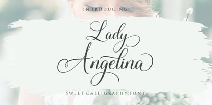 Lady Angelina Script is a sweet calligraphy font. This font is casual and pretty with swashes and can be used for various purposes including logos, product packagings, wedding invitations, branding, headlines, signage, labels, signature, book covers, posters, quotes and more. Lady Angelina Script features OpenType stylistic alternates, ligatures and International support for most Western Languages. To enable the OpenType Stylistic alternates, you need a program that supports OpenType features such as Adobe Illustrator CS, Adobe Indesign & CorelDraw X6-X7, Microsoft Word 2010 or later versions.How to access all alternative characters using Adobe Illustrator: https://www.youtube.com/watch?v=XzwjMkbB-wQ Lady Angelina Script is coded with PUA Unicode, which allows full access to all the extra characters without having special designing software. Mac users can use Font Book , and Windows users can use Character Map to view and copy any of the extra characters to paste into your favourite text editor/app. How to access all alternative characters, using Windows Character Map with Photoshop: https://www.youtube.com/watch?v=Go9vacoYmBw If you need help or have any questions, please let me know. I'm happy to help :) Thanks & Happy Designing!
 - Perfora by In-House International,
$15.00 Perfora is the typographic antidote to our relentlessly anxious and uncertain times. On one hand, Perfora is heavy, monospaced and brick-like. It feels secure, permanent, reliable. On the other, Perfora is extra variable—stretching taller or growing wider as needed—so all your words can fit perfectly together. And this seeming contradiction is the sweet spot we’ve all been missing: sturdy but not rigid. Named for its punch-hole shaped counters and eyes, Perfora is a flexible powerhouse that’s easy to use, stack, and click into any shape. Use it to assemble everything from dynamic logos to posters and festival lineups, from seamlessly responsive titles to instantly recognizable product lines. Perfora features two uppercase styles—rounded and angular—punctuation, numbers, latin diacritics, and stylistic alternates for a subset of characters. It also includes 19 ornamental glyphs to compose with flair and add some rhythm to your copy. It’s available (and recommended) as a variable type (.ttf) for designers using compatible platforms. It’s also available in opentype format (.otf) as a set of 25 static fonts, spanning 5 widths and 5 heights. Perfora was created by In-House International, designed by Alexander Wright and developed by Rodrigo Fuenzalida.
 - Fontella by Canada Type,
$24.95 Italian type design master Aldo Novarese was not famous for making calligraphic designs, nor had he any interest in them. He is much better known for his text faces, and quite innovative sans serif and decorative designs which became the definition of what we now know as techno and modern. But in 1968, Novarese surprised everyone with a fantastic flowing deco script entitled Elite. Novarese's formula of simple soft curves and toned-down swashes makes for one of the most unique alphabets ever seen, not to mention one of the best flowing and most legible scripts. This is now its digital incarnation, named Fontella. Fontella's applications are virtually limitless. This is the sort of script that can feel at home pretty much anywhere; a sign, a fridge magnet, a bumper sticker, a greeting card, a movie poster, a book cover, music artwork, magazine ads, newsletter headlines, etc. Digitized from original specimen and expanded with a few built-in alternates and ligatures by Rebecca Alaccari, the font was named after the famed jazz singer Fontella Bass. These letters are just so sweet they had to be called Fontella.
 - Once upon a time in the vast, colorful world of typography, Shanghai arose, a font that whispers tales of the Orient with a flirtatious wink to the Art Deco era. Crafted by the dynamic duo known as M...
- Swift by Linotype,
$30.99 Gerard Unger developed this newspaper font between 1984 and 1987 for Dr.-Ing. Rudolf Hell GmbH, Kiel. He was mainly influenced by William A. Dwiggins (1880-1956), the typographic consultant of Mergenthaler Linotype, who started to develop more legible, alternative fonts for newspaper printing as early as 1930. Swift was named after the fast flying bird. Austere and concise, firm and original, Swift is suited for almost any purpose. Swift has been specially developed to sustain a maximum of quality and readability when used in unfavorable print and display processes, e.g. newspapers, laser printing and low resolution screens. Its robust, yet elegant serifs and its large x-height provide an undeniable distinction to the typeface, making it suitable for corporate ID and advertising purposes as well. Swift 2.0 family was designed in 1995. It's an improved version with technical and aesthetic enhancements and new family members. The Cyrillic version was developed for ParaType in 2003 by Tagir Safayev. Please note that this family includes only basic latin characters; it does not include accented characters required for western and central Europe.
 - Swift 2.0 Cyrillic by ParaType,
$100.00 Gerard Unger developed this newspaper font between 1984 and 1987 for Dr.-Ing. Rudolf Hell GmbH, Kiel. He was mainly influenced by William A. Dwiggins (1880-1956), the typographic consultant of Mergenthaler Linotype, who started to develop more legible, alternative fonts for newspaper printing as early as 1930. Swift was named after the fast flying bird. Austere and concise, firm and original, Swift is suited for almost any purpose. Swift has been specially developed to sustain a maximum of quality and readability when used in unfavorable print and display processes, e.g. newspapers, laser printing and low resolution screens. Its robust, yet elegant serifs and its large x-height provide an undeniable distinction to the typeface, making it suitable for corporate ID and advertising purposes as well. Swift 2.0 family was designed in 1995. It's an improved version with technical and aesthetic enhancements and new family members. The Cyrillic version was developed for ParaType in 2003 by Tagir Safayev. Please note that this family includes only basic latin characters; it does not include accented characters required for western and central Europe.
 - Grand Hotel is a captivating font that exudes a timeless charisma, embodying the essence of classic elegance with a contemporary twist. Designed by the Astigmatic One Eye Typographic Institute, this ...
- Vinyle by Lián Types,
$37.00 Bold, rounded and super cool. Those are the attributes of my latest font “Vinyle”, french for vinyl. In this epoque where all fields of Design are giving a lot of importance and attention to Typography and Lettering, I felt it was my duty to contribute with something that could really stand alone and ‘say something else’ that just words to be read. I've found that lately in the world, regarding a finished piece of design, the role of Typography (and of letters in general) went from being secondary, (like a minor player or a supporting actor) to the most important one. People are starting to understand the beauty of a well-done letter: they want their storefronts with unique scripts, they want to drink coffee surrounded by lettered blackboards, they want to buy books with astonishing covers with swashes ‘por doquier’. I'm more than happy to be alive in a present where even the most unimaginable friends of mine, (who couldn't spot differences between comic sans and helvetica before) are now conscious of the importance of a letter, or let’s say: Of the ‘voice’ of Typography. With Vinyle I tried to make a font with power. Following the nowadays trend of, let me say, “the vintage sans renaissance”. This time I put my brushes and nibs aside and experimented with something new. It wasn't easy, if you will pardon, for me to see swashes all over the place withouth the classic calligraphic ‘thick and thins’, but with after some weeks of work I started to love them. Like I already showed you in other creations (1) let me finish with the phrase: GEOMETRY IS SEXY! TIPS Vinyle has a lot of attitude, it shouts “here I am!” it really can ‘design an entire piece’ for you with just a word or two: It was designed with a 10 degree slant on purpose so the user may rotate it (like on the posters) that amount of degrees in order to see better results. Use Vinyle with the ‘fi’ standard ligatures activates for better kerning and ligatures! NOTES (1) See my font Selfie , the ‘little sister’ of Vinyle.
 - Bree by TypeTogether,
$37.50 The Bree font family is a spry sans serif by Veronika Burian and José Scaglione that delivers a spirited look and feel for branding and headline usage. As an upright italic, Bree shows a pleasant mix of rather unobtrusive capitals with more vivid lowercase letters, giving text a lively appearance. Bree is clearly influenced by handwriting. As such, some of its most characteristic features are the single-story ‘a’, the cursive ‘e’, the outstroke curves of ‘v’ and ‘w’, the flourished ‘Q’, and the fluid shapes of ‘g’, ‘y’, and ‘z’. Alternates of these letters are available when a more neutral look is desired. Bree has a touch of cheekiness, a wide stance for each character, and an extra-large x-height. All this adds up to a big personality, so even when set in small text there is no skimming past the words Bree voices. In 2019, the Bree font family got a huge update. A few shapes were updated or added (the ‘k’ and German capital ‘ß’), two entirely new weights were added (Book and Book Italic), and spacing was perfected. More than that, Vietnamese support was added to Bree Latin, and the Bree Greek and Bree Cyrillic scripts were designed from scratch to parallel the Latin’s tone. Additionally, Bree was designed in variable font format for those who want complete control over the font’s appearance while simultaneously saving digital weight in the form of kilobytes and megabytes. Bree is in the perfect position for the next digital revolution. The complete Bree font family, along with our entire catalogue, has been optimised for today’s varied screen uses. Bree has been chosen for such wide-ranging uses as Breast Cancer Awareness Month in the US, the branding for the country of Peru, and numerous layouts including mobile apps, magazines, newspapers, and books. Awards – Tipos Latinos exhibition 2008 – Several best-of-the-year typeface lists of 2008 MyFonts Top 10 Fonts of 2008 Smashing Magazine: 60 Brilliant Typefaces For Corporate Design https://www.smashingmagazine.com/2008/03/60-brilliant-typefaces-for-corporate-design/ Die besten Schriften 2008 http://www.fontwerk.com/619/die-besten-schriften-2008/ – Selected for Typographica’s Best Typefaces of 2008 – Won Bronze for Original Typeface in the 2009 European Design Awards
 - Surprise Pro by Naghi Naghachian,
$58.00 Surprise Pro is designed by Naghi Naghashian. It is a delicate decorative headline font. The character set of this Font supports most western languages including: Afrikaans, Basque, Breton, Catalan, Danish, Dutch, English, Finnish, French, Gaelic, German, Icelandic, Indonesian, Irish, Italian, Norwegian, Portuguese, Sami, Spanish, Swahili and Swedish. There are 17 additional symbol characters: euro, litre, estimated, omega, pi, partialdiff, delta, product, summation, radical, infinity, integral, approxequal, notequal, lessequal, greaterequal, and lozenge. It also includes the characters necessary to support the following central European languages: Croatian, Czech, Estonian, Hungarian, Latvian, Lithuanian, Polish, Romanian, Serbian (Latin), Slovak, Slovenian and Turkish.