9,232 search results
(0.032 seconds)
- Blanc Groove by Godbless Studio,
$28.00 BLANC GROOVE, a font with a futuristic and experimental concept created with a strong and charismatic character. following the current trend design style. BLANC GROOVE is made experimentally following a futuristic style recipe with alternate characters made with outstanding alternate and display that makes this font more stylish and varied. BLANC GROOVE is a variable font that has 18 Font, 9 weights with 2 Variable from thin to black & Italic. also includes alternates that are more varied with variables. BLANC GROOVE is a versatile font system, designed primarily for display uses with a need of visual impact. Variable : Thin & Italic Light & Italic ExtraLight & Italic Regular & Italic Medium & Italic SemiBold & Italic Bold & Italic ExtraBold & Italic Black & Italic Feature : Alternate Character Ligature Discretionary Ligature Multilingual Support Numeral & Punctuation Symbol etc alihbWish you enjoy our font and if you have a question, don't hesitate to drop message & I'm happy to help.
 - Ryo Gothic PlusN by Adobe,
$79.00Ryo Gothic is a new Japanese sans serif (or gothic) kana typeface design. Created by Adobe type designer Ryoko Nishizuka , the typeface has a bright and speedy calligraphic touch and can be used to compose readable body text, as it gives a calm and well-controlled color to the typeset page. Supplied in OpenType format, each Ryo Gothic font includes hiragana, katakana and some punctuation marks and should be combined with the kanji and other glyphs in existing Japanese gothic typefaces that contain full character sets. This typeface family is available in seven weights--extra light, light, regular, medium, bold, heavy, and ultra heavy--which allow end users to select the best-matching weight for their favorite full-set Japanese gothic typeface. Creative professionals using the Japanese version of Adobe InDesign may use that program's Composite Font tool to easily combine Ryo Gothic with other typefaces. - Stapel by ParaType,
$30.00 Stapel is a contemporary closed sans serif with sci-fi looking forms and eloquent, thin stroke joints. The superfamily consists of three subfamilies of different width: Normal, Narrow and Condensed. Each subfamily contains seven weights with corresponding true italics. Additionally, there are several extra wide bold styles. All these styles work perfectly in headings and short display texts. Another important subfamily is Stapel Text which includes upright and italic styles of lower contrast and more generous spacing. Text styles are great for body text in small and medium point sizes. Most styles include alternate characters, proportional and lining figures, math symbols, fractions, currency signs and case-dependent punctuation. A wide range of styles and typographic features makes Stapel ideal for use in brand identity, infographics and all kinds of designs related to technology, science, finance, politics or sports. Stapel was designed by Alexander Lubovenko and released by Paratype in 2020.
 - Bilokos Pro by AukimVisuel,
$14.00 Bilokos Pro is a cool and modern display font. Designed by experts to make your design look out of this world, this font has the potential to take your creative ideas far. This is a condensed sans serif display font. On the one hand, it has rounded curves with very open terminals that make this font family elegant, user-friendly and contemporary and on the other hand very useful for writing titles in any medium. It also comes with stylistic variations of 0-9, A-Z and a-z to satisfy the most demanding professionals. It has OpenType features like full ligatures, tabular figures for tables, old style figures to elegantly insert numbers into your sentences. With its large character set, it meets the needs of professionals because it will support several languages of Western Europe, Eastern Europe, Central Europe, Greek and Cyrillic for international communication.
 - Dupincel by Plau,
$30.00 A typeface for telling stories. After seven years through which Rodrigo Saiani worked on Dupincel, Plau’s team still had months of dedication until found a good way of summing up this typeface. All this effort was rewarded, though, when we came up with a motif that gave Dupincel the grandiosity it deserves. Telling stories is this typeface’s gift because it has the emotion for it, resources for it and the breadth for it. Like all that wasn’t enough, it has the scale for it: optical sizes Small, Medium and Large make Dupincel optimized for stories of every length. From short stories displayed big or long stories on small letters. We don’t want to dictate the types of stories either, anything goes. But if ornaments make a good fit with that story, we will be even more thrilled. In the end, Dupincel makes us want to find new stories to tell.
 - Informative by Latinotype,
$39.00 Informative is a typeface consisting of a whole family of sans fonts and a collection of thematic pictograms. This combination of two different types of communication reflects the current need for using text and images as means of conveying information in a complementary way. The family comes with a text version of 7 weights (with matching italics)—Thin, Light, Regular, Medium, SemiBold, Bold and Black, and includes 7 thematic icons sets which allude to elements related to alimentation, city, energy, people, politics, sports and work. Each set contains 88 glyphs and includes both outline and black versions. The text font contains a set of 423 glyphs that support 207 different languages. Informative is a clean, simple and versatile typeface well-suited for a wide range of graphic design and visual communication projects. This font has especially been designed for infographics, maps and digital applications.
 - Norden Display by Asgeir Pedersen,
$19.99 The name Norden means “the Nordic”, as in the geographical area or its countries. Inspired by the simplicity of Nordic and Scandinavian design, the Norden fonts give you clarity of expression, beyond the usual geometric look and feel of traditional sans-serifs. Open and spacious, the shapes of the glyphs play both with and against each other. Round and soft versus square and solid, a basic curve versus a straight line, creating a detached yet distinct style of expression, from the light-as-air Hairline to dark and Bold. The Display variant has diagonal as well as slightly rounded ends, similar to the Standard version but with and edge, so to say. As its name suggests, this font is intended for use in headlines and/or for small chunks of text at medium and large sizes. Norden comes in three variants: Standard, Round and Display.
 - Fondue by Latinotype,
$29.00 Fondue: an eclectic-flavoured contemporary typeface. Designed by Jorge Alberto Martínez and Latinotype Team. Fondue is a type family of eclectic shapes, inspired by Art Deco designs, in particular, the lettering used by the Mexican cartoonist Ernesto “El Chango” Cabral on almost the entire publication Revista de Revistas ("Magazine of Magazines"). Far from being a copy, Fondue expects to be an adaptation of the thinking of that time to be used in contemporary context. Fondue has a cursive ductus, wide horizontal proportion and large x-height. Its friendly consistent rhythm makes it ideal for medium-sized text, headlines, branding, and so on. The family comes in 6 weights, from Thin, which reminds of the cartoonist’s loose strokes, to Ultra Bold, the version with powerful and unique voice. Fondue has a set of 496 characters that support 207 different languages.. OpenType features include standard and discretionary ligatures as well as stylistic alternates.
 - Structorator by Furiosum,
$15.00 Structorator is a grid-based, experimental display font. This typeface emerged from experiments with generative type design. It evolved from a piece of code into a fully usable opentype font. The two main features are its rigid but playful design and a multitude of alternate glyphs. These features make it possible to create interesting lettering when using the default spacing. The glyphs are constructed from a limited set of patterns which are arranged within a predefined grid. The line thickness corresponds to the different cuts. Due to the rather complex shape this font will look best in larger sizes and resolutions. Its best suited for headline, display or illustrative work. - 3 weights: light, medium and heavy - 5 character sets - 3 number sets - Basic punctuation - Seperate diacrits - Ornamental glyphs - Access via stylistic sets *OT feature - Random access from the whole range of chars *OT feature - Total of 1062 Glyps
 - Widy by Pasternak,
$12.00 Wide font family is a geometric sans serif font, which features 9 styles. It’s based on the Futura developed by Paul Renner and neo sans-serif fonts. At the same time, it has significant stylistic differences. Massive lengthy letters are among the unique features of this font. They will help you come up with the perfect composition. The letters have optical compensation, while a circle is the main figure of the fonts. Due to wide fonts, your project will have modern and fresh design. The composition will keep its contrast regardless of a background you’ve chosen. The Widy family includes 9 styles: Thin, Extra Light, Light, Semi Light, Regular, Medium, Semi Bold, Bold and Extra Bold. Each of them also has Italic variation. The fonts are perfect for both graphic design projects (posters, brand identities, logotypes) and simple interface design, which needs the necessary style.
 - Tighten Caps Light - Personal use only

- Oxford Street by K-Type,
$20.00 Oxford Street is a signage font that began as a redrawing of the capital letters used for street nameplates in the borough of Westminster in Central London. The nameplates were designed in 1967 by the Design Research Unit using custom lettering based on Adrian Frutiger’s Univers typeface, a curious combination of Univers 69 Bold Ultra Condensed, a weight that doesn’t seem to exist but which would flatten the long curves of glyphs such as O, C and D, and Universe 67 Bold Condensed with its more rounded lobes on glyphs like B, P and R. Letters were then remodelled to improve their use on street signs. Thin strokes like the inner diagonals of M and N were thickened to create a more monolinear alphabet; the high interior apexes were lowered and the wide joins thinned. The crossbar of the A was lowered, the K was made double junction, and the tail of the Q was given a baseline curve. K-Type Oxford Street continues the process of impertinent improvement and includes myriad minor adjustments and several more conspicuous amendments. The stroke junctions of M and N are further narrowed and their interior apexes modified. The middle apex of the W is narrowed and the glyph is a little more condensed. The C and S are drawn more open, terminals slightly shortened. The K-Type font adds a new lowercase which is also made more monolinear so better suited to signage, loosely based on Univers but also taking inspiration from the Transport typeface both in a taller x-height and character formation. The lowercase L has a curled foot, the k is double junctioned to match the uppercase, and terminals of a, c, e, g and s are drawn shorter for openness and clarity. A full repertoire of Latin Extended-A characters features low-rise diacritics that keep congestion to a minimum in multiple lines of text. The font tips the hat to signage history by including stylistic alternates for M, W and w that have the pointed middles of the earlier MOT street sign typeface. Incidentally, Alistair Hall (‘London Street Signs’, Batsford, 2020) notes that when the manufacturer of signs was changed in 2007, Helvetica Bold Condensed was substituted in place of the custom design, “an unfortunate case of an off-the-peg suit replacing a tailored one” and a blunder that has happily since been rectified, though offending nameplates can still be spotted by discerning font fans.
 - Albert Einstein by Harald Geisler,
$29.00 Harald Geisler wants to make you as brilliant as Albert Einstein. Or at least let you write like him. Or at least write in his handwriting. — The Wall Street Journal Imagine you could write like Albert Einstein. The Albert Einstein font enables you to do exactly that. In an joined effort, creators Harald Geisler and Elizabeth Waterhouse, spend over 7 years on finalising the project. It was made possible with the help of the Albert Einstein Archive, the Albert Einstein Estate, and funding by a successful Kickstarter Campaign of 2, 334 backers. The outcome was worth the effort: a font unprecedented in aesthetic technique and a benchmark for handwriting fonts. To create a result that is true to the original, Harald Geisler developed a method to analyse the movement of the famous writer. Letter by letter, every glyph was digitally re-written to create a seamlessly working font. It is the only font that holds 5 variations for each lowercase and uppercase-letter, number, and punctuation sign. Each based on meticulous detail to the original samples of Albert Einstein’s handwriting. The OpenType contextual alternates feature dynamically arranges the letters automatically as you type to ensure that no repeated letter forms are placed next to each other. Stylistic variants can also be accessed through stylistic sets. The font has 10 fine-tuned weights ranging from extra-light to fine and extra bold to heavy. The result is a vivid handwritten text true to the original. A PDF documentation, showing step by step how the font was made and comparing numerous original samples, is included with the font and can be downloaded here. The work has been recognised internationally, by press, Einstein fans, and designers. Some quotes used in images: “The font is beautiful“ — Washington Post “If you could write like Einstein, would it help you to think like Einstein?” — The Times (London) “Finally, if your colleagues aren’t taking you seriously, then perhaps you could start sending e-mails in a new font that mimics the handwriting of Albert Einstein.” — Physics World “Geisler and Waterhouse are really asking deeper questions about the diminishing (or evolving) role of our flawed, variable penmanship as a conduit of thought in today’s pixel-perfect landscape.” — QUARTZ “Your writing will look imaginative — which is exactly what Einstein would've wanted." — Huffington Post Arts & Culture "Forget Myriad Pro, Helvetica or Futura. The only font you’ll ever need" — Gizmodo “Capture a piece of Einstein's genius in your own writing." — Mashable
 - Air Superfamily by Positype,
$29.00 In B-movie awesomeness, Air began as Grotesk vs. Grotesque. I was trying to unify the prevailing traits of German and English Grotes(que/k)s in order to make something different but familiar. I am NOT trying to reinvent Helvetica (snore), so get that out of your system. From the onset, I intended this typeface to be a true workhorse that offers infinite options and flexibility for the user. At its core, it is the maturation of the Aaux Next skeleton I developed years ago. I worked out Aaux Next to settle my issues and love for Akzidenz. With Aaux Next, I strove to be mechanical, cold and unforgiving with it. I was single, young, cocky and it fit. Now I'm married, kids, dog and have found that I've turned into a big softy. When I look at Aaux Next (and have for the past few years) I see another typeface trying to eek out. I wanted it to avoid the trappings of robotic sans, quick tricks and compromises. The typeface’s DNA needed to be drawn and not just generated on a screen — so I set aside a year. I love type. I love working with type. I hate when my options for a slanted complement is only oblique or italic. I set out to produce both to balance usage — there are more than enough reasons to prepare both and I want the user to feel free to consciously choose (and have the option to choose) the appropriate typeface for print, web, etc. That flexibility was central to my decision-making process. The Oblique is immediate and aggressive. The Italic was redrawn at a less severe angle with far more movement and, as a result, is far more congenial when paired with the Uprights. Condensed and Compressed. Yep, why not? I know I would use them. There are nine weights currently available. The logical progression of weights and the intended flexibility demanded I explore a number of light weights and their potential uses — this has produced a number of ‘light without being too light’ options that really work based on the size. The result is a robust 81-font superfamily that is functional, professional, and highly legible without compromising its personality. Pair that with over 900 characters per font that includes ligatures, discretionary ligatures, stylistic alternates, fractions, proportional/tabular lining and proportional/tabular oldstyle figures, numerators, denominators, ordinals, superiors, inferiors, small caps, case-sensitive functionality and extensive language support and you have a versatile superfamily well-suited for any project.
 - Reina by Lián Types,
$37.00ATTENTION! See the newest version of Reina here. Reina Neue is now a family of 45 styles and it's also a Variable Font! Have a look. For the traditional version of Reina, you may stay here ;) --- Reina is Sproviero’s didone of the year. We recommend seeing its user’s guide . Inspired in the sweet letters of calligraphy and typography masters of our past; such as Didot, Bodoni and the incredible Herb Lubalin, its aim was to incorporate the decorative accolades from blackletter and copperplate styles of calligraphy into a Modern Roman typeface. Reina reflects sovereignty due to the enveloping atmosphere and the sensation of greatness that can be felt when using it. It has an unique way of standing over paper and screen, being its swashes responsible of an extreme elegance. Similar to what Lian did in his last font Breathe , Reina was designed to be playful yet formal: While none of its alternates are activated it can be useful for short to medium length texts; and when the user chooses to make use of its open-type decorative glyphs, it can be useful for headlines with dazzling results. TECHNICAL Reina is a family with many members. In order to achieve better results when printing, Lian took his time to design the necessary styles: Reina 72 Pro, prepared for display sizes; Reina 36 Pro, for medium sizes; and Reina 12 Pro, the best for text or decorative words in small size. Each of these members have variants inside, which are open-type programmed: The user decides which glyph to alternate, equalizing the amount of decoration wanted. Reina Engraved Pro has the same features than the variants mentioned above. The family also contains variants which were made exclusively for decoration. These are: Reina Words, a set of the most common words used in english, german, italian, french and spanish; Reina Capitals, which consists in a big set of ornamented capitals; and Reina Fleurons, those little friends which always help to embellish our work. - Wiegel Latein Medium, crafted by the talented typeface designer Peter Wiegel, is a font that encapsulates elegance and versatility within its characters. Its design harks back to the grace of traditi...
- Egorycastle by Seventh Imperium,
$40.00 Egory castle was inspired from the history of the medieval age. The idea was to make us interested to explore in the aspect of art and decorative letters forms. Lots of studies that we have learned from history in middle age and inspiration from many different sources make very valuable references for us to develop a new idea in the development of this typeface.
 - Radonezh by Simeon out West,
$22.00 The Radonezh font is a Latin alphabet layout based on Russian Lettering I have seen. The font is designed to give a classic Medieval Eastern European feel with a hand-lettered style. Radonezh comes with full punctuation, a complete character set for most Western European Latin alphabet languages, Cyrillic languages, and polytonic orthography for Greek. Being a decorative font, it works best at larger point sizes.
 - Isolde by Linotype,
$29.99There is not much I can tell about Isolde. It is a plain typeface, rather wide and with dominant serifs. Its italics are more slanted than usual. In fact only Caslon's italic can compete about that. Its width makes it more suitable for decorations than for larger amounts of text. The name comes from the medieval tale about Tristan and Isolde. Isolde was released in 1993. - Brightfate by Zealab Fonts Division,
$10.00 Brightfate is font designed by Reza Rasenda & Riska Candra Dewi, with design choices and a combination between the medieval times and urban street wear themes. Brightfate comes with stylistic, alternates, ligatures and supports multilingual languages. Create unique & beautiful logotype, use it as an elegant solution for your next magazine layout, or choose Brightfate for any graphics that require a sleek look with a elegant flair.
 - Cranach by profonts,
$41.99 This picturesque, beautiful German Blackletter typeface was originally released by Benjamin Becker Succ, Frankfurt am Main, then named ?K�nstlergotisch?. Ralph M. Unger redesigned, digitally remastered and completed the font based on old catalogues/specimen. In honor of the famous Cranach family, German artists in medieval times, we renamed the font after them. The shadowed version was added for even more eye-catching purposes, e.g. in headlines.
 - Missale Solis by astype,
$41.00 Missale Solis is an overhaul of my previous font Missale Lunea from 2004. After some usecases and requestes for customized versions I decided to make a redesign that is better suited for screen. The font is useful for headlines and small amounts of text with a distinctive medieval impression. It includes Roman figures, dynamic fractions, zodiacs and an alternate design for T and ampersand (&).
 - West Avenue by KA Designs,
$12.00 West Avenue is a chic font that combines the look of both a traditional and modern serif. Use opentype features to take full advantage of the sleek alternates and glyphs - making each project luxurious and unique! This font is perfect for logos, branding, packaging, advertisements, social media and more!
 - Reasont by Genesislab,
$15.00 Reasont is to be perfect for logos, branding, greetings, social media themes and wedding invitation designs. It is also a great typeface for titles due to its smooth design and eye-catching appearance. Available Fonts: . Multilingual. If you have any questions don't hesitate to contact me! Thank you,
 - Mazreha by Sronstudio,
$23.00 Mazreha – Display Font comes with an elegant and modern touch this font is perfect for branding, invitation, stationery, wedding designs, social media posts, advertisements, product packaging, product designs, label, photography, watermark, special events, and more. Features: Uppercase and lowercase letters Lowercase Swashes Alternates Ligatures Multilingual, numerals, and punctuation
 - Southwood by Timurtype,
$14.00 Introducing by Timur type Proudly Present, Southwood Southwood A Handwritten Script Font Southwood is perfect for product packaging, branding project, megazine, social media, wedding, or just used to express words above the background. Southwood also multilingual support. Embelish your designs with our original fonts.Enjoy the font,Thank you!
 - Comic Tantrum by David Engelby Foundry,
$25.00 Comic Tantrum is a versatile font – you can use it for headline posters, for infographics, for web pages or other media, when you need an expressive comic font. And you can skew it and squeeze it. It also has many special designed alternates, swash versions and ligatures. Have fun!
 - Stalshine by Qwrtype Foundry,
$14.00 Proudly Present, Stalshine Stalshine is a Handwritten Font Stalshine is perfect for product packaging, branding project, megazine, social media, wedding, or just used to express words above the background. Stalshine also has multilingual support. Enjoy the font, feel free to comment or feedback, send me PM or email.
 - Dimetone by Timurtype,
$14.00 Proudly presented by Timur Type: Dimetone – A handwritten script font Dimetone is perfect for product packaging, branding projects, magazine, social media, wedding invitations, or just used to express words above the background. Dimetone has multilingual support. Embellish your designs with our original fonts. Enjoy the font, thank you!
 - This year by Jadatype,
$10.00 This Year is a duo font that contains fine line script font and playful slab that had cute, playful, joy, youth, and bouncy feel. suitable for social media, branding, craft, products, handwritten, and so on. contains standard English letters, numbers, punctuation, and several accents that support multilingualism. Thank you!.
 - Lovely Mother by Fikryal,
$15.00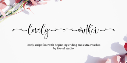 Lovely Mother is a beautiful calligraphy font perfect for crafting, branding, invitation, stationery, wedding designs, social media posts, advertisements, product packaging, product designs, label, photography, watermark, special events or anything. Lovely Mother comes with full set of uppercase and lowercase letters, swash alternates, ligatures, multilingual symbols, numerals and punctuation.
 - MC Ronttsly by Maulana Creative,
$15.00 Ronttsly script brush font. This font is good for logo design, Social media, Movie Titles, Books Titles, a short text even a long text letter and good for your secondary text font with signature or script typeface. Make a stunning work with Ronttsly script brush font. Cheers, Maulana Creative
 - Rise of Beauty by Kereatype,
$9.00 Rise of Beauty - Modern Variable Paired Duo A classy, contemporary pair of Script Signature and Sans Serif fonts. With a stylish expressive script companion, Rise of Beauty offers beautiful typographic harmony for a diversity of design projects, including logos & branding, wedding designs, social media posts, advertisements & product designs.
 - Quantica by Gian Studio,
$10.00 Quantica is to be perfect for logos, branding, greetings, social media themes, and wedding invitation designs. It is also a great typeface for titles due to its smooth design and eye-catching appearance. Available Fonts: . Multilingual. . Ligatures. If you have any questions don't hesitate to contact me! Thank you,
 - Million Dreams by Typesthetic Studio,
$13.00 Million Dreams is a bold and playful, but also elegant handwritten font. It has beautiful and neat characters and as a result, it matches a wide pool of designs. This font is perfect for many different project such as logos, branding, social media, crafty DIY projects or anything.
 - Rockers Garage by Fikryal,
$18.00 Rockers Garage – Font is a display brush font. It’s perfect for logo, branding, title, social media posts, advertisements, product packaging, product designs, label, photography, watermark, special event, magazine, web designs, etc. If you have any questions please don’t hesitate to contact me. follow my Instagram: fkryall Thank you 🙂
 - The Fashionist by Mas Anis Studio,
$16.00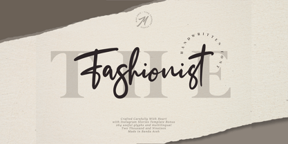 The Fashionist is a natural handwritten font, this font Is perfect for logo, invitation, stationery, wedding designs, social media posts, advertisements, product packaging, product designs, label, photography, watermark, special events or anything. Comes with full set of uppercase and lowercase letters, lowercase beginning & ending swashes , multilingual symbols, numerals, punctuation.
 - Kallisty by Creaditive Design,
$12.00 Kallisty is a thin lettered and graceful script font. Fall for its ravishing style and use it to create gorgeous wedding invitations, beautiful stationary art, eye-catching social media posts, and your branding project! Kallisty is PUA encoded which means you can access all glyphs and swashes with ease!
 - Khalitta by Yoga Letter,
$14.00 Khalitta is a modern calligraphy font. This font is very elegant and beautiful and is perfect for all types of your work. This font is perfect for weddings, branding and logos, for marketing your business, status updates on social media, and for capturing beautiful and romantic moments, and more.
 - Beloved Sandra by Lunas Type,
$19.00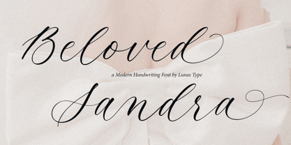 Introducing, Beloved Sandra! Beloved Sandra is a modern and luxury calligraphy font. Beloved Sandra will add charm and impression for your design. Beloved Sandra is perfect for many design needs such as merch, T-shirts, signature logo, wedding, book covers, social media posts, websites, events, and many more.
