10,000 search results
(0.02 seconds)
- Haniberryku by Kotak Kuning Studio,
$20.00 Haniberryku is a lovely modern script font with a natural & stylish flow. Perfect for making elegant stylish statements - or adding a touch of class to your designs. This script has a multitude of lovely alternates character in its OpenType features - making the font look a beautiful. Haniberryku is perfect for many different projects such as logos & branding, invitation, stationery, wedding designs, social media posts, advertisements, product packaging, product designs, label, photography, watermark, special events or anything. I highly recommend using a program that supports OpenType features and Glyphs panels such as Adobe Illustrator, Adobe Photoshop CC, Adobe InDesign, or CorelDraw, so you can see and access all Glyph variations. We hope you enjoy the font, please feel free to comment if you have any thoughts or feedback. Or simply email me at kotakkuningstudio@gmail.com. Thanks for purchasing and have fun!
 - Burgstaedt Antiqua by Linotype,
$29.99At first glance, Burgstaedt Antiqua looks like an old typewriter face, or rather like a typeface from a typewriter that has gone hopelessly wrong! Only after your second glance will you see this font for what it really is - a thoroughly new text face. Several features of Burgstaedt Antiqua, and its companion italic face, are worth special attention: First, the terminal styles of the letters vary throughout the alphabet. This gives text set in Burgstaedt Antiqua a slightly jittery feeling. A second interesting feature is the lowercase q", which takes the form of a shrunken-down uppercase "Q". Burgstaedt Antiqua Regular and Burgstaedt Antiqua Italic may be used in both text and headlines. For use in text, we recommend employing a slightly larger point size (12 pt or 14 pt and above). British designer Richard Yeend designed this family in 2002. - Hot Potato by Gassstype,
$23.00 Here comes a New font, Introducing Roselle It's Fun Script Font is a Textured Natural Style and Authentic classy style, this font is great for your creative projects such as watermark on photography, and perfect for logos & branding, invitation,advertisements,product designs, stationery, wedding designs,label ,product packaging, special events or anything that need handwritting taste. Roselle a Natural Script Hand Drawn feel. This handmade font will make your design has a beautiful natural touch for each details. It is perfect for any design project as Invitation,logo, book cover, craft or any design purposes,photos, photography overlays, signs, window art, scrapbooking, tags and so much more! It is perfect for any design project as Invitation,logo, book cover, craft or any design purposes. This font is PUA encoded which means you can access all of 22 Ligatures glyphs.
 - Bell MT by Monotype,
$39.00 Monotype’s hot metal Bell series from 1931 was based on original types made by the punchcutter Richard Austin for the foundry of John Bell in the 1780s. The different sizes of Monotype’s series were not all based on the same model. As type historian James Mosley wrote on Typophile, “For 18 point and above (the metal type was cut in sizes up to 36 point) Monotype’s model was a larger type [than the model used for the text sizes], the ‘Great Primer’ cut by Austin. This has greater contrast in the capitals and a flat foot to letter a.” The digital Bell closely follows the design of the hot metal 18pt version, and is therefore somewhat lighter in color than the text sizes of Monotype’s original metal face. James Mosley’s Typophile article can be found here.
 - Wide House by Letterhend,
$16.00 Introducing Wide House, a playful and charming hand-written font that will add a touch of whimsy to your designs. This font has a casual and relaxed vibe that makes it perfect for projects that require a friendly and approachable feel. The letters are slightly wider than usual, giving it a modern yet comfortable appearance. Wide House works well for various design projects especially in logo, and the other various formal forms such as invitations, labels, logos, magazines, books, greeting / wedding cards, packaging, fashion, make up, stationery, novels, labels or any type of advertising purpose. Features : Uppercase & lowercase Numbers and punctuation Alternates & Ligatures Multilingual PUA encoded We highly recommend using a program that supports OpenType features and Glyphs panels like many of Adobe apps and Corel Draw, so you can see and access all Glyph variations.
 - Sweet Pancake by Locomotype,
$15.00 We often see calligraphy fonts with a standard style developed from the brush pen strokes. Sweet Pancake fonts come in different calligraphy styles. The usual shape has been customized to make it look more personal and special. Sweet Pancake is available in two versions, regular and X. The second version is the development of the regular version by adding sharp corners to the stem. To be more specific, this font also includes several swash so that you can easily mix and match unique and different typographic designs. To attach a special swash to the letter end automatically, you only need to add two / three / four hyphens (the standard ligature feature must be activated). Sweet Pancake is suitable for logotype, invitation, poster and more. Available in OTF and TTF formats, also supports multi-language and PUA encoded.
 - Gothiks Round Compressed by Blackletra,
$50.00 Gothiks Round Compressed is the rounded version of Gothiks Compressed. It is a 6-weight display sans-serif influenced by Texturas. The rhythm and verticality of Texturas can be easily identified on the letters with diagonal strokes like A N M K k V v W w X x Y y Z z: here they are all vertical. This kind of morphology was chosen because it accepts condensation in a very natural way, giving to this sans-serif a very unique personality. It has an extensive character set—with extensive language support—and many OpenType features like fractions, small capitals and different figure sets. Default figures align with lowercase. The typeface’s name refers to the plural of the word Gothic, which in turn can refer to both sans-serifs or Blackletter, depending on geographic location. Use it BIG!
 - Madegra by Letterhend,
$19.00 Madegra is an elegant display serif family. It includes many alternates with swashes that can make your lettering and logotype become more interesting. The clean and neat of a serif combined with the swirl swashes makes this font even more unique, especially since this family has 9 weight styles which you can choose according your needs! This font works well in various formal forms such as invitations, labels, logos, magazines, books, greeting / wedding cards, packaging, fashion, make up, stationery, novels, labels or any type of advertising purpose. Features : uppercase & lowercase numbers and punctuation multilingual ligatures alternates swashes PUA encoded 9 Weight Styles We highly recommend using a program that supports OpenType features and Glyphs panels like many of Adobe apps and Corel Draw, so you can see and access all Glyph variations. Email us to letterhend@gmail.com if you need something! Happy Designing!
 - Uni Sans by Fontfabric,
$29.00 Important! There is a whole new redesigned version (remake) of Uni Sans called Uni Neue . The Uni Sans font family includes 14 weights - seven uprights with seven italics. It is characterized by excellent legibility in both - web & print design areas, well-finished geometric designs, optimized kerning, excellent web-font performance and legibility etc. Inspired by the classic grotesque strong typefaces like DIN and Dax - Uni Sans has his own unique style in expressed perfect softened geometric forms. The font family is most suitable for headlines of all sizes, as well as for text blocks that come in both maximum and minimum variations. Uni Sans font styles are applicable for any type of graphic design in web, print, motion graphics etc and perfect for t-shirts and other items like posters, logos. PDF Specimen also available - click here .
 - Gothiks Round Condensed by Blackletra,
$50.00 Gothiks Round Condensed is the rounded version of Gothiks Condensed. It is a 6-weight display sanserif influenced by Texturas. The rhythm and verticality of Texturas can be easily identified on the letters with diagonal strokes like A N M K k V v W w X x Y y Z z: here they are all vertical. This kind of morphology was chosen because it accepts condensation in a very natural way, giving to this sans-serif a very unique personality. It has an extensive character set—with extensive language support—and many OpenType features like fractions, small capitals and different figure sets. Default figures align with lowercase. The typeface’s name refers to the plural of the word Gothic, which in turn can refer to both san-serifs or Blackletter, depending on geographic location. Use it BIG!
 - Regitha Script by Black Studio,
$15.00 Introducing Regitha Script, Thanks for checking out Regitha Script! A very fun yet elegant script font with lots of energy, it lets you create beautiful handcrafted typography in an instant. With extra curves & twists, Regitha Script is guaranteed to make your text stand out - perfect for logos, printed quotes, invitations, cards, product packaging, headers, weddings and anything else you can imagine. What's really awesome is that Regitha Script comes with a full set of lowercase alternatives, which allow you to create more authentic custom-feel text. This type has become the work of true love, making it as easy and fun as possible. I can't wait to see what you do with Regitha Script! Feel free to use the #Black Studio tag and the #Regitha Script font to show what you've been up to, I really hope you enjoy it! Thank you!
 - Vtg Stencil Germany No.101 by astype,
$31.00 Vtg Stencil Germany No.101 is modeled after historic stencil plates from Bavaria. The design is a blackletter chancery, a romantic reprise of a style that was common in German writing offices from the 14th to the 16th century. The flourishes stylistically quote the Baroque period. A talented mind, perhaps around 1890, has transformed the textura shapes into a modular stencil system. Many elements are repeated throughout the glyph set - see for example the initial swashes on the letters A, B, U etc. Overall, this decorative blackletter doesn’t look like a stencil design. Maybe it was originally used by a sign painter, and all the typical stencil bridges would have been painted over in the final work. If you’re looking for a decorative blackletter font with a unique touch and a romantic feel, you will love Germany No.101.
 - Little Micro Sans by Caron twice,
$39.00 It is 1984 and Ridley Scott’s commercial for Apple tells us, “You’ll see why 1984 won’t be like ‘1984’.” The first Mac comes on the market. The Mac interface includes a font for use in small sizes called Chicago. The first version was designed by Susan Kare. The font’s modern grid-like character was also used for the first iPod screens, which is why this font is also associated with music. Today’s font upgrade, Little Micro Sans, is suited for small-point texts, product labels, lists of ingredients, and small captions in books, magazines, websites or applications. For online use, a variable format is particularly handy as it offers all font styles in a single file, has a faster display time and takes up less memory. Little Micro Sans is a revolution for small sizes. Specimen: http://carontwice.com/files/specimen_Little_Micro_Sans.pdf
 - Dixplay by Emtype Foundry,
$69.00 Dixplay, a typeface based on a pixel grid, is available in two weights: regular and black. Inspired by video game aesthetics of the 80s, was originally intended for display applications, but it works fine on paper as well. The font has been conceived in 20 px size allowing more freedom to manipulate it and making a big difference with other fonts of its kind, this difference it’s more evident in Dixplay Black. As a result, it’s optimized for screen use at 20 px and its multiples. Spacing is one of the most outstanding aspects of Dixplay. While pixel fonts doesn't have kerning pairs, Dixplay offers more than 300 manually done that fit perfectly to the grid. It is available in Open Type format and supports Western European Languages that uses the Latin alphabet. For more details see the PDF.
 - Break Parquet by Gassstype,
$22.00 Here comes our new font Break Parquet this is a Unique Display Font that is written casually and quickly.this a Authentic Style and classy style This font are handmade with unique font . Then crafted carefully drawn into vector format.this font is great for your creative projects such as watermar.k on photography, and perfect for logos & branding, photography, invitation, watermark,advertisements,product designs, stationery, wedding designs,label ,product packaging, special events or anything that need handwritting taste. That is a natural handwritten feel. This handmade font will make your design has a beautiful natural touch for each details. It is perfect for any design project as Invitation,logo, book cover, craft or any design purposes. That is why Break Parquet is strong characteristic more natural look to your text with a more modern look to your text.
 - Charpentier Renaissance Pro by Ingo,
$42.00 A very legible Renaissance Antiqua This typeface is based on the desire to create an Antiqua like those which might have existed at the beginning of the »printing age« — the basic form oriented on the classical Roman and early Middle Ages models, the ductus defined completely by writing with a wide pen and much individual expression in detail. In the spring of 2005 I had the opportunity to closely examine a few pages in the famous book »Hypnerotomachia Poliphili« from 1499. The script used here from Aldus Manutius is exemplary. Most of the book, however, is not very carefully printed. The characters do not stay on the line; the print is at times too strong and at times much too weak. And on these imperfect pages the true character of the letters is recognizable; that is, that they are cut with lively detail which is a result of the patterns provided by full-time writers. After all, around 1499 script was written as a rule and the printed type was oriented on this pattern. I prefer the typeface on the lightly printed pages. The characters are not placed neatly on the line, but the distinct and emerging lively ductus of the individual characters automatically presents harmonious word formations in the eye of the beholder, with the non-perfect line stepping into the background. Also in Charpentier Renaissance, the strokes of the wide pen are still noticeable. The font has very defined softly bent serifs. The forms are powerful and stand solidly on the baseline. Charpentier Renaissance is very legible and yields a solid and yet still lively line formation. The accompanying italic, like its historical models, has almost no inclination. The lower case characters of Charpentier Renaissance Oblique have such idiosyncratic figures that they can also form a font of their own. Please visit www.ingofonts.com
 - Shout by HiH,
$12.00 Shout is a “Hey, Look at ME” font. It is an attention-getting font for posters, flyers and ads. Its lineage includes the Haas Type Foundry’s 19th century advertising font, Kompakte Grotesk, which Jan Tschichold (1902-1974) dryly described as “extended sans serif” and which graphic designer Roland Holst (1868-1938) would have disapprovingly referred to as a “shout,” as opposed to the quiet presentation of information that he believed was the proper function of advertising. In 1963 Letraset released what appears to be an updated variation in multiple weights designed by Frederick Lambert called Compacta. Shout draws heavily on Compacta, as well as other similar fonts of the 50s and 60s like Eurostile Bold Condensed and Permanent Headline. In weight, it falls about halfway between Compacta Bold and Compacta Black, but with a relatively heavier lower case that is not so easily pushed around by the upper case. After all, one can shout while sitting down. Shout is the first font released with our new encoding, as noted in the All_customer_readme.txt. The Euro symbol has been moved to position 128 and the Zcaron/zcaron have been added at positions 142/158 respectively. Otherwise, Shout has our usual idiosyncratic glyph selection, with the German ch/ck instead of braces, a long s instead of the Greek mu and our usual Hand-in-Hand symbol. There are also left and right glyphs of a big mouth ]ing (135/137) and left and right glyphs of an angry man shouting (172/177). Please use Shout with discretion. Folks get tired of being yelled out. After awhile, they stop listening. Shout ML represents a major extension of the original release, with the following changes: 1. Added glyphs for the 1250 Central Europe, the 1252 Turkish and the 1257 Baltic Code Pages. Add glyphs to complete standard 1252 Western Europe Code Page. Special glyphs relocated and assigned Unicode codepoints, some in Private Use area. Total of 355 glyphs. 2. Added OpenType GSUB layout features: pnum, ornm, liga, hist & salt. 3. Added 266 kerning pairs. 4. Revised vertical metrics for improved cross-platform line spacing. 5. Revised hyphen, dashes & math operators. 6. Minor refinements to various glyph outlines. 7. Inclusion of both tabular & proportional numbers. Please note that some older applications may only be able to access the Western Europe character set (approximately 221 glyphs). The zip package includes two versions of the font at no extra charge. There is an OTF version which is in Open PS (Post Script Type 1) format and a TTF version which is in Open TT (True Type)format. Use whichever works best for your applications.
 - KG Like A Skyscraper - Personal use only

- Payung Senja by Zamjump,
$17.00 Introducing, Payung Senja is a beautiful handwritten typeface with an elegant style that is here to give a luxurious impression to your designs, made with consistent strokes to produce works that enhance your designs, complete with alternative ending swashes that will add to the luxurious impression. impact on your design. Payung Senja is perfect for Branding, Logos, Magazines, crafts, quotes, book covers, wedding invitations and more.
 - Mothra by madeDeduk,
$15.00 Introducing MOTHRA use this font for any branding, product packaging, invitation, quotes, t-shirt, label, poster, logo etc. Feature Uppercase & Lowercase Number & Symbol International Glyphs Multilingual support Feel free to drop us a message any time and follow my shop for upcoming updates Shoot me on email at: dedukvic@gmail.com and find more previews on my Instagram here : https://www.instagram.com/acekelgondolayu/?hl=en Hope you enjoy it.
 - Fagetone by Prioritype,
$15.00 Dating back to the 60s 70s, this retro script font comes in bold bold and thin, perfect for your projects and supports multilingualism and other character additions. Can be applied to various print and digital media such as food packaging, clothing stores, accessories, clothing, creative goods, antique workshops, sports, entertainment and even logos. For reference, see preview. Features: -Uppercase -Lowercase -Numeral -Punctuation -Ligature -Multilingual
 - Ring Eyes by Ochakov,
$11.00 Now you can see... the new direction of the big family called Ring - Ring Eyes! That's a very unique Ring & truly devoted. There are only four styles, but they are all very important. Ring Eyes font like our eyes held a million stories. Ring Eyes font like other of the Ring Family is the perfect choice for headlines, logos, branding, packaging, publications, and much more.
 - Battle Cry by Comicraft,
$19.00 As Titans Clash in The Final Battle of Good versus Evil, Man versus Machine, God versus Mortal and Coke versus Pepsi, ace lettering artist, Ferran Delgado from Spain teams up with our very own John ‘JG’ Roshell for one last attack on the assembled Cover Lettering Styles of Yore. Fill your lungs and prepare for... BATTTTTTLECRRRRRYYYYYYYYYYY! See the families related to Battle Cry: Battle Scarred & Battle Damaged .
 - Greissler by Markus Fetz,
$21.00 GREISSLER is a Retro Display Font inspired by old letterings on store fronts and building facades in Vienna. "Greißler" is a term used in the east of Austria and means small grocer. In Vienna you can still see some of the letterings "Lebensmittel", "Feinkost", etc. on the storefronts of mostly abandoned shops. Similar letters can be found on "Gemeindebauten" (council housing) from the 1920s.
 - Hilton Serif by Juraj Chrastina,
$39.00 There is something special about thin fonts. On one side there is the sensitive, charming and warm touch, on other side they are uncompromising, thoroughgoing. Here the contrast can't hide the clear shapes. Hilton Serif and Hilton Sans are a pair of highly legible, subtle and elegant sans-serif and semi-serif display faces. The quality of spacing and kerning are ensured by Igino Marini.
 - Cover Charge JNL by Jeff Levine,
$29.00 Although less prevalent today, a cover charge was added to better class night clubs of the 1930s and 1940s to discourage patronage by people of questionable social graces. The general idea was that the lower strata of society (meaning the "average Joe" or "hoi polloi") would balk at paying an extra fee just for entrance to a place of good entertainment and fine dining.
 - South Pacific by Nicky Laatz,
$26.00 Say hello to South Pacific Marker , a new bold inky font with a casual handwritten feel. South Pacific includes a large selection of natural-looking ligatures and extra alternate characters ( see previews) in it's Opentype Features - make sure you have your stylistic alternates switched on to enjoy all the extras. Four handy swashes are also included in the glyphset - accessible via your glyphs panel.
 - Diogenes by Ludwig Type,
$45.00 Diogenes is an elegant and crisp text typeface. While the skeletons of the individual characters are distinct and strong, the serifs are fine and sharp. This is especially true for the capitals with their comparatively strong horizontal strokes. The graceful appearance of Diogenes makes it an ideal choice for books, newspapers, and magazines, both at small text sizes and display sizes. See also this minisite.
 - Hopeless Romantic Society by PeachCreme,
$23.00 An imperfectly charming handwritten font, "Hopeless Romantic Society", is here to liven up your design works. This carefree ligature-filled handwritten typeface was influenced by writings that were sloppily produced by hand. With these 55 ligatures, your designs will have that extra layer of authenticity. Whether you're looking to create a playful logo or send a handwritten letter, this typeface is the way to go.
 - Umbriago NF by Nick's Fonts,
$10.00No mystery here: this typeface is based on the not-often-seen Cooper Black Swash Italic, designed by Oswald Bruce Cooper. Swash variants are the norm with this font, but enabling Contextual Alternates will prevent collisions between the swash “tails” and letters with descenders. Both versions of this font contain the Unicode 1252 (Latin) and Unicode 1250 (Central European) character sets, with localization for Romanian and Moldovan. - Cafe De Paris by Studio K,
$45.00 Café de Paris is, clearly, inspired by all things French, especially the quirky typefaces that adorn French shopfronts from cafes to charcuteries and bistros to boulangeries. My intention was a fresh, crisp, modern take on a classic theme, with just a soupcon of Art Nouveau, which is characteristic of so much of French typography (See also Studio K’s Paris Metro font) C'est chic - n'est-ce pas?
 - Bluster by Ingrimayne Type,
$5.95 BlusterLeft and BlusterRight are distortions of the font ConcavexCaps. Both are caps only, but some of the shapes on the lower-case keys differ from the corresponding shapes on the upper-case keys. They family was named Bluster because I thought they have a wind-blown, flopping-in-the-breeze look. Others may see them as spooky or eerie, something that could be used for Halloween.
 - Grand Heist by Palmer Type Company,
$30.00 Grand Heist is a bold and unique display typeface, fully equipped with basic and Western European Latin characters, numbers, punctuation, some symbols and special characters. Now we don't condone robbing banks here, but if you do, we can't deny that you'll have way more street credibility if you have this font in your handy fontbook. Just sayin'. Aa-Zz Numbers Multi-language support Symbols Special Characters
 - Hedgehog Lake by Tom Simons,
$10.00 “Can you write this card? You have the best handwriting.” Was commonly heard question by Karin that inspired the creation of this font. Now anyone is able to write in her unique style. Hedgehog Lake includes over 400 glyphs for languages based on the latin alphabet and comes in two weights. Perfect for designs that need a human touch like invitations, titles, and more.
 - Kegilka by Tony Type Studio,
$17.00 Seeing the characters in rhythm makes the Kegilka font very charismatic, the intersection of curves is so smooth and beautiful that it makes your project look neat and special. Kegilka comes with Alternative and Ligature fonts that add an elegant value to make your project look more charming. kegilka also provides international languages. Kegilka is suitable for use on product brands, covers for print and digital media.
 - Lusta by Device,
$29.00 Lusta plays with the interchangeability of an inline and an outline, negative and positive space. Often one single character will epitomise the design of a font, and here the S served as the conceptual starting point. The inline/outline was then applied to sans and serif variants, and extended into a multi-line prisma and an offset layered shadow version, probably inspired by Face Photosetting’s Stack.
 - Hilton Sans by Juraj Chrastina,
$39.00 There is something special about thin fonts. On one side there is the sensitive, charming and warm touch, on other side they are uncompromising, thoroughgoing. Here the contrast can't hide the clear shapes. Hilton Sans and Hilton Serif is a pair of highly legible, subtle and elegant sans-serif and semi-serif display faces. The quality of spacing and kerning ensured by Igino Marini.
 - Lava Cookies by Letterhend,
$17.00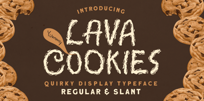 Introducing, Lava Cookies - A quirky display typeface. The unusual quirky style make this font looks great and standout for tittle, branding, logo, packaging, etc. Features : uppercase & lowercase numbers and punctuation multilingual alternates & ligatures PUA encoded We highly recommend using a program that supports OpenType features and Glyphs panels like many of Adobe apps and Corel Draw, so you can see and access all Glyph variations Thank You!
 - PAG Sottoterra by Prop-a-ganda,
$19.99Prop-a-ganda offers retro-flavored fonts inspired by lettering on retro propaganda posters, retro advertising posters, retro packages all the world over. This is perfect font for your retrospective project. PAG Sottoterra is heavy and high-contrast font, and you can see triangles in some letters. This font reminds us of old posters of science fiction movie. It works best for for display or titling. - Darby Display by Courtney Rhodes,
$19.95Darby came about while playing with a loaded round-tipped brush. The letters remind me a bit of signage I remember seeing at county fairs in my youth. It's a casual comfortable font that lends itself well to outlining and drop shadows for emphasis. Not intended for long copy, it would work well in headlines or in signage where one is wishing to attract attention.
