10,000 search results
(0.032 seconds)
- Nurnberg Schwabacher by Intellecta Design,
$29.95"I digitized and to revitalize NurnbergSchwabacher by the extinct Haas'sche Schriftgiesserei, a German/Swiss foundry established in 1790 and based in Basel/Münchenstein. Many of its shares were acquired by D. Stempel in 1927. On the Luc Devroye site this foundry is listed on the Extinct Foundries of the 18th century page. This design is very similar to another Intellecta best seller: Hostetler Fette Ultfraktur Ornamental, both drawn from the classical type specimen book from Hostetler. The ornamental frame that completes the font is a fantastic baroque ornament that I found in another old book, unfortunately lost now. Luc Devroye, whose book is the source for all of my fonts, writes this about Rudolf Hostettler: He was a Swiss type designer, author of “The Printer’s Terms” designed by Jan Tschichold, of "Technical Terms of the Printing Industry" (5th edition was printed in 1995), and of "Type: eine Auswahl guter Drucktypen; 80 Alphabete klassischer und moderner Schriften" (Teufen, Ausser-Rhoden: Niggli, 1958). He also wrote "Type: A Selection of Types" (1949, fgm books, R. Hostettler, E. Kopley, H. Strehler Publ., St. Gallen and London) in which he highlights type made by European houses such as Haas, Enschedé, Deberny and Nebiolo. Jost Hochuli wrote his biography. - Steinweiss Script by Alphabet Soup,
$59.00 Steinweiss Script began its journey towards daylight when Michael Doret was asked by Taschen Publishing to do cover lettering for the huge commemorative edition they were putting together on the work of Alex Steinweiss—“The Inventor of the Modern Album Cover”. The lettering was to be created to appear similar to the famous “Steinweiss Scrawl” the calligraphy that Steinweiss had used on countless album covers. While designing this piece of lettering, Michael realized that there was great potential for a font that was designed in the spirit of that famous “scrawl”. Through his contacts at Taschen Publishing, he was fortunate enough to be able to contact the Steinweiss family, and get the official Steinweiss approval to proceed with his “Steinweiss Script” project. Michael decided that in addition to giving the font his name as an homage, that he would donate a portion of the proceeds from the sale of this font to the man himself: Alex Steinweiss. Read more about the background of Steinweiss Script in Steven Heller’s article in Imprint. Steinweiss Script is a family of fonts in three weights: Light, Medium, and Bold. Additionally, within each weight there are three variations: Simple, Fancy, and Titling. These variations relate to the size/ratio of the caps to the lowercase, the complexity of those caps, and the size of the ascenders/descenders on the lowercase characters. These variations add usefulness to the font, making it accessible not just for headlines, but for longer passages of text as well. For a better understanding of its unique features please download The Steinweiss Script Users Guide from the Gallery section. PLEASE NOTE: the three Steinweiss Script fonts are cross-platform fonts which depend to some extent on certain advanced OpenType features, therefore they can be used to their full potential only with programs that support those features. When setting Steinweiss Script one should almost ALWAYS select the “Standard Ligatures" and “Contextual Alternates” buttons in your OpenType palette. See the “Read Me First!” file in the Gallery section.
 - AS Palmer by Andrey Sharonov,
$24.00 AS Palmer Script & Sans This pair was inspired by the spirit of the past, when manual labor was common, and technology was just beginning to develop. It was crafted by hand specially for traditional typography lovers and anyone who want to add natural handmade feeling in brand identity. It comes with Regular and Aged versions that expands its posibilities in use. Opentype features Script font has 151 stylistic alternates and 3 variations of end-swashes with about 10 lengths of each style. Stylistic Alternates. The easiest way to get alternate character is to add number for example 2, 3 or 4 after any Uppercase. Each of them has from two up to five alternates. This combination works with activated Standard Ligatures option in Opentype panel (Photoshop / Illustrator). End-swashes. AS Palmer Script has 3 variants of end-swashes and about 10 lengths of each style. It works like Stylistic Alternates with activated Standard Ligatures in Opentype panel. Just add special combination at the end of the word, to get needed swash element and its length. Underscore, double underscore or slash is swash style. Number is length. For example: _3, __5, /6. Just try, it's easy. AS Palmer Sans - different Double letters. This feature work automatically with activated Contextual Alternates in Opentype panel. Note, that this features are not available in Miscrosof Word. Palmer is very good looking in logo, labels, t-shirt prints, product packaging, invitations, advertising and others. I've designed some examples, so you can see how it can be used. Multilingual support (Western European characters). English, Danish, Dutch, Estonian, Faroese, Filipino, Finnish, French, German, Hungarian, Icelandic, Irish, Italian, Norwegian, Polish, Portuguese, Spanish, Swedish, Turkish.
 - Houston Pen by Three Islands Press,
$39.00 Early Texas patriots had fascinating penmanship. In researching Texas Hero years ago, I had occasion to pore over copies of letters by the likes of Stephen F. Austin, William B. Travis, Thomas J. Rusk, and others. Austin's hand was pretty messy. Young, brave Travis wrote his last during the Alamo siege. Rusk's suited my original task. But a couple other styles caught my eye -- among them the bold yet graceful strokes of Sam Houston, the prototypical Texas Hero. Houston Pen has a complete character set.
 - Eurotypo BKL by Eurotypo,
$28.00 Eurotypo BKL is a family of fonts inspired in on one of the most beautiful British Typography ever done. This version of Baskerville tries to reflect the taste of his fine style, compatible with the bluntness of the digital present. As many other designers and foundries, our intention has been to represent the atmosphere of Baskerville's style, than simply relive the shapes of its letters. Actually, capitals fits almost to a square proportions, lowercases are more open, ascenders and descenders are shorter, offering more space for enlarge the "x" high. The beauty of his letterforms can enrich headlines; this font can also be used as body text for its good legibility and accurate kerning. John Baskerville (1706-1775) was born 1706 in Wolverley, England. He was a great typographer and printer who published a remarkable edition of Virgil in 1757. His typefaces were greatly admired by Benjamin Franklin; He also has improved and developed many innovations in printing, paper and ink production. Baskerville’s typefaces are regarded as transitional types that represents the link between Old Roman Style and Modern Roman typography.
 - P22 Albers by P22 Type Foundry,
$24.95 This set of typefaces was produced in conjunction with the Guggenheim Museum and the Josef Albers Foundation. Josef Albers was one of the most important artists and educators of the twentieth century. He was a member of the Bauhaus first as a student and then as a teacher from 1920 until its closing in 1933. He then moved to America, where he continued making art and teaching at numerous institutions until his death. Known principally as an abstract painter, he was also an accomplished designer, draftsman, typographer, and photographer. His works explore permutations of form, color, and perception using a restricted visual vocabulary. Created when he was at the Bauhaus, his Kombinationschrift alphabets exemplify the school's ethos. Using 10 basic shapes based on the circle and the rectangle, he created a system of lettering that was meant to be efficient, easy to learn, and inexpensive to produce. These 10 shapes in combination could form any letter or number. The letterforms of this computer version were taken directly from Albers' drawings and notes.
 - Night Light Neon by Wing's Art Studio,
$24.00 Night Light is a specially created collection of seven neon inspired fonts giving designers the power to replicate traditionally hand-made lettering from the comfort of their own computer. Choose from the selection of script, sans serif and outline fonts to set your text. Then apply our custom graphic styles for a life giving jolt of electricity! The appeal of neon lettering lives in its power to display a message in a functional, eye-catching and timelessly cool way. How many times have you stopped in the street to admire a bar sign or shop front blazing with neon colors? It's aesthetic works equally well for a Hot Dog stand or high-end fashion brand, providing a tried and tested technique for grabbing customer attention. I've designed these fonts to make the power of neon accessible to all, investing time to research real neon signs and how they are made, paying attention to their human imperfections and inherent limitations (all of which makes them). This research has been distilled into these essential styles; Script, Outline, Inline, Square and Compressed. These seven core fonts give designers a new opportunity to take advantage of realistic neon lettering in their print and online projects, perfect for music promotion, film titles, YouTube tutorials and gig posters. Ready to be moulded to any requirement, the power of neon is in your hands. Neon Graphic Style Presets Available Here The link above provides access to the graphic styles seen in the visuals with support for Adobe Photoshop, Adobe Illustrator, Adobe After Effects. Simply download and follow the instructions provided.
 - Aretino by Eurotypo,
$24.00 Pietro Aretino (1492 – 1556) Was an Italian author, playwright, poet, satirist and blackmailer, who wielded influence on contemporary art and politics. The most vigorous and versatile vernacular writer of the 16th century He was a very versatile writer, famous for his Lascivious Sonnets – which caused great scandal at the time – but also for his satirical verses, addressed to all the powerful people in Italy, without forgetting the many plays that he wrote for the theatre. Part of the charm of his letters is that through them you may know the whole of Venetian society from the top to the bottom. The little-known church of San Luca in Venice (in St Mark's district) has been a place of pilgrimage for centuries for people who are decidedly not devout: journalists, writers, free thinkers. In 1556 Pietro Aretino, a unique character of the Italian and Venetian Renaissance period was buried there. Such strong of personality, has contributed to generate the powerful wind of change that emerged from the italian renaissance. We have inspired on that talent searching for a new sight the famous Venetian typefaces. Probably looking for more vigour and contemporary digital style. This typeface is slightly condensed, lighter and has more contrast between the thick and thin letter-strokes, it has concave bracketed serif. Their ascender and descenders strokes are very shorts. Aretino family is completed by four weigh: Regular, SemiBold, Bold and ExtraBold, while Italics has three weighs. These fonts came with a full OpenType features and CE languages.
 - White Hiltony by Nathatype,
$29.00 Your selected font type has a big influence on your customers’ perceptions on your designs. It can even beautify or destroy them. With White Hiltony, worry no more about a perfect font for your designs as it is a lovely display sans serif font applicable for elegant, stylish designs. This font has no serif making it look more modern and simple. Furthermore, White Hiltony has regular structures to make it legible enabling you to freely use the font due to its great legibility. Enjoy the features available here. Features: Alternates Ligatures Multilingual Supports PUA Encoded Numerals and Punctuations White Hiltony fits best for various design projects, such as brandings, posters, banners, logos, magazine covers, quotes, headings, printed products, greeting cards, merchandise, social media, etc. Find out more ways to use this font by taking a look at the font preview. Thanks for purchasing our fonts. Hopefully, you have a great time using our font. Feel free to contact us anytime for further information or when you have trouble with the font. Thanks a lot and happy designing.
 - Rig Shaded by Jamie Clarke Type,
$15.00 Rig Shaded is an award-winning 3D type family with a geometric sans serif at its heart. As its name suggests, Rig is designed as a framework to support a range of striking 3D effects. It has four versatile weights including a unique ‘zero’ weight. Each has two grades of distinctive halftone shading, Fine and Coarse, which emphasises Rig’s solid appearance. Rig developed from my quest to find ideal letter shapes for a shaded typeface while retaining their geometric principles and legibility. Each character has been designed to ensure maximum clarity and harmony when combined with 3D effects. The extrude and shaded styles have been handcrafted to produce a consistent weight and tone. Rig’s character set includes 230 glyphs, supporting 198 languages, including all Western, Central and South Eastern European languages. You can buy individual weight packs of Rig Shaded or the entire family for a discounted cost. See the full specimen for Rigs design features, additional examples and tips on using the typeface. Note: Rig’s shading styles have a high level of detail so may process more slowly in some applications.
 - Magneton by Melvastype,
$32.00 Magneton is a brush script typeface that contains three weights and two slant angles. Three weights simulates the pressure of the brush pen; light is written with a gentle pressure and the bold one with more pressure. Two slant angles gives Magneton two natures; the more casual one and the more dynamic one. So with this script you have lots of options to choose from. You can adjust the look and feel just like when writing with a real brush pen! Magneton has lots of alternates and swash characters. It has two sets (and more) of upper case letters. The more basic one and the more flamboyant one. It also has lots and lots of lower case alternates: two styles of end swashes, underlines, a few different ascender and descer swashes and much more. Please explore the images and glyhp set to get the idea. I hope you like what you see and use Magneton in logos, lettering compositions, t-shirts etc. there are lots of opportunities with this one. Thank you and please enjoy!
 - Relato by Emtype Foundry,
$69.00 Relato has a low contrast and “a muscular” structure that makes it useful for setting longer text. In display sizes it has a variety of details that lends it a unique and personal expression. The formal principle of the serif, the variety of terminal strokes and the combination of curves and semi-straight lines gives the Relato a more “human” flavor. The inspiration for the design comes from different traditional calligraphic styles. The upper case letter, for example, is based on roman capitals from the Rennaissance, whereas the lower case relates to humanist handwriting. Even so, Relato is a decidedly contemporary typeface, proposing individual ideas on the design of type. The italic has a distinct typographic color thanks to the construction principle of broken lines. The bold weights have an increased contrast in the union of the strokes which helps improve legibility in small sizes and reinforce their personality in display sizes. The family consists of a Regular version, Italic, Small caps, Semibold and Bold. For a sans serif version of Relato, please see Relato Sans.
 - Oksana by AndrijType,
$40.00 Oksana is a Ukrainian female name. As a true native Ukrainian, this semi-serif type family has a strong structure, but soft and friendly nature. In six weights from thin to heavy it is perfect for titles and short texts lines. Look how people use it: http://use.type.org.ua/tagged/oksana
 - Fancy Dancing JNL by Jeff Levine,
$29.00 The 1938 movie musical "Carefree" starring Fred Astaire and Ginger Rogers featured the song "Change Partners" by Irving Berlin. A copy of the sheet music for this song had the title hand lettered in a wonderful tri-line design that has been recreated in the digital typeface Fancy Dancing JNL.
 - Bosque by Latinotype,
$29.00 Bosque is a typeface designed by Paula Nazal and Daniel Hernandez. It belongs to handmade style, it's rough and raw with soft edges. It has 6 variants: Normal, Wood, Shadow, Wood Shadow, Dingbats y Shadow One, this gives great versatility. It possess a wide set of characters, ligatures and some alternates.
 - Figgins Tuscan by HiH,
$12.00 Early in the 19th century, foundries began releasing a variety of decorated ornamental letters based on the Tuscan letterform. Fancy Tuscan letters quickly became so popular, they eventually came to represent the cluttered extremes of Victorian design. Foundries competed with each other to produce most extravagantly decorated letterforms. As often happens, success turned to excess. What is often overlooked is the long history of the Tuscan style. Early examples have been traced back to ancient Rome. Indeed, the characteristic bifurcation may have represented a fishtail to the early Christians, thus sharing in the roll of symbolic identification played by the simple drawing of a fish as a whole. Later. trifurcation was developed as an alternate termination, followed by loops, full fishtails, curls, hooks and other fancy variations. Nicolete Gray provides an extensive history in her Appendix One of NINETEENTH CENTURY ORNAMENTED TYPEFACES. According to Gray, the first metal typeface based on the Tuscan form was the Ornamented of 1817 by Vincent Figgins of London. Thorowgood followed suit in 1821, Fry in 1824 and Caslon in 1830. Each was to re-visit the form many times during the Victorian era. Here we present our interpretation of what Figgins might have produced in a basic, plain Tuscan form - free of the decorative additions. We are pretty safe here because Figgins was very creative. He explored many of the terminal variations listed above and combined them with different decorative devices to produce a constant stream of new faces to meet the demands of the marketplace. Figgins Tuscan ML represents a major extension of the original release, with the following changes: 1. Added glyphs for the 1250 Central Europe, the 1252 Turkish and the 1257 Baltic Code Pages. There are also a few glyphs for Anglo-Saxon, Gaelic and Old Gaelic. Total of 355 glyphs. 2. Added OpenType GSUB layout features: aalt, ornm and liga ˜ with total 34 lookups. 3. Added 351 kerning pairs. 4. Redesigned several glyphs: the comma, quotes, brackets, braces, acute accent, and grave accent. 5. Revised vertical metrics for improved cross-platform line spacing. Please note that some older applications may only be able to access the Western Europe character set (approximately 221 glyphs). The zip package includes two versions of the font at no extra charge. There is an OTF version which is in Open PS (Post Script Type 1) format and a TTF version which is in Open TT (True Type)format. Use whichever works best for your applications.
 - Janda Spring Doodles - Personal use only

- PORT118 - Unknown license

- Riot Act 2 - Unknown license

- Infrastructure JNL by Jeff Levine,
$29.00 A 1930s-era poster to "See America - Welcome to Montana" was issued by the United States Travel Bureau; one of the WPA (Works Progress Administrations) projects promoting travel and tourism within the country. The hexagon-inspired angular lettering on the poster provided the inspiration for Infrastructure JNL.
 - Domingo by Sudtipos,
$25.00 The smooth curves and big wondrous eyes of the Tango dancer in all her charm. Domingo expresses the sensual mysteries of South America like no other typeface ever could. Fragile yet firm, loving yet proud, Domingo conveys an eternal sense of care and beauty, depth and poetry.
 - Admercia by Khoir,
$15.00 Admercia is a classic minimalist serif font with lots of variant on each letter, this font is perfect for your design needs like creating eye-catching logos and titles to stand out in any design project. Admercia Uppercase Lowercase 75+ Language 87 Alternates Thank you for seeing
 - Diltoon by Prioritype,
$15.00 Introducing a new unique and cute font. You can apply this font in projects such as packaging products, crafts, video previews, food products, logos, and much more to explore. For a view see some of the preview examples above. Features: -Uppercase -Lowercase -Numeral -Punctuation -Multilingual Thanks.
 - Asbanur by Mightyfire,
$10.00 Hello! Asbanur is here. Asbanur brings modern, clean and neat looks. This font can be used as the logo of your brand, headline title, magazine title or many things. We have two versions: light and regular, but both of the versions is cool! Try them and enjoy!
 - Wallflowers II by Laura Worthington,
$19.00 Create borders, wallpaper, or repeating patterns using Wallflower II’s unique hand drawn wallpaper tiles and accompanying icons. Wallflowers II are easy to use for borders or wallpaper: simply type the same letter consecutively (i.e., aaa) and the pattern will emerge. See what’s included! http://bit.ly/2bGXbnC
 - LD Walt by Illustration Ink,
$3.00Know anybody named Walt? Ever seen his handwriting? Well, here it is (at least a similar style). You will enjoy using it for your theme park titles, invitations etc. (And it’s much cleaner and nicer-looking than any other version out there.) Font inspired from Walt Disney. - Theyriad Script by FallenGraphic,
$20.00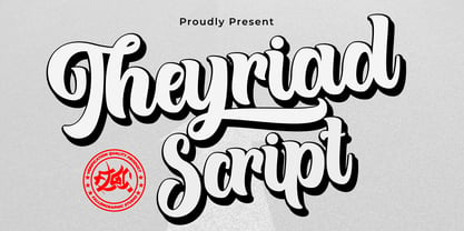 Theyriad Script is the great choice for watermarks on photography, logo designs, quotes, album covers, business cards, and many other design projects. Theyriad Script is here to elevate your work to the highest level. Features: -Accents (Multilingual Characters) -PUA encoded -Numerals and Punctuations (OpenType Standard) -Many alternates
 - Roseborough by BeckMcCormick,
$14.00Roseborough is best for: - logos + branding, especially cosmetics, fashion, & clothing brands - website design + website accents - think feminine websites, creative professionals, travel blogs, fashion blogs, & more - clean print design, like magazines + flyers - header elements that need a clean, modern look - quote graphics for social media - chic graphic tees - Bloktor Mosaik JNL by Jeff Levine,
$29.00Bloktor Mosaik JNL from Jeff Levine was at first a straightforward brick design sent to Typodermic's Ray Larabie for preview. Ray decided to run it through a filter to see what would happen, resulting in a font that emulates the look of cut stone or tile. - Konscript by Michael Browers,
$25.00Konscript is a distressed typewriter face developed from analog samples from papers Mary Browers typed in the 1950s for her high school coursework. The model and age of the typewriter are not known. Additional characters were developed based on the analog samples to complete the character set. - Winter Wallflowers by Laura Worthington,
$19.00 Create borders, wallpaper, or repeating patterns using 25 unique hand drawn wallpaper tiles and accompanying icons. Winter Wallflowers are very easy to use for borders or wallpaper: simply type the same letter consecutively (i.e., aaa) and the pattern will emerge. See what’s included! http://bit.ly/2bO1mIE
 - Rayters by skillyas studio,
$23.00 The Rayters is a Modern bold script. Rayters is handcrafted Carefully with smooth curves so this font is great for Branding, Logo Design, Lettering, Logotype, Clothing, Poster, magazine, and other design project. The Rayters Character Set : to see more of our work visit our website: skillyasstudio.com
 - Valentine's Fleurons by Greater Albion Typefounders,
$3.95 Valentine's Fleurons is a bit of romantic (the emotion, not the era) fun!. Need a few dingbats for that special card you're making for that special person-or for others to give to their special person(s)? You'll find them here in a charming hand-drawn style.
 - Road Rage by Vozzy,
$10.00 Introducing a vintage look label font family named "Road Rage". All available characters you can see at the screenshot. This font have 4 styles - Regular, Shadow, Rough and Rough Shadow. This font will good viewed on any retro design like poster, t-shirt, label, logo etc.
 - Home Grown by Studio K,
$45.00 Home Grown is a hand-drawn font that is fresh, immediate and informal. As the applications here show it is especially well suited to food packaging and natural or organic products in particular. However, it can be used wherever a friendly, approachable feel is sought after.
 - Ela by Wiescher Design,
$39.50 Ela is the typeface I originally designed for the business of my second wife and mother of my two sons, her name is of course Michaela. Ela the typeface is suitable for magazines, newspapers, posters, advertiments, books, text, documentation/business reports, business correspondence, multimedia, and corporate design.
 - Chifully by Astageni,
$10.00 hi, here is Chifully, a handwritten font. started with writing, and I thought, well it's good to make a font, Chifully fonts are perfect for design needs with cheerful nuances, very suitable for use in t-shirts, for quotes on mugs, etc, develop your imagination, right?
 - Malibu by Solotype,
$19.95If you like thematic fonts, this is for you. It appeared in an old lettering book (from the 1930s, if memory serves) and later came out as a film font for photolettering machines. We cleaned it up and drew the missing characters, and here it is. Enjoy. - Pine Nuts United by Jonahfonts,
$35.00 Pine Nuts-United is the little sister of the popular "Pine Nuts" and "Pony Tale" family fonts. It's a connected (United) version with some new ligatures, stylistic alternates and alternate glyphs, small-caps are also included. See the 'Pine Nuts', 'Pony Tale' and 'Pony Tale Pro' versions.
 - ShadyCharacters by Ingrimayne Type,
$4.95 ShadyCharacters is an all-caps font with a ziggy, hollow top and a solid bottom. With lots of imagination, you might see the letters as tree-like, hence its name. The ShadyCharactersInside font can be layered over letters of ShadyCharacters to fill in the tops with color.


