10,000 search results
(0.026 seconds)
- Winterlust by Epiclinez,
$20.00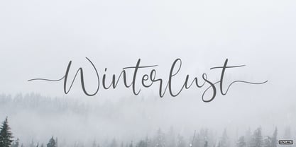 Winterlust is a lovely and timeless handwritten font. It is the best choice for creating eye catching logos, branding and quotes. Every letter has a unique and beautiful touch, which will make your design come alive!
 - Spaceboy by Drewfonts,
$15.00Originally conceived from the basic sign writers brush stroke pattern and heavily influenced by the songs of David Bowie this style has developed into an organic Futurist face, kind of post modern retro, catch my drift? - Shipped JNL by Jeff Levine,
$29.00 One of six fonts inspired by old stencil lettering guides, Jeff Levine has drawn a font which captures the feel of simpler times when signs and posters were stencilled by school children, teachers, librarians and shopkeepers.
 - Oabestira by Mabhal Studio,
$15.00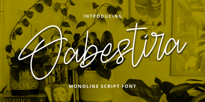 Oabestira is an asymmetrical and timeless handwritten font. It is the best choice for creating eye-catching logos, branding and quotes. Every letter has a unique and beautiful touch, which will make your design come alive!
 - Thousands by Dharma Type,
$19.99 This slab serif has an incredible type system. By using power of OpenType alternates, typographic flexibility going up and up as its name indicates. Serifs transform, change to small caps and ligatures give you rich typography.
 - Head Strung by PizzaDude.dk,
$17.00 The Head Strung font is designed with a simple and basic serif structure, but has its oddities and curly lines. It comes with 4 different versions of each letter, and these automatically cycle as you type.
 - Delivered JNL by Jeff Levine,
$29.00One of six fonts inspired by old stencil lettering guides, Jeff Levine has drawn a font which captures the feel of simpler times when signs and posters were stencilled by school children, teachers, librarians and shopkeepers. - Sealed JNL by Jeff Levine,
$29.00One of six fonts inspired by old stencil lettering guides, Jeff Levine has drawn a font which captures the feel of simpler times when signs and posters were stencilled by school children, teachers, librarians and shopkeepers. - Mesopotamia by Teweka,
$15.00 Introducing New Mesopotamia Modern Signature, created with signature letters in mind. This font also has Swash, Ligature in it. You can use it as a logo, packaging, headline, poster, t-shirt, greeting card, wedding invitation, etc.
 - Liebelei Variable by Wannatype,
$138.00 The typeface Liebelei has its roots back in 1932, when Vienna-based painter Rudolf Vogl created the poster for a movie called Liebelei after the popular play by Arthur Schnitzler. Now also available as Variable font!
 - Flamenco Inline by ITC,
$29.99Flamenco is the work of British artist Tony Geddes. Its versatile display style has an inline contour decoration and a controlled yet casual appearance. Flamenco will guarantee visual excitement across a vast range of advertising applications. - Canadia by BonjourType,
$15.00 Canadia is a cursive and lovely handwritten font. This versatile script font has a wide spectrum of applications ranging from greeting cards to headlines and is guaranteed to add a romantic feel to your next project.
 - Crunk by Nerfect,
$15.00Crunk was inspired by the creator's (at the time) teenaged hoodlum of a brother. The font Crunk is great for headlines and text and has served its creator well over the years since it was made. - Aicho by Handpik,
$13.00 Aicho is beauty serif display.This font is suitable for invitation cards, decorations, clothing products, greeting cards and others. This font also has uppercase, lowercase, numeric, puntuation and multilingual. and there are several ligature and stylistic alternate.
 - Reymond by Rockboys Studio,
$18.00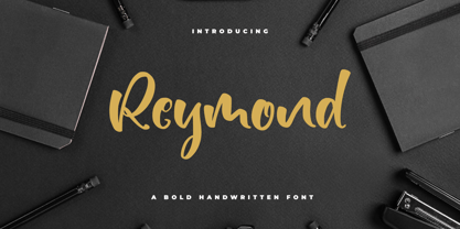 Reymond is a lovely and timeless handwritten font. It is the best choice for creating eye catching logos, branding and quotes. Every letter has a unique and beautiful touch, which will make your design come alive!
 - Under Weak by Trustha,
$16.00 Under Weak is an amazing and bold script, suitable for a large number of designs. This font has two styles, clean and rough. With two styles, you can choose according to the project you're working on.
 - Toscana by Hemphill Type,
$20.00 A traditional Italian style font family inspired by the rural landscape and characterful back streets of Tuscany. The blend of gently rolling hills leading onto sharply peaked mountains has influenced the natural shapes of the letterforms.
 - Burkey by Muksal Creatives,
$10.00 Burkey is modern family of Display fonts. Koumon has 8 families font, starting from the small thin to the largest black. This typeface is versatile and can be used successfully in magazines, posters, branding, websites, etc.*
 - Willpower Slab by Sign Studio,
$9.00 Willpower Slab is made to write neatly and to make it easy to read properly. Smooth design and balanced thickness. Each character has been set kerning. You can just write comfortably with him 5 thickness options.
 - Laurentian by Monotype,
$29.99 Maclean's is a weekly Canadian newsmagazine with a broad editorial mission. A typical issue covers everything from violence on the other side of the globe to the largest pumpkin grown in a local county. In 2001, Maclean's invited Rod McDonald to become part of the design team to renovate" the 96-year-old publication. The magazine wanted to offer its readers a typographic voice that was professional, clean, and easy to read. Above all, the typeface had to be able to speak about the hundreds of unrelated subjects addressed in each issue while remaining believable and uncontrived. A tall order, perhaps? Now add in that this would be the first text typeface ever commissioned by a Canadian magazine. McDonald, who some have called Canada's unofficial "typographer laureate," took on the challenge. McDonald used two historic models as the basis for Laurentian's design: the work of French type designer Claude Garamond, and that of the English printer and type founder, William Caslon. From Garamond Laurentian acquired its humanist axis, crisp serifs and terminals that mimic pen strokes. Caslon's letters are less humanistic, with a more marked contrast in stroke weight and serifs that appear constructed rather than drawn. These traits also made their mark on Laurentian. Using these two designs as a foundation, McDonald drew Laurentian with the narrow text columns and small type sizes of magazine composition in mind. He gave his letters strong vertical strokes and sturdy serifs, a robust x-height and a slightly compressed character width A tall order, per McDonald's genius is evident in the face's legibility, quiet liveliness and in the openness of the letters. The result is a typeface that not only met Maclean's demanding design brief, but also provides exceptional service in a wide variety of other applications. Laurentian is available in three weights of Regular, Semi Bold and Bold, with complementary italics for the Regular and Semi Bold, and a suite of titling caps."
 - Ambassador Script by Canada Type,
$69.95 When Aldo Novarese designed his “tipo inglese” Juliet typeface, he had a simple objective in mind: Reduce the inclination angle of the traditional 18th and 19th centuries English script in order to make the punchcutter’s job easier and the resulting metal type more durable. But when Juliet was released by Nebiolo in 1955, it was a big surprise to both typesetters and calligraphers all over Europe. Novarese’s idea of working the standard copperplate script within the limited technology of the time proved to be a marvel in optical metal sizing (Juliet was available in sizes ranging from 12 to 60 pt), but also opened the door to new calligraphic possibilities. Easier readability and a very friendly color were obvious side effects of the reduced angle. So soon after its release, calligraphers worldwide began emulating the angle reduction and experimenting with the application of the same concept to other calligraphic genres. Today, more than 50 years later, many professional calligraphers point to Novarese’s Juliet as an opening to fresh ideas and new directions in 20th century elegant calligraphy. Ambassador Script, this digital version of Aldo Novarese’s surprising masterpiece, is the result of more than a thousand hours of work. Going above and beyond its duty as a revival, it was expanded by a great number of alternates, swashes, beginning and ending forms, as well as accompanying flourishes and snap-on strokes for even more ending forms. Ambassador Script also supports almost every known Latin-based language, which makes its name all the more fitting. Ambassador Script is available in all popular font formats. The True Type and Postscript Type 1 versions come in 12 fonts, available in different piecemeal configurations or a full volume. The OpenType version collects more than 2300 characters in a single feature-rich font that can sing mightily in OpenType-supporting applications. Ambassador Script is ideal for weddings, invitations, greeting cards, book and magazine covers, or anywhere a touch of calligraphic elegance is desired.
 - Blessing and Struggle by Colllab Studio,
$7.00 Presenting Blessing and Struggle! A Spontaneous Handwritten Font with all-caps glyphs. This font made with the perfect combination of each character. You can combine with Extra to get a unique combination. It looks original and can be used for all your project needs. Each glyph has its own uniqueness and when meeting with others will provide dynamic and pleasing proximity. This font can be used at any time and in any project. You can see in the presentation picture above, Blessing and Struggle looks unique and authentic style on design projects. So, Blessing and Struggle can't wait to give its touch to all your design projects such as quotes, poster design, personal branding, promotional materials, website, logotype, product packaging, etc. WHAT'S INCLUDED? 1. Blessing and Struggle Regular • The first version comes with uppercase, lowercase, ligatures, numeral, punctuation, symbols, and Standard Latin Multilingual Support (Afrikaans, Albanian, Catalan, Danish, Dutch, English, French, German, Icelandic, Indonesian, Italian, Malay, Norwegian, Portuguese, Spanisch, Swedish, Zulu, and More). 2. Blessing and Struggle Slant • The first version comes with uppercase, lowercase, ligatures, numeral, punctuation, symbols, and Standard Latin Multilingual Support (Afrikaans, Albanian, Catalan, Danish, Dutch, English, French, German, Icelandic, Indonesian, Italian, Malay, Norwegian, Portuguese, Spanisch, Swedish, Zulu, and More). 3. Blessing and Struggle Slant Bold • The first version comes with uppercase, lowercase, ligatures, numeral, punctuation, symbols, and Standard Latin Multilingual Support (Afrikaans, Albanian, Catalan, Danish, Dutch, English, French, German, Icelandic, Indonesian, Italian, Malay, Norwegian, Portuguese, Spanisch, Swedish, Zulu, and More). 4. Blessing and Struggle Semi Bold • The first version comes with uppercase, lowercase, ligatures, numeral, punctuation, symbols, and Standard Latin Multilingual Support (Afrikaans, Albanian, Catalan, Danish, Dutch, English, French, German, Icelandic, Indonesian, Italian, Malay, Norwegian, Portuguese, Spanisch, Swedish, Zulu, and More). 5. Blessing and Struggle Minus Slant • The first version comes with uppercase, lowercase, ligatures, numeral, punctuation, symbols, and Standard Latin Multilingual Support (Afrikaans, Albanian, Catalan, Danish, Dutch, English, French, German, Icelandic, Indonesian, Italian, Malay, Norwegian, Portuguese, Spanisch, Swedish, Zulu, and More). 6. Extra Swashes • Included 7 Dingbats. You can feature all with typing c_1 until c_7 (in all versions) A Million Thanks Colllab Studio
 - Price Didone by Eclectotype,
$25.00 PUBLIC SERVICE ANNOUNCEMENT: Price Didone has inspired a full alphabetic font - Mastadoni, so if you're after more than numerals, head over there! Price Didone is a font with a singular purpose: The setting of elegant, stylish price tags. As such it is non-alphabetic, featuring instead numerals, a large array of currency symbols, and a smattering of typographic niceties such as quotes, brackets, pilcrow, daggers and a very curvaceous ampersand. Certain currency symbols that are not independent glyphs (Q, Ft, kr etc.) are included as their constituent letters, some of which also have automatic ligatures for that little something extra. There are currency symbols included which have not (yet) been accepted to unicode, such as the Russian Ruble and Bitcoin symbols. For ease of access, these can be typed using the standard ligatures feature. See features below for the full list. Features: Automatic Fractions - with fractions feature engaged, arbitrary fractions are a doddle. Stylistic Sets: SS01 - an alternate look for 4 SS02 - a double stroked dollar symbol SS03- the # sign becomes a stylish numero Stylistic Alternates - for software that doesn't support stylistic sets, the above three features are grouped into the one SALT feature. Standard Ligatures - certain typed combinations automatically change to different glyphs: B|| = Bitcoin symbol P- = Russian Ruble RM = Malaysian Rimgit symbol Rp = Indonesian Rupiah Rs = Rupees Ft = Hungarian Forint kr = Kroner symbol % off;%off;%ff = Special percent off ligature Discretionary Ligatures - this feature sets decimal prices like $5.95 with the numerals after the period smaller and raised from the baseline, underlined by a nice swoosh. It also shrinks the dollar, sterling, and Euro symbols for a more authentic look. While intended for one sole purpose, Price Didone could nevertheless be quite versatile. Quote marks and typographic symbols can be used for decoration. Everybody loves a nice ampersand and this is one I'm really proud of. Or you might just want some pretty numbers for your house, or sports jersey, or just to stand out a little from the rest of your text. Whatever use you may have in mind, go for it. And do let me know if your currency symbol isn't included, and I'll quickly add it to the glyph set in future versions.
 - Port Vintage by Onrepeat,
$25.00 Guided tour available here. Port Vintage is a new typeface expanded upon the original Port typeface, released in 2013, and being an experimental Didone typeface with a modern twist, inspired by the well known forms of typography masters such as Bodoni and Didot and the exuberance and elegance of calligraphy typefaces. A lot of changes were made, the whole typeface is now softer and has less rough edges, the time it took to mature made it possible to achieve an entirelly new and distinct flavour from the original Port, giving away the rough edges from Port and giving place to the soft transitions and curved connections between the stems and serifs of Port Vintage. Port Vintage melts the straight lines and strong contrasts of the Didone typefaces with the elegant lines of calligraphy in a geometric way, resulting in exuberant characters with geometric swashes that can be combined in countless ways. The result of this experiment is Port Vintage, an unique and rich display typeface meant to be used on big sizes and it’s main perk is the amount of alternative characters it features. Port Vintage is Open-Type programmed and includes hundreds of alternates, from swashes to titling alternates, ligatures and stylistic sets with each character having a thin version of itself, giving complete freedom to all your creative needs. Port Vintage is available in 10 different styles: Port Vintage Regular, being the base version and featuring the whole base character set; Port Vintage Regular Decorated, featuring richer forms and containing more ornamentated and more extravagant characters; Port Vintage Medium and Port Vintage Medium Decorated, designed for the occasions you need a bit more thickness and the decoration variants: Port Vintage Ornaments, containing a wide set of elements meant for the creation of fillets, vignettes and fleurons, resulting in an almost infinite number of possible combinations to embellish your designs and Port Vintage Words, a set of some of the most common words used in English, Spanish, French, German, Italian and Portuguese. All styles, except Port Vintage Ornaments and Port Vintage Words, include italic styles. For a better understanding of all the uses of Port Vintage and the full character list the reading of the manual is recommended.
 - Wubble by Typodermic,
$11.95 Welcome to Wubble Labs—where we don’t just think outside the box, we dissolve it! Our team of mad scientists has been busy experimenting with the latest in colloidal glopulation technology, and we’re thrilled to present our latest creation: Wubble, the blobbiest, squishiest, most liquid font you’ve ever seen! We know what you’re thinking, “liquid font? What the heck does that even mean?” Well, let us tell you, Wubble is more than just a font—it’s a living, breathing, dripping typographical workfish. Each letter is like a tiny blob of ooze, flowing and shifting in a mesmerizing dance of liquidy goodness. But don’t let Wubble’s gooey exterior fool you—this font is the product of years of careful research and development. Our team of scientists have spent countless hours studying the precise characteristics of colloidal glopulation, perfecting every last detail to bring you the finest liquid font ever produced. So if you’re ready to take your design game to the next level, come on down to Wubble Labs and see what all the fuss is about. We promise, once you go Wubble, you’ll never go back! Most Latin-based European writing systems are supported, including the following languages. Afaan Oromo, Afar, Afrikaans, Albanian, Alsatian, Aromanian, Aymara, Bashkir (Latin), Basque, Belarusian (Latin), Bemba, Bikol, Bosnian, Breton, Cape Verdean, Creole, Catalan, Cebuano, Chamorro, Chavacano, Chichewa, Crimean Tatar (Latin), Croatian, Czech, Danish, Dawan, Dholuo, Dutch, English, Estonian, Faroese, Fijian, Filipino, Finnish, French, Frisian, Friulian, Gagauz (Latin), Galician, Ganda, Genoese, German, Greenlandic, Guadeloupean Creole, Haitian Creole, Hawaiian, Hiligaynon, Hungarian, Icelandic, Ilocano, Indonesian, Irish, Italian, Jamaican, Kaqchikel, Karakalpak (Latin), Kashubian, Kikongo, Kinyarwanda, Kirundi, Kurdish (Latin), Latvian, Lithuanian, Lombard, Low Saxon, Luxembourgish, Maasai, Makhuwa, Malay, Maltese, Māori, Moldovan, Montenegrin, Ndebele, Neapolitan, Norwegian, Novial, Occitan, Ossetian (Latin), Papiamento, Piedmontese, Polish, Portuguese, Quechua, Rarotongan, Romanian, Romansh, Sami, Sango, Saramaccan, Sardinian, Scottish Gaelic, Serbian (Latin), Shona, Sicilian, Silesian, Slovak, Slovenian, Somali, Sorbian, Sotho, Spanish, Swahili, Swazi, Swedish, Tagalog, Tahitian, Tetum, Tongan, Tshiluba, Tsonga, Tswana, Tumbuka, Turkish, Turkmen (Latin), Tuvaluan, Uzbek (Latin), Venetian, Vepsian, Võro, Walloon, Waray-Waray, Wayuu, Welsh, Wolof, Xhosa, Yapese, Zapotec Zulu and Zuni.
 - Lisbeth by TypeTogether,
$39.00 Louisa Fröhlich’s Lisbeth is the charming all-italic trailblazer that handles branding and text with internal vividness. With no roman style, it’s an italic-only family whose creation was guided by imagination instead of restrictive writing tools. Some type families aren’t sure what they want. Lisbeth proceeds with the utmost confidence on its own terms — it’s a feisty three-dimensional thespian amidst the cast of strait-laced characters you’re used to. With branding and magazine usage in mind, Lisbeth addresses the distinct challenges of text and display in a characterful way. The curves of the text weights show a soft angularity, emphasising the handwritten quality and the subtle twist inside the letters. The stroke’s carefully balanced contrast is more pronounced in the vibrant heavier weights but almost absent in the graceful structure of the thin weight. The angle of the letters is almost upright and the x-height is relatively large, so longer texts can be read comfortably and without effort. Lisbeth is slightly condensed and so uses a smaller area to efficiently impart much information. So if a type design can be thought of as the clothing letters wear, then Lisbeth is an energetic, freely flowing stroke wrapped around practical and efficient letter proportions. Another highlight of the family is the quirky high-contrast display style, easily catching every eye. The design concept of the twisted stroke shows at the extreme here and makes the letters dance a little on the page. Even though the shapes behave wildly, every letter is carefully balanced in itself so that the rhythmic repetition of the lettershapes results in an even and harmonic total picture. Lisbeth’s five text weights (from thin to bold) perform excellently in text settings, and its funky display style amps up the internal shimmer within each glyph. It supports numerous languages (Latin-A extended) and comes with ligatures and contextual alternates to produce beautiful typography. The character set contains proportional lining and oldstyle figures, tabular figures, subscripts, superscripts, and fractions. The complete Lisbeth family, along with our entire catalogue, has been optimised for today’s varied screen uses.
 - Connected Neon by Ditatype,
$29.00 Connected Neon is a mesmerizing display font that encapsulates the vibrant glow of neon lights, fusing it with a unique twist of connected letterforms. With its bold and uppercases design, this typeface commands attention, drawing the viewer into a captivating visual experience. The defining feature of Connected Neon lies in its elegant lines that seamlessly connect each letter, creating a unified and harmonious composition. These delicate lines flow effortlessly from one character to the next, accentuating the connectivity between them. As a result, the letters appear to dance with an electric energy, forming an enchanting tapestry of illuminated artistry. The neon-inspired style of Connected Neon is a nod to the retro-futuristic aesthetics of the 80s, reminiscent of the vibrant signage that adorned the bustling city streets. The font's luminous glow radiates with an otherworldly aura, casting a vivid hue that is both nostalgic and contemporary, evoking a sense of vibrant energy and modernity. Each character in Connected Neon has been meticulously crafted to strike the perfect balance between legibility and decorative flair. The bold letterforms boast a sleek, sans-serif design, ensuring clarity even in the midst of the dynamic interplay of lines. The seamless connections between letters create a sense of continuity and fluidity, enhancing the visual appeal without compromising readability. Enjoy the various features available in this font. Features: Multilingual Supports PUA Encoded Numerals and Punctuations Connected Neon is ideal for a range of creative projects that demand a touch of charismatic flair. From eye-catching headlines on posters and advertisements to striking branding elements, this font adds a touch of electrifying allure to any design. Whether you're designing a captivating logo, crafting an attention-grabbing title, or bringing a digital artwork to life, Connected Neon will effortlessly infuse your creations with a radiant glow and a sense of interconnectedness. Find out more ways to use this font by taking a look at the font preview. Thanks for purchasing our fonts. Hopefully, you have a great time using our font. Feel free to contact us anytime for further information or when you have trouble with the font. Thanks a lot and happy designing.
 - Sofachrome by Typodermic,
$11.95 Introducing Sofachrome—the epitome of the modern, the pinnacle of the sleek, and the embodiment of high-tech design. Its extended futuristic letterforms will take your project to the next level, while its streamlined, industrial contours will give your work a feeling of durability and strength. This typeface is not just any ordinary typeface. It has been specifically designed to evoke a sense of futuristic innovation, with its bold thick and thin stroke contrast that provides a striking impact. Its sleek and polished finish will leave an unforgettable impression on anyone who lays their eyes on it, making it perfect for designs that demand a high-speed and technical efficiency. With five sleek weights and italics, Sofachrome is versatile enough to use in a variety of projects. Whether you’re creating a high-tech ad campaign, designing a futuristic poster or even creating an eye-catching logo, this typeface will help you achieve the desired impact. Sofachrome is not just a font, it’s a statement—a statement of quality, precision, and sophistication. So why settle for anything less when you can elevate your designs to the next level with Sofachrome? Choose Sofachrome for your next design project and see the future of design unfold before your very eyes. Most Latin-based European writing systems are supported, including the following languages. Afaan Oromo, Afar, Afrikaans, Albanian, Alsatian, Aromanian, Aymara, Bashkir (Latin), Basque, Belarusian (Latin), Bemba, Bikol, Bosnian, Breton, Cape Verdean, Creole, Catalan, Cebuano, Chamorro, Chavacano, Chichewa, Crimean Tatar (Latin), Croatian, Czech, Danish, Dawan, Dholuo, Dutch, English, Estonian, Faroese, Fijian, Filipino, Finnish, French, Frisian, Friulian, Gagauz (Latin), Galician, Ganda, Genoese, German, Greenlandic, Guadeloupean Creole, Haitian Creole, Hawaiian, Hiligaynon, Hungarian, Icelandic, Ilocano, Indonesian, Irish, Italian, Jamaican, Kaqchikel, Karakalpak (Latin), Kashubian, Kikongo, Kinyarwanda, Kirundi, Kurdish (Latin), Latvian, Lithuanian, Lombard, Low Saxon, Luxembourgish, Maasai, Makhuwa, Malay, Maltese, Māori, Moldovan, Montenegrin, Ndebele, Neapolitan, Norwegian, Novial, Occitan, Ossetian (Latin), Papiamento, Piedmontese, Polish, Portuguese, Quechua, Rarotongan, Romanian, Romansh, Sami, Sango, Saramaccan, Sardinian, Scottish Gaelic, Serbian (Latin), Shona, Sicilian, Silesian, Slovak, Slovenian, Somali, Sorbian, Sotho, Spanish, Swahili, Swazi, Swedish, Tagalog, Tahitian, Tetum, Tongan, Tshiluba, Tsonga, Tswana, Tumbuka, Turkish, Turkmen (Latin), Tuvaluan, Uzbek (Latin), Venetian, Vepsian, Võro, Walloon, Waray-Waray, Wayuu, Welsh, Wolof, Xhosa, Yapese, Zapotec Zulu and Zuni.
 - Kirsty by Typodermic,
$11.95 Introducing Kirsty, the typeface that will give your designs a cutting-edge, contemporary feel. With its sharp, Latin-serif design, Kirsty is a modern take on the classic nineteenth-century railroad lettering. Released in 2000, this typeface quickly became a favorite for its unique octagonal shape and bold, commanding presence. Now, with a proper lowercase, five weights, and obliques, Kirsty is more versatile than ever. Its sleek, angular lines make it perfect for graphic design, branding, and advertising, while the small caps add a touch of sophistication to any layout. Just be aware that not all languages are available in small caps, so be sure to check if your application supports them. Whether you’re looking to create eye-catching headlines, standout logos, or striking marketing materials, Kirsty has the style and versatility to make your designs pop. So why settle for bland, generic typefaces when you can make a statement with Kirsty? Try it out today and see the difference for yourself. Most Latin-based European, Vietnamese, Greek, and most Cyrillic-based writing systems are supported, including the following languages. Afaan Oromo, Afar, Afrikaans, Albanian, Alsatian, Aromanian, Aymara, Azerbaijani, Bashkir, Bashkir (Latin), Basque, Belarusian, Belarusian (Latin), Bemba, Bikol, Bosnian, Breton, Bulgarian, Buryat, Cape Verdean, Creole, Catalan, Cebuano, Chamorro, Chavacano, Chichewa, Crimean Tatar (Latin), Croatian, Czech, Danish, Dawan, Dholuo, Dungan, Dutch, English, Estonian, Faroese, Fijian, Filipino, Finnish, French, Frisian, Friulian, Gagauz (Latin), Galician, Ganda, Genoese, German, Gikuyu, Greenlandic, Guadeloupean Creole, Haitian Creole, Hawaiian, Hiligaynon, Hungarian, Icelandic, Igbo, Ilocano, Indonesian, Irish, Italian, Jamaican, Kaingang, Khalkha, Kalmyk, Kanuri, Kaqchikel, Karakalpak (Latin), Kashubian, Kazakh, Kikongo, Kinyarwanda, Kirundi, Komi-Permyak, Kurdish, Kurdish (Latin), Kyrgyz, Latvian, Lithuanian, Lombard, Low Saxon, Luxembourgish, Maasai, Macedonian, Makhuwa, Malay, Maltese, Māori, Moldovan, Montenegrin, Nahuatl, Ndebele, Neapolitan, Norwegian, Novial, Occitan, Ossetian, Ossetian (Latin), Papiamento, Piedmontese, Polish, Portuguese, Quechua, Rarotongan, Romanian, Romansh, Russian, Rusyn, Sami, Sango, Saramaccan, Sardinian, Scottish Gaelic, Serbian, Serbian (Latin), Shona, Sicilian, Silesian, Slovak, Slovenian, Somali, Sorbian, Sotho, Spanish, Swahili, Swazi, Swedish, Tagalog, Tahitian, Tajik, Tatar, Tetum, Tongan, Tshiluba, Tsonga, Tswana, Tumbuka, Turkish, Turkmen (Latin), Tuvaluan, Ukrainian, Uzbek, Uzbek (Latin), Venda, Venetian, Vepsian, Vietnamese, Võro, Walloon, Waray-Waray, Wayuu, Welsh, Wolof, Xavante, Xhosa, Yapese, Zapotec, Zarma, Zazaki, Zulu and Zuni.
 - Grenale by insigne,
$24.00 The elegant Grenale brings a new look to the classic didone. This shimmering sans-serif family with its mild deco shades alters the typical serifs and terminals of the classic style to form a gracefully eye-catching, high-contrast font. While high-contrast, sans serif forms tend to disappear in the copy, Grenale's meticulously designed features exhibit proper balance in the spacing and in the thorough improvements of its contours. The rigorous consideration given these details leaves a delicate typeface that doesn't get washed out in certain applications. Its pure, polished, geometric structure has a glamorous sensitivity, drawing heavily from the inspiration of the haute couture influence. Grenale's thin weights are simple but vibrant--elegant forms that naturally lend themselves to high fashion journals, high-end branding, and other five star applications. With added energy and power, the thicker weights with their ink traps and optical compensation intensify the gravitas for a statelier look to the graceful forms. Grenale's upright versions are also matched by optically adjusted italics, intentionally tailored to maintain their counterparts' sharp edge, causing the font's fierce characteristics to shine through the refined face. The typeface also includes a wide variety of alternates that can be accessed in any OpenType-enabled application. The stylish features include a large group of alternates, swashes, and meticulously precise details with teardrop terminals and alternate titling caps to accessorize the font. Also included are capital swash alternates, old style figures, and small caps. Take a look at the informative PDF brochure to see these features in action. OpenType enabled applications such as the Adobe suite or Quark can take full advantage of the automatic replacing ligatures and alternates. This family also offers the glyphs to support a wide range of languages. It's time to think high-class. Graceful and confident, Grenale's carefully crafted features transfer pleasantly to each page with elegant charm. With its variety of alternate glyphs and its high, classy contrast, this five star font is a great option for bringing a more refined look to your work. Production assistance for Grenale provided from Lucas Azevedo and iKern.
 - Morris by HiH,
$10.00 Morris is a four-font family produced by HiH Retrofonts and based on the work of the very English William Morris. William Morris wanted a gothic type drawn from the 14th century blackletter tradition that he admired both stylistically and philosophically. He drew from several sources. His principal inspiration for his lower case was the 1462 Bible by Peter Schoeffer of Mainz; particularly notable for the first appearance of the ‘ear’ on the g. The upper case was Morris’s amalgam of the Italian cursive closed caps popular throughout the 12th through 15th centuries, a modern example of which is Goudy’s Lombardic Capitals. The gothic that Morris designed was first used by his Kelmscott Press for the publication of the Historyes Of Troye in 1892. It was called “Troy Type” and was cut at 18 points by Edward Prince. It was also used for The Tale of Beowulf. The typeface was re-cut in at 12 points and called “Chaucer Type” for use in The Order of Chivalry and The Works of Geoffrey Chaucer. Morris' objective is designing his gothic was not only to preserve the color and presence of his sources, but to create letters that were more readable to the English eye. ATF copied Troy and called it Satanick. Not only was the ATF version popular in the United States; but, interestingly, sold very well in Germany. There was great interest in that country in finding a middle ground between blackletter and roman styles -- one that was comfortable for a wider readership. The Morris design was considered one of the more successful solutions. Our interpretation, which we call Morris Gothic, substantially follows the Petzendorfer model used by other versions we have seen, with the following exceptions: 1) a larger fillet radius on the upper arm of the H, 2) a more typically broadpen stroke in place of the foxtail on the Q, which I do not like, 3) inclusion of the aforementioned ear on the g and 4) a slightly shorter descender on the y. We have included five ornaments, at positions 0135, 0137, 0167, 0172 and 0177. The German ligatures ‘ch’ & ‘ck’ can be accessed using the left and right brace keys (0123 & 0125). Morris Initials One and Morris Initials Two are two of several different styles of decorative initial letters that Morris designed for use with his type. He drew from a variety of 15th century sources, among which were Peter Schoeffer’s 1462 Mainz Bible and the lily-of-the-valley alphabet by Gunther Zainer of Augsburg. Each of the two initial fonts is paired with the Morris Gothic lower case. Morris Ornaments is a collection of both text ornaments and forms from the surrounding page-border decorations.
 - Gothikka - Unknown license

- Meritocracy by Up Up Creative,
$29.00 Introducing Meritocracy, a full-featured handwritten font with tons of alternate characters and OpenType features. My goal with this font was to make you a typeface that will look as much like hand lettering as possible. Using the built-in OpenType pseudo-random contextual alternates and over 300 individually drawn ligatures, you can infuse your typography with personality and variety.** OpenType Features Meritocracy comes with more than 900 glyphs! Specific OpenType features include contextual alternates, stylistic alternates, a second stylistic set for variety, multiple alternate glyphs for many letters (accessed through the glyphs panel), multilingual support (including multiple currency symbols), standard numbers, and seven ampersand styles. It also includes 325+ standard and discretionary ligatures, all of them individually hand-drawn to be different from all other glyphs in the font. These ligatures allow you to give a super-realistic hand-lettered look to your typography. You can write the same word in so many different ways if you combine the default set, stylistic set 01, and standard and discretionary ligatures in different ways. SPECIAL OPENTYPE FEATURE: If you are using OpenType-capable software like Adobe Illustrator, Photoshop, InDesign, or CorelDraw and you have contextual alternates turned on, you can see the letters randomize themselves as you type, mixing from the default character set and stylistic set 01. (You can always turn on contextual alternates after you have already typed your passage and it will randomize all at once, or you can choose to turn off contextual alternates and substitute specific glyphs yourself - I find that if I'm typing a word or two, I prefer to control the individual glyphs myself; if I'm typing a paragraph, I like to use the built-in randomness of the contextual alternates feature). Note that this pseudo-randomization (aka contextual alternate feature) is ON by default in Apple's Pages app and OFF by default in Microsoft Word, but it can be turned on. The OpenType features can be very easily accessed by using OpenType-savvy programs such as Adobe Illustrator and Adobe InDesign. (To access most of these awesome features in Microsoft Word, you'll need to get comfortable with the advanced tab of Word's font menu. If you have questions about this, ask me!) Files included: Meritocracy-Regular.otf Please note: there is only one file for this font. That's the magic of OpenType - all of the alternates, ligatures, etc. are built right into the .otf file! Mail support : julie@upupcreative.com --- Find inspiration (and sneak peeks at my next font-in-progress) on - Instagram: http://instagram.com/julieatupupcreative - Facebook : https://www.facebook.com/upupcreative - Pinterest: https://www.pinterest.com/upupcreative - My website: http://upupcreative.com --- **PLEASE ENJOY! I can't wait to see what you make with Meritocracy! Feel free to use the #upupcreative and #meritocracyfont tags to show me what you've been up to!**
 - Duddy by Letritas,
$30.00 Duddy is a “friendly” sans-serif typography designed by Eleonora Lana and the Letritas team. The shape of Duddy was created based on sketches that looked after carrying the concept of kindness as far as possible, keeping always in mind the readability and functionality of the font. In the stage of brainstorming, the team started listing things that were friendly to the touch or sight, such as a candy gum, or marshmallow, to become acquainted with the intended goal. Although slowly, as the letters were being created, the objects associated with the forms were not satisfactory, since when forming words a special personality of its own appeared. By reconceptualizing everything, the personality of the letter the team wanted to work with had to be redefined. Thus it went from "caramel" to "teddy bear", from "teddy bear" to "puppy" and from "puppy" to "dolphin". And Duddy is the perfect name for a dolphin. Duddy was a sound idea: friendly, intelligent, social. Once the concept was nailed, the design of graceful and “soft” shapes started. Almost chewable, almost huggable, as if composing words was a game. Duddy has a slanted version with "real italics". These italics are slightly more condensed than the regular version, in order to give it a different text texture. The typeface has 9 weights, ranging from “thin” to “heavy”, and two versions: "regular" and "italic". Its 18 files contain 729 characters with ligatures, alternates, small caps, oldstyle and tabular numbers, fractions, case sensitive, and unicase figures. It supports 219 Latin-based languages, spanning through 212 different countries. Duddy supports this languages: Abenaki, Afaan Oromo, Afar, Afrikaans, Albanian, Alsatian, Amis, Anuta, Aragonese, Aranese, Aromanian, Arrernte, Arvanitic (Latin), Asturian, Atayal, Aymara, Bashkir (Latin), Basque, Bemba, Bikol, Bislama, Bosnian, Breton, Cape Verdean Creole, Catalan, Cebuano, Chamorro, Chavacano, Chichewa, Chickasaw, Cimbrian, Cofán, Corsican Creek,Crimean Tatar (Latin),Croatian, Czech, Dawan, Delaware, Dholuo, Drehu, Dutch, English, Estonian, Faroese, Fijian Filipino, Finnish, Folkspraak, French, Frisian, Friulian, Gagauz (Latin), Galician, Ganda, Genoese, German, Gikuyu, Gooniyandi, Greenlandic (Kalaallisut)Guadeloupean, Creole, Gwich’in, Haitian, Creole, Hän, Hawaiian, Hiligaynon, Hopi, Hotc?k (Latin), Hungarian, Icelandic, Ido, IgboI, locano, Indonesian, Interglossa, Interlingua, Irish, Istro-Romanian, Italian, Jamaican, Javanese (Latin), Jèrriais, Kala Lagaw Ya, Kapampangan (Latin), Kaqchikel, Karakalpak (Latin), Karelian (Latin), Kashubian, Kikongo, Kinyarwanda, Kiribati, Kirundi, Klingon, Ladin, Latin, Latino sine Flexione, Latvian, Lithuanian, Lojban, Lombard, Low Saxon, Luxembourgish, Maasai, Makhuwa, Malay, Maltese, Manx, M?ori, Marquesan, Megleno-Romanian, Meriam Mir, Mirandese, Mohawk, Moldovan, Montagnais, Montenegrin, Murrinh-Patha, Nagamese Creole, Ndebele, Neapolitan, Ngiyambaa, Niuean, Noongar, Norwegian, Novial, Occidental, Occitan, Old Icelandic, Old Norse, Oshiwambo, Ossetian (Latin), Palauan, Papiamento, Piedmontese, Polish, Portuguese, Potawatomi, Q’eqchi’, Quechua, Rarotongan, Romanian, Romansh, Rotokas, Sami (Inari Sami), Sami (Lule Sami), Sami (Northern Sami), Sami (Southern Sami), Samoan, Sango, Saramaccan, Sardinian, Scottish Gaelic, Serbian (Latin), Seri, Seychellois Creole, Shawnee, Shona, Sicilian, Silesian, Slovak, Slovenian, Slovio (Latin), Somali, Sorbian (Lower Sorbian), Sorbian (Upper Sorbian), Sotho (Northern), Sotho (Southern), Spanish, Sranan, Sundanese (Latin), Swahili, Swazi, Swedish, Tagalog, Tahitian, Tetum, Tok Pisin, Tokelauan, Tongan, Tshiluba, Tsonga, Tswana, Tumbuka, Turkish, Turkmen (Latin), Tuvaluan, Tzotzil, Uzbek (Latin), Venetian, Vepsian, Volapük, Võro, Wallisian, Walloon, Waray-Waray, Warlpiri, Wayuu, Welsh, Wik-Mungkan, Wiradjuri, Wolof, Xavante, Xhosa, Yapese, Yindjibarndi, Zapotec, Zulu, Zuni.
 - Chopard by Larin Type Co,
$16.00 Chopard is an elegant and modern sans-serif font family. It includes upright and Italic style, each of them has six weights from light to bold. This is a multi-purpose font that is perfect for any project, it is contrasted, modern and easy to read. With it, you can create logos, use in advertising, packaging, book covers and magazines, headings, descriptions and much more. Todes includes stylistic alternates for uppercase and lowercase, with them you can add dynamics to the font and make your project more individual and stylized. This font is easy to use has OpenType features.
 - Mirai by GT&CANARY,
$34.00 Mirai, a new geometric sans font family, is clean, strong and composed yet effortlessly contemporary. Mirai is a Japanese word meaning “the future”. While inspired by iconic fonts throughout history, Mirai has its own unique character with a Zen-like neutral tone. Mirai’s geometric shapes, mono-line and especially its high X-height make it legible and easily recognizable. The Mirai font family is comprised of 12 styles with 6 different weights from Thin to black, along with matching italics. Each weight has been specifically designed to contrast with other weights offering countless possibilities for use in web, print, package and sign design.
 - Royalana by Kufic Studio,
$15.00 Royalana is a modern royal font with a minimalist factor. A complete font set containing all the important glyphs. Royalana has been inspired by the very minimalist and compact designs in trend to deliver a new look and yet keeping the professional outlook of any design or print. Royalana font set includes; Royalana Light, Royalana Light Italic, Royalana Regular, Royalana Italic, Royalana Bold, Royalana Bold Italic, Royalana Extra Bold & Royalana Extra Bold Italic. Kufic Studio is a platform that provides professional and high-quality designs & fonts to fill the gap that has been missing in the market.
 - Litho Display by Arkitype,
$9.00 Litho Display is a bold display typeface, it has 8 fonts in the family with four different styles. Litho Display has been created with bold headline and poster typography in mind. It is perfect for use on typography heavy posters, packaging or on screen idents. The four different styles Litho Display comes in is Regular, Rounded, Rough and Press each with an italic pairing. With these styles Litho Display is versatile for various different uses whether it needs to be clean type for a poster or on screen or a more rough and rustic style for some packaging.
 - Pennyroyal by Stiggy & Sands,
$29.00 A Historic Revival with a Sophisticated Rustic Edge Pennyroyal began as a Barnhart Brothers & Spindler typeface called Plymouth Bold, first cut in 1900. What began as a straightforward rustic typestyle has been revived to include a more extensive character set. But this font wasn’t just revived, it has come alive with character and personality. Pennyroyal includes 564 characters. The expanded SmallCaps option for gives the typestyle a more sophisticated look, expanding on the original typeface inspiration. Opentype features include: A collection of ligatures. Smallcaps. Full set of Inferiors and Superiors. Proportional figures and Oldstyle figure sets
 - Magento by Anomali Creative,
$11.00 Introducing MAGENTO MAGENTO is a stylish font It has both modern and retro look - clear, modern and fun. Helps to create layout design in 60s or 70s design projects. This MAGENTO Family has 9 weights from thin to black, and Italic version on it What's you get? Magento TTF, OTF, WOFF Magento Italic TTF, OTF, and WOFF Unique letterforms Works on PC & Mac Simple Installations Accessible in the Adobe Illustrator, Adobe Photoshop, Microsoft Word even work on Canva! Fully accessible without additional design software. For MORE FREEBIES : just like these and more, as well as Font Deals and discounts , visit https://wecreatype.com
