7,483 search results
(0.045 seconds)
- DOCK11 by artill,
$22.00 DOCK11 is a heavy headline typeface with an elegant look. This typeface will work well for headings, short paragraphs, magazines, web, posters, logos and any type of graphic design.
 - Revue by ITC,
$29.99Revue is a display face originally designed for Letraset. The heavy sans serif letterforms of this font are ideal for use in signage, on posters and in advertising display. - Dreamland by Monotype,
$29.00 Dreamland is a bold, top-heavy style inspired by mid-20th century poster lettering. It has a lower case and is quite informal. Featured in: Best Fonts for Logos
 - Authenticity by Doehantz Studio,
$20.00 Authenticity is an authentic signature font. It made with a neat touch making it easy to read. This font is suitable for use as web logos, signatures, invitation, prints, headers, magazines, book covers, t-shirt prints, craft, product brand, business card, logo, and gift card
 - Business Lunch JNL by Jeff Levine,
$29.00 Business Lunch JNL is an extra bold hairline serif font based on Monotype’s Falstaff, which in turn was greatly influenced by Bodoni Extra Bold. Great for posters, menu headers and other forms of headlining, Business Lunch JNL is available in both regular and oblique versions.
 - Dunscans Mills by Deeezy,
$14.00 Trendy or modern style sans font for your fancy projects. Bold, elegant and retro style on Dunscans Mills font will be great for any branding project. Lot of alternates and ligatures will help you to create unique and original logo design or website header! Enjoy :)
 - Quanticoverse by JK Typeface,
$12.00 Semi-condensed sans-serif with expressive curves on the outside and closed on the inside, with diagonal stems to convey modernity and a unique personality. Perfect for titles and headers in graphic and editorial design projects, as well as standing out in digital applications.
 - Food Doodles by Outside the Line,
$19.00 A playful dingbat/picture font of what else but food. Each tiny illustration is offered as a line drawing and a reverse. Great for menus or to add a little fun to inter office communications. Use the pickle as a header for 911 memos.
 - Simply Happy by Seemly Fonts,
$14.00 For stationery, logos, t-shirts, print design, website headers, photo frames, flyers, music album covers, posters, image sliders, and much more, Simply Happy is a handwritten typeface that works beautifully. Your favorite creative ideas will come to life when you add this typeface to them.
 - Stonehouse by Scriptorium,
$12.00Stonehouse is based on samples of Art Nouveau title lettering, adapted and expanded into a complete titling font. It has a nice intermediate weight ideal for titles on the web or in print, especially for section or topical headers within a body of text. - Queensby by Uncurve,
$18.00 Queensby is a unique modern serif font with tons of alternates, to use in such place as headlines. You can mix and match to find something different. Queensby is perfect for advertising, magazines, editorial, posters, branding, logo type, headers, titles, packaging, displays and more.
 - VVDS Pacifica by Vintage Voyage Design Supply,
$18.00 Pacifica – hand lettered elegant bold script for decorative typography inspired by American branding typography from end of XX century. Comes with different variates – filled, highlighted or pressed. Perfectly for headers, signs, logos, prints, etc. Comes with ending and some middle alternates and some standard ligatures.
 - MVRX maverix by Maulana Creative,
$16.00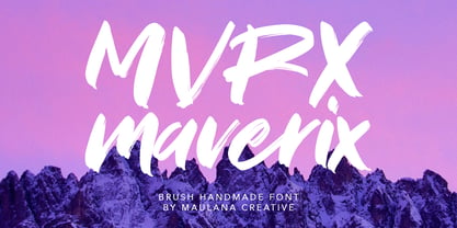 MVRX Maverix Brush Font Give your designs an authentic brush handcrafted feel. "MVRX Maverix Brush Font" is perfectly suited to signature, stationery, logo, typography quotes, magazine or book cover, website header, flyer, clothing, branding, packaging design and more. Thanks for use this font. MaulanaCreative
 - Hold On by Seemly Fonts,
$12.00Hold on is a chunky and bold display font featuring subtle brush-strokes for a friendly feel. This gorgeous typeface is perfectly suited for stationery, logos, t-shirt, paper, print design, website header, photo frame, flyer, music cover, poster, image slider, and much more! - Great Meadow by Ira Natasha,
$10.00 Great Meadow is a fun and cute script font. A new fresh handmade font with smooth edges. This font is support multi language. This font will perfect for many different project ex: quotes, logo, blog header, poster, branding, fashion, apparel, letter, invitation, stationery, etc….
 - The Rivers by Deeezy,
$14.00 Trendy or modern style sans font for your fancy projects. Elegant, thin and fashion style on The Rivers font will be great for any branding project. Lot of alternates and ligatures will help you to create unique and original logo design or website header! Enjoy :)
 - Cherry Jelly by Ira Natasha,
$10.00 Cherry Jelly is a fun and cute handwritten script font. A new fresh handmade font with smooth edges. This font is support multi language. This font will perfect for many different project ex: quotes, logo, blog header, poster, branding, fashion, apparel, letter, invitation, stationery, etc….
 - Rose Madina by Struggle Studio,
$12.00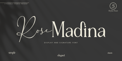 Rose Madina is a display and signature font made into one family. Give your designs an authentic brush handcrafted feel. Rose Madina is perfectly suited to signature, stationery, logo, typography quotes, magazine or book cover, website header, flyer, clothing, branding, packaging design and more.
 - Granbury by Deeezy,
$14.00 Trendy or modern style sans font for your fancy projects. Bold, elegant and retro style on Granbury font will be great for any branding project. Lot of alternates and ligatures will help you to create unique and original logo design or website header! Enjoy :)
 - Paint Hand by Letters&Numbers,
$18.00 Paint Hand is based on type drawn with an open acrylic paint tube. This bold vernacular typeface with rugged rounded edges will work well for headers and captions. Paint Hand is extended, containing West European diacritics making it suitable for multilingual environments and publications.
 - Loubotin by Rifa Studio,
$15.00 Loubotin Inspired by Modern Vintage & Retro style and combination with old american traditional style.Loubotin allowing you to create hand lettering is an instant and a super handy set of bonus Swash. Ideal for logos, handwritten quotes, product packaging, header, poster, merchandise, social media & greeting cards.
 - Tiramisu Sans by BeckMcCormick,
$12.00Introducing Tiramisu Sans, a cute mixed-case sans font. Tiramisu Sans is best for: - adorable quote graphics for social media - playful logos + branding - website design + website accents - think travel blogs, fashion blogs, & more - SVG designs - fun sticker designs - header elements that need handwritten touch - Nervous by Trustha,
$15.00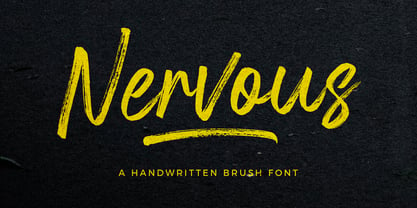 Nervous is a handwritten brush font with a bold twist. Nervous perfect for branding, logo, poster design, book covers, invitations, packaging, headers, greeting cards, apparel designs, fashion campaigns, newsletters, album covers, quote and many more. It will add an authentic spark to any creative project!
 - French Forge by Anton Shlyonkin,
$- This is decorative typeface for large scale designs (like headers or so), inspired by french forged balcony decorations. This font has 2 dimensions in it (thin letters like a, o, e and ‘wide’ m, b etc.), to make it more vibrant and add volume.
 - Culington by Nurf Designs,
$16.00 Culington is a bold script font. This font will look great in any creative project such as logos, printed quotes, invitations, cards, product packaging, headers, and more! This font is PUA encoded which means you can access all of the glyphs and swashes with ease!
 - Alexaniri by Gassstype,
$25.00 Alexaniri is a Handwritten Brush font with a natural Rough style and dramatic movement. Crafted manually with love and passion, This font is great for your next creative project such as logos, printed quotes, invitations, cards, product packaging, headers, Logotype, Letterhead, Poster, Label, and etc.
 - More Dots by Beware of the moose,
$9.99 It is not really a font, they are more icons. Based on a grid of seven circles al 127 possibilities – filled an unfilled. Use it decorative or just for fun.
 - Deuterium by Kostic,
$40.00 This versatile font family comprises 10 distinct weights, ranging from the delicate Thin to the bold and distinctive Ultra Heavy. What makes Deuterium special is its approach to the heavy styles. Balancing geometric principles with the challenges of extreme weight, Deuterium manages to preserve the geometric character even when the stems expand to extraordinary widths and the apertures narrow to the size of a dot. In the world of type design, geometric sans-serif fonts are known for their precision and adherence to symmetry. Deuterium deviates from this norm while keeping its geometric essence — it is a thoughtful reinterpretation of the classic style. Whether you’re designing for branding, headlines, or text, Deuterium is a versatile tool that adds a modern touch to your projects. It explores geometry in unconventional heavy styles, making your designs stand out with a subtle yet distinct geometric charm.
 - Stepford by Joanne Marie,
$10.00 A typographic playground Stepford is a versatile semi-serif boasting 6 styles - regular and italic, sketch and italic and outline and italic. It includes 231 glyphs, ligatures and multilingual support. These six styles make it the perfect display typeface for any kind of project. Absolutely sweet for editorial design - mainly headers and sub-headers but can also be used for body text too. This typographic trio is based on the vintage 50’s and 60’s style scripts and modernised for the present day. It’s another powerful typeface to add to your arsenal of design assets that command attention. That’s what design is all about! For regular updates and freebies follow me on Instagram at joannemarie_cm
 - Azero by Mysterylab,
$15.00 Azero is a extra heavy sans serif font with four style variations. The uppercase alphabet in particular is stylized to feature a wavy baseline on many of the characters, for a unique look that's just enough to add some unusual vibe and uniqueness. When your layout calls for heavy type with a wide (but not too wide) look, Azero is a strong choice. Great for bold headlines, logos, branding, wide horizontal banners, themes with a Hispanic flair, fitness products, food packaging, or retro poster styles.
 - Encorpada Essential by dooType,
$15.00 Encorpada Essential is part of Encorpada Project. It started in 2011 with Encorpada Black. Encorparda Pro was released in 2012 with 14 weight - being seven uprights and seven italics. The Pro version brought a lot of opentype features and a extended character set. The Encorpada Essential has the basic character set with 455 glyphs, that supports more than 50 languages and opentype’s basic features such as: allcaps, standard and discretionary ligatures, numerator, denominator, superior, inferior and fractions. Check out the details on Encorpada Project website.
 - Byker by The Northern Block,
$49.50 Byker is a geometric sans serif font that blends technology with handcrafted skill. The letterforms are constructed digitally from a technical grid and overlaid with handmade curves. The combination of this process creates a strong, organic font that is precise with subtle movement and personality without being too clinical. Details include seven carefully chosen weights with true cursive italics, over 800 characters, alternative lowercase a, e, g and y. Seven variations of numerals, true small caps with accents, ligatures, manually edited kerning and Opentype features.
 - Basati by Blancoletters,
$33.00 Basati is a display typeface designed for headlines and hard-hitting messages. It is sharp, heavy, and hard as an axe. But don’t be fooled by its rough look or the impression of having been carved with a machete. Each character is precise and sharp as a scalpel, and in that perfectly cut informality lies her deliberately wild temperament. Perhaps because its design was conceived during a severe bout of lumbago, its strokes are heavy and provocative, as if trying to defy logic and gravity alike.
 - Hand Stamp Swiss Rough Sans by TypoGraphicDesign,
$19.00 The typeface Hand Stamp Swiss Rough Sans is designed for the Typo Graphic Design font foundry in 2015 by Manuel Viergutz. A display sans serif type for headlines with an authentic used stamped style by hand. It started analogous with 42 stamps. Vintage look plus state-of-the-art OpenType-features like contextual alternates (calt) for more hand-stamped feeling with the automatic generated stylisitc set loop. Decorative ligatures like CT, LL, LI, LU, MM, OO, TH, TT, TU, UH and Versal Eszett (German Capital Sharp S) type the word LOVE for ❤ and the word SMILE for ☺. Character Set: Latin Extended (Adobe Latin 3). 1086 glyphs with 4× A–Z, 4× a–z, 4× 0–9 and 100+ extra icons like arrows, dingbats, symbols, geomatric shapes, catchwords and many alternative letters. Have fun with this font & use the DEMO-FONT (with reduced glyph-set) FOR FREE! Example of use from the Font The font works best for headline size. Logo, Poster, Editorial Design (Magazine or Fanzine), Flyer, Music Covers or Webdesign (Headline Webfont for your website), Webbanner, Animations … ■ Font Name: Hand Stamp Swiss Rough Sans ■ Font Weights: Regular + Mix + Icons + DEMO (with reduced glyph-set) ■ Font Category: Display & Decorative ■ Font Format: .otf (OpenType Font for Mac + Win) + .ttf (TrueType Font) ■ Glyph Set: 1086 glyphs ■ Language Support: 28+ for Latin Extended (Adobe Latin 3). Afrikaans, Albanian, Catalan, Croatian, Czech, Danish, Dutch, English, Estonian, Finnish, French, German, Hungarian, Icelandic, Italian, Latvian, Lithuanian, Maltese, Norwegian, Polish, Portugese, Romanian, Slovak, Slovenian, Spanisch, Swedish, Turkish, Zulu ■ Specials: 100+ decorative extras like icons for arrows, dingbats, emojis, symbols, geometric shapes, catchwords + German Capital Eszett. Open Type Features: Kerning (kern), Access All Alternates (aalt), Stylistic Alternates (salt), Stylistic Set 1 (ss01) … Stylistic Set 6 (ss06), Localized Forms (locl), Subscript (subs) Superscript (sups), Ordinals (ordn), Proportional Figures (pnum), Oldstyle Figures (onum), Lining Figures (lnum), Tabular Figures (tnum), Slashed Zero (zero), Fractions (frac), Denominators (dnom), Numerators (numr), Standard Ligatures (liga), Contextual Alternates (calt) e. g. Stylistic Set-Loop and Decorative Ligatures (dlig) e. g. type the word “LOVE” for ❤ or “SMILE” for ☺ ■ Design Date: 2015 ■ Type Designer: Manuel Viergutz
 - TOMO Pillo by TOMO Fonts,
$15.00 TOMO Pillo! a blocky style fat face with attitude. Bold, heavy and fun! all at the same time! You will only need this font to make your designs stand out fresh!
 - BoldAyres by Wiescher Design,
$39.50 BoldAyres is the heavy version of my Ayres Royal that was inspired by famous calligrapher Ayres and a little bit by a Bavarian King. Your lover of Blackletter typefaces, Gert Wiescher
 - Thick Goth by Aah Yes,
$9.00Thick Goth is a slightly degraded sans serif - a block design with a heavy feel. The zip files contain both OTF and TTF versions of the font - install one version only. - Stanford by profonts,
$41.99 The strong, geometric letterforms of this typeface incorporate a heavy outline and were inspired by college and university sportswear, making Stanford an excellent choice for work associated with sports in general.
 - Schism One by Alias,
$55.00 Schism is a modulated sans-serif, originally developed from our Alias Didot typeface, as a serif-less version of the same design. It was expanded to three sub-families, with the thin stroke getting progressively heavier from Schism One to Schism Three. The different versions explore how this change in contrast between thick and thin strokes changes the character of the letterforms. The shape is maintained, but the emphasis shifts from rounded to angular, elegant to incised. Schism One has high contrast, and the same weight of thin stroke from Light to Black. Letter endings are at horizontal or vertical, giving a pinched, constricted shape for characters such as a, c, e and s. The h, m, n and u have a sharp connection between curve and vertical, and are high shouldered, giving a slightly square shape. The r and y have a thick stress at their horizontal endings, which makes them impactful and striking at bolder weights. Though derived from an elegant, classic form, Schism feels austere rather than flowery. It doesn’t have the flourishes of other modulated sans typefaces, its aesthetic more a kind of graphic-tinged utility. While in Schism Two and Three the thin stroke gets progressively heavier, the connections between vertical and curves — in a, b, n etc — remain cut to an incised point throughout. The effect is that Schism looks chiselled and textural across all weights. Forms maintain a clear, defined shape even in Bold and Black, and don’t have the bloated, wide and heavy appearance heavy weights can have. The change in the thickness of the thin stroke in different versions of the same weight of a typeface is called grading. This is often used when the types are to used in problematic print surfaces such as newsprint, or at small sizes — where thin strokes might bleed, and counters fill in and lose clarity, or detail might be lost or be too thin to register. The different gradings are incremental and can be quite subtle. In Schism it is extreme, and used as a design device, giving three connected but separate styles, from Sans-Didot to almost-Grotesk. The name Schism suggests the differences in shape and style in Schism One, Two and Three. Three styles with distinct differences, from the same start point.
 - Schism Three by Alias,
$55.00 Schism is a modulated sans-serif, originally developed from our Alias Didot typeface, as a serif-less version of the same design. It was expanded to three sub-families, with the thin stroke getting progressively heavier from Schism One to Schism Three. The different versions explore how this change in contrast between thick and thin strokes changes the character of the letterforms. The shape is maintained, but the emphasis shifts from rounded to angular, elegant to incised. Schism One has high contrast, and the same weight of thin stroke from Light to Black. Letter endings are at horizontal or vertical, giving a pinched, constricted shape for characters such as a, c, e and s. The h, m, n and u have a sharp connection between curve and vertical, and are high shouldered, giving a slightly square shape. The r and y have a thick stress at their horizontal endings, which makes them impactful and striking at bolder weights. Though derived from an elegant, classic form, Schism feels austere rather than flowery. It doesn’t have the flourishes of other modulated sans typefaces, its aesthetic more a kind of graphic-tinged utility. While in Schism Two and Three the thin stroke gets progressively heavier, the connections between vertical and curves — in a, b, n etc — remain cut to an incised point throughout. The effect is that Schism looks chiselled and textural across all weights. Forms maintain a clear, defined shape even in Bold and Black, and don’t have the bloated, wide and heavy appearance heavy weights can have. The change in the thickness of the thin stroke in different versions of the same weight of a typeface is called grading. This is often used when the types are to used in problematic print surfaces such as newsprint, or at small sizes — where thin strokes might bleed, and counters fill in and lose clarity, or detail might be lost or be too thin to register. The different gradings are incremental and can be quite subtle. In Schism it is extreme, and used as a design device, giving three connected but separate styles, from Sans-Didot to almost-Grotesk. The name Schism suggests the differences in shape and style in Schism One, Two and Three. Three styles with distinct differences, from the same start point.