10,000 search results
(0.04 seconds)
- Calissha Script by Mega Type,
$10.00 Calissha Script is a handmade font created with a brush and ink, bold and irregular baseline. Contains a complete set of lowercase, uppercase, alternates, ligatures, punctuation, numbers, and multilingual support. And additional Calissha Capitals, working in harmony with Calissha Script to create typography awesome creations. Get some inspiration from the preview above. Contains a complete set of lowercase, uppercase, ligatures, punctuation, numbers, and multilingual support. Calissha Script is perfect for use in watercolor design or lettering style bold hand, such as blog header, branding, t-shirt, weddings, social media, product design, stationery, advertising, apparel, cover books, business cards, greeting cards, branding, merchandise, invitations and handmade quotes and more. Calissha Script features OpenType stylistic alternates, ligatures and International support for most Western Languages is included. To enable the OpenType Stylistic alternates, you need a program that supports OpenType features such as Adobe Illustrator CS, Adobe Indesign & CorelDraw X6-X7, Microsoft Word 2010 or later versions.How to access all alternative characters using Adobe Illustrator: https://www.youtube.com/watch?v=XzwjMkbB-wQ Calissha Script is coded with PUA Unicode, which allows full access to all the extra characters without having special designing software. Mac users can use Font Book , and Windows users can use Character Map to view and copy any of the extra characters to paste into your favourite text editor/app.How to access all alternative characters, using Windows Character Map with Photoshop: https://www.youtube.com/watch?v=Go9vacoYmBw If you need help or have any questions, please let me know. I'm happy to help :) Thanks & Happy Designing!
 - SF Beaverton SC - Unknown license

- Qene G by Balibilly Design,
$21.44 Say hello to Qene-G Typeface, Qene-G is based on a problem that often occurs when I design, which is to combining typefaces in typographic art. I am pretty sure you also in this problem, so Qene-G Typeface comes to solve the problem. Qene-G is a complete package consisting of serif fonts and signature scripts. A careful approach makes this font give a luxurious and elegant taste to your project. Smooth curves, some flowy terminals, and flirty tails will make your project looks unique. The handmade signature combination emphasizes the style that you create in the natural beauty atmosphere. Qene-G consists of 5 families, they are Qene-G-Regular, Qene-G-Regular Italic, Qene-G-Outline, Qene-G-Outline Italic, and Qene-G-Script. You will get all caps letters with 2 styles that you can access via uppercase and lowercase buttons, charming script fonts, and tons of ligatures and stylistic alternates. Complete with Unicode and PUA which allows you to access all features without graphic design software. Your project will travel around the world with 131 languages of this font. Qene-G is a strikingly versatile font, It is a bold choice for branding projects, fashion magazine imagery, social media text overlays, posters, website headers, and more. Let's start creating stand out designs with this font. We are pleased to tell you about our newest product made with totality, please CLICK HERE
 - Bellfort Draw by GRIN3 (Nowak),
$19.00 Bellfort Draw family is a hand-drawn version of the Bellfort family. It features 5 different sub-families: Regular, Rough, Hollow, Dark, Script. Each of these sub-families contains up to three font weights. When the font is used in OpenType-savvy applications, the 3 variants of glyphs are automatically alternated to achieve a random-like effect. When not using the Contextual Alternates feature, you can still pick the alternates in the Glyphs palette or use the alternates available from the keyboard upper and lower case. Bellfort Draw Script is a handwritten, fully connected script with ligatures and contextual alternates to help with flow and readability. Language support includes Western, Central and Eastern European character sets, as well as Baltic and Turkish languages.
 - Greywall by Khurasan,
$8.00 Introducing Greywall, a bold stretch sans serif font. Greywall it perfect for posters, logos, magazines, covers, banners, t-shirts and headers, or even large-scale artwork.
 - FM Bolyar Ornate Pro by The Fontmaker,
$29.00 FM Bolyar Ornate Pro is the latest member of our renowned Bolyar mega family and the perfect companion for our very successful FM Bolyar Pro . Developed to a new level of excellence this new improved ornate design is quite able to satisfy every typographic taste and meet the ever growing design requirements for high quality typefaces. If you are addicted to classic vintage style, then you could easily use Bolyar Pro Ornate for almost any project of desire - from letterheads, logos and catchy headlines to elegant packaging, book covers and wine labels. Alternates, Swashes and Ligatures will help you customize almost every single letter and fit perfectly to your artwork. Bolyar Ornate Pro provides a broad range of advanced typographical features such as: Five weights ranging from thin (100) to black (900) with full multilingual support of all Latin based languages as well as Cyrillic; 1000 glyphs per weight including three multilingual stylistic sets, swash designs and useful discretionary ligatures; Sub- and superscript basic Latin and Cyrillic glyphs as well as figures. Two positional models for lowercase accessed as OpenType case sensitive forms ñ base to base (default) and spur to spur (vertical center).
 - ITC Avant Garde Gothic Paneuropean by ITC,
$49.00ITC Avant Garde Gothic¿ was designed by Herb Lubalin and Tom Carnase in 1970. They based it on Lubalin¿s logo for Avant Garde Magazine - an exciting construction of overlapping and tightly-set geometric capitals. ITC Avant Garde is a geometric sans serif; meaning the basic shapes are constructed from circles and straight lines, much like the work from the 1920s German Bauhaus movement. The early versions of ITC Avant Garde became well-known for their many unique alternates and ligatures that still conjure up the typographic aura of the 1970s. These fonts contain the basic alphabets (without the old unusual ligatures). Still strong and modern looking, ITC Avant Garde has become a solid staple in the repertoire of today's graphic designer. The large, open counters and tall x-heights seem friendly, and help to make this family work well for short texts and headlines. The condensed weights were drawn by Ed Benguiat in 1974, and the obliques were designed by Andr¿ G¿rtler, Erich Gschwind and Christian Mengelt in 1977. ITC Avant Garde¿ Mono is a monospaced version done by Ned Bunnel in 1983. - Schism One by Alias,
$55.00 Schism is a modulated sans-serif, originally developed from our Alias Didot typeface, as a serif-less version of the same design. It was expanded to three sub-families, with the thin stroke getting progressively heavier from Schism One to Schism Three. The different versions explore how this change in contrast between thick and thin strokes changes the character of the letterforms. The shape is maintained, but the emphasis shifts from rounded to angular, elegant to incised. Schism One has high contrast, and the same weight of thin stroke from Light to Black. Letter endings are at horizontal or vertical, giving a pinched, constricted shape for characters such as a, c, e and s. The h, m, n and u have a sharp connection between curve and vertical, and are high shouldered, giving a slightly square shape. The r and y have a thick stress at their horizontal endings, which makes them impactful and striking at bolder weights. Though derived from an elegant, classic form, Schism feels austere rather than flowery. It doesn’t have the flourishes of other modulated sans typefaces, its aesthetic more a kind of graphic-tinged utility. While in Schism Two and Three the thin stroke gets progressively heavier, the connections between vertical and curves — in a, b, n etc — remain cut to an incised point throughout. The effect is that Schism looks chiselled and textural across all weights. Forms maintain a clear, defined shape even in Bold and Black, and don’t have the bloated, wide and heavy appearance heavy weights can have. The change in the thickness of the thin stroke in different versions of the same weight of a typeface is called grading. This is often used when the types are to used in problematic print surfaces such as newsprint, or at small sizes — where thin strokes might bleed, and counters fill in and lose clarity, or detail might be lost or be too thin to register. The different gradings are incremental and can be quite subtle. In Schism it is extreme, and used as a design device, giving three connected but separate styles, from Sans-Didot to almost-Grotesk. The name Schism suggests the differences in shape and style in Schism One, Two and Three. Three styles with distinct differences, from the same start point.
 - Schism Three by Alias,
$55.00 Schism is a modulated sans-serif, originally developed from our Alias Didot typeface, as a serif-less version of the same design. It was expanded to three sub-families, with the thin stroke getting progressively heavier from Schism One to Schism Three. The different versions explore how this change in contrast between thick and thin strokes changes the character of the letterforms. The shape is maintained, but the emphasis shifts from rounded to angular, elegant to incised. Schism One has high contrast, and the same weight of thin stroke from Light to Black. Letter endings are at horizontal or vertical, giving a pinched, constricted shape for characters such as a, c, e and s. The h, m, n and u have a sharp connection between curve and vertical, and are high shouldered, giving a slightly square shape. The r and y have a thick stress at their horizontal endings, which makes them impactful and striking at bolder weights. Though derived from an elegant, classic form, Schism feels austere rather than flowery. It doesn’t have the flourishes of other modulated sans typefaces, its aesthetic more a kind of graphic-tinged utility. While in Schism Two and Three the thin stroke gets progressively heavier, the connections between vertical and curves — in a, b, n etc — remain cut to an incised point throughout. The effect is that Schism looks chiselled and textural across all weights. Forms maintain a clear, defined shape even in Bold and Black, and don’t have the bloated, wide and heavy appearance heavy weights can have. The change in the thickness of the thin stroke in different versions of the same weight of a typeface is called grading. This is often used when the types are to used in problematic print surfaces such as newsprint, or at small sizes — where thin strokes might bleed, and counters fill in and lose clarity, or detail might be lost or be too thin to register. The different gradings are incremental and can be quite subtle. In Schism it is extreme, and used as a design device, giving three connected but separate styles, from Sans-Didot to almost-Grotesk. The name Schism suggests the differences in shape and style in Schism One, Two and Three. Three styles with distinct differences, from the same start point.
 - Schism Two by Alias,
$55.00 Schism is a modulated sans-serif, originally developed from our Alias Didot typeface, as a serif-less version of the same design. It was expanded to three sub-families, with the thin stroke getting progressively heavier from Schism One to Schism Three. The different versions explore how this change in contrast between thick and thin strokes changes the character of the letterforms. The shape is maintained, but the emphasis shifts from rounded to angular, elegant to incised. Schism One has high contrast, and the same weight of thin stroke from Light to Black. Letter endings are at horizontal or vertical, giving a pinched, constricted shape for characters such as a, c, e and s. The h, m, n and u have a sharp connection between curve and vertical, and are high shouldered, giving a slightly square shape. The r and y have a thick stress at their horizontal endings, which makes them impactful and striking at bolder weights. Though derived from an elegant, classic form, Schism feels austere rather than flowery. It doesn’t have the flourishes of other modulated sans typefaces, its aesthetic more a kind of graphic-tinged utility. While in Schism Two and Three the thin stroke gets progressively heavier, the connections between vertical and curves — in a, b, n etc — remain cut to an incised point throughout. The effect is that Schism looks chiselled and textural across all weights. Forms maintain a clear, defined shape even in Bold and Black, and don’t have the bloated, wide and heavy appearance heavy weights can have. The change in the thickness of the thin stroke in different versions of the same weight of a typeface is called grading. This is often used when the types are to used in problematic print surfaces such as newsprint, or at small sizes — where thin strokes might bleed, and counters fill in and lose clarity, or detail might be lost or be too thin to register. The different gradings are incremental and can be quite subtle. In Schism it is extreme, and used as a design device, giving three connected but separate styles, from Sans-Didot to almost-Grotesk. The name Schism suggests the differences in shape and style in Schism One, Two and Three. Three styles with distinct differences, from the same start point.
 - Battista by preussTYPE,
$29.00 The BATTISTA typeface stands in the long tradition of the designs developed by Giambattista Bodoni, who made his famous typefaces in the end of the eighteenth century. Similar designs can be found on various specimen books e.g. Alexander Wilson, John Bell, Edmund Fry and Alexander Thibaudeau. One of the best italics was available by Stephenson Blake & Co. foundry form Sheffield, England. In the end of the nineteenth century an unknown punch cutter at the German type foundry Schelter & Giesecke made an very bold cut of this Bodoni design. He brought both designs, the regular and the italic to an new level of harmony. Compared to the original Bodoni designs the new typeface was a lot bolder, which was well taken by the audience in this time. The BATTISTA typeface is an remarkable design, assembled of ultra bold and very fine shapes, but in all, the spirit of Bodonis design was well preserved. BATTISTA is a classic display design. The fine details are best shown on larger text sizes.
 - Analisa by Gatype,
$12.00 Analisa is a special modern style font. Crafted with pinpoint accuracy with beautiful curves. with alternate characters and bonds that make your work very special. Analisa is perfect for use in watercolor designs or bold handwriting styles, such as blog headers, branding, t-shirts, Great for branding designs, logos, greeting cards, title packaging, weddings, social media, product design, stationery , advertising, clothing, book covers, business cards, greeting cards, branding, merchandise, handmade invitations and quotes, and more. Immediately use our fonts to make your work more amazing. Feature analisa of OpenType style alternatives, International binders and support for most Western Languages included. To enable the OpenType Stylistic alternative, you need a program that supports OpenType features such as Adobe Illustrator CS, Adobe Indesign & CorelDraw X6-X7, Microsoft Word 2010 or later versions. How to access all alternative characters using Adobe Illustrator: https://www.youtube.com/watch?v=XzwjMkbB-wQ Analisa are coded with PUA Unicode, which allows full access to all additional characters without having to design special software. Mac users can use Font Book , and Windows users can use Character Map to view and copy any additional characters to paste into your favorite text editor/application. How to access all alternative characters, using the Windows Character Map with Photoshop: https://www.youtube.com/watch?v=Go9vacoYmBw If you need help or have any questions, let me know. I'm happy to help. Thanks & Happy Designing.
 - BD Telegraph by Typedifferent,
$25.00 BD Telegraph is a heavy uppercase titling font with various alternatives and an architectural approach, great for logotype creation and titling.
 - Jesus Saves by Breauhare,
$13.94 Jesus Saves is a font based on the familiar old logo that has “JESUS” hidden within a maze-like set of multi-branched vertical bars. The characters appear to be an alien, cryptic language at first sight, perhaps even a Japanese, Chinese, or Korean language, thanks to the unusual figures created by the combinations of various letters. It is a teaser for the eyes, as well as a visual feast of De Stijl-type art. It is an attention-getting font that is cool to look at, an eye puzzle that is enticing to decipher. It’s a great font to use for striking logos (see Gallery Images) by the judicious use of ligatures, where in word settings ligatures may be used at the beginnings of words, the middle or the endings of words. Jesus Heals is the missing spaces from the Jesus Saves font, sort of like a doughnut hole font! If you use this font to fill in the spaces in the Jesus Saves font, it becomes whole, or healed, thus the name. Jesus Lives is a raised block/3D or three dimensional version of Jesus Heals. For color combinations in apps that support layering, Jesus Lives synchs and has perfect kerning register with Jesus Heals, as Jesus Heals has with Jesus Saves. The digitization was done by fontmeister John Bomparte.
 - Bantarbjörn - Unknown license

- Liniga by Graphite,
$15.00 A tall, warm and friendly handwritten typeface with a simple structure and low contrast. Works well for both display and body text. It has a serif version as well - Liniga Serif.
 - Brake by Black Studio,
$19.00 New from Black Studio, presenting Brākė is a typeface that is feminine, adaptable, contemporary aesthetic and creates endless variations for your creative needs. Its striking contrasts and subtle details, together with its sumptuous strokes and voluptuous curves, create a beautiful and powerful statement for any typographic composition, blending glamor with a contemporary aesthetic. Brākė really helps you create unlimited variations for your creative needs in making your project titles: such as Books, fashion, magazines, logos, branding, photography, invitations, wedding invitations, quotes, blog headers, posters, advertisements, postcards, books, websites, etc. WHAT IS INCLUDED • Brākė – Regular • Brākė – Oblique • Brākė – Outline This type of family has become the work of true love, making it as easy and fun as possible. I can't wait to see what you do with Brākė! Feel free to use the #Black Studio tag and the #Brākė font to show what you've been up to, I really hope you enjoy it! Thank You!
 - Morning Memories by Set Sail Studios,
$22.00 Introducing the Morning Memories Serif & Script. It's a nostalgic nod to those cherished memories of golden years gone by, but also a revived hope in creating new moments to treasure. At the forefront is the Morning Memories Serif - a bold, condensed, striking serif which includes a regular and true italic version, perfect for bold statements, logo designs and header text. Also included in the Morning Memories Script, a fast hand, pencil-textured handwritten font, perfect as a secondary font to the serif, standout words, and logo taglines. Includes 36 ligatures (unique double and triple letter combinations), to help recreate naturally flowing handwritten letterforms. A bonus Morning Memories Doodles font is also included, which contains 26 handrawn ovals, underlines and arrows - perfect for highlighting your serif text and adding a personal touch. Language Support • All fonts the following languages; English, French, Italian, Spanish, Portuguese, German, Swedish, Norwegian, Danish, Dutch, Finnish, Indonesian, Malay, Hungarian, Polish, Croatian, Turkish, Romanian, Czech, Latvian, Lithuanian, Slovak, Slovenian
 - Bentoga by Black Studio,
$25.00 New from Black Studio, presenting bentoga is a typeface that is feminine, adaptable, contemporary aesthetic and creates endless variations for your creative needs. Its striking contrasts and subtle details, together with its sumptuous strokes and voluptuous curves, create a beautiful and powerful statement for any typographic composition, blending glamor with a contemporary aesthetic. Bentoga really helps you create unlimited variations for your creative needs in making your project titles: such as Books, fashion, magazines, logos, branding, photography, invitations, wedding invitations, quotes, blog headers, posters, advertisements, postcards, books, websites, etc. WHAT IS INCLUDED • Bentoga – Regular • Bentoga – Italic This type of family has become the work of true love, making it as easy and fun as possible. I can't wait to see what you do with Bentoga! Feel free to use the #Black Studio tag and the #Bentoga font to show what you've been up to, I really hope you enjoy it! Thank You!
 - Prague Metronome by 38-lineart,
$16.00 We are happy to introduce Prague Metronome, inspired by the city of Prague and the metronome in the heart of this city. Prague Metronome, a font made manually by hand that we set in such a way that everything is connected in a neat rhythm, just like metronome used by musicians to set the tempo. This font has alternate stylistic for Uppercase and Lowercase, we also complement lowercase with alternate swash and titling. No half-hearted, we added 142 ligature to get the impression of natural handwriting. Comes with two thicknesses namely hairline and monoline as well as a unique shape appearance that will attract interest when used as your brand identity. This font can be used for brands, quotes, headers, websites, and other broader graphic designs. Prague with its metronome is a symbol for everything, beauty, history and personal impression that cannot be described. If European cities were a necklace, Prague would be a diamond among the pearls. Enjoy our font. thanks.
 - Irrelevante by Intellecta Design,
$14.90 Irrelevante is a decorative display font great for large header-like usage. Uppercase letter designs only, works best when used for headers containing a limited amount of randomic letter designs.
 - Painless Feedback by Bogstav,
$15.00 Here you go...a handmade sans font without much of surprise...actually, this is how I draw letters with my eyes closed...well, almost! I wanted to make a font with letters that were pretty obvious, but had that handmade look that I love so much. The result is this really painless font - it won't hurt or scare anyone, but it could help making your handmade things (such as posters, postcards, flyers, books and alike) come more alive! Anyway, I've added 3 different versions of each lowercase letter...just to add some spice to the painlessness of the font!
 - Lucaria by Jehoo Creative,
$19.00 Lucaria is a modern serif typeface that combines classic design with contemporary details. The most distinctive feature of Lucaria is its strong shape on the edges, which gives the font a bold and commanding presence. This design element is complemented by the wide characters, which provide ample space for legibility and readability. The combination of these features makes Lucaria a great choice for displays and headlines. This versatile font family is available in seven weights, including Light, Regular, Medium, Semibold, Bold, Extrabold, and Black, as well as a variable font for added flexibility. The variable font option allows designers to customize the weight makes Lucaria an ideal choice for a range of design projects, including branding, packaging, and editorial layouts.
 - Merlo Neue Round by Typoforge Studio,
$29.00 Merlo Neue Round is the younger brother of Merlo Round and cousin of Merlo Neue. This new family received a refreshed, rounded style and a new shape of many glyphs. New Merlo consist of a wide range of instances' seven new weights with italics, from Hairline to Bold allows to use the family in a complex way, depending on the users' needs. The font has a glyph set for latin and cyrylic script, small caps and old-style figures. Merlo Neue Round would be a great choice for display use as well as for the longer texts. This family is inspired by a "You And Me Monthly" published by National Magazines Publisher RSW "Prasa" from May 1960 till December 1973 in Poland.
 - A bite - Personal use only

- Marvelouz DSG - Unknown license

- Visaka by Putracetol,
$14.00 Introducing Visaka, a Vintage Display Typeface. Classic, Elegant , Unique and Luxury merged into one. Visaka is great for any kind of display purpose from logos, T-shirts, apparel, quotes, handwritten quotes, product packaging, tittle header, posters, merchandising, social media, labels, branding & greeting cards.
 - Rollingtime by Cititype,
$14.00 'Rollingtime.' is a bold script font with a graffiti style. this font looks natural. purely produced from hand sketches. we added a few ligatures to emphasize the natural impression. This font is great for logotypes, brands, website, header, writing quotes and graffiti.
 - Yggdrasil by Bogstav,
$19.00 In Norse mythology, Yggdrasil is the tree of life, which grows right into heaven - maybe even space! It has deep roots, which grows into three different worlds. I made this font in hope that someone with a love to Norse mythology could use it - maybe even for something viking themed! I don’t think that the gods of Norse mythology ever heard of contextual alternates or multilingual support - but I added it, without even asking! - Yggdrasil has 5 different versions of each letter (in both Regular and Rough) and supports loads of different languages!
 - Bonna by Eurotypo,
$28.00 Bonna and Bonna Bold is a casual calligraphy family Font with an original textured appearance that will allow you to create an effect even more authentic. It’s an exclusively Open Type release with 815 glyphs, 93 ornaments to combine with letters and decorate your text. There are plenty of options to create something unique and special with lots of possibility an infinity of combinations: standard and discretionary ligatures, several swashes and stylistics alternates for each letter, catchwords, tails that can be added to the beginning or end of each letter, and much more. These ravishing fonts have already an extended character set to support Central and Eastern as well as Western European languages. Bonna was designed to help your projects look more creative, wonderful and fascinating! Have fun with it!
 - Signatires by Din Studio,
$29.00 Are you looking for a unique signature font to show your style? We have the right signature font for you. This is the Signatires, our signature font to help you create a visually amazing signature. This font is carefully designed to express elegant, dazzling characters which also helps you deliver your messages easily. Signatires’ contrast is high with swinging end wipes. Furthermore, its legibility is so great that it is suitable to apply for any text sizes. You can enjoy the available features here as well. Features: Stylistic Sets Ligatures Multilingual Supports PUA Encoded Numerals and Punctuations Signatires fits best for various design projects, such as brandings, posters, banners, greeting cards, magazine covers, quotes, printed products, merchandise, social media, etc. Find out more ways to use this font by taking a look at the font preview. Thanks for purchasing our fonts. Hopefully, you have a great time using our font. Feel free to contact us anytime for further information or when you have trouble with the font. Thanks a lot and happy designing.
 - Luruh by Sebeningjingga,
$5.00 Luruh are inspired by the flow of running and melting water. Luruh is guaranteed to make your text stand out - perfect for logos, printed quotes, invitations, cards, product packaging, and headers. Publisher: Sebeningjingga
 - Ingenue by Seemly Fonts,
$14.00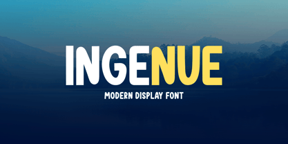 Ingenue is a friendly and simple display font. It is perfectly suited for stationery, logos, t-shirt, paper, print design, website headers, photo frames, flyers, music covers, posters, image sliders, and much more.
 - Sragera by ffeeaarr,
$14.00 Sragera is a rounded and bubbly display font offering you lots of creative space! You can use it to design outstanding titles, posters, book covers, magazine headers, product packaging, and so much more
 - Syl by Intellecta Design,
$28.90 A classic and antique font design remastered by the type foundry Intellecta Design. Great display face for headers and antique-like projects. Contains a limited amount of letter designs, all uppercase letter designs.
 - Bommer Slab by dooType,
$15.00 Bommer project started in January of 2014 and I am happy to announce the first family - Bommer Slab - is now ready for release. This family includes 14 weights - being seven uprights and seven italics. This font has a strong personality, that makes it perfect for use in headline sizes but means it also works gracefully within text blocks.
 - Moki by FaceType,
$25.00 The seven ways of Moki. Moki comes in seven different styles: Base, Cut, Dust, Lean, Mono, Soft and Uni. Moki is a display expert – with a wide range of languages covered, the family offers a style for every purpose. You are a SciFi movie director and are looking for an alternative to the inevitable Eurostile? Now you have!
 - Shubbak by Archetype Foundry,
$30.00 Shubbak ('window' in Arabic) is a highly flexible Arabic Sans (Kufic) typeface that was designed to work with a wide range of Latin counterparts. A friendly and human typeface family that is very flexible to use when coupled with many popular fonts you may use. Full set of Arabic, Farsi (Persian) and Urdu character sets as well as a basic Latin set are included. There is also a Variable version of Shubbak. Designed originally by British designer Ruh Al-Alam, further developed by Mohammed Gabr, Muhammad Hadi and then fully expanded by Abdelrahman Farahat. Archetype Foundry aims to help revolutionise and spread the use of beautiful Arabic and multi-lingual typefaces.
 - Soup Du Jour by PizzaDude.dk,
$18.00 "Soup Du Jour" is French and simply means "Soup Of the Day" - may not sound interesting, but I can tell you that I have had several tasty soup of the day served. I wanted to make a font that resembles that feeling of not really knowing what you get served, but you got a feeling that it is something good! The font has got 6 different versions of each letter, and they automatically changes as you type - it makes your text organic and lively, and probably quite tasty too! :) "Soup Du Jour" is also a well-known quote from one of my favourite movies: "Dumb and dumber"
 - White Crystal Script by Mytha Studio,
$14.00 Hello Font Lovers, I want to introduce my latest font that is ” White Crystal Script”. White Crystal is a modern calligraphy font that features a varying baseline, smooth line, classic and elegant touch. Can be used for various purposes.such as headings, signature, logos, wedding invitation, t-shirt, letterhead, signage, lable, news, posters, badges etc. White Cristal features 320+ glyphs and 146 alternate characters. including initial and terminal letters, alternates, ligatures and multiple language support. Files included: • White Crystal Script .otf To enable the OpenType Stylistic alternates, you need a program that supports OpenType features such as Adobe Illustrator CS, Adobe Indesign & CorelDraw X6-X7, Microsoft Word 2010 or later versions. There are additional ways to access alternates/swashes, using Character Map (Windows), Nexus Font (Windows), Font Book (Mac) or a software program such as PopChar (for Windows and Mac). Need help? If you need help or advice, please contact me by e-mail “mythastudio@gmail.com” Thank you for your purchase!


