10,000 search results
(0.016 seconds)
- Arta by Olivier Blanc,
$34.00 ARTA is an ArtDeco style font, inspired by classic font like Newport Classic with elongated typeface with high waisted uppercase letters which curve in an geometric and elegant way. It consisted of really condensed lettering which had little space available. It's a well complet font with 315 Glyphs for most latin languages as "English, French, Spanish, German, Icelandic, Afrikaans, Catalan, Czech, Esperanto, Hungarian, Latin, Latvian, Lithuanian, Maltese, Northern Sami, Polish, Serbo-Croatian, Slovak, Slovene, Sorbian, Turkish and Welsh". ARTA will give to your design an chic presentation, you will be able to generate beautiful writings,thanks to 3 differents type "Light, Regular & Bold". It can be used for Shop, Restaurant, Jewelry, Cosmetic, Press identity & more. I started to work on this typeface at the creation of a logo in 2017 for the butcher shop of my uncle in Luchon in France named "Le Louchébem". I always had in mind to complete & share it. So after some years, I decided that it was time to finish it. This was my first Typography creation and I wanted to make it as an Art Deco typeface. I really love this elegant, high & classy lettering style. I want to bring this 1910's vibes back to be more use in our days.
 - DearJoe 6 by JOEBOB graphics,
$29.00 The dearJoe series of fonts had it’s origin somewhere around 1999, the year I created dearJoe 1, which was a first (and half-assed) attempt at converting my own handwriting into a working font. Being able to type in my own handwriting had always been a childhood fantasy, and even though I only partly understood the software, a working font was generated and I decided to put it on the internet for people to use. And that’s what they did: at this moment the dearJoe 1 font has been downloaded millions of times and can be found on just about anything, ranging from Vietnamese riksjas, a Tasmanian gym to a fancy chocolate store on 5th Avenue. The font is not something I am particularly proud of, but it started me of in building what later became the JOEBOB graphics font foundry. Inbetween creating other fonts, the dearJoe series has become a theme I revisit every once in a while, trying to create an update on how my handwriting evolved, along with my abilities in creating fonts that mimic actual handwriting. In the last decade or so I started implementing ligatures and alternate characters, which helped a lot in making something that can almost pass for actual handwriting.
 - FS Kitty by Fontsmith,
$50.00 Cute FS Kitty is the type equivalent of Bagpuss: plump, cute, cuddly and not fond of exercise. So don’t go giving it a run-out on body copy; FS Kitty is an all-caps font made for showing off in posters and headlines, and on products, point-of sale and especially sweets. Blubber Kitty had been quietly curled up in Phil Garnham’s sketchbook for a year before he brought it out to be brushed up. “It was in the mix as a basic form when I started thinking about FS Lola. It was a twisted, bubbly beauty – quite squishable and huggable. The working file was called Blubber. “At that time it was a basic construction of strokes. I created the ‘A’ first, purely as a shape to play with, not as type. I flipped it for ‘V’, and copied that for a ‘W’. I flipped the ‘W’ for an ‘M’... I thought, ‘This looks a bit wacky, but I like it,’ and just carried on. The most tricky characters were the ‘B’ ‘P’ and ‘R’. I must have drawn about 20 kinds of B for this, just to get it to fit.” Variety “When the regular weight of Kitty had been designed,” says Jason Smith, “it just felt like a natural progression to go on and explore how far we could go with it: Light, Solid, Headline, Shadow.” Phil Garnham thinks there’s still more to come. “There are some really individual characters in this font that I think have yet to be exploited: the Greek Omega symbol, the strange face in the ampersand. Like Bagpuss, Kitty has kept a low profile so far. “We know people are using Kitty. In fact, it was the first of any of our fonts that we sold on the day it was released. But I still haven’t seen it out there in the wild. It’s going to be a exciting moment.”
 - FS Kitty Variable by Fontsmith,
$199.99Cute FS Kitty is the type equivalent of Bagpuss: plump, cute, cuddly and not fond of exercise. So don’t go giving it a run-out on body copy; FS Kitty is an all-caps font made for showing off in posters and headlines, and on products, point-of sale and especially sweets. Blubber Kitty had been quietly curled up in Phil Garnham’s sketchbook for a year before he brought it out to be brushed up. “It was in the mix as a basic form when I started thinking about FS Lola. It was a twisted, bubbly beauty – quite squishable and huggable. The working file was called Blubber. “At that time it was a basic construction of strokes. I created the ‘A’ first, purely as a shape to play with, not as type. I flipped it for ‘V’, and copied that for a ‘W’. I flipped the ‘W’ for an ‘M’... I thought, ‘This looks a bit wacky, but I like it,’ and just carried on. The most tricky characters were the ‘B’ ‘P’ and ‘R’. I must have drawn about 20 kinds of B for this, just to get it to fit.” Variety “When the regular weight of Kitty had been designed,” says Jason Smith, “it just felt like a natural progression to go on and explore how far we could go with it: Light, Solid, Headline, Shadow.” Phil Garnham thinks there’s still more to come. “There are some really individual characters in this font that I think have yet to be exploited: the Greek Omega symbol, the strange face in the ampersand. Like Bagpuss, Kitty has kept a low profile so far. “We know people are using Kitty. In fact, it was the first of any of our fonts that we sold on the day it was released. But I still haven’t seen it out there in the wild. It’s going to be a exciting moment.” - Kylo Sans by The Northern Block,
$29.95 Kylo Sans is a carefully blended typeface, one-part humanist, one-part grotesque and a small dose of geometric. It takes the essence of three distinct forms to create a unique, readable typeface with an exact and understated personality. Additionally, the design process includes a hand-eye adjustment to three master weights, giving a greater range of usability across text layouts. Kylo Sans remastered to version 2.0 for improved OpenType features and usability. Details include six weights and italics, over 700 characters with alternative lowercase Q, a, g, l and y. Open type features include six variations of numerals, small caps, ligatures, and language support covering Western, South and Central Europe.
 - Zainer by Proportional Lime,
$9.99 Günther Zainer, (or Zeyner or Zeiner), was the first printer to operate in the city of Augsburg. He was active from 1468 to his death in 1478. In that single decade he was responsible for printing 80 works. Most of these editions were for the clergy but he also printed the first Calendar and large-scale illustrated book intended for the wider public. This font is based on one of his more interesting and peculiar fonts. And it has been enlarged to include over a 1,000 defined glyphs for modern use and also for historical purposes many glyphs recommended by the Medieval Unicode Font Initiative organization have also been included.
 - Totally Awesome by Comicraft,
$29.00 Our newest release is so Totally Awesome, we haven't even found a good NAME for it yet! It’s the kind of font you'll splash all over your covers and title pages to call out FINAL BATTLES WHEN ALL-NEW ALL-DIFFERENT TITANS CLASH! It’s gonna grab your readers and pull them into your own special house of ideas! The story this font wants to tell you is NOT a what if?, NOT a hoax, not an imaginary story. It didn't come BEFORE ELEPHANTMEN, AFTER ELEPHANTMEN or anywhere inbetween! It’s Uncanny, it’s Amazing, it’s Incredible, Invincible, it’s Mighty, Superlative and Wondrous. It’s ready to Assemble, it’s TOTALLY AWESOME!
 - Piggy Bank by Missy Meyer,
$12.00 PIGGY BANK is a casual handwriting font, smoothed and cleaned for cutting and crafting, but also sharp and crisp for print projects! It contains two uppercase sets of letters, so you can mix and match for a hand-written look. It's useful for everything from kids' designs to branding, from book covers to product packaging! The PIGGY BANK family contains two weights - regular and bold - so you have options that will be easy to read no matter how large or small your design will be. Plus, it has my usual 500+ glyphs, including tons of punctuation and over 300 accented characters for language support!
 - Nadirii Pro by Nantia.co,
$12.00 Nadirii Pro Greek Cyrillic Font is a fun display typeface with a nostalgic touch. In fact, this typeface supports over 30 languages and it can be a perfect match for all your food packaging projects. Of course, you can use it for organic handcrafted products branding. Also, it can be an ideal tool for storytellers, too! In other words, the crafty feeling of this font is pairing perfectly with illustrations, book covers and handmade social media content. In addition, Nadirii Pro Font supports extended Greek diacritics or Polytonic Greek. Therefore, this feature is perfect for writing Byzantine, Katharevousa and Greek-Orthodox texts, with a modern twist.
 - Dx Gaster by Dirtyline Studio,
$29.00 Dx Gaster is a high-contrast Serif family with a strong impact and elegant typeface. Dx Gaster offers a wide variety of combinations for you to create with. Dx Gasters multiple alternates and swashes can add extra spice to your designs. A Strong sharp typeface specially designed for beautiful titles. Dx Gaster comes with elegant style, strength, and contrasts, with features an extended Latin character set of 404 glyphs covering over 86 languages. Casta is ready to be like a top model on the design catwalk, making your projects look classic but contemporary, finely tuned but assertive, and elegant as the best luxury fashion.
 - Cadmus Pro by Canada Type,
$39.95 Cadmus Pro is the newly remastered and greatly expanded version of a Jim Rimmer design based on a type originally done by hand lettering artist Robert Foster. Foster’s type, named Pericles, was published by ATF in the 1930s, and used in lettering magazines and advertising headings. The design is based closely on early inscriptional Greek. Cadmus Pro comes with over 1130 glyphs, covering pretty much all Latin languages (including Vietnamese) as well as Cyrillic, Greek and Hebrew. OpenType features include stylistic alternates, automatic fractions, ordinals, and small figure ranges for superiors and inferiors. Proceeds from this font will be put towards a variety of Canadian typography education causes.
 - TA Kenisans by Tural Alisoy,
$35.00 TA Kenisans is a combination of two fonts. You can create very good works with Geometric and Grotesque style. This typeface also equipped with useful OpenType features such as Ordinal, Superior, Stylistic Alternates, Proportional Figure, Fraction, Tabular Figure, Numerator & Denominator. Each font file covers Western & Eastern Europe Latin language, as well as other Latin based languages – over 200 languages supported! This is a new real multi-purpose typeface that will be perfect for logo, packaging, greeting cards, presentations, headlines, lettering, posters, branding, quotes, titles, magazines, headings, web layouts, mobile applications, art quote, typography, advertising, invitations, packaging design, books, book title, & nearly any other type of creative design you’re working on.
 - Sequal by Mans Greback,
$29.00 Sequal is a handwritten graffiti tag script. It was drawn and created by Måns Grebäck between 2018 and 2020. Its round and soft letters are youthful and active, and cool while being cute. Sequal is a typeface family of five weights: Thin, Light, Regular, Bold and Black. The different weights ensures usability in any context, while also giving the ability to emphasize phrases or words. The font supports hundreds of languages, including European and Asian Latin scripts. Composed of over 1250 glyphs, it is guaranteed to contain all characters you'll ever need, including all punctuation and numbers. It also contains OpenType features such as alternates and ligatures.
 - Cabrito Contrast by insigne,
$29.99 The Cabrito family is back again to make a statement. Released as a complement to the children's book, The Clothes Letters Wear, the original Cabrito is light-hearted, fun, and easy to read. Now, balancing this friendliness with a new elegance, Cabrito Contrast steps forward--a handsome typeface with an extra-sophisticated sensibility injected into the design. Still bright and playful in its Cabrito ancestry, this new Cabrito member approaches the field with a cleaner, more reductionist form, ensuring that its polished look retains the readability. Regular features and Italic forms of the 54 fonts include upright alternates, ligatures, and old figures. A range of weights include extended and condensed variants. To preview any of these interactive features, see the PDF manual. The family also includes language support for 72 Latin-based languages, and there are over 600 glyphs for further refining your work. Cabrito Contrast is best used for logos and packaging as well as flyers and websites, though its readability makes it a great option across a wide variety of works. In short, it’s well-designed just for you. Take a stroll with Cabrito Contrast, and see how much fun refinement can be. Along the way, take a look at a few other members of Cabrito, too and see how well the likes of Original, Inverto or Didone can pair with the new Contrast.
 - Komikaze - 100% free

- Akceler by Adtypo,
$45.00 Many sport publications missed typefaces designed especially for sport communication conditions. We usually see only mechanically slanted or other synthetically destroyed standard typefaces. I want to fill in this space and create a system of fonts, that will be used primarily in sport. It is usable for many prints - logotypes, magazines, catalogues, posters etc. Elasticity of glyphs reflected an adrenalinous shapes of latest bikeframes, skies or sportcars. Maximum open arches guaranteed good readability in very small sizes and prevented interchanges of glyphs „o, c, e“ per poor reading conditions. Softness of lowercase is at uppercase balanced in bottom arches, that are subtly kicked-up. Numerals are an important component of sport communication, so this font offers expressive design, different from numerals of book typefaces. Every font has 9 kinds of numerals. Character case contains over 1000 glyphs, sport icons and othes signs creating the sport feeling. The font name, Akceler, represents acceleration, which is characteristic attribute of this typeface. It’s suitable for display and text usage, too. To see more please visit the PDF specimen. ■24 styles (2 alternatives, 3 grades of dynamics, 4 weights) ■over 1 000 glyphs per font ■9 kinds of numerals ■icons of sport equipment ■8 stylistic sets ■8 kinds of arrows ■23 OT features ■support of latin languages
 - Enchantee by Creativework Studio,
$12.00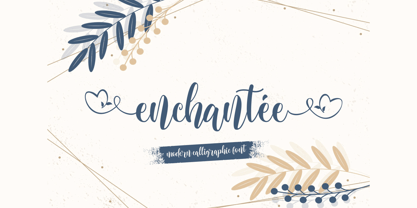 Enchantee feels equally charming and elegant. This stunning script font is a stylish homage to classic calligraphy. It features a varying baseline, smooth lines, gorgeous glyphs and stunning alternates. This font is PUA encoded which means you can access all of the hearty glyphs and swashes with ease It also features a wealth of special features including alternate glyphs and ligatures.
 - Gallows Hill by Hanoded,
$15.00 I am creating new fonts for my Halloween collection and Gallows Hill is the latest one. It was made using a cheap brush, gouache mixed with Chinese ink and paper. The result is a very messy, rough and scary font. As a bonus, I have added double letter ligatures for the lower case.
 - Cutting Corners by Just My Type,
$20.00 Cutting Corners is all about letters made of squares that also suggest circles. That’s it. This is one of several fonts I’ve created based upon a strictly geometric form; in this case, a round-cornered square. The width is equal to height (except for i, I and most punctuation). Usage recommendations: logos, samplers.
 - Geommaze by Artyway,
$14.00 If you like minimalism and geometry, symmetrical and line design, I suggest you get acquainted with the Geommaze font. I created it with love and attention to detail. It was inspired by computer chip, architectural shapes, maze of road junctions. Try "Geommaze" in these topics and the result will be really awesome!
 - Grumpy Tiger by Hanoded,
$15.00 I really like tigers! In fact, I like all animals, but the tiger is my favorite! Grumpy Tiger is a ‘kiddie’ font: it is bold and rounded, very legible and doesn’t have complicated glyphs. It would look fantastic on new children’s books, posters and product packaging. Comes with a roaring amount of diacritics!
 - Harpsichord by Jonahfonts,
$35.00 Harpsichord (as I have named it) is from the late 1940s and was designed at Lucian Bernhard Studios in New York for Bernhard's Magnetype Collection. It was originally published as 'Community Low' along with 'Community Condensed'. Many of his Magnetype Fonts have been dormant which I hope to revive in the near future.
 - Dragonblood by Hanoded,
$20.00 Dragonblood is quite an unusual font: it was made with Parker ink and a Chinese fur brush. When all the glyphs had been vectorized, and I saw them in a text for the first time, the only appropriate name I could think of was Dragonblood. Dragonblood comes with a realm of diacritics.
 - High Cut by Palmer Type Company,
$30.00 High Cut came about by this found object I stumbled upon, while exploring an abandoned building, which had this word "High" cut out of it in a similar stencil design. I thought it would be a fun challenge to create an entire typeface inspired by this found object. Enjoy this new stencil typeface!
 - Mentor by Ultramarin,
$40.00 Mentor is a font made for professor Bruno K. Wiese 85th birthday. I made it especially for the birthday card I sent him as friendly comment to his always present ideas on clarity, purity, exactness and "less is more". He taught us the importance of carefully managing the spaces between elements in typography.
 - Bodoni Classic Swirls by Wiescher Design,
$39.50 Bodoni Classic Swirls breaks all the rules. The idea of Bodoni typefaces is no embellishments and here I go again and do another decorated set of Bodonis. But I find this is another very nice and useful typeface for all kinds of cards and certificates. Enjoy! Yours, again breaking the rules, Gert Wiescher
 - Fictional Friend by Hanoded,
$15.00 No, I don’t have a fictional friend, nor an imaginary one. Never had! But that name popped up in my head and I used it for this font. Fictional Friend font is a handwritten ‘comic book’ font - sort of. It’s very legible, soft and rounded and comes with all the accents you want!
 - Raffles by Scrowleyfonts,
$20.00 Raffles is an Art Deco inspired font which takes geometric lettering to another level with comprehensive contextual alternates for exciting uppercase titling. There are four different styles available for a retro or a more contemporary look and feel. I hope that you will enjoy using it as much as I enjoyed creating it!
 - Ugroh Black by Saffatin.co,
$12.00 Get ready to jazz up your design game with the brave Ugroh Display Black font include Italic! Armed with a whopping 260 glyphs, it's got all the languages covered and comes with a bonus of ligatures and alternative glyphs. So, whether you want to add a fancy twist or a subtle tweak, it's got you covered and will make your designs shine like a star! With its bold and modern look, Ugroh Display Black font is a perfect choice for any design project that requires a touch of elegance. Its clean lines and sharp edges will give your designs a professional look that will impress any audience. Whether you're creating a logo, a poster, or a website layout, Ugroh display black font will give your project a unique and stylish look. Its versatile character set makes it a great choice for a variety of design styles, from minimalistic to ornate. And with its extensive language support, you can be sure that your message will be heard loud and clear, no matter where your audience is located. So, why settle for a dull and uninspired design when you can jazz it up with Ugroh display black font? Try it out today and see your designs shine like never before!
 - Verse Sans by Hubert Jocham Type,
$39.00 In 2006 the art director of Emotion, a women’s psychology magazine, asked me to design a copy typeface for them. Before I actually got the job I started to work on a serif. I wanted it to be feminine but still clear and modern. On one hand there are the floral round elements and on the other hand the angular serifs. In the composition I wanted the two extremes to work together. All the other elements had to be harmonized. The proportions needed to match the magazine’s requirements. The ascenders and descenders are short enough to work in narrow columns but long enough to work in small sizes. As you can imagine, the emotion-job never happened. In copy you should not get heavier than Heavy. Extrabold and Ultrabold work best in display.
 - WBP Emperio by Studio Jasper Nijssen,
$20.00 A classic serif font with a twist. WBP Emperio has an interesting shape. She has rounded corners and a slightly 'curvy' look. The little indent makes her stand out above the rest. A sensation in the making. Emperio has two styles. The Regular: Great for designing friendly corporate identities. And there's the Hand Drawn style: Great for design posters of prints with a handmade feel. Combine the two and you can go infinite. WBP Emperio was a sketch I designed when I started my company. So you can say it's been five years in the making XD. When I was invited to add two pages to the Typodarium 2022, I speeded up the process and added the hand-drawn style. The end result is awesome. A classic serif font, with a crazy extra style.
 - Ongunkan Radloff Viking by Runic World Tamgacı,
$100.00 Vasili Vasilyevich Radlof or Wilhelm Radloff (Russian: Василий Васильевич Радлов; German: Wilhelm Radloff; 17 January 1837 - 12 May 1918) was a German-born Russian orientalist and founder of Turcology. Radloff is a Russian Turkologist of German origin, who researches the Turkish world from different aspects, opens a new era in the history of Turkology by bringing them to light, and has devoted 60 years of his 81-year long life to these studies. In his work known as Radloff Atlas, it was published with a runic font that he developed specifically for the Old Turkish Runic Alphabet. I made the Turkish Runic Font using Radloff's Atlas. I developed this viking font based on this font and adapted it to Viking writing. I will adapt other runic versions when I have the opportunity.
 - Bodoni Classic Ad by Wiescher Design,
$55.00 I became interested in designing Bodoni Classic because of a lazy graphic designer at Jacques Damase publishing house. He had to change a single letter on a bookcover about J. B. BODONI. The French call him Jean Baptiste instead of Giambattista! And that unknown graphic designer just took any old “J” from some newly cut Bodoni. All the new Bodoni cuts have square serifs, whereas the originals had rounded serifs and slightly concave feet. The single letter “J” with the squared off serif was for me like a road sign to start redesigning the entire Bodoni family. That’s exactly what I started in 1993 and a dozen years later I am finished. Okay, I am still adding new Bodoni Classics, but those are my personal additions. Yours very retro, Gert Wiescher
 - Bodoni Classic Initials by Wiescher Design,
$55.00 I became interested in designing Bodoni Classic because of a lazy graphic designer at Jacques Damase publishing house. He had to change a single letter on a bookcover about J. B. BODONI. The French call him Jean Baptiste instead of Giambattista! And that unknown graphic designer just took any old “J” from some newly cut Bodoni. All the new Bodoni cuts have square serifs, whereas the originals had rounded serifs and slightly concave feet. The single letter “J” with the squared off serif was for me like a road sign to start redesigning the entire Bodoni family. That’s exactly what I started in 1993 and a dozen years later I am finished. Okay, I am still adding new Bodoni Classics, but those are my personal additions. Yours very retro, Gert Wiescher
 - Bodoni Classic Chancery by Wiescher Design,
$55.00 I became interested in designing Bodoni Classic because of a lazy graphic designer at Jacques Damase publishing house. He had to change a single letter on a bookcover about J. B. BODONI. The French call him Jean Baptiste instead of Giambattista! And that unknown graphic designer just took any old “J” from some newly cut Bodoni. All the new Bodoni cuts have square serifs, whereas the originals had rounded serifs and slightly concave feet. The single letter “J” with the squared off serif was for me like a road sign to start redesigning the entire Bodoni family. That’s exactly what I started in 1993 and a dozen years later I am finished. Okay, I am still adding new Bodoni Classics, but those are my personal additions. Yours very retro, Gert Wiescher
 - Skeletal Wish by Hanoded,
$15.00 Skeletal Wish is a line from one of my favourite Opeth songs: Heir Apparent. The lyrics are pretty veiled and bleak, describing the destruction and downfall of something that once was beautiful. I am worried about what is happening with our planet: the Amazon forest is burning down, our oceans are full of plastic and the earth is warming up. I had to think of this when I created Skeletal Wish and I thought the title was perfect. Skeletal Wish is a heavy and scary halloween font. It comes with blobs, splatter, gore and whatever else you may need for your designs. It won’t help save the Amazon rainforest, nor will it stop the flow of marine plastic, but you could use it to create a protest sign. After all, the change begins with you.
 - Bodoni Classic Text by Wiescher Design,
$55.00 I became interested in designing Bodoni Classic because of a lazy graphic designer at Jacques Damase publishing house. He had to change a single letter on a bookcover about J. B. BODONI. The French call him Jean Baptiste instead of Giambattista! And that unknown graphic designer just took any old “J” from some newly cut Bodoni. All the new Bodoni cuts have square serifs, whereas the originals had rounded serifs and slightly concave feet. The single letter “J” with the squared off serif was for me like a road sign to start redesigning the entire Bodoni family. That’s exactly what I started in 1993 and a dozen years later I am finished. Okay, I am still adding new Bodoni Classics, but those are my personal additions. Yours very retro, Gert Wiescher
 - Museo by exljbris,
$- Museo... it all started with my love for the letter ‘U’. This uppercase letter just came to me as an image in a daydream. The top of both stems bent into semi-slab serifs. From this principle I worked out the rest of the uppercase letters. My first intention was to make it an all-caps display font, but after a while, I changed my mind. I wanted it to be a bit more versatile, so I decided to add lowercase and adjust spacing and kerning to increase legibility. This OpenType font family comes in five weights, and each weight comes with support for CE languages, even Esperanto. Besides ligatures, contextual alternatives, stylistic alternates, fractions and proportional/tabular figures, Museo has a ‘case’ feature for case-sensitive forms.
 - Kobely by Partnrz,
$15.00 Kobely is a reproduction of a local broadcaster's real handwriting. My daughter thought her boss's handwriting was so neat and uniform, it would make a great font and asked if I would be willing to create it. I agreed. She had him write out all the basic characters, which he gladly did with both a standard ink pen and a Sharpie¨ marker. I then turned it into a three weight family, perfect for use on post-it notes, shopping and to-do lists - anywhere you need the natural feel of real handwriting. I created it in various weights to spare you from adding a stroke to make it bolder. Adding a stroke can often compromise the small details of a font. Kobely is designed to be readable in even the boldest weight!
 - Bodoni Classic Hand by Wiescher Design,
$55.00 I became interested in designing Bodoni Classic because of a lazy graphic designer at Jacques Damase publishing house. He had to change a single letter on a bookcover about J. B. BODONI. The French call him Jean Baptiste instead of Giambattista! And that unknown graphic designer just took any old “J” from some newly cut Bodoni. All the new Bodoni cuts have square serifs, whereas the originals had rounded serifs and slightly concave feet. The single letter “J” with the squared off serif was for me like a road sign to start redesigning the entire Bodoni family. That’s exactly what I started in 1993 and a dozen years later I am finished. Okay, I am still adding new Bodoni Classics, but those are my personal additions. Yours very retro, Gert Wiescher
