10,000 search results
(0.206 seconds)
- Waiting For My Girl by Hanoded,
$15.00 Waiting For My Girl comes from a System of a Down song (Hypnotize). I was listening to it when I created this font and I liked the name! Waiting For My Girl is a script font - it’s quite loose and uneven, just like proper hand writing. It comes with double letter ligatures and a lot of character!
 - Splinterhand by Hanoded,
$12.00 No, I did not have a splinter in my hand when I came up with the name for this font. It sounded right, so I used it! Splinterhand is a script font made with an almost dried out marker pen. It comes with a whole bunch of diacritics and it can be used for just about anything.
 - Danger Agenda by PizzaDude.dk,
$17.00 "Punk is not dead, grunge is not dread, skateboarding and grafitti is forever" - shouted by some (possibly drunk!) person one late night. I had these "wise" words in the back of my mind, while making this font. I wanted to capture the wildness of both punk/grunge/skateboarding and grafitti without overdoing any of them!
 - Soul Skull by Otto Maurer,
$19.00 Soul Skull ist a special Version of my Font „Soul“ (soul ultra black). For a long Time i want to make a Font like this. Before FL6 that was impossible. I know it is a big File Size for a Font with all the Graphics but i need a Font like this for a Halloween Projekt. And so i did it myself. I hope you like it as i do! At this time i will say Thank you for FontLab 6 It is so much better than V5. I love this App :)
 - Lemon Smash by Bogstav,
$18.00 Lemons here and lemons there - I really love lemons! I use them in foods, deserts and drinks. I even eat them just for the taste of it! And, I name a lot of my fonts something with lemon! This Lemon font has 3 different versions of each lowercase letter and comes in both Regular, Outside and Inside versions - use them as single fonts, or mix them for nice results! Go go Lemon Smash!
 - Rosliyati by Sulthan Studio,
$14.00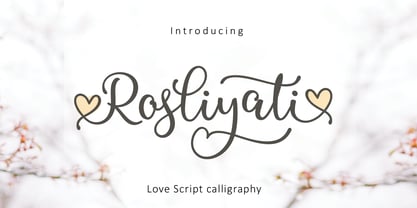 Rosliyati script -font that is fresh, funny, interesting, cute with lots of heart characters and also very beautiful with alternatives, this font looks natural, elegant, and perfect for extraordinary projects. Rosliyati script is suitable for various products such as invitations, product packaging, offers, product design, crafters, labels, photography, watermarks, logos & branding. Everything can be accessed using software that supports Opentype, such as Adobe Indesign, Adobe CS Illustrator, Adobe Photoshop CC, and Corel Draw.
 - Big Boy by Type Innovations,
$39.00I have always wanted to create the world's biggest and heaviest font. I admit that I was visually inspired by contenders like Akimoto, Champ Ultra, Blackoak and Bloque. However, I not only wanted a real heavyweight, but a really good looking and readable font as well. Look out—Big Boy is here. This powerhouse can get the job done. Try it out and get the attention you deserve. - Primitivus by PizzaDude.dk,
$18.00 It all started with making of a simple all-caps font. I drew the whole alphabet, numbers all else needed - but something wasn't quite right...the lettershapes were fine, but quite boring. Then I took a drastic decision: I started all over again ... meaning, I printed the whole thing, messed it up using a wet cloth and wrinkled the paper - then scanned it all again, and imported all the graphics yet again. A lot of work, yes - but personally I think it was worth it! But anyway, that's the story of how Primitivus was made ... well, almost, but not quite ... but that's another story! Use Primitivus for anything that needs that special kind of look were handdrawn letters meets grunge! Play around with the 4 different versions of each letter to make your text look even more random and natural!
 - Salas by AdultHumanMale,
$20.00 Salas is a fun, chunky, slab serif omnicase display font. It's blocky and loud, so it can scream from Posters and Headlines. Think of a clown with poor hearing making a Skype call, he's shouting, but you like it. Anyway: it has over 300 glyphs, several variations on the standard alphabet and lots of those extra foreign features for sending international ransom notes. OpenType coded, it has various letter pairings that interlock automatically to create a more randomized, bespoke feel to your copy. It also has some extra characters available directly through your glyphs palette. Play around with it, I hope you like it.
 - Galitha Script by Letterfreshstudio,
$13.00 Hello everyone, I would like to introduce my newest font Galitha Script is a beautiful modern calligraphy typeface, I hope you will be interested in this font, if you want to use it for your work. This font can be used easily and simply because there are many features in it. contains a complete set of lowercase and uppercase letters, assorted punctuation, numbers, and multilingual support. font also contains multiple ligatures and many contain alternative Style Stylistic Sets such as a heart swash alternative. Galitha Script is very suitable for market designs being developed today, this font has a stylish, trendy, natural and soft font, with this font you can take advantage of opportunities every moment is a great way to highlight the celebration of the best of the party, because this font will be an advocate for the purposes such as wedding invitations, branding, parties, graduations, birthdays, gatherings, etc.
 - Chaplin by Monotype,
$29.99The Chaplin font is a light-hearted script created for display purposes. Chaplin leans slightly to the right. Used for packaging and posters, the Chaplin font has a relaxed charm. - Cabrito by insigne,
$24.00 After my son was born, I found myself reading him a lot of books. A LOT of books. Some were good, some were great, but I found myself wanting to develop something using my skills and interests to make something that only I could make. In short, I realized my son needed to be indoctrinated—I mean, introduced into the wonderfully wild world of fonts. So, I set about to make a board book to teach about typography, called “The Clothes Letters Wear.” You can learn more about the book here. I’ve made the captivating illustrations bright and colorful, and the use of different letter forms makes for a fascinating read to delight ages young and young at heart. And, as an added bonus, this children’s book has a custom designed font. I’m always looking for an excuse to design a new font, and this book created the perfect alibi. Drum roll, please. I now give you … Cabrito (“little goat” en Español). This new serif typeface incorporates the latest research on typographic legibility for children, features to make it—well, extra legible. A little background: studies show that Bookman Old Style is one of the most readable typefaces, and as a consequence or perhaps the reason why, it is used thoroughly for children’s books. This font became my initial inspiration for the typeface. Then, I found more legibility research saying that (brace yourselves) Comic Sans is also very legible for beginning readers, much due to the large x-height and softer, easily recognizable forms. In addition, forms that are closer to handwriting also seem to be more legible. Once I threw all that into my cauldron and stewed it a bit, the result was a pleasantly rounded typeface that includes not-so-strictly geometric, handwriting-inspired forms for the b, d, p, and q. Es guapo! Cabrito’s slender weights are simple and fun, with extras that turn any “bah humbug” into a smile. Add lighter touches to your project with the typeface’s included sparkles or rainbows (not included). Splash a little more color on the page with the firmer look of the thicker weights. Cabrito’s upright variations across all weights are matched by optically altered italics, too, giving you even more variety with the font family. This modern typeface’s bundle of alternates can be accessed in any OpenType-enabled software. The fashionable options involve a significant team of alternates, swashes, and meticulously refined aspects with ball terminals and alternate titling caps to decorate the font. Also bundled are swash alternates, old style figures, and small caps. Peruse the PDF brochure to check out these options in motion. OpenType-enabled applications like the Adobe suite or Quark allows comprehensive control of ligatures and alternates. This font family also provides the glyphs to aid a variety of languages. Cabrito is a welcoming, everyday font family by Jeremy Dooley. Use it to convey warmth and friendliness on anything from candy and food packages to children’s toys, company IDs or run-of-the-mill promotional material. Cabrito’s unique appearance and high legibility make it equally at home in print as it is on a screen.
 - QR Hiykaya by QR Type,
$45.00 All uppercase typeface for comic book lettering. Designed by Abay Emes. Supports extended Cyrillic and Latin characters. Has a stylistic set alternate L and D for Cyrillic and a stylistic set for languages with dotless i and i with dot (like Turkish). "Hiykäyä" translates from Qazaq as "Story".
 - Ogenblik by Hanoded,
$15.00 The other day, I was thinking how time flies and how my kids grow up so fast. In the blink of an eye, they had turned from babies into almost-teenagers. They're not teenagers yet, but given their tantrums, it does feel like I have three teenagers in the house... ;-) Ogenblik, in Dutch, means: ‘in the blink of an eye’, ‘lightning fast’, or ‘for a brief moment’. It’s similar to the German ‘Augenblick’, which means exactly the same. Ogenblik was made with the same dried out marker pen that helped me create my font Castlerigg. I guess it had more than one extra font in it! Ogenblik is a bit of a grungy, yet quite legible and neat font. Comes with multilingual support.
 - Urban Tour by Roland Hüse Design,
$10.00 -This font has been basically designed for poster display in black weight and big size (mostly for capital letters). The rest of the family is a derivative work of it. I can’t guarantee if it works well on small size print. -Future updates may follow in the near future or on request. Please feel free to contact me via rolandhuse@aol.com about the following: -This family does not contain all the language extensions, but I am willing to create any extensions (including Cyrillic) on request; - Discovering kerning problems while using; Or any other question.
 - Redtab by MKGD,
$13.00 With Redtab I tried to create a typeface that could be used equally well in either in body copy, or in headline form. I like to think that, although it has a more traditional look to it, it still possesses a bit of a creative flourish that sets it apart from similarly designed fonts. Whether used sparingly or in paragraph form, Redtab has the ability to not only read well, but stand out while doing so.
 - Oddlini by sugargliderz,
$44.00 I have a lot of options to choose from, and it's hard to decide. For example, if I use "Thin" for the body text, I might make the title slightly larger and use "ExLight," and for the headings, I could use "Regular" or something similar. I could also stick to one font weight, like "Light," and differentiate the text using various sizes. This font is designed for enjoying the process of "indecisiveness," so please feel free to wander and deliberate extensively.
 - Breakfast Pastry by Missy Meyer,
$12.00 I’d been thinking for a while about making a serif font with ball terminals: big fun round ends to the letters anywhere I can squeeze them in. So I made Breakfast Pastry! I started with a hand-drawn set of basic letters, then went hog-wild making alternates and ligatures galore with fun swirls, curls, and even more balls! I’ve cleaned the letters up significantly to make them smooth and easy for any cutting or printing you may want to do, but I’ve also left in some of the hand-drawn character so that the letters are warmer and not too formal. Then I took the first font, and made a second solid version without the cutouts. After that I thought: I tend to make plumper fonts ... why not make an even thinner version? So I did! All three versions have the same character set (over 700 glyphs total), which means they all have the same extras and alternates. All three fonts have over 300 extended Latin characters for language support, as well as over 200 bonus items: alternate letters, letters with swashes, two-letter ligatures, small caps, catchwords, and even some bonus ornaments and elements to make the fonts even more flexible. (After all, if one swash on a letter is good, two or three might be great!)
 - Xspace by Artyway,
$14.00 I'm thrilled to present you a new futuristic typeface. Smooth humanistic forms and elongated proportions, modern trends dictate a new fashion in type design. Perfect for science research posters, modern futuristic logos, automotive type design and more. Check how it works and let me know, I am always glad to hear your opinion.
 - FS Joey Paneuropean by Fontsmith,
$90.00Kangaroo FS Joey was the offspring of a project with Rudd Studio to develop a logotype for an online streaming TV service, in 2008. While under wraps, the secret project was code-named Kangaroo. The logotype led to a second project, to design a corporate typeface for the service. It was the first big project Fernando Mello had worked on with Jason Smith. “Like any designer who just joined a team, I was very excited about it, drawing and sketching lots of ideas. I remember Jason and I experimenting with lots of possibilities, for both the logo and the typeface.” Online As the font for a Spotify-style, internet-based service, FS Joey needed to be highly legible on-screen, including at very small sizes. There had to be a range of weights, and they’d have to work well in print, too. It was also important that it felt corporate, not too quirky, while still having a strong character of its own. Quirkiest “We designed three weights specifically for use on the Web,” says Jason Smith. “There was the usual fight between me and my team. I wanted at least one identifiable letter that was a quirk. As always I went straight for the lowercase ‘g’, and it was drawn numerous times with lots of variation. I got the quirkiest one accepted by the client.” But, later in 2009, the Competition Commission blocked Project Kangaroo, and Fontsmith were left with a couple of weights of an as yet unused font. From Kangaroo, Joey was born. A favourite “Straight away, people started to notice the typeface,” says Jason. “I can take the credit for pushing the art direction and standing up for the quirks. But it was Fernando who was the key to pulling it all together and adding his own distinct flavour. Now it’s one of my favourite designs in our library.” Fresh and friendly, geometric and energetic, Joey is available in five weights, all with italics, all finely-tuned for both screen and print. - FS Joey by Fontsmith,
$80.00 Kangaroo FS Joey was the offspring of a project with Rudd Studio to develop a logotype for an online streaming TV service, in 2008. While under wraps, the secret project was code-named Kangaroo. The logotype led to a second project, to design a corporate typeface for the service. It was the first big project Fernando Mello had worked on with Jason Smith. “Like any designer who just joined a team, I was very excited about it, drawing and sketching lots of ideas. I remember Jason and I experimenting with lots of possibilities, for both the logo and the typeface.” Online As the font for a Spotify-style, internet-based service, FS Joey needed to be highly legible on-screen, including at very small sizes. There had to be a range of weights, and they’d have to work well in print, too. It was also important that it felt corporate, not too quirky, while still having a strong character of its own. Quirkiest “We designed three weights specifically for use on the Web,” says Jason Smith. “There was the usual fight between me and my team. I wanted at least one identifiable letter that was a quirk. As always I went straight for the lowercase ‘g’, and it was drawn numerous times with lots of variation. I got the quirkiest one accepted by the client.” But, later in 2009, the Competition Commission blocked Project Kangaroo, and Fontsmith were left with a couple of weights of an as yet unused font. From Kangaroo, Joey was born. A favourite “Straight away, people started to notice the typeface,” says Jason. “I can take the credit for pushing the art direction and standing up for the quirks. But it was Fernando who was the key to pulling it all together and adding his own distinct flavour. Now it’s one of my favourite designs in our library.” Fresh and friendly, geometric and energetic, Joey is available in five weights, all with italics, all finely-tuned for both screen and print.
 - JulesLove - Unknown license

- Cosmic Sans by Zachary Mazur,
$15.00 Cosmic Sans was my first font ever created for a school project. The class I made this font for was my Advanced Typography and was a semester project. I really couldn't think of a title for this font, until one of my good friends said, "Why don't you name it Cosmic Sans?" I searched the internet for any other fonts with that name, and sure enough there wasn't. Thus the name stuck. This font is more or less a display font, thus every secondary character was not created. I hope you enjoy this font and much as I have while creating it!
 - Bodoni Classic Deco by Wiescher Design,
$39.50 Bodoni Classic Deco is against all rules. Giambattista Bodoni himself would probably hate me for doing it; he was a real purist. The whole idea of the Bodoni typeface is no embellishments and here I go and decorate those nice clear letters. Shame on me! But I find this is a very nice and useful typeface for all kinds of cards and certificates. So I just did it for all of you out there that are not born purists, but want a little embellishment to their lives. And to make things worse, I added a Small Caps cut. I even decorated it. Enjoy! Yours, breaking all the rules, Gert Wiescher
 - NAKED - Personal use only

- White Rabbit - Unknown license

- Rough Therapy by Hanoded,
$15.00 No, I don’t need therapy - at least, not that I’m aware of. I needed a bold and rough name for this bold and rough font. Rough Therapy is a strong display font. Comes in a clean and a dirty version, so take your pick!
 - Roosk by DearType,
$39.00 Roosk is a round, reverse-contrast serif designed for display usages. It bears a 70s influence as well as a subtle western vibe, although it’s more rounded and chunky. The font is a single weight, Caps only and sports a set of 450+ glyphs and some cute symbols such as hearts and floral hearts. Roosk has Cyrillic and All European Languages Support and is best suited for posters, headlines, editorial, merchandise and packaging.
 - Sticky Love by Bogstav,
$17.00 The name "Sticky Love" is taken from a song by Kate Bush. Perhaps not one of Kate Bush' most famous songs, but nevertheless, the song is about love (Which I think is what Kate Bush sings a lot about!) The Sticky Love font is also about love - that kind of love you just can't control. In this case, the love is about wacky letters! :) Sticky Love is handmade and just a tiny bit cleaned up. Not much though. The font has kept the handmade love!
 - Bottle Party by PizzaDude.dk,
$20.00 A bottle party is a party where you are supposed to bring whatever you wish you drink. When using my Bottle Party font, you need not bring anything at all! The font does all the partying itself - all you need to do is type, and the contextual alternates makes sure that your text doesn’t repeat the same letters over and over again! How is that? As I said, it happens automatically as you type, because the font cycles through the 4 different versions of each lower-case letter! The font is handmade with a brush feeling to it, legible at even very small sizes and it’s quite full of international characters!
 - Gusto by Device,
$39.00Gusto comes in three related variants that go from hot-dog to melted chocolate, a gastronomic combination not to be passed up (or thrown up). - NoraPen by sugargliderz,
$40.00 This font is influenced by Walbaum. However, I did not just trace the design, but sort of had the image in my head while I drew the letters. This font is balanced by not being entirely Walbaum, but still basically is. I've named it "NoraPen." Nora comes from the name of the main character in Ibsen's "A Doll's House," and Pen means a cage for livestock.
 - Une Nuit Parisienne by Megami Studios,
$10.00 This font is based on a lot of the downtempo culture in Paris. Smoky bars, jazz clubs, that sort of thing. How a font can be influenced by intangibles is a question that I can't quite answer, but I can say that when I created it, it strongly reminded me of a couple of times spent in Paris back in the mid-90s.
 - Bumpy Ride by Hanoded,
$16.00 I live in a small hamlet near the Rhine river. It is a sleepy little town and it doesn’t have any facilities. For groceries I need to go to the next town. The only road leading to that town has been closed for half a year, because of ‘maintenance’, so doing groceries got a lot trickier. The fastest way to travel is through yet another hamlet in the forest, on a very narrow road with extremely bumpy shoulders. Yes, you’ve guessed it: it is a Bumpy Ride. Bumpy Ride was made using a so called Brush Pen. It comes with all the accents and a sweet set of alternates for the lower case letters.
 - LOVE-BOX - Personal use only

- Promenade by Jen Wagner Co.,
$17.00 Introducing Promenade – a calligraphic serif that started on paper with a flat nib pen (see the 6th image), and blossomed into a full serif with italics. At its core, this font is just... beautiful. It's elegant, it's crisp, it's delicate, but can still hold its own. As I was creating the graphics, I just couldn't get over the flow of the letters – especially the italic. It's got class, but also isn't afraid to rock a pair of Doc Marten's. Funny enough, Jen from Tonic (they make beautiful websites) saw a preview of this font and said, "I'd take that font to prom." Which of course spurred a conversation about how this font would take a Mercedes G-Series instead of a limo, and wear Doc Marten's instead of heels, but still wear the most gorgeous dress, and that is 100% Promenade (and inspo for the name – thanks, Jen!). I've also been loving combining the regular and italic, especially for logos (see the "Friendfolk" logo) One thing to note about Promenade is the letter spacing. It was spaced for clean reading and intentional balance, so I recommend setting the spacing a little tighter if you want to create the display look found in many of the logo mockups(around -20 to -40 should do!).
 - Hodgepodge by Outside the Line,
$19.00 Hodgepodge is a confused mixture of letters that somehow work together. While I know this has been done before I create fonts that I need. And I occasionally have found a need for this. And it was not there, so now it is. There is a mixture of light and dark, bold and regular, caps and lower case but not where you would expect them to be. Since this is a headline font you can set the headline and then easily go back and change a letter here or there to get the best-looking combination. Hodgepodge was in the 2011 Typodarium Page-A-Day Calendar on 7-17-2011.
 - Route Du Soleil by Hanoded,
$15.00 Probably everyone living in Europe has heard of the (in)famous Route Du Soleil. The Route Du Soleil (Motorway Of The Sun) is a stretch of road from Paris to Lyon (in the south). It is THE route holiday makers take to reach southern France, so they can get there before everyone else does. The result: endless traffic jams, overheated engines and people and more toxic exhaust fumes than your average petroleum distillery. Route Du Soleil is also a very nice hand written font that comes with swashes and ligatures. If you happen to find yourself in a traffic jam on your way to southern France, then I hope you have downloaded this font. Just one look at it and you’ll forget your problems! ;-)
 - Capsule by Eclectotype,
$40.00 Capsule is a reverse-stress, high-contrast, rounded sans-serif font with two distinct personalities. An all-caps face, there are however variations of some letters in the lowercase slots. The lowercase variants are more playful, with more bulbous elements that riff on phototype faces like Amelia and Data 70, but all can work together and be mixed and matched to your heart's content. Capsule boasts a bunch of esoteric discretionary ligatures to play around with, and stylistic alternates for 4, 7 and £. The language support is extensive enough to set essays in most Latin-based languages, even though that's the last thing you should be doing with this font! Capsule should be set large. The fit is tight and the kerning is aggressive. It's not what you'd call a workhorse, but Capsule is an All-Caps you'll (see what I did there?!) want to use for impactful headlines, cutting edge logos and post-modern layouts.
 - Barracuda by Wiescher Design,
$39.50 Barracuda has this sharp, sharky look and I do a lot of diving with my best friend. What else is there to say? If you see a shark say hello from me. Yours from under the Red Sea, Gert Wiescher


