5,887 search results
(0.011 seconds)
- Vellvé by ITC,
$29.99For over 30 years, Tomás Vellvé created beautiful graphics and distinctive typefaces in his native homeland of Spain. First drawn as a phototype display design in 1971, Vellvé’s only typeface in digital form is an uncommon solution to the problem of creating a new sans serif design. The end result, which bears his name, is a design that stands out from the crowd of other sans serif typefaces. The phototype version was only available in a single, light weight. With the release of the digital fonts, however, three additional weights as well as a companion italic for the light weight were created.The typeface designs were originally drawn for Agfa Monotype (now Monotype Imaging) in 1996 as part of the company’s “Creative Alliance” initiative. Through an exclusive licensing arrangement, the Vellvé™ family has now been added to the ITC Typeface Library.ITC Vellvé is a wide design with strong calligraphic overtones. This is no “anonymous” design like so many modern sans. Letters like the `R, `e and `s clearly show the hand of Tomás Vellvé in the design process. Vellvé provides a fresh choice between geometric sans serifs such as Helvetica® and industrial sans serifs like Futura®. - Daiquiri by Wiescher Design,
$39.50 Daiquiri is a revival of a handlettered font in two weights, from an ad for Puerto Rico Rum dating back to the forties or fifties. I found the ad on a French antique market on my last visit for Mardi Gras in Nice. The ad read "Breeze through the heat, be a Daiquiri fan". That's why they had this "fan" in the illustration! Did they want you to rotate like a fan when you had enough Daiquiris? Or did they just do it for that little "Jeu des mots"? Anyway I found the handlettering very pretty, so I took those few letters and made a whole font out of them. I think Daiquiri has that touch that brings those happy and uncomplicated times back when advertising was still fun. I started something like 20 years later in advertising and things had gotten more stringent. We already had to satisfy those marketing guys with their scholarly attitude. They have taken all the fun out of the job, for the creators as well as for the consumers. I would like to see more uncomplicated ads like this again, yours Gert Wiescher
 - Priori Serif by Emigre,
$59.00 After the popular successes of Exocet and Mason, Emigre has once again teamed up with Jonathan Barnbrook to bring you his latest venture into type land. Priori is a logical progression from Mason, a typeface he designed around ten years ago. Where Mason was designed purely for display purposes and featured only caps, Priori includes lower case, companion serif and sans serif versions, alternates and, according to its creator, is shooting for text face status - a bold claim from a designer who loves to wear his influences on his sleeve and who has little use for typography that aspires to be "neutral" or "transparent." Like many of Barnbrook's typeface designs, Priori is based on his interest in British typography of the early 20th century. It is inspired by the work of famous British typographers, such as Eric Gill and Edward Johnston. But it also embraces all of the signage and lettering that Barnbrook observes in the streets, cathedrals, and public buildings of his London neighborhood. This mixing of native influences with a contemporary pop culture intent is what gives Barnbrook's types a distinct and unique flavor. Like its creator, Priori is a one of a kind.
 - Linotype Typo American by Linotype,
$29.99Mark Stanczyk designed Linotype Typo American in 1999. The font is an excellent revival of American style typewriter type. As most of us can remember from our childhood years, or through old stories and movies, everyone used to type with typewriters before the invention of computers. Unlike computers, most individual typewriters only had one typestyle, or font, to chose from. To make matters worse, the letters in a typewriter font would wear down with use. Over time, text typed out on a typewriter would look more and more corroded, old, and uneven. Stanczyk has captured exactly these features in this “revival” font! Also like most older typewriter styles, Linotype Typo American’s letters are all mono-spaced, i.e., the letter i is the same width as the letter w. Typewriter letters also all tended to be cast in the same size, around 12 points or so. When using typewriter-style fonts, it is best to keep setting your text in similar sizes. (Of course, you can set really large and fun headlines with Linotype Typo American, too; if anything the unevenness of the design will come even more across in these applications.) - Priori Sans by Emigre,
$59.00 After the popular successes of Exocet and Mason, Emigre has once again teamed up with Jonathan Barnbrook to bring you his latest venture into type land. Priori is a logical progression from Mason, a typeface he designed around ten years ago. Where Mason was designed purely for display purposes and featured only caps, Priori includes lower case, companion serif and sans serif versions, alternates and, according to its creator, is shooting for text face status - a bold claim from a designer who loves to wear his influences on his sleeve and who has little use for typography that aspires to be "neutral" or "transparent." Like many of Barnbrook's typeface designs, Priori is based on his interest in British typography of the early 20th century. It is inspired by the work of famous British typographers, such as Eric Gill and Edward Johnston. But it also embraces all of the signage and lettering that Barnbrook observes in the streets, cathedrals, and public buildings of his London neighborhood. This mixing of native influences with a contemporary pop culture intent is what gives Barnbrook's types a distinct and unique flavor. Like its creator, Priori is a one of a kind.
 - H-AND-S by AND,
$89.00 A common creation: (to pass from one hand to the other): For the first time, various hand-signs from diverse sources are unified into one single visual style. This compendium is the result of 15 years of incubation and 7 years of creation. In his travels throughout the world, graphic designer Jean-Benoit Levy, principal of the visual studio AND, has collected pictures of multiple hand signage. Uncertain what to do with those signs, he kept them year after year until the idea came to unify almost 200 handsigns into one single family. In accordance with this entire collection, the name of the typeface is a mix: "h-and-s". A global collection: (To put in good hands): We all have one thing in common: Hand-signs are an international language, they are meant to be understood by all of us. Each of us regularly comes in contact with modern hieroglyphs such as the hand-sign-codes that are so prevalent in our daily life. This way of communication belongs to no one in particular and to all of us in general. Even if the sense of certain signs varies from one culture to the other, there is a common hand-sign language. We are surrounded by this language of handsigns each time we step in a store, we eat, open a container of milk, we clean up, use package of wash-powder, by shaving, when we work, use tools, at home, by tearing the envelope of a condom, by traveling, etc. When we encounter these signs, we all understand them easily. A visual connection: (To go hand in hand): This typeface is a global visual statement. Collecting, ordering, redrawing, unifying. Reconstructed and assembled into one original alphabet, H-AND-S is a unique and complex signs program. Our choice is based on daily gestures and global hand-codes. Logically this typeface starts with the "American Sign Language" and expands on two type-variations, each on two levels of keyboard. The international team of H-AND-S would like to send his special thanks to all of the anonymous graphic designers throughout the world who designed different hand-signage and who influenced and inspired to create such a sign collection into one unified family. We, the global nomad team of AND, hope that you will enjoy our H-AND-S. Additional Credits Production: Studio AND. www.and.ch. Concept, Idea & Creative Direction: Jean-Benoît Lévy, Switzerland / USA. Research & Sketches: Eva Schubert, Germany. Illustration, Graphic Design & Visual Fusion: Diana Stoen, USA. Transfer, Adaptation & Refining: Moonkyung Choi, Korea. Finalization & Checking: Sylvestre Lucia, Switzerland. Coaching & Technical Advice: Mike Kohnke, USA. Creative Energy & Implementation: Joachim Müller-Lancé, Germany / USA.
 - Magic Forest by Radoselsky,
$11.00 This font is designed by me for the use in my friend´s invitation for her childrens birthday party. I hope you can use it in yours.
 - Allow me to introduce you to the enchanting world of Dreamspeak, a font that could charm the socks off a centipede - not that they wear any, but let's not get bogged down by the details. Dreamspeak i...
- Journal Sans New by ParaType,
$40.00 The Journal Sans typeface was developed in the Type Design Department of SPA of Printing Machinery in Moscow in 1940–1956 by the group of designers under Anatoly Schukin. It was based on Erbar Grotesk by Jacob Erbar and Metro Sans by William A. Dwiggins, the geometric sans-serifs of the 1920s with the pronounced industrial spirit. Journal Sans, Rublenaya (Sans-Serif), and Textbook typefaces were the main Soviet sans-serifs. So no wonder that it was digitized quite early, in the first half of 1990s. Until recently, Journal Sans consisted of three faces and retained all the problems of early digitization, such as inaccurate curves or side-bearings copied straight from metal-type version. The years of 2013 and 2014 made «irregular» geometric sans-serifs trendy, and that fact affected Journal Sans. In the old version curves were corrected and the character set was expanded by Olexa Volochay. In the new release, besides minor improvements, a substantial work has been carried out to make the old typeface work better in digital typography and contemporary design practice. Maria Selezeneva significantly worked over the design of some glyphs, expanded the character set, added some alternatives, completely changed the side-bearings and kerning. Also, the Journal Sans New has several new faces, such as true italic (the older font had slanted version for the italic), an Inline face based on the Bold, and the Display face with proportions close to the original Erbar Grotesk. The new version of Journal Sans, while keeping all peculiarities and the industrial spirit of 1920s-1950s, is indeed fully adapted to the modern digital reality. It can be useful either for bringing historical spirit into design or for modern and trendy typography, both in print and on screen. Designed by Maria Selezeneva with the participation of Alexandra Korolkova. Released by ParaType in 2014.
 - Arts And Crafts-GS by Bannigan Artworks,
$19.95The Arts And Crafts-GS font is loosely inspired by the lettering of Charles Rennie Mackintosh (1868 - 1928) of the Glasgow School, from which Jessie receive her training. - Ronita by Typadelic,
$19.00Even as a child, I was interested in letterforms. I admired my grade 4 teacher's handwriting and so Ronita is based on fuzzy memories of her elegant script. - LiebeRuth by LiebeFonts,
$29.90 LiebeRuth is your 100 percent hand-made organic type. She absolutely loves to be typeset in large *and* small sizes, because Legibility is her middle name. (Yes, we know it’s not a typical girl’s name.) She is friendly and polite, but she also has a few quirks. Her friends are impressed with how natural she manages to look every day. Her four weights ensure that Ruth has the right boldness for any context: birthday invitation, personal correspondence, photo album, or billboard ad. During the creation of this font, her designer ate plenty of healthy, organic foods. We think this is the reason why Ruth looks so fresh and lively. And of course Ruth has been designed with lots of Liebe (which is German for “love”—and she speaks many other languages, too). One more thing Ruth is marvelous at: showing off her curly-swirly swashed alternative letterforms that can be activated via OpenType. (Please make sure your software supports OpenType if you wish to use the advanced features.) Each style contains more than 560 gluten-free glyphs—now that is great value! If you like this font, you may want to look at LiebeRuth’s bolder sister LiebeDoni and our best-sellers LiebeErika and LiebeKlara. Or add in some LiebeOrnaments to prepare a curly-licious feast. By the way: LiebeRuth also gets along great with our wide range of illustrative fonts, including LiebeCook, LiebeFish, and LiebeTweet.
 - Beautiful Moonlight by Fargun Studio,
$14.00 Beautiful Moonlight is handwritten stylish copperplate calligraphy fonts, combines from copperplate to contemporary typeface with a dancing baseline, classic and elegant touch. Can be used for various purposes. such as headings, signature, logos, wedding invitation, t-shirt, letterhead, signage, lable, news, posters, badges etc.
 - Sweet Afton NF by Nick's Fonts,
$10.00 Samuel Welo offered the pattern for this font as a titling font for silent movies. Its rustic charm has held up well, some eighty years on. Both versions of this font support the Latin 1262, Central European 1250, Turkish 1254 and Baltic 1257 codepages.
 - Cat Paw by Beary,
$14.00 Cat Paw embodies fun, quirkiness and authenticity. It features gorgeous and fun characters that will brighten up your crafting projects. It will elevate a wide range of design projects to the highest level, be it branding, headings, invitations, signatures, logos, labels, and much more!
 - Jumbox by Tour De Force,
$25.00 Jumbox is display family containing five weights that are actually layers. Combining them with different colours, Jumbox will bring strong sense of graphicism in your titles, product names, signage, billboards, packaging, web page headings – for wide range of uses. Comes with pack of ligatures.
 - Wilde Rosa by PeachCreme,
$23.00 Say hello to our new contemporary all-caps font "Wilde Rosa". Perfect for logos, magazine titles, this lovely font can be paired with clean sans serif. Wilde Rosa is designed to be used for large headings whether it be displayed on billboards, advertisements, or magazines.
 - Mono Seahorse Graffiti by Sipanji21,
$16.00 Mono Seahorse is a display font with a monoline graffiti style, there is some swash for your awesome design. It will elevate a wide range of design projects to the highest level, be it branding, headings, wedding designs, invitations, signatures, logos, labels, and much more!
 - Alyrak by Konstantine Studio,
$16.00 ALYRAK is born from the anxiety of the future dystopia of the human race. The fear of Artificial Intelligence, robots, and technology that potentially invade living things. Represented in a font and visual to emulate the vibe every time you type it from your keyboard.
 - Really Love by Selvia Design,
$14.00 "Really Love" is a very unique and beautiful retro font. This font is decorated with a heart shape on each letter. equipped with uppercase, lowercase, swashes, uppercase alternates, numerals, punctuations, and multilingual support. It is suitable for Valentine's Day moments, weddings, engagements, photography, and others.
 - Design Or Die by Type-Ø-Tones,
$40.00 Many people asked why we removed Design or Die of our collection. After years of hibernation in our vault, one of the sexiest italics of the Classic Type-Ø-Tones is back. New subtle changes for a definitive version of this Luis Mendo type.
 - Porky Mother by Sipanji21,
$10.00 Porky Mother is a spectacular decorative font with a graffiti style and bubble looks. It will elevate a wide range of design projects to the highest level, be it branding, headings, wedding designs, invitations, signatures, logotype, wall art illustration, apparel, labels, and much more!
 - Eskos by Pesotsky Victor,
$10.00 Eskos is designed for headings. It is deliberately diagonal and gives a sharp, oblique texture in the text set. It has rough irrational knots and oblique strokes. Eskos supportsBasic Latin, Cyrillic and more than 100 languages all together. The font was designed by Viktor Pesotsky.
 - Freight Display Pro by Freight Collection,
$39.00 Freight Display kicks it up another notch from the Freight Text family with more open counters and a bit more contrast. Those warmer proportions give balance for easily read headlines, running heads, and subheads while still standing tall if reversed-out at smaller sizes.
 - My Fox by Typefactory,
$14.00 My Fox is a fun and playful display font with adorable feel. It will turn any design project into a stand out. This cute font is really great for a birthday card, clothing, thanksgiving gift card, quotes, headings, birthday invitations, posters, and many others.
 - Locked Monster by Sipanji21,
$18.00 Locked Monster is a display font with a basic graffiti style. It will elevate a wide range of design projects to the highest level, be it branding, headings, wedding designs, tittle, signatures, logos, labels, movie, video, magazine, logotype, crafting, packaging, advertising and much more!
 - Bastard by Barnbrook Fonts,
$30.00 Bastard is a contemporary blackletter typeface and was one of the first created using a personal computer. It was drawn using primitive font design software in 1988, and refined and published two years later. It has now been revised to feature an expanded character set.
 - Mustafa Script by Fargun Studio,
$12.00 Mustafa Script is handwritten stylish copperplate calligraphy fonts, combines from copperplate to contemporary typeface with a dancing baseline, classic and elegant touch. Can be used for various purposes. such as headings, signature, logos, wedding invitation, t-shirt, letterhead, signage, lable, news, posters, badges etc.
 - Marmorherz NF by Nick's Fonts,
$10.00 A blast from the past, this timeless typeface is based on Marble Heart, first released in the United States by Farmer, Little and Co. in 1866. Both versions of this font support the Latin 1252, Central European 1250, Turkish 1254 and Baltic 1257 codepages.
 - Grecian by Solotype,
$19.95Our first font of Grecian was so old that it had been cast in a hand mold. Extremely popular face in the nineteenth century, made by many foundries and wood type makers in various widths. Lowercase was added by some foundries in later years. - Anamorphic by TEKNIKE,
$39.00 Anamorphic is a display monospace handwriting font. The typeface is a distinct hand drawn font using a felt tip marker. The Anamorphic name is derived from Greek words meaning “formed again”. Anamorphic is great for display work, invitations, writing, architecture, posters, logos and headings.
 - Horror Metal by Letterara,
$14.00 Horror Metal is a brush font with a bold weight font that’s perfect for any horror or metal designs! As its name suggests, Horror Metal is not a font for the faint-hearted. In fact, using this metal-style display font requires courage and bravery.
 - Broken Sunday by Sipanji21,
$10.00 Broken Sunday is a display font with a monoline graffiti style, there is some swash for your awesome design. It will elevate a wide range of design projects to the highest level, be it branding, headings, designs, invitations, signatures, logos, labels, and much more!
 - Neeskens by Type-Ø-Tones,
$40.00 Neeskens, by Enric Jardí. A few years ago we used to talk about Neeskens as the font preferred by the crew of Ganimedes' commercial vessels. Now we see it as one of most solid geometrics of our typefaces. Neeskens has two versions: solid and inline.
 - Linex Sweet by Monotype,
$29.99Linex Sweet was designed by Albert Boton in the late 1990s. It's a smallish family of three weights; the middle weight has an italic companion face. With its soft corners and slightly quirky head-serifs, Linex Sweet is a friendly design that sees much use. - Jarkids by Raditya Type,
$12.00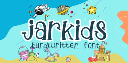 Jarkids is a picture of fun, uniqueness, and authenticity. This eye-catching handwritten font will turn your creative ideas into a standout. It will take your various design projects to the highest level, be it branding, headings, wedding designs, invitations, signatures, logos, labels, and more!
 - Petersburg by ParaType,
$30.00 Designed at ParaType in 1992 by Vladimir Yefimov. Based on Kudryashevskaya Encyclopedicheskaya of Polygraphmash, 1960-74, a typeface by Nikolai Kudryashev and Zinaida Maslennikova. A very lightweight style with neutral letterforms, it is quite space-saving. Excellent for long texts, headings and display typography.
 - Winter Snowy by Sipanji21,
$10.00 Winter Snowy is a decorative font with a snow decoration on the top of characters. It will elevate a wide range of design projects to the highest level, be it branding, headings, wedding designs, invitations, signatures, logotype, wall art illustration, apparel, labels, and much more!
 - Freshtea Healthy by ahweproject,
$14.00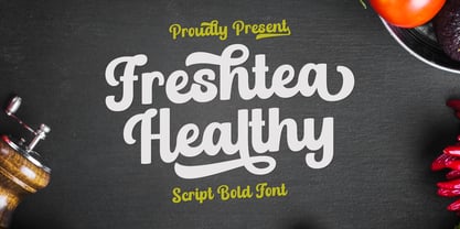 Freshtea Healthy feels equally charming and elegant. This stunning script font is a stylish homage to classic calligraphy. It will elevate a wide range of design projects to the highest level, be it branding, headings, wedding designs, invitations, signatures, logos, labels, and much more!
 - Kind Type by Letters&Numbers,
$28.00 Kind Type is based on watercolor painted letters. Open, bold strokes with rounded terminals make it a very legible typeface even at small size. Kind Type has a soft, friendly character with a distressed edge. It is suitable for short paragraphs, captions or headings.