10,000 search results
(0.067 seconds)
- Cityscape™ - Unknown license

- Pea Karen's Print - Unknown license

- Mercury Blob - Unknown license

- Pea cammi-pea - Unknown license

- Seanor by Typebae,
$15.00 Seanor is a modern and versatile logo font that features 26 elegant ligatures. It offers a modern aesthetic, making it suitable for various branding and design projects. The font's ligatures provide unique and stylish combinations of letterforms, enhancing the overall visual appeal of any logo or typographic design.
 - Chaleum by Sronstudio,
$20.00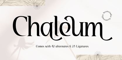 Chaleum Display Font comes with an elegant and modern touch this font is perfect for branding, invitation, stationery, wedding designs, social media posts, advertisements, product packaging, product designs, label, photography, watermark, special events, and more. Features: Uppercase and lowercase letters 42 Alternates Swashes 23 Ligatures Multilingual, numerals, and punctuation
 - Ongunkan Gothenburg Futhark Swe by Runic World Tamgacı,
$40.00 Sweden Gothenburg Futhark In Sweden you have another set called the Bohuslän runes, which are used specifically in the west coast area (Bohuslän) north of (and including) Gothenburg city (my hometown, incidentally). Interestingly, this is a string of 26 letters, not 16; 2 more than the original Elder Futhark
 - Odyssea 632 by Thinkdust,
$10.00 Odyssea 632 is the follow up to a http://www.hypefortype.com exclusive font called Odyssea which was originally designed by Pablo Alfieri. Odyssea 632 contains all of the features of the original font and also supports 42 languages. Check out the gallery for a full character set, and other imagery!
 - Metafora by Dirtyline Studio,
$17.00 Metafora Sans is a contemporary display family with multifunctional workhorse designed to work best in any printed and on screen contexts, including logo design, brand identities, websites, packaging, poster and headline. The Typeface come in 13 weights, with Upright and Oblique each, for a total of 26 styles.
 - Munchies by W Type Foundry,
$25.00 Munchies is a reverse contrast slab-serif font family. Inspired by the volume and size of 19th century wood letterpress blocks and the Italian Caslon language. Munchies has 12 variants, from Heavy to Thin, with opentype options in a set consisting of uppercase, lowercase, small caps, ligatures, and alternate letters (A, M, N, V, W, &, Arrows, *). Munchies is divided into two subfamilies: Normal and Display. The Normal style has an appearance reminiscent of Western posters with a “measured” contrast. While the Display style takes the contrast to the extreme. Both styles are also available in Variable version. The inverted contrast makes it an interesting and striking looking typeface that stands out in any context. Perfect for headlines, bold branding, or animation like kinetic typeface.
 - Gernsheim by Brenners Template,
$19.00 Gernsheim is a semi condensed display sans serif font family. This font family has been created for use in headlines and logo display fitted on showcase screen. 9 weights and 18 font styles make up the initial release. To increase the adoption of a wide range of display fonts, the individual glyphs' handle fluctuations were subtly applied. The compromise of disproportion between straight lines and curves improves glyphs autonomy and relieves tension. And by applying rounded corner effects to each style, it presents the reader with softness and comfort. It is designed so that the rebellious disproportion created by heavy styles transition to flat and classy tenderness as the thin style approaches. Try the uniqueness and excitement of individual styles for yourself
 - Atlan by Latinotype,
$29.00 Atlan—a Latin ‘spin-off’ of classic geometric sans typefaces. Remembering typefaces like ‘Kabel’ by Rudolf Koch, while paying attention to current design needs, was the starting point for ‘Atlan’—a simple, elegant and appealing font. This typeface is based on highly expressive sans-serif geometric fonts of the 1920s. We challenged ourselves to reinterpret these characteristics, without losing expressiveness, in order to create a functional and versatile design. This process resulted in a font with display features, well-suited for light, uniform-coloured texts. The family offers a variety of styles from the elegant Thin weight—ideal for publishing and corporate websites—to the Heavy variant (perfect for logotypes and packaging), which reveals the stylistic elements of the typeface.
 - Araldo by Hackberry Font Foundry,
$14.95 My latest book production group is quite conservative. I discovered my need for a pair of headline fonts with the same vertical metrics which are looser and more lively. Since the serif family is Biblia Serif, and the Sans family is Draetha [which is Welch for preach], Araldo [which is Italian for herald] makes sense to me. Narrow has my normal set of Opentype features with small caps, small cap figures, and the rest of the figure sets. Bold is too heavy for small caps, without messing with the metrics. So, it has the normal figure sets, plus a decent set of discretionary ligatures. They both work well, and are meeting my need for a headline family to add to the book production group.
 - ITC Manhattan by ITC,
$29.99Manhattan was designed in 1970 for ITC by Tom Carnase, who also created Avant Garde Gothic. The distinguishing characteristic of this designer's work is found in the emphasis on the thick-thin constrast. In this case, Carnase approached the border of the impossible. The heavy vertical strokes stand opposite the finest of lines and the thick columns dominate the overall look. The basic forms are strictly constructed, as are those of Morris F. Benton's Broadway of 1925, to which many parallels can be found. Manhattan is best used for applications which will not be placed too far from the viewer, as at too great a distance the fine lines can no longer be seen. It should be used exclusively for headlines in medium point sizes. - Senlot Serif by insigne,
$29.00 Senlot Serif is a follow-up to the technical yet elegant sans serif Senlot . In this serif edition, the original’s calligraphic tension shines through, with a moderate amount of contrast. Moreover, you can use Senlot Serif to set large amounts of text or for titling. It has a special calligraphic tension, and lends itself to luxury and design work of high quality. There’s a full set of small capitals and titling capitals and a real italic. Including thin to heavy, there are nine weights and three widths. Also included are a full set of OpenType features, super and subscript, old style numbers, and expanded Latin with support for more than 72 languages. For your next luxury campaign, the new rich text is Senlot Serif.
 - ZT Arturo by Zetafonts,
$29.00 ZT Arturo is a sans serif family designed by Francesco Canovaro as part of his research in the digital reinvention of handmade brush lettering. Marrying a fun, playful approach to letterforms to the versatility of a text family with multiple weights and advanced features, Arturo comes in seven weights with matching italics, and sports a wide array of OpenType features including stylistic alternates, small caps and discretionary ligatures (providing options for display usage and fine-tuning in logo design) as well as more offbeat features as ordinals, superior and inferior numerals, tabular, lining and oldstyle figures and OpenType-generated fractions. The family is complemented with a outline version that can be used on its own or together with the heavy weight for multi-layer color font inventions.
 - Künstlerschreibschrift by URW Type Foundry,
$35.99 After inventing a new metal typecasting procedure that allowed for the production of more detailed typefaces, the famous German typefoundry D. Stempel AG developed Kuenstler Script in 1902 - 1903. Originally called Kunstlerschreibschrift (artistic handwriting), this design was based on English copperplate script styles from the late 1800s. In 1957, Hans Bohn added the heavy Kuenstler Script Black weight to the family. Like intricate handwriting put to paper with a feather and an inkwell, Kuenstler Script makes almost any text look distinguished and elegant. Kuenstler Script is a joining script; and because of its fine hairlines and small x-height, it is best used at sizes above 12 pt. The typeface works well in advertising work and on invitations, greetings cards, business cards, and certificates.
 - Wordmark by W Type Foundry,
$28.00 Wordmark is our new fully equipped branding tool. Designed with a refreshed humanist style, much loved by brands that need to deliver their message in a serious way, with a current look. Drawn by the cool eye of Gaspar Muñoz, expect this font to be as good or even better than its predecessor "Herokid". "Wordmark" is super complete; it includes condensed, thin, expanded, and heavy weights plus italics with two complementary systems that work together in a powerful way. "Wordmark Normal" offers great readability for text and signage, big or small. And "Wordmark Display", designed with a noticeably taller X height specifically made for headlines, big windows, and big screens. With 48 different styles keep it simple and make reliable designs with "Wordmark".
 - Narcissus SG by Spiece Graphics,
$39.00 Narcissus Open is a heavy typeface designed by Walter Tiemann in 1921 for the Klingspor Foundry in Germany. It is a shaded wide roman using a very modest amount of white highlighting. Serifs are extremely delicate, almost ornamental. This elegant old typeface gives a feeling of importance and authority and is highly effective when used in large display sizes. Narcissus Solid lacks all highlighting and becomes more useful in smaller sizes. Narcissus Open and Solid are also available in the OpenType Std format. Some new characters have been added to this OpenType version. Advanced features currently work in Adobe Creative Suite InDesign, Creative Suite Illustrator, and Quark XPress 7. Check for OpenType advanced feature support in other applications as it gradually becomes available with upgrades.
 - Hard Rain by Scholtz Fonts,
$19.00 Hard Rain is named after the torrential thunderstorms that occur in the subtropical regions on the east coast of southern Africa -- the land of the Zulu. During the two-month long rainy season the steamy downpour usually lasts for a few days, and is then followed by the welcoming sun. The diagonal stripes represent the heavy drops of water that drench everything they touch. The resulting font has something of a grunge look to it. As with other grunge fonts, Hard Rain is best used for posters and display work. However, the crisp edges mean that it can be very readable even if used at a small size. Unlike most grunge fonts, Hard Rain has a full character set and this greatly extends its usability.
 - Hartwell by W Type Foundry,
$25.00 Hartwell is a Neo-humanist sans serif type family. Its strokes and terminal are related to the calligraphic shapes from humanist typefaces in sets with geometric touches. This combination results in a versatile postmodern type family ready to use with many possibilities. Hartwell comes in 18 weights from thin to heavy plus its matching italics. Moreover, this family has OpenType features such as arrows, ligatures, fractions, special numbers, alternate glyphs, extended language support and many more. Hartwell has the ability to blend perfectly in all sort of projects like editorial design, branding, advertising, headlines and short texts. Finally, I would like to thank the entire W team and their collaborators for the months of learning, goodwill and make this project possible.
 - Honesty Sans by Océane Moutot,
$32.90 Honesty was the first font published by the Studio in 2020. It was a typeface with flared stems. 2 years later, we are now publishing Honesty Sans. It is inspired by the original design but is revisited as a sans serif this time. Honesty Sans keeps the inspiration from the incise genre and font such as Albertus or the Trajan but with softness, thanks to its low contrast and smooth curves. Honesty Sans is highly lisible, which offers a variety for use, from titles, edition of texts, branding, magazines and so on. Its large variety of glyphs, including accents, old-style numbers and ligatures will give uniqueness to your designs. Honesty Sans is available in 16 styles, from thin to heavy in roman and italic.
 - Auteur by Up Up Creative,
$29.00 Introducing Auteur, a graceful, full-featured script font with tons of alternate characters and OpenType features. Hand-lettered with a heavy right slant and realistic disconnected letters (connected versions also included), Auteur’s casual elegance is particularly well-suited to invitations, branding, and editorial design. Auteur comes with more than 1200 glyphs! Specific OpenType features include contextual alternates, stylistic alternates, optional initial and final forms, multiple alternate glyphs for many letters (accessed through the glyphs panel), multilingual support (including multiple currency symbols), ligatures, multiple numeral forms (standard, tabular, proportional oldstyle), and ten ampersand styles. Perhaps the most fun thing about Auteur is that it includes multiple versions of all ascending and descending letters, making it lots of fun to play with layouts and compositions.
 - Linotype Sangue by Linotype,
$29.99Linotype Sangue is part of the Take Type Library, selected from the contestants of Linotype’s International Digital Type Design Contests of 1994 and 1997. This prize-winning font was designed by the German artist Gabriele Laubinger. The most distinguishing characteristic of Linotype Sangue is the contrast between the wide, rounded capital letters and the tall, narrow and pointed lower case. Another factor which makes this font so unique is the way Laubinger worked with stroke contrasts, using heavy strokes in the top third of the characters and diminishing to extremely light strokes at the bottom. Linotype Sangue makes a mysterious, secretive impression. It is best used for headlines and displays and shorters texts with point sizes of 12 and larger. - AS Haref by Sallam Type,
$23.00 AS HAREF is a contemporary geometric Arabic font, drawn and constructed carefully Font design is inspired by the ARABIC calligraphic style. AS HAREF Its structure is equal and visually controlled. Character forms are a combination of vertical straight lines that integrate visually with soft angles in some areas. This makes it a line of nature suitable for today's technological and visual development. The variations and weights of this font are suitable to use companies in their names and appearance, and also suitable with the titles and logos and is also used in all the requirements of advertising and long texts, use in headlines, logotypes, branding, books, magazines, motion graphics, web and Tv. AS HAREF consists of 7-weight versions from Thin to Heavy.
 - Portheras by Identity Letters,
$39.00 What does “smart casual” look like as a font? Try Portheras: a fairly wide, contemporary humanist sans with a laid-back attitude. Inspired by the fine Cornish beach of Portheras Cove, this typeface pays homage to British design tradition while incorporating an informal idiom. At ease both in flip-flops and silk blouses, in Bermudas and knit ties, Portheras sports a low x-height and comes with italics between “oblique“ and “true italic”. Despite its approachable look, the font family is equipped for heavy duty—you’ll get 16 styles with 780 glyphs each and OT features such as small caps, numerous figure sets (with old-style figures at mid-cap height), a bunch of arrows, three stylistic sets, and more. Portheras is as classy as relaxed gets.
 - Cooper BT by ParaType,
$30.00Bitstream Cooper was designed at Bitstream in 1986 by means of adding light, medium, and bold styles, with the corresponding italics, to the existing black ones. Based on Cooper Black, 1919, by Oswald Bruce Cooper, which was firstly released as a hand composition font in 1922 by Barnhart Brothers & Spindler of Chicago and later spread by ATF. Cooper Black is an extra bold face based on Cooper Old Style. Bitstream Cooper is an old style face with rounded serifs and tilted back ovals. For use both in text (normal weights) and in advertising and display typography (heavy weights). Cyrillic version was developed for ParaType in 2000 by Manvel Shmavonyan and based on TM Oswald face of TypeMarket, 1996, by Victoria Grigorenko. - Breakers by Kostic,
$40.00 Breakers is a sans serif originally conceived to be a display typeface. Works great in text also, but the diversity in weights is its strong point. It is easy to achieve that high contrast using thin against the ultra weight, but setting tall and lean capitals against the compact and heavy small caps can make really diverse compositions for all kinds of display design. With small caps included, and over 600 glyphs in each weight, it should prove itself useful in finding the right combination for any typographic setting. Breakers has a character set to support Western and Central European languages, and an extended set for monetary symbols. Each weight includes small caps, ligatures, proportional lining and oldstyle numbers, tabular figures, fractions and scientific superior/inferior figures.
 - Linotype Gotharda by Linotype,
$29.99Linotype Gotharda is part of the Take Type Library, chosen from contestants of Linotype’s International Digital Type Design Contests of 1994 and 1997. This display font started as an experiment of the Croatian-German designer Milo Dominik Ivir. He wanted to design a font with characteristics of both sans serif and Gothic faces. From the Gothic he took the heavy strokes, the narrow letters, the exaggerated overmatter and the high x-height. The modern standard forms of the letters s, a, x and z, the clear capitals and the lack of serifs are the characteristics taken from sans serif faces. The result is a font with a constructed, old German feel. Linotype Gotharda is intended exclusivley for headlines in large point sizes. - La Taqueria by Sudtipos,
$39.00 Mexico’s storied culture is one of the most recognizable today. Its amazing vibrant art and delicious foods have made the leap to influence many parts of the world in recent years. This proud, intense and diverse identity was the inspiration behind La Taqueria, a set of four fonts that express different characteristics of Mexican pop culture. The heavy and spicy, the light and gentle, the constant dynamism, all come together with one rhythm to produce an explosion of personality. Just like its predecessors Distillery and Scrapbooker, the La Taqueria set contains down-to-earth alphabets perfect for chalkboard art and handmade design. All the fonts include alternates and ligatures, providing plenty of variation for that spontaneous appearance everyone is looking for these days.
 - Railroad Gothic by Linotype,
$29.99Railroad Gothic was originally designed in 1906 for ATF (American Type Founders). This uppercase-only typeface is very condensed and also heavy, giving it a distinct 19th American wood type feeling. Like those 19th Century classics, Railroad Gothic is best used when set really big. Originally designed for use in railroad signage, Railroad Gothic has since been adapted for use in many American tabloid journals, which employ it in screaming headlines. When you need to set something large and loud for the whole world to see, this old ATF classic may be right for you. Railroad Gothic is an all caps font, and is available in digital format exclusively from Linotype. The typeface is included in the Take Type 4 collection from Linotype GmbH." - Diphthong by Diphthong Type Foundry,
$10.00 The challenge was to create a single typeface weight that was versatile enough without a large font family, and could be put to use with a variety of media formats, from book text to advertising spreads, all while remaining legible and delightful to read. Originally designed between the years 2002 and 2004, the inspiration for the design originated from the concepts of Stefano Giovannoni's uber-contemporary industrial designs and architecture. Where to start with such a font design was obvious to Diphthong Regular's designer, Max Hancock; to create a transitional, slab serif form that was corky and serious, interchangeably. The characteristics of the font followed a postmodern playfulness, popular in many sub-cultures looking for an alternative to the harsher, cut-shape, deconstructivist styles. And, the unique objective behind the design was to make it so that the usual difficult combination of the t and h (hth) in language was legible as well as pleasant to look at, thus the reason for the name. The soft, subtle roundings add a flair of utilitarianism while the cut edge ascenders help to blur the line between cute and diametrical mannerisms.
 - Neue Haas Unica by Linotype,
$53.99 The Neue Haas Unica™ family is an extended, reimagined version of the Haas Unica® design, a Helvetica® alternative that achieved near mythical status in the type community before it virtually disappeared. Originally released in 1980 by the Haas Type Foundry and designed by Team ’77 — André Gürtler, Erich Gschwind and Christian Mengelt— for phototypesetting technology of the day, the design was never successfully updated for today’s digital environments – until now. Toshi Omagari of Monotype Studio has given this classic a fresh, digital facelift with more weights, more languages and more letters to meet today’s digital and print needs. Available in 18 styles, the Neue Haas Unica family is remarkably appropriate for a wide range of applications, possessing a delicate gradation of weights and clear character shapes. The family's lighter weights are perfect for headlines and other large settings, as well as small blocks of copy at typical text sizes. The regular, medium and bold weights know no boundaries and the heavy and black designs are ideal for when typography needs to be powerful and commanding. Like the Neue Helvetica and Univers Next typefaces, the Neue Haas Unica family can be used just about anywhere – or for any project. In addition to its 9 tailored weights and complementary italics, the Neue Haas Unica family also possesses additional characters for Eastern and Central European, Greek and Cyrillic language support, which did not exist in the original design. A cosmopolitan typeface for today's modern, discerning design needs, the Neue Haas Unica collection is a new classic in the making—one that every designer should surely have at their disposal.
 - Brandogram Monogram Typeface by Design A Lot,
$45.00 After months of testing and development, we have managed to put together the Brandogram Typeface, an ultimate tool for monogram design. With the help of this typeface you can easily create a monogram in less than a minute. Thanks to the way we have created and optimised Brandogram, the uppercase letters effortlessly fit together with the small caps that are activated by the lowercase letters. Using the Brandogram typeface you can create unlimited monogram combos with 2, 3 or even 4 letters in some cases. And these are all possible thanks to features like: Multiple letter widths, from condensed to wide; Both sans serif and slab serif letter designs; Up to 24 different designs per letter; All letter variations are available as alternates so you can easily choose your favorite; Accents are available for each letter alternate; Uppercase and lowercase activated letters are constructed to perfectly center and middle align; There are 5 solid ready-made weights; There are another 2 stencil weights that can bring a new touch to your designs. The 7 weights of Brandogram Monogram Typeface: Thin Light Regular Medium Bold Stencil One Stencil Two Each of these weights are thought to express different levels of heaviness. The thicker the weight of the font gets, the less white space will be left between the letters when they are combined, therefore your design gets heavier. The role of the stencil weights is to create depth in the monogram designs. With those you can easily delete the extra overlapping shapes of the letters and create passages between the letters and give an interlocking impression. This typeface combined with your creativity can have no limits!
 - Philosopher - 100% free

- Bezar - Personal use only

- Argithea DEMO - Personal use only

- Resavska BG Sans - 100% free

- Quad Light - 100% free

- Kingthings Petrock Light - Unknown license


