10,000 search results
(0.239 seconds)
- Starburst - Unknown license

- Commerciality - Unknown license

- Gerd - Personal use only

- monoMMM_5 - 100% free

- Aarco- - Unknown license

- Creepygirl - Unknown license

- Zit Graffiti - Unknown license

- Skylligraphy by Urge Fountain,
$30.00 This is a unique approach to calligraphy if you're looking for deep and sharp style. Skylligraphy Regular.
 - Brutal by bb-bureau,
$65.00 Brutal is a not stencil calligraphic typeface designed in light, regular and bold. language: all latin glyphs
 - Norwich Aldine ML by HiH,
$12.00 Norwich Aldine ML is a all-cap typeface with enlarged serifs, designed and produced in wood by William Hamilton Page of Norwich, Connecticut in 1872. Norwich Aldine ML is a fine example of the strength of decorative wood types: large, simple type forms that provide the visual boldness sought by advertisers of the Victorian period. While our marketing has gotten so very sophisticated, there is always a place for a simple, visually strong typeface. Although about 14 miles inland, Norwich, Connecticut lies at the head of the Thames River. The river is both wide and deep, and therefore was not bridged in the early 20th century. Until then, if you wanted to get from Groton on the west bank to the whaling port of New London on the east bank by land, you had to go by way of Norwich. Because of its size, the Thames is navigable all the way from Norwich to New London. Docks were built in Norwich around 1685 and the city became Connecticut’s 2nd largest port by 1800. With the construction of the Norwich & Worcester Railroad in 1835, Page could easily ship his wood type north by rail or south by coastal schooner. Included with our font, Norwich Aldine ML, are two 19th century printer’s ornaments of sailing ships similar to those that sailed up the Thames to Norwich. Reference: Moon’s Handbooks, Connecticut 2nd Edition (Emeryville CA 2004) The family has expanded from one to four fonts: 1. Norwich Aldine ML: the concept font, computer-sharp corners and smooth curves, as we imagine it was designed. 336 Glyphs including some reduced-width alternatives for better letter spacing. 2. Norwich Aldine Worn ML: the way actual wooden type would look after have been used for a while. 332 Glyphs 3. Norwich Aldine Distressed ML: the way the wooden type would look after it had really been used, perhaps abused. Alternatives to the more popular letters reflect the damage that typically occurs on a well-wormn font, with nicks, cuts and scratches and the overall wear that reduces the overall height and leads to uneven inking due to varying heights in the chase. A couple of bullets look like bullet holes. 345 glyphs. 4. Norwich Aldine Cyrillic: Cyrillic includes alll English and Cyrillic letters for MS Windows Code Page 1251, ISO 8859-5 and MacOS Cyrillic. 235 glyphs. We did Cyrillic because is was fun and we felt the basic design cried out for Cyrillic. While obviously subjective, we hope you will agree.
 - P22 Wedge by IHOF,
$24.95 Wedge’ is the outcome of a search for the essence of a formal alphabet for text — for 26 letters of the simplest form consistent with ease of reading.. Noted New Zealand architect Bruce Rotherham (1926–2004) was inspired by Herbert Bayer’s ‘universal alphabet’ created at the Bauhaus in 1927. While he admired Bayer’s pure geometry, Rotherham felt it was ‘virtually unreadable’. The Bauhaus-inspired inclination for architectural publications to use sans serif faces provoked Rotherham to consider how a readable Roman book face might be approached using some of Bayer’s same principles of simplification, but also retracing the evolution and use of the Roman form in an analytic manner. The Wedge alphabet was started in 1947 when Rotherham was an architecture student at the University of Auckland. It was worked on and refined over several decades but never commercially released, until now. Over sixty years after it was first conceived, Wedge is available from P22.
 - GoodCityModern Plain - Unknown license

- DiPed Thick - Unknown license

- Sujeta - Unknown license

- 101! Shooting StarZ - Unknown license

- I2technoBrush - Unknown license

- Teleprinter - Unknown license

- Silkscreen Expanded - Unknown license

- Sujeta - Unknown license

- Geistig by Michael Browers,
$15.00 Geistig is a set of 26 individual letter monogram designs. Geistig works great for monograms, drop caps, and unique display settings.
 - Guhly by Ingo,
$35.00 A modern Sans Serif — prosaic, designed geometrically, beautiful in large sizes All the dimensions of the font are based on Factor 10. The general principle of construction leads to slim forms and nearly equally wide characters. So the font appears very solid but is actually difficult to decipher in longer texts. Along with the ”normal“ Guhly Regular there are also the two versions Guhly Light and Guhly Bold, whereas in each only the vertical strokes [Guhly Light] or horizontal [Guhly Bold] have been changed in strength. The result is a very individual decorative effect which slightly reflects old circus and western scripts. The lower case characters in the version Guhly Book are, therefore, optimized to be suitable for longer texts in smaller font sizes — because after all, sometimes you should read a bit more than just the headline… The design of a shampoo bottle stands behind the creation of this sans serif display font. Prominent, clearly constructed forms with circular arcs define its appearance. This is a font primarily designed for use with capital letters — for all sorts of advertising purposes, headlines and titles. But lower case letters also belong to a good functional font; so, of course, Guhly includes them and ligatures for the more ”critical“ letter combinations as well as stylistic alternates for the letters K (or k), V (v) and o. As a decorative “encore”, the Guhly family also contains the “normal” weight in two variants: on the one hand the Guhly Cutout – these are letters without counter, as if the letters were cut out and the internal surfaces fell out; and on the other hand the Guhly stencil – as the name suggests, a stencil font with the typical bars that give a stencil the necessary cohesion.
 - Neue Haas Grotesk Display by Linotype,
$33.99 The first weights of Neue Haas Grotesk were designed in 1957-1958 by Max Miedinger for the Haas’sche Schriftgiesserei in Switzerland, with art direction by the company’s principal, Eduard Hoffmann. Neue Haas Grotesk was to be the answer to the British and German grotesques that had become hugely popular thanks to the success of functionalist Swiss typography. The typeface was soon revised and released as Helvetica by Linotype AG. As Neue Haas Grotesk had to be adapted to work on Linotype’s hot metal linecasters, Linotype Helvetica was in some ways a radically transformed version of the original. For instance, the matrices for Regular and Bold had to be of equal widths, and therefore the Bold was redrawn at a considerably narrower proportion. During the transition from metal to phototypesetting, Helvetica underwent additional modifications. In the 1980s Neue Helvetica was produced as a rationalized, standardized version. For Christian Schwartz, the assignment to design a digital revival of Neue Haas Grotesk was an occasion to set history straight. “Much of the warm personality of Miedinger’s shapes was lost along the way. So rather than trying to rethink Helvetica or improve on current digital versions, this was more of a restoration project: bringing Miedinger’s original Neue Haas Grotesk back to life with as much fidelity to his original shapes and spacing as possible (albeit with the addition of kerning, an expensive luxury in handset type).” Schwartz’s revival was originally commissioned in 2004 by Mark Porter for the redesign of The Guardian, but not used. Schwartz completed the family in 2010 for Richard Turley at Bloomberg Businessweek. Its thinnest weight was designed by Berton Hasebe.
 - PiS VinoZupa by PiS,
$28.00 PiS VinoZupa is based on a logo found on an old Serbian bottle of brandy. The vintage 1971 plum fuel burns down your throat and blinds your eyes, the serifs you draw grow bigger and bigger with every sip you take. A Western-style slab serif font, coming from the finest distilleries in an Eastern European village. Features heavy caps with a few alternating glyphs in the lowercase letters and all the nice diacritics you need for super-drunk Serbian babble.
 - Amberday by Richarts,
$4.99 Amberday is a modern display serif typeface to be used more than just as a header font. When I was creating this typeface my first though was to create a light font but strong enough to stand as a header font. Amberday is a perfect typeface to use for logo design, webdesign, header design, typedesign, posters and many more. Amberday family includes eight weight starting with Thin and ending with a Heavy style. Each style includes kerning, ligatures and alternates.
 - Penta Rounded by Wiescher Design,
$29.00 This is the rounded version of Penta! »Penta« is a new Sans typeface, designed in the American tradition with contrast between the up- and downstrokes. The contrast is hardly visible on the »thin« cut, but the heavier the weights get, the more contrast becomes visible. That makes this font very useful, almost linear in the lighter weights and very distinct rhythm in the heavier ones. »Penta« is extremly versatile, it can be used for bodycopy in the lighter weights and for heavy headlines.
 - Gentona by René Bieder,
$25.00 Designed for a wide range of applications, Gentona was intended to support the goals of contemporary design paired with a mostly swiss oriented demand on typography – neutrality. The result is a nine-weight neo-grotesque family ranging from sharp and fine thin cuts to muscle-bound and strong heavy weights. Gentona’s confident and open shapes support legibility especially in small sizes while its alternative shapes and letterforms create flexibility. A wide range of typographic features round up the whole family.
 - Dinosauria by Deniart Systems,
$15.00 Let these Mesozoic dinosaurs adorn all your documents! This series contains an assortment of 52 dinosaurs, flying reptiles and birds from each period ranging from the vicious carnivores like Tyrannosaurus Rex and Velociraptor to giant sauropods like Brontosaurus, to heavy Ceratopsians like the Triceratops, and Pterosaurs like the giant Quetzalcoatlus. In addition, you'll find 10 extra characters that feature trackprints, skulls and talons to help put all your imagework in perspective. NOTE: bundle comes with a comprehensive interpretation guide in pdf format.
 - Bear Club by Pink Broccoli,
$19.00 Another offbeat typeface inspired by the lettering on a design by Patrick Owsley for the Chicago Bears. There's nothing more lively than animated text, and Bear Club has that flavor in two ways. With counter inspirations drawn from fonts like Ad Lib and Nightclub, an automatic alternating caps and alternate caps feature, as well as a contextual alternates set that creates a true animated bounce, just like Hip Hopper. Let the fun begin with this spunky, lighthearted and heavy-weighted comic typeface.
 - Podles Atubin by Maulana Creative,
$17.00 Podles Atubin fat bubble display font. Heavy stroke, fun character with a bit of ligatures. To give you an extra creative work. Podles Atubin fat bubble display font support multilingual more than 100+ language. This font is good for logo design, Social media, Movie Titles, Books Titles, a short text even a long text letter and good for your secondary text font with script or serif. Make a stunning work with Podles Atubin fat bubble display font. Cheers, Maulana Creative
 - Rioma by Halbfett,
$30.00 Rioma is a geometric typeface inspired by a legend of type design: Antique Olive. As a font family, Rioma ships in two different formats. Depending on your preference, you can install the typeface as two Variable Fonts or use the family’s 16 static OpenType font files instead. Those weights run from Light to Heavy. While the static-format fonts offer a good intermediary-step selection, users who install the two Variable Fonst have vastly greater control over their text’s stroke width.
 - Neo Sans Arabic by Monotype,
$114.99The futuristic forms of Neo® Sans are captured beautifully in this fine Arabic accompaniment from Patrick Giasson. The subtly futuristic forms of Neo Sans are carried through to the Arabic with aplomb, making these fonts an ideal companion to the Latin in both text and display settings.Neo Sans Arabic is available in six weights, from the airy Light, through to the heavy-hitting Ultra – all with companion italics. Ideal for multilingual projects, but just as accomplished on its own. - MC Scar Rock by Maulana Creative,
$16.00 Scar Rock Scary Display Font. Scar Rock scary display font. Heavy stroke, fun character with a bit of ligatures. To give you an extra creative work. Scar Rock scary display font support multilingual more than 100+ language. This font is good for logo design, Social media, Movie Titles, Books Titles, a short text even a long text letter and good for your secondary text font with script or serif. Make a stunning work with Scar Rock scary display font. Cheers, Maulana Creative
 - Morexbomb by WingBuk Studio,
$27.00 Morexbomb is an exclusive piece made with a touch of cold darkness, featuring a heavy and death metal feel to compliment your design. Morexbomb is very easy to use in any variation or writing combination with extra custom bracket, also perfect for metal band logos, merchandise, clothing, apparel, or anything else that calls for a metal feel. Here is tutorial how to use it : https://youtu.be/Qi5tgAc2MMw Recomended Software to use : Corel Draw Adobe Photoshop Adobe Illustrator Clip Studio Paint
 - MC Rayon by Maulana Creative,
$15.00 Rayon is a tech-square sans display font with all-caps design. With heavy stroke and slanted style, fun character with a bit of ligature and alternates. To give you extra creative work. Rayon font support multilingual more than 100+ language. This font is good for logo design, Social media, Movie Titles, Books Titles, short text even long text letters, and good for your secondary text font with script or serif. Make stunning work with Rayon font. Cheers, Maulana Creative
 - Windsor by URW Type Foundry,
$35.99 Windsor is an unusual design cut by Stephenson Blake in 1905. Windsor is a bold face with heavy rounded serifs and strong diagonal stress. Capitals M and W are widely splayed, P and R have very large upper bowls. The Lowercase a h m and n of the Windsor font have angled right hand stems, e has an angled cross-stroke. The overall effect is one of friendliness and warmth. Use the Windsor font in advertising, on posters and for general display work.
 - LeadSheet Pen by NorFonts,
$29.95 LeadSheet Pen font is my handwriting emulation of an Engraving font style. It is a handwritten text font witch can be used with any word processing program for text and display use, print and web projects, CAD, Headlines, apps and ePub, comic books, graphic identities, branding, editorial, advertising, scrapbooking, cards and invitations and any casual lettering purpose… or even just for fun! The set comes with 12 weights in Light, Normal, Heavy Small-Caps and Expanded each with Italic version.
 - Windsor by Monotype,
$40.99 Windsor is an unusual design cut by Stephenson Blake in 1905. Windsor is a bold face with heavy rounded serifs and strong diagonal stress. Capitals “M” and “W” are widely splayed, “P” and “R” have very large upper bowls. The Lowercase “a”, “h” “m” and “n” of the Windsor font have angled right hand stems, “e” has an angled cross-stroke. The overall effect is one of friendliness and warmth. Use the Windsor font in advertising, on posters and for general display work.
 - MC Rock Ice by Maulana Creative,
$17.00 Rock Ice Funny Display Typeface Rock Ice funny display typeface. Heavy stroke, fun character with a bit of ligatures. To give you an extra creative work. Rock Ice funny display typeface support multilingual more than 100+ language. This font is good for logo design, Social media, Movie Titles, Books Titles, a short text even a long text letter and good for your secondary text font with script or serif. Make a stunning work with Rock Ice funny display typeface. Cheers, Maulana Creative
 - Skin Slow by Maulana Creative,
$12.00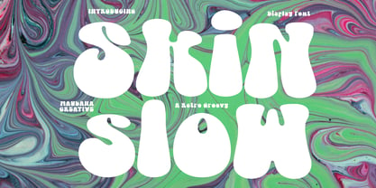 Skin Slow is a psychedelic vibes display font. With heavy contrast stroke, fun character with a bit of ligatures and alternates. To give you an extra creative work. Skin Slow font support multilingual more than 100+ language. This font is good for logo design, Social media, Movie Titles, Books Titles, a short text even a long text letter and good for your secondary text font with sans or serif. Make a stunning work with Skin Slow font. Cheers, Maulana Creative
 - Barranco by W Type Foundry,
$20.00 Barranco is a 3d layered fontfamily of 3 weights (thin, medium, black), plus shadows and one inline effect layer. It’s inspired by the caps neo-humanist typefaces of the 80’s with a mix of new trends such as the new layered typefaces and super heavy font families. Each font also comes with a set of Stylistic Alternatives for letters A I K W Q, and extensive language support. Barranco is really nice for magazines design, trademarks, logos and posters.


