10,000 search results
(0.091 seconds)
- They Killed Kenny! - Unknown license

- Days Like This by Pesic,
$19.00 This font is inspired by Van Morrison’s song named “Days like this”. Contains all Latin glyphs and more than 400 characters with ornaments. It is decorative, very modern and useful for logos, T-shirt designs, packaging design, posters, billboards, magazines, covers, etc. Contains regular and italic.
 - This Vintage One by Putracetol,
$24.00 This Vintage One - Retro Font is a script typeface that embodies bold retro aesthetics with a touch of nostalgia. The font is crafted with a multitude of alternative characters, each offering unique variations and even decorative swooshes in the alternates. Its thickness and groovy style make it a great choice for a wide range of applications. Whether you're working on logos, packaging, invitations, greeting cards, posters, magazines, titles, business branding, or designs with a retro and vintage theme, This Vintage One adds a sense of classic charm and style to your projects. The font's alternative characters and swooshes allow for a myriad of design possibilities, making it a versatile resource for creating captivating visuals with a vintage flair.
 - Shes All That by Typadelic,
$19.00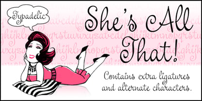
- Pass This On by PizzaDude.dk,
$18.00 Pass This On comes with 5 different layers to make cool effects, and every layer has 5 different versions of each letter that automatically cycles as you type. Besides that, Pass This On comes with a dingbat with 62 note-like drawings to complimate whatever you wrote with the font!
 - This Little Piggy by Hanoded,
$10.00 This Little Piggy is a cute, kiddy-style font. A little haphazard, a little messy, but funny and happy. Great for wishing-well cards or books.
 - Chew On This by Kitchen Table Type Foundry,
$16.00 Back in 2013 I released an all caps font called Rum Doodle. Rum Doodle is a really nice, really weird font with angular glyphs and a unique look. I decided that it would be nice to tweak this font a bit and design a lower case for it. The result is Chew On This. I chose that name for no apparent reason - so don’t make a fuss about it…
 - Dos De Tres by Volcano Type,
$19.00 This is an idea to reproduce the masks of the Mexican wrestlers of the late 60s and 70s. The typography is based in keeping the shape of the face in the wrestler's masks.
 - LD This Way by Illustration Ink,
$3.00 - They Live Brush by Alphabet Agency,
$14.00 They Live Brush font is inspired by the 80's cult classic movie They Live logo. The font is ideal for use in designs that you include a bold brush font in a cool way. The font has a graffiti feel that can allow you to express yourself with some attitude. The font is an all capital letters font. The font contains 128 characters.
 - KG She Persisted by Kimberly Geswein,
$5.00 A chunky, playful, feminine font with personality.
 - Sambeld Trust She by Haksen,
$10.00 Sambeld Trust-She is a chic casual modern handwritten font. It is perfect for branding, signature, wedding invitation, promotion, product packaging, and other needs. You will get full set of lowercase and uppercase letters, numerals and punctuation, multilingual symbols that giving realistic hand-lettered style. Thanks and have a wonderful day, Haksen
 - She is Mine by Olivetype,
$18.00 She's Mine is a fun and girly handwritten font. Its skinny and smooth style makes this font incredibly versatile, fitting a wide variety of creative ideas such as: kids, school projects, crafting and DIY projects. So what’s included: She's Mine (OTF) Basic Latin A-Z, a-z, numbers, symbols, and punctuations International Characters. Thank you
 - Teh And Kopi by Tigade Std,
$20.00 Teh and Kopi is a cute and charming display font. Whimsical and a bit quirky, this font will brighten up each of your designs. Add it confidently to your projects, and you will love the results.
 - Eurotypo BKL by Eurotypo,
$28.00 Eurotypo BKL is a family of fonts inspired in on one of the most beautiful British Typography ever done. This version of Baskerville tries to reflect the taste of his fine style, compatible with the bluntness of the digital present. As many other designers and foundries, our intention has been to represent the atmosphere of Baskerville's style, than simply relive the shapes of its letters. Actually, capitals fits almost to a square proportions, lowercases are more open, ascenders and descenders are shorter, offering more space for enlarge the "x" high. The beauty of his letterforms can enrich headlines; this font can also be used as body text for its good legibility and accurate kerning. John Baskerville (1706-1775) was born 1706 in Wolverley, England. He was a great typographer and printer who published a remarkable edition of Virgil in 1757. His typefaces were greatly admired by Benjamin Franklin; He also has improved and developed many innovations in printing, paper and ink production. Baskerville’s typefaces are regarded as transitional types that represents the link between Old Roman Style and Modern Roman typography.
 - ITC Obelisk by ITC,
$29.99 ITC Obelisk is the work of British designer Phill Grimshaw. He classified his typeface as glyphic" in style, meaning chiseled rather than calligraphic in form. ITC Obelisk is a legible, elegant text typeface."
 - ITC Freddo by ITC,
$29.99ITC Freddo is the work of New York designer James Montalbano and was inspired by a sign lettering manual from the 1930s. Montalbano liked the character shapes illustrated in this manual but found many of the proportions odd. So he reinterpreted them to produce capitals and lower case letters which, according to today's standards, better complement one another. - Dossier by Tabular Type Foundry,
$29.99 Dossier is a monospaced serif face that originates in Dwiggins's designs for typewriter. It has a soft and casual personality and comes in 8 weights and matching italics, making it ideal for text typography, package and advertisement design. Dossier is an adaptation of William Addison Dwiggins's unfinished typewriter faces. He worked with multiple typewriter manufactures including Underwood, Remington Rand, and IBM, but none of them were finished. He left a number of intriguing drawings which are now kept at the Boston Public Library. You could see in the drawings that Dwiggins was also interested in exploring designs of varied width. Toshi Omagari decided to combine these materials to make a cohesive family: the upright was taken from a drawing of monospaced lowercase for an unknown client, and the italic was from the work he did for Underwood which he called "Aldine". Toshi added narrower and wider alternates in the same way Dwiggins devised.
 - Koch Schrift by Ingo,
$42.00 A heavy blackletter; Rudolf Koch’s first type from 1909. On an old page full of type specimen from the 1930s, the type is described as ”Schwabacher (used by the Deutsche Reichsbahn [German Imperial Railway]).“ As a matter of fact, it is the first print of the Offenbach script master Rudolf Koch, who came out with this typeface in 1909. At that time, it was given the name ”Neudeutsch“ (New German). Later, it became very popular under the name Koch-Schrift, and was at times the official typeface of the Deutsche Reichsbahn (German Imperial Railway).
 - Luis Serra by Homelessfonts,
$49.00 Homelessfonts is an initiative by the Arrels foundation to support, raise awareness and bring some dignity to the life of homeless people in Barcelona Spain. Each of the fonts was carefully digitized from the handwriting of different homeless people who agreed to participate in this initiative. Please Note: these fonts include only the latin alphabet; no accented characters, no numbers or punctuation. MyFonts is pleased to donate all revenue from the sales of Homelessfonts to the Arrels foundation in support of their mission to provide the homeless people in Barcelona with a path to independence with accommodations, food, social and health care. Luis Serra was born in Alicante. There he grew up and even started a family His life was there. But at the age of 35 he split up with his wife and decided to go to Barcelona in search of a new life. And it wasn’t easy for him. He had to turn his hand to all kinds of jobs and didn’t manage to find the stability he needed. Luis is a shy, retiring person who takes great pleasure in the little things in life such as walking in the mountains or celebrating the victories of his football team, Barça. After four years living in Barcelona, Luis found himself in a position he’d never imagined. “The street’s much worse now, there’s more trouble, there’s more tension,” says Luís. In the street he had to learn, as he always had, to move fast, to find a place to sleep and something to eat. Luís is one of those people who don’t let circumstances mould him, but adapts to them and always tries to do his best.
 - Lubaline by Lián Types,
$39.00 Who haven't heard the phrase that ‘any past time was better’?. Although I sometimes find this phrase a little too pessimistic (because I try to think that the best is yet to come), it may be true regarding my passion, typography. I'm too young (29) unfortunately, and this means I did not have the pleasure of being contemporary with maybe the man who has influenced my work the most (1). The man that showed that letters are more than just letters to be read. Herb Lubalin (1918-1981), also called sometimes as ‘the rule basher’ (2), smashed the taboos and sacred rules of type design and gave it personality. He rejected the functionalist philosophy of europeans in favor of an eclectic and exuberant style. To him, letters were not merely vessels of form, they were objects of meaning. (3). Nowadays, when looking at his portfolio, who dares to deny that the term ‘typography’ and ‘beauty’ may go hand-in-hand without any problem? Ed Benguiat, one of Herb’s partners, still likes making jokes with the phrase “screw legibility, type should be beautiful” and what I understand of this is not to forget the rules, but to know and break them carefully. In an era of pure eclecticism, we, the lovers of flourishes and swashes, can't do nothing but admire all the legacy that Lubalin, this wonderful type-guru, left. My font Lubaline read as “the line of Lubalin” is my humble tribute to him. Those who know his work, may see the influences easily like in his ‘Beards’ (1976) and ‘The Sound of Music’ (1965) posters; the art-deco forms in many of his amazing logos and practically in all his creations where letters seem to be alive just like you and me. I really hope that the future finds me still learning more and more about type-design and letterforms, and like him, always willing to make innovations in my field: Because letters are not just letters to be read. NOTES (1) These are some of my fonts in which some of Lubalin’s influences can be seen (in order of creation): Reina, Aire, Erotica, String, Beatle, Heroe, Selfie, Model, Seventies, and many others that are still in progress. (2) (3) Steven Heller. Herb Lubalin: Rule Basher. U&lc (1998) http://www.printmag.com/imprint/my-favorite-lubalin/
 - Pantera by Lián Types,
$39.00 ROARRR! THE STYLES -Pantera Pro is the most complete style, and although its default look is mono-rhythmic it gets really playful and crazy like the examples of the posters by just activating the Decorative Ligatures button in the Open-type Panel of Adobe Illustrator. However, I recommend using also the Glyphs Panel because there you'll find much more variants per letter. Pantera Pro is in fact, coded in a way the combination of thicknesses will always look fantastic. -Pantera Black Left, and Pantera Black Right are actually “lite” versions of Pantera Pro: They have very little Open-Type code, so what you see here is what you get. Pantera Black Left has its left strokes thick, while Pantera Black Right has its right strokes thick. -Pantera White is a lovely member in this family that looks lighter and airy, hence its name. With the feature Standard Ligatures activated (liga) the font gets very playful. -Pantera Caps is based on sign painters lettering and since it follows the same pointed brush rules as the other styles, it matches perfectly. -Pantera Claws like its name suggests, is a set of icons that were done by our dear panther. THE STORY It is said that typography can never be as expressive as calligraphy, but sometimes it can get close enough. I tend to think that calligraphic trials, in order to work well as potential fonts, need first to go through very strict filters before going digital: While calligraphy is synonym of freedom (once its rules are mastered), type-design, in the other hand, has its battlefield a little tighter and tougher. When I practice pointed brush lettering, there are so many things happening on the paper. And most of them are delicious. The ones who know my work may see that although many of my fonts are very expressive, my handmade brush trials are much more lively than them. With that in mind, this time I tried to go further and rescue more of those things that are lost in the process of thinking type when first sketches are calligraphic. I wondered if I could create something wild, hence its name Panther, by understanding the randomness that sometimes calligraphy conveys and turning it to something systemic: With Pantera, I created an ordered disorder. Like it happens a lot in many kinds of lettering styles, in order to enrich the written word the scribe mixes the thickness of the strokes and the width of the letters. Like one of my favorite mentors say (1), they make thoughtful gestures Some lively strokes go down with a thick, while some do that with a thin. Some letters are very narrow, meaning some of them will need to be very wide to compensate. Why not?. The calligrapher is always thinking on the following letters, and he/she designs in his head the combination of thicks and thins before he/she executes them. He/she knows the playful rhythm the words will have before writing them. It takes time and skill to master this and achieve graceful results. Going back to the font, in Pantera, this combination of varying thicknesses and widths of letters were Open-Type coded so the user will see satisfactory results by just enabling or disabling some buttons on the glyphs panel. I'm very pleased with the result since it’s not very easy to find fonts which play with the words' rhythm like Pantera does, following of course, a strong calligraphic base. I believe that if you were on the prowl for innovative fonts, this is your chance to go wild and get Pantera! NOTES (1) Phrase by Yves Leterme. In fact, it’s the title of a book by him. EPILOGUE Esta fuente está dedicada a mi panterita
 - Mene One Mexicali by Handselecta,
$38.00This style mimics the flare or upward fade that comes with the use of a spray paint can, as the tops of the letters flare, and become wider. An original font style, named after the border town of Mexicali, this font style falls under the larger umbrella of what is called Cholo-graffiti style. Originally from New Jersey, MENE has made his home in, New York City. He had a brief albeit satisfying career of street bombing in the late 90s that saw its end with a brief encounter with the Vandal Squad. Now a family man, Mene has dedicated himself to the preservation and education of style in its many forms. - Rocket Clouds by Wacaksara co,
$18.00 Introducing our new font called Rocket Clouds inspired by Sythwave Style, 80's Music, and Neon Light Sign. This font offer the aesthetic style and retro mood for your design needed. The Rocket Clouds style has a universal and timeless design. This font uses style of classic sign typography. Rocket Clouds immediately engages you no matter what you use it for. It’s beautiful for product labels, houseware and text overlay to any background picture.
 - Iwan Stencil by Linotype,
$40.99 Iwan Stencil is a new revival of an old display typeface. Based on type originally designed by Jan Tschichold in 1929, the style was revived by Klaus Sutter in 2008. The letterforms in this peculiar design are very high contrast; all of the thin bits are much thinner than the thick parts. They have a modern, upright axis. All in all, the creation has a bit of a Bodoni-gone-crazy touch. The thin elements are the unique part of the design that binds this face together. They almost naturally fade away in the stencil gaps (or pylons), making you wonder if you are really looking at a stencil face at all. These thins contribute greatly to the typeface's overall serif-style, making the design at least a semi serif typeface, if not a full serif one. The lowercase n, for instance, has no serifs of its own, but many of the other letters have clear ones, or serif-like terminals. A serif stencil face is a peculiar variety, especially in this day and age, but in the past they were much more common, if not the norm, The Iwan Stencil typeface has only one weight. Naturally, this is just for display. Use Iwan Stencil to cut real stencils, or only to create the effect of stenciled type in your design work. Ivan Stencil includes all of the characters that you have come to expect in a font. Just because this design was originally made in 1929 does not mean that is has a 1929 character set. Instead, it includes a 21st century, with extended European language support Jan Tschichold, who we have to thank for today's Iwan Stencil inspiration, was a man of many faces. A trained calligrapher who went on to codify the New Typography, would go on to become a teacher, a classical book designer, and the creator of the Sabon typeface. Like all young designers, he was occasionally in need of money. Before his emigration from Germany in 1933, he took on many kinds of commissions. In the late 1920s, a time full of waves of economic turmoil within Germany and across the world, he began designing a typefaces for different European companies, mostly display things like this. For a time during the mid-1920s, Jan Tschichold went by the name Iwan" "
 - Waterloo Bold by ITC,
$29.99The slab serif Waterloo Bold was designed by Alan Meeks. He chose unique and individual forms to give this alphabet its unmistakable character. The cross strokes of the capitals are not in the optical center, the serifs have light furrows, and the figures have a slight slant tot he right, giving this font a dynamic, flowing look. Waterloo Bold is reminiscent of cigars, whiskey and the 1930s and should be used only in headlines in large point sizes. - Hearst Italic by Solotype,
$19.95Carl Schraubstadter of the Inland Type Foundry probably had more to do with the design of this italic than he did with the roman. Great for Craftsman Era projects. - Rothwood by Type-Ø-Tones,
$60.00 In 2011, while tutoring an exercise on Slab Serifs, Josema discovered Robert Thorne’s work for Thorowgood. Specifically, he was fascinated by the extraordinary density of the 6-line Egyptian Pica from 1820-21. As a simple exercise, he wanted to test the limits of readability within the context of a contemporary alphabet. Rothwood Ultra is the result of this experiment. As a way of developing the series, he found it interesting to go to the opposite end of the spectrum and discover how to evolve the extra-black Ultra’s DNA into a super lightweight model. The Hairline and Thin styles are her slim sisters. The third challenge has been the creation of the text version. Light, Book, DemiBold and Bold, including italics and Small Caps close the Rothwood cycle for editorial use.
 - Cisalpin by Linotype,
$29.99 The ideal typeface for cartography The Swiss designer/typographer Felix Arnold designed Cisalpin during the late 1990s, after he had challenged himself to create a contemporary typeface that could be used for cartographic uses. Arnold came to the subject of cartographic typefaces after analyzing many maps and atlases, and discovering that there was no standard typeface for these types of documents. Like any good cartographic type, Cisalpin is very legible at small sizes. While he was drawing this typeface on his computer, Arnold used a reduction glass to refine his design, making it work in these situations. Cisalpin is a linear sans serif face, with slight resemblance to renaissance serif types. The various weights are all clearly differentiated from one another. And because space is often a premium on maps, Cisalpin runs narrow. Words close in around themselves to help them become more identifiable. The letterforms in Cisalpin are durable, and can maintain their readability when placed over complex backgrounds. They have open interior forms, flattened curves, tall x-heights, and a capital height that almost reaches the tops of the ascenders. Cisalpin also has pronounced Italics, with a very clear angle of inclination. Each letterform in the family has been optimized so that they cannot be easily mistaken for another. This again helps minimize the misunderstandings that often occur because of illegibility. Although Cisalpin was developed for use in cartography, it may be used for countless other purposes; any font that can work well in small sizes on a map could be used almost anywhere else!
 - Geometa Rounded Deco by Wiescher Design,
$39.50 Geometa is based on Paul Renners Futura Classic, the one that he designed before he had to soften it to make it more appealing to the broad public. I thought the normal rounded fonts needed a decorative sister. Here they are! Your type-designer for decorative solutions, Gert Wiescher
 - VLNL Irish Stew by VetteLetters,
$35.00 Obviously the Irish Stew font finds its origin in Ireland. During a vacation in West Ireland Donald® fell in love with the famous local dish. In fact, he loved Irish stew so much he couldn't wait to create a font dedicated to the stew from Ballymaloe. He found the inspiration for this font on an old shop front sign somewhere in Dublin. The sign only contained a few characters, but the stew had given him more than enough energy and inspiration to complete the whole alphabet!
 - Osnova by AndrijType,
$18.75 The common Slavic word Osnova means basis in English. This universal but still distinctive typeface can make a good foundation for any design project. There is the main Osnova version and separated faces Osnova Alt, Osnova Fancy and Osnova Small Caps for Western Latin, Greek and Cyrillic languages.
 - Thalweg by Ani Dimitrova,
$35.00 Thalweg serif typeface is a project focused on the digitalization and development of the Thalweg font. The font was originally designed in 1993 by the Bulgarian artist Ivan Kyosev. In 2018 Ani Dimitrova began the revival of the Thalweg font and converted the drawings into a digital form. The existing set of characters required some necessary expansions such as the development of capital letters, alternative symbols and many other functions. Furthermore, some additional weights were developed which aimed to make the font more complete. Thalweg was completed in 2020 with 16 weights ranging from Thin to Black with extra drawn italics and small caps versions, each style containing more than 1100 glyphs. The font comes with an extended coverage of the Latin, Cyrillic and Greek Scripts. All of the weights are specifically equipped for complex, professional typography with Open Type Features. These features include: Small Caps, Ligatures, Discretionary Ligatures, Superscript, Subscript, Tabular Figures, Old-Style Figures, Circled Figures, Arrows, Matching currency symbols and fraction. The Thalweg serif typeface is a perfect choice for body text, branding design, web design, editorial design and more. Ivan Kyosev (1933-1994) was one of Bulgaria’s most famous artists whose work influenced several generations of bulgarian designers. He was born on February 5, 1933, in the city of Burgas. In 1957 he graduated in illustration at the National Academy of Art in Sofia led by Prof. Iliya Beshkov. Mr. Kyosev was a member in the management of the “Graphics and Illustration” section in the Union of Bulgarian Artists, member of the UBA board, artist in the publishing houses “September” and “World”. Together with Boris Angelushev, he worked on the layout design of the “Literary Front” newspaper. Furthermore, in 1963 - 1964 he was the main artist in the publishing house “Prosveta”. Ivan Kyosev excelled in the field of illustration, book design and library layouts in various genres (classics, children's literature, poetry, journalism, memoirs, etc.). He is also the author of many fonts.
 - Meno Text by Lipton Letter Design,
$29.00 Richard Lipton designed Meno in 1994 as a modest yet elegant workhorse serif family in seven styles. In 2016, he expanded this spirited oldstyle into a 78–style superfamily. The romans gain their energy from French baroque forms cut late in the 16th century by Robert Granjon, the italics from Dirk Voskens’ work in 17th-century Amsterdam. Meno consists of three carefully drawn optical sizes—Text, Display, and Banner, with Condensed and Extra Condensed widths added to the latter two cuts. Steadfast in text settings, Meno is replete with alternate forms, swashes, and other enhancements that showcase Lipton’s masterful calligraphic hand. The series offers a complete solution for achieving high-end editorial typography.
 - Meno Display by Lipton Letter Design,
$29.00 Richard Lipton designed Meno in 1994 as a modest yet elegant workhorse serif family in seven styles. In 2016, he expanded this spirited oldstyle into a 78–style superfamily. The romans gain their energy from French baroque forms cut late in the 16th century by Robert Granjon, the italics from Dirk Voskens’ work in 17th-century Amsterdam. Meno consists of three carefully drawn optical sizes—Text, Display, and Banner, with Condensed and Extra Condensed widths added to the latter two cuts. Steadfast in text settings, Meno is replete with alternate forms, swashes, and other enhancements that showcase Lipton’s masterful calligraphic hand. The series offers a complete solution for achieving high-end editorial typography.
 - Meno Banner by Lipton Letter Design,
$29.00 Richard Lipton designed Meno in 1994 as a modest yet elegant workhorse serif family in seven styles. In 2016, he expanded this spirited oldstyle into a 78–style superfamily. The romans gain their energy from French baroque forms cut late in the 16th century by Robert Granjon, the italics from Dirk Voskens’ work in 17th-century Amsterdam. Meno consists of three carefully drawn optical sizes—Text, Display, and Banner, with Condensed and Extra Condensed widths added to the latter two cuts. Steadfast in text settings, Meno is replete with alternate forms, swashes, and other enhancements that showcase Lipton’s masterful calligraphic hand. The series offers a complete solution for achieving high-end editorial typography.
 - Mooncake by RA Studio,
$10.00 He is round. He is funny. He is Mooncake font. It is perfect for eye-catching signs, posters, headers, product packaging, book cover, logotype, apparel design and etc. Display font Extended latin & cyrillic 600 glifs
 - Basely Bagel by RA Studio,
$12.00 He is round. He is funny. He is Bagel font. It is perfect for eye-catching signs, posters, headers, product packaging, book cover, logotype, apparel design and etc. Display font Extended latin & Cyrillic 605 glifs
 - PF DaVinci Script Pro by Parachute,
$79.00 PF DaVinci Script Pro is based on DaVinci’s own handwriting. He is considered to be one of the greatest painters of all time and perhaps the most diversely talented person ever to have lived. This great Italian artist left us with a unique writing (used to write from right to left), which we attempted to decode and simplify with PF Da Vinci Script Pro. Many of these letters are free interpretations and do not stick to the original forms. This typeface comes in 2 different styles: Regular and a more informal style called Inked. The all new “Pro” version supports all European languages including Latin, Greek, Greek Polytonic and Cyrillic. It comes loaded with many stylistic alternates in all languages.
 - Manzello by Tour De Force,
$35.00 To start with one personal fact: I really like to listen Rahsaan Roland Kirk. He was a multi-instrumentalist, real grandmaster and unique jazz virtuoso. The way he improvised and walked through variety of different music influences are admiring. One of things he liked is to modify instruments, so he modified soprano saxophone and got an instrument called manzello. When I was looking for good name for this typeface, it came on my mind that Manzello could be the perfect one. It has the symbolic background from the instrument and theoretically in my head, it's imagined as typeface that rely on stable classic examples, but graphically designed and modified to match modern standards. Manzello contains a dose of characteristics of display typefaces with terminals that aren't perfectly rounded, high contrast between stems and good balanced Italics with elements of fine calligraphy. It's a small font family, something what I was always looking for to have as first text solution in my web and graphic projects.
