10,000 search results
(0.073 seconds)
- About Loving by Akifatype,
$14.00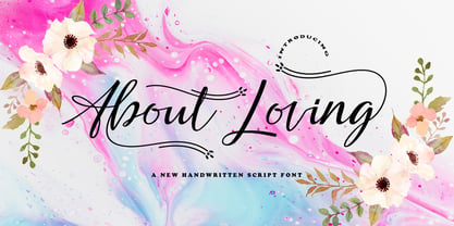 About Loving is highly legible Script typeface, get touch of a bold, classic and fun Vintage Script font, With glyphs and opentype features with stylistic alternates. Can be used for various purposes. such as posters, t-shirt, signage, logos, news, badges etc. To enable the OpenType Stylistic alternates, you need a program that supports OpenType features such as Adobe Illustrator CS, Adobe Indesign & CorelDraw X6-X7, Microsoft Word 2010 or later versions. About Loving is coded with PUA Unicode, which allows full access to all the extra characters without having special designing software. Mac users can use Font Book , and Windows users can use Character Map to view and copy any of the extra characters to paste into your favourite text editor/app.
 - Twenty One by Akifatype,
$14.00 Twenty One is highly legible Script typeface, get touch of a bold, classic and fun Vintage Script font, With glyphs and opentype features with stylistic alternates. Can be used for various purposes. such as posters, t-shirt, signage, logos, news, badges etc. To enable the OpenType Stylistic alternates, you need a program that supports OpenType features such as Adobe Illustrator CS, Adobe Indesign & CorelDraw X6-X7, Microsoft Word 2010 or later versions. Twenty One is coded with PUA Unicode, which allows full access to all the extra characters without having special designing software. Mac users can use Font Book , and Windows users can use Character Map to view and copy any of the extra characters to paste into your favourite text editor/app.
 - Hispania Script by HiH,
$10.00 Hispania Script is a distinctive and distinctly nineteenth century script. It was released by Schelter & Giesecke of Leipzig, Germany around 1890. Particularly noteworthy are the sharply-pointed legs of the upper case ‘K’ & ‘R’ that seem to be characteristic of the period. Similar strokes, often with a slight curve, may be seen in typefaces like Alt-Romanish and Tinteretto by Schelter & Giesecke, Artistic and Lateinsch by Bauer and Berthold and the poster lettering of Edward Penfield. The angle of this script (approximately 24 degrees) and the sharp delicate points must have made the manufacture of this face in metal type a challenge. The resulting type was probably quite fragile and subject to accidental damage. Additionally, the sharp points would be subject to wear. With digital type, these concerns are eliminated. As far as I know, no one has ever dropped a digital letter on the floor. Nonetheless, creating a digital outline for a typeface like Hispania Script, with many crossing strokes, can be quite time-consuming. Even with an accurate scan of a good quality original, it is usually necessary to construct each crossing stroke separately and then remove the overlap in order to obtain a sharp and convincing intersection. Steep internal angles are often defined with two points, rather than one, to minimize ink or toner fill that can muddy the rendering in smaller sizes. Like all formal scripts, Hispania Script is always useful for announcements and invitations. However, the distinctiveness of of this design strongly suggests that there are other applications that may benefit from its use. Step outside the box and try it in some unexpected places. It is the unexpected that often draws a person’s eye.
 - Arkusi by Gatype,
$10.00 Arkusi is a neatly crafted and highly detailed script font. Whatever the topic, this font will be a wonderful asset to your font library, as it has the potential to enhance any creation. Arkusi is coded with PUA Unicode, which allows full access to all additional characters without having to design any special software. Mac users can use Font Book, and Windows users can use Character Map to view and copy any additional characters for pasting into your favorite text editor / application.
 - Guau by Cuchi, qué tipo,
$9.95 From the abyss and the quarantine hell, drawn in absolute lonelyness, and finished during the darkest hours of confinement… "Guau" is born, the type that barks directly at your face! "Guau" is a high-contrast display font with as many weights and versions as there are types of puppies in this fantastic world. It is thought to bring up glances in middle and heavy boxing weights, although you can also take its compressed and italic styles just for a walk. "Guau" is a font with three axes (italic, weight and width) and 20 instances, and it also contains thousands of glyphs and Opentype features that means a "guaorld of posibilities". This name comes from the time when you could only go to the street to take a walk to your pooch. Definitely, "Guau!, your new best friend!".
 - Croissant by ITC,
$39.00Phillip Kelly first drew the Croissant typeface in 1978 for Letraset. Back in the 1970s and 80s, Letraset's rubdown lettersheets were a popular means of designing with type. Today, many of these nostalgic classics are available in digital format. Linotype is pleased to re-present Croissant. This experimental typeface is built up out of round, brush-like strokes, creating heavy, and black letters. These forms are best used for display signage and headline text. If you are designing for a local bakery or donut shop, this typeface may be the perfect fit. The dark, heavy character that Croissant lends to the page is similar to Cooper Black , one of the most renowned American type designs ever produced. If you are looking for a typeface with Croissant's feel, but need to set smaller headlines or text, check out that family's offerings." - FS Kitty by Fontsmith,
$50.00 Cute FS Kitty is the type equivalent of Bagpuss: plump, cute, cuddly and not fond of exercise. So don’t go giving it a run-out on body copy; FS Kitty is an all-caps font made for showing off in posters and headlines, and on products, point-of sale and especially sweets. Blubber Kitty had been quietly curled up in Phil Garnham’s sketchbook for a year before he brought it out to be brushed up. “It was in the mix as a basic form when I started thinking about FS Lola. It was a twisted, bubbly beauty – quite squishable and huggable. The working file was called Blubber. “At that time it was a basic construction of strokes. I created the ‘A’ first, purely as a shape to play with, not as type. I flipped it for ‘V’, and copied that for a ‘W’. I flipped the ‘W’ for an ‘M’... I thought, ‘This looks a bit wacky, but I like it,’ and just carried on. The most tricky characters were the ‘B’ ‘P’ and ‘R’. I must have drawn about 20 kinds of B for this, just to get it to fit.” Variety “When the regular weight of Kitty had been designed,” says Jason Smith, “it just felt like a natural progression to go on and explore how far we could go with it: Light, Solid, Headline, Shadow.” Phil Garnham thinks there’s still more to come. “There are some really individual characters in this font that I think have yet to be exploited: the Greek Omega symbol, the strange face in the ampersand. Like Bagpuss, Kitty has kept a low profile so far. “We know people are using Kitty. In fact, it was the first of any of our fonts that we sold on the day it was released. But I still haven’t seen it out there in the wild. It’s going to be a exciting moment.”
 - FS Kitty Variable by Fontsmith,
$199.99Cute FS Kitty is the type equivalent of Bagpuss: plump, cute, cuddly and not fond of exercise. So don’t go giving it a run-out on body copy; FS Kitty is an all-caps font made for showing off in posters and headlines, and on products, point-of sale and especially sweets. Blubber Kitty had been quietly curled up in Phil Garnham’s sketchbook for a year before he brought it out to be brushed up. “It was in the mix as a basic form when I started thinking about FS Lola. It was a twisted, bubbly beauty – quite squishable and huggable. The working file was called Blubber. “At that time it was a basic construction of strokes. I created the ‘A’ first, purely as a shape to play with, not as type. I flipped it for ‘V’, and copied that for a ‘W’. I flipped the ‘W’ for an ‘M’... I thought, ‘This looks a bit wacky, but I like it,’ and just carried on. The most tricky characters were the ‘B’ ‘P’ and ‘R’. I must have drawn about 20 kinds of B for this, just to get it to fit.” Variety “When the regular weight of Kitty had been designed,” says Jason Smith, “it just felt like a natural progression to go on and explore how far we could go with it: Light, Solid, Headline, Shadow.” Phil Garnham thinks there’s still more to come. “There are some really individual characters in this font that I think have yet to be exploited: the Greek Omega symbol, the strange face in the ampersand. Like Bagpuss, Kitty has kept a low profile so far. “We know people are using Kitty. In fact, it was the first of any of our fonts that we sold on the day it was released. But I still haven’t seen it out there in the wild. It’s going to be a exciting moment.” - Sansha by Tegaki,
$16.00 Proudly presenting: Sansha! Sansha is created with stylistic and rough characters. This great font is also PUA encoded. Sansha is a radical script typeface that comes with Extended Latin Characters. You express your creativity with this font more easily. Sansha works perfectly for logos, display, product branding, wedding invitation card, stationary, packaging, clothing, flyer, apparel, magazines, brochures, labels, posters, badges, etc. Sansha comes with 376 glyphs and 107 alternate characters contain with opentype features. Sansha has many stylistic alternate characters that allowing you to make stuff looks more exclusive and pro standard. You can access all those alternate characters by using OpenType savvy programs such as Adobe Illustrator, Adobe InDesign and CorelDraw X6-X7, Microsoft Word 2010 or later versions. There are additional ways to access alternates/swashes, using Character Map (Windows), Nexus Font (Windows), Font Book (Mac) or a software program such as PopChar (for Windows and Mac). For other programs that doesn't support OpenType features or Glyphs Panel such as Photoshop, you can use Character Map in Windows to access the alternate characters. Files included: Sansha (otf)
 - Thanks Mom by Letterafandi Studio,
$12.00 Thanks Mom is a delicate and elegant handwritten font. Its distinct and well balanced letters make this font a masterpiece. Thanks Mom is PUA encoded which means you can access all of the glyphs and swashes with ease!
 - Aloka Gikairo by Letterena Studios,
$17.00 Aloka Gikairo is a stylish and serif script font. It is PUA encoded which means you can access all of the amazing glyphs and ligatures with ease! Its distinct and well balanced letters make this font a masterpiece.
 - Goat & Qalvigo by Letterena Studios,
$17.00 Goat & Qalvigo is a stylish and distinct serif font. It maintains its classy calligraphic influences while feeling contemporary and fresh. This font is PUA encoded which means you can access all of the glyphs and swashes with ease!
 - Benaya by Muksal Creatives,
$13.00 Benaya is a Modern displaya serif font. Use it to make your ideas even more realistic and create spectacular designs! This font is PUA encoded which means you can access all of the glyphs and swashes with ease!
 - Salysta Victoria by Letterena Studios,
$9.00 Salysta Victoria is an elegant script font with a contemporary atmosphere and impeccable form, inspired by timeless classic calligraphy. This font is PUA encoded which means you can access all of the amazing glyphs and ligatures with ease!
 - Captain Kangaroo by Letterara,
$16.00 Captain Kangaroo is a cute and sweet handwritten font with an incredibly friendly feel. This font will turn any creative idea into a true piece of art! This font is PUA encoded which means you can access all of the cute glyphs with ease! It also features a wealth of special features including ligatures.
 - Geriatric - Unknown license

- Galitha Script by Letterfreshstudio,
$13.00 Hello everyone, I would like to introduce my newest font Galitha Script is a beautiful modern calligraphy typeface, I hope you will be interested in this font, if you want to use it for your work. This font can be used easily and simply because there are many features in it. contains a complete set of lowercase and uppercase letters, assorted punctuation, numbers, and multilingual support. font also contains multiple ligatures and many contain alternative Style Stylistic Sets such as a heart swash alternative. Galitha Script is very suitable for market designs being developed today, this font has a stylish, trendy, natural and soft font, with this font you can take advantage of opportunities every moment is a great way to highlight the celebration of the best of the party, because this font will be an advocate for the purposes such as wedding invitations, branding, parties, graduations, birthdays, gatherings, etc.
 - Brandan by Andfonts,
$69.00 If you're looking for the perfect font to make your logo stand out, then look no further than Brandan font. This modern and cool font is sure to give your logo, text, or any other design element a unique and eye-catching look. Whether you're looking for a font for a logo, lettering, website, or something else entirely, Brandan font has got you covered. Plus, it looks great on both light and dark backgrounds, so you know your design is going to look nice no matter where it's seen. Check out Brandan font today and give your design a professional edge!
 - Winterfalls by Joanne Marie,
$30.00 I always like to make a heart swash font and this is my 7th. Winterfalls is a high quality, smooth, simple script font which is easy to read and ideal for anything romantic and loving. Use it on cards and notes for baby announcements, wedding stationery, birthday and thank you cards but most of all, anything for your Valentine. Winterfalls includes left and right end swashes and connecting swashes on the lowercase letters, and a set of alternate uppercase letters with heart swashes. There are a few alternate lowercase letters, such as the ‘i’ and the ‘j’ dotted with a cute little heart and many, many ligatures. As usual, this font also comes with a good set of international characters, which will come in handy when you want you entice your valentine with a little french, haha. If you use a program which doesn’t have a glyphs panel then it’s super easy to copy and paste the alternates and ligatures from Font Book (Mac) or Character Map (Windows).
 - Fiori Dorati by Sign Studio,
$15.00 Fiori Dorati is an absolutely elegant serif font. This typeface includes beautiful stylistic alternates and discretionary ligatures. It will elevate a wide range of crafting ideas, from cards to branding, labels, and more. This font is PUA encoded, which means you can access all of the glyphs and swashes with ease.
 - Burgs by Putracetol,
$16.00 Burgs - Multistyle Font is a versatile typeface that starts as a modern sans-serif font and expands into a diverse collection of eight alternative font styles. These variations include slab, stencil, display, sport, classic, serif, and decorative, offering a wide range of design options. Each font style can be combined with others or used individually, making it adaptable for a multitude of design purposes. Whether it's for logos, posters, packaging, branding, business names, stickers, headlines, or any creative endeavor, Burgs provides a wealth of options for your projects.
 - Deposta by Black Studio,
$14.00 Deposta handwriting fonts are a charming collection of typefaces that encapsulate the authenticity and organic flow of handwritten script. Each font within the Deposta family is carefully crafted to evoke a sense of elegance, yet maintain a casual and natural appearance. With varying styles and weights, these fonts exhibit fluid strokes, graceful curves, and nuanced detailing, capturing the essence of handwritten text while offering versatility for diverse design projects. Whether used for invitations, branding, or creative endeavors, Deposta handwriting fonts bring a delightful touch of personal expression and sophistication to any typographic composition.
 - Mocombo JNL by Jeff Levine,
$29.00Mocombo JNL is a slightly modified version of one of the numerous alphabets created by the late Alf R. Becker for Signs of the Times Magazine during the period of the 1930s through the 1950s. Tod Swormstedt of ST Media—who is also the curator of the American Sign Museum in Cincinnati, Ohio—supplied Jeff Levine a wealth of source material from which this font is derived. The angular style of this typeface was originally referred to as “German Poster Lettering” by Becker, but it can represent many styles from 1940s night clubs to African safaris and just about anything in-between. - Mr Palker by Letterhead Studio-YG,
$35.00 A slab serif Mr Palker and grotesque Mr Palkerson build one superfamily together. These are blank types. In a way even the display ones. Typefaces for newspapers, announcements, cheap advertising and police posters. Mr Palker and Mr Palkerson will turn every language into a fence. And due to six types of faces one can choose what material should the fence be made from — from Thin steel rods to the Black stone blocks. In their simplest appearance Mrs P&P are intended for the solid blank composition in victorian or industrial style. They are quite decent, a bit old-fashioned slab serif and grotesque with closed aperture. All my types have layers. Walker and Palkerson also do. Besides the standard set of symbols, they have 4 add-ons. 1. Alternate glyphs, including unicase ones. 2. Ligatures with A letter. 3. Extra tall small caps. 4. Two-storey ligatures. All this options are intended for the complex composition. The additional letters are rather eccentric as their main function here is to imitate the victorian oddities. Imitate, parody, just not repeat. There are lower-case As and Es in the set in height of small caps and uppercases. They can turn every writing into the unicase. The lower-case A (as well as uppercase and small caps version of it) has deliberately by my taste grown a ludicrous tail. To compensate it I’ve built all the possible ligatures - ад, ал, ая. There are 35 of this ligatures all together. Take a closer look at the Russian letters D, L, K, Ya from the main set as well as their alternates. The additional glyphs are one more comic than the other — on purpose to imitate (not to repeat!) the victorian set. This sets have lowercase numbers. And small caps numbers as well. What a modern typeface without them. They also have an У-letter with a generously curvy tail. As if before the WWI. The Latin of course has alternates as well. It has letters to make the perfect French sound more like the russian provincial version of it. The tails of Js and Ts can be made a little bit more open — or a little bit closed. My favorite feature here, an invention of a kind - extra tall small caps. It allows to compose logos with the small caped uppercases directly from the keyboard. The small caps of this typefaces are usually much taller than the customary ones. This is the kind of small caps that Palker and Palkerson have. More to that, the strokes’ weight and the letters width are corresponded to the uppercases. Just a ready set for making a logo a la 1913 style. With a unicase, one has to mind! One more trick with the tall small caps is a possibility to make them work like lower uppercases. Their height is just in between of lower- and uppercases. Isn’t it great to have an additional set of uppercase working ponies in stock for the case of emergency. And finally — the trademark of Palkers family, two-storey ligatures. They are made in the height of uppercases and turn every writing into an ornament or a puzzle of a kind, while at the same time making them much shorter. Each face has 90 of them. Mainly those are twins: CC, BB, DD and so on. ll this things are for the unhasty compositing, even for lettering. Which means that for the things which are not there you always should have Command+Option+O and some patience. Also — among the two storey ligatures one also can find some belvedere villas. All my types are glasses from the one kaleidoscope. The P&Ps family was preliminary part of the victorian set, which already has 1 Cents and Clarendorf - optionally one can add Costro, Gordoni, Handy, Guardy, Surplus, Red Ring, Red Square, Babaev to the list. And also Sklad, Odessa, Dreamland, Romb, Platinum - here, at Letterhead’s, every second one is victorian. All together our typefaces can allow one to set advertisement of any kind, even the trickiest one, and compose everything, from the coffee place’s menu to the antiquarian magazine.
 - Mr Palkerson by Letterhead Studio-YG,
$35.00 A grotesque Mr Palkerson and slab serif Mr Palker build one superfamily together. These are blank types. In a way even the display ones. Typefaces for newspapers, announcements, cheap advertising and police posters. Mr Palker and Mr Palkerson will turn every language into a fence. And due to six types of faces one can choose what material should the fence be made from — from Thin steel rods to the Black stone blocks. In their simplest appearance Mrs P&P are intended for the solid blank composition in victorian or industrial style. They are quite decent, a bit old-fashioned slab serif and grotesque with closed aperture. All my types have layers. Walker and Palkerson also do. Besides the standard set of symbols, they have 4 add-ons. 1. Alternate glyphs, including unicase ones. 2. Ligatures with A letter. 3. Extra tall small caps. 4. Two-storey ligatures. All this options are intended for the complex composition. The additional letters are rather eccentric as their main function here is to imitate the victorian oddities. Imitate, parody, just not repeat. There are lower-case As and Es in the set in height of small caps and uppercases. They can turn every writing into the unicase. The lower-case A (as well as uppercase and small caps version of it) has deliberately by my taste grown a ludicrous tail. To compensate it I’ve built all the possible ligatures - ад, ал, ая. There are 35 of this ligatures all together. Take a closer look at the Russian letters D, L, K, Ya from the main set as well as their alternates. The additional glyphs are one more comic than the other — on purpose to imitate (not to repeat!) the victorian set. This sets have lowercase numbers. And small caps numbers as well. What a modern typeface without them. They also have an У-letter with a generously curvy tail. As if before the WWI. The Latin of course has alternates as well. It has letters to make the perfect French sound more like the russian provincial version of it. The tails of Js and Ts can be made a little bit more open — or a little bit closed. My favorite feature here, an invention of a kind - extra tall small caps. It allows to compose logos with the small caped uppercases directly from the keyboard. The small caps of this typefaces are usually much taller than the customary ones. This is the kind of small caps that Palker and Palkerson have. More to that, the strokes’ weight and the letters width are corresponded to the uppercases. Just a ready set for making a logo a la 1913 style. With a unicase, one has to mind! One more trick with the tall small caps is a possibility to make them work like lower uppercases. Their height is just in between of lower- and uppercases. Isn’t it great to have an additional set of uppercase working ponies in stock for the case of emergency. And finally — the trademark of Palkerson family, two-storey ligatures. They are made in the height of uppercases and turn every writing into an ornament or a puzzle of a kind, while at the same time making them much shorter. Each face has 90 of them. Mainly those are twins: CC, BB, DD and so on. ll this things are for the unhasty compositing, even for lettering. Which means that for the things which are not there you always should have Command+Option+O and some patience. Also — among the two storey ligatures one also can find some belvedere villas. All my types are glasses from the one kaleidoscope. The P&Ps family was preliminary part of the victorian set, which already has 21 Cents and Clarendorf - optionally one can add Costro, Gordoni, Handy, Guardy, Surplus, Red Ring, Red Square, Babaev to the list. And also Sklad, Odessa, Dreamland, Romb, Platinum - here, at Letterhead’s, every second one is victorian. All together our typefaces can allow one to set advertisement of any kind, even the trickiest one, and compose everything, from the coffee place’s menu to the antiquarian magazine.
 - Mustopha by Arterfak Project,
$17.00 Greetings! Introducing Mustopha, the brand new Arabic font, inspired by Latin classic handwriting and Arabic letters called 'hijaiyah'. The letterforms designed by a combination of Carolingian typography which visualizes a humanism feel and the Arabic calligraphy that mostly showing decorative with the long-swash of the letters. Feel the humanism with this font, neat, elegant, and luxurious with an extra set of alternates characters and Arabic symbols as a decoration of your typographic design. Musthopa created to bring back the classic typography (specifically cursive typography) between the many styles of design trends. This beautiful font also designed to be versatile that you can use this font for many themes, not only Islamic or Arabic. Perfect choice for poster, logo, branding, greeting card, wedding, apparel, cosmetic labels, packaging, Book cover, short body text, quotes, and many more! Fonts Featured : Uppercase Lowercase Numbers Symbols Stylistic alternates SS01 - SS05 Ligatures Extras
 - Hobo Symbols Mod by SymbolMinded,
$29.99 During the period of the Great American Depression, “hobos” created a system of symbols to communicate and assist fellow travelers. These symbols would mark a home, farm, fence or other structure to indicate what to expect in the area. They would tip off travelers on how to find food, stay safe and what to avoid and more. In some areas of the USA, these symbols are still visible and have also become part of the American popular culture. These 96 symbols are accompanied by the what the symbol was used to indicate. The meanings and symbols are by no means the complete list andther may be additional or alternative meanings. These are for casual use and not historical or anthropologically completely accurate
 - Cherubina by Hanoded,
$15.00 Cherubina means ‘Blessed’. It is a name derived from the Akkadian “karabu / kuribu”, meaning “blessing, blessed”. A cherub is a type of spiritual being mentioned in the Hebrew Bible, often depicted as a baby with wings. This font was based on the hand lettering I found on a 1962 Japanese poster for the movie “Mother Joanna Of The Angels”. The poster was designed by Hiroyoshi Oshima. Cherubina font is an all caps font (upper and lower case differ and can be used together) with a medieval feel to it. I tried to keep the ‘spirit’ of Hiroyoshi Oshima’s lettering, but changed the glyphs and designed most of them myself, as I had nothing but the title of the poster to work with. I have added some ligatures as well. Comes with my blessing and an eternity of diacritics.
 - Athan Script by Max.co Studio,
$14.00 Athan Script is a classic calligraphy font. This is a classic thin font with an italic style. This font is available in several modern swirls that can make your work look elegant, sweet and perfect. This font is suitable for logos, branding projects, design of household appliances, product packaging, mugs, quotes, posters, shopping bags, logos, t-shirts, book covers, business cards, invitation cards, greeting cards, and all your other beautiful projects. Athan Script has 620+ glyphs and 400 alternative characters, including various language support. You can use this font for your work very easily. Because there are many features in it. Contains a complete set of upper and lowercase letters, punctuation, numbers and multilingual support. This font also includes several ligatures and alternative styles Set Stylistic For those of you who have software that is able to work OpenType (Corel Draw / Photoshop / Illustrator / InDesign). If you don't have a program that supports OpenType features such as Adobe Illustrator and CorelDraw X Version, you can access all alternative glyphs using Font Book (Mac) or Character Map (Windows). How to access all alternative characters using Adobe Illustrator: https://www.youtube.com/watch?v=XzwjMkbB-wQ How to access all alternative characters, using Windows Character Map with Photoshop: https://www.youtube.com/watch?v=Go9vacoYmBw Mail support: maximal.fonts@gmail.com
 - Piscis by Susana Simplício,
$35.00 Piscis Dingbats are inspired by aquaculture and fishkeeping, and its main feature is the detailed drawings enabling a real representation of the fishes. Each Dingbat can be used individually or in the construction of illustrations through the combination of drawings, the limit is the imagination to create a variety of creative possibilities.
 - TT Fellows by TypeType,
$39.00 TT Fellows useful links: Specimen | Graphic presentation | Customization options There can't be too many universal fonts! Meet TT Fellows, a new workhorse whose functionality allows you to comfortably use the font in a variety of projects. Calm and neutral at first glance, the mood of TT Fellows can change. Working with the typeface, you can reveal its soft and friendly nature, or even the brutal one, for example, by typing the text exclusively in capital letters in the bold style. TT Fellows is easy to use and perfect for setting large text arrays. Thanks to the font's uniwidth and versatility, the font is ideal for use on websites or in periodicals. Bold styles will work harmoniously in headlines or as accents in print or on packaging. TT Fellows is a humanist sans serif with a mechanical touch. With its open shapes, the friendly neutral character of thin weights and an even softer character in bold weights, the new typeface differs in character from the classic TT Norms® and TT Commons sans serifs, while still offering the same functionality. Calm regular styles differ from bold, deliberately display and more expressive ones. By the way, TT Fellows is a unwidth typeface. It was important for us that the user could change the styles, knowing that the layout will not suffer. The typeface features equal width proportions, open apertures, and slightly squared ovals, which associatively brings it closer to other popular modern fonts. Since the idea of the typeface was focused on it being a uniwidth typeface, we needed to fit the bold styles into the regular em squares, which led to interesting graphic solutions that are noticeable, for example, in the k and ж characters, in which the branches are cut directly into the stems. TT Fellows consists of 19 styles: 9 upright, 9 italic and 1 variable, each with over 700 glyphs. The font has 26 useful OpenType features. For example, there is a switch to single-part versions of letters a and y, fractions, tabular characters, case versions of punctuation, and localized versions of characters for different languages. There is a ligature for a combination of two characters of a complex design fl. TT Fellows font field guide including best practices, font pairings and alternatives.
 - FF Fago Monospaced by FontFont,
$67.99 FF Fago Thanks to his many years of involvement in major corporate type projects, Ole Schäfer had the necessary resources from which to construct his FF Fago™. The result is an extended family that provides comprehensive typographic support and whose qualities come to the fore in all relevant contexts ? from print to office through internet and wayfinding systems. FF Fago The sizable x-height together with the generous and open design of the characters ensure that the sans serif Fago remains clearly legible even in small point sizes or in potentially difficult situations, such as on wayfinding systems. A subtle contrast in line weight and letter forms that are reminiscent of those of an antiqua typeface provide the font with a restrained yet friendly and lively tone. Available in five weights, each with three different kerning widths and matching genuine italic variants, FF Fago is equipped for practically every situation. There are also small caps, oldstyle and lining figures, a selection of ligatures and geometric symbols. The range of potential applications of this universal font is almost inexhaustible ? it can be used in packaging design, on signs, posters and even for setting longer text sections. Fago is the ideal partner for those working on major corporate projects! FF Fago Correspondence Sans und Correspondence SerifThe Correspondence versions of Fago have been optimized for use in the business environment and in office communication. The carefully modified characters have a particularly robust feel, so that the clear, easily differentiated glyphs allow for straightforward communication even on screen. With these aims in mind, Schäfer has not only adjusted the x-height, but has provided certain letters in the sans variant ? such as the lowercase "i", the "r" and the uppercase "I" ? with serifs. Correspondence Serif, on the other hand, has been conceived as a slab serif throughout and in appearance has the look of the letters produced by the old office typewriting machines. An individual note has been added by providing a few unusual serif forms, as for example in the case of the "m", the "v" and the "y". Both Correspondence Sans and Serif are available in two weights with complementary italic versions and thus are ideally suited for use with standard office programs. This is all rounded off with a selection of office symbols. FF Fago Monospaced The use of a few typographic tricks is necessary to ensure that the letters of the alphabet appear to have the same width. Narrow letters such as "r" and "i" have been made to seem more expansive by using prominent serifs while the broader letters ? a good example is the "m" ? have the forms seen in a condensed font. And it is thanks to this design strategy that Fago Monospaced has the character of old typewriter text. What was once unavoidable because of the technology of the time is now a welcome alternative that can be used for the purposes of emphasis. As an additional supplement to the Fago superfamily, Fago Monospaced can be used, for example, to set short notes or draw attention to special text passages. There are three weights, in their original form without italic variants or small caps, but offering an alternative, technical form of the "0" with a crossbar.
 - Sabastian by Letterara,
$12.00 Sabastian is the perfect handwritten font: Sweet, innocent, light, and charming, this one-of-a-kind typeface will add a unique charm to any design project! Sabastian font was created to look as close to a natural handwritten script as possible by including 73 ligatures. With built-in Opentype features, this script comes to life as if you are writing it yourself. You can see it in the picture shown. This font is PUA encoded which means you can access all of the amazing glyphs and swashes with ease! It also features a wealth of special features including alternate glyphs and ligatures.
 - Pressato by Resistenza,
$180.00 Pressato Font is a dynamic and innovative typeface meticulously crafted in collaboration with Pressato Coffee Bookshop in Torino. This unique font boasts three axes—weight, width, and slant—providing designers with unparalleled flexibility and control over their typographic compositions. With a total of 12 distinct fonts and a variable option, Pressato Font allows for a rich variety of styles, making it a versatile choice for a myriad of design applications. The font's flexibility in weight enables users to seamlessly transition from bold and impactful headlines to subtle and elegant body text, ensuring a cohesive and visually appealing design. The inclusion of width and slant axes further enhances the adaptability of Pressato Font. Designers can effortlessly customize the width of characters for a condensed or expanded look, while the slant axis adds a dynamic tilt, injecting personality and movement into the typography. Rooted in the aesthetics of Pressato Coffee Bookshop, this font exudes a contemporary and artistic vibe. Its variable nature opens up endless possibilities for creative expression, making it an ideal choice for branding, editorial design, and various other graphic projects. Pressato Font stands as a testament to the seamless integration of form and function, providing a sophisticated and engaging typographic solution for diverse design needs.
 - Onetha by Gatype,
$12.00 Onetha is elegant calligraphy font. This font is casual and pretty with swashes. Can used for various purposes. such as logo, product packaging, wedding invitations, branding, headlines, signage, labels, signature, book covers, posters, quotes and more. Onetha features OpenType stylistic alternates, ligatures and International support for most Western Languages is included. To enable the OpenType Stylistic alternates, you need a program that supports OpenType features such as Adobe Illustrator CS, Adobe Indesign & CorelDraw X6-X7, Microsoft Word 2010 or later versions. Onetha is coded with PUA Unicode, which allows full access to all the extra characters without having special designing software. Mac users can use Font Book , and Windows users can use Character Map to view and copy any of the extra characters to paste into your favourite text editor/app. How to access all alternative characters, using Windows Character Map with Photoshop: https://www.youtube.com/watch?v=Go9vacoYmBw Thanks so much for looking and Enjoy it!
 - Due Giorni by Eurotypo,
$80.00 “Due Giorni”, two days in italian language, express a measurement of time, it can be little or a lot, depending on who or what it is used for. “Due Giorni” is a script font very expressive, fresh, agile and dynamic, hand-drawn with connected forms on slanted angle of 23º This font contain 542 glyphs with plenty OpenType features: Standard and discretionary ligatures, stylistic alternates, swashes, Old style figures, small caps, case sensitives and ornaments. It come also, with three kind of capitals: Roman Capitals, Small Caps (different proportions) and Swashes. Roman Capitals are inspired on the beautiful inscription found in the Augustorium’s house in Ercolano, Naples.those letters have been carefully drawn and sculpted. Swashed Cursive Capitals are similar to 18th century penmanship. “Due Giorni” is a versatile font that may give you the chance to create original logos and headlines, specially by many stylistic sets, ligatures and alternates that can be combined with them.
 - Blangkist by Picatype,
$12.00 Blangkist Script is a handwritten script font, based on the expression of the signature style that flows freely, friendly and organic. hand painted with love. Blangkist Script contains ligatures and alternates characters in Open Type Features. Perfect for brand projects, logos, product packaging, posters, invitations, greeting cards, news, blogs, everything including personal charm. Blangkist Script is coded with PUA Unicode, which allows full access to all the extra characters without having special designing software. Mac users can use Font Book , and Windows users can use Character Map to view and copy any of the extra characters to paste into your favorite text editor/app. Thanks so much for looking and please let me know if you have any questions.
 - Wamelo by Groen Studio,
$16.00 Wamelo, a work that is purely a result of handwriting and writing by using a liquid ink pen, has a natural characteristic. This is perfect for invitations, signatures, blogs, social media, business cards, product brands. OpenType features can be accessed by using OpenType smart programs such as Adobe Photo Shop, Adobe Illustrator, Adobe Indesign, Corel Draw and Microsoft Office. They can also be accessed through the character map.
 - ITC Vineyard by ITC,
$29.99Although inspired by the engraved lettering on eighteenth-century English trade-cards, ITC Vineyard has unusual characteristics of its own. The type retains some quality of copperplate scripts, but the differentiation between thicks and hairlines is not very sharp. There are a few cursive forms, but most of the letters are romanized: they are almost upright and not joining. Occasional flourishes are casually interpreted from various sources such as the lettering on trade-cards and writing masters' copybooks. “I think it is a new kind of 'copperplate script' which is not too formal and easier to read,” claims designer Akira Kobayshi. Irregularities are apparent in the angle of caps and numerals, but the face's quirkiness gives a type page some friendliness rather than cold brilliancy. ITC Vineyard is designed in two weights: regular and bold. Each variation includes several extra characters such as an alternative lowercase 'd' with a long arm, a T-h ligature, swelled rules, and a pair of flourishes. Swash caps are available for both weights. The swash caps variation also includes oldstyle figures. Kobayashi notes: “There are a few swash-cap lowercase combinations that collide or look awkward. In that case, I recommend using the plain caps. Setting all swash cap copy should also be discouraged.” Featured in: Best Fonts for Tattoos - Venturico by Typeskets,
$11.00 venturico is a variable serif font and font family category that has 6 weights, taking the classic side of serif fonts that look elegant and have unique characters, of course this font is very suitable for various designs such as posters, headlines, covers, typography, and many more others, it looks like maybe you can make this font as one of the font collections on your computer
