10,000 search results
(0.195 seconds)
- Pamplemousse by The Ampersand Forest,
$19.00 Meet Pamplemousse, a display font that's part fun, casual script and part elegant typeface! Pamplemousse is most decidedly a fellow who enjoys lazy Sunday mornings spent sipping mimosas or bloody marys over a plate of eggs benedict and the New York Times crossword puzzle. He enjoys dressing up for use in branding and headlines (he looks particularly dashing in all caps) and also sitting back and composing a casual note to a dear friend. Pamplemousse is mostly sweet and just a little sophisticated, and he likes being just as he is. Pamplemousse started out as a typeface based on the lettering of Gustav Klimt in his poster for the first exhibition of the Vienna Secession movement (Art Nouveau). This drifted into an homage to Rea Irvin's iconic masthead typeface for the New Yorker magazine. Finally, with the addition of a lowercase (absent from Irvin's typeface), a significant revision away from both Klimt and Irvin into a more casual space, Pamplemousse was born! Oh — why "pamplemousse?" "Pamplemousse" is French for grapefruit. What goes better in your Sunday gin and tonic than an aromatic slice of pamplemousse? Say it a few times. Preferably after a couple of those g & t's. You'll see how fun he can be...
 - Orion MD by Alphabet Soup,
$45.00 A font where "each word that's set approaches becoming its own logo" is how some have described this unique typeface. Originally inspired by an enamel sign he picked up at a Paris flea market, Michael Doret says that the seven letters contained in the sign were enough to suggest to him that here were letterforms put together in a way that he had never seen in a contemporary digital font. Always eager to create something a little out of the ordinary, he took up the challenge to flesh out the forms into a complete font. Orion can be defined as a geometric, connecting script that is at once contemporary, yet classic and timeless.
 - EDB Indians - Unknown license

- Belly Laugh by Comicraft,
$19.00 When we asked Dave Gibbons to name the typestyle he created for the sound effects in GIVE ME LIBERTY, he must've thought we were kidding. So we humored him, and now you can get in on the joke when you order BELLY LAUGH and Dave's signature font for just $99. It's a rib-tickler alright, and it's also available separately for those of you who like to laugh alone.
 - Byngve by Linotype,
$29.99Inspired by calligraphic styles from 15th century Italy, master Swedish typographer Bo Berndal designed the Byngve font family. With four styles-Regular, Italic, Bold, and Bold Italic-Byngve proudly shows its process: Berndal wrote out the entire family by hand before digitizing it and converting its beauty into a typeface. Byngve is most suited for advertising uses, and for greeting cards. The name Byngve comes from Bo Berndal's two Christian names: Bo Yngve. He just put the two names together and it formed Byngve"." - Weiss Rundgotisch by Linotype,
$67.99The German designer Emil Rudolf Weiss originally created Weiss Rundgotisch for the Bauer typefoundry in 1937. In their catalog for the typeface, Bauer began with this quote from Leonhard Wagner: The round gothic (rundgotisch) script is the most beautiful kind of script; she is called the mother and the queen of all the rest." While designing Weiss Rundgotisch, Weiss was inspired by Renaissance types cut by the Augsberg printer Erhard Ratdolt. Ratdolt had spent some time in Venice, which is most likely where he became familiar with round gothic letters. This sort of letterform was never as popular in Germany as Fraktur or Gotisch may have been, but round gothic types were used there for centuries to represent arts and craft feelings, as well as old-fashioned handwork. For a blackletter typeface, Weiss Rundgotisch is very similar to normal serif and sans serif designs, especially its uppercase letters, which seem to have some uncial influence in them as well. Therefore, Weiss Rundgotisch is more legible for contemporary readers, making this an excellent choice for anyone looking to set text, logos, or headlines with in blackletter. Weiss Rundgotisch was apparently quite a difficult typeface to design, even for a master designer like Weiss. He began work on the face in 1915; Weiss Rundgotisch's development took over 20 years to complete." - ITC Greengate by ITC,
$29.99ITC Greengate is the result of a time-traveling, intercontinental collaboration--one between 21st century South African designer Richard Every, and early 20th century Scottish artist Jessie Marion King. Jessie Marion King (1875-1949) began her professional career as a book designer and illustrator, but over time her creativity found its outlet in many forms, including posters, jewelry, ceramics, wallpaper, fabrics, murals, interior design and costumes. After eventually settling in Kirkcudbright, Scotland, she founded Green Gate Close, a center for women artists. Although her style is reminiscent of the Art Nouveau artist, Aubrey Beardsley, King's aesthetic was an offshoot of the “Glasgow Style,” a Scottish hybrid of the Arts and Crafts movement and Art Nouveau. Often, her illustrations included hand lettering. It was just this kind of lettering that gave Richard Every his inspiration for ITC Greengate. When he saw some children's book illustrations that King created in 1898, he knew on the spot he had to complete the hand lettering as a typographic font. He began working on the typeface in 1996, but it took six years to be released as an ITC typeface. Every simplified and harmonized King's letterforms slightly and, most importantly, added a suite of lowercase characters. The result is a somewhat earthy Art Nouveau design, with a character quite distinct from typical digital revivals. Every's career has been as diverse as King's. He was born in Durban, South Africa and studied graphic design at ML Sultan Technikon in Durban. He's been an art director, freelance designer, the owner and manager of a nightclub and co-manager of a South African band. “Through it all,” he says, “typography has always been one of my passions.” - Warkat by Wahyu and Sani Co.,
$29.00 Back in late 2019, Wahyu Wibowo designed a logotype for Wahyu and Sani Co., he decided to shorten the name to be WSCo. for the logo. Then by the end year of 2021, he got an idea to develop the typeface he did for the logo and start developing a font family which can be used for company branding. Now the typeface has come to life with the name "Warkat". The font family comes in two styles, upright and italic. It has 14 styles in total and additional two variable fonts. Each font has more than 580 glyphs including the alternates which covers Western and Eastern Europe Latin based languages and equipped with functional OpenType features like standard and discretionary ligatures, various format for numbers, ordinal, etc.
 - SL Borges by Sudtipos,
$29.00A man purposes himself the task of drawing the world. Among the years, he populates a space with images of provinces, reigns, mountains, bays, ships, islands, fishes, rooms, instruments, heavenly bodies, horses and people. A while before he died, he discovers that patient labyrinth of lines traces the image of his own face. J. L. Borges. SL Borges is a homage to the genial Jorge Luis Borges, illustrious Argentinean writer who lived between 1899 and 1986. Sharply depicted by Augusto Costhanzo, SL Borges synthesizes to icons the big themes that obsessed him: the infinite, labyrinths, libraries, identity. But it although traces lines over the more human side of the writer, who loved cats, fervent politics and the taste of Tango. SL Borges abridges a sum of original iconographic illustrations in True Type format, which masterly synthesizes the most important themes of the grand genius of the literature. SL Borges takes part of the "Icons of Icons" Gallery, developed by SinergiaLab for Sudtipos - Mc Lemore by Galapagos,
$39.00Back when OpenType hadn't yet opened and Apple was developing the Line Layout Manager called GX Typography I created a test font that I name after my stepdaughter, Kristen (now ITC Kristen). Not wanting to offend my wife I started on a font project and gave her name to this new set of glyphs, Roberta. Unfortunately, the name was already in use so I needed to find another name for the fonts. After September 11th I decided that there were people I'd met during my life who were truly cut from the cloth of the hero. Master Sargent McLemore of the 75th Ranger Battalion was one of these people. I met the Sarge when I was in basic training at Fort Gordon. I saw him 2 weeks before he died in 1970. All of the heroes we see on the silver screen pale in comparison to this man. John Wayne and Clint Eastwood both have played the type well, both could have taken lessons from the Sarge. - Goudy Type by Matteson Typographics,
$19.95 Goudy Type was designed by Frederic Goudy for ATF in 1916. He endeavored to create a lively design with some brush-lettering qualities. In his words, he believed he was still attempting to ‘find himself’ as a designer. Thirty years later he was shown the design and could hardly recollect its creation. Steve Matteson has digitized Goudy Type to preserve its place in typographic history.
 - Rachelle JNL by Jeff Levine,
$29.00One of Jeff Levine's friends kept requesting that he name a font after her, and he finally obliged with Rachelle JNL. The font gets its inspiration from the antique wood type version of the popular font most often known as a Latin typeface - complete with spur serifs and all of the usual quirks of wooden type. - Excalibur SCF by Scholtz Fonts,
$21.00 Let it be known that this font is named for Excalibur, King Arthur's Magic Sword. The font is derived from a note that Arthur hastily penned to his Queen, Guinevere, during a lull in one of his many battles against the Saxons. Arthur's armour was so hefty that he could not easily seat himself, and so to pen his letter to Guinevere he plunged his legendary sword Excalibur into the marshy soil on which he had been fighting and thereby steadied his writing hand with the hasp of his magical sword. This ancient and battle-weary font is based on the writing from a fragment of that original document. It has been heralded by modern scholars as "grunge" writing of great antiquity. The font Excalibur SCF contains a full character set and it is professionally letterspaced and kerned. Use this font to create a feeling of haste, of authentic ancient history, of magical times, of chivalry, of dragons and of brave battles fought.
 - Visum by Hanoded,
$15.00 Visum means Visa in Dutch. The name was inspired by Dutch soccer club Vitesse's rather sad decision to leave Israeli player Dan Mori behind, after he was refused a UAE visa because of his nationality. Visum font is a tall and proud all caps typeface. It comes with alternates for the lower case letters, some ligatures and an impressive language support. Of course, upper and lower case glyphs can be freely interchanged.
 - Classic Grotesque by Monotype,
$40.99 Classic Grotesque by Rod McDonald: a traditional font with a modern face. The growing popularity of grotesque typefaces meant that many new sans serif analogues were published in the early 20th century. Setting machines were not compatible with each other but all foundries wanted to offer up-to-date fonts, and as a result numerous different typeface families appeared that seem almost identical at first glance and yet go their separate ways with regard to details. One of the first fonts created with automatic typesetting in mind was Monotype Grotesque®. Although this typeface that was designed and published by Frank Hinman Pierpont in 1926 has since been digitalised, it has never achieved the status of other grotesque fonts of this period. But Monotype Grotesque was always one of designer Rod McDonald’s favourites, and he was overjoyed when he finally got the go-ahead from Monotype in 2008 to update this “hidden treasure”. The design process lasted four years, with regular interruptions due to the need to complete projects for other clients. In retrospect, McDonald admits that he had no idea at the beginning of just how challenging and complex a task it would be to create Classic Grotesque™. It took him considerable time before he found the right approach. In his initial drafts, he tried to develop Monotype Grotesque only to find that the result was almost identical with Arial®, a typeface that is also derived in many respects from Monotype Grotesque. It was only when he went back a stage, and incorporated elements of Bauer Font’s Venus™ and Ideal Grotesk by the Julius Klinkhardt foundry into the design process, that he found the way forward. Both these typefaces had served as the original inspiration for Monotype Grotesque. The name says it all: Classic Grotesque has all the attributes of the early grotesque fonts of the 20th century: The slightly artificial nature gives the characters a formal appearance. There are very few and only minor variations in line width. The tittles of the ‘i’ and ‘j’, the umlaut diacritic and other diacritic marks are rectangular. Interestingly, it is among the uppercase letters that certain variations from the standard pattern can be found, and it is these that enliven the typeface. Hence the horizontal bars of the “E”, “F” and “L” have bevelled terminals. The chamfered terminal of the bow of the “J” has a particular flamboyance, while the slightly curved descender of the “Q” provides for additional dynamism. The character alternatives available through the OpenType option provide the designer with a wealth of opportunities. These include a closed “a”, a double-counter “g” and an “e” in which the transverse bar deviates slightly from the horizontal. The seven different weights also extend the scope of uses of Classic Grotesque. These range from the delicate Light to the super thick Extrabold. There are genuine italic versions of each weight; these are not only slightly narrower than their counterparts, but also have variant shapes. The “a” is closed, the “f” has a semi-descender while the “e” is rounded. Its neutral appearance and excellent features mean that Classic Grotesque is suitable for use in nearly all imaginable applications. Even during the design phase, McDonald used his new font to set books and in promotional projects. However, he would be pleased to learn of possible applications that he himself has not yet considered. Classic Grotesque, which has its own individual character despite its neutral and restrained appearance, is the ideal partner for your print and web project.
 - Jenson Old Style by ITC,
$29.00In 1458, Charles VII sent the Frenchman Nicolas Jenson to learn the craft of movable type in Mainz, the city where Gutenberg was working. Jenson was supposed to return to France with his newly learned skills, but instead he traveled to Italy, as did other itinerant printers of the time. From 1468 on, he was in Venice, where he flourished as a punchcutter, printer and publisher. He was probably the first non-German printer of movable type, and he produced about 150 editions. Though his punches have vanished, his books have not, and those produced from about 1470 until his death in 1480 have served as a source of inspiration for type designers over centuries. His Roman type is often called the first true Roman." Notable in almost all Jensonian Romans is the angled crossbar on the lowercase e, which is known as the "Venetian Oldstyle e." Jenson Old Style™ was designed by Freda Sack and Colin Brignall for Letraset in 1982. Because of its darkness, this version is best used for display designs that call for a sense of old-world elegance and solidity." - Boris Brush by Hanoded,
$20.00 Boris is my son: he was born on January 7th and he is as cute as can be. Boris Brush font is a very loud, very useful brush typeface, which I created using some fine-haired brushes and black paint. It is all caps, but lower and upper case are different and can be freely interchanged. Comes with all the diacritics you need.
 - ITC Luna by ITC,
$40.99 ITC Luna is the work of Japanese designer Akira Kobayashi. He turned to the designs of the 1930s for his inspiration for both ITC Luna and ITC Silvermoon. Luna is designed to fill the gap between a pure Art Deco display face and an ordinary text face," says Kobayashi. "It has an Art Deco style but is still fairly easy to read. It can be used in short passages of text. As for individual characters, I especially liked the distinctive O, shaded only on one side. Lowercase a and g are also unusual, but they are somehow legible enough in text matter." And for a finishing touch on his Luna, Kobayashi added the charming moon face as an extra character.
 - Architype Schwitters by The Foundry,
$99.00 Architype Konstrukt is a collection of avant-garde typefaces deriving mainly from the work of artists/designers of the inter-war years, whose ideals have helped to shape the design philosophies of the modernist movement in Europe. Due to their experimental nature character sets may be limited. Architype Schwitters was developed from the phonetic experiments made by Kurt Schwitters with his 1927 universal alphabet, where he attempted to link sound and shape. He ‘played with’ using heavier, wider, rounded forms to convey the vowels, creating a unique visual speech texture.
 - Kickback by Comicraft,
$39.00 Joe Canelli is a crooked cop working in a corrupt police force. Joe is haunted by nightmares of powerlessness. When his partner is brutally murdered and he's betrayed by his colleagues, it appears that Joe's nightmares are coming true. With his back against the wall there's only one thing he can do -- turn against the criminal network that he once embraced... KICKBACK is a fast-paced, action-filled, noir-style, crime thriller from the co-creator of V FOR VENDETTA, David Lloyd. KICKBACK is also a font. This one.
 - Shinn Kickers JNL by Jeff Levine,
$29.00 Conrad X. 'Cobb' Shinn (Sept. 4, 1887- Jan. 28, 1951) was a Fillmore, Indiana-born post card illustrator who sold a series of successful novelty postcard lines which included (among others) Charlie Chaplin, automobiles and the Dutch culture in the beginning years of the 20th Century. After serving in World War I, Shinn found the market for novelty postcards dwindling, and he also lent his artistic skills to cartoon features and illustrating many children's books [including his own, under the nickname 'Uncle Cobb'] which taught easy step-by-step drawing methods. Some time in the 1920s, he eventually migrated into the field of supplying electrotypes and stereotypes of 'stock cuts' of photos and line art to the printing trade. In the days of letterpress printing, this was the forerunner of paper clip art and its successor, electronic clip art. Purchasing many of his designs from 'journeyman' artists of the time, the diversity of Cobb Shinn's stock cuts library grew with the passing years, reflecting changing times, styles and topics. Some of the illustrators whose signed works were presented in Shinn's 'CUTalogs' [as he called his stock cuts catalogs] include Mary Clemmitt, Louis H. Hippe, E.C. Klinge, Nelson White, Harvey Fuller, Bess Livings, Lois Head, Harvey Peake and Van Tuyl. Upon his passing in 1951, it's not known how long the Indianapolis-based company existed before finally closing its doors. One of the more popular series of cartoons were the line illustrations of men and women affectionately called 'little big head guys' by many modern fans of these cuts because the heads of the characters were drawn somewhat larger than the rest of their bodies. Shinn Kickers JNL is a collection twenty-six of these illustrations, and just like a kick in the shin (as the pun in the name implies), these charming cartoons get your attention.
 - Rufina STD by TipoType,
$13.00 Rufina was as tall and thin as a reed. Elegant but with that distance that well-defined forms seem to impose. Her voice, however, was sweeter, closer, and when she spoke her name, like a slow whisper, one felt like what she had come to say could be read in her image. Rufina's story can only be told through a detour because her origin does not coincide with her birth. Rufina was born on a Sunday afternoon while her father was drawing black letters on a white background, and her mother was trying to join those same letters to form words that could tell a story. But her origin goes much further back, and that is why she is pierced by a story that precedes her, even though it is not her own. Maybe her origin can be traced back to that autumn night in which that tall man with that distant demeanor ran into that woman with that sweet smile and elegant aspect. He looked at her in such a way that he was trapped by that gaze, even though they found no words to say to each other, and they stayed in silence. Somehow, some words leaked into that gaze because since that moment they were never apart again. Later, after they started talking, projects started coming up and then coexistence and arguments, routines and mismatches. But in that chaos of crossed words in their life together, something was stable through the silence of the gazes. In those gazes, the silent words sustained that indescribable love that they didn't even try to understand. And in one of those silences, Rufina appeared, when that man told that woman that he needed a text to try out his new font, and she saw him look at her with that same fascination of the first time, and she started to write something with those forms that he was giving her as a gift. Rufina was as tall and thin as a reed, wrote her mother when Rufina was born.
 - ITC Merss by ITC,
$29.99ITC Merss proves that sometimes accidents work out just fine. Late one evening Eduardo Manso, an Argentinean graphic and type designer, spilled coffee on his desk. When he began to wipe up the mess, he noticed that one of the splashes looked like a roman letter 'l' - complete with serifs. This triggered his imagination. “What if a complete alphabet was created with this same irregular flow to the character designs?” ITC Merss was the result of Manso's experiments with “fluid” letter shapes. The oddly handsome design looks aged and spontaneous at the same time. Its irregular texture is striking-the result of careful modeling of character shapes. While Manso wanted to maintain the free-form character of spilled liquid, he also knew the individual letters had to work together with an underlying harmony. When not experimenting with typefaces - or spilled coffee - Manso creates award-winning graphic and publication designs. A contributor to the design magazine el Huevo (the Egg), he also writes articles on type and typography and is part of the publication's design team. - Leipziger Antiqua by profonts,
$41.99 The original typeface was designed by Albert Kapr between 1971 and 1973 for Typoart in Dresden. Kapr was the font designer and teacher as well as book author on type design of former East Germany. He also was an expert on this kind of type design, and thus, it is no surprise that he created Leipziger Antiqua, a design combining features of both Latin and broken scripts. The result is a stunning and unique gem from earlier times although it does not come along too distinguished or artsy. The digital version of Leipziger Antiqua was developed by Ralph M. Unger exclusively for profonts in 2005. During the work, Unger fell so deeply in love with this typeface that he couldn't help but add an expert font with small caps etc.
 - ITC Freddo by ITC,
$29.99ITC Freddo is the work of New York designer James Montalbano and was inspired by a sign lettering manual from the 1930s. Montalbano liked the character shapes illustrated in this manual but found many of the proportions odd. So he reinterpreted them to produce capitals and lower case letters which, according to today's standards, better complement one another. - Eurotypo BKL by Eurotypo,
$28.00 Eurotypo BKL is a family of fonts inspired in on one of the most beautiful British Typography ever done. This version of Baskerville tries to reflect the taste of his fine style, compatible with the bluntness of the digital present. As many other designers and foundries, our intention has been to represent the atmosphere of Baskerville's style, than simply relive the shapes of its letters. Actually, capitals fits almost to a square proportions, lowercases are more open, ascenders and descenders are shorter, offering more space for enlarge the "x" high. The beauty of his letterforms can enrich headlines; this font can also be used as body text for its good legibility and accurate kerning. John Baskerville (1706-1775) was born 1706 in Wolverley, England. He was a great typographer and printer who published a remarkable edition of Virgil in 1757. His typefaces were greatly admired by Benjamin Franklin; He also has improved and developed many innovations in printing, paper and ink production. Baskerville’s typefaces are regarded as transitional types that represents the link between Old Roman Style and Modern Roman typography.
 - ITC Obelisk by ITC,
$29.99 ITC Obelisk is the work of British designer Phill Grimshaw. He classified his typeface as glyphic" in style, meaning chiseled rather than calligraphic in form. ITC Obelisk is a legible, elegant text typeface."
 - Dossier by Tabular Type Foundry,
$29.99 Dossier is a monospaced serif face that originates in Dwiggins's designs for typewriter. It has a soft and casual personality and comes in 8 weights and matching italics, making it ideal for text typography, package and advertisement design. Dossier is an adaptation of William Addison Dwiggins's unfinished typewriter faces. He worked with multiple typewriter manufactures including Underwood, Remington Rand, and IBM, but none of them were finished. He left a number of intriguing drawings which are now kept at the Boston Public Library. You could see in the drawings that Dwiggins was also interested in exploring designs of varied width. Toshi Omagari decided to combine these materials to make a cohesive family: the upright was taken from a drawing of monospaced lowercase for an unknown client, and the italic was from the work he did for Underwood which he called "Aldine". Toshi added narrower and wider alternates in the same way Dwiggins devised.
 - Luis Serra by Homelessfonts,
$49.00 Homelessfonts is an initiative by the Arrels foundation to support, raise awareness and bring some dignity to the life of homeless people in Barcelona Spain. Each of the fonts was carefully digitized from the handwriting of different homeless people who agreed to participate in this initiative. Please Note: these fonts include only the latin alphabet; no accented characters, no numbers or punctuation. MyFonts is pleased to donate all revenue from the sales of Homelessfonts to the Arrels foundation in support of their mission to provide the homeless people in Barcelona with a path to independence with accommodations, food, social and health care. Luis Serra was born in Alicante. There he grew up and even started a family His life was there. But at the age of 35 he split up with his wife and decided to go to Barcelona in search of a new life. And it wasn’t easy for him. He had to turn his hand to all kinds of jobs and didn’t manage to find the stability he needed. Luis is a shy, retiring person who takes great pleasure in the little things in life such as walking in the mountains or celebrating the victories of his football team, Barça. After four years living in Barcelona, Luis found himself in a position he’d never imagined. “The street’s much worse now, there’s more trouble, there’s more tension,” says Luís. In the street he had to learn, as he always had, to move fast, to find a place to sleep and something to eat. Luís is one of those people who don’t let circumstances mould him, but adapts to them and always tries to do his best.
 - This Little Piggy - Personal use only

- Bring tha noize - Unknown license

- I Did This! - Unknown license

- This Boring Party - Unknown license

- Trust This One - Unknown license

- They Killed Kenny! - Unknown license

- Days Like This by Pesic,
$19.00 This font is inspired by Van Morrison’s song named “Days like this”. Contains all Latin glyphs and more than 400 characters with ornaments. It is decorative, very modern and useful for logos, T-shirt designs, packaging design, posters, billboards, magazines, covers, etc. Contains regular and italic.
 - This Vintage One by Putracetol,
$24.00 This Vintage One - Retro Font is a script typeface that embodies bold retro aesthetics with a touch of nostalgia. The font is crafted with a multitude of alternative characters, each offering unique variations and even decorative swooshes in the alternates. Its thickness and groovy style make it a great choice for a wide range of applications. Whether you're working on logos, packaging, invitations, greeting cards, posters, magazines, titles, business branding, or designs with a retro and vintage theme, This Vintage One adds a sense of classic charm and style to your projects. The font's alternative characters and swooshes allow for a myriad of design possibilities, making it a versatile resource for creating captivating visuals with a vintage flair.
 - Shes All That by Typadelic,
$19.00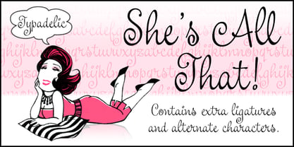
- Pass This On by PizzaDude.dk,
$18.00 Pass This On comes with 5 different layers to make cool effects, and every layer has 5 different versions of each letter that automatically cycles as you type. Besides that, Pass This On comes with a dingbat with 62 note-like drawings to complimate whatever you wrote with the font!
 - This Little Piggy by Hanoded,
$10.00 This Little Piggy is a cute, kiddy-style font. A little haphazard, a little messy, but funny and happy. Great for wishing-well cards or books.


