10,000 search results
(0.022 seconds)
- Uto by Fenotype,
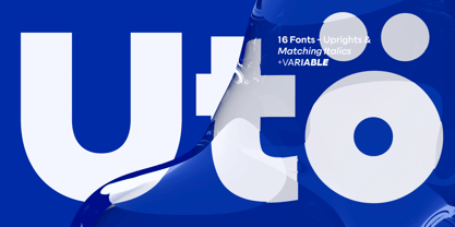
$99.00The Uto font family is named after the island of Utö, the southernmost part of Finland – an ascetic place that’s defined by bare simplicity. The same is true for the font, that’s constructed of the simplest of forms. At the outer archipelago, life is shaped by the ever-changing nature and its seasons. Uto thus comes as a variable font, making it highly adaptable for different requirements. For more conventional use, a compact range of single fonts in different weights is provided, equipped with multiple Open Type numeral styles. - Haverj by ParaType,
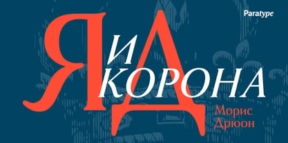
$30.00An original typeface designed for ParaType in 2004 by Armenian designer Manvel Shmavonyan. Based on the lettering created in 1970s by outstanding Armenian type designer Henrik Mnatsakanyan (1923-2001) of the same name. In Armenian ‘Haverj’ means ‘Eternally’. The face resembles many regular text serif fonts but elements like serifs and terminals make it eccentric and a little bit funny. The shape of diagonal legs in capital K and R resembles book lettering of the 1950s—60s. Using it in text, advertising and display typography may lead to surprising effects. - Marazion by Studio K,
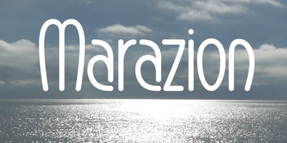
$45.00Marazion takes its name from a Cornish seaside resort in the UK's West Country. It was inspired by some hand lettering I came across at a local inn on the seafront where I was enjoying a lunchtime pint (always a good place to seek inspiration in my experience!) Being based on a hand drawn script Marazion is a smooth, fluid and rounded font that is both fresh and distinctive. Personally, I think it is well suited to applications in food and fashion, but in practice its uses are more or less universal. - Cadora Woods by Hanoded,
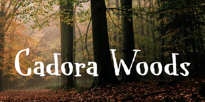
$15.00Last year I walked half of Offa’s Dyke path, a long distance trail on the Welsh/English border. Walking the trail, I came across a beautiful stretch of forest with a lovely name: Cadora Woods. Cadora Woods font was made with a Japanese brush pen. It sort of looks medieval and a friend of mine suggested it would be the font of choice for maps of ‘The Shire’. I guess that is true, but I am convinced you can come up with some innovative uses for this font! - Meteor Strike by Hanoded,
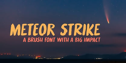
$15.00My kids asked me what killed the dinosaurs. I told them it probably was a meteor strike off the coast of Yucatán in Mexico. So, when I made this font, that little talk about the meteor hitting earth came to mind and a font name was born! Meteor strike is a slightly slanted brush font. It was made with my Chinese ink and a cheap brush (like most of my brush fonts). Meteor Strike comes with an attitude and a cheeky grin. It will sure leave a lasting impact on your designs! - MBF Alphamoon by Moonbandit,
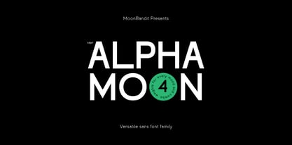
$15.00 - Some Weatz Symbols - Personal use only
- Messenger by Canada Type,
$29.95Messenger is a redux of two mid-1970s Markus Low designs: Markus Roman, an upright calligraphic face, and Ingrid, a popular typositor-era script. Through the original film faces were a couple of years apart and carried different names, they essentially had the same kind of Roman/Italic relationship two members of the same typeface family would have. The forms of both faces were reworked and updated to fit in the Ingrid mold, which is the truer-to-calligraphy one. The Messenger package is comprised of two interchangeable fonts that support Western, Eastern and Central European languages, as well as Baltic, Celtic/Welsh and Esperanto. Messenger Pro is a single OpenType font that contains the characters of both Messenger and Messenger Alt, linked by programmed features for stylistic alternates, automatic f-ligatures and class-based kerning. - Broadway Poster by GroupType,
$15.00Originally designed by Morris Fuller Benton in 1925, FontHaus's 1995 revival is based on a design named "Novelty Broadway". Characters were referenced from "Commercial Art of Show Card Lettering" by James Eisenberg, published by D. Van Nostrand Company in 1945. This Broadway is classic Broadway but with some charming differences such as a slanted lower case "f" a remarkable lower case "g" and a high-waisted upper case case "R", as only a few examples. It was named "Novelty" because the alphabet incorporated a concave design feature in the tops and bottoms of each letter. These differences allow this version to possess much more personality than that of all other Broadway designs on the market. It looks almost hand brushed, has soft edges and is no where near as sterile looking as all the other digital versions. It feels very 1925! - Pentathlon Pro by DBSV,
$80.00Strait passages second part… I tried in this fifth (that's why she took the name "Pentathlon Pro”) consecutive font family to give her a character style with again a strait way of writing. Walking on the same considerations as the previous series (Khamai, Aeolus, Corset & Artios) I tried to give some sense of diversity for the strait passages of character: those fourteen style are the result. And in this family, the “Bold” with "Inlier" and “Bold Italic” with "Inlier Italic” engage in the same way as did the “Layered font families” in the previous series. Also I added a design statement for the twelve zodiac signs, only presented in the Bold, Inlier, Bold Italic and Inlier Italic style. This series is composed of fourteen styles with 628 glyphs each, with true italics and supports Latin, Greek and Cyrillic. - Dear Dolores by Samuelstype,
$24.00Dear Dolores has had its name from the latin word dolorem, meaning sorrow or grief. When I started working on this display font I found myself trying it out using the latin requiem texts. The capitals somehow sat well with the monumental and solemn words of mourning. The broken hairlines suggested stone cuttings where the fine details had been worn down and obliterated over time and it felt at home in a churchyard or in a monument park. Adding lowercase gave the font a more personal and friendly appearance and opened up new possibilities for use. The name itself is a fictional message to someone long missed or perhaps lost too soon. Dear Dolores comes in a cut and an uncut version where the fine details are left intact. Both are excellent for headlines or memorable quotes. - Schism One by Alias,
$55.00Schism is a modulated sans-serif, originally developed from our Alias Didot typeface, as a serif-less version of the same design. It was expanded to three sub-families, with the thin stroke getting progressively heavier from Schism One to Schism Three. The different versions explore how this change in contrast between thick and thin strokes changes the character of the letterforms. The shape is maintained, but the emphasis shifts from rounded to angular, elegant to incised. Schism One has high contrast, and the same weight of thin stroke from Light to Black. Letter endings are at horizontal or vertical, giving a pinched, constricted shape for characters such as a, c, e and s. The h, m, n and u have a sharp connection between curve and vertical, and are high shouldered, giving a slightly square shape. The r and y have a thick stress at their horizontal endings, which makes them impactful and striking at bolder weights. Though derived from an elegant, classic form, Schism feels austere rather than flowery. It doesn’t have the flourishes of other modulated sans typefaces, its aesthetic more a kind of graphic-tinged utility. While in Schism Two and Three the thin stroke gets progressively heavier, the connections between vertical and curves — in a, b, n etc — remain cut to an incised point throughout. The effect is that Schism looks chiselled and textural across all weights. Forms maintain a clear, defined shape even in Bold and Black, and don’t have the bloated, wide and heavy appearance heavy weights can have. The change in the thickness of the thin stroke in different versions of the same weight of a typeface is called grading. This is often used when the types are to used in problematic print surfaces such as newsprint, or at small sizes — where thin strokes might bleed, and counters fill in and lose clarity, or detail might be lost or be too thin to register. The different gradings are incremental and can be quite subtle. In Schism it is extreme, and used as a design device, giving three connected but separate styles, from Sans-Didot to almost-Grotesk. The name Schism suggests the differences in shape and style in Schism One, Two and Three. Three styles with distinct differences, from the same start point. - Schism Three by Alias,
$55.00Schism is a modulated sans-serif, originally developed from our Alias Didot typeface, as a serif-less version of the same design. It was expanded to three sub-families, with the thin stroke getting progressively heavier from Schism One to Schism Three. The different versions explore how this change in contrast between thick and thin strokes changes the character of the letterforms. The shape is maintained, but the emphasis shifts from rounded to angular, elegant to incised. Schism One has high contrast, and the same weight of thin stroke from Light to Black. Letter endings are at horizontal or vertical, giving a pinched, constricted shape for characters such as a, c, e and s. The h, m, n and u have a sharp connection between curve and vertical, and are high shouldered, giving a slightly square shape. The r and y have a thick stress at their horizontal endings, which makes them impactful and striking at bolder weights. Though derived from an elegant, classic form, Schism feels austere rather than flowery. It doesn’t have the flourishes of other modulated sans typefaces, its aesthetic more a kind of graphic-tinged utility. While in Schism Two and Three the thin stroke gets progressively heavier, the connections between vertical and curves — in a, b, n etc — remain cut to an incised point throughout. The effect is that Schism looks chiselled and textural across all weights. Forms maintain a clear, defined shape even in Bold and Black, and don’t have the bloated, wide and heavy appearance heavy weights can have. The change in the thickness of the thin stroke in different versions of the same weight of a typeface is called grading. This is often used when the types are to used in problematic print surfaces such as newsprint, or at small sizes — where thin strokes might bleed, and counters fill in and lose clarity, or detail might be lost or be too thin to register. The different gradings are incremental and can be quite subtle. In Schism it is extreme, and used as a design device, giving three connected but separate styles, from Sans-Didot to almost-Grotesk. The name Schism suggests the differences in shape and style in Schism One, Two and Three. Three styles with distinct differences, from the same start point. - Schism Two by Alias,
$55.00Schism is a modulated sans-serif, originally developed from our Alias Didot typeface, as a serif-less version of the same design. It was expanded to three sub-families, with the thin stroke getting progressively heavier from Schism One to Schism Three. The different versions explore how this change in contrast between thick and thin strokes changes the character of the letterforms. The shape is maintained, but the emphasis shifts from rounded to angular, elegant to incised. Schism One has high contrast, and the same weight of thin stroke from Light to Black. Letter endings are at horizontal or vertical, giving a pinched, constricted shape for characters such as a, c, e and s. The h, m, n and u have a sharp connection between curve and vertical, and are high shouldered, giving a slightly square shape. The r and y have a thick stress at their horizontal endings, which makes them impactful and striking at bolder weights. Though derived from an elegant, classic form, Schism feels austere rather than flowery. It doesn’t have the flourishes of other modulated sans typefaces, its aesthetic more a kind of graphic-tinged utility. While in Schism Two and Three the thin stroke gets progressively heavier, the connections between vertical and curves — in a, b, n etc — remain cut to an incised point throughout. The effect is that Schism looks chiselled and textural across all weights. Forms maintain a clear, defined shape even in Bold and Black, and don’t have the bloated, wide and heavy appearance heavy weights can have. The change in the thickness of the thin stroke in different versions of the same weight of a typeface is called grading. This is often used when the types are to used in problematic print surfaces such as newsprint, or at small sizes — where thin strokes might bleed, and counters fill in and lose clarity, or detail might be lost or be too thin to register. The different gradings are incremental and can be quite subtle. In Schism it is extreme, and used as a design device, giving three connected but separate styles, from Sans-Didot to almost-Grotesk. The name Schism suggests the differences in shape and style in Schism One, Two and Three. Three styles with distinct differences, from the same start point. - Buchfraktur by RMU,
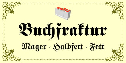
$25.00The late-19th and early-20th century standard blackletter family in Germany, in three weights. To get access to all ligatures, it is recommended to activate both Standard and Discretionary Ligatures. You find the round s on the # key, and by typing the combination N-o-period and activating the OT feature Ordinals you get the numero sign. - Sharik Sans by Dada Studio,
$29.00Sharik Sans (named after the brave and smart dog-hero from my favorite TV series) has a warm and gentle personality. It does not shout; it does not stand out. Sharik serves his master in everyday work. Although it is a sans serif, you can feel a calligrapher’s touch in its subtle details and endings. They shine out, especially at display sizes. The family consists of nine weights plus matching italics. It meets most of the needs designers deal with on a daily basis, including web usage. It is stuffed up with various OpenType features such as small capitals, a wide set of numerals, fractions, ordinals, alternates, and, of course, ligatures. And it perfectly harmonises with my other serif-like typeface family Clavo. NB: This font is NOT style linked by weight! - Cordelia by PintassilgoPrints,
$20.00Impacting and vibrant, Cordelia family draws inspiration from covers of 'cordel literature’, small booklets of popular story-poems that played an essential role on the folk-popular cultural life of Brazil. Printed in coarse paper, usually with an woodcut illustration and lettering in the front, these booklets were sold on the streets, in marketplaces and town squares, hung in a cord - therefore the name ‘cordel’. The work of these humble printers and poet-singers of northeastern Brazil strongly served as source for acclaimed romances and movies and still inspires writers of all genres, movie makers, painters, musicians. And type designers too :) Cordelia doesn’t bring a picture font yet, but it goes pretty well with Chronic and Manicuore illustrations. It goes well with and without them. It definitely goes well. You bet! - Floyal Rush by PizzaDude.dk,
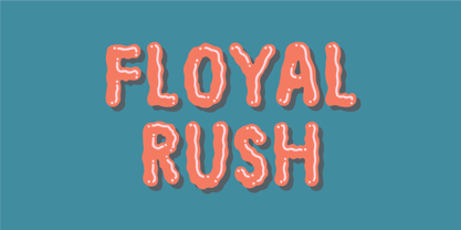
$18.00Floyal Rush is 100% handmade, it’s organic looking and super friendly in a funky wobbly way! Although inspired by grafitti, Floyal Rush has got this cartoon and whimsical vibe to it. I don’t know about using Flyal Rush for massive text, but I would suggest short words and shout-outs - but I dare you! Go ahead and challenge me! I have added 3 versions, which fit together: Solid, Shine and Regular. - Tokoloshe by Scholtz Fonts,
$17.95Tokoloshe is a name in African mythology for a mischievous leprechaun-like figure that loves practical jokes and tricking people. There are many books of such African stories, for example Tales of the Tokoloshe by Pieter Scholtz. The letter shapes that I used in the Tokoloshe font have inspiration from two sources: -- the spiky character of the font was derived from the wonderfully imaginative, wooden carvings of the Makonde people of beings called "shetani". The word "tokoloshe" is used by other tribes, but from his behaviour, he is certainly a type of shetani. -- some of the letter shapes were informed by Art Deco styles of fonts, for example: Kunjani, Black Tie SF, Selznick Normal, Zaire SF, Binner Gothic and ITC Anna. But the Tokoloshe font, like its namesake, is much more freespirited. Use this font whenever you want to suggest the rich artistic, cultural and spiritual heritage of Africa. The font is fully professional in terms of its character set. It contains over 235 characters - (upper and lower case characters, punctuation, numerals, symbols and accented characters are present). In fact, it has all the accented characters used in the major European languages. - ITC Oldrichium by ITC,
$29.99Spirited, unaffected and buoyant, the ITC Oldrichium type family pays homage to the calligraphy and typeface designs of Czech designer Oldrich Menhart. “I came upon one of Menhart's typefaces over a decade ago,” says George Thompson, designer of ITC Oldrichium. “I've been collecting examples of his work ever since.” Thompson was born in Chicago and grew up in north-west Indiana. “While I've been an educator and general graphic designer for over 30 years, lettering and type design have always been an important part of my work,” he says. Thompson now spends much of his free time designing typefaces. ITC Oldrichium is a subtle melding of the shapes and proportions of Menhart's Manuscript typeface, the energetic strokes of his calligraphy, and Thompson's own design skills. The result is a distinctive, powerful, and exceptionally versatile typeface family. Available in light, regular, demi bold and bold weights, with corresponding italics for all but the bold, ITC Oldrichium is comfortable setting both text and display copy. In addition to the basic weights, Thompson has created an Engraved version for those times when an especially powerful statement is called for. - Plethora by Sudtipos,
$49.00A few years ago I've discovered the work of one of the most prolific typeface designers of the Bruce type Foundry in NYC during late nineteenth century. Browsing Julius Herriet's work I found a very unique kind of ligatures in his patented "Old Style Ornamented" type design. Some letters were designed with a little top tail that allowed them to connect to each other. After that, I found that he also designed a single italic weight of the same font 7 years later. Since the beginning of the Opentype days I’ve been deeply obsessed with exploring different ways to build ligatures, so that lead me up to this point where I felt the need to create “Plethora”, this new font inspired by Herriet’s work. Extrapolating weights, adding variable technology and playing with additional interconnected letters and alternates. Definitely, Plethora means a large or excessive amount of something, and this font tries to bring back this abundance of details two centuries later. Available in 9 weights, from roman to italic, and also as variable format, “Plethora” supports plenty of latin languages and is a perfect choice for today’s design tides. - Salamat by Sudtipos,
$59.00Since the release of his first typeface, Zulia Pro, Joluvian has spent his time dedicatedly experimenting with an array of calligraphic styles and typography, before starting on his second typeface, Salamat. The journey began on a trip to Asia, where Joluvian was inspired by his time in the Philippines. After a series of discarded type sketches, the first stroke of what is now Salamat was then born. What at first was a quick sketch, over time, evolved into a stylized typography; that lends to humanistic-expressive calligraphy, optimized with wide variety of swash capitals, contextuals ligatures, ascending and descending, starting and ending letters and a wide range of characters for each glyph. Salamat provides the user absolute freedom to play, create words, sentences and even very stylized paragraphs. Giving one the freedom with type, the way the Philippines gave Joluvian the freedom to explore calligraphy and typography. Joluvian considers Salamat a new benchmark in his career. He now possesses more typography maturity, and a refined focus to put into practice all the knowledge acquired in his recent years of study, for this and much more salamat ('thank you' in Tagalog) to the Philippines. - Andrade by DSType,
$19.00Andrade is a new typeface designed by Dino dos Santos in 2005. This typeface was inspired in the typographic work of Manoel de Andrade de Figueiredo (b.1670-d.1735), Nova Escola para Aprender a Ler, Escrever e Contar, printed in 1722 at Offcina de Bernardo da Costa de Carvalho. This is one of the most important books, and almost forgotten, about Portuguese calligraphy and typography, and the work of Andrade de Figueiredo is among the most amazing examples of type design of the Eighteenth Century. His work inspired Ventura da Silva, a Portuguese typographer, who in 1803 published a book named Regras Methodicas, where he redesigns some of Figueiredo's type specimens. But Ventura's purpose was to create a more elegant and readable typeface than Didot and Bodoni. This kind of typeface used to be called leitura and is a transition between the baroque and modern typography. Andrade is a brilliant text typeface and is available in Regular, Italic, Bold, Bold Italic, Ligatures, Ligatures Italic, Swashes and Ornaments. Andrade is my tribute to Portuguese typography and to the work of Manoel de Andrade de Figueiredo in particular. - Multipolar by MYSTERIAN,
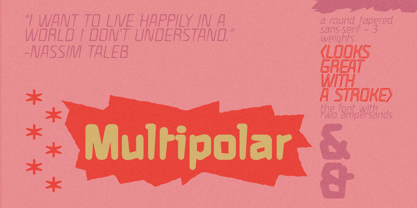
$9.00This typeface was designed as the house style by and for design studio Mysterian. It was drafted and completed during most of 2020. The intention of the design of the forms was to develop a unique signification in the mind, but one that could have potential relevant associations such as with sci-fi. The solution, brought along with a fascination with this rarely seen pattern in type, was to taper round forms. The name 'Multipolar' was inspired by the term used by game theorist Daniel Schmachtenberger, which is a kind of event that seemed relevant to the Covid-period in which the font was made. Alternate characters include: Two Ampersands Upper and Lowercase PI Upper and Lowercase Eszett Latin Characters - Therok by Twinletter,
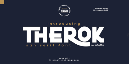
$12.00Introducing our newest font named Therok. We design this san serif family font with attention to the combination of each letter to create an elegant impression and appearance so that it makes it easy for you to use it according to what you need, both formal and non-formal needs. This font is powerful for your very extraordinary project. This font is perfect for games, sporting events, branding, banners, posters, movie titles, food and beverage, technology, quotes, clothing, logo types and more. of course, your various design projects will be perfect and extraordinary if you use this font because this font is equipped with a font family, both for titles and subtitles and sentence text, start using our fonts for your extraordinary projects. - Xavierace by Portograph Studio,
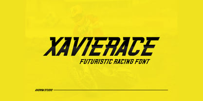
$20.00 - NAKED - Personal use only
- Mir by Juliasys,
$22.00Мир is Mir. The Russian word Мир (Mir) means both World and Peace. The rendezvous of the two terms seems quite unique and utopistic today, but it is comforting to see that it was natural at some time deep down in Russian history. Bits of both meanings were going through my mind while I was designing this typeface. Mir’s character set is multiscript – Latin, Cyrillic and Greek – and extends to many parts of the linguistic world. In fact it covers more than 100 languages. Stylistic consistency between the language systems make typographic border crossings painless even where national borders are still closely guarded. And in regions where mathematics, physics or chemistry are to be expressed, a rich set of OpenType features lets Mir master also these situations. Serious things are best be said in a relaxed, unpretentious way. So Mir doesn’t put on a show. Mir has authority without being authoritarian, it is serious but not stern. It can explain difficult things and stay calm and down to earth at the same time. Mir Medium has another useful feature: It can be freely downloaded and used by anybody anywhere. You can test the Mir Family with free Mir Medium and get more styles when you need them. @juliasys - Mundbind DK by PizzaDude.dk,
$15.00A few days ago, my good friend David from Hanoded.com visited me for a few days. We drank a lot of coffee and walked the streets of Copenhagen - we even took a trip up in Rundetårn! :) Well, on one of our walk (of course looking for inspiration for new fonts) we spotted this handmade sign. We agreed to make a font of the 7 letters available, using our own imagination and style! I called my font Mundbind DK and David named his Mundbind NL - of course it is the landcodes of Denmark and Holland. As you can tell, the font is uneven and somewhat unpredictable - following only the "rules" of the person who handprinted that sign ... and not many of the rules of the good old and respected painter who make beautiful signs ... however, this sign had it's beauty in a natural and innocent way. - Naive Sans by S&C Type,
$8.00Naïve Sans is a sans serif handwritten font designed by Fanny Coulez and Julien Saurin in Paris. Our goal was to draw a font with finely irregular lines that give a human and whimsical feeling. We drew five finely balanced weights to assure a good readability whatever the size, with contrasting upstrokes and downstrokes to add an unusual, fancy touch. We also designed five shaked versions with different lowercases and uppercases, to improve your designs and bring a more organic and playful feeling. Mixed or not, both styles can be used for various purposes, such as headings, logos, posters, wedding invitations... This font is part of our Naïve superfamily that contains lot of variations: Line, Inline, Serif, Sans Serif, and a special Art Deco one. Just click on our foundry name to see them all! We hope you will enjoy our work. Merci beaucoup! - DIN Next Decorative by Monotype,
$40.99This four-piece family is the DIN design, but not as you know it. The famously, crisp, clean and precise typeface has been given a textured update that's reminiscent of rusted metal, or rubber stamps. Underneath this lies the same sturdy, geometric shapes that have allowed DIN to stand the test of time, but with a new sense of tangibility. “This kind of treatment is more about creating a feeling or a mood that goes beyond the communication of the words themselves,” explains Monotype Studio director Tom Rickner. “I think it expands the repertoire of what DIN Next can express.” Designed for display, these four typefaces – DIN Next Rust, DIN Next Shadow, DIN Next Slab Rust and DIN Next Stencil Rust – show a new side of DIN Next's personality, as if the surface of each letterform has been gradually worn away over the years. - Indecise by Tipo Pèpel,
$22.00Even though the name seems not to tell much, Indecise shows a clean and coherent design. The shapes of the characters reference the Latin typefaces that were promoted by great figures like Enric Crous-Vidal and José Mendoza y Almeida in the 50s. Indecise uses the body of incise typefaces and gets rid of the subtle terminals for the strokes. It is a high-contrast sans divided into 5 elegant subfamilies, which use different widths. From the condensed version to the extended one, the family includes 50 fonts counting upright and italic. This collection of widths make for many possible combinations of styles. Indecise is a humanist typeface, it puts geometry apart and embraces the calligraphic gesture. This helps to suggest the movement of the strokes while avoiding to create text with a static appearance. Thin and thick strokes come together and define a smooth rhythm for reading. - Mixcoatl Mono by URW Type Foundry,
$19.99The Typeface «Mixcoatl» by Elia Salvisberg was developed as a part of a course at the Lucerne School of Design and Art in 2016. Based on the book «The Empire of the Inca», a display-font has been created, which is inspired by the graphic language of the South American Empire of the Incas. At the beginning, only capital letters were designed but there was the desire for a complete typeface – which is why the missing signs were added. The font is based on a grid, so the characters are constructed equivalently and a uniform geometric font arose. The name was adopted from the god of hunting who plays an important role in the mythology of the Aztecs and appears in various forms. The uppercase letters can also be represented and combined in two alternative character-sets, so there are a lot of opportunities to combine uppercase words in different forms. - Bicyclette by Kostic,
$40.00The name “Bicyclette” was chosen because this typeface is all about balance and elegance. The idea was to create a highly contrasted sans-serif family carefully balanced between gentle curves and sharp angles, with large capitals opposing uncommonly short lower case, through six distinctive weights. The letters are wide, and the capitals pop up in headlines while the lower case leaves a lot of white space between the text lines because of its small x-height. The edges are rounded (but not so much for the family to be called rounded), just enough to make the text feel slightly softer, gentler, while retaining some of that technical sans sharpness. The Bicyclette character set supports Western and Central European languages, and includes an extended set of monetary symbols. Each weight includes small caps, ligatures, proportional lining and oldstyle numbers, tabular figures, fractions and scientific superior/inferior figures. - Aztec Initials by Kaer,
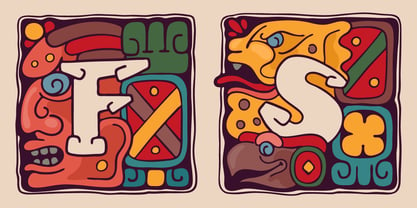
$19.00Hey guys! Do you know this guys from ancient America? I'm happy to present you Aztec Initials Colored font! Each uppercase character made with unique illustration. Native American symbols with warrior, conqueror, skull, vulture, and leopard faces. Perfect for ethnic labels, sport emblem, tattoo design and tribal identity, etc. What you will get: * Colored and regular style * Uppercase only (lowercase glyphs are same) I hope you enjoy this font. Follow my shop to receive updates of products and the very hottest news! If you have any question or issue, please contact me: kaer.pro@gmail.com Please request to add additional characters and glyphs if you need! Thank you! --- *You can use color fonts in PS since CC 2017, AI since CC 2018, ID since CC 2019, QuarkXPress since 2018, Pixelmator, Sketch, Affinity Designer Since macOS 10.14 Mojave, Paint.NET Windows only.* *Please note that the Canva do not support color fonts!* - Averia Serif - 100% free
- News Cycle - 100% free
- Pfennig - 100% free
- nineveh - 100% free
- Averia Sans - Unknown license
