6,957 search results
(0.023 seconds)
- Cream Pie by ErlosDesign,
$14.00 CreamPie - Handwritten Display Font by erlosDESIGN CreamPie is a sweet and friendly handwritten font. Its natural and unique style makes it incredibly fitting to a large pool of designs. The only limit is your imagination!
 - Sea of Japan JNL by Jeff Levine,
$29.00 A 1922 piece of sheet music entitled “Japanese Sailor” had its title hand lettered in a Far Eastern motif. This design is now available as Sea of Japan JNL, in both regular and oblique versions.
 - Magic Wand by Stringlabs Creative Studio,
$29.00 Magic Wand is a great script font with a retro style. Clean and a little bit quirky, this font is the perfect fit for all of your logos, branding, social media, and crafty DIY projects.
 - Shaded Spheres by Dingbatcave,
$15.00These Op-Art-looking little balls and gems appear 3-D without the help of any special graphic filters, which makes them perfect for use with flat colors or one-color print jobs. 72 characters. - Karline by Rillatype,
$17.00 Introducing, Karline! Karline is a reversed contrast font that will fit perfectly into any of your design such as branding, packaging, headline, tshirt, branding, etc. This font also support multilingual support and PUA encoded already.
 - Awesome Quote by Atom,
$15.00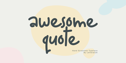 Awesome Quote is a sweet and friendly handwritten font. Its natural and unique style makes it incredibly fitting to a large pool of designs. The only limit is your imagination. Happy design! Eko Kurniawan | Letteratom
 - Geometa Deco by Wiescher Design,
$39.50 Geometa Deco is based on Paul Renners Futura Classic. The design is timeless, but I always missed some decorative characters. So I sat down and did some. The type-designer for surprising solutions, Gert Wiescher
 - Subroc by Typodermic,
$11.95 As I contemplate the beauty of Subroc, my mind drifts to a melancholic state, reminiscing the memories of a bygone era. This debonair joined-marker script typeface embodies a nostalgic charm that is difficult to resist. If your application supports ligatures, Subroc’s custom letter pairs automatically substitute for a more natural look. The resulting effect is akin to a handwritten note from a long-lost lover, carefully crafted with every stroke. But what truly sets Subroc apart is its inconspicuous, granular texture. The grittiness of its design transports you to a different time, evoking feelings of nostalgia and carefree abandon. Subroc’s beauty is not for the faint of heart, as it carries the weight of a thousand emotions with it. But for those brave enough to embrace it, the result is a breathtaking amalgamation of history, art, and emotion. So let Subroc be your muse, and let your words flow freely, imbued with the essence of a bygone era. Let your message carry the weight of history, and leave a lasting impression on all who see it. Most Latin-based European writing systems are supported, including the following languages. Afaan Oromo, Afar, Afrikaans, Albanian, Alsatian, Aromanian, Aymara, Bashkir (Latin), Basque, Belarusian (Latin), Bemba, Bikol, Bosnian, Breton, Cape Verdean, Creole, Catalan, Cebuano, Chamorro, Chavacano, Chichewa, Crimean Tatar (Latin), Croatian, Czech, Danish, Dawan, Dholuo, Dutch, English, Estonian, Faroese, Fijian, Filipino, Finnish, French, Frisian, Friulian, Gagauz (Latin), Galician, Ganda, Genoese, German, Greenlandic, Guadeloupean Creole, Haitian Creole, Hawaiian, Hiligaynon, Hungarian, Icelandic, Ilocano, Indonesian, Irish, Italian, Jamaican, Kaqchikel, Karakalpak (Latin), Kashubian, Kikongo, Kinyarwanda, Kirundi, Kurdish (Latin), Latvian, Lithuanian, Lombard, Low Saxon, Luxembourgish, Maasai, Makhuwa, Malay, Maltese, Māori, Moldovan, Montenegrin, Ndebele, Neapolitan, Norwegian, Novial, Occitan, Ossetian (Latin), Papiamento, Piedmontese, Polish, Portuguese, Quechua, Rarotongan, Romanian, Romansh, Sami, Sango, Saramaccan, Sardinian, Scottish Gaelic, Serbian (Latin), Shona, Sicilian, Silesian, Slovak, Slovenian, Somali, Sorbian, Sotho, Spanish, Swahili, Swazi, Swedish, Tagalog, Tahitian, Tetum, Tongan, Tshiluba, Tsonga, Tswana, Tumbuka, Turkish, Turkmen (Latin), Tuvaluan, Uzbek (Latin), Venetian, Vepsian, Võro, Walloon, Waray-Waray, Wayuu, Welsh, Wolof, Xhosa, Yapese, Zapotec Zulu and Zuni.
 - Kindred by Rachel Kick,
$9.00 Kindred is an organic and hand-lettered sans typeface. It has a friendly and organic feel that works great for branding, social media, and marketing! Kindred is inspired by hand lettering art - incorporating many letters that fit into each other and swashes that add a hand-drawn feel. The corners are slightly rounded to give it an organic and friendly feel. With so many alternatives and ligatures, each word can be customized to fit the needs of your project. The Details: 34 Standard Ligatures: Enabled by default to create a hand-drawn feel! (Make sure your open-type features are enabled!) These can also be switched out depending on the look you're going for. Over 90 Alternatives: These are the perfect way to make the type look custom-made for your project. Add small details, change double letters, or add swatches that fit around surrounding letters. Language Support: Danish, English, French, German, Irish, Italian, Portuguese, Spanish, Swedish, & Swiss German.
 - Veto Sans by Monotype,
$50.99 Veto® Sans is both highly legible and handsomely distinctive – a rare blend in a typeface. It’s a design that stands out and fits in. Veto Sans is equally competent on screen and in print. It’s four carefully determined weights in both normal and condensed proportions, each with an italic complement, give the family an exceptionally deep range of applications. All the designs in the family are valuable design tools. None are superfluous. Advertising, brand, corporate, editorial and interactive design are all in Veto Sans’ wheelhouse. It also shines in wayfinding and other signage projects. And to all these, it brings a warmth and personality. An ample x-height, open counters, vertical stroke endings and subtly condensed capital letters enable Veto Sans fonts to perform with grace in print and digital environments while being space efficient. An added benefit is that all-capital typography set in Veto Sans is not only space saving, it’s also easy to read. Drawn as a complete reimaging of his earlier Veto design, Swiss designer Marco Ganz worked to create character shapes distilled to their purest forms while maintaining a relaxed and natural demeanor. Ganz, who is also a three-dimensional artist, is acutely aware that the negative space between letters and the internal space within letters is as important as the positive shape of the letters themselves. This dynamic balance between the negative and positive aspects of character forms gives Veto Sans a sense of immediacy without looking hurried. Ganz also took great care to draw a suite of italic designs that not only complement the roman weights perfectly, but also give the family a dynamic verve. A large international character set also ensures ease of localization. “Veto Sans,” says Ganz, “is a typeface for designers that search for a new and different solution to age-old typographic challenges.”
 - Journal Sans New by ParaType,
$40.00 The Journal Sans typeface was developed in the Type Design Department of SPA of Printing Machinery in Moscow in 1940–1956 by the group of designers under Anatoly Schukin. It was based on Erbar Grotesk by Jacob Erbar and Metro Sans by William A. Dwiggins, the geometric sans-serifs of the 1920s with the pronounced industrial spirit. Journal Sans, Rublenaya (Sans-Serif), and Textbook typefaces were the main Soviet sans-serifs. So no wonder that it was digitized quite early, in the first half of 1990s. Until recently, Journal Sans consisted of three faces and retained all the problems of early digitization, such as inaccurate curves or side-bearings copied straight from metal-type version. The years of 2013 and 2014 made «irregular» geometric sans-serifs trendy, and that fact affected Journal Sans. In the old version curves were corrected and the character set was expanded by Olexa Volochay. In the new release, besides minor improvements, a substantial work has been carried out to make the old typeface work better in digital typography and contemporary design practice. Maria Selezeneva significantly worked over the design of some glyphs, expanded the character set, added some alternatives, completely changed the side-bearings and kerning. Also, the Journal Sans New has several new faces, such as true italic (the older font had slanted version for the italic), an Inline face based on the Bold, and the Display face with proportions close to the original Erbar Grotesk. The new version of Journal Sans, while keeping all peculiarities and the industrial spirit of 1920s-1950s, is indeed fully adapted to the modern digital reality. It can be useful either for bringing historical spirit into design or for modern and trendy typography, both in print and on screen. Designed by Maria Selezeneva with the participation of Alexandra Korolkova. Released by ParaType in 2014.
 - Behrensschrift iF Plus by Ingo,
$29.00 Peter Behrens’ renowned art nouveau type from 1902 – with ornaments. Newly revised and neatly digitalized by Ingo Zimmermann In 1902, Peter Behrens (1869–1940), architect, designer and typographer, created a new ”German“ type which became very successful very quickly for the Rudhard’sche Gießerei (foundry which later became Gebr. Klingspor AG) in Offenbach am Main. It served, for example, as the official German type for the world expositions in 1904 and 1910. Behrens himself writes about the development of this type ”...For the actual form of my type, I took the technical principle of the Gothic script, the stroke of the quill feather. The proportions of height and width and the boldness of the strokes of the Gothic letters were also decisive for me in producing a German character. A cohesive character could be hoped for by avoiding all non-necessities and by strictly carrying out the design principle of holding the quill at an angle…“ By the way, when “long s” is activated, the typographically correct “round s” is automatically placed at the end of the word so that you need only pay attention to the correct s on syllable endings within words. When using “long s,” you must ensure the correct use of the rules for the Fraktur font: “round s” is always at the end of the word, also in compound words. For those of you who want to be even more correct, read the corresponding article in >> Wikipedia. Peter Behrens also drew matching ornaments for his typeface – we have likewise carefully revised these decorative touches and arranged them into a font. The "Behrens-Schrift" fits best on all topics that have something to do with art history or the time around 1900.
 - SW Crawl Body - Unknown license

- Linotype Xmas Pi by Linotype,
$40.99You need traditional christmas symbols to illustrate your text? How about using these historic designs that had been used in good old typography. xmas is not too far and always comes in winter time. Happy Xmas. - Birthday Doodles by Outside the Line,
$19.00 Birthday Doodles.... cakes, hats, banners, flags, confetti, streamers, balloons, noise makers, and some written and printed words. Plus a full set of numbers. Everything you need to make cards, invitations, and to scrapbook all your parties.
 - Swadi Marker by Sipanji21,
$15.00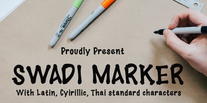 Swadi Marker is a sweet and friendly serif font and features Cyrillic and Thai character. Its natural and unique style makes it incredibly fitting to a large pool of designs. The only limit is your imagination!
 - Quinstar by Sarid Ezra,
$15.00 Quinstar is an applicable hand marker font that contains uppercase, lowercase, number and symbol. You can use this font for any project. It's so fit for social media promotion and all. This font support multi language!
 - Better Friend by Trustha,
$17.00 Better Friend is an authentic handwritten signature font with personal touch. Created with a marker by hand makes each stroke more natural. This font fits all creative projects and will make each of your projects amazing!
 - Prisom by Illuminaut Designs,
$10.00 I really wanted to make my own condensed typeface for memes and such. I think i have succeeded. This typeface is so average looking that no one would suspect that it is in fact very radical.
 - Faux Decaux JNL by Jeff Levine,
$29.00Faux is false or phony in French and Decaux is a spoof spelling of Deco, thus "False Deco". Faux Decaux JNL will still fit your Art Deco revival project and blends well with complimentary font designs. - Religiosity by Seemly Fonts,
$12.00 Religiosity is a cute and casual handwritten font. Its friendly feel makes this font incredibly versatile, fitting a wide range of contexts. Add it to your creative ideas and notice how it makes them stand out!
 - Kalash by Tomass Gavars,
$7.00 Kalash is minimalistic monospaced font family. Each glyph has eased 45° angled cut and has the right properties to fit with various styles. Combine multiple weights for best results. Each font includes 230 Glyphs & Latin support.
 - Things To Remember by Orenari,
$14.00 Things To Remember is a chill and friendly display font. Its natural and unique style makes it incredibly fitting to a large pool of designs. Level up your creative project with this thin yet memorable font.
 - Meila by NamelaType,
$19.00 Meila is a cheerful font, visually featuring bold and cute characters. Meila has smooth lines on each side, especially on the outside, almost no sharp corners. On the inside there is only one line that functions as a counter space. We made as little sidebaring as possible on each letter character, so that each character letter would intersect and that made "Meila" look solid, fat but still soft and huggable. Meila consists of several style variants and thickness variants, namely; Lines, Strokes and Solids. Meila is very suitable for children's themed designs or others such as; T-Shirt Designs, Birthday invitations, Product packaging, Logos etc.
 - Moho Sport Pro by John Moore Type Foundry,
$36.00 As an ingredient of the large family of display typefaces "Moho", John Moore Type Foundry presents another variation of fonts consisting of two components: a main font Moho Sport based on a thick outline overlapping and Moho Sport Top, a counterblocks as shape or inside filler. Both typographic forms, Open Type, empty and filled complement one another to create interesting layering headlines for announcements, posters, marks or logo design, labels etc. This combination of both typefaces can still gain more interest if the forms are colored using graphic patterns, drawings or photographs. A nonoverlapping version is also available in Moho Sport Fat and your partner Moho Sport Fattop.
 - Girga by DSType,
$40.00 Triumphant, vigorous and strong. These were the keywords for the design of Girga, named after an Egyptian city in the Sohag Governorate. The power and strength of the Egyptian letterforms were balance with a few sans serif forms so the darkness of the text and the fatness of the overall glyphs could be kept. We never intended to design a revival of the nineteen century egyptian typefaces, but we included a series of features that can be found in many wood letters from that era. With five styles divided in Regular, Italic, Stencil, Engraved and Banner, Girga is full features that allow many design possibilities.
 - Politica by Sudtipos,
$39.00 Describe the 21st century politician. Left or right? Fat or thin? War or peace? Straight or gay? Hard or soft? Male or female? Pro or con? Young or old? East or west? Now look at the Politica super-family and see which font they may be. The overused sans serif faces don’t cut it anymore. This day and age requires a sturdy, modern and straight-to-the-point sans to cover the issues. The Politica family also come in OpenType variations which extend the character set to include Cyrillic, Greek, Baltic, Turkish and Central European languages. You have no excuse: the globe is yours with Politica.
 - Pudgy Puss NF by Nick's Fonts,
$10.00Here’s a new take on an old favorite, the Lubalin-Carnase classic Fat Face. This version, intended for large headlines, cranks the original’s very high contrast up another notch. Both versions of this font contain the complete Unicode Latin A character complement, with support for the Afrikaans, Albanian, Basque, Bosnian, Breton, Catalan, Croatian, Czech, Danish, Dutch, English, Esperanto, Estonian, Faroese, Fijian, Finnish, Flemish, French, Frisian, German, Greenlandic, Hawaiian, Hungarian, Icelandic, Indonesian, Irish, Italian, Latin, Latvian, Lithuanian, Malay, Maltese, Maori, Moldavan, Norwegian, Polish, Portuguese, Provençal, Rhaeto-Romanic, Romanian, Romany, Sámi, Samoan, Scottish Gaelic, Serbian, Slovak, Slovenian, Spanish, Swahili, Swedish, Tagalog, Turkish and Welsh languages, as well as discretionary ligatures and extended fractions. - Kuppa by Huh? Type Foundry,
$15.00 Kuppa is a yummy display unicase with a lot of attitude. Two styles within the Kuppa family a like brothers — look alike and still completely different. Both brothers have 555 glyphs, including alternates, ligatures, fractions and even german capital eszett and excluding Cyrillic in Basic version. Kuppa Regular is clear, powerful and will suit for menus, coffee shop and restaurant use, for magazine handwritten heads and sub-lines and even for kids books. Kuppa Fat is on the dark side — it is bizarre and wild, sometimes even hardly legible. Sometimes you won't see letters, just encrypted symbols — perfect for music posters, vinyl shops, cd covers and hip stuff.
 - Bodoni Campanile Pro by Red Rooster Collection,
$60.00 Bodoni Campanile Pro is a font that bridges the gap between a “fat” and a compressed traditional serif typeface. It was originally designed in 1936 by Robert H. Middleton for Ludlow. International TypeFounders exclusively licensed the family from the Ludlow Collection, and Steve Jackaman (ITF) produced a digital version in 1998. Jackaman completely redrew the font for its 2017 release. Bodoni Campanile Pro, much like its transitional status as a font, is successful in both formal and casual roles. The free-flowing aspects of the family, seen especially in the lowercase ‘g’ and the leg of the uppercase ‘R,’ give the family an air of elegance.
 - Food Truck by Hanoded,
$14.00 Food Truck package is a wonderful set of fonts. During my recent trip to Japan, I stumbled upon a food truck / street food festival in Nara. Besides drinking the best cup of coffee ever (seriously, it was THAT good!), I got the idea of creating a font package based on the various handwritten signs I saw at the festival. Food Truck package consists of a fat headline font, a couple of outlined fonts, a great chalkboard font, a rather messy script font and a whole bunch of food-related doodles. I am sure you will come up with some great ideas to put these babies to use! Enjoy!
 - CA Cape Rock by Cape Arcona Type Foundry,
$39.00 CA Cape Rock, first released in 2007 and now reissued and expanded, is an impressive display typeface. Designed with a fat Clarendon and wood type in mind, the typeface’s bold and distinctive forms add spice and personality to any design that requires a strong display aesthetic. CA Cape Rock is particularly enjoyable for use in headlines and ideal for highlighted text. With already two dozen existing ligatures and many OpenType swashes, the new edition also received letters for use in the Central European and South Eastern European area. Cleaned and harmonized paths, a completely new kerning as well as a newly added Italic (Slanted) style are also among the new features.
 - FF Max by FontFont,
$72.99 Danish type designer Morten Olsen created this sans FontFont between 2003 and 2004. The family has 18 weights, ranging from Extra Light to Fat (including italics) and is ideally suited for advertising and packaging, editorial and publishing, logo, branding and creative industries, software and gaming as well as sports. FF Max provides advanced typographical support with features such as ligatures, small capitals, alternate characters, case-sensitive forms, fractions, and super- and subscript characters. It comes with a complete range of figure set options – oldstyle and lining figures, each in tabular and proportional widths. This FontFont is a member of the FF Max super family, which also includes FF Max Demi Serif.
 - Daytona by Monotype,
$50.99 The Daytona™ typeface family grew out of a desire to provide improved fonts for use in televised sporting events. Jim Wasco drew the design as sturdy squared letters based on humanist shapes and proportions. Letters were kept narrow for economy of space, and inter-character spacing was established for easy reading. While televised sporting events may have initially been his target, the design considerations he incorporated into the Daytona family also enabled it to perform well in a variety of other video and on screen environments. Daytona Variables are font files which are featuring two width axes and have a preset instance from Thin to Fat.
 - Stay Dreaming by Set Sail Studios,
$16.99 Introducing Stay Dreaming SVG Font! An expressive, streetwise script font with a fast flow and dry textures to the max. It's a bold choice of typography ideal for injecting a confident, custom-made style to your design project. Stay Dreaming is packed full of extra features; The script font includes a full alternate set of characters, as well as a set of 26 Swashes, these fast strokes are ideal for underlining the script font and giving your text that extra flair & customized feel. Language Support is provided for; English, French, Italian, Spanish, Portuguese, German, Swedish, Norwegian, Danish, Dutch, Finnish, Indonesian, Malay.
 - Trippy Hippie JNL by Jeff Levine,
$29.00 Don’t let the name “Trippy Hippie JNL” fool you. Although the type design fits well with the 1960s-70s hippie movement and the “love generation”, the design is actually straight out of a page from a vintage German lettering textbook entitled “50 Alphabete fur Technikur und Fachschulen” (loosely translated to “50 Alphabets for Technicians and Specialized Schools”). The novelty, free form shapes and stroke weights of this hand lettered alphabet fits well in creating 1920s period pieces or for designing a retro-inspired rock and roll concert poster. Trippy Hippie JNL is available in both regular and oblique versions.
 - pf_zappa - Unknown license

- KR Crowd Surfer - Unknown license

- Urbax by Eko Bimantara,
$16.00 Urbax; Bold expressive script for urban people and urban projects. Fit for Logo, Brand, Titling, Shirt, Hoodie, Products, Signage, Prints and Various Creative Projects. Contain 5 stylistic sets with lot of alternates. Contain basic latin multilanguage support.
 - Be Kind by Seemly Fonts,
$12.00 Be Kind is a sweet and simple handwritten font. Its friendly feel makes this font incredibly versatile, fitting a wide range of contexts. Add it to your creative ideas and notice how it makes them stand out!


