10,000 search results
(0.044 seconds)
- Berthusen by Sabrcreative,
$25.00 Introducing Berthusen, a stunning handwriting signature font that exudes elegance and sophistication. With its graceful curves and fluid strokes, this script font captures the essence of handwritten beauty and adds a touch of refinement to your designs. Whether you're creating logos, branding materials, invitations, or any creative project, Berthusen will elevate your work with its timeless charm. Berthusen features a perfect balance between uppercase and lowercase letters, offering versatility and creative freedom. The inclusion of numbers and punctuations ensures seamless integration into your designs, allowing you to craft captivating compositions. With multilingual support, this font enables you to express your message effectively across different languages, reaching a broader audience. The PUA encoding of Berthusen allows for easy access to its extensive collection of unique glyphs and ligatures. These special characters and letter combinations add an authentic and handcrafted touch to your typography, enhancing the overall visual appeal of your designs. With its refined script style, Berthusen is perfect for various design projects where a touch of elegance is desired. Its versatility makes it ideal for wedding invitations, stationery, quotes, branding, and much more. Let Berthusen elevate your designs and leave a lasting impression on your audience.
 - Refresh by Scholtz Fonts,
$12.00 Refresh was inspired and partly based on handwritten text from advertisements for a popular cola-based soft drink from the 1950s. I designed the missing characters in the handwriting style of the original. The Refresh family comes in three styles: - Lite- possibly the most elegant of the three styles -- use at larger sizes for greater legibility; - Med -of intermediate weight - more legible than Lite; - Blak - for bolder statements and best readabilty. Refresh, with its three styles, is ideal for any display work needing a feminine, handwritten effect. Use it for product branding, book covers, invitations, greeting cards where you're looking for charm and movement. Refresh has not been designed to be used with capital letters placed next to one another: it is not advisable to use text in "ALL CAPS". The best effects for headings and subheads are obtained with an initial upper case letter followed by lower case characters. If you are using upper and lower case then it is not necessary to use kerning. Refresh contains over 250 characters - (upper and lower case characters, punctuation, numerals, symbols and accented characters are present). It has all the accented characters used in the major European languages.
 - Be A Star by One Line Design,
$19.99 Be a Star font brings the universe into your creative designs. Use this font for posters, vinyl creations, logos, t-shirts, and many more projects. It’s written in the stars to make your design unique and fun! Use glow-in-the-dark vinyl or paper to make these letters stand out- of this world. There are 286 glyphs. These include upper and lower case letters, numbers, punctuation glyphs, latin extension, constellations, astrology signs, and letter alternates for upper case letters.
 - Smokers by Vozzy,
$5.00 A vintage look layered label font named "Smokers".Typeface includes six styles (including effect styles), for sample look at 4th preview. This font will good viewed on any retro design like poster, t-shirt, label, logo etc. For using effects layers: - Type your text in Regular. - Copy that and paste at the same position. - Change the style to Shadow or Texture. - Alternates in first letters - just type letter in caps. For alternates in last letters - just use alternates for small letters. Thank you!
 - Bonjour by Nicky Laatz,
$25.00 Say hello to BONJOUR! A bold and beautiful brush-lettered font with inky watercolour-like contours, and a natural hand-painted look. Bonjour comes with Opentype alternate upper and lowercase characters, - switch between the letters available to make your lettering look more natural and less like a font. Perfect for using in ink or watercolour based designs or on its own as bold hand-brushed lettering. Bonjour makes for fun, bold branding, quotes, greetings, adverts, posters, packaging and so much more.
 - FF DIN Slab Variable by FontFont,
$419.99 FF DIN: the famous, faithful and first revival of DIN 1451. FF DIN originates in the lettering models from the German standard DIN 1451, and is considered the perfect standard typeface due to methodical and engineered design. FF DIN Slab is a robust compliment to the FF DIN family. Designed by Antonia Cornelius and Albert-Jan Pool, it offer designers tools to create greater rhythm and design depth. FF DIN Slab’s proportions have been meticulously aligned with its Sans origins, offering the perfect balance between positive and negative space. The serifs are assertive, sturdy and balanced, they are engineered to emphasis a strong horizontal flow through text, a grounded utility and assurance in headlines. The result of this attention to detail is a typeface that harmonizes beautifully with other FF DIN styles. Pushing font technology to its limits, FF DIN Slab is also available as a Variable font. Allowing creatives to design hyper specific variations which thrive in any design space, and even seamlessly animate movement from one state to the next. FF DIN Slab distinctively carries on its parent’s DNA, speaks the same native language — but with a strong peculiar dialect. It expands the DIN family worthily — independent but integrated — and opens totally new possibilities of uses with the whole DIN family.
 - FF DIN Slab by FontFont,
$50.99FF DIN: the famous, faithful and first revival of DIN 1451. FF DIN originates in the lettering models from the German standard DIN 1451, and is considered the perfect standard typeface due to methodical and engineered design. FF DIN Slab is a robust compliment to the FF DIN family. Designed by Antonia Cornelius and Albert-Jan Pool, it offer designers tools to create greater rhythm and design depth. FF DIN Slab’s proportions have been meticulously aligned with its Sans origins, offering the perfect balance between positive and negative space. The serifs are assertive, sturdy and balanced, they are engineered to emphasis a strong horizontal flow through text, a grounded utility and assurance in headlines. The result of this attention to detail is a typeface that harmonizes beautifully with other FF DIN styles. Pushing font technology to its limits, FF DIN Slab is also available as a Variable font. Allowing creatives to design hyper specific variations which thrive in any design space, and even seamlessly animate movement from one state to the next. FF DIN Slab distinctively carries on its parent’s DNA, speaks the same native language — but with a strong peculiar dialect. It expands the DIN family worthily — independent but integrated — and opens totally new possibilities of uses with the whole DIN family. - Neue Frutiger Paneuropean by Linotype,
$79.00During planning for the new Roissy Charles de Gaulle airport in Paris at the beginning of the 1970s, it was determined that the airport's signage system had to include the clearest and most legible lettering possible. The development of all signage was put into the hands of Adrian Frutiger and his studio. The team carried out their task so effectively that a huge demand for their typeface soon arose from customers who wanted to employ it in other signage systems, and in printed materials as well. The Frutiger® typeface not only established new standards for signage, but also for a range of other areas in which a clear and legible design would be required, especially for small point sizes and bread-and-butter type. The typeface family that which emerged as a result of this demand was added into the Linotype library as "Frutiger" in 1977. Frutiger Next, created in 1999, is a further development of Frutiger, not necessarily a rethinking of the design itself. It was based on a new concept, the most obvious visual characteristics of which is the larger x-height, as well as a more pronounced ascender height and descender depth for lower case letters in relation to capitals. This new design created a balanced image and included considerably narrower letterspacing. Frutiger Next meets the demand for a space-saving, modern humanist sans. 2009's Neue Frutiger is a rethink of the 1977 Frutiger family, now revised and improved by Akira Kobayashi in close collaboration with Adrian Frutiger. Despite the various changes, this "New Frutiger" still fits perfectly with the original Frutiger family, and serves to harmoniously enhance the weights and styles already in existence. The perfect mix, guaranteed Neue Frutiger has the same character height as Frutiger. As a result of this, already existing Frutiger styles can be mixed with Neue Frutiger where necessary. Likewise, Neue Frutiger is perfect for use alongside Frutiger Serif. Newly added are the "Neue Frutiger 1450" weights. Especially for the requirements of the newly released German DIN 1450 norm we have built together with Adrian Frutiger specific weights of the Neue Frutiger. The lowercase l" is curved at the baseline to better differentiate between the cap "I", additionally the number "0" has a dot inside to better differentiate between the cap "O", and the number "1" is now a serifed 1. The font contains additionally the origin letterforms from the regular Neue Frutiger font which can be accessed through an Opentype feature." - Neue Frutiger Cyrillic by Linotype,
$89.00During planning for the new Roissy Charles de Gaulle airport in Paris at the beginning of the 1970s, it was determined that the airport's signage system had to include the clearest and most legible lettering possible. The development of all signage was put into the hands of Adrian Frutiger and his studio. The team carried out their task so effectively that a huge demand for their typeface soon arose from customers who wanted to employ it in other signage systems, and in printed materials as well. The Frutiger® typeface not only established new standards for signage, but also for a range of other areas in which a clear and legible design would be required, especially for small point sizes and bread-and-butter type. The typeface family that which emerged as a result of this demand was added into the Linotype library as "Frutiger" in 1977. Frutiger Next, created in 1999, is a further development of Frutiger, not necessarily a rethinking of the design itself. It was based on a new concept, the most obvious visual characteristics of which is the larger x-height, as well as a more pronounced ascender height and descender depth for lower case letters in relation to capitals. This new design created a balanced image and included considerably narrower letterspacing. Frutiger Next meets the demand for a space-saving, modern humanist sans. 2009's Neue Frutiger is a rethink of the 1977 Frutiger family, now revised and improved by Akira Kobayashi in close collaboration with Adrian Frutiger. Despite the various changes, this "New Frutiger" still fits perfectly with the original Frutiger family, and serves to harmoniously enhance the weights and styles already in existence. The perfect mix, guaranteed Neue Frutiger has the same character height as Frutiger. As a result of this, already existing Frutiger styles can be mixed with Neue Frutiger where necessary. Likewise, Neue Frutiger is perfect for use alongside Frutiger Serif. Newly added are the "Neue Frutiger 1450" weights. Especially for the requirements of the newly released German DIN 1450 norm we have built together with Adrian Frutiger specific weights of the Neue Frutiger. The lowercase l" is curved at the baseline to better differentiate between the cap "I", additionally the number "0" has a dot inside to better differentiate between the cap "O", and the number "1" is now a serifed 1. The font contains additionally the origin letterforms from the regular Neue Frutiger font which can be accessed through an Opentype feature." - Neue Frutiger 1450 by Linotype,
$71.99 During planning for the new Roissy Charles de Gaulle airport in Paris at the beginning of the 1970s, it was determined that the airport's signage system had to include the clearest and most legible lettering possible. The development of all signage was put into the hands of Adrian Frutiger and his studio. The team carried out their task so effectively that a huge demand for their typeface soon arose from customers who wanted to employ it in other signage systems, and in printed materials as well. The Frutiger® typeface not only established new standards for signage, but also for a range of other areas in which a clear and legible design would be required, especially for small point sizes and bread-and-butter type. The typeface family that which emerged as a result of this demand was added into the Linotype library as "Frutiger" in 1977. Frutiger Next, created in 1999, is a further development of Frutiger, not necessarily a rethinking of the design itself. It was based on a new concept, the most obvious visual characteristics of which is the larger x-height, as well as a more pronounced ascender height and descender depth for lower case letters in relation to capitals. This new design created a balanced image and included considerably narrower letterspacing. Frutiger Next meets the demand for a space-saving, modern humanist sans. 2009's Neue Frutiger is a rethink of the 1977 Frutiger family, now revised and improved by Akira Kobayashi in close collaboration with Adrian Frutiger. Despite the various changes, this "New Frutiger" still fits perfectly with the original Frutiger family, and serves to harmoniously enhance the weights and styles already in existence. The perfect mix, guaranteed Neue Frutiger has the same character height as Frutiger. As a result of this, already existing Frutiger styles can be mixed with Neue Frutiger where necessary. Likewise, Neue Frutiger is perfect for use alongside Frutiger Serif. Newly added are the "Neue Frutiger 1450" weights. Especially for the requirements of the newly released German DIN 1450 norm we have built together with Adrian Frutiger specific weights of the Neue Frutiger. The lowercase l" is curved at the baseline to better differentiate between the cap "I", additionally the number "0" has a dot inside to better differentiate between the cap "O", and the number "1" is now a serifed 1. The font contains additionally the origin letterforms from the regular Neue Frutiger font which can be accessed through an Opentype feature."
 - Euro Travel JNL by Jeff Levine,
$29.00 A German travel poster from 1927 became the design inspiration for a type revival because of its pleasantly hand lettered sans serif type style. Euro Travel JNL is available in both regular and oblique versions.
 - Charleston Caps by Type Associates,
$21.95 Based on hand-lettered poster styles of the twenties and thirties, Charleston evokes a mood of flapper-era nostalgia. Ideal font to suggest the period of fashionable bobbed hairstyles, short(ish) hemlines and baggy pants.
 - Koffer by design-tourist,
$15.00 Koffer is a decorative headline font that can be used for serious screen graphics, retro posters and futuristic signage on a spaceship. It contains all small and capital letters from the Latin and Cyrillic alphabet.
 - Speedster by Vozzy,
$10.00 Introducing a vintage label font named Speedster. This strong typeface is perfect for lettering on vintage style posters, t-shirts, greeting cards, logo etc. All available characters and styles you can see at the preview.
 - Freich by Nasir Udin,
$15.00 Freich is a mighty bold typeface with a vintage vibe and rebellious feeling. Perfect choice for posters with super hero or propaganda themes. Its sharp and strong letter forms will make any statements more powerful.
 - Silent Comedy JNL by Jeff Levine,
$29.00 A poster for the 1917 Charlie Chaplin comedy “Easy Street” had Chaplin’s name hand lettered in thick, round cornered block characters. This inspired Silent Comedy JNL, which is available in both regular and oblique versions.
 - Progreso by CastleType,
$59.00 Progreso is a condensed, unicase, serif gothic type design inspired by the hand-lettering on Russian posters from the 1920s. Supports most European languages, including modern Greek and most languages that use the Cyrillic alphabet.
 - Creepy Events JNL by Jeff Levine,
$29.00 The 1963 German release poster for "What Ever Happened to Baby Jane?" features a creepy, sinister, hand-lettered type design that became the model for Creepy Events JNL, available in both regular and oblique versions.
 - Demine by Craft Supply Co,
$20.00 Introducing Demine – Condensed Bold Sans Serif Font The Perfect Typeface for Large Displays Demine – Condensed Bold Sans Serif Font is an ideal choice for meeting your large display typography needs. With its distinct features, this font stands out in the world of design. Bold Impact for Attention Demine’s bold design unquestionably captures attention. Whether it’s billboards, posters, or signage, this font excels in conveying a powerful message that can’t be ignored. Furthermore, it ensures that your content immediately seizes the viewer’s gaze. Optimal Readability Even at Scale Despite its condensed form, Demine prioritizes readability. Each character is thoughtfully crafted to remain clear and legible, ensuring your message is effectively communicated, even at larger sizes. Consequently, it guarantees that your audience can easily comprehend the content. Versatile Design Applications Demine’s versatility shines through in various design applications. It’s not limited to headlines; it also excels in branding, packaging, and any project where making a bold statement is essential. As a result, it can adapt to a wide range of creative endeavors. In Conclusion Demine – Condensed Bold Sans Serif Font epitomizes typography that marries boldness with clarity. When you need your message to shine large and clear, Demine is your go-to choice. Elevate your designs with Demine’s impactful presence, and witness your message soar to new heights, leaving an indelible impression on your audience.
 - Mantylie Script by Inumocca,
$20.00 Mantylie Script, unique calligraphy stroke and standout character. simplel for access of Unique Alternates really Easy to make it your own style typography. Good for your Lettering, Signature, Typography, Magazine, Branding, Poster, wedding invitations, Quotes Lettering, and more your project design. - Unique glyphs - Multilingual Characters Support - UPPERCASE - Lowercase - Numeric - Symbol - Punctuation Character - Stylistic Set Alternates Inumocca type
 - Chancellor by PintassilgoPrints,
$24.00 Chancellor is a robust hand-drawn sans serif display typeface. Its sturdy letterforms takes inspiration from Plakatstil era posters, while bringing up also cool adornments to flourish your lettering designs. This all caps typeface has two versions for each letter, amplifying your composition choices. It's positively a great tool for a wide range of creative display uses.
 - Katharine by Teweka,
$20.00 Katharine is a fresh new font, Made in Upright style, Katharine Has 417 glyphs with lots of swash options. This Katharine font is very easy for you to work with, because it has automatic letter and number combinations to change the swash inside the letters. This font is suitable for: Branding, Logotype, Poster, Social Media and others.
 - Sidelle by Beary,
$15.00 Sidelle is an amazing hand lettering script that is attractive and natural. Every single letter have been carefully crafted to make your text look beautiful. This font is suitable for invitations, branding, advertising, classic design, poster designs, and more. This font is PUA encoded so you can access extras from character map in most design software.
 - Casual Nouveau JNL by Jeff Levine,
$29.00 Free-flowing pen lettering of the Art Nouveau period took letter forms into interesting curves and angles. The style was embraced and revived by the 1960s counter-culture in its rock concert posters and record album covers. However, the source for Casual Nouveau JNL is a 1911 piece of sheet music entitled "Back to the Carolina You Love".
 - Light Sunday by Yoga Letter,
$15.00 "Light Sunday" is a modern calligraphy font with beautiful lettering. Letter decoration is very easy to use because it has been specially designed. This font is perfect for all your types of work. This font can be used for summer, spring, back to school, logos, branding, banners, posters, prints, weddings, invitations, birthdays, boutiques, promotions, social media, quotes.
 - Straight Flush Block by Inumocca,
$18.00 Straight Flush font family inspiration from Old school traditional tattoo font, simple and Strong Charachters. come with some simple Alternates for covering your Project, like Branding, Movie Title, Headline Letter, Bookcover or Book Content, Magazine cover, Poster, Quotes Lettering, Logos, and more your project design. - Unique glyphs - Multilingual Characters - UPPERCASE - Lowercase - Numeric - Symbol - Punctuation Character - Alternates inumocca type Studio
 - Subletter by Type Colony,
$25.00 Subletter Script is a casual script typeface with stylish style, clean, and great movement this typeface and allow you to make lettering and logotype quickly and easily. This typeface is inspired by brush lettering and sign painting that has strong styles and classy for using on project such as Logotype, Letterhead, Poster, Apparel Design, Label and etc.
 - Sheila Hudson by Crowntype Studio,
$14.00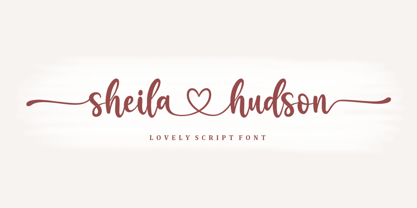 Sheila Hudson is modern script font, where every single letter has been carefully crafted to make your text look beautiful. With a modern script style, this font will perfect for many different project such as: quotes, blog headers, posters, weddings, branding, logos, fashion, apparel, letters, invitations, stationery, and more. This font includes alternate glyphs and beautiful swirls.
 - For Real by KA Designs,
$12.00 For Real is a fun mix of bubbly and retro.. you could say it's a little groovy too! Each letter is hand-drawn giving this font a unique and fun look! For Real boasts big bubbly letters that are perfect for all of your retro designs, t-shirt designs, branding, packaging, advertisements, social media, posters and more!
 - Carolinea by Seniors Studio,
$17.00 Carolinea is a hand lettered script fonts, using brush & ink combines a style brush calligraphy, irregular baseline, a rough edges, bold and organic. Including initial and terminal letters, ornament, ligatures and multiple language support. Can be used for various purposes such as posters, logos, t-shirt, signage, businnes card, magazines, book cover, wedding invitation, greeting cards etc.
 - Bloodstone by sizimon,
$16.00 Bloodstone is strong, sharp and have a painted look feel. Suitable for digital lettering, branding materials, t-shirt, print, business cards, quotes, logo, poster, t-shirt, nature photography and applicable for any graphic design. It contains a full set of lower & uppercase letters, a large range of punctuation, numerals, and multilingual support, also has alternative characters.
 - Medisans by Inumocca,
$20.00 Medisans is A Retro Font, come from 70s style era Exellent typeface to use for covering your Project, like Branding, Movie Title, Headline Letter, Bookcover or Book Content, Magazine cover, Poster, Quotes Lettering, Logos, and more your project design. - Unique glyphs - Multilingual Characters Support - UPPERCASE - Lowercase - Numeric - Symbol - Punctuation Character - Stylistic Set (ss01) - PUA encoded inumoccatype
 - Meatball by Parkinson,
$25.00 Meatball is a fat and happy display font based on some lettering on a mid-20th century poster for the movie Bringing Up Baby. The lettering for the names of the stars, AudryHepburn, Cary Grant and Charles Ruggles, was the basis for Meatball. The sample was all caps and as it evolved, a lower case started to appear, etc.
 - Rahaely by Putracetol,
$19.00 Introducing Rahaely, a elegant script font with a lot of alternates character. This font is perfect for logotype creation, lettering compositions, wedding invitations, fashion projects, book design cover, magazines typography, cards, packagings, posters, branding and more. Come with Opentype feature with a lot of alternates, its help you to make great lettering. This font is also support multi language.
 - Rosemary Love by HRDR,
$15.00 Rosemary Love is a modern brush font. Every single letter has been crafted with love to make your text look beautiful. Rosemary Love is perfect for invitations, business cards, inspirational quotes, posters, blog headers, wedding design, packaging, wall art, custom printables and a lot more! This font can run on any software but works better if using design software that have program to access all special characters (Stylistic Set01 - Stylistic Set04 & Ligatures) such as Adobe Illustrator, Photoshop, In Design, Corel draw etc. The file is OpenType, PUA Encoded (Use character Map for Windows OS, use Font Book for Mac OS).
 - Customs Agent JNL by Jeff Levine,
$29.00 The hand lettered, condensed stencil title on a movie poster for the 1950 film “Customs Agent” inspired both the digital typeface and the font’s name. Customs Agent JNL is available in both regular and oblique versions.
 - Packed JNL by Jeff Levine,
$29.00One of six fonts inspired by old stencil lettering guides, Jeff Levine has drawn a font which captures the feel of simpler times when signs and posters were stencilled by school children, teachers, librarians and shopkeepers. - French Wine JNL by Jeff Levine,
$29.00 French Wine JNL is an Art Deco thick-and-thin type design based on the hand lettering from a vintage poster for Monarch Cabernet Sauvignon wine. The typeface is available in both regular and oblique versions.
 - Shantika Script by Masinong Studio,
$14.00 Shantika Script is inspired by a retro and hand lettering style and features a very bouncy baseline. This font is ideal for logos, handwritten quotes, product packaging, headers, posters, merchandise, social media, greeting cards and more.
 - Livingstone by Stringlabs Creative Studio,
$29.00 The Livingstone is an unique blackletter decorative font. It’s suitable for use in various projects such as gothic lettering, tattoo, headlines, posters, magazines, newspapers, t-shirts, labels, and every other design which needs a striking typeface.