10,000 search results
(0.014 seconds)
- Savage Sword by Comicraft,
$29.00 Mother of Mitra, Crom’s Devils and other Savage WORDS! The only thing better than one dead Pict is TWO! Or THREE! Or FOUR! And what better than this SAVAGE font to sound the sword strokes of a BARBARIAN BORN?! Hack! Slice! Cut your fiendish foes into pieces with Comicraft’s SAVAGE SWORD and tell your SAVAGE TALES to all and sundry and even those you’ve sundered! BE AWARE! Handle with care and keep some neosporin or other antibacterial cream at hand -- being Savage and filled with Berserker Rage may result in unintended wounds to yourself and your kinsmen. Savage Sword features two sets of automatically alternating uppercase characters, plus support for Western & Central Europe and Vietnamese.
 - Sticky Glue by Putracetol,
$28.00 Sticky Glue is Quirky Bold Font. This font is a quirky font with a lot of character ligatures, as many as 325 ligatures. The concept of this font is to make the letters stick together, like glue. This font theme is more fun, playful and childish with quirky characters and displays. This font is suitable for your projects such as logos, branding, packaging, crafting, titles, books, headlines, posters, t-shirts, films and others. This font can be used and supported in various programs and OS, such as procreate, cricut, windows, macOS and others. Come with lot of ligatures character, its help you to make great lettering, quote, logos. This font is also support multi language.
 - Gastella Night by Fromletterel,
$12.00 Gastella Night is a handwritten font family consist of script, casual handwritten, and unique all caps font. In other words you can get four styles of fonts at once, all styles in this family is well matched to each other. Gastella Night Script font comes with few ligatures to make it looks more natural, also comes with slant style named Gastella Night Script Italic to make it looks more delicate when used as signature. Gastella Night Regular is a casual handwritten font, so it will be suitable to all kind of design, as tagline, quotes, etc Gastella Night All Caps consist the uppercase only, add this font to beautify your design with it's unique style.
 - Barn Party by Missy Meyer,
$15.00 I'll admit right off the bat here -- I've never been to a party in a barn. I don't even know if they still do barn dances and parties, or if that's something out of the musical Oklahoma! or something. But this font gave me kind of a homey, rustic feel, so the name felt right! Like many of my fonts, this one has been refined with crafters in mind -- smoothed curves and reduced nodes, for easy cutting and printing. It's also packed with over 600 characters total! The usual alphabet, numbers, and punctuation, plus 30 double-letter ligatures, over 300 diacritics, and a full second alphabet coded in as Stylistic Alternates. Enjoy!
 - Nadella by Abbasy Studio,
$15.00 Nadella Script is beauty combinations of script layered and sans font . It has 7 font on script and 1 sans inside. Both combination are perfect for you to make design more detail. You can express the style on script font, you can add line, shadow, extrude, inline_1, inline_2, or inline_3. Changing the color of the other layer as just easy as change standard color of the fonts but it’s make more detail. with 1 more sans font, and some extras. you no longer need to worry about how to make effect and ornament on the text. This font is suitable for young, passionate design, such as logo design, t-shirts, branding, and various other design purposes.
 - Rebus Script by Ascender,
$29.99 Rebus Script is a fun, lively font that lets you create rebus puzzles by automatically replacing certain words or syllables with pictures. This font is an advanced OpenType font that requires an application that supports Contextual Alternates. The font was created by Terrance Weinzierl and is based on the Louisville Script handwriting font designed by Steve Matteson. To use the font you simply type a word like 'sun' or 'son' and those letters will automatically be replaced by a picture of the sun. There are over 70 pictorial symbols in Rebus Script that make up the 'vocabulary' for automatic substitution based on over 300 different syllable/word combinations in various cases (lower, upper, titling) in the English language.
 - Neustade by Twenty-Six Types,
$3.00 Neustade is a layered typeface based on a simple grid, taking inspiration from the work of Wim Crouwel and Foundry Types. I challenged myself to create a typeface where words and letters can appear within or outside of other words and letters with the help of layering. Neustades grid also applies to the spacing and kerning of individual letters or words, ensuring that every layer will line up and allowing different weights to interact with each other. Individually each weight within the Neustade family has been designed with legibility at small sizes in mind, allowing for smooth and uninterrupted reading. Neustade in large sizes feels both modern and retro, especially when mixing weights and colors.
 - Jagerlay by Picador,
$29.00 Jagerlay was brought to life to cope with diverse and complex data gathered in presentations, corporate identity and other office documents. Its geometric shape and characteristic endings are reminiscent of classic typography from Sci-Fi Movies from the 80's. The simple design makes Jagerlay outstandingly easy to use for every user. Jagerlay pairs with other typefaces in the blink of an eye – it goes well with display, serif or script fonts. The whole family consists of 9 weights and matching italics. Every style has almost 900 glyphs. Jagerlay has many opentype features such as tabular figures, fractions, superscript and subscript, small caps and arrows. Low contrast makes it easy to read. The rest makes it easy to use.
 - Rich Dingbats & Bursts by Enrich Design,
$24.95 Rich Dingbats & Bursts was created with graphic designers in mind. I worked for a weekly newspaper, and finding different bursts was a challenge. You either had to draw your own (and who has time for that under tight deadlines) or use the same dull bursts over and over. I wanted to give the people I worked with at the newspaper choices, and Rich Dingbats & Bursts was born. There are several uses for this font. It's great for adding graphic elements to your Photoshop artwork. In FreeHand, users can convert the burst and paste a photo inside the burst for an interesting effect. QuarkXPress users don't have to import or draw bursts, just type the appropriate character!
 - P22 CoDependent by IHOF,
$24.95 P22 CoDependent is a revival of the Independant typeface from 1930 created by Dutch designer Johannes Nicolaas Coenraad Collette along with Jos Dufour from Belgium. Independant was released in metal by the Belgian division of the Amsterdam Type Foundry in commemoration of the 100th anniversary of the independence of Belgium from the Netherlands. Despite the name, the two fonts contained in the set, Regular and Shadow, are not codependent upon each other. They can be used alone, but together they can create a dynamic two-color option. There have been other fonts inspired by and revived directly from Independant, but this version adheres the original design with the added consideration of how the shadow version will overlap.
 - Morable by Malindo Creative,
$10.00 Morable is a modern hand based typeface, This font consists of letters that flows irregularly, either between top-down and with the letter afterwards, which makes it suitable for Logotype, posters, businness card, merchandise, wedding invitations, greeting cards, blog banners, apparel, design of water-based paints/prints, correspondence, quotes and a variety of other! Morable has given PUA encoded (specially coded fonts). Files included: morable.otf If you want other files that are not here, please let me know. I will be happy to help. If you have any questions, please contact me at. malindocreative@gmail.com. Thanks for Support Feel free to contact me if you have any questions, I am happy to help you.
 - Mideo by Forberas Club,
$16.00 Mideo is a Handwritten Script font that will make your designs look classic, Farmhouse, Boho, and Feminine. It is a great font for events, Wedding Project, fashion, apparel projects, signature, album covers, logos, branding, magazines, social media posts, advertisements, but it also works great for other projects. Add it to your fonts’ library, and it will enhance your creativity! Mideo is best for: - logos, branding, & Signatures. - Flyers, Album cover, Magazine, & Advertisements. - Website design , design blogs, & fashion. - Quote graphics for social media. - and also it works great for other projects. Whats included : - Character Set - Numerals and Punctuation (OpenType Standard) - Accents (Multilingual characters) If you have any questions, before or after purchase, please feel free to get in touch.
 - Eclectic Pixel Web by Altered Ego,
$45.00Eclectic PixelWeb is a collection of three sizes of popular web icons in the pixel aesthetic. With 80+ icons designed for creating e-commerce, navigation, and interface designs. Use it as a starting point in your favorite vector program, or use the icons as is - they are optimized for sizes at 20 point and will work in Flash and other web graphics programs. Shopping carts, directional arrows, buttons galore! It's like a pinata in font format, surprises for everyone! This font includes: a new and search buttons, home, security, email, search, and a host of other icons and images to make designing your next website a breeze!. Available in Mac and PC formats, in TrueType, PostScript and OpenType formats. - Alternate Gothic by Linotype,
$20.99 Alternate Gothic was designed by Morris Fuller Benton for American Typefounders Company in 1903. All three weights of Alternate Gothic are bold and narrow. In fact, this face is essentially a condensed version of Benton’s other well-known sans serif types, Franklin Gothic and News Gothic. In the early twentieth century, the modern concept of type “families” had not yet been formed — and though Benton designed these sans serifs to harmonize with each other, the foundry gave them different names. Robust, dark, and coolly competent, Alternate Gothic is a good choice when strong typographic statements must fit into tight spaces. As a modern usage, it is currently the font of YouTube’s homepage logo.
 - Brute Sans by Wiescher Design,
$15.00 »Brute Sans« is a classic Sans typeface that looks like it has been designed by a chainsaw. »Brute Sans« looks really crude only in big sizes, the smaller the font gets the more it looks like any other Sans typeface. »Brute Sans« prints very fast, because there are no curves to compute, but that is just a side effect. »Brute Sans« is the typeface you should use if you need a really different look, since Sans typefaces tend by design to look very similar. This one is different. I always wanted to do this font, but then other projects crept up so I pushed »Brute Sans« to the end of the line. Enjoy!
 - Santorio by Skinny Type,
$15.00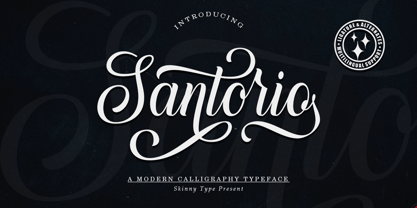 Please welcome our newest script typeface, Santorio Script, a beautiful script typeface with unique alternatives and strokes. This font is very suitable to be applied especially to logos, and various other formal forms such as invitations, labels, logos, magazines, books, greeting / wedding cards, packaging, fashion, make up, stationery, novels, labels or other types of fonts. advertising purposes. Feature : uppercase & lowercase numbers and punctuation multilingual ligature alternative PUA encoded We highly recommend using a program that supports the OpenType feature and the Glyphs panel like many Adobe and Corel Draw applications, so that you can view and access all variations of Glyphs. Email us to skinnyart871@gmail.com if you need anything! Happy Designing! Thank you
 - Ovenci by ENCI Fonts,
$19.00 Ovenci is a unique font family based on ovals and curves. Its unique and original design makes it unlike any other. As in nature, the oval curves of Ovenci family combine very well with the rest of the shapes. Trust your eyes to create the perfect mix for your projects using the Ovenci fonts family along with other fonts that you consider appropriate for what you want. For millions of years organic forms have been part of creation. The shape of Ovenci family glyphs is extremely organic, which makes it very pleasing to the eye, so you can give it the use you want. Thank you for choosing us, you will surely create great things with the Ovenci family.
 - Sparhawk by Albatross,
$19.00 Sparhawk in its obvious form is a 3D layered display font, but it's packed with over 300 swashes, extremely rare in the 3D font world. Every single swash is hand-drawn for extreme organic realism. The lowercase are small caps and the swashes are designed to be used mostly with the lowercase letters (top and drop swashes), but the drop (bottom) swashes also work well with all caps. Sparhawk’s large character set and plethora of alternates makes it perfect for logo type, birthdays, weddings, bands… the list goes on. All features include: 8 Awesome Layer Styles, 15 sets of Stylistic Alternates (over 300+ Individually Drawn Swashes), Double-Letter Ligatures for upper and lowercase, and Contextual Alternates.
 - Whimsical Musical by Harald Geisler,
$34.56 Whimsical Musical is a vivid, hand drawn font with 405 alternate letters, all caps. Developed from a lighthearted drawing in my sketchbook saying the German word “MUSIK” cheerfully over and over in twenty vivid variations. Next to it was the date “6th April 2007”. This initial idea has burst into a font that is full of surprises and whimsical turns. It is dynamically suggestive, like music, and humorously chaotic, as in Dada. Each uppercase letter is enriched with ten stylistic alternates (OpenType stylistic sets) to create a heap of playful variations amounting to a mountain of possibilities. Recommended for display usage: gonzo headlines, fantastical picturesque covers, extravagant quirky flyers, chichi posters, individual labels and fun logos.
 - Novecento Slab Rough by Synthview,
$22.00 Novecento Slab Rough adds a letterpress / analog effect to its Slab Serif parent. Each letter has a different pattern and gives you a truly realistic effect. Even accented variants of any base character are all different. This font has also a built-in feature that automatically displays a texture variant for the 2nd occurrence of a letter or a number when they appear close one to each other. For instance: AA OO TT ÜÜ. But also: AOA NON TXT etc. And don't forget alternate glyphs design such as N I J Q Y and all other features present in the Novecento mega family: 32 styles, 76 latin languages supported, 590 glyphs and 16 stylistic opentype features for advanced typography.
 - Starkido by Forberas Club,
$16.00 Introducing Starkido by Forberas Club Starkido is a handwritten script font that will make your designs look classic, Farmhouse, and Boho. It is a great font for events, wedding invitations, fashion, apparel, signature, album covers, logos, branding, magazines, social media posts, advertisements, but will also work great with any other project. Add it to your fonts’ library to enhance your creativity! Starkido is best for: - logos, branding & signatures - Flyers, album cover, magazine & advertisement - Website design, design blogs & fashion - Quote graphics for social media - Also works great with any other project Whats included : - Font provided in OTF format - Numerals and Punctuation - Accents (Multilingual characters) If you have any questions, before or after purchase, please feel free to get in touch.
 - Straits Light by AdultHumanMale,
$12.00 Straits is an oddball fun ALL-CAPS font, a modern take / re-imagining of some old Art Deco signage and a sister to my other font Penang. The font is available in 2 weights for now, a light and a medium. In general I think ALL-CAPS steal 26 characters from you, so each letter in each case is a little different, however subtly. This being an ALL-CAPS font I imagine it will work best in Headlines and other bold statements, but buy it and find out. The font is loaded with plenty of extras and glyphs. This was designed to be fun, so I hope you can have some with it.
 - Lastlap by Din Studio,
$29.00 Experience the amazing feeling with Lastlap that will make your work a lot easier than before. It is a display font designed in a racing theme. In accordance with its theme, Lastlap expresses a brave feeling with its dramatic bold style suitable to use in titles, logos, and any other designs with large-sized texts. Enjoy other incredible features available on this font. Features: Multilingual Supports PUA Encoded Numerals and Punctuation Lastlap fits best on various design projects such as posters, banners, logos, book covers, headings, printed products, merchandise, social media, etc. Find out more ways to use this font by taking a look at the font preview. Get it now. Happy designing
 - Naishila by FadeLine Studio,
$10.00 Introducing Naishila. This new font family includes a caps and script. Naishila is a lovely and sweet font duo with a dancing baseline. You will receive the regular font (not dancing) while the script comes with stylistic sets and ligatures. Like my other fonts, Naishila is made to meet the growing market of design today. This font is suitable for use in design styles such as watercolor, minimalist, flat, modern design, etc. With this font duo, you can very easily combine. Surely you can make something perfect for your design. Naishila will look gorgeous on cards, mugs, quotes, posters, shopping bags, logo's, t-shirts, branding, book covers, birthday invitations, greeting cards, and all your other lovely projects.
 - Keep Calm by K-Type,
$20.00 Keep Calm is a family of fonts developed from the now famous World War 2 poster that was designed in 1939 but never issued, then rediscovered in 2000. As well as the original Keep Calm font, the medium weight of the poster, new weights are now available – Keep Calm Book (regular weight), Heavy and Light – and each weight comes with a complimentary italic. Version 2.0 (2017) is a comprehensive update which consists of numerous refinements and improvements across all weights. The family now contains a full complement of Latin Extended-A characters, Welsh diacritics and Irish dotted consonants. The four italics have been optically corrected with revised, ‘true italic’ forms of a and f. The crown motif from the top of the Keep Calm poster is located at the plus minus ± and section § keystrokes (Alt 0177 and Alt 0167 on Windows). The lowercase g follows the Gill/Johnston eyeglass model, but also included is an alternative, single-story g at the Alt G keystroke (Alt 0169 on a Windows keyboard), the normal location of the copyright symbol which has been relocated elsewhere in the fonts. An alternative lowercase t, without the curved wedge cutaway, is provided at the Alt T (dagger) keystroke (Alt 0134 on Windows). When I first saw the Keep Calm and Carry On poster, I wrongly assumed the letters to be Gill Sans. Recent research at the National Archive by Dr. Bex Lewis of Manchester Metropolitan University has revealed that the original poster was hand drawn by the illustrator and painter, Ernest Wallcousins. The Gill Sans influence is apparent, in the R particularly, the M’s perfectly pointed vertex is redolent of Johnston’s Underground, and the most anomalous character, the C, resembles the ‘basic lettering’ of engineers that provided the vernacular sources for the Gotham typeface. Developing the Keep Calm typeface has been an exercise in extrapolation; an intriguing challenge to build a whole, high quality font family based on the twelve available capitals of the Keep Calm poster, and on similar lettering from the other two posters in the original series. This has required the creation of new lowercase letters that are believably 1939; that maintain the influence of Gill and Johnston while also hinting at the functional imperative of a wartime drawing office. Wallcousins’s lettering balanced intuitive human qualities and the pure pleasure of drawing elegant contemporary characters, against an underlying geometry of ruled lines, perfect circles, 45° terminals, and a requirement for no-nonsense clarity.
 - Friendly by Positype,
$29.00 Friendly is an homage to Morris Fuller Benton's adorable Announcement typeface. It is not a strict interpretation, digital revival or reverent reproduction of the original letterforms… but I would be remiss and shady to not acknowledge the letterforms that inspired this typeface. If you are looking for a more accurate 'scanned revival' I would recommend searching "Announcement" on MyFonts. As stated earlier, it is an homage to the original letterforms of the typeface but takes a great bit of freedom tightening the construction up in order to loosen up the movement of the variant letterforms to allow a great deal of usable personality. I enjoy stating this dichotomy… "loosen up to tighten up the forms" and vice versa. It seems counterintuitive or silly but by allowing the letterforms to normalize, I felt more comfortable going back and adding rather indulgent personality. Infused with stylistic alternates, swashes, titling, many many contextual alternates, 9 stylistic sets and 2 stylistic sets with wordmarks, the typeface became far more 'friendly' for me… how could it not? With so many loops, swashes and typographic indulgences, it was bound to be fun. The more elaborate and 'overdone' Friendly got, the more I wanted to slant it. Here's where my thinking differs from MFB's original. I like slanted romans… especially ones with long ascenders, but I do not like much of a slant. It has to be the lettering person in me. It's hard for me to do a completely upright serif and not pair it with an angle, but I did not feel Announcement's 'Italic' offered much and the actual slant needed to be far less. If it's not an italic, I prefer the letters to slant with an angle equivalent to the thickness of the vertical stroke. The Slanted version of Friendly is set at 3.6 degrees, is quite subtle, and very fitting for me. You will find that most characters have a contextual, stylistic, swash and titling alternate assigned to them and some have an echoed alternate to the swash and titling options if the stylistic alt has been selected in tandem. Additionally, all of these are accessible in the glyph palette directly from the base glyph typed or through selecting options through the Stylistic Sets 1–9. Stylistic Sets 10 & 11 are a little different. They are actually configured as complex majuscule ligatures… a result of me getting carried away. Other features like a default old style numeral set and coordinating glyphs have been produced along with case support, ordinals, and more have been added to make it more relevant for contemporary use.
 - Air Superfamily by Positype,
$29.00 In B-movie awesomeness, Air began as Grotesk vs. Grotesque. I was trying to unify the prevailing traits of German and English Grotes(que/k)s in order to make something different but familiar. I am NOT trying to reinvent Helvetica (snore), so get that out of your system. From the onset, I intended this typeface to be a true workhorse that offers infinite options and flexibility for the user. At its core, it is the maturation of the Aaux Next skeleton I developed years ago. I worked out Aaux Next to settle my issues and love for Akzidenz. With Aaux Next, I strove to be mechanical, cold and unforgiving with it. I was single, young, cocky and it fit. Now I'm married, kids, dog and have found that I've turned into a big softy. When I look at Aaux Next (and have for the past few years) I see another typeface trying to eek out. I wanted it to avoid the trappings of robotic sans, quick tricks and compromises. The typeface’s DNA needed to be drawn and not just generated on a screen — so I set aside a year. I love type. I love working with type. I hate when my options for a slanted complement is only oblique or italic. I set out to produce both to balance usage — there are more than enough reasons to prepare both and I want the user to feel free to consciously choose (and have the option to choose) the appropriate typeface for print, web, etc. That flexibility was central to my decision-making process. The Oblique is immediate and aggressive. The Italic was redrawn at a less severe angle with far more movement and, as a result, is far more congenial when paired with the Uprights. Condensed and Compressed. Yep, why not? I know I would use them. There are nine weights currently available. The logical progression of weights and the intended flexibility demanded I explore a number of light weights and their potential uses — this has produced a number of ‘light without being too light’ options that really work based on the size. The result is a robust 81-font superfamily that is functional, professional, and highly legible without compromising its personality. Pair that with over 900 characters per font that includes ligatures, discretionary ligatures, stylistic alternates, fractions, proportional/tabular lining and proportional/tabular oldstyle figures, numerators, denominators, ordinals, superiors, inferiors, small caps, case-sensitive functionality and extensive language support and you have a versatile superfamily well-suited for any project.
 - Sapore by Fonderia Serena,
$23.90 Sapore is a script font family, mostly monoline, inspired by the elegant handmade signs in the beautiful city of Venice, Italy, where I work and live. Many of these signs were made at the beginning of the 20th century by skillful craftsmen and artists, carrying that distinct vintage Italian flavour, and this is why I named the font Sapore, which means precisely flavour (also, one of the signs is from a pastry shop that makes the most delicious things). The design takes this retro vibe into the 21st century, making it up-to-date and fresh, while keeping it authentic. It is a script font, but I added some stand alone capitals that you can use in all caps words and texts effortlessly, as the open type code is taking care of using the right set of letters at the right time, I could have made two separate fonts, but I wanted to give you the best value I could and ease of use. Make sure contextual alternates are always on! There are also swashes, alternate styles, stylistic sets, small caps, 2 figure sets and decorative elements, all accessible through open type. I think the font is particularly suited for display use, as in logos, packaging design, branding, but it is readable enough for small text blocks. You can access the non-linking caps by clicking on the discretionary ligatures button. You can access the loopy caps by clicking on the titling alternates button. The main version has straight terminals but I included a round version and a calligraphic one, called “classico”. Hope you like it!
 - Cursed Stone by Ditatype,
$29.00 Cursed Stone is a spine-chilling display font that will transport your designs to a realm of dark enchantment. Designed in large letters and with a bold weight, this typeface demands attention and exudes an aura of haunting mystery. Each letter is meticulously crafted with eerie stone texture details, adding an ominous and cursed touch to the font. The large size of the letters enhances the font's imposing presence, making it impossible to ignore. The stone texture details in each letter of this font bring an authentic and sinister feel, as if the font was chiseled from the depths of an ancient cursed monument. These haunting details add an element of mystique and darkness, immersing the viewer into a world of malevolent enchantment. The combination of bold weight and stone texture gives Cursed Stone a rugged and formidable look, evoking images of cursed relics and forbidden ruins. The letters appear to hold secrets from the past, carrying a haunting energy that captures the imagination. For the best legibility you can use this font in the bigger text sizes. Enjoy the available features here. Features: Alternates Multilingual Supports PUA Encoded Numerals and Punctuations Cursed Stone fits in headlines, logos, movie posters, flyers, invitations, branding materials, print media, editorial layouts, headers, and any horror-themed project. Find out more ways to use this font by taking a look at the font preview. Thanks for purchasing our fonts. Hopefully, you have a great time using our font. Feel free to contact us anytime for further information or when you have trouble with the font. Thanks a lot and happy designing.
 - Fab by Canada Type,
$24.95 It's 1984 and everything has sideburns. Shoulder-padded "dress for success" is in, with power suits for women, black and white layers for men, neon brights for the youngsters. Maggie's "enemy within" and "no society" speeches preface the arrival of shopping malls and corporate status symbols. The economy is a philosophy and accountants carry ambiguous but very sophisticated-sounding titles. Thousands of words and expressions are reduced to initials or monosyllabic sounds. Synthesizers are very refined and the music is very catchy. The Macintosh and MTV are making waves. Brands are lifestyles. "Yuppy," Yummy," "Bobo," "Dinky" and "Woopie" are standard consumer categories in advertising lingo. The Volkswagen identity, only 5 years old now, is all the rage in design. VAG Rundschrift, by all appearances a rounded and slightly condensed Futura, is everywhere. Tube design is king. Fast forward two dozen years. Replay, but bigger and much louder. Fab. Let's dance. Fab is Canada Type's tribute to the Eighties. It's a five-font unicase family that brings tube design into the 21st century. The main font is an all-in-one treatment of the shiny roundness that the 1980s were. Fab White is a tightly packed thick outline font that conveys luscious contentedness like nothing else. The Fab Trio package is very useful for layered and colorful design, with the Black style serving as a backdrop, the Bold style as the front forms, and the Fill style for inlining. Fab comes in all popular formats and contains support for Western, Central and Eastern European languages, as well as Baltic, Esperanto, Maltese, Turkish and Celtic/Welsh languages.
 - LT Soul - 100% free

- Temporarium - 100% free

- LT Hoop - 100% free

- Gentium - 100% free

- Venereal - Unknown license

- The Spring by Sakha Design,
$14.00 The Spring is a romantic and sweet handwritten font. It looks astonishing on love letters, greeting cards, logos, business cards, and every other design which needs a personalized touch. This font is PUA encoded which means you can access all of the glyphs and swashes with ease!
 - Aristeo by MysticalType,
$10.00 Aristeo is a font family that is specifically designed for sports-related designs, although it can also be used for other designs. Aristeo is special because it is made with a balanced thickness and full of caution so that it emits a dynamic aura when viewed.
 - Angelin Love by Letterara,
$12.00 Angelin Love is a gorgeous script font, beautiful and romantic. This font looks perfect for Valentine’s Day designs, or for other romantically inclined styles and projects. To stay up to date for my latest job, follow me and let’s be friends because there will be many promos.
 - Reins Olstd by Olexstudio,
$19.00 REINS Olstd - Display Serif Font will look gorgeous on all your designs, invitation, poster design, book design, branding materials, logo's, and all project design other. WHAT'S INCLUDED REINS Olstd - Display Serif Font contains standard characters, Lowercase, Uppercase, numbers, punctuation, ligatures and international glyphs. Enjoy Designed.! Regard Olexstudio
 - Milligan by Greater Albion Typefounders,
$14.50 Milligan is named in honor of the late Spike Milligan, a wonderful comedian who (amongst many other things) wrote and start in the Goon Show. It's a jolly, boisterous display Roman which can bring a sense of liveliness and fun to any project where it's used.


