3,246 search results
(0.017 seconds)
- Alternate Gothic by Linotype,
$20.99 Alternate Gothic was designed by Morris Fuller Benton for American Typefounders Company in 1903. All three weights of Alternate Gothic are bold and narrow. In fact, this face is essentially a condensed version of Benton’s other well-known sans serif types, Franklin Gothic and News Gothic. In the early twentieth century, the modern concept of type “families” had not yet been formed — and though Benton designed these sans serifs to harmonize with each other, the foundry gave them different names. Robust, dark, and coolly competent, Alternate Gothic is a good choice when strong typographic statements must fit into tight spaces. As a modern usage, it is currently the font of YouTube’s homepage logo.
 - Boneribbon Tall - Unknown license

- ThamesCondensed - Unknown license

- U.S.A. Condensed - Personal use only

- DS CenturyCapitals - Unknown license

- The Night Lamp by Putracetol,
$28.00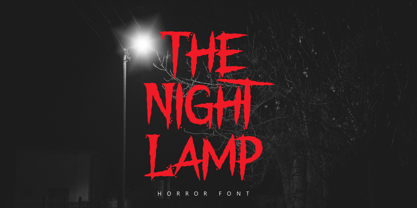 The Night Lamp is a horror style display font. Inspired from horror thriller movie. This font designed for Halloween, Horror, Thriller and Scary theme projects. The Night Lamp would be perfect for logo, quotes, apparel, comic, cover books, cards, posters, or anything that requires a horror or scarylook!
 - MardiKrewe PB by Pink Broccoli,
$14.00 Wild and carefree, the MardiKrewe Family is filled with spunk and personality. MardiKrewe started as a digitization of a film typeface called MardiGras by Lettergraphics. From there, this lively typeface was fleshed out to a full character set and expanded to a family of 5 widths: Extra Narrow, Narrow, Regular, Wide, and Extra Wide to fit a variety of funktastic needs.
 - Spaceland by Pepper Type,
$35.00 Spaceland is a narrow display font family with constant counter width and gradually growing stroke over 11 weights with matching obliques. Spaceland is a perfect choice for designs that require extra narrow but legible letters, such as movie posters, health warnings, bold titles etc. It has rich language support, including Cyrillic, as well as numerous OpenType features to customize your design.
 - Asylum - Unknown license

- Julia Script by ITC,
$29.99Julia Script is a playful calligraphic font designed by David Harris in 1983. It takes the viewer back to the flower power of the 1970s. Generous capitals with cheerful, rounded stroke beginnings and endings contrast perfectly with the narrower, closer, but nevertheless vibrant lower case letters. Characteristic of this typeface and similar to Candice is the marked increase in stroke width in the lower third of the figures. This detail is reminiscent of the platform shoes typical of the 1970s. Julia Script suggests freedom and fun and can often be found on party fliers and retro advertisements. Used sparingly in headlines and slogans, Julia Script will be sure to attract attention. - Matteo scary by Scratch Design,
$14.00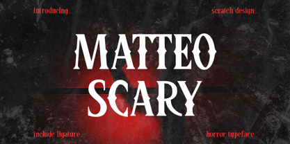 Please Welcome Matteo Scary. Matteo Scary is a horror and creepy font inspired by classic horror movie posters. It gives us the spirit of horror, spooky, frightening and suitable for poster movies, especially Halloween-themed, horror or thriller. This font is perfect also for branding, book cover, magazine header, and others which has horror or spooky vibes. What’s included? Uppercase & lowercase Number & Punctuation Ligatures Multilingual support Enjoy this font!
 - Stranger Creature by Putracetol,
$22.00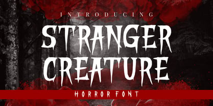 Stranger Creature is a horror style display font. Inspired from horror and thriller movies, this font is designed for Halloween, horror, thriller and scary theme projects. Stranger Creature would be perfect for logos, quotes, apparel, comics, book covers, cards, posters, or anything that requires a horror or scary look to it.
 - Roman X by Wooden Type Fonts,
$15.00 One of the first and best of the Roman styles, this a condensed, narrow version, with very short descenders.
 - Perpetuity by Zang-O-Fonts,
$25.00Strict, strong and narrow, Perpetuity is clean and perfectly designed to be used as a more formal display face. - P22 Plymouth by IHOF,
$34.95 Plymouth is a pen-drawn calligraphic font of narrow proportions featuring plain capitals and an alternate range with swashes.
 - Fideo by Ayi Studio,
$10.00 Font family designed for ornament use in texts, with three variants, arrows, dividers and ornaments.
 - Academy by Scriptorium,
$12.00A classic example of a narrow 19th century 'egyptian' style font. Excellent for old-fashioned posters where space is limited. - Aegipti 7 by 2D Typo,
$28.00 Aegypti 7 is a digital revival of Font No.7 or Egyptian Narrow - a Soviet display face cast for hand composition. I settled on the 12pt version as a basis for my digital version, as larger sizes added too much contrast to an otherwise quite orderly slab serif. The Soviet Font No.7 itself was based on an older Semi-Egyptian narrow cut before the revolution.
 - Cassandra by Wiescher Design,
$49.50 Cassandra has two kinds of letters, wide Capitals on the (shift) capitals and narrow ones on the (no shift) lowercase. You can match them as you like. Take one narrow S and a wide one or two wide ones, whatever turns you on. It will almost always look good. Cassandra is my "bow" to Adolphe Mouron Cassandre. Yours sincerely mixing things up for you Gert Wiescher
 - Kappa by W Type Foundry,
$25.00 Kappa is a modern sans serif with humanistic and geometric features. Its structure is slightly narrow to fit in a greater range of platforms (moreover if you print it, you may save a lot of paper), and its height is higher allowing a great legibility in small sizes. This family is composed with the display version and the text version providing a broad spectrum of solutions, making this family easier and friendlier to use. Designed with powerful OpenType features in mind. Each weight includes alternate characters, ligatures, fractions, special numbers, arrows, extended language support, small caps and many more… Perfectly suited for graphic design and any display / text use. The 36 fonts are part of the larger Kappa super family. Learn about upcoming releases, work in progress and get to know us better! On Instagram W Foundry On facebook W Foundry wtypefoundry.com
 - Brix Sans by HVD Fonts,
$40.00 It took Hannes von Döhren and Livius Dietzel two years to develop and complete the Brix Sans family – the companion of the well-known Brix Slab . The approach was to design an independent type family following the rules of the “Sans-Serif” genre, harmonizing with its older sister Brix Slab from the “Slab-Serif” genre. The result is a family of 6 weights with matching italics, which works perfectly for corporate design & editorial design. Combined with Brix Slab, high and complex typographical challenges can be solved. The Brix Sans OpenType fonts feature small caps, five variations of numerals, arrows and an extended character set to support Central and Eastern European as well as Western European languages.
 - HWT Unit Gothic by Hamilton Wood Type Collection,
$39.95 The Unit Gothic series was released by Hamilton Manufacturing Co. in 1907. This sans serif family features one of the first multi width/weight type 'systems' anticipating the Univers font system by 50 years. This set of 7 fonts was designed to aid in press room efficiency and with its incremental variation in widths gave poster printers unprecedented flexibility in fitting copy while using consistently harmonious fonts. This HWT release is the first ever digital version of these fonts. Each font contains 600 glyphs including Greek and Cyrillic character sets as well as alternate characters which are based on the actual special character production patterns from the Hamilton Wood Type Museum collection. HWT Unit Gothic system features: •HWT Unit Gothic 716 - 50% wider •HWT Unit Gothic 717 - 25% wider •HWT Unit Gothic 718 - (Standard width which others are based on) •HWT Unit Gothic 719 - 25% narrower •HWT Unit Gothic 720 - 50% narrower •HWT Unit Gothic 721 - 62.5% narrower •HWT Unit Gothic 722 - 75% narrower
 - TagStarHardcore by PizzaDude.dk,
$15.00TagStarHardcore comes with a full character set plus extra features such as wavy arrows and stuff. - Ayi Dingbats by Ayi Studio,
$10.00 Font family designed for ornament use in texts, with four variants, arrows, emoji, geometry and symbols.
 - Altemus Dingbats by Altemus Creative,
$11.00 A collection of 197 graphic, pointer, numbering, leaf sun and arrow illustrative and printer cut designs.
 - Nosferatu - Unknown license

- Dismembered - Personal use only

- IngyArrows by Ingrimayne Type,
$10.00 IngyArrows is a set of three fonts with three sets of arrows, with one of them a blend of the other two, where normally there are standard numbers, letters, and punctuation marks. The revision of 2011 added many of the arrows that exist in several places in the unicode codings and that cannot be accessed by normal keystrokes.
 - Spoongky by Juliawan90,
$30.00 Introducing of our new product the name is Spoongky a Horror Font, Spoongky inspired by Bouncy horror style with a fun theme very good for horror, scary, spooky and halloween theme design. FEATURES : Uppercase Lowercase Number Punctuation Multilingual
 - Huxley Vertical by Image Club,
$29.99A delicate narrow sans serif face with an apparent even weight, it is characterized by low cross strokes extended to the left. - Ghost Grim by Mvmet,
$15.00 Ghost Grim is a cool font inspired by vintage slasher horror movies and horror comics. It will be perfect for your horror and Halloween themed needs! You can use it for anything ranging from merchandise like t-shirts and clothing, for your scary book designs, Halloween party needs, greeting cards, stickers, posters, banners, or anything that needs a horror touch.
 - Concave Extended by Solotype,
$19.95Many foundries had versions of Concave ‹ wide, narrow, extra condensed, some with lowercase, some without. A good general utility style for Victorian typography. - Garota Sans SC - Personal use only

- Globet - Personal use only

- Kramps by Mvmet,
$16.00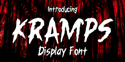 Kramps is a very cool horror display font. It will be perfect for your horror and Halloween-themed needs! You can use it for anything ranging from t-shirts and clothing, to your scary book designs, Halloween party needs, greeting cards, stickers, posters, banners, or anything that needs a horror touch. Try it to create fabulous designs and feel the horror and Halloween vibes with it!
 - Point Taken JNL by Jeff Levine,
$29.00For those seeking pointing hands or arrows for project embellishment, Point Taken JNL offers an assortment sure to please. - Artz by Hackberry Font Foundry,
$24.95Artz is a highly stylized sans serif with a Deco look in Narrow, Plain and Wide. It has oldstyle numbers and many special characters. - Jacmax by Stringlabs Creative Studio,
$25.00 Jacmax is display font with horror and scary style. Jacmax has unique design that is combined with decorative horror style. This font is perfect for your horror projects, such as: Movie Posters, Lettering on Cover Books, Album music covers, Logo Brand, and much more.
 - Izmir by Ahmet Altun,
$19.00 Izmir is a modern, geometric font family. Izmir font family consists of 44 fonts in two widths, normal and narrow where each width consists of regular and italic styles in 11 weights. Each weight is equipped with useful OpenType features. A local ampersand has been added to use in Turkish in normal weights and italics. The combination of normal and narrow weights can be an excellent choice for any graphic design and display use.
 - Veritas by Altered Ego,
$45.00Veritas is a serif text family. It is a narrow-width typeface, with a taller x-height than Times Roman for added legibility, but maintains a similar character count in text. It is typeface designed for publication, newspaper (anywhere where narrow columns are necessary) and identity design. It is exquisitely spaced and kerned, even in European characters. The Digital Type Review states "...Veritas is one of the most important contributions ... from any independent foundry."


