10,000 search results
(0.039 seconds)
- Caswallon by Scriptorium,
$18.00The original Caswallon font was based on samples of 17th century text script, featuring a decorative upper case character set with clean, basic lower case letters plus some bonus decorative ornaments to add flair to any design. The popularity of the original script style has lead us to develop a full family of associated fonts, including the recently released Caswallon Ornament set, plus the brand new Caswallon Archaic Text font and Caswallon Alternate script style. - Coroner by Storm Type Foundry,
$39.00 I never needed to digitize this early design from 1988. I found it in a drawer underneath layers of dozens of other type designs. The drawings were made with ink on paper, about 15 cm high, meticulously executed and retouched separate glyphs for a primitive photo-lettering. I used a photographic magnifier to set words and lines in my darkroom. In 2018 I decided to make a font out of it just for fun...
 - Ollives by Olivetype,
$18.00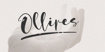 Introducing Ollives, a stylish modern calligraphy-styled script font. This beautiful font is perfect for adding a touch of elegance to any project. With its flowing lines, cool textures and graceful curves, Ollives is sure to add a touch of class to your work. So what’s included : Basic Latin Uppercase and Lowercase Numbers, symbols, and punctuations Multilingual Support. PUA Encoded and fully accessible without additional design software Simple Installations works on PC & Mac Thank You.
 - Lookey Here JNL by Jeff Levine,
$29.00Lookey Here JNL is an "Alphading" - a term coined by Jeffrey N. Levine to describe dingbat fonts containing both images and letters and/or numbers. This one - partially based on the classic "Kilroy" icon from the World War II era is a newer, cleaner reworking of one of Jeff's early freeware fonts. The typeface used inside the images is Casual Lunch JNL, so you can match this text for a particular project. Limited character set. - XAirebesk by Ingrimayne Type,
$14.95 I am not sure exactly how to classify these geometrical ornaments. They resemble the arabesque ornamentation of medieval Islamic art, but also have similarities to Celtic knots and to some Chinese and Korean ornamentation. The bolder of the two only works well at very large point sizes, while the thinner is designed for use at smaller point sizes. There are usually similar ornaments on the same characters of the two, but not always.
 - RNS Pictografica Cocina by RNS Fonts,
$9.00 RNS Pictografica Cocina (Kitchen, culinary arts and food related font) it is comprised of 230 glyphs, it's based on a modular structure of a minimal thickness on lines and round corners, making a clean visually drawing, give importance to the surround white for improve contrast. The font is better used on a big white canvas for achieve visual focus. And in great sizes for more impact, however the font is legible even at small sizes.
 - Grumbear by Almarkha Type,
$29.00 Grumbear is sweet and playful, but also elegant. This versatile script font has a wide range of applications ranging from greeting cards to kids’ crafts, and is guaranteed to add a sweet touch to your next design. Accessible in the Adobe Illustrator, Adobe Photoshop, Adobe InDesign, even work on Microsoft Word. PUA Encoded Characters – Fully accessible without additional design software. + Fonts include multilingual support for; ä ö ü Ä Ö Ü Thank’s
 - Sidro by Tour De Force,
$30.00 Condensed sans family Sidro comes in 9 weights – from extreme light Thin to dark Heavy. Compact, solid and still new and recognizable, Sidro is designed with purpose to serve in every project. It is tightly spaced family which is ideal for space saving in variety projects – from posters, packages and branding in general, to websites, editorial usage and applications. Sidro comes with Small Caps, Fractions and one Stylistic Set in extended Latin character map.
 - Avocado Creamy by Almarkha Type,
$27.00 Avocado Creamy is sweet and playful, but also Crafty. This versatile script font has a wide range of applications ranging from greeting cards to kids’ crafts, and is guaranteed to add a sweet touch to your next design. Accessible in the Adobe Illustrator, Adobe Photoshop, Adobe InDesign, even work on Microsoft Word. PUA Encoded Characters – Fully accessible without additional design software. Fonts include multilingual support for; ä ö ü Ä Ö Ü ß Thank’s !
 - Magrit by Creativemedialab,
$20.00 Magrit is a bold serif display font, It has many alternates character with nice curve that you can arrange to create a nice logo lettering, or use it as a display face on a poster and add a few alterations to it to make a beautiful eye catching words. Magrit font is best for branding, logo lettering, headlines, product packaging, tshirt design, wedding theme, poster, book cover, wedding invitation, Christmas and many more
 - MVB Emmascript by MVB,
$39.00Kanna Aoki drew the letters for MVB Emmascript while on a picnic near the Conservatory of Flowers in San Francisco’s Golden Gate Park. Mark van Bronkhorst adapted the writing as a font that maintains a very natural scrawl. Later a bold weight was added. MVB Emmascript has been used to add a lighthearted, human touch to everything from fiction paperbacks to potato chip packaging. The typeface is named for Aoki's 1968 Volkswagen, Emma. - Imperio by Juan I. Siwak,
$40.00 Imperio is a font inspired by old posters, especially those related to constructivism and futurism. It reflects both the rationalism of Bauhaus as a propagandist and revolutionary spirit of an era. On the other hand it is not nostalgic, but instead looks for its own way to get diagonals where there was rigidity. The poster itself is the language of graphic design, and geometry is its ally. This font aims for that goal. It has two variants that derive from its source. Imperio Giga Black attempts to be a negative typography, starting with the black and then searching for small windows in which they begin to uncover the morph. This is an extreme and modern font. Imperio West is a metamorphosis of the original one, with decorative details which transform it into a typeface of wood and saloon font. In all cases we recommend its use in large sizes (up to 20pt) and main titles. Imperio UltraBlack can work in smaller sizes than Imperio Regular.
 - Regasto by Sealoung,
$25.00 Regasto is a display serif font with a luxury, elegant, modern, unique and classy look. One of the most elegant, exquisite yet strong fonts. This font is made to bring out a modern and stylish view of what you make. Regasto contains upper & lowercase characters, all punctuation, and numerals. Also features ligatures and alternate characters to help the text flow naturally and add a custom-made feel. Its lighter weights are well-suited for body text. The available stylistic alternates offer some different characters that give your logo or business card a unique look. This font crafted specials for luxury-themed projects, ready to use on Magazine, Social Media, Branding, Logo, and Many more that needs Luxury touches. Regasto is also included a full set of: uppercase and lowercase letters multilingual characters numerals punctuation Ligatures Alternates Wish you enjoy our font and if you have a question, don't hesitate to drop a message & I'm happy to help :)
 - Bennet Display by Lipton Letter Design,
$29.00 Bennet, Richard Lipton’s spirited serif superfamily, was inspired by Moth Design’s logotype and stationery system for the North Bennet Street School in Boston. Initially modest in concept, Bennet grew to an expansive suite of 96 fonts tuned for editorial use. The three widths of Bennet’s Display and Banner sizes—Regular, Condensed, and Extra Condensed—are ideal for precise fitting of newspaper and magazine headlines. Lipton developed graded text styles for the series, offering users precise variations to help compensate for varying degrees of ink spread on different types of paper stock during the printing process. For example, because of ink absorption, the lightest grade—Bennet Text One—printed on low-quality newsprint stock will have the same gray value as the darkest grade—Bennet Text Four—on superior coated paper. (Bennet Text Two is the default grade and offered here.) Bennet also provides for a stellar reading experience in digital media, its carefully considered details vibrant yet legible on-screen.
 - Gilter by Shakira Studio,
$23.00 Start good day for new font! present to you, Gilter! Gilter is a font created specifically to give your designs a modern, stylish, and unique feel. With a combination of fun retro serif shapes and an elegant appearance, this font is the right choice for designs that want to display a creative impression and be different from the others. Gilter presents strong and tough-looking letter characters, but still maintains a friendly and welcoming impression. This makes this font very suitable for various types of projects, from branding, packaging, posters, to website design. What's you get? Gilter Regular Gilter Italic Unique letterforms Works on PC & Mac Simple Installations Accessible in the Adobe Illustrator, Adobe Photoshop, Microsoft Word even work on Canva! PUA Encoded Characters Fully accessible without additional design software. I really hope you'll get pleasure using Gilter font and it will be perfect addition to your font collection! If you have some questions, please write me a letter! Shakira Studio
 - Sharplion by Zeki Michael,
$30.00 Sharplion is a typeface family designed by Zeki Michael and Leyla Melis Aslan. It’s a simple, but sharp display typeface with a clear yet powerful personality, created to not only optimize space, but also build contrast on the printed page and on the screen. Sharplion, coming in two weights and a matching slanted version, is designed to give that neo-vintage industrial feel in 'titles and hierarchic subheadings, logotypes and cases of short and simple copywriting for the artisan, hand-made and small batch look.’ The first 4 letters for what is now Sharplion, were designed in 2018 by Zeki Michael to be used as a logotype for Depo Coffee Roasting’s branding project. In early 2019 after Zeki designed all the letters, numbers and glyphs, he teamed up with talented designer, Leyla Melis Aslan to add strength to the project. The full Sharplion type system includes Regular, Black and Slanted styles – providing a simple but sharp contrast type solution for digital and print design work.
 - Catarina by alphArt,
$15.00 Catarina - a Handwritten Font is a handwritten script font with a simple and classy style, this font is great for your next creative projects such as watermark on photography, quotes, album cover, logo, business card, and many other design project. From business cards to photo watermarks, Catarina is here to elevate your work to the highest level. Catarina comes with uppercase letters, lowercase letters, lowercase alternative letters, numbers, punctuation, ligature tt and multi lingual support What's inclued : - Catarina.otf note : to use alternative end text is just block end letters and select alternative letters on glyphs option. it may be used in almost any program by using your Operating System’s utilities (CharacterMap for Windows and Font Book for Mac.), as well as Illustrator, Photoshop CC 2017 and several other applications. we hope you enjoy this font. If you have any questions please don't hesitate to drop me a message :) Thank you, Best regards alphArt
 - Cosmic Venus by Ironbird Creative,
$15.00 Cosmic Venus - Brush Typeface Cosmic Venus is a handmade brush typeface with bold and strong feel. This type of font perfectly made to be applied especially in headlines which is need a standout font, and the other various formal forms such as labels, logos, magazines, books, packaging, fashion, stationery, novels, labels or any type of advertising purpose. Features : Uppercase & lowercase (alternates) PUA encoded ADDITIONAL INFORMATION Feel free to convert the fonts to web fonts for your personal/business website. You may not use the fonts in templates or for sale/free or on template websites. ( web/print/app ) For upgrading license please contact me. Upgraded licenses are required for apps, books, television, commercial exhibition, film, gaming, print on demand products, etc. Simply email me to : ironbirdcreative@gmail.com Hope you enjoy the font, please feel free to comment if you have any thoughts or feedback. Thanks for purchasing and have fun! Regards, Ironbird Creative
 - Mountella by Kereatype,
$14.00 Mountella is a modern editorial serif font family that includes 18 fonts, uprights, italic, and 2 variable font from Extra Light to Black which has more than 500 characters, and still has all the nostalgic vibes!. Mountella is a beautiful serif family that includes many visual details, adding uniqueness that looks incredible in both large and small settings as a display and body text. Mountella can be used in high-end branding, logo designs, magazines, product packaging & invitations. One thing to note about Mountella is the letter spacing. It was intentionally for clean reading if you wanted to use it for the body type, so I recommended setting the spacing a little tighter for display use (around -10 to -50 should do!). Design Tips: combine the regular and italic, whether all in one word or body text for logo or quote. Adjust your letterspacing to add more groove! Tighter letterspacing for large headers.
 - OCR B by Linotype,
$40.99OCR A and OCR B are standardized, monospaced fonts designed for Optical Character Recognition" on electronic devices. OCR A was developed to meet the standards set by the American National Standards Institute in 1966 for the processing of documents by banks, credit card companies and similar businesses. This font was intended to be "read" by scanning devices, and not necessarily by humans. However, because of its "techno" look, it has been re-discovered for advertising and display graphics. OCR B was designed in 1968 by Adrian Frutiger to meet the standards of the European Computer Manufacturer's Association. It was intended for use on products that were to be scanned by electronic devices as well as read by humans. OCR B was made a world standard in 1973, and is more legible to human eyes than most other OCR fonts. Though less appealingly geeky than OCR A, the OCR B version also has a distinctive technical appearance that makes it a hit with graphic designers. - Bennet Text by Lipton Letter Design,
$29.00 Bennet, Richard Lipton’s spirited serif superfamily, was inspired by Moth Design’s logotype and stationery system for the North Bennet Street School in Boston. Initially modest in concept, Bennet grew to an expansive suite of 96 fonts tuned for editorial use. The three widths of Bennet’s Display and Banner sizes—Regular, Condensed, and Extra Condensed—are ideal for precise fitting of newspaper and magazine headlines. Lipton developed graded text styles for the series, offering users precise variations to help compensate for varying degrees of ink spread on different types of paper stock during the printing process. For example, because of ink absorption, the lightest grade—Bennet Text One—printed on low-quality newsprint stock will have the same gray value as the darkest grade—Bennet Text Four—on superior coated paper. (Bennet Text Two is the default grade and offered here. Additional grades are available upon request.) Bennet also provides for a stellar reading experience in digital media, its carefully considered details vibrant yet legible on-screen.
 - Flefixx by Sun Young Oh,
$54.00 Flefixx is a typeface designed to support a project "Flefixx", an idiosyncratic visual language and typeface system that unfolds narratives based on common combinations of letters. In this visual language, just as individual letters come together like puzzle pieces to form different meanings or words based on combinations, the typeface is also constructed from fragmentary elements, each playing a distinct role as if they are individual pieces. The intentional exposure of the intersections of these fragments emphasizes the typeface's creation through interconnected elements. Furthermore, diacritics and dots are strategically positioned as ornaments, enhancing their presence within the gaps between letters. This concept aligns with the theme of composition and connectivity among fragments, allowing strong rhythmic patterns to emerge as letters and symbols blend in a paragraph. Additionally, the prominent and bold punctuation marks serve to provide pauses and clarity within sentences that incorporate both letters and the visual language. They contribute to articulating sentence structure amidst the dynamic flow of sentences with combined characters and visuals.
 - Dez Now Sans by Dezcom,
$28.00 Dez Now Sans is a humanistic typeface family that was begun in 2005 by Chris Lozos of Dezcom. Since then, it has been nurtured, revised, and expanded to include 12 weights in both upright roman and true italics totaling 24 variations. This allows the user to choose the weights which best work for type-size, output device, and reproduction process. There is often a difference of opinion on what the best weight to use for normal text when setting type. The truth is, there is more than one answer. When you consider the size, weight, leading and set width—along with paper and ink specifications, you may find the need for several. The subject matter of the text with the specifics of the target audience, also increase the demand for expanding choices. Dez Now Sans was designed with several potential text weights to address any circumstance. Dez Now Sans gives you a full and varied toolbox of fonts to choose from.
 - Esm by Harvester Type,
$15.00 Esm is a font that tries to convey the reinterpreted aesthetics of German and Swiss typography along with a new trend of unusual shapes. The font has a different approach to the internal elements of letters-ovals that have a straight line on one side, drawing the glyph "a" example. I wanted to diversify the font with different styles to avoid the effect of triviality of machine text. The font has a large language support and contains 626 characters. And a large number of special characters. The font family is universal. It is suitable for large text, magazines, posters, logos, and headlines. Thanks to 6 different font styles and customized kerning, the font will look just fine. The thin print is incredibly elegant. The regular is great for a large amount of text. And bold for posters and headlines. Named by the French feminine name Esm. The name itself has a meaning: dear and beloved. I hope my font will convey these feelings.
 - MFC Heathcliff Monogram by Monogram Fonts Co.,
$19.00 The source of inspiration for MFC Heathcliff Monogram is a crudely hand drawn vintage monogram transfer depicting a wider format diamond monogram. We revised numerous letters for better clarity and a more vintage industrial vibe. MFC Heathcliff Monogram is capable of traditional two and three letter format monograms, as well as gapped and hugging framing options for each. Numerals 1-9 and 0 on the keyboard for the 2 letter framing options typed before the letters, and use the shift key on the numerals for the 3 letter framing options type before the letters. It's just that easy. Looking for an MC in one of the letter slots? Just type mc on either side of MC in the middle to get it. Otherwise, just type a lowercase, a Capital, and then a lowercase to build your monogram. As one of the most popular shape based formats for monogramming since the beginning, it must be true that diamonds are forever.
 - Southaste by alphArt,
$15.00 Southaste - a Signature Font is a handwritten script font with a simple and modern style, this font is great for your next creative projects such as watermark on photography, signature or signature logo design, quotes, album cover, business card, and many other design project. From business cards to photo watermarks, Southaste is here to elevate your work to the highest level. Southaste comes with uppercase letters, lowercase letters, lowercase alternative letters, numbers, punctuation, 47 ligature and multi lingual support note : to use alternative end text is just block end letters and select alternative letters on glyphs option. it may be used in almost any program by using your Operating System’s utilities (CharacterMap for Windows and Font Book for Mac.), as well as Illustrator, Photoshop CC 2017 and several other applications. We hope you enjoy this font. If you have any questions please don't hesitate to drop me a message :) Thank you, Best regards alphArt
 - OCR A Extended by Monotype,
$40.99OCR A and OCR B are standardized, monospaced fonts designed for Optical Character Recognition" on electronic devices. OCR A was developed to meet the standards set by the American National Standards Institute in 1966 for the processing of documents by banks, credit card companies and similar businesses. This font was intended to be "read" by scanning devices, and not necessarily by humans. However, because of its "techno" look, it has been re-discovered for advertising and display graphics. OCR B was designed in 1968 by Adrian Frutiger to meet the standards of the European Computer Manufacturer's Association. It was intended for use on products that were to be scanned by electronic devices as well as read by humans. OCR B was made a world standard in 1973, and is more legible to human eyes than most other OCR fonts. Though less appealingly geeky than OCR A, the OCR B version also has a distinctive technical appearance that makes it a hit with graphic designers. - Lemony by Din Studio,
$29.00 Lemony is a serif font family in 8 different volume options expressing formality and elegance in your designs. Its family character is that it has small lines in horizontal or vertical forms on the letter body, easing readers to read the letter as the lines guide readers’ attention to the reading directions. As a result, you may use this font on any text sizes. In addition to the font weight variations, you will have freedom of how and where you should use the font. Enjoy the available features here. Features: Ligatures Multilingual Supports PUA Encoded Numerals and Punctuations Lemony fits for various design projects, such as posters, banners, logos, magazine covers, quotes, invitations, greeting cards, merchandise social media, etc. Find out more ways to use this font by taking a look at the font preview. Hopefully, you have a great experience using our font. Feel free to contact us if you require more information when you are dealing with a problem. Thank you. Happy designing.
 - Myflora by Nathatype,
$29.00 Myflora is a high level serif font in simple styles to create formal, modern, elegant impressions on your designs. Like the other serif font, its main characteristic is the small hooks on the letters’ edges. Besides, its morphological letter forms are simply presented with high contrasts and wide spaces to be legible enough to use in any text sizes. Furthermore, you can enjoy the available features in this font. Features: Ligatures Multilingual Supports PUA Encoded Numerals and Punctuations Myflora fits for various design projects, such as posters, banners, logos, magazine covers, quotes, headings, printed products, invitations, name cards, merchandise, social media, etc. Find out more ways to use this font by taking a look at the font preview. Thanks for purchasing our fonts. Hopefully, you have a great experience using our font. Feel free to contact us for further information when you have a problem using the font. Thank you. Happy designing.
 - Bennet Banner by Lipton Letter Design,
$29.00 Bennet, Richard Lipton’s spirited serif superfamily, was inspired by Moth Design’s logotype and stationery system for the North Bennet Street School in Boston. Initially modest in concept, Bennet grew to an expansive suite of 96 fonts tuned for editorial use. The three widths of Bennet’s Display and Banner sizes—Regular, Condensed, and Extra Condensed—are ideal for precise fitting of newspaper and magazine headlines. Lipton developed graded text styles for the series, offering users precise variations to help compensate for varying degrees of ink spread on different types of paper stock during the printing process. For example, because of ink absorption, the lightest grade—Bennet Text One—printed on low-quality newsprint stock will have the same gray value as the darkest grade—Bennet Text Four—on superior coated paper. (Bennet Text Two is the default grade and offered here.) Bennet also provides for a stellar reading experience in digital media, its carefully considered details vibrant yet legible on-screen.
 - Beach Vibes by Din Studio,
$29.00 Wanna make your branding spark? Do you sometimes have an appetite for a bit more wholesome typography? Looking for a gorgeous and stylish font? If you need to create a big, bold logo for your business, work on a poster for an event, or whatever your project may be-then we've got what you want. Beach Vibes - A Display Brush Font Beach Vibes is an awesome font. A display font that is accompanied by a fabulous handcrafted script brush font that works together in perfect harmony. This font made all in uppercase that easy on the eyes and nice to look while it’s also easy to read Designed primarily as a captivating font to add the right amount of modernity and style, Great choice for your logo, book cover, poster, t-shirt, branding, and advertisement needs. Our font always includes Multilingual Support to make your branding reach a global audience. Features: Ligatures Alternates PUA Encoded Numerals and Punctuation Thank you for downloading premium fonts from Din Studio
 - P22 Flora Mambo by P22 Type Foundry,
$24.95 P22 Flora Mambo is based on the distinctive style of 20th century illustrator Jim Flora. Most widely known for his Jazz album covers of the 1940s & 50s, Flora's style shows his fantastic imagination and bold graphic style. The P22 Flora Mambo Set contains 3 fonts- Flora Mambo, a 2-part font that can be used to achieve 2-color text in the style of Flora's iconic 1955 album design, Mambo for Cats and Flornaments, a set of 72 ornaments that features a variety of Flora's illustrative styles from his Jazz album covers to children's books to his fine art prints. Please note that P22 Flora Mambo B is not intended to be used on its own but rather is included with P22 Flora Mambo to create 2-color text. For best results, use with page layout applications. The fonts contained in the P22 Flora Mambo Set are licensed through the Estate of James Flora and JimFlora.com .
 - Fresh Onion by Haksen,
$12.00 Hello Guys! I would like to present my new collection font with handmade style. Fresh Onion comes with natural taste of handwritten. with the real hand done I created them, also additional Extrude for a layered font to make good sensation feel. When you type with this font, I believe you will enjoy the sensation of the natural feel of this font, equipped with ligatures and extrude features make the display even stronger for your projects such as posters, logos, advertisements, book covers and all brands for your requirement. I recommend for you to use photoshop or illustrator to make design with this font and let see when you will say WOW :) So what include when You want to use them ? OTF Ligatures Numbers + Punctuation Non-English support Ligatures Extrude for a second layer font Please contact me if anything question,I'm glad to help :) Happy Designing, Haksen
 - Barney Script by Mans Greback,
$59.00 Barney Script is a cool baseball typeface. A sporty calligraphy, this retro lettering will be your go-to style for a fresh team logotype or a vintage headline. Drawn and created by Mans Greback in 2022, it has a competitive style and a bold personality. The Barney Script family consists of three professional styles: Regular, Bold and Rounded, complimenting each other for greater design opportunities. Use underscore _ to make a swash. Example: Letter_ Use multiple underscores to make longer swashes. Example: Football____ The font is built with advanced OpenType functionality and has a guaranteed top-notch quality, containing stylistic and contextual alternates, ligatures and more features; all to give you full control and customizability. It has extensive lingual support, covering all Latin-based languages, from Northern Europe to South Africa, from America to South-East Asia. It contains all characters and symbols you'll ever need, including all punctuation and numbers.
 - Ardoise Std by Typofonderie,
$59.00 A straightforward sanserif in 20 fonts, 4 widths Ardoise met the needs of publications. By extension, it met the needs of a newpapers typeface featuring a low contrast, straightforward forms, as Franklin Gothic. The verticals metrics and proportions of Ardoise are calibrated to match perfectly others Typofonderie families. Four widths to answer all situations Ardoise, inspired by the needs of today’s fine newspapers offers simple and tense shapes designed to renew and revitalize. Ardoise could be considered as an homage to Antique Olive, but quite indirectly and as an organic result of the designer’s longstanding admiration of the work of Roger Excoffon. Ardoise shares a purity and dynamics with Excoffon’s designs giving it a unique elegance and excellent readability. Its sturdiness means it is virtually immune it to distortion. In addition, a few alternates glyphs (a, c, g) can be used to alter the overall tone of a text setting.
 - Kerney Script by Mans Greback,
$59.00 Kerney Script is a cool baseball typeface. A sporty calligraphy, this retro lettering will be your go-to style for a fresh team logotype or a vintage headline. Drawn and created by Mans Greback in 2022, it has a competitive style and a bold personality. The Kerney Script family consists of three professional styles: Regular, Bold and Rounded, complimenting each other for greater design opportunities. Use underscore _ to make a swash. Example: Letter_ Use multiple underscores to make longer swashes. Example: Football____ The font is built with advanced OpenType functionality and has a guaranteed top-notch quality, containing stylistic and contextual alternates, ligatures and more features; all to give you full control and customizability. It has extensive lingual support, covering all Latin-based languages, from Northern Europe to South Africa, from America to South-East Asia. It contains all characters and symbols you'll ever need, including all punctuation and numbers.
 - Quarca by insigne,
$24.75 Quarca's masculine power runs strong across the page with bold self-assurance and a raw energy that courses through its thick veins. Don't think the continuous, smooth geometry of this semi-modular face is captively chained to the grid, though. Quarca has been cautiously optimized to engage the reader's eye. Achieving an attractive balance to its sturdy design, the open forms of this "rounded square" geometric sans -together with a tall x-height- make the font legible even when using the compact widths. This high-impact typeface definitely doesn't sacrifice versatility for style. These compact widths, with their raw heart and strength, are perfect for callouts, while the extended widths provide you with the platform for a punchy and extremely efficient headline. The font has a thinner weight and transcends to an intense bold. The face's geometric or technological construction also tends to make it right at home on the web. The family consists of 36 fonts -six weights plus italics. Where Quarca truly stands out, though, is its wide number of OpenType typographic choices and optional glyphs, allowing you to design your piece with a personal, one-of-a-kind variant touch. These variations consist of Experimental Capitals, Angled Capital Terminals, and "Future Stencil". In all, you can find more than one hundred of these alternate glyphs. Quarca is well-suited for anything you are able to throw at it. Devised for today's multi-disciplined designer, this clear and infinitely versatile family provides tremendous value to your toolbox.
 - DIN Next by Monotype,
$56.99 DIN has always been the typeface you root for—the one you wanted to use but just couldn’t bring yourself to because it was limited in its range of weights and widths, rendering it less useful than it could be. The century-old design has proven to be timeless, but modern use cases demanded an update, which resulted in DIN Next—a versatile sans serif family that will never go out of style. This classic design turned modern must-have includes seven weights that range from light to black, each of which has a complementary italic and condensed counterpart. The family also included four rounded designs, stretching the original concept’s range and core usability. DIN Next also boasts a suite of small capitals, old style figures, subscript, superscript and several alternate characters. A quintessential 20th-century design, its predecessor DIN was based on geometric shapes and was intended for use on traffic signs and technical documentation. Akira Kobayashi’s update made slight changes to the design, rounding the formerly squared-off corner angles to humanize the family. Rooted in over 100-years of history, it’s safe to say that there will always be a demand for the DIN design, and thanks to DIN Next, now it’s as usable as it is desired. Wondering what will pair with it perfectly? Check out Agmena™, Bembo® Book, Cardamon™, Joanna® Nova, FF Quadraat® and Quitador™. Featured in: Best Fonts for Logos, Best Fonts for Websites, Best Fonts for Tattoos
 - Janda Capslock - Personal use only

- Fierro by Los Andes,
$16.00 Fierro is a heavy-geometric-retrofuturistic typographic construction that, without any curve, still retains good legibility. These shapes are based on great bended metal pieces, which represent its name, meaning "hardware store". It has been designed to be used in large sizes and for designs with character that look to create a strong visual block. Designed by Jko Contreras.
