10,000 search results
(0.088 seconds)
- Belda Didone by insigne,
$25.00 Belda Didone: the elegant strokes of Belda, now with higher contrast. A sleek Didone fusing graceful motion with an elegant typeface, this family offers new versatility. Belda Didone is a refined gem of a font that provides an unmatched level of luxury. Belda Didone is the child of Belda, offering new opportunities for a brave new world. The high contrast strokes reference the delicate shapes, curves, and sharp serifs of the original. The design of Belda Didone represents a unique balance of harmony and elegance. The architecture is robust and elegant. Belda’s forms have an intense luster and sparkle that captivates the reader’s eye. Belda Didone has plenty of OpenType alternates, including small capitals, titling, and a wealth of weights and widths. This font has the potential to serve as both text and titling. It’s an excellent choice for book jackets, advertising, packaging, and other luxury applications.
 - Exelancer Extra by Popskraft,
$9.00 Introducing the cutting-edge Excelancer Extra font, a modern masterpiece born from the rich heritage of classic sci-fi typography. Our inspiration? The boundless allure of outer space. And bestseller — the Excelancer font! https://www.myfonts.com/collections/exelancer-font-popskraft Excelancer Extra font is a harmonious blend of sleek, contemporary design, drawing from the timeless elegance of its predecessor. What sets Excelancer Extra apart is its captivating fusion of bold, ornate uppercase characters with meticulously crafted lowercase letters that maintain exceptional readability, even in extensive text. With Excelancer, you possess an all-encompassing font toolkit, designed to tackle every facet of forward-looking design. But that's not all. This font isn't just for intergalactic tales; it's also a striking choice for anything related to technology, innovation, progress, and even the world of sports. In essence, Excelancer embodies the pure essence of the future—an infusion of dynamism that knows no bounds!
 - Senpai Coder by Dharma Type,
$9.99 Senpai Coder is a family of typewrighter-style monospaced font for developing, programming, coding, and table layout. Some desirable features in monospaced fonts are listed below. 1.Easy to distinguish 2.Easy to identify 3.Easy to read Senpai Coder has very distinguishing letterforms for confusable letters such as Zero&Oh, One&I, and Two&Z. A lot of ingenuity makes this family very distinguishable. Italics have somewhat large inclination angle to be distinguished from their Roman. For the same reason, Italics are slightly lighter than Romans. Italic is not cursive Italic. It is near the slanted Roman. This is an intentional design to identify Italic letters. Cursive is not suitable for programming font. Typewriter letterform (serif) is good for reading. Common elements for each letterform makes harmony and a sense of unity. Senpai Coder supports almost all Latin languages. Try this all-new experiment.
 - Metromedium #2 by Linotype,
$29.00American graphic designer William Addison Dwiggins' (W.A.D. for short) first typefaces were the Metro family, designed from 1927 onward. The project grew out of Dwiggins' dissatisfaction with the new European sans serif typefaces of the day, such as Futura, Erbar, and Kabel, a feeling he expressed in his seminal book Layout in Advertising. Urged by Mergenthaler Linotype to create a solution for the problem, Dwiggins began a professional relationship that would span over the next few decades. The first Metro family typeface to be released was Metroblack, brought to market by Linotype in 1929 (Metroblack #2™ the only one of the two versions that Mergenthaler Linotype eventually put into production which is available in digital form). With more of a humanist quality than the geometric styles popular in Europe at the time, Dwiggins drew what he believed to be the ideal sans serif for headlines and advertising copy. Metroblack has a warmer character than the Modernists' achievements, and the type is full of mannered curves and angled terminals (Metroblack also has an astoundingly beautiful Q). The other weights of the Metro family, Metromedium #2™ and Metrolite #2™, were designed by Mergenthaler Linotype's design office under Dwiggins' supervision. Despite having been created more than three-quarters of a century ago, the Metro family types have aged well, and remain a popular sans serif family. Although spec'd less often than other bestsellers, like Futura, Metro continues to find many diverse uses. The typeface has appeared throughout Europe and the North America for decades in newspapers and magazines, and can even help create a great brand image when used in logos and corporate identity. Dwiggins ranks among the most influential graphic designers and typeface designers of the 20th Century. He has several other quality fonts in the Linotype Originals, including the serif text faces Electra™ and New Caledonia™, as well as Caravan™, a font of typographic ornaments." - Vernacular Serif by jpFonts,
$19.95 The Vernacular trilogy was designed by Swiss designer Hans-Jürg Hunziker, who had worked for Adrian Frutiger in Paris for many years. Based on the concept of a transitional Linear Antiqua, he has developed a colorful bouquet of typefaces that contain the entire spectrum of typefaces for book design and corporate identity. Thanks to his "Swiss school" and his outstanding skills, he has succeeded in giving the typefaces a particularly noble and sympathetic expression. In addition to the Sans family, there is a Serif family and a Clarendon family, each of which, including the separately drawn italics, is equipped with 12 font weights that are finely tuned to one another. Each of the 3 font styles develops its own character, but thanks to a concept that brings the different font styles closer together, they also work well together and complement each other perfectly. Sans and Clarendon have a vertical axis and similar endings in contrast to the Serif, which has a traditional diagonal axis and horizontal endings. The straight stems and the proportions are used as an element to stress the closeness of the typeface-trilogy. They thus share a comon feature. All fonts contain tabular and proportional figures as well as old style figures. Small caps and small cap figures are also available in all fonts. In addition, some fonts have alternative characters available via style set, such as «g», which can be used to further vary the typeface. Vernacular offers all the options for well-kept typesetting for print and web - for small and large orders.
 - Vernacular Clarendon by jpFonts,
$19.95 The Vernacular trilogy was designed by Swiss designer Hans-Jürg Hunziker, who had worked for Adrian Frutiger in Paris for many years. Based on the concept of a transitional Linear Antiqua, he has developed a colorful bouquet of typefaces that contain the entire spectrum of typefaces for book design and corporate identity. Thanks to his "Swiss school" and his outstanding skills, he has succeeded in giving the typefaces a particularly noble and sympathetic expression. In addition to the Sans family, there is a Serif family and a Clarendon family, each of which, including the separately drawn italics, is equipped with 12 font weights that are finely tuned to one another. Each of the 3 font styles develops its own character, but thanks to a concept that brings the different font styles closer together, they also work well together and complement each other perfectly. Sans and Clarendon have a vertical axis and similar endings in contrast to the Serif, which has a traditional diagonal axis and horizontal endings. The straight stems and the proportions are used as an element to stress the closeness of the typeface-trilogy. They thus share a comon feature. All fonts contain tabular and proportional figures as well as old style figures. Small caps and small cap figures are also available in all fonts. In addition, some fonts have alternative characters available via style set, such as «g», which can be used to further vary the typeface. Vernacular offers all the options for well-kept typesetting for print and web - for small and large orders.
 - Beldaron by Konstantine Studio,
$12.00 Are you ready to transform your projects into visual masterpieces? Say hello to Beldaron, the experimental serif font that draws its inspiration from the dynamic world of modern music visuals and album design. It's your key to unlocking creativity like never before! Beldaron captures the essence of avant-garde music visuals and modern album aesthetics, infusing your designs with a futuristic aura. Watch your projects evolve into visually stunning, captivating masterpieces! Enhanced with a plethora of exquisite Ligatures and captivating Stylistic Alternates, this exquisite font is meticulously crafted to elevate your design journey to unparalleled heights. Just as music evolves, Beldaron seamlessly adapts to your design needs. From posters to websites and branding, it's your dynamic partner, harmonizing effortlessly with your creative vision. Break free from the ordinary and unleash your brand's uniqueness with this cutting-edge typeface. Whether you're a graphic designer, artist, or a creative visionary, Beldaron will ignite your imagination and empower you to bring your vision to life with the aesthetics of futuristic music visuals and modern album design. Beldaron - Where Design Meets Visual Symphony!
 - Switched On by Type Innovations,
$39.00 Switched On and Switched Off where two fonts developed by placing points on a pre-defined square grid template. The experiment was to explore all the variations possible by just using straight connecting lines on a grid. I stumbled on the final concept, almost accidentally, and was amazed by the numerous possibilities. Both designs where created to work together. By adjusting the stroke and inline proportions between the two fonts, I was able to achieve a good overall color balance between 'Switched On' (dark letters on a light background), and the 'Switched Off' design as a knockout treatment (light letters on a dark background). Used in this way, both fonts visually appear similar in overall weight and proportion. They harmonize well together. Used separately, they make for some interesting visual effects and headline treatments. The fonts are best used at large point sizes, but they are still legible in a variety of smaller sizes. I think that by experimenting with these two fonts one can achieve some stunning visual effects. Explore and have fun.
 - Bordonaro Script by Estudio Calderon,
$35.00 Bordonaro Script - Bordonaro Spur’s partner - is an interpretation of the “English Roundhand” style with a strong influence by the logos of American basketball and baseball teams. It is designed from simple shapes ideal to be used in long titles and fits perfectly into the branding design. Psss...Check out the NEW Bordonaro Script with Rounded corners , same version but soft! Bordonaro has a complete set of special and original characters: Stylistic Ligatures, Discretionary Ligatures, Swashes, Contextual Alternates, Titling, ss01,ss02, ss03 & apostrophes' ligatures that work as complements to enrich the text composition. Bordonaro Script and Bordonaro Spur are two typographic styles that were designed under the same characteristic features with the idea of combining them to obtain better results, for that reason, we recommend merging them in a creative way and you will realize everything you can design with them. The banners designs are based on old brands of beer labels, coffee packaging, sports logos and in some cases we use Copperplate Gothic but only as a complementary font in order to harmonize the layout of the elements in each banner.
 - Arta by Olivier Blanc,
$34.00 ARTA is an ArtDeco style font, inspired by classic font like Newport Classic with elongated typeface with high waisted uppercase letters which curve in an geometric and elegant way. It consisted of really condensed lettering which had little space available. It's a well complet font with 315 Glyphs for most latin languages as "English, French, Spanish, German, Icelandic, Afrikaans, Catalan, Czech, Esperanto, Hungarian, Latin, Latvian, Lithuanian, Maltese, Northern Sami, Polish, Serbo-Croatian, Slovak, Slovene, Sorbian, Turkish and Welsh". ARTA will give to your design an chic presentation, you will be able to generate beautiful writings,thanks to 3 differents type "Light, Regular & Bold". It can be used for Shop, Restaurant, Jewelry, Cosmetic, Press identity & more. I started to work on this typeface at the creation of a logo in 2017 for the butcher shop of my uncle in Luchon in France named "Le Louchébem". I always had in mind to complete & share it. So after some years, I decided that it was time to finish it. This was my first Typography creation and I wanted to make it as an Art Deco typeface. I really love this elegant, high & classy lettering style. I want to bring this 1910's vibes back to be more use in our days.
 - Aeroko Variable by Monotype,
$279.99 Meet Aeroko, a slick variable typeface that evokes grit and speed, a dynamic play, a future–present competitive edge that evokes motorsport and all progressive brand design. This is a robust type system that creates memorable brand headlines. Powered by four display weights and three widths. Turbo-charged by a two-axes variable font. High performance brands can expect Aeroko to out-pace in every graphic condition. Aeroko is bold and assertive, it moves fast in headlines, it flexes when and where you need it. The forms are boxed and solid from Condensed to Wide, and they provide a distinct contrast when paired with rounder text fonts. Aeroko’s secondary power unit is harnessed from the ever adaptable variable font format. Variable font technology enables vast levels of typographic scale and expression, furthermore it allows Aeroko to react instantly in any digital space to maximize results. Aeroko evokes confidence, this is a typeface that actively encourages you to be courageous and daring with type in your own way. Brands demand distinct and robust typography, much in the same way that drivers demand pace. Aeroko meets these demands with ease, delivering assurance and weight across a valiant aesthetic. Aeroko is designed by Krista Radoeva and the Monotype Studio.
 - Grand Atlantic by Fenotype,
$35.00 Grand Atlantic is a powerful display package by Fenotype. It’s a genuine Brush script packed with features and Swoosh extras and it’s a striking condensed flared serif in two weights, designed with the same sharp edges on the flares as the Brush. Together they make stunning logotypes, posters or headlines. On top of that there’s a “Printed” version of each. Printed versions are the same but with rugged outlines and a print texture. Grand Atlantic is great for creating powerful identities for artisanal coffee brands, craft beer, organic juice or a sports teams. Grand Atlantic Brush is equipped with Standard Ligatures and Contextual alternates that help keeping the connections between letters smooth. They’re automatically on as you should normally keep them. On top of that Grand Atlantic Brush has Stylistic, Titling and Swash Alternates for standard characters if you need more ornamental letters and if you want to break up the rectangular word shapes. There’s even more alternates in the glyph palette, making it total more than 600 glyphs. Grand Atlantic Swoosh contains 52 shapes designed to go with the Brush. There’s many “terminal swashes” that you can put in the end of a word and it will connect to the last letter, and swirl under the word from there.
 - Mon Nicolette by Sudtipos,
$49.00 This is a digital revival by Cristóbal Henestrosa based on an experimental typeface named Charter, designed – yet never fully accomplished – by the prominent William Addison Dwiggins. It is an upright italic, unconnected script typeface, whose main features are a pronounced contrast, condensed forms and exaggerated ascenders. While Dwiggins worked on this project from 1937 to 1955, he only completed the lowercase and a few other characters. However, it was used to set a specimen in 1942 and a short novel in 1946. The sources that Cristóbal used for Mon Nicolette were the original sketches by WAD as well as printing trails kept at the Boston Public Library, and a copy of the 1946 edition of The Song-Story of Aucassin and Nicolette. This gorgeous typeface can be used successfully in headlines, subheads and short passages of text from 12 points onwards, in applications such as fashion magazines, soft news, advertising, poetry, albums, and book covers. This project started ten years ago, while Cristóbal was studying the Type@Cooper Extended Program at New York City. A previous version was selected to be part of the Biennial Tipos Latinos 2018, and now Mon Nicolette is finally ready for commercial distribution with Sudtipos… and we are very proud of it! Festina lente.
 - Aukim by AukimVisuel,
$20.00 Aukim is an exceptional, unique and ligature-rich font that gives a new look to your texts. It is a more text-oriented font and thanks to its OpenType features, it becomes versatile. It is available in 3 sub-families (condensed, normal and extended) for a total of 54 fonts. There are 9 weights with their real italics. It has 886 glyphs, 107 uppercase and 65 lowercase ligatures per font. It also offers a wide range of languages, from Latin to Cyrillic, as well as powerful OpenType features such as meticulously and professionally maintained kerning, stylistic variations, swashes, highly distinctive ligatures, old-fashioned tabular figures, fractions, denominators, superscripts, unlimited subscripts, arrows and much more to satisfy the most demanding professionals. On the one hand, it has rounded curves with very open endings that make this font family noble, friendly and contemporary and on the other hand very useful for writing titles on any medium. Perfectly suitable for graphic design and any display use. It could easily work for web, signage, corporate design as well as editorial design. Aukim is a cool, wonderful, elegant, bold and fun display font. It can easily be paired with an incredibly wide range of projects, so add it to your creative ideas and notice how it makes them stand out!
 - Pressato by Resistenza,
$180.00 Pressato Font is a dynamic and innovative typeface meticulously crafted in collaboration with Pressato Coffee Bookshop in Torino. This unique font boasts three axes—weight, width, and slant—providing designers with unparalleled flexibility and control over their typographic compositions. With a total of 12 distinct fonts and a variable option, Pressato Font allows for a rich variety of styles, making it a versatile choice for a myriad of design applications. The font's flexibility in weight enables users to seamlessly transition from bold and impactful headlines to subtle and elegant body text, ensuring a cohesive and visually appealing design. The inclusion of width and slant axes further enhances the adaptability of Pressato Font. Designers can effortlessly customize the width of characters for a condensed or expanded look, while the slant axis adds a dynamic tilt, injecting personality and movement into the typography. Rooted in the aesthetics of Pressato Coffee Bookshop, this font exudes a contemporary and artistic vibe. Its variable nature opens up endless possibilities for creative expression, making it an ideal choice for branding, editorial design, and various other graphic projects. Pressato Font stands as a testament to the seamless integration of form and function, providing a sophisticated and engaging typographic solution for diverse design needs.
 - Aeroko by Monotype,
$49.99 Meet Aeroko, a slick variable typeface that evokes grit and speed, a dynamic play, a future–present competitive edge that evokes motorsport and all progressive brand design. This is a robust type system that creates memorable brand headlines. Powered by four display weights and three widths. Turbo-charged by a two-axes variable font. High performance brands can expect Aeroko to out-pace in every graphic condition. Aeroko is bold and assertive, it moves fast in headlines, it flexes when and where you need it. The forms are boxed and solid from Condensed to Wide, and they provide a distinct contrast when paired with rounder text fonts. Aeroko’s secondary power unit is harnessed from the ever adaptable variable font format. Variable font technology enables vast levels of typographic scale and expression, furthermore it allows Aeroko to react instantly in any digital space to maximize results. Aeroko evokes confidence, this is a typeface that actively encourages you to be courageous and daring with type in your own way. Brands demand distinct and robust typography, much in the same way that drivers demand pace. Aeroko meets these demands with ease, delivering assurance and weight across a valiant aesthetic. Aeroko is designed by Krista Radoeva and the Monotype Studio.
 - Darkheart by Typodermic,
$11.95 Introducing the spookiest typeface on the block—Darkheart! With its condensed horror style, this font will send shivers down your spine. The interlocking letterforms are reminiscent of the monstrous creatures that roamed the silver screen in the 1960s. Darkheart’s eerie letters will give your message a mournful and terrifying voice, perfect for any horror-themed project. Use this font to create movie posters, book covers, or even Halloween party invitations. And, for your convenience, Darkheart is designed with ligatures that automatically create interlinked combinations. No need to fiddle around with separate letters, let the font work its magic and create the perfect spine-tingling message. Don’t miss out on this creepy typeface—get Darkheart today and let the monsters lurch to life! Most Latin-based European writing systems are supported, including the following languages. Afaan Oromo, Afar, Afrikaans, Albanian, Alsatian, Aromanian, Aymara, Bashkir (Latin), Basque, Belarusian (Latin), Bemba, Bikol, Bosnian, Breton, Cape Verdean, Creole, Catalan, Cebuano, Chamorro, Chavacano, Chichewa, Crimean Tatar (Latin), Croatian, Czech, Danish, Dawan, Dholuo, Dutch, English, Estonian, Faroese, Fijian, Filipino, Finnish, French, Frisian, Friulian, Gagauz (Latin), Galician, Ganda, Genoese, German, Greenlandic, Guadeloupean Creole, Haitian Creole, Hawaiian, Hiligaynon, Hungarian, Icelandic, Ilocano, Indonesian, Irish, Italian, Jamaican, Kaqchikel, Karakalpak (Latin), Kashubian, Kikongo, Kinyarwanda, Kirundi, Kurdish (Latin), Latvian, Lithuanian, Lombard, Low Saxon, Luxembourgish, Maasai, Makhuwa, Malay, Maltese, Māori, Moldovan, Montenegrin, Ndebele, Neapolitan, Norwegian, Novial, Occitan, Ossetian (Latin), Papiamento, Piedmontese, Polish, Portuguese, Quechua, Rarotongan, Romanian, Romansh, Sami, Sango, Saramaccan, Sardinian, Scottish Gaelic, Serbian (Latin), Shona, Sicilian, Silesian, Slovak, Slovenian, Somali, Sorbian, Sotho, Spanish, Swahili, Swazi, Swedish, Tagalog, Tahitian, Tetum, Tongan, Tshiluba, Tsonga, Tswana, Tumbuka, Turkish, Turkmen (Latin), Tuvaluan, Uzbek (Latin), Venetian, Vepsian, Võro, Walloon, Waray-Waray, Wayuu, Welsh, Wolof, Xhosa, Yapese, Zapotec Zulu and Zuni.
 - Rasheda by Keristyper Studio,
$14.00 Rasheda is a beautiful italic font. Inspired by classic cursive calligraphy from the Renaissance era in the 8th Century. This font is good for logo design, Social media, Movie Titles, Books Titles, short text even long text letters, and good for your secondary text font with script, sans, or serif. **Featured:** * Standard Uppercase & Lowercase * Numeral & Punctuation * Multilingual : ä ö ü Ä Ö Ü ß ¿ ¡ * Alternate & Ligature * PUA encoded We recommend programs that support the OpenType feature and the Glyphs panel such as Adobe applications or Corel Draw. so you can use all the variations of the glyphs. Hope you enjoy our fonts!
 - Almefia by Keristyper Studio,
$14.00 Proudly present Almefia Signature, a handwritten script font based on the expression of real handwriting. This font is good for logo design, Social media, Movie Titles, Books Titles, short text even long text letters, and good for your secondary text font with sans or serif. **Featured:** * Standard Uppercase & Lowercase * Numeral & Punctuation * Multilingual : ä ö ü Ä Ö Ü ß ¿ ¡ * Alternate & Ligature * PUA encoded We recommend programs that support the OpenType feature and the Glyphs panel such as Adobe applications or Corel Draw. so you can use all the variations of the glyphs. Hope you enjoy our fonts!
 - Saint Pauline by Keristyper Studio,
$14.00 Saint Pauline is a modern minimalist serif font. Elegant Vintage aesthetic design inspired by the Art deco era. This font is good for logo design, Social media, Movie Titles, Books Titles, short text even long text letters, and good for your secondary text font with sans or serif. Featured: Standard Uppercase & Lowercase Numeral & Punctuation Multilingual : ä ö ü Ä Ö Ü ß ¿ ¡ Alternate & Ligature PUA encoded We recommend programs that support the OpenType feature and the Glyphs panel such as Adobe applications or Corel Draw. so you can use all the variations of the glyphs. Hope you enjoy our fonts!
 - FF Dax Compact by FontFont,
$59.99 German type designer Hans Reichel created this sans FontFont in 2004. The family has 6 weights, ranging from Light to Black and is ideally suited for editorial and publishing and small text. FF Dax Compact provides advanced typographical support with features such as ligatures, alternate characters, case-sensitive forms, fractions, super- and subscript characters, and stylistic alternates. It comes with a complete range of figure set options – oldstyle and lining figures, each in tabular and proportional widths. This FontFont is a member of the FF Dax super family, which also includes FF Dax and FF Daxline.
 - Kamigoya by Keristyper Studio,
$14.00 Kamigoya is a classy font with visual elegance, and smooth curves, making your work look true and attractive. This font is good for logo design, Social media, Movie Titles, Books Titles, short text even long text letters, and good for your secondary text font with sans or serif. Featured: Standard Uppercase & Lowercase Numeral & Punctuation Multilingual : ä ö ü Ä Ö Ü ß ¿ ¡ Alternate & Ligature PUA encoded We recommend programs that support the OpenType feature and the Glyphs panel such as Adobe applications or Corel Draw. so you can use all the variations of the glyphs. Hope you enjoy our fonts!
 - Fatbun by Keristyper Studio,
$14.00 Introducing Fatbun - playful hand-lettered bold typeface inspired by classic groovy retro display font. This font is good for logo design, Social media, Movie Titles, Books Titles, short text even long text letters, and good for your secondary text font with sans or serif. **Featured:** * Standard Uppercase & Lowercase * Numeral & Punctuation * Multilingual : ä ö ü Ä Ö Ü ß ¿ ¡ * Alternate & Ligature * PUA encoded We recommend programs that support the OpenType feature and the Glyphs panel such as Adobe applications or Corel Draw. so you can use all the variations of the glyphs. Hope you enjoy our fonts!
 - Nixon Script by Barnbrook Fonts,
$30.00 NixonScript is a display typeface inspired by the typographic emancipation given voice by 1950s and '60s north American vernacular type. NixonScript's starting point was lettering found on a 1960s camera found in a Chicago junk shop, but its development saw it transformed from a punchy sans-serif to a more thoughtful serif, with a lowered x-height and a vibe of almost priestly piousness. Rather than a simple regular italic, a bold italic is offered. During its development, the regular version seemed almost placid but with the double emphasis of bold and italic, NixonScript gained an energetic, self-congratulatory form.
 - Mellofian by Keristyper Studio,
$14.00 Proudly present Mellofian a romantic script font Inspired by drama and love story. This font is good for logo design, Social media, Movie Titles, Books Titles, short text even long text letters, and good for your secondary text font with the script, sans, or serif. Featured: Standard Uppercase & Lowercase Numeral & Punctuation Multilingual : ä ö ü Ä Ö Ü ß ¿ ¡ Alternate & Ligature PUA encoded We recommend programs that support the OpenType feature and the Glyphs panel such as Adobe applications or Corel Draw. so you can use all the variations of the glyphs. Hope you enjoy our fonts!
 - Wayville by Keristyper Studio,
$14.00 Wayville is a casual script font, with clean high contrast stroke, slanted and fun character. This font is good for logo design, Social media, Movie Titles, Books Titles, short text even a long text letter, and good for your secondary text font with sans or serif. Featured: Standard Uppercase &Lowercase Numeral & Punctuation Multilingual : ä ö ü Ä Ö Ü ß ¿ ¡ Alternate &Ligature PUA encoded We recommend programs that support the OpenType feature and the Glyphs panel such as Adobe applications or Corel Draw. so you can use all the variations of the glyphs. Hope you enjoy our fonts!
 - ITC Berranger Hand by ITC,
$29.99Controlled casualness is the watchword in this new handwriting script from the prolific young French designer Éric de Berranger, who also designed the sans serif type family ITC Octone. ITC Berranger Hand has its roots in chancery calligraphy, yet its surface looks like contemporary informal lettering that was written quickly with a felt-tip pen on slightly absorbent paper. The counters of some letters appear to almost fill in from ink spread, yet Berranger Hand is admirably readable at small sizes. The capital letters are restrained, without swashes, so they can be used together in all-caps combinations. - Kruger by Keristyper Studio,
$14.00 Kruger is a Horror font ready to be splattered on your design projects. Inspired by horror movies. This font is good for logo design, Social media, Movie Titles, Books Titles, short text even long text letters, and good for your secondary text font with sans or serif. Featured: Standard Uppercase & Lowercase Numeral & Punctuation Multilingual : ä ö ü Ä Ö Ü ß ¿ ¡ Alternate & Ligature PUA encoded We recommend programs that support the OpenType feature and the Glyphs panel such as Adobe applications or Corel Draw. so you can use all the variations of the glyphs. Hope you enjoy our fonts!
 - Artographie by Mans Greback,
$49.00 Artographie is a Art Deco sans-serif family. The lettering was designed by Måns Grebäck during 2019 and 2020. It gives any project a moderist appearance, as a reinvention of the hundred-year-old style of design, adapted and adjusted to fit in present-time purposes and technology. The typeface is a family containing five styles: Thin, Light, Medium, Bold and Black. The weights are top quality and created to balance perfectly against each other. It has a very extensive lingual support, covering all European Latin scripts. The font contains all characters you'll ever need, including all punctuation and numbers.
 - Marlivane by Keristyper Studio,
$14.00 Marlivane has a strong characteristic sports display font that is suitable for Esports or sports activity. This font is good for logo design, Social media, Movie Titles, Books Titles, short text even long text letters, and good for your secondary text font with sans or serif. Featured: Standard Uppercase & Lowercase Numeral & Punctuation Multilingual : ä ö ü Ä Ö Ü ß ¿ ¡ Alternate & Ligature PUA encoded We recommend programs that support the OpenType feature and the Glyphs panel such as Adobe applications or Corel Draw. so you can use all the variations of the glyphs. Hope you enjoy our fonts!
 - Elvogena by Keristyper Studio,
$14.00 Elvogane is a classy chic font that is both stylish and unique with smooth curves. This font is good for logo design, Social media, Movie Titles, Books Titles, short text even long text letters, and good for your secondary text font with sans or serif. **Featured:** * Standard Uppercase & Lowercase * Numeral & Punctuation * Multilingual : ä ö ü Ä Ö Ü ß ¿ ¡ * Alternate & Ligature * PUA encoded We recommend programs that support the OpenType feature and the Glyphs panel such as Adobe applications or Corel Draw. so you can use all the variations of the glyphs. Hope you enjoy our fonts!
 - Kevlar by Letterbox,
$50.00 Kevlar was initially inspired by an obscure logo discovered in a 1960s radio-fan magazine. Of immediate interest was that the upper half of the typeface appeared to be a sans while the lower half appeared as a curious blend of a slab serif imbued with a script-like quality. First came Kevlar Bold in 2003, closely followed by its text weight companion Kevlar Regular. The original source of the inspiration as then revisited to develop the third in the set, Kevlar Slab, a truly individual mix of script-like fluency with the heavy weight base of a slab serif.
 - Maat by Wordshape,
$20.00 Maat is a modular geometric stencil display font that includes a number of modular pattern characters, and can be used to create designs that echo early Modernism by merely applying letters, patterns and color. Maat is a loose interpretation of a hand lettered alphabet by the late Dutch designer Jurrian Schrofer called Sans Serious which was included in Wim Crouwel's publication Letters of Maat. It is inflected with a bit of influence from British designer Ken Garland's similar lettering form the cover of his textbook, The Graphics Handbook. Maat derives its name from the title of Couwel's booklet.
 - Niwatch by Keristyper Studio,
$14.00 Niwatch is an elegant modern script font. With high contrast stroke and fun character. This font is good for logo design, Social media, Movie Titles, Books Titles, short text even long text letters, and good for your secondary text font with sans or serif. Make a stunning work with Roselites font. Featured: Standard Uppercase & Lowercase Numeral & Punctuation Multilingual : ä ö ü Ä Ö Ü ß ¿ ¡ Alternate & Ligature PUA encoded We recommend programs that support the OpenType feature and the Glyphs panel such as Adobe applications or Corel Draw. so you can use all the variations of the glyphs. Hope you enjoy our fonts!
 - Neftora by Keristyper Studio,
$14.00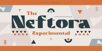 Neftora is an experimental display font with aesthetic and modern touch inspired by contemporary typography. This font is good for logo design, Social media, Movie Titles, Books Titles, short text even long text letters, and good for your secondary text font with sans or serif. Featured: Standard Uppercase & Lowercase Numeral & Punctuation Multilingual : ä ö ü Ä Ö Ü ß ¿ ¡ Alternate & Ligature PUA encoded We recommend programs that support the OpenType feature and the Glyphs panel such as Adobe applications or Corel Draw. so you can use all the variations of the glyphs. Hope you enjoy our fonts!
 - Kajju by Twinletter,
$15.00 Introducing Kajju, a premium font family designed to help you create visually stunning projects of any kind. Kajju San Serif comes in 18 different styles and has everything you need for your design projects. This is an all-in-one font pack with a wide variety of font styles to choose from. So whatever your needs, Kajju can do the job! of course, your various design projects will be perfect and extraordinary if you use this font because this font is equipped with a font family, both for titles and subtitles and sentence text, start using our fonts for your extraordinary projects.
 - Juvelith by Keristyper Studio,
$14.00 Proudly present Juvelith a modern black letter font inspired by contemporary design and calls back to Old English Gothic Scriptures. This font is good for logo design, Social media, Movie Titles, Books Titles, short text even long text letters, and good for your secondary text font with sans or serif. **Featured:** * Standard Uppercase & Lowercase * Numeral & Punctuation * Multilingual : ä ö ü Ä Ö Ü ß ¿ ¡ * Alternate & Ligature * PUA encoded We recommend programs that support the OpenType feature and the Glyphs panel such as Adobe applications or Corel Draw. so you can use all the variations of the glyphs. Hope you enjoy our fonts!
 - Kidyzen by Niznaztype,
$10.00 Kidyzen is a sans handwritten typeface. Inspired from the character of kids writing in their book. Kidyzen have unique style because it like same with typing of children. Kidyzen is perfect for comic, illustration, cartoon, kids design and very suitable for speech bubble text. It have very fun, cute, easy communication, easy reading and unique styles. You can use it for kids t-shirt, cover book, tagline, poster, branding, advertising, wall painting letter and graphic designs that use kids character . Kidyzen have 6 styles, there are regular, italic, bold, bold italic, thin and thin italic. Be enjoy it with my fonts.
 - Lucky Duke by Keristyper Studio,
$14.00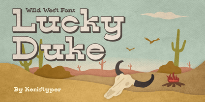 Introducing Lucky Duke font a western display typeface, inspired by cowboy wild west styles. This font is good for logo design, Social media, Movie Titles, Books Titles, short text even long text letters, and good for your secondary text font with sans or serif. **Featured:** * Standard Uppercase & Lowercase * Numeral & Punctuation * Multilingual : ä ö ü Ä Ö Ü ß ¿ ¡ * Alternate & Ligature * PUA encoded We recommend programs that support the OpenType feature and the Glyphs panel such as Adobe applications or Corel Draw. so you can use all the variations of the glyphs. Hope you enjoy our fonts!
 - Sign Painter by Vintage Voyage Design Supply,
$10.00 The Sign Painter – a layered type system with a lot of decor stuff. Inspired by Victorian era signs of IX and XX century. Traditional sans with moonlike script are cool pair to give you really vintage touch, especially with Decoration, which one you find inside. Simple layered system give you easy way to get really cool result. You will get many variations of your inscription with layered system (PDF "How To Use" instruction inside). The Sign Painter script has stylistic alternate with swashes for each letter (Initial, Middle and Final) so you can have swashes for any length of your inscription.